What This Guide Covers (and What You’ll Need)
Your cafe website has one job: turn local intent into action. That action usually looks like reservations, phone calls, and walk-ins—and the best sites make those options obvious within the first few seconds.
This guide focuses on two areas that create quick, measurable wins:
1) Reservation setup that’s actually usable
How to choose a booking method (from a simple “Call to book” button to a full restaurant booking widget), where to place it, and what rules reduce no-shows and staff headaches.
2) Local SEO that helps people find you (and trust you)
Local SEO for cafes isn’t about tricking search engines. It’s about making sure Google and customers see the same clear facts: your name, address, hours, contact info, menu, and reviews. When your reservation flow is easy and your local info is consistent, you get more conversions from the same traffic.
How reservations and local SEO support each other
Local SEO brings people with high intent (“cafe near me”, “brunch reservations”). A good reservation setup captures that intent without friction. Just as importantly, accurate local info reduces mis-bookings (wrong location, wrong hours) and prevents disappointed customers who show up to a closed door.
What you can implement in a weekend vs. longer-term upgrades
Weekend fixes (high impact, low effort):
- Add clear “Reserve” and “Call” buttons in the header (especially on mobile)
- Confirm your hours, holiday hours, and contact details are consistent everywhere
- Create/clean up your contact page so it’s unmissable and complete
- Add a reservation link to your Google Business Profile
Longer-term upgrades (worth planning):
- Location pages (if you have multiple cafes)
- Schema markup to help Google understand your business details and menu
- Performance improvements (page speed, mobile UX) that increase conversions
If you don’t have a developer (or you’re tired of waiting on one), this is also where a build workflow matters. For example, teams use Koder.ai to generate and iterate on pages like /reservations, /menu, and /locations via chat, then export source code or deploy with rollback/snapshots—helpful when you want improvements shipped quickly without rebuilding your whole site.
What you’ll need before you start (asset checklist)
Gather these once, and you’ll move faster through every step:
- Logo files (SVG or PNG) and brand colors
- High-quality photos (exterior, interior, key menu items)
- Menu (ideally a clean page on your site, not only a PDF)
- Accurate hours (including holiday exceptions)
- Phone number and email used for customers
- Address formatting exactly as you want it shown (suite/unit included)
- Reservation policies (late arrivals, table hold time, party size limits, deposits if any)
- Links/logins for your booking tool and Google Business Profile
If you can assemble these pieces first, the rest of the guide becomes a straightforward set of improvements instead of a back-and-forth scramble.
High-Conversion Cafe Website Basics
A high-conversion cafe website does one thing well: it helps a guest decide and take the next step in seconds. Before you tweak SEO or add features, make sure your core actions are obvious, easy, and consistent across every page.
Make the “next step” unmistakable
Most visitors are looking for just a few actions:
- Reserve (or join a waitlist)
- Call
- Get Directions
- View Menu
If these four are visible without scrolling, you’ll convert more of the people already trying to visit you.
Booking links shouldn’t be hidden in a menu.
- Header: a clear “Reserve” button in the top navigation.
- Mobile: add a sticky button (“Reserve” or “Call”) so it’s always one tap away.
- Footer: repeat key actions for people who scroll after reading.
Keep the label simple (e.g., “Reserve” or “Book a Table”), and use the same wording everywhere.
Avoid clutter: 1–2 primary CTAs per page
Too many competing buttons (“Order,” “Catering,” “Gift Cards,” “Events,” “Join our list”) can freeze decision-making. Pick one primary CTA per page, and at most one secondary. For example:
- Home: Reserve (primary), View Menu (secondary)
- Menu: View Menu (primary), Reserve (secondary)
Quick accessibility basics that also boost conversions
- Use readable font sizes and strong color contrast.
- Make tap targets big enough (aim for 44px+ buttons).
- Keep important info scannable: short headings, short paragraphs, clear spacing.
These basics make your site easier for everyone—and reduce drop-offs on mobile.
Choose the Right Reservation Setup
Your reservation flow should feel effortless for guests and easy for staff. Before picking a tool, choose the setup that best matches how your cafe runs—then plug in the provider that fits.
Three common setups
1) Embedded booking widget (on your site)
Guests book without leaving your cafe website. This often converts well, especially on mobile, but some widgets can slow pages down.
2) Dedicated booking page (on your site)
A simple page like /reservations keeps the experience clean, improves tracking, and lets you add helpful details (parking, patio notes, policies) without cluttering your homepage.
3) External booking link (to a third-party page)
Fast to launch and often reliable, but you lose some control over branding and analytics. Some guests drop off when they’re sent away from your site.
Pros/cons to weigh
- Control & branding: highest with an on-site page, lowest with an external link.
- Tracking: easiest when the booking happens on
/reservations (clear pageviews, button clicks).
- Page speed: external links are usually fastest; embedded widgets can add load time.
- Ease of use: external links are simplest for you; embedded widgets can be simplest for guests.
Decision factors (what actually matters)
If you have limited seats or tight table turnover, you’ll benefit from clear time slots and party-size limits. If peak hours regularly create lines, prioritize the setup that’s fastest on mobile and supports waitlists or deposits.
No-shows a problem? Choose a provider that supports deposits, card holds, or confirmation reminders—then make those policies visible near the “Book” button.
What to prepare before you implement
Have these ready so your booking flow isn’t vague:
- Party sizes (min/max), seating notes (bar, patio, high chair)
- Lead time (how far ahead people can book) and cutoff time
- Booking rules (late arrivals, cancellation window, deposits if needed)
- Confirmation message (include address, parking tips, and how to modify)
If you want a clean default: start with a dedicated /reservations page and add a “Reserve” button in your header.
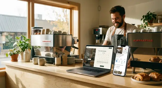
Reservation Setup: Implementation Checklist
A reservation tool only works if guests can find it quickly, trust it, and complete a booking without friction. Use this checklist to implement a clean, reliable setup on your cafe website.
1) Create a dedicated /reservations page
Build a simple page at /reservations and link to it from your main navigation (or at least your header button). Keep the page focused:
- A short intro: what reservations are for (table service, weekend brunch, groups, etc.)
- Your booking rules in plain English (e.g., “Reservations up to 6 guests”)
- A “Need help?” line with a phone number and a link to
/contact
Add clear instructions right above the widget, such as: “Select date, time, and party size, then confirm.” This reduces abandoned attempts—especially on mobile.
Place the widget high on the page so it’s visible without scrolling too far.
Then add a fallback in case the widget fails to load (slow connections, ad blockers, script errors):
- A prominent button: “Book a table” linking to the provider’s hosted booking page
- A secondary option: “Prefer to call? (555) 123‑4567”
If your booking tool supports it, prefill details when linking out (location, party size) so guests don’t have to start over.
3) Add booking CTAs across key pages
Guests rarely start on /reservations. Add consistent calls-to-action in these high-traffic spots:
- Home page: a primary “Reserve” button in the header + one mid-page CTA
- Menu page (
/menu): a sticky or near-top “Reserve a table” link
- Contact page (
/contact): a “Reservations” section with link to /reservations
- Location pages: “Reserve at this location” (especially important if you have multiple cafes)
Use the same wording everywhere (“Reserve” or “Book a table”) to build recognition.
4) Test the full flow on mobile (not just desktop)
Run through at least 5 complete test bookings on an actual phone:
- Date/time picker works and doesn’t get cut off
- Party size selection is easy to tap
- Confirmation page/message is clear (and includes what happens next)
- Error states are readable (e.g., sold-out times, missing fields)
- Calendar/timezone issues don’t shift the selected time
Finally, ask one person who hasn’t seen your site to book a table. If they hesitate or get confused, your next improvement is obvious.
Reduce No-Shows and Mistakes with Simple Booking Rules
No-shows usually aren’t “bad customers”—they’re unclear expectations, missed messages, or a booking flow that makes it too easy to enter the wrong details. A few simple rules (written in plain language) can cut mistakes without adding friction.
Write booking rules like a sign on your front door
Keep rules short, specific, and visible near the “Book” button and in the confirmation message. Focus on the scenarios that create the most chaos:
- Late arrivals: “We hold tables for 10 minutes. If you’re running late, reply to your confirmation or call us.”
- Cancellations/changes: “Changes are free up to 2 hours before. After that, please call.”
- Party size accuracy: “Please book the exact number of guests so we can seat you properly.”
If you take deposits or require a card, explain why (“to protect small teams from no-shows”) and keep the policy consistent.
Ask for fewer fields (and get more completed bookings)
Every extra form field increases drop-offs and typos. For most cafes, the minimum that still works operationally is:
- Name
- Mobile number (or email)
- Date/time
- Party size
Optional fields should stay truly optional (e.g., “allergy notes” or “high chair needed”). If you need both email and phone, make one optional unless you’re doing SMS-only confirmations.
Confirmation email/SMS that prevents confusion
Your confirmation message should answer the questions people will otherwise call about. Include:
- Exact address (plus a short landmark)
- Parking note (“street parking after 6pm” / “paid lot next door”)
- A quick allergens note (“Tell us in advance—our kitchen is small but we’ll do our best.”)
- One-tap instructions to change/cancel (“Use this link” or “Reply CHANGE”)
Staff workflow: where bookings go—and what happens if it breaks
Decide one source of truth (booking dashboard, POS, shared tablet) and assign ownership per shift.
- Who checks new reservations (and how often)?
- Where do walk-ins get recorded so you don’t double-seat?
- What’s the backup during an outage (printed list, manual logbook, phone script)?
A booking system is only as reliable as the last person who confirmed it—make that responsibility clear, and your no-shows and seating mistakes usually drop quickly.
Local SEO Foundation: NAP, Hours, and Contact Page
Mulai dengan paket gratis
Uji alur kerja pembangunan yang lebih cepat untuk situs kafe Anda sebelum berkomitmen ke paket berbayar.
If you only fix three things for local SEO, start here: your NAP, your hours, and your contact page. These basics tell Google (and customers) that your cafe is real, consistent, and easy to visit.
Primary NAP: keep it identical everywhere
Your Name, Address, and Phone should appear on your website in one “primary” format—and that exact formatting should match your major listings (especially Google Business Profile).
Small differences can create big confusion, like using “St.” on your website but “Street” on a listing, or showing two different phone numbers.
A simple rule: pick one version and stick to it.
Business hours: visible, current, and complete
Make your hours easy to find without hunting. Customers often search “open now” moments before visiting, so if your site is missing hours (or they’re outdated), people will bounce and choose another option.
Include:
- Regular hours (by day)
- Holiday hours (or at least a clear “holiday hours may vary” note with a way to confirm)
- Any special notes (e.g., “Kitchen closes at 2:30pm”)
Place hours in the footer and on your Contact page so they’re always one click away.
Map + directions: answer real-life questions
A map embed is helpful, but directions content is what reduces friction. Add a short “Getting here” section that covers:
- Parking tips (street vs. lot, paid vs. free)
- Entrance notes (especially if you’re inside a market, hotel, or courtyard)
- Accessibility details (ramps, step-free entry, accessible restroom if applicable)
These details also naturally include location terms people search for—without stuffing keywords.
Most local searches happen on phones, so your contact info should be instantly usable.
Add:
- Click-to-call phone links
- Tap-to-open-maps address links
On mobile, a customer should be able to call or start navigation in one tap—no copying, no pinching and zooming.
A quick test: open your Contact page on your phone and time how long it takes to start directions. If it’s more than 5 seconds, simplify.
Google Business Profile Quick Wins
Your Google Business Profile (GBP) is often the first “page” people see—before they ever reach your cafe website. A few focused updates can improve calls, directions, and bookings within days.
1) Claim, verify, and choose the best primary category
First, make sure you own the profile (claim and verify it). Then review your primary category—it matters more than most fields. Pick the category that best matches what you want to be found for (usually “Cafe” or “Coffee shop”). Add a couple of relevant secondary categories only if they’re truly accurate.
2) Add attributes that match how guests decide
Attributes act like filters in search and Maps, and they help set expectations. Add anything that’s true and meaningful for a cafe, such as:
- Wi‑Fi availability
- Outdoor seating
- Takeaway / dine‑in
- Wheelchair accessible entrance
- Payment options
Keep these updated when seasons change (e.g., patio seating) or policies change.
3) Upload fresh photos—and pick a cadence you can maintain
Photos influence clicks and visits more than most cafe owners realize. Add a mix of:
- Exterior shots (help people recognize your entrance)
- Interior seating (set the vibe)
- Best-selling drinks/pastries (make choices easy)
Aim for a simple routine you’ll stick to—like 5–10 new photos per month. Consistency beats a one-time dump.
4) Use the booking link field to drive reservations
If you take bookings, connect them directly in GBP. Add your reservation URL in the booking link field and point it to /reservations. This reduces friction (and mistakes) by sending guests to the exact place to book—no scrolling, no guessing.
If you post updates, occasionally include a clear call-to-action (e.g., “Reserve a table”) and link to /reservations as well.
Location Pages That Rank (and Convert)
Sempurnakan halaman kontak
Rancang halaman kontak dengan jam buka, catatan parkir, dan aksi 'ketuk untuk telepon' dalam satu alur kerja.
If you have more than one cafe, a single “Locations” page usually isn’t enough. Searchers want the closest option, and Google wants clear, specific pages it can match to local intent. The goal is simple: one dedicated page per location that’s genuinely helpful—so it ranks and gets bookings.
Build one page per location (no copy-paste)
Avoid creating near-identical pages where only the address changes. Instead, write each location page like it’s the only one:
- Unique photos: the storefront, interior, patio, and a couple of best-sellers that are actually available at that branch.
- Neighborhood details: nearby landmarks (“across from Central Station”), what the area is known for, and who it’s ideal for (quick coffee, quiet work, family brunch).
- Parking and transit: where to park, nearest metro/bus stops, bike racks.
- Exact hours: including kitchen hours if they differ.
Make it easy to choose you
Add conversion-friendly elements that answer “Can I go right now?” and “How do I get in?”
Include an embedded map, a prominent click-to-call number, and clear buttons (e.g., “Book a table,” “Order ahead,” “Get directions”). If you use reservations, keep the booking option consistent across locations, but display the correct branch preselected.
Add schema per location (fast structured data win)
Implement LocalBusiness (or Restaurant/Cafe) schema on each location page with that location’s name, address, phone, opening hours, and geo coordinates. This helps search engines connect the page to local searches and improve map visibility.
Internal linking that supports ranking
Create a hub page like /locations that links to every branch, and make sure each location page links back to /locations (and optionally to the next nearest location). This improves discoverability for both visitors and search engines—and reduces dead ends.
Your menu is often the most-visited page on a cafe website—and one of the strongest signals for what you actually serve. A few small, non-technical tweaks can help it rank better in local searches and convert more visitors into guests.
Make /menu easy to find (and avoid PDF-only menus)
Put a clear “Menu” link in your main navigation and footer, and keep the URL simple (ideally /menu). If you currently use only a PDF, consider adding an HTML menu page as the primary version.
PDF menus are fine as a downloadable option, but they’re harder for search engines (and some customers) to use. An indexable page loads faster on mobile, is easier to scan, and can show up for searches like “brunch near me” or “oat milk latte.”
Add indexable text for key categories people search for
Even if you use beautiful menu photos, add real text for the important sections customers look for:
- Coffee (espresso drinks, iced coffee, specialty lattes)
- Pastries (croissants, muffins, gluten-free options)
- Brunch (sandwiches, eggs, bowls)
Keep it readable—short descriptions are enough. The goal is to help visitors and search engines quickly understand what you offer.
Use descriptive headings and image alt text (without keyword stuffing)
Structure the page like a well-organized menu board:
- Use clear headings (H2/H3) such as “Coffee,” “Tea,” “Pastries,” “Brunch,” “Seasonal Specials.”
- If you use images, add helpful alt text that describes the item (e.g., “Almond croissant” or “Iced vanilla latte”).
Avoid cramming in location terms or repeating the same phrase unnaturally. Simple, specific descriptions work best.
Include pricing, allergens note, and a “last updated” date
Prices help customers decide faster and reduce surprises at the counter. Add an allergen note (e.g., “Please ask about allergens; items may contain nuts, dairy, or gluten”) and include a visible “Last updated” line near the top or bottom of the menu.
That date builds trust, and it prevents visitors from wondering whether an item is still available—especially helpful if you rotate seasonal drinks or weekend brunch items.
Schema Markup for Cafes: The Fastest Structured Data Wins
Schema markup is a small piece of structured data (usually JSON-LD) that helps Google understand your cafe’s essentials—what you are, where you are, when you’re open, and what customers can do (view a menu, book a table). It won’t magically rank you overnight, but it often improves how your listing appears (rich results) and reduces confusion.
1) Add Cafe/Restaurant (or LocalBusiness) schema
Start with one primary entity that matches your business type (often Restaurant). Include your NAP (name, address, phone), opening hours, and a link to your key pages.
{
  "@context": "https://schema.org",
  "@type": "Restaurant",
  "name": "Example Cafe",
  "url": "/",
  "telephone": "+1-555-0100",
  "address": {
    "@type": "PostalAddress",
    "streetAddress": "123 Main St",
    "addressLocality": "Springfield",
    "addressRegion": "IL",
    "postalCode": "62701",
    "addressCountry": "US"
  },
  "openingHoursSpecification": [
    {
      "@type": "OpeningHoursSpecification",
      "dayOfWeek": ["Monday","Tuesday","Wednesday","Thursday","Friday"],
      "opens": "07:00",
      "closes": "17:00"
    }
  ],
  "acceptsReservations": true,
  "sameAs": []
}
If you take bookings online, include acceptsReservations and make sure your reservation flow is linked clearly on-page (a “Book a table” button). You can also reference your booking URL via url on the reservation page.
If your menu lives on your site, mark it up with Menu and connect it to the business entity. This helps search engines interpret the menu as structured content rather than a random page. Keep it simple—don’t try to model every ingredient on day one.
3) Use FAQ schema for real customer questions
Add FAQPage markup on pages that already contain the questions and answers (don’t create fake FAQs). Good candidates:
- Parking and accessibility
- Dietary options (gluten-free, vegan)
- Reservation policy (walk-ins, patio seating)
4) Validate and fix warnings
After publishing, run the page through Google’s Rich Results Test and address errors first (warnings second). Re-test after changes, and keep your schema aligned with what the page visibly says—especially hours, phone number, and reservation rules.
Speed and Mobile UX Fixes (That Don’t Break Design)
Buat halaman reservasi
Buat halaman reservasi khusus dan sesuaikan lewat chat hingga nyaman di ponsel.
A fast site isn’t just “nice to have”—it directly affects how many people actually reach your menu, tap “Reserve,” and show up. The good news: most speed wins don’t require redesigning anything.
Start with the pages that matter most
Prioritize performance on the pages customers hit right before taking action:
- Home
/menu/reservations/contact
If these four feel instant on mobile, you’ve covered the highest-impact journey.
Optimize images without making them look worse
Large images are usually the #1 reason a cafe website feels slow.
- Compress photos before uploading (keep them sharp, just smaller)
- Use modern formats like WebP/AVIF when possible
- Lazy-load images below the fold so the top of the page appears quickly
A simple rule: the hero image should be high quality, but not huge. Everything else can load after the page becomes usable.
Keep booking and marketing scripts on a diet
Reservation widgets, chat tools, popups, and analytics can quietly add multiple seconds—especially on mobile.
- Remove plugins you’re not actively using
- Avoid adding “one more” script for a small feature (many are redundant)
- If your booking widget allows it, load it only on
/reservations instead of every page
If you’re using multiple tracking tools, consolidate where you can—less code means fewer delays.
Mobile UX tweaks that protect conversions
Speed and usability go together. A fast page still fails if it’s hard to tap.
- Make phone and address tap-to-call and tap-to-map
- Keep buttons large enough for thumbs (especially “Reserve”)
- Ensure the reservation button stays visible near the top on mobile
What to measure (simple and actionable)
Watch these basics in your performance tool of choice:
- LCP (Largest Contentful Paint): how fast the main content appears
- CLS (Cumulative Layout Shift): whether buttons jump around while loading
- Mobile performance score: a quick indicator of regressions after changes
Aim for “feels instant” on a real phone, on cellular—not just on your office Wi‑Fi.
Reviews, Tracking, and a 30-Day Improvement Plan
Reviews are one of the few marketing assets that help your cafe in three places at once: Google Business Profile visibility, click-through rate, and customer confidence. The trick is to treat reviews like an ongoing system—not a one-time push.
Ask at the right moment (and make it effortless)
The best time to ask is right after a good experience: when you hand over a takeaway order, drop the bill, or thank someone for a compliment.
Make it easy:
- Use a short link (or QR code) that goes straight to your review screen.
- Train staff on a one-sentence prompt: “If you enjoyed today, would you mind leaving us a quick Google review? It really helps a local cafe.”
- Put the QR on a small card by the register, not all over the space.
Respond to every review with a consistent template
Replying shows you’re active, and it gives future customers extra context.
Use a simple structure:
- Thank them by name (if shown)
- Mention something specific (drink, dish, vibe)
- Invite them back + sign off
For negative reviews: acknowledge, apologize if appropriate, and move the conversation offline (“Please contact us at [email/phone] so we can make it right.”). Don’t argue.
Add reviews to your website (carefully)
If a customer gives permission, feature short testimonials on your homepage and reservation page. Keep them accurate and current—don’t edit the meaning. If you quote Google reviews, include the customer’s first name/initial and the platform.
Track what matters (and set goals)
Pick a few signals you can act on:
- Bookings completed (not just widget opens)
- Calls from your site and from Google Business Profile
- Direction clicks from Google Business Profile
A practical 30-day plan
Days 1–7: Create your short review link/QR, write two response templates (positive + negative), and assign one person to reply daily.
Days 8–21: Ask consistently at peak moments; add a small “Review us” prompt on the contact page.
Days 22–30: Review metrics weekly, identify what changed (more calls, more bookings, fewer no-shows), and set a realistic next-month goal (example: +15 reviews, maintain 100% response rate).