Define the Goal and the Communication Gaps
Before you choose features or screens, get specific about what “better communication” actually means for your clinic. Otherwise, you’ll end up with an app that looks polished but doesn’t reduce daily friction for staff or patients.
Start with the real pain points (not assumptions)
Most clinics don’t have one communication problem—they have several small breakdowns that compound:
- Missed calls during peak hours, followed by voicemail ping-pong
- No-shows and late cancellations because reminders are inconsistent or unclear
- Slow follow-ups after visits (patients unsure what to do next)
- Repeat questions (“When will my results be ready?” “Can I take this with food?”)
Write these down as scenarios, not complaints. Example: “Front desk receives 40+ calls between 8–10am; patients wait on hold; staff later re-enters the same info into the schedule.”
Define what success looks like in plain terms
“Better communication” should translate into measurable outcomes such as:
- Faster, more predictable response times (e.g., same-day replies for non-urgent messages)
- Fewer errors (less back-and-forth, fewer missed details)
- Clearer instructions (patients can find prep steps, follow-ups, and policies without calling)
Identify who benefits—and how
A patient communication app should reduce work, not move it around. Map benefits across roles:
- Front desk: fewer calls about hours, directions, billing basics, and appointment status
- Nurses/medical assistants: structured intake info and fewer fragmented messages
- Clinicians: fewer interruptions and better-prepared patients
- Patients and caregivers: one place for updates, instructions, and questions without phone tag
Set realistic outcomes you can track
Pick 2–4 outcomes for the first release and baseline them now. Common starting targets include reducing call volume, improving attendance (no-show reduction), and speeding up intake. These goals will guide your MVP decisions later—especially what to automate, what to standardize, and what must stay human.
Know Your Users and Their Real-World Needs
A patient communication app succeeds when it fits the people using it—not the org chart. Before you pick features or screens, map the real users and what they’re trying to get done on a stressful day.
Primary users (and what they actually need)
Patients want clarity and reassurance: “What’s next, and did the clinic get my message?” Many also need help understanding medical terms and instructions.
Caregivers (parents, adult children, partners) often manage logistics—scheduling, forms, medication questions—especially for children, older adults, or patients recovering from surgery. They may need delegated access without seeing everything.
Clinic staff and providers need fewer back-and-forth calls, a clean queue, and confidence that messages and tasks won’t be missed. They also need predictable handoffs: who answers what, and when.
Key journeys to design around
New patient onboarding should be fast and forgiving: account setup, identity verification if required, basic history, insurance, and “what to bring.”
Visit reminders should reduce anxiety and no-shows: time, location, parking/telehealth link, prep instructions, and an easy way to reschedule.
Post-visit follow-up should turn instructions into action: medication guidance, red-flag symptoms, next steps, and a simple path to ask a question.
Accessibility and device realities
Assume mixed comfort with apps and healthcare terms. Use simple language, large text options, clear buttons, and support for screen readers.
Design for older phones and limited storage: keep downloads light, avoid heavy animations, and make key info readable on small screens.
Plan for poor connectivity. Patients may be in elevators, rural areas, or hospital corridors—so drafts, offline-friendly screens, and “message pending” states prevent frustration and duplicate submissions.
Pick the Right Features for a Clinic Patient App
Feature selection is where a clinic patient communication app either stays simple and useful—or becomes confusing for patients and exhausting for staff. Start by prioritizing the small set of functions that reduce phone calls and missed care, then add extras only when the workflow is stable.
Start with the “must-haves”
For most clinics, the first release should cover:
- Secure patient messaging (asynchronous chat with clear response expectations)
- Reminders (appointments, prep instructions, vaccine schedules)
- Basic scheduling (request/reschedule/cancel, or at least appointment requests)
This core set often delivers the fastest value in healthcare mobile app development because it reduces incoming calls and keeps patients informed without adding new clinical risk.
Add “nice-to-haves” only after the basics work
Once the clinic can consistently support messaging and reminders, consider:
- Telehealth app features (video visits, document sharing, visit summaries)
- Digital forms (intake, consent, screening questionnaires)
- Payments (copays, balances, receipts)
- Prescription requests (renewal requests, pickup preferences)
- Education content (care plans, post-visit instructions)
Define roles and permissions early
A patient portal mobile app lives or dies by clarity: what staff can do vs. what patients can do. For example, patients might request changes, but only staff confirm appointments; patients can upload photos, but only clinicians can route them to the chart. Role-based access also supports HIPAA and GDPR considerations.
Write “done” in plain language
For every feature, write simple success criteria. Example: “Messaging is done when a patient can send a question, the clinic can assign it to a team inbox, and the patient receives a clear reply within the promised timeframe.” This keeps MVP scope tight and makes later EHR integration decisions much easier.
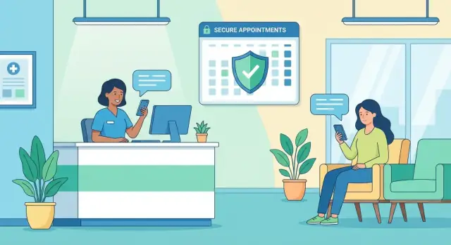
Design Secure Messaging That Fits Clinic Workflow
Secure messaging is often the most-used part of a clinic patient communication app—so it has to match how your team already works. The goal isn’t “more chat.” It’s fewer phone tags, clearer handoffs, and safer patient communication.
Choose the right messaging types
Most clinics need three patterns:
- 1:1 chat for ongoing questions, medication clarifications, and follow-ups tied to a patient
- Broadcast announcements for office closures, vaccine clinics, or system outages—sent to targeted groups (e.g., “all patients with appointments today”)
- Automated replies that acknowledge receipt and set expectations (“We received your message. If this is urgent, call…”) and can route common requests (refill, referral, scheduling) into the right queue
Support attachments—without creating chaos
Patients will want to send photos (for example, a rash) and documents (referrals, insurance cards). Set clear limits:
- Allowed formats (e.g., JPG/PNG/PDF)
- Max size per file and per message
- Simple guidance on what makes a useful photo (lighting, distance, one issue per photo)
Also decide where attachments should appear for staff—ideally inside the conversation, with quick preview and download controls.
Route conversations to the right team
A single inbox quickly becomes unmanageable. Build routing that reflects clinic roles:
- Front desk: scheduling, billing questions, general admin
- Nurse/triage: symptoms, vitals, post-op questions
- Clinician: messages that truly require medical decision-making
Use tags, templates, and assignment so staff can hand off threads without losing context.
Set response expectations and safety rules
Make business hours and typical response times visible, and define escalation rules for time-sensitive symptoms. Include an emergency disclaimer in the composer and auto-replies (“If you think this is an emergency, call local emergency services.”) so patients aren’t tempted to treat chat as urgent care.
Appointments, Reminders, and No-Show Reduction
Missed appointments cost clinics time and patients momentum. Your app can lower no-shows when scheduling is simple, reminders are timely, and patients can take action without calling.
Appointment actions patients actually need
Make the “next appointment” card the center of the home screen. From there, patients should be able to:
- Request or book an appointment (with clear provider/location options)
- Confirm with one tap
- Reschedule or cancel without hunting for a phone number
- Join a waitlist and get offered earlier slots when they open up
Pair each action with clear rules (e.g., “You can reschedule up to 24 hours before”). If a request needs staff approval, say so and show status (“Pending review”).
Reminder strategy: choose channels and timing on purpose
Use the channels patients already check, and don’t spam. A practical pattern is:
- Immediate confirmation (push + email) right after booking/changes
- A “heads-up” reminder 3–7 days before (email or push)
- A final reminder 24–48 hours before (SMS if allowed)
Let patients pick their preferred channel(s) and quiet hours in settings.
Two-way reminders that trigger a workflow
One-way reminders still leave the front desk flooded. Add reply actions that update the schedule:
- “Reply 1 to confirm”
- “Reply R to reschedule” (opens available times)
- “Reply C to cancel” (and offer waitlist enrollment)
Reduce no-shows with prep that removes friction
Each reminder should include what patients need to succeed:
- Location, parking/entrance tips, and check-in instructions
- A checklist of required forms and ID/insurance items
- Prep instructions (fasting, medication notes) and a “Complete now” button for forms
If your clinic already uses online scheduling, link to it from the app (e.g., /pricing or your own /appointments page) and keep the flow consistent.
Plan Your Workflow Clearly
Map roles, permissions, and MVP scope in Planning Mode before you build.
Digital forms do more than replace clipboards—they reduce back-and-forth, cut errors, and help staff start visits with cleaner information. The key is to keep forms short, mobile-friendly, and easy to resume if a patient gets interrupted.
Simple intake that patients will actually finish
Start with the essentials: demographics, insurance basics, preferred pharmacy, and a small set of symptom questions that match the visit type. Use plain language, one question per screen where possible, and smart defaults (for example, remembering a patient’s pharmacy or address after they confirm it’s still correct).
When you need a longer questionnaire, break it into sections with a progress indicator and a “Save and finish later” option. Patients don’t think in forms—they think in time. Five minutes feels reasonable; fifteen feels like homework.
Photo ID and insurance capture (without frustration)
Photo capture is often where completion drops. Add clear guidance right on the camera screen:
- Show where to place the card (simple frame overlay)
- Remind users to avoid glare and keep text readable
- Offer “Retake” and “Use photo” buttons that are easy to tap
If the image is blurry, explain why and how to fix it (“Too dark—move closer to a light”). Small feedback like this prevents repeated failures.
Signatures and consent flows
For consents (HIPAA acknowledgements, telehealth consent, financial policies), design for understanding first: short summaries with a “Read full policy” option.
From an operations standpoint, make sure each signed consent is stored with:
- Timestamp and version of the document
- Patient identity link (account + visit context)
- An audit-friendly record staff can retrieve later
Staff should be able to re-send a consent request if it expires or regulations change, without creating duplicate confusion.
Post-visit tasks that keep care on track
After the visit, the app should translate clinical instructions into simple follow-up items: medication instructions, care plans, and next steps (“Book labs,” “Schedule follow-up,” “Complete daily symptom check”). Use checklists, due dates, and gentle reminders—then let patients confirm completion or ask a clarifying question.
When designed well, intake and follow-up become a loop: better pre-visit information leads to clearer post-visit plans, which leads to fewer avoidable calls and missed steps.
Sharing lab results, visit summaries, and provider notes is one of the fastest ways to improve patient satisfaction—if you do it with clear rules, simple explanations, and careful access controls. The goal is to help patients understand what happened and what to do next, without accidentally creating confusion or risk.
Share what’s appropriate (and when)
Not every piece of clinical data should appear instantly. Decide, with your clinicians, what becomes available automatically (for example: routine normal labs, after-visit summaries) and what should wait for a quick review (for example: sensitive findings or results that usually require a call).
Make availability rules visible in the app: “This result will be released after your clinician reviews it” is better than silence.
Explain medical terms in plain language
A patient app shouldn’t expect people to speak “clinical.” Add short help text next to common fields (e.g., “reference range,” “flagged,” “units”) and link to trusted educational pages.
Keep the tone practical: define what the number means, common reasons it may be high/low, and what the clinic typically recommends. Avoid diagnosing in the app. Your job is to reduce confusion and guide the next step.
Set expectations and urgent guidance
Every results screen should answer two questions:
- When will someone review this?
- What should I do if I’m worried right now?
Use clear guidance like “Messages are reviewed within 1–2 business days” and an “If urgent” note that directs patients to call the clinic or emergency services. Put this guidance where patients will actually see it: at the top of results and within the messaging screen.
Audit history for trust and operations
Patients want reassurance that their information is handled carefully, and clinics need traceability. Include an audit history that records who viewed what and when (and, ideally, whether it was opened by the patient, a proxy, or staff).
Keep the audit view understandable: show the event (“Viewed lab result”), timestamp, and actor (“You,” “Care team,” “Proxy: Parent”). This supports internal investigations, reduces “I never got it” disputes, and strengthens trust.
If you’re building secure patient messaging alongside results sharing, align notifications and access rules so patients aren’t alerted to content they can’t open yet.
Privacy, Compliance, and Trust Requirements
Add a Staff Messaging Dashboard
Give staff a clear inbox, routing, and status views with an admin dashboard.
Trust is a feature. If patients don’t feel safe using your clinic patient communication app, they won’t message, share updates, or rely on reminders—no matter how polished the interface is.
Confirm what rules apply (early)
Bring legal/compliance in at the start, not right before launch. Requirements depend on where you operate and what data you handle. For example, a patient portal mobile app in the U.S. often needs HIPAA-aligned safeguards, while clinics serving EU residents must meet GDPR obligations.
Clarify upfront:
- What counts as protected health information (PHI) in your app
- Whether you’re acting as a “processor” or “controller” (GDPR) or handling PHI for a covered entity (HIPAA)
- Which vendors need agreements (e.g., BAA for HIPAA)
Data minimization and retention rules
Collect only what you truly need for care and operations. This reduces risk, simplifies compliance, and makes healthcare mobile app development easier.
Decide and document:
- Minimum profile data (often name, DOB, contact method, identifiers)
- What messages and attachments you allow (and what you block)
- How long you retain chats, forms, and files
- How patients can request deletion or export where applicable
A helpful test: if a data field doesn’t change a clinical or scheduling decision, it may not belong in the MVP.
Security basics patients (and auditors) expect
Even non-technical users recognize “secure” behavior: login protections, timeouts, and clear confirmation screens.
Baseline safeguards for secure patient messaging and scheduling:
- Encryption in transit (TLS) and at rest for stored data
- Secure authentication (strong passwords plus optional MFA)
- Session timeouts and automatic logout on inactivity
- Device protections (biometric unlock support, limited local caching, jailbreak/root checks where appropriate)
Operational safeguards inside the clinic
Privacy isn’t only technical—it’s also about workflow. Define who can see what, and prove it later.
Key operational controls:
- Role-based access (front desk vs. nurse vs. billing)
- Audit logs for access and changes to records/messages
- Clear breach response plan: detection, internal escalation, patient notification timelines
If you’re planning EHR integration, align access rules with the EHR so staff don’t gain broader access through the app than they have elsewhere.
Integrations: EHR, Scheduling, Billing, and Labs
A patient communication app becomes truly useful when it reflects what the clinic already knows: who the patient is, what’s booked, what’s due, and what results are available. That means planning integrations early—otherwise the app turns into “one more place” staff must update.
Which systems usually need to connect
Most clinics end up integrating with at least a few of these:
- Scheduling system (appointments, provider availability, cancellations)
- EHR/EMR (patient demographics, care team, clinical notes metadata, document links)
- Billing/Payments (balances, invoices, payment status)
- CRM or outreach tools (campaigns, segmentation, consent status)
- Lab systems (orders, results, reference ranges, result timestamps)
Not every clinic needs all of them on day one—but you should decide what’s “must-have” for your MVP so workflows don’t break.
Integration options: API, standards connectors, or middleware
Clinics typically integrate in three ways:
- Vendor APIs: Best when your EHR/scheduler offers stable APIs and support.
- HL7/FHIR connectors: Useful when data must follow healthcare standards (FHIR is common for modern patient data access).
- Middleware/iPaaS: A “hub” that connects multiple systems, handles transformations, and can reduce custom code.
The right choice often depends on your vendors, budget, and how quickly you need to go live.
Data mapping that prevents mismatches
Integration projects fail more from identity confusion than from code. Define how you’ll map:
- Patient identifiers (internal MRN vs. portal ID vs. phone/email)
- Appointment IDs (source of truth, reschedules, cancellations)
- Message records (how messages are stored, linked to the chart, and auditable)
Agree on a single “source of truth” for each item.
Fallback plan when systems are down
Integrations will have outages. Decide in advance:
- What the app shows if scheduling/EHR data can’t be fetched (e.g., “We’re updating—try again soon”)
- Whether messages can still be sent and queued
- How staff are alerted, and what manual steps keep care moving
A clear fallback plan protects both patient experience and clinic operations.
Build Approach and Technical Choices (Without the Jargon)
You don’t need to be technical to make smart build decisions. What matters is choosing options that fit your clinic’s budget, timeline, and how you already work.
iOS, Android, or both?
Most clinics serve patients on both platforms, so building for iOS and Android is usually the safest choice. You have two common routes:
- Native apps (built separately for iPhone and Android): best polish and performance, but typically higher cost
- Cross-platform apps (one codebase for both): faster to build and easier to maintain, while still feeling “like a real app” when done well
A practical approach is to start cross-platform for an MVP, then go native later only if you truly need it.
Build vs. buy (or extend what you already have)
Before custom development, check whether your EHR or patient portal already offers:
- a mobile add-on
- a white-label patient app
- or modules for messaging and scheduling
Buying can be quicker, but it may limit the workflow details that matter (triage rules, templates, routing, reporting). Custom development costs more upfront, but you control the experience and can evolve it over time.
If you want to move fast without committing to a long build cycle, some teams also prototype and ship internal tools using a vibe-coding platform like Koder.ai—where you can describe the patient messaging and scheduling workflow in chat, generate a working web or mobile app foundation, and iterate with stakeholders. This can be especially useful for MVPs and admin dashboards, as long as you still validate security, compliance, and integration requirements.
What you’re actually building (the “parts”)
A clinic patient communication app typically includes:
- The patient app (where patients message, book, and view updates)
- A secure backend (the service that stores data and applies rules)
- A database (where messages, appointments, and documents live)
- Notifications (push + SMS/email as a fallback)
- An admin dashboard for staff to manage conversations, users, and settings
Analytics and monitoring (so you can trust it)
Plan for basics from day one: crash reports, uptime monitoring, and message delivery tracking (sent → delivered → read). This helps you spot problems early and prove the system is working during busy clinic hours.
MVP Scope, Prototyping, and Testing Plan
Go Live for a Pilot
Deploy and host your app from Koder.ai to share with pilot users quickly.
An MVP (minimum viable product) is the smallest version of your clinic patient communication app that reliably solves the main communication problem—usually “patients can reach the clinic and get clear next steps without phone tag.” Keeping the first release tight helps you launch sooner, learn faster, and reduce risk.
Define the MVP scope (what you ship first)
Pick a short list of “must work” flows and treat everything else as a later iteration. A practical MVP often includes:
- Secure messaging with a simple inbox and clear status (new, waiting, answered)
- Appointments list (upcoming and past)
- A basic way to upload or complete forms (photo/PDF upload is enough at first)
- Profile basics (name, contact details, notification preferences)
If a feature doesn’t directly reduce calls, missed appointments, or unanswered questions, park it for later.
Prototype the core screens before building
Create clickable prototypes for key screens: message inbox, appointment list, form upload, and profile. Prototypes let staff confirm workflow (“Where do messages land?” “What’s urgent?”) and help patients confirm clarity (“Where do I tap?” “Did my form go through?”) without spending weeks on development.
Usability testing: small group, big insights
Run quick sessions with 5–10 patients and 5–10 staff members. Ask them to complete real tasks (send a question, find an appointment, upload a form). Watch where they hesitate, misread labels, or abandon steps—those are your highest-impact fixes.
Quality checks before release
Plan lightweight but serious checks: security testing for common issues, accessibility (larger text, screen readers, contrast), and performance on older devices. The MVP should feel dependable, not “early.”
Launch, Adoption, and Ongoing Improvement
A patient communication app only works if staff use it consistently and patients trust it enough to switch from phone calls and paper. Plan the launch like a service change, not just a software release.
Roll out in a controlled pilot
Start with a small pilot: one clinic location, or one provider team (for example, one specialty). Keep the pilot long enough to see patterns—typically a few weeks—then adjust workflows before expanding.
During the pilot, define what “good” looks like: which message types should move into the app, what still requires a phone call, and how fast patients should expect replies.
Train staff with clear rules (and scripts)
Adoption rises when the team knows exactly what to do.
- Triage rules: who answers what (front desk vs. nurse vs. billing)
- Response times: set realistic expectations (and align them with clinic hours)
- Templates/scripts: short, approved replies for common requests (refills, reschedules, lab questions)
- Escalation: what triggers a call-back or urgent clinical review
Help patients start using it the same day
Make onboarding effortless at the point of care.
- Put QR codes at the front desk and in after-visit paperwork
- Send a welcome message with 1–2 clear actions (“Message us here” / “Request an appointment”)
- Provide a one-page guide that shows where to find messages, appointments, and results
If you already have a website, link patients to a short “How it works” page and keep instructions consistent across channels.
Measure impact and improve continuously
Track a small set of metrics and review them with staff weekly during rollout:
- Call volume (especially repetitive requests)
- No-show rate and reminder effectiveness
- Median reply time (and after-hours backlog)
- Patient satisfaction (short in-app survey after resolved threads)
Use the data to decide your next improvements. Common next steps include adding telehealth visits, payments, or education content based on what patients request most.
If you need help scoping a phased rollout or estimating effort, see /pricing. For related playbooks and examples, browse /blog.