15 ਅਗ 2025·8 ਮਿੰਟ
ਇੱਕ-ਪੰਨੇ ਦਾ ਲੈਂਡਿੰਗ ਪੇਜ ਕਿਵੇਂ ਬਣਾਇਆ ਜਾਵੇ ਜੋ ਤੁਹਾਡੀ ਸੇਵਾ ਵੇਚੇ
ਇੱਕ-ਪੰਨਾ ਸੇਵਾ ਲੈਂਡਿੰਗ ਪੇਜ ਬਣਾਓ ਜਿਸ ਵਿੱਚ ਸਪਸ਼ਟ ਸੁਨੇਹਾ, ਮਜ਼ਬੂਤ ਸੈਕਸ਼ਨ, ਭਰੋਸੇ ਦੇ ਨਿਸ਼ਾਨ, ਕੀਮਤਾਂ, FAQs ਅਤੇ ਆਸਾਨ ਟੈਸਟ ਹੋਣ—ਤਾਕਿ ਸਾਈਨ-ਅਪ ਵਧ ਸਕਣ।
ਇੱਕ-ਪੰਨਾ ਸੇਵਾ ਲੈਂਡਿੰਗ ਪੇਜ ਬਣਾਓ ਜਿਸ ਵਿੱਚ ਸਪਸ਼ਟ ਸੁਨੇਹਾ, ਮਜ਼ਬੂਤ ਸੈਕਸ਼ਨ, ਭਰੋਸੇ ਦੇ ਨਿਸ਼ਾਨ, ਕੀਮਤਾਂ, FAQs ਅਤੇ ਆਸਾਨ ਟੈਸਟ ਹੋਣ—ਤਾਕਿ ਸਾਈਨ-ਅਪ ਵਧ ਸਕਣ।
A one-page landing page works best when it asks visitors to do one thing. If you try to sell, educate, capture emails, and push a demo all at once, your message gets diluted—and your conversion rate optimization efforts become guesswork.
Start by defining the primary conversion event: the action you most want a qualified visitor to take. For a landing page for services, common primary goals include:
Then choose one backup goal for people who aren’t ready yet (for example: “Get pricing by email” or “Download a short checklist”). This keeps your one-page landing page focused while still capturing demand.
Decide what “success” means before you write a single line of landing page copywriting:
Write your page for one specific buyer type. Name them clearly: their role, situation, and what they’re trying to fix. A helpful prompt is:
“This page is for [who] who struggle with [pain] and want [outcome] without [common objection].”
When your target customer and single goal are clear, every part of your landing page layout—from the hero message to the call to action—becomes easier to design and easier to improve later with A/B testing.
Before you touch layout or colors, get clarity on what you’re selling and why someone should believe you. A one-page landing page works best when every line reinforces a single promise.
Make it specific and easy to test. Use this formula:
For [who] who want [outcome], I help you [get the outcome] by [your unique approach/proof].
Example: “For busy founders who need qualified leads, I build and manage LinkedIn outreach campaigns that book 10–20 sales calls per month using targeted lists and proven messaging.”
If you can’t say it in one sentence, the page will feel scattered.
Aim for 3–5 objections you can answer on the page (directly or indirectly), such as:
This list becomes your checklist for landing page copywriting and helps you avoid vague claims.
Match proof to the promise. Pick a few strong items rather than everything:
Have these ready so the page can be built quickly:
Photos (you/team), screenshots, a short demo (30–60 seconds), and FAQs. The clearer your inputs, the cleaner your one-page landing page will read—and the easier it will be to convert.
Your hero section is the “decision zone.” In a few seconds, visitors should understand what you do, who it’s for, and what to do next—without scrolling.
A strong headline focuses on the result the customer wants. Instead of describing your method or credentials, make the promise clear and specific.
For example:
If you can’t responsibly add a timeframe or measurable result, keep it outcome-based and concrete:
Your headline grabs attention; your subheadline removes confusion. In one short sentence, explain what you actually deliver and how it works at a high level.
Examples:
Keep it plain-language. If a visitor has to decode jargon, you’ll lose them.
Above the fold, include a single primary call to action button. This is not the place to offer three different paths.
Good CTA examples:
Pick one CTA and repeat the same action later on the page. Consistency reduces hesitation.
A simple visual can do a lot of heavy lifting: it can humanize your service, show what the deliverable looks like, or make the page feel credible.
Strong options include:
Avoid generic stock photos that don’t match your offer. If the visual feels fake, your promise will too.
A short line under the CTA can reduce doubt without turning the hero into a brag wall. Use real, verifiable signals:
Examples:
Keep it tight—one line is enough. The hero’s job is clarity and momentum, not your full case for credibility.
Most service pages list features (“weekly calls,” “custom plan,” “done-for-you setup”). Buyers don’t wake up wanting features—they want a problem to go away.
A simple way to write benefits that convert is: problem → solution → result. Keep each benefit concrete and written in the customer’s words (the phrases they’d use in an email or a complaint), not internal jargon.
Before you write, pick 3–6 painful moments your customer recognizes instantly. Then translate each into a benefit that promises a clear change.
Keep benefit bullets short (one sentence). If you use small icons, use them only to speed up scanning—not as decoration.
Be specific about what changes: time saved, errors reduced, revenue protected, stress lowered, clarity gained. If you can’t measure it, describe the visible outcome (“handoffs stop breaking,” “projects stop stalling,” “you stop chasing approvals”).
People don’t hesitate because they dislike your offer—they hesitate because they can’t picture what happens next. A short, concrete process section turns “Sounds good” into “I know what I’m buying.”
Step 1 — Confirmation (0–5 minutes)
Right after they click the CTA, they see a confirmation page and get an email with the next step, expected timeline, and a calendar link (if you book calls). Deliverable: receipt + “what to expect” summary.
Step 2 — Kickoff + intake (same day / within 24 hours)
They answer a short questionnaire or upload materials. Tell them exactly what you need so they don’t guess. For example:
Deliverable: completed intake + kickoff call notes (optional).
Step 3 — First draft / first output (2–5 business days)
Explain what arrives first and what “done” looks like. Deliverable examples: a draft landing page outline, initial copy, or a working prototype.
Step 4 — Review + revisions (1–2 rounds, 3–7 days)
Set boundaries to prevent surprises: number of revision rounds, typical turnaround time, and what counts as a revision vs. a new request. Deliverable: final version + handoff.
Spell out what happens after completion: implementation support, a short walkthrough, and where files live. If you offer ongoing help, link to it (e.g., /pricing) without pushing.
Click CTA → Confirmation Email → Intake Form → First Draft → Revisions → Final Delivery
   (5 min)        (24 hrs)        (15 min)     (2–5 days)   (3–7 days)     (handoff)
When visitors can see the steps, timeline, and their responsibilities at a glance, your CTA feels lower-risk—and conversions usually follow.
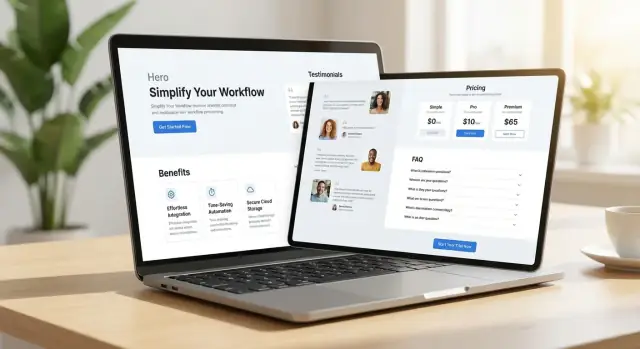
Social proof answers a quiet question every visitor has: “Has this worked for someone like me?” The goal isn’t to impress—it’s to reduce risk. A few strong proof points beat a wall of logos or a carousel nobody reads.
Prioritize testimonials that feel specific and real. Include a name and role (and a photo if you have permission) so it doesn’t read like anonymous marketing copy.
A solid testimonial usually includes:
If you can’t use full names, add context another way (industry, company size, location) to keep it credible.
Numbers are powerful, but only if they’re true and defensible. Use metrics you can point back to (reports, invoices, screenshots, email confirmations). If you can’t verify a result, keep it qualitative.
Good examples:
Avoid vague claims like “10x growth” unless you can explain what changed and over what timeframe.
On a one-page landing page, case studies should be short. Think 5–7 lines:
Before: the problem and stakes.
After: what you implemented + what improved.
This format gives visitors a quick mental picture without forcing them to read a full report. If you have longer case studies, link them as optional reads (e.g., /case-studies).
Certifications, memberships, guarantees, and partner badges can help—when they’re current and legitimate. Don’t add badges “because they look official.” If a guarantee has conditions, state them plainly.
A simple rule: every trust signal should answer a real doubt (quality, safety, reliability), not decorate the page.
Pricing is where many service landing pages lose people—not because the price is “wrong,” but because it’s unclear. Your goal is to make the next step feel predictable.
Choose one of these and commit to it:
People don’t fear paying; they fear surprises. Under each package (or under your “starting at” price), include 3–6 bullets that clarify what they get. Then add a short “Not included” line for common assumptions.
Example:
That one “not included” line can prevent refund requests and back-and-forth emails.
A small block beneath pricing can remove friction:
Keep it plain language. You’re not writing legal text—you’re setting expectations.
Don’t make visitors hunt for the next step. Add a button beneath each option or under the pricing block.
Most important: use the exact same CTA wording as your hero section to avoid a mental “reset.” For example, if your hero says “Book a Free Call,” your pricing CTA should also say “Book a Free Call,” not “Get Started” or “Contact Us.”
An FAQ section is a “silent salesperson.” It catches the questions people hesitate to ask, clears up confusion, and prevents them from bouncing to Google or a competitor.
Keep answers short, specific, and written in plain language. If a question needs a long explanation, give a one‑sentence summary and link to a deeper page.
Is this service a good fit for my situation?
If you have [common problem] and want [desired outcome], it’s likely a fit. If you’re unsure, use the form and we’ll confirm in one reply.
How fast can we get started?
Typical start time is X–Y days after you sign up. Urgent timelines can be discussed before payment.
When will I see results?
Many clients see early progress within X weeks, with stronger results by Y. Exact timing depends on your starting point.
What do you need from me to begin?
Usually: a short intake form, access to [tool/account], and a 30‑minute kickoff call.
What’s included (and what’s not)?
You get [deliverables] and [support level]. You don’t get [out-of-scope item] unless we agree on an add‑on.
Do you offer ongoing support after delivery?
Yes—choose email support for X days or an ongoing plan. If you want details, see /pricing.
How does pricing work? Fixed price or custom quote?
Simple projects are fixed price. Complex needs get a quote after we review scope. You can request one via /contact.
What if I’m not happy with the result?
We’ll revise based on the agreed scope and success criteria. If we miss what we promised, we’ll make it right.
Use the same wording your prospects use on calls and in emails. If you hear a question twice, it belongs here.
By the time someone reaches your form, they’re often “almost convinced.” Your job is to remove the last bits of uncertainty and make the next step feel effortless.
Aim for name + email + one qualifying question. That third field should help you respond faster, not create work for the visitor. Examples: “What are you looking for help with?” or “What’s your timeline?”
If you need more details, collect them after the first step (in the confirmation email or on a follow-up page like /thank-you).
A few small lines near the CTA and form can dramatically increase submissions:
Some people won’t fill out forms. Provide a clear backup option like “Prefer email? [email protected]” or “Call (555) 123‑4567,” especially if your service is urgent or high-ticket.
Most people will meet your one-page landing page on a phone, while multitasking, with limited patience. Your job is to make the page effortless to scan, tap, and understand.
Start your layout at mobile width and scale up—not the other way around. Use a single-column structure, large tap targets, and short content blocks so each screen has one main idea.
A quick mobile checklist:
For a one-page landing page for services, navigation often creates escape routes. If you keep a menu, make it minimal (3–4 anchors max) and ensure it doesn’t compete with your primary action.
If you do use anchor links (e.g., “Pricing,” “FAQ”), make sure they scroll smoothly and don’t hide headings under a sticky bar.
Good page flow alternates between information and action. As visitors scroll, they should repeatedly see:
Place CTAs every 1–2 screen lengths on long pages so people don’t have to hunt for the next step.
Keep each CTA consistent (same button text and style) unless there’s a clear reason to change it (for example, “Get a Quote” vs. “Book a Call”).
Use short paragraphs, descriptive subheadings, and plenty of whitespace. When in doubt, cut. If a sentence doesn’t help someone decide, it’s slowing them down.
Finally, test your layout on at least three real devices (small phone, large phone, and a laptop) and try completing the form with one thumb. If it feels even slightly annoying, it’s costing conversions.
A one‑page landing page can convert well and still be easy to find, fast to load, and measurable. Before you hit publish, spend an hour on these basics—you’ll avoid “mystery” traffic drops and you’ll know what’s working.
Start with a focused page title and meta description that match the offer. Think clarity over cleverness: include what you do, who it’s for, and the outcome.
Keep your heading structure simple: use one H1 for the core promise, then clear H2s for the main sections (benefits, process, pricing, FAQ). Search engines—and skimmers—rely on this structure to understand the page.
If you use images (even a small logo strip), add descriptive alt text that explains what’s in the image, not keyword stuffing. Example: “Before-and-after dashboard showing weekly leads” is better than “best service landing page.”
Speed is conversion rate optimization in disguise. Large images and heavy scripts are the usual culprits.
Also test on mobile data, not just Wi‑Fi. If it feels slow to you, it’s slow to prospects.
Add basic tracking before launching: analytics plus conversion events. At minimum, track your primary action (form submit, “Book a call” click, checkout completed). If you have a /thank-you page, use it as a clean conversion signal.
Finally, double‑check that events fire once (not twice) and that you can see test conversions in your analytics dashboard. That way, when you start making tweaks, you’ll know what actually moved the needle.
A one‑page landing page is never “done.” The goal is to get it live, watch how real people use it, and make small, steady improvements. Big redesigns usually create new problems; tiny changes compound.
If your bottleneck is getting from copy to a working page, consider using a build workflow that makes iteration cheap. For example, on Koder.ai you can vibe-code a production-ready landing page from a chat brief, generate a React front end (with a Go + PostgreSQL back end if you need lead capture beyond a simple form), deploy and host it, add a custom domain, and use snapshots + rollback to test changes without fear.
That “reversible” setup is especially useful when you’re running sequential tests week to week and want to keep a clean changelog of what shipped when.
Before you share the page widely, run a simple quality pass:
If you’re using a scheduler, test the full flow: CTA → calendar → confirmation email.
When you change five things at once, you won’t know what helped. Pick one variable, run it for a set period, then decide.
Good first tests for a landing page for services:
If you can run A/B testing, keep it simple. If you can’t, do sequential tests week to week.
If you have heatmaps or session replays, look for:
Once a week, review: visits, conversion rate, top traffic sources, and form completion. Then:
Small, consistent updates turn a decent one‑page landing page into one that reliably sells.
Pick one primary conversion event (e.g., Book a call, Request a quote, Start a trial) and define what success looks like (conversion rate, cost per lead, or qualified inquiries per week). Then add one backup goal (like “Get pricing by email”) for visitors who aren’t ready.
Keeping it to one primary action makes your copy, layout, and testing much easier.
Write for one specific buyer type—their role, situation, and desired outcome. Use a simple sentence like:
“This page is for [who] who struggle with [pain] and want [outcome] without [common objection].”
A page aimed at “everyone” usually feels generic and converts poorly.
Use a one-sentence value proposition you can test:
For [who] who want [outcome], I help you [get the outcome] by [your unique approach/proof].
If you can’t say it in one sentence, the page will likely feel scattered and visitors won’t know what you actually offer.
Make the hero answer three questions immediately:
Add a supporting visual (you, a deliverable screenshot, or a simple mockup) and optionally one short trust line if it’s verifiable.
Choose one action that matches how you sell (e.g., Book a call for high-ticket, Get a quote for variable scope). Use the exact same CTA wording throughout the page.
Consistency reduces hesitation because visitors don’t have to re-decide what each button does.
Start from real customer pain and write benefits as problem → solution → result.
Example:
Keep benefit bullets short, specific, and written in the customer’s words (not internal jargon).
List the 3–5 objections your visitor will have and answer them directly or indirectly on the page:
This becomes your copy checklist and prevents vague claims.
Show a short, concrete timeline so people can picture what happens after they click:
Clear steps lower perceived risk and reduce back-and-forth after inquiries.
Make pricing feel predictable by choosing a format that matches your sales motion:
Always include what’s included (and a brief “not included” line) and place a CTA right next to the pricing block.
Do three basics before launch:
This prevents “mystery” performance drops and makes optimization decisions reliable.