19 ਸਤੰ 2025·8 ਮਿੰਟ
ਕਿਵੇਂ ਇੱਕ ਕੰਮਯਾਬ ਕਮਿਊਨਿਟੀ ਰਿਸੋਰਸ ਡਾਇਰੈਕਟਰੀ ਵੈਬਸਾਈਟ ਬਣਾਈਏ
ਜਾਣੋ ਕਿ ਕਿਵੇਂ ਇੱਕ ਕਮਿਊਨਿਟੀ ਰਿਸੋਰਸ ਡਾਇਰੈਕਟਰੀ ਵੈਬਸਾਈਟ ਦੀ ਯੋਜਨਾ ਬਣਾਈਏ, ਬਣਾਇਆ ਜਾਵੇ ਅਤੇ ਲਾਂਚ ਕਰੀਏ—ਲਿਸਟਿੰਗਾਂ, ਨਕਸ਼ੇ, ਪਹੁੰਚਯੋਗਤਾ, SEO, ਮੋਡਰੇਸ਼ਨ ਅਤੇ ਸੰਭਾਲ ਸਮੇਤ।
ਜਾਣੋ ਕਿ ਕਿਵੇਂ ਇੱਕ ਕਮਿਊਨਿਟੀ ਰਿਸੋਰਸ ਡਾਇਰੈਕਟਰੀ ਵੈਬਸਾਈਟ ਦੀ ਯੋਜਨਾ ਬਣਾਈਏ, ਬਣਾਇਆ ਜਾਵੇ ਅਤੇ ਲਾਂਚ ਕਰੀਏ—ਲਿਸਟਿੰਗਾਂ, ਨਕਸ਼ੇ, ਪਹੁੰਚਯੋਗਤਾ, SEO, ਮੋਡਰੇਸ਼ਨ ਅਤੇ ਸੰਭਾਲ ਸਮੇਤ।
ਟੂਲ ਚੁਣਨ ਜਾਂ ਲਿਸਟਿੰਗ ਇਕੱਤਰ ਕਰਨ ਤੋਂ ਪਹਿਲਾਂ, ਇਹ ਸਪਸ਼ਟ ਕਰੋ ਕਿ ਇਹ ਡਾਇਰੈਕਟਰੀ ਕਿਸ ਲਈ ਹੈ ਅਤੇ “ਸਫਲਤਾ” ਦਾ ਕੀ ਅਰਥ ਹੈ। ਇੱਕ ਕਮਿਊਨਿਟੀ ਰਿਸੋਰਸ ਡਾਇਰੈਕਟਰੀ ਵੱਧ-ਵੱਖ ਸਮੂਹਾਂ ਦੀ ਸੇਵਾ ਕਰ ਸਕਦੀ ਹੈ, ਪਰ ਜਦੋਂ ਤੁਸੀਂ ਇੱਕ ਪ੍ਰਾਈਮਰੀ ਦਰਸ਼ਕ ਤੇ ਧਿਆਨ ਦਿੰਦੇ ਹੋ ਅਤੇ ਉਨ੍ਹਾਂ ਦੀਆਂ ਜ਼ਰੂਰਤਾਂ ਅਨੁਸਾਰ ਡਿਜ਼ਾਈਨ ਕਰਦੇ ਹੋ ਤਾਂ ਇਹ ਹੋਰ ਪ੍ਰਭਾਵਸ਼ਾਲੀ ਹੁੰਦੀ ਹੈ।
ਆਪਣੇ ਮੁੱਖ ਯੂਜ਼ਰਾਂ ਨੂੰ ਸਧਾਰਣ ਭਾਸ਼ਾ ਵਿੱਚ ਨਾਮ ਦਿਓ:\n\n- ਮਦਦ ਲੱਭਦੇ ਨਿਵਾਸੀ (ਅਕਸਰ ਫੋਨ 'ਤੇ, ਅਕਸਰ ਤਣਾਅ ਵਿੱਚ, ਤੇਜ਼ੀ ਨਾਲ)
ਫੈਸਲੇ ਕਰਨ ਲਈ ਇੱਕ ਨੂੰ “ਡਿਫੋਲਟ” ਯੂਜ਼ਰ ਚੁਣੋ। ਕਈ ਲੋਕਲ ਸਰੋਤ ਪ੍ਰੋਜੈਕਟਾਂ ਲਈ ਇਹ ਨਿਵਾਸੀ ਪਹਿਲਾਂ ਹੁੰਦੇ ਹਨ—ਕਿਉਂਕਿ ਜੇ ਉਹ ਤੇਜ਼ੀ ਨਾਲ ਮਦਦ ਨਹੀਂ ਲੱਭ ਸਕਦੇ, ਤਾਂ ਹੋਰ ਕੁਝ ਮਹੱਤਵ ਨਹੀਂ ਰੱਖਦਾ।
ਲਾਂਚ ਤੋਂ ਬਾਅਦ ਟ੍ਰੈਕ ਕਰਨ ਲਈ ਕੁਝ ਮਾਪਣਯੋਗ ਨਤੀਜੇ ਤੈਅ ਕਰੋ। ਉਦਾਹਰਣ:
ਇਹ ਗੱਲਾਂ ਹੁਣ ਹੀ ਲਿਖ ਲਓ; ਇਹ ਤੁਹਾਡੇ ਡਾਇਰੈਕਟਰੀ ਦੀ ਬਣਤਰ ਅਤੇ ਬਾਅਦ ਵਿੱਚ ਤੁਸੀਂ ਜੋ ਮਾਪੋਗੇ ਉਸ ਨੂੰ ਆਕਾਰ ਦੇਣਗੀਆਂ।
ਸਪਸ਼ਟ ਹੋਵੋ ਕਿ ਤੁਸੀਂ ਕਿੱਥੇ ਦੀ ਸੇਵਾ ਕਰ ਰਹੇ ਹੋ: ਇੱਕ ਨੇਬਰਹੁੱਡ, ਸ਼ਹਿਰ, ਕਾਉੰਟੀ ਜਾਂ ਖੇਤਰ। ਸੰਕੁਚਿਤ ਹੱਦ ਖੋਜ ਨਤੀਜਿਆਂ ਨੂੰ ਹੋਰ ਸੰਗਤ ਬਣਾਉਂਦੀ ਹੈ ਅਤੇ ਤੁਹਾਨੂੰ ਉਹ ਜਾਣਕਾਰੀ ਰੱਖਣ ਤੋਂ ਬਚਾਉਂਦੀ ਜੋ ਤੁਸੀਂ ਅਪ-ਟੂ-ਡੇਟ ਨਹੀਂ ਰੱਖ ਸਕਦੇ।
ਜੇ ਤੁਸੀਂ ਵੱਧ ਖੇਤਰ ਨੂੰ ਕਵਰ ਕਰੋ ਤਾਂ ਸਾਫ਼ ਹੱਦਾਂ ਪਰਿਭਾਸ਼ਿਤ ਕਰੋ ਅਤੇ ਉਨ੍ਹਾਂ ਨੂੰ ਇੱਕਸਾਰ ਲੇਬਲ ਕਰੋ ਤਾਂ ਜੋ ਲੋਕ ਜਾਣ ਸਕਣ ਕਿ ਉਹ ਯੋਗ ਹਨ।
ਤੁਹਾਡਾ ਹੋਮਪੇਜ ਅਤੇ ਨੈਵੀਗੇਸ਼ਨ ਅਸਲ ਜ਼ਰੂਰਤਾਂ ਨੂੰ ਦਰਸਾਉਣੀ ਚਾਹੀਦੀ ਹੈ, ਨਾ ਕਿ ਤੁਹਾਡੇ ਆਰਗ ਚਾਰਟ ਨੂੰ। “ਕਰਨ ਵਾਲੇ ਕੰਮ” ਦਸਤਾਵੇਜ਼ ਕਰੋ, ਜਿਵੇਂ:
ਇਹ ਕਾਰਜ ਇੱਕ ਵਾਰੀ ਹੋਣ ਤੋਂ ਬਾਅਦ, ਤੁਸੀਂ ਤੈਅ ਕਰ ਸਕੋਗੇ ਕਿ ਹਰ ਲਿਸਟਿੰਗ ਵਿੱਚ ਕੀ ਜਾਣਕਾਰੀ ਜ਼ਰੂਰੀ ਹੈ ਅਤੇ ਕੀ ਵਿਕਲਪੀ ਹੋ ਸਕਦਾ ਹੈ।
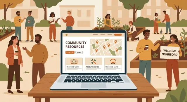
ਇੱਕ ਕਮਿਊਨਿਟੀ ਰਿਸੋਰਸ ਡਾਇਰੈਕਟਰੀ ਦੀ ਕਾਮਯਾਬੀ ਜਾਂ ਨਾਕਾਮੀ ਸਪਸ਼ਟਤਾ 'ਤੇ ਨਿਰਭਰ ਕਰਦੀ ਹੈ। ਰੰਗਾਂ ਜਾਂ ਲੇਆਉਟ ਦੇ ਬਾਰੇ ਸੋਚਣ ਤੋਂ ਪਹਿਲਾਂ, ਇਹ ਤੈਅ ਕਰੋ ਕਿ ਲੋਕ ਤਣਾਅ ਵਾਲੀ ਸਥਿਤੀ ਵਿੱਚ, ਤੇਜ਼ੀ ਨਾਲ ਜਾਂ ਅਣਜਾਣ ਹੋ ਕੇ ਕਿਵੇਂ ਬ੍ਰਾਊਜ਼ ਕਰਨਗੇ। ਤੁਹਾਡੀ ਜਾਣਕਾਰੀ ਦੀ ਬਣਤਰ ਉਹ ਨਕਸ਼ਾ ਹੈ ਜੋ “ਬਹੁਤ ਸਾਰੀ ਮਦਦਗਾਰ ਜਾਣਕਾਰੀ” ਨੂੰ “ਮੈਂ 30 ਸਕਿੰਟ ਵਿੱਚ ਸਹੀ ਥਾਂ ਲੱਭ ਲਿਆ” ਵਿੱਚ ਬਦਲ ਦਿੰਦਾ ਹੈ।
ਉਹਨਾਂ ਉਪਰਲੇ-ਸਤ੍ਹਾ ਸ਼੍ਰੇਣੀਆਂ ਨਾਲ ਸ਼ੁਰੂ ਕਰੋ ਜੋ ਜ਼ਿਆਦਾਤਰ ਲੋਕ ਤੁਰੰਤ ਪਛਾਣਦੇ ਹਨ। ਆਮ ਸ਼ੁਰੂਆਤੀ ਬਿੰਦੂਆਂ ਵਿੱਚ ਸ਼ਾਮਲ ਹਨ Food, Housing, Health, Employment, Legal, Childcare, Transportation ਅਤੇ Mental Health।
ਸ਼੍ਰੇਣੀਆਂ ਨੂੰ ਅਸਪਟ ਹਾਂ। ਜੇ ਕੋਈ ਚੀਜ਼ ਕਈ ਥਾਂ ਫਿੱਟ ਹੋ ਸਕਦੀ ਹੈ (ਉਦਾਹਰਨ: “ਕਿਰਾਇਆ ਸਹਾਇਤਾ”), ਤਾਂ ਇੱਕ ਪ੍ਰਾਇਮਰੀ ਘਰ (Housing) ਚੁਣੋ ਅਤੇ ਟੈਗਸ (ਜਿਵੇਂ “financial aid”) ਦੀ ਵਰਤੋਂ ਕਰੋ ਤਾਂ ਕਿ ਇਹ ਹੋਰ ਛੰਟਣ ਵਾਲੇ ਨਜ਼ਾਰਿਆਂ ਵਿੱਚ ਵੀ ਦਿਖੇ।
ਇਹ ਸਪਸ਼ਟ ਕਰੋ ਕਿ ਤੁਸੀਂ ਕੀ ਲਿਸਟ ਕਰੋਗੇ। ਕਈ ਡਾਇਰੈਕਟਰੀਜ਼ ਵਿੱਚ, ਇੱਕ “ਰਿਸੋਰਸ” ਹੋ ਸਕਦਾ ਹੈ:
ਇਹ ਪਰਿਭਾਸ਼ਾ ਆਪਣੀ ਟੀਮ ਲਈ ਲਿਖੋ ਤਾਂ ਕਿ ਸਬਮਿਸ਼ਨ ਅਤੇ ਮੋਡਰੇਸ਼ਨ ਇੱਕਸਾਰ ਰਹਿਣ।
ਸਮਾਨਤਾ ਨਾਲ ਉਪਭੋਗਤਾਵਾਂ ਨੂੰ ਵਿਕਲਪਾਂ ਦੀ ਤੁਲਨਾ ਕਰਨ ਵਿੱਚ ਮਦਦ ਮਿਲਦੀ ਹੈ। ਇੱਕ ਮਿਆਰੀ ਲਿਸਟਿੰਗ ਫਾਰਮੈਟ 'ਤੇ ਫੈਸਲਾ ਕਰੋ ਜਿਵੇਂ:
ਨਾਮ, ਛੋਟੀ ਵਰਣਨਾ, ਕਿਸ ਲਈ ਹੈ (ਯੋਗਤਾ), ਕਿਵੇਂ ਪ੍ਰਾਪਤ ਕੀਤਾ ਜਾ ਸਕਦਾ ਹੈ (walk-in/appointment/referral), ਘੰਟੇ, ਲਾਗਤ, ਪਤਾ/ਸੇਵਾ ਖੇਤਰ, ਫੋਨ/ਈਮੇਲ/ਵੈਬਸਾਈਟ, ਅਤੇ ਆਖਰੀ ਅੱਪਡੇਟ।
ਵਰਣਨ ਨੂੰ ਛੋਟਾ ਅਤੇ ਵਰਤੋਂਯੋਗ ਰੱਖੋ। ਜੇ ਤੁਹਾਨੂੰ ਲੰਬੀਆਂ ਵਿਸਥਾਰਾਂ ਦੀ ਲੋੜ ਹੈ, ਤਾਂ ਉਨ੍ਹਾਂ ਨੂੰ “ਵਧੇਰੇ ਵਿਸਥਾਰ” ਸੈਕਸ਼ਨ ਦੇ ਪਿੱਛੇ ਰੱਖੋ ਤਾਂ ਕਿ ਪੰਨੇ ਸਕੈਨਯੋਗ ਰਹਿਣ।
ਫਿਲਟਰਾਂ ਹੀ ਹਨ ਜਿੱਥੇ ਤੁਹਾਡੀ ਡਾਇਰੈਕਟਰੀ ਵਾਸਤਵ ਵਿੱਚ ਉਪਯੋਗੀ ਬਣਦੀ ਹੈ। ਉਹ ਟੈਗਸ ਨਾਲ ਸ਼ੁਰੂ ਕਰੋ ਜੋ ਲੋਕ ਆਮ ਤੌਰ 'ਤੇ ਚਾਹੁੰਦੇ ਹਨ:
ਭਾਸ਼ਾ, ਲਾਗਤ (ਫਰੀ/ਸਲਾਈਡਿੰਗ ਸਕੇਲ), ਉਮਰ ਗਰੁੱਪ, ਅਪੋਇੰਟਮੈਂਟ ਲਾਜ਼ਮੀ ਹੈ, ਪਹੁੰਚਯੋਗਤਾ ਫੀਚਰ, ਅਤੇ ਵਰਚੁਅਲ ਵਰਸਸ ਇਨ-ਪੈਰਸਨ।
ਲਾਂਚ 'ਤੇ ਫਿਲਟਰਾਂ ਦੀ ਸੰਖਿਆ ਸੀਮਿਤ ਰੱਖੋ ਤਾਂ ਜੋ ਉਹ ਸਹੀ ਰਹਿਣ।
ਸਧਾਰਣ ਭਾਸ਼ਾ ਅਤੇ ਇਕਸਾਰ ਫਰੇਜ਼ਿੰਗ ਵਰਤੋ। ਛੋਟੀ ਵਾਕਾਂਸ਼ਾਂ ਲਈ ਲਕਸ਼ ਕਰੋ, ਸਰਗੜੀਆਂ ਸ਼ਬਦਾਵਲੀ ਦੀ ਵਿਆਖਿਆ ਕਰੋ, ਅਤੇ ਵਰਣਨਾਂ ਨੂੰ ਐਸਾ ਲਿਖੋ: “ਮੰਗਲਵਾਰ ਨੂੰ ਮੁਫ਼ਤ ਰੋਟੀ ਮਿਲਦੀ ਹੈ। ਥੋੜਾ ID ਲਿਆਉਣ ਦੀ ਕੋਸ਼ਿਸ਼ ਕਰੋ।” ਇਹ ਲਿਸਟਿੰਗਾਂ ਨੂੰ ਸਮਝਣ ਅਤੇ ਰੱਖ-ਰੱਖਾਅ ਦੋਵਾਂ ਲਈ ਆਸਾਨ ਬਣਾਉਂਦਾ ਹੈ।
ਇੱਕ ਕਮਿਊਨਿਟੀ ਰਿਸੋਰਸ ਡਾਇਰੈਕਟਰੀ ਉਹੀ ਉਤਸ਼ਾਹੀ ਹੈ ਜੋ ਉਸ ਦੀਆਂ ਲਿਸਟਿੰਗਾਂ ਦੀ ਇੱਕਸਾਰਤਾ ਤੇ ਆਧਾਰਿਤ ਹੈ। ਫਾਰਮ ਜਾਂ ਪੰਨਿਆਂ ਨੂੰ ਬਣਾਉਣ ਤੋਂ ਪਹਿਲਾਂ ਤੈਅ ਕਰੋ ਕਿ ਹਰ ਵਾਰੀ ਤੁਹਾਨੂੰ ਕੀ ਇਕੱਤਰ ਕਰਨਾ ਅਵਸ਼੍ਯਕ ਹੈ—ਅਤੇ ਕੀ ਵਿਕਲਪੀ ਹੋ ਸਕਦਾ ਹੈ ਬਿਨਾਂ ਉਪਭੋਗਤਾ ਅਨੁਭਵ ਨੂੰ ਨੁਕਸਾਨ ਪਹੁੰਚਾਏ।
ਜ਼ਰੂਰੀ ਫੀਲਡ ਉਹ ਘੱਟੋ-ਘੱਟ ਚੀਜ਼ਾਂ ਬਣਾਓ ਜੋ ਕਿਸੇ ਨੂੰ ਕਾਰਵਾਈ ਕਰਨ ਲਈ ਚਾਹੀਦਾ ਹੈ। ਹਰ ਵਾਧੂ ਜ਼ਰੂਰੀ ਬਾਕਸ ਅਧੂਰੇ ਜਾਂ ਛੱਡ ਦਿੱਤੇ ਜਾਣ ਦੇ ਆਸਾਰ ਵਧਾ ਦਿੰਦਾ ਹੈ।
ਅਮਲੀ ਨਿਯਮ: ਸੰਪਰਕ + ਸਥਾਨ ਜਾਂ ਸੇਵਾ ਖੇਤਰ + ਸੰਗਠਨ ਦੇ ਕੀ ਪ੍ਰਦਾਨ ਕਰਦੇ ਹਨ, ਇਹ ਜ਼ਰੂਰੀ ਰੱਖੋ।
ਘੱਟੋ-ਘੱਟ, ਜਿਆਦਾਤਰ ਵਿਜ਼ਟਰਾਂ ਨੂੰ ਲੱਭਣ ਲਈ ਲੋੜੇਗਾ:
ਜੇ ਤੁਸੀਂ ਇੱਕ ਗੈਰ-ਮੁਨਾਫਾ ਡਾਇਰੈਕਟਰੀ ਚਲਾ ਰਹੇ ਹੋ ਤਾਂ ਯੋਗਤਾ (ਉਮਰ ਸੀਮਾਂ, ਆਮਦਨੀ ਨਿਯਮ, ਨਿਵਾਸੀ ਨਿਯਮ) ਅਤੇ ਲਾਗਤ (ਮੁਫ਼ਤ, ਸਲਾਈਡਿੰਗ ਸਕੇਲ, ਭੁਗਤਾਨ) ਵੀ ਧਿਆਨ ਵਿੱਚ ਰੱਖੋ।
ਇਹ ਫੀਲਡ ਲੋਕਾਂ ਨੂੰ ਤੇਜ਼ੀ ਨਾਲ ਸਵੈ-ਚੋਣ ਕਰਨ ਵਿੱਚ ਮਦਦ ਕਰਦੀਆਂ ਹਨ ਅਤੇ ਬੇਕਾਰ ਫੋਨ ਕਾਲਾਂ ਨੂੰ ਰੋਕਦੀਆਂ ਹਨ:
“Unknown” ਨੂੰ ਇੱਕ ਖੁਲ੍ਹਾ ਵਿਕਲਪ ਰੱਖੋ ਤਾਂ ਕਿ ਤੁਸੀਂ ਲੋਕਾਂ ਨੂੰ ਅਨੁਮਾਨ ਲਗਾਉਣ ਲਈ ਮਜਬੂਰ ਨਾ ਕਰੋ।
ਜਦੋਂ ਪਾਠਕ ਦੇਖ ਸਕਦੇ ਹਨ ਕਿ ਇੱਕ ਲਿਸਟਿੰਗ ਕਿੰਨੀ ਹਾਲ ਦੀ ਹੈ ਤਾਂ ਵਿਸ਼ਵਾਸ ਵਧਦਾ ਹੈ। ਹਲਕੀ ਗਵਰਨੈਂਸ ਫੀਲਡ ਸ਼ਾਮਲ ਕਰੋ ਜਿਵੇਂ:
ਆਪਣੇ ਕੋਲ ਲੋਗੋ ਜਾਂ ਫੋਟੋ ਸਟੋਰ ਕਰਨ ਦੀ ਯੋਜਨਾ ਹੈ ਤਾਂ ਪਹਿਲਾਂ ਨਿਰਧਾਰਤ ਕਰੋ: ਕੌਣ ਅਪਲੋਡ ਕਰ ਸਕਦਾ ਹੈ, ਕੀ ਮਨਜ਼ੂਰ ਹੈ, ਅਤੇ ਅਪਲੋਡਰ ਕੋਲ ਅਧਿਕਾਰ ਹਨ ਇਹ ਪੁਸ਼ਟੀ ਕਰਨ ਦੀ ਲੋੜ।
ਟਿਪ: ਜੇ ਮੋਡਰੇਸ਼ਨ ਸਮਰੱਥਾ ਸੀਮਿਤ ਹੈ ਤਾਂ ਸਿਰਫ਼ ਲੋਗੋ ਨਾਲ ਸ਼ੁਰੂ ਕਰੋ ਅਤੇ ਬਾਅਦ ਵਿੱਚ ਫੋਟੋ ਸ਼ਾਮਲ ਕਰੋ।
ਇੱਕ ਕਮਿਊਨਿਟੀ ਰਿਸੋਰਸ ਡਾਇਰੈਕਟਰੀ ਤਦ ਹੀ ਕਾਮਯਾਬ ਹੁੰਦੀ ਹੈ ਜਦੋਂ ਲੋਕ ਤੁਰੰਤ ਇਹ ਦੋ ਸਵਾਲਾਂ ਦੇ ਜਵਾਬ ਲੱਭ ਸਕਣ: “ਕਿਹੜੀ ਮਦਦ ਉਪਲਬਧ ਹੈ?” ਅਤੇ “ਮੈਂ ਇਸਨੂੰ ਕਿਵੇਂ ਪ੍ਰਾਪਤ ਕਰਾਂ?” ਪੰਨਿਆਂ ਨੂੰ ਹਕੀਕਤੀ ਕਾਰਜਾਂ ਦੇ ਆਧਾਰ 'ਤੇ ਯੋਜਨਾ ਬਣਾਉਣਾ (ਆਪਣੇ ਅੰਦਰੂਨੀ ਆਰਗ ਚਾਰਟ ਨਹੀਂ) ਅਨੁਭਵ ਨੂੰ ਸਧਾਰਨ ਰੱਖਦਾ ਹੈ।
ਹਰੇਕ ਪੰਨੇ ਲਈ ਇੱਕ ਵਾਕ ਵਿੱਚ ਸਮਝ ਆਉਣ ਵਾਲੀ ਛੋਟੀ ਗਿਣਤੀ ਨਾਲ ਸ਼ੁਰੂ ਕਰੋ:
ਇਸ ਨਾਲ ਪਹਿਲੀ ਵਾਰੀ ਆਉਣ ਵਾਲੇ ਵਿਅਕਤੀਆਂ ਲਈ ਦੋ ਸਾਫ਼ ਰਾਹ ਮਿਲਦੇ ਹਨ: ਖੋਜ ਜਾਂ ਬ੍ਰਾਊਜ਼।
ਡਾਇਰੈਕਟਰੀ ਜਲਦੀ ਬੁੱਢੀ ਹੋ ਸਕਦੀ ਹੈ, ਇਸ ਲਈ ਅਪਡੇਟਸ ਅਤੇ ਜਵਾਬਦੇਹੀ ਨੂੰ ਸਮਰਥਨ ਦੇਣ ਵਾਲੇ ਪੰਨੇ ਸ਼ਾਮਲ ਕਰੋ:
ਬਣਾਉਣ ਤੋਂ ਪਹਿਲਾਂ, ਮੋਬਾਈਲ ਲਈ ਮੁੱਖ ਸਕ੍ਰੀਨਾਂ ਦੇ ਖਾਕੇ ਬਣਾਓ: Home, Results, Listing Detail, Submit। ਛੋਟੀ ਸਕ੍ਰੀਨ 'ਤੇ, ਤਰਜੀਹ: ਖੋਜ, ਫਿਲਟਰ, ਕਾਲ/ਟੈਕਸਟ ਬਟਨ, ਅਤੇ ਯੋਗਤਾ ਨੋਟਸ।
ਫਿਲਟਰ ਉਹ ਹਨ ਜੋ ਲੋਕ ਮਦਦ ਬਾਰੇ ਪੁੱਛਦੇ ਹੋਏ ਵਰਤਦੇ ਹਨ: ਸ਼੍ਰੇਣੀ, ਟਿਕਾਣਾ, ਅਤੇ ਜ਼ਰੂਰਤਾਂ (ਜਿਵੇਂ “walk-in,” “Spanish,” “Free,” “open now”)। ਦੁਰਤੀ ਦੇਖਣਾਂ ਲਈ ਤੇਜ਼ੀ ਅਤੇ ਸਕੈਨਯੋਗੀ ਲਈ ਲਿਸਟ ਵਿਊ ਨੂੰ ਪਹਿਲਾਂ ਰੱਖੋ।
ਜਦੋਂ ਟਿਕਾਣਾ ਮੁੱਖ ਫੈਸਲਾ ਕਰਨ ਵਾਲਾ ਕਾਰਕ ਹੋਵੇ ਅਤੇ ਪਤੇ ਭਰੋਸੇਯੋਗ ਹੋਣ ਤਾਂ ਨਕਸ਼ਾ ਦੀ ਵਰਤੋਂ ਕਰੋ। ਨਹੀਂ ਤਾਂ ਨਕਸ਼ੇ ਮੋਬਾਈਲ ਅਤੇ ਘੱਟ-ਬੈਂਡਵਿਡਥ ਸਥਿਤੀਆਂ ਵਿੱਚ ਲੋਕਾਂ ਨੂੰ ਧੀਮੀ ਕਰ ਸਕਦੇ ਹਨ।
ਪਲੇਟਫਾਰਮ ਚੁਣਨਾ “ਸਭ ਤੋਂ ਵਧੀਆ” ਬਾਰੇ ਘੱਟ ਅਤੇ ਇਸ ਗੱਲ ਬਾਰੇ ਜ਼ਿਆਦਾ ਹੈ ਕਿ ਤੁਹਾਡੀ ਟੀਮ ਕਿੰਨੇ ਸਮੇਂ ਲਈ ਹਕੀਕਤ ਵਿੱਚ ਚਲਾ ਸਕਦੀ ਹੈ। ਇੱਕ ਕਮਿਊਨਿਟੀ ਰਿਸੋਰਸ ਡਾਇਰੈਕਟਰੀ ਸਫਲ ਹੁੰਦੀ ਹੈ ਜਦੋਂ ਅਪਡੇਟਸ ਆਸਾਨ ਹੋਣ ਅਤੇ ਮਲਕੀਅਤ ਸਪਸ਼ਟ ਹੋਵੇ।
ਵੈੱਬਸਾਈਟ ਬਿਲਡਰ (ਸਭ ਤੋਂ ਤੇਜ਼ ਲਾਂਚ): Squarespace, Wix, ਜਾਂ Webflow ਵਰਗੇ ਟੂਲ ਉਹਨਾਂ ਲਈ ਚੰਗੇ ਹੁੰਦੇ ਹਨ ਜੇ ਤੁਹਾਡੇ ਕੋਲ ਛੋਟੀ ਟੀਮ ਹੈ, ਟਾਈਟ ਟਾਈਮਲਾਈਨ ਹੈ, ਅਤੇ ਡਾਇਰੈਕਟਰੀ ਨੂੰ ਜ਼ਿਆਦਾ ਜਟਿਲ ਫੀਚਰਾਂ ਦੀ ਲੋੜ ਨਹੀਂ। ਇਹ ਆਮ ਤੌਰ ਤੇ ਹੋਸਟਿੰਗ, ਸੁਰੱਖਿਆ ਅਪਡੇਟ ਅਤੇ ਟੈਮਪਲੇਟ ਸ਼ਾਮਲ ਕਰਦੇ ਹਨ—ਜਦੋਂ ਤੁਹਾਡੇ ਕੋਲ ਡਿਵੈਲਪਰ ਨਹੀਂ ਹੁੰਦਾ ਤਾਂ ਇਹ ਫਾਇਦੇਮੰਦ ਹੁੰਦੇ ਹਨ।
CMS ਪਲੇਟਫਾਰਮ (ਲਚਕੀਲਾ, ਗੈਰ-ਨਫੇਕਾਰੀ ਲਈ ਆਮ): WordPress (ਅਕਸਰ ਡਾਇਰੈਕਟਰੀ ਪਲੱਗਇਨ ਦੇ ਨਾਲ) ਇੱਕ ਮਜ਼ਬੂਤ ਮੱਧ ਰਸਤਾ ਹੈ। ਤੁਹਾਨੂੰ ਭਾਲ ਪ੍ਰਬੰਧਨ, ਐਡਿਟਰਾਂ ਲਈ ਭੂਮਿਕਾਵਾਂ ਅਤੇ ਕਈ ਇਨਟੀਗ੍ਰੇਸ਼ਨ ਮਿਲਦੇ ਹਨ। ਲਗਾਤਾਰ ਅਪਡੇਟ ਅਤੇ ਕਦੇ-ਕਦੇ ਪਲੱਗਇਨ ਟਕਰਾਅ ਲਈ ਯੋਜਨਾ ਬਣਾਓ।
ਕਸਟਮ ਬਿਲਡ (ਸਭ ਤੋਂ ਵੱਧ ਨਿਯੰਤਰਣ): ਇੱਕ ਕਸਟਮ ਸਾਈਟ (ਉਦਾਹਰਣ ਲਈ, ਇੱਕ React ਫਰੰਟ ਐਂਡ ਨਾਲ Django/Node ਬੈਕ-ਐਂਡ) ਉਹ ਸਮਾਂ ਹੈ ਜਦੋਂ ਤੁਹਾਨੂੰ ਅਡਵਾਂਸਡ ਖੋਜ, ਜਟਿਲ ਯੋਗਤਾ ਨਿਯਮ, ਜਾਂ ਅੰਦਰੂਨੀ ਸਿਸਟਮਾਂ ਨਾਲ ਇਨਟੀਗ੍ਰੇਸ਼ਨ ਦੀ ਲੋੜ ਹੋਵੇ। ਇਹ ਅੱਗੇ ਵੱਧ ਲਾਗਤ ਵਾਲਾ ਹੈ ਅਤੇ ਭਰੋਸੇਮੰਦ ਤਕਨੀਕੀ ਰਖ-ਰਖਾਵ ਦੀ ਲੋੜ ਹੈ।
ਜੇ ਤੁਸੀਂ ਹਦ ਤੱਕ ਗਾਈਡ ਕੀਤੇ ਬਿਲਡ ਦੀ ਰਫਤਾਰ ਚਾਹੁੰਦੇ ਹੋ ਬਿਨਾਂ “ਨੋ-ਕੋਡ ਪਲੱਗਇਨ ਫੈਲ”的 ਸਮੱਸਿਆ ਦੇ, ਤਾਂ Koder.ai ਵਰਗਾ vibe-coding ਰਸਤਾ ਇੱਕ ਅਮਲੀ ਮੱਧਮਾਰਗ ਹੋ ਸਕਦਾ ਹੈ: ਤੁਸੀਂ ਚੈਟ ਵਿੱਚ ਡਾਇਰੈਕਟਰੀ ਦਾ ਵਰਣਨ ਦਿਓ (ਸ਼੍ਰੇਣੀਆਂ, ਲਿਸਟਿੰਗ ਫੀਲਡ, ਸਬਮਿਸ਼ਨ ਵਰਕਫਲੋ, ਮੋਡਰੇਸ਼ਨ ਕਿਊ, ਅਤੇ ਖੋਜ/ਫਿਲਟਰ ਵਿਹਾਰ) ਅਤੇ ਪਲੇਟਫਾਰਮ ਇੱਕ ਅਸਲੀ ਐਪ ਜਨਰੇਟ ਕਰਦਾ ਹੈ ਜਿਸਨੂੰ ਤੁਸੀਂ ਆੱਗੇ ਚ ਲਿਜਾ ਸਕਦੇ ਹੋ ਅਤੇ ਜਦ ਚਾਹੋ ਐਕਸਪੋਰਟ ਵੀ ਕਰ ਸਕਦੇ ਹੋ।
ਜੇਕਰ ਵੀ ਕਿਸੇ ਵਿਅਕਤੀ/ਵੈਨਡਰ "ਹਰ ਚੀਜ਼ ਸੰਭਾਲਦਾ" ਕਹੇ, ਤਦ ਵੀ ਇੱਕ ਮਲਿਕ ਨਿਰਧਾਰਤ ਕਰੋ ਜੋ:
ਜ਼ਿਆਦਾਤਰ ਡਾਇਰੈਕਟਰੀਆਂ ਨੂੰ ਕੁਝ ਬੁਨਿਆਦੀ ਚੀਜ਼ਾਂ ਦੀ ਲੋੜ ਹੁੰਦੀ ਹੈ:
ਇੱਕ ਛੋਟਾ “ਸਾਈਟ ਹੈਂਡਬੁੱਕ” ਸੇਅਰ ਕੀਤੇ ਫੋਲਡਰ ਵਿੱਚ ਬਣਾਓ: ਪਲੇਟਫਾਰਮ ਚੋਣ, ਲੌਗਿਨ ਮਲਕੀਅਤ, ਡੇਟਾ ਕਿੱਥੇ ਰੱਖੀ ਜਾਂਦੀ ਹੈ, ਬੈਕਅੱਪ ਸ਼ੈਡਿਊਲ, ਮੁੱਖ ਇਨਟੀਗ੍ਰੇਸ਼ਨ ਅਤੇ ਸੰਪਰਕ ਕੌਣ ਹੈ। ਇਹ ਉਸ ਵੇਲੇ ਗਿਆਨ-ਖੋਹ ਦਾ ਰੋਕਥਾਮ ਕਰਦਾ ਹੈ ਜਦੋਂ ਸਟਾਫ ਜਾਂ ਵਲੰਟੀਅਰ ਬਦਲਦੇ ਹਨ।
ਇੱਕ ਕਮਿਊਨਿਟੀ ਰਿਸੋਰਸ ਡਾਇਰੈਕਟਰੀ ਸਿਰਫ਼ ਉਸ ਵਕਤ ਹੀ ਲਾਭਕਾਰੀ ਰਹਿੰਦੀ ਹੈ ਜਦੋਂ ਨਵੀਆਂ ਲਿਸਟਿੰਗਾਂ ਆਸਾਨੀ ਨਾਲ ਸ਼ਾਮਲ ਕੀਤੀਆਂ ਜਾ ਸਕਦੀਆਂ ਹਨ—ਅਤੇ ਗਲਤ ਜਾਣਕਾਰੀਆਂ ਨੂੰ ਤੇਜ਼ੀ ਨਾਲ ਠੀਕ ਕੀਤਾ ਜਾ ਸਕੇ। ਇੱਕ ਹਲਕੀ ਵਰਕਫਲੋ ਤੁਹਾਨੂੰ ਉੱਚ ਗੁਣਵੱਤਾ ਬਣਾਈ ਰੱਖਣ ਵਿੱਚ ਮਦਦ ਕਰੇਗੀ ਬਿਨਾਂ ਟੀਮ ਨੂੰ ਝੱਲਣ ਦੇ।
ਇੱਕ ਪ੍ਰਮੁੱਖ ਇੰਟੇਕ ਢੰਗ ਚੁਣੋ ਅਤੇ ਉਸਨੂੰ ਸਪੱਸ਼ਟ ਬਣਾਓ।
ਜੇ ਤੁਸੀਂ ਈਮੇਲ ਨਾਲ ਸ਼ੁਰੂ ਕਰਦੇ ਹੋ, ਤਾਂ ਇੱਕ ਫਾਰਮ ਵੱਲ ਜਲਦੀ ਮਾਈਗਰੇਟ ਕਰਨ 'ਤੇ ਵਿਚਾਰ ਕਰੋ ਜਦੋਂ ਤੁਸੀਂ ਦੁਹਰਾਏ ਸਵਾਲ ਜਾਂ ਅਨਿ]{
A community resource directory stays useful only if new listings can be added easily—and inaccurate ones can be fixed quickly. A lightweight workflow helps you keep quality high without burning out your team.
Pick one primary intake method and make it obvious.
If you start with email, consider moving to a form as soon as you see repeat questions or inconsistent details.
Even small directories attract spam. Basic friction is worth it.
Use:
Also log the submission date and source so you can spot patterns and follow up later.
Organizations change hours, eligibility rules, and locations.
Provide a clear “Suggest an edit” option on each listing, or a short update form that asks for:
Tell submitters what happens next: typical review time, what you accept, and what you reject (for example: incomplete entries, duplicates, services outside your area, or promotional-only listings).
Keep reviewer decisions consistent. Example checklist:
When in doubt, request clarification—then publish only once the basics are confirmed.
A directory succeeds when people can scan a listing quickly, understand it the first time, and feel confident the information is accurate. Treat each listing like a mini “how to get help” page: clear, specific, and consistent.
Use short sentences, common words, and a straightforward tone. Replace vague phrases like “support available” with specifics: “Free grocery pickup on Tuesdays” or “Help applying for SNAP benefits.”
Add a one- or two-sentence intro at the top of each category, explaining who it’s for and what kinds of services belong there. This reduces confusion and misfiled submissions.
People come to a resource directory to take action. Give them the fastest path:
If a service requires an appointment, say so near the top: “Appointments required—call first.”
Standardize the information users compare across listings:
If programs change often, add a visible note such as: “Seasonal program (Nov–Mar). Please call to confirm availability.” Also include a “Last verified” date to set expectations.
A simple template keeps submissions readable and reduces follow-up work. For example:
Summary (1–2 sentences)
Services offered (bulleted)
Eligibility
Cost
Hours
How to access (walk-in/appointment/referral)
Location + directions notes
Contact + website
Last verified
Your directory will be used in messy, real situations: on a phone at a bus stop, on an old laptop in a library, or with spotty internet. Usability isn’t just polish—it determines whether someone finds help quickly or gives up.
Keep the page calm and predictable. Use a readable font size (especially for body text), clear headings, and strong color contrast so links and buttons are easy to spot. Give important actions (Call, Get directions, Visit website) enough spacing to prevent mis-taps.
On desktop, sidebars can work. On mobile, they often become a wall of checkboxes.
Use a prominent search box plus a small set of high-impact filters (e.g., “Category,” “Eligibility,” “Open now”). Put advanced filters behind a “Filter” button or drawer.
If location matters, add “Near me” and neighborhood filters. Keep them optional—some people don’t want to share their location.
Maps are useful, but they’re not always accessible or convenient. Offer a list view with the same information, and make sure key navigation works with a keyboard (tab order, visible focus) and screen readers.
If you include a map, ensure listings can be reached without dragging, pinching, or hovering.
Before launch, run quick tests with 3–5 people who represent your audience. Give them tasks like “Find a food pantry open today” or “Find legal help near you.” Watch where they hesitate, and fix those points first.
A small amount of testing early prevents expensive redesigns later.
An accessible community resource directory website helps more people find help—especially folks using assistive technology, older devices, or limited mobility. Aim for “works for everyone” basics first, then improve over time.
Use a logical heading order (one H1 per page, then H2/H3 in sequence). This helps screen reader users scan pages quickly and helps everyone understand where they are.
Give every image meaningful alt text when the image adds information (e.g., a map screenshot or an icon that communicates a service). If an image is purely decorative, use empty alt text so it’s skipped.
Your resource listing form is often the hardest part for users.
If you have multi-step forms, show progress and allow people to review before submitting.
Ensure the site can be used without a mouse: tab order should follow the visual layout, and every interactive element must have a visible focus state.
Use accessible names for buttons and links. Avoid vague labels like “Click here”; prefer “View food pantry details” or “Call this provider.”
If your community is multilingual, offer key pages (home, search, category pages, listing pages, and submission form) in the most-used languages. Keep the language switcher easy to find and label it clearly.
Run automated checks, then do a quick manual test:
Treat accessibility as ongoing maintenance, not a one-time task.
SEO for a community resource directory is mostly about clarity: clear page topics, clear locations served, and clear paths for people (and search engines) to find what they need. You don’t need tricks—just consistent, descriptive content.
Give each category (and sometimes each subcategory) its own page with an SEO-friendly URL:
resources/food-assistanceresources/housing-sheltersresources/mental-healthMatch that clarity in your page titles and meta descriptions. A good title includes the service type and the area you cover:
Avoid dumping every listing onto a single “All resources” page. Instead, create:
This structure helps search engines understand each page and helps users land directly where they need.
Many searches include “city + service type,” like “housing help in Springfield.” Make sure your key pages naturally include:
If you serve multiple cities, consider separate pages (or clear sections) rather than repeating the same text.
Duplicate text across categories (or copied descriptions from providers) can make pages look interchangeable. Write unique summaries for high-traffic categories and edit listing descriptions to add what’s locally useful (eligibility, what to bring, wait times, referral rules).
Add intentional links between related pages so users can keep moving:
Good internal links reduce dead ends and improve discoverability across your whole directory.
A community resource directory only works if people feel safe being listed—and safe using it. Before you add new fields or features, decide what data you truly need to deliver value.
Start with the smallest set of information that helps someone take action: organization name, service description, location/coverage area, and one public contact method (phone, email, or website).
If you’re tempted to collect extra details (“just in case”), write down the reason. If it’s not essential for users, don’t collect it. Less data means fewer privacy risks and less maintenance.
Avoid publishing anything that could put individuals at risk, such as personal home addresses, personal phone numbers, client details, case notes, or staff schedules. For services that involve safety (domestic violence support, shelters, youth services), consider showing only a general area and a central hotline rather than specific addresses.
When in doubt, default to publishing organization-level contacts instead of individual names.
Include a short privacy statement in your footer that answers:
Make the removal contact method easy (a dedicated email or a contact form). Treat removal requests as time-sensitive.
Use strong, unique passwords and enable two-factor authentication if your platform supports it. Assign role-based permissions so only trusted admins can publish changes, while others can suggest edits.
Schedule automatic backups (at least daily for active directories) and test restoring them. Write a simple “what to do if something breaks” checklist: who is notified, how to roll back, and how to temporarily pause submissions if needed.
Launching your community resource directory website isn’t the finish line—it’s the moment you start learning what people actually need. A good launch is calm and predictable, and ongoing maintenance keeps the directory trustworthy instead of turning into a graveyard of outdated listings.
Before you announce the site widely, run through a quick quality check so people’s first experience is smooth:
If you need a lightweight internal checklist page for volunteers or staff, link it from your admin docs.
Analytics should help you answer simple questions about your local resources website:
Focus on trends, not vanity metrics. A smaller number of visits can still mean high impact if people quickly find food assistance, housing support, or legal aid.
Directories stay useful when updates are routine.
If you’re building a custom directory, consider choosing tooling that supports safe iteration—like snapshots and rollback—so routine updates don’t become high-risk releases. (Platforms such as Koder.ai include snapshot-style workflows that can make maintenance less stressful for small teams.)
Put a “Report an issue” link on every listing. People will tell you when a phone number is disconnected, eligibility rules changed, or a service closed.
Make the follow-up clear: after someone reports a problem, show a short message explaining what happens next and when they can expect a fix.
A nonprofit directory site often fails for one reason: nobody “owns” it.
Publish a simple maintenance schedule that lists:
When responsibilities are named and recurring, your directory website structure stays accurate—and people learn they can rely on it.
ਪਹਿਲਾਂ ਇੱਕ ਮੁੱਖ “ਡਿਫੋਲਟ ਯੂਜ਼ਰ” ਚੁਣੋ (ਅਕਸਰ ਫੋਨ 'ਤੇ ਮਦਦ ਲੱਭ ਰਹੇ ਨਿਵਾਸੀ) ਅਤੇ ਕੁਝ ਮਾਪਣਾ ਯੋਗ ਨਤੀਜੇ ਤੈਅ ਕਰੋ, ਉਦਾਹਰਣ ਵਜੋਂ:
ਟੂਲ ਚੁਣਨ ਤੋਂ ਪਹਿਲਾਂ ਇਹ ਗੱਲਾਂ ਲਿਖ ਲਓ ਤਾਂ ਕਿ ਸਾਈਟ ਦੀ ਬਣਾਵਟ ਲਕਸ਼ਾਂ ਦੇ ਅਨੁਕੂਲ ਹੋਵੇ।
ਸਧਾਰਣ ਭਾਸ਼ਾ ਵਿੱਚ ਪਰਸੋਨਾਸ ਬਣਾਓ ਅਤੇ ਫੈਸਲਿਆਂ ਲਈ ਇੱਕ ਨੂੰ ਪ੍ਰਾਥਮਿਕਤਾ ਦਿਓ:
ਜਦੋਂ ਡੀਟੇਲਜ਼ ਅਤੇ ਤੇਜ਼ ਸਕੈਨਿੰਗ ਵਿੱਚ ਜ਼ਰੂਰੀ ਟਰੇਡ-ਆਫ ਆਏ, ਤਾਂ ਪਹਿਲਾਂ ਡਿਫੋਲਟ ਯੂਜ਼ਰ ਲਈ ਓਪਟੀਮਾਈਜ਼ ਕਰੋ।
ਉਹ ਹੱਦ ਚੁਣੋ ਜਿਸਨੂੰ ਤੁਸੀਂ ਵਾਸਤਵ ਵਿੱਚ ਰੱਖ ਸਕੋ (ਨੇਬਰਹੁੱਡ, ਸ਼ਹਿਰ, ਕਾਉਂਟੀ ਜਾਂ ਖੇਤਰ)। ਸੰਕੁਚਿਤ ਹੱਦ ਖੋਜ ਨਤੀਜੇ ਹੋਰ ਸੰਗਤ ਬਣਾਉਂਦੇ ਹਨ ਅਤੇ ਉਹ ਜਾਣਕਾਰੀ ਰੱਖਣ ਵਿੱਚ ਮਦਦ ਕਰਦੇ ਹਨ ਜਿਸਨੂੰ ਤੁਸੀਂ ਅਪ-ਟੂ-ਡੇਟ ਰੱਖ ਸਕਦੇ ਹੋ।
ਜੇਕਰ ਤੁਹਾਨੂੰ ਵੱਡੇ ਖੇਤਰ ਨੂੰ کور ਕਰਨਾ ਪਵੇ, ਤਾਂ ਸਪੱਸ਼ਟ ਹੱਦਾਂ ਨਿਰਧਾਰਤ ਕਰੋ ਅਤੇ ਉਹਨਾਂ ਨੂੰ ਇੱਕਸਾਰ ਲੇਬਲ ਕਰੋ (ਉਦਾਹਰਣ ਲਈ, “ਸ਼ਹਿਰ X” ਵਿਰੁੱਧ “X ਕਾਉਂਟੀ”) ਤਾਂ ਜੋ ਲੋਕ ਜਾਣ ਸਕਣ ਕਿ ਉਹ ਯੋਗ ਹਨ ਜਾਂ ਸੇਵਾ ਉਪਲਬਧ ਹੈ।
ਛੋਟੀ-ਗਿਣਤੀ ਦੀਆਂ ਉੱਪਰੀ-ਸਤ੍ਹਾ ਸ਼੍ਰੇਣੀਆਂ ਨਾਲ ਸ਼ੁਰੂ ਕਰੋ ਜੋ ਜਿਆਦਾਤਰ ਲੋਕ ਤੁਰੰਤ ਪਛਾਣ ਲੈਂਦੇ ਹਨ, ਜਿਵੇਂ Food, Housing, Health, Employment, Legal, Childcare, Transportation ਅਤੇ Mental Health.
ਸ਼੍ਰੇਣੀਆਂ ਨੂੰ ਸਪੱਸ਼ਟ ਰੱਖੋ। ਜੇ ਕੋਈ ਚੀਜ਼ ਕਈ ਥਾਵਾਂ ਵਿੱਚ ਫਿੱਟ ਹੋ ਸਕਦੀ ਹੈ (ਉਦਾਹਰਣ ਲਈ “ਕਿਰਾਇਆ ਸਹਾਇਤਾ”), ਤਾਂ ਇੱਕ ਪ੍ਰਾਇਮਰੀ ਘਰ ਚੋਣੋ (Housing) ਅਤੇ ਟੈਗਸ ਨਾਲ ਹੋਰ ਫਿਲਟਰ ਨਜ਼ਾਰਿਆਂ ਵਿੱਚ ਦਿਖਾਓ (ਉਦਾਹਰਣ: “financial aid”)।
ਆਪਣੀ ਟੀਮ ਲਈ ਸਪਸ਼ਟ ਪਰਿਭਾਸ਼ਾ ਲਿਖੋ, ਉਦਾਹਰਣ ਲਈ:
ਇਸ ਨਾਲ ਅਸਮੰਜਸਭਰ ਸਬਮਿਸ਼ਨਾਂ ਨੂੰ ਰੋਕਣ ਅਤੇ ਮੋਡਰੇਸ਼ਨ ਨੂੰ ਨਿਰਪੱਖ ਅਤੇ ਅਨੁਕੂਲ ਬਣਾਏ ਰੱਖਣ ਵਿੱਚ ਮਦਦ ਮਿਲਦੀ ਹੈ।
ਜ਼ਰੂਰੀ ਫੀਲਡ ਉਹ ਹੀ ਰੱਖੋ ਜੋ ਕਿਸੇ ਵਿਅਕਤੀ ਨੂੰ ਕਾਰਵਾਈ ਕਰਨ ਲਈ ਲੋੜੀਂਦੇ ਹਨ:
ਫਿਰ ਇਲਜ਼ਾਮ, ਲਾਗਤ, ਪਹੁੰਚਯੋਗਤਾ ਅਤੇ ਭਾਸ਼ਾਵਾਂ ਵਰਗੇ ਵਿਕਲਪੀ ਫੀਲਡ ਸ਼ਾਮਲ ਕਰੋ ਤਾਂ ਕਿ ਫਿਲਟਰੀੰਗ ਬਿਹਤਰ ਹੋਵੇ ਬਿਨਾਂ ਸਬਮਿਸ਼ਨ ਰੋਕੇ।
ਉਹ ਫੀਲਡ ਪ੍ਰਾਥਮਿਕਤਾ ਦਿਓ ਜੋ ਬੇਅਉਝਾ ਫੋਨਾਂ ਅਤੇ ਨਿਰਾਸ਼ਾ ਘਟਾਉਂਦੇ ਹਨ:
“Unknown” ਇੱਕ ਸਰਗਰਮ ਵਿਕਲਪ ਹੋਣਾ ਚਾਹੀਦਾ ਹੈ ਤਾ ਕਿ ਪ੍ਰਦਾਤਾ ਜਾਂ ਵਲੰਟੀਅਰਾਂ ਨੂੰ ਅਨੁਮਾਨ ਨਹੀਂ ਲਗਾਉਣਾ ਪਏ।
ਇੱਕ ਸਰਲ ਮਾਡਲ ਵਰਤੋ ਜੋ ਸਪੈਮ ਅਤੇ ਗਲਤ ਡੇਟਾ ਨੂੰ ਰੋਕੇ:
ਇੱਕ ਛੋਟੀ ਮੋਡਰੇਸ਼ਨ ਚੈੱਕਲਿਸਟ ਸ਼ਾਮਲ ਕਰੋ ਤਾਂ ਕਿ ਸਮੀਖਿਆ ਕਰਨ ਵਾਲੇ ਇੱਕਸਾਰ ਫੈਸਲੇ ਲੈ ਸਕਣ।
ਆਪਣੀ ਟੀਮ ਜੋ ਸਾਲਾਂ ਤੱਕ ਹਲ ਚਲਾ ਸਕੇ ਉਸ ਅਨੁਸਾਰ ਪਲੇਟਫਾਰਮ ਚੁਣੋ:
ਜੇ ਤੁਹਾਨੂੰ ਗਾਈਡ ਕੀਤੀ ਬਿਲਡ ਦੀ ਰਫਤਾਰ ਚਾਹੀਦੀ ਹੈ ਬਿਨਾਂ “ਨੋ-ਕੋਡ ਪਲੱਗਇਨ ਫੈਲ” ਦੇ, ਤਾਂ Koder.ai ਵਰਗਾ vibe-coding ਰਸਤਾ ਇੱਕ ਦਰਮਿਆਨਾ ਵਿਕਲਪ ਹੋ ਸਕਦਾ ਹੈ: ਤੁਸੀਂ ਚੈਟ ਵਿੱਚ ਡਾਇਰੈਕਟਰੀ ਦਾ ਵਰਣਨ ਦਿਓ, ਅਤੇ ਪਲੇਟਫਾਰਮ ਇੱਕ ਅਸਲੀ ਐਪ ਜਨਰੇਟ ਕਰਦਾ ਹੈ ਜਿਸ ਨੂੰ ਤੁਸੀਂ ਅੱਗੇ ਸੁਧਾਰ ਸਕਦੇ ਹੋ ਅਤੇ ਨਿਰਯਾਤ ਕਰ ਸਕਦੇ ਹੋ।
ਸਰਲ, ਪੜ੍ਹਨ-ਯੋਗ ਲੇਆਉਟ ਨਾਲ ਸ਼ੁਰੂ ਕਰੋ। ਬਾਡੀ ਟੈਕਸਟ ਲਈ ਪਾਠ-ਸਾਈਜ਼ ਵਰਗਾ ਰੱਖੋ, ਸਪੱਸ਼ਟ ਹੈਡਿੰਗ ਅਤੇ ਉੱਚ ਰੰਗ ਕਾਂਟਰਾਸਟ ਜਿਨ੍ਹਾਂ ਨਾਲ ਲਿੰਕ ਅਤੇ ਬਟਨ ਸਪੱਸ਼ਟ ਹੋਣ। ਮਹੱਤਵਪੂਰਨ ਕਾਰਵਾਈਆਂ (Call, Get directions, Visit website) ਨੂੰ ਚੋਟ ਹੋਣ ਤੋਂ ਬਚਾਉਣ ਲਈ ਕਾਫ਼ੀ ਜਗ੍ਹਾ ਦਿਓ।
ਫਿਲਟਰ ਅਤੇ ਖੋਜ ਜੋ ਛੋਟੀ ਸਕ੍ਰੀਨ 'ਤੇ ਕੰਮ ਕਰਨ — ਪ੍ਰਮੁੱਖ ਖੋਜ ਬਾਕਸ ਅਤੇ ਘੱਟ ਸੰਖਿਆ ਵਿੱਚ ਉੱਚ-ਪ੍ਰਭਾਵਸ਼ਾਲੀ ਫਿਲਟਰ ਰੱਖੋ।
ਛੋਟੇ-ਜਿਹੇ ਪਰਖ-ਟੈਸਟ ਸਾਥੀ ਸਮੁਦਾਇਕ ਮੈਂਬਰਾਂ ਨਾਲ ਕਰੋ (3–5 ਲੋਕ)। ਉਨ੍ਹਾਂ ਨੂੰ ਕੰਮ ਦਿਓ ਜਿਵੇਂ “ਅਜੋਕੇ ਦਿਨ ਖੁੱਲ੍ਹੀ ਫੂਡ ਪੈਂਟਰੀ ਲੱਭੋ” ਜਾਂ “ਤੁਹਾਡੇ ਨੇੜੇ ਕਾਨੂੰਨੀ ਮਦਦ ਲੱਭੋ” ਅਤੇ ਦੇਖੋ ਕਿੱਥੇ ਉਹ ਹਿਚਕਦੇ ਹਨ। ਸ਼ੁਰੂ ਵਿੱਚ ਥੋੜੀ ਜਾਂਚ ਮਹਿੰਗੇ ਰੀਡਿਜ਼ਾਈਨ ਨੂੰ ਰੋਕਦੀ ਹੈ।
ਸਪੱਸ਼ਟ, ਵਰਣਨਸ਼ੀਲ URLs ਅਤੇ ਪੇਜ਼ ਟਾਈਟਲ ਬਣਾਓ:
ਦੁਹਰਾਵਾਂ ਨਾਲ ਬਚੋ ਅਤੇ ਅੰਦਰੂਨੀ ਲਿੰਕ ਬਣਾਓ ਜੋ ਸਬੰਧਤ ਪੰਨਿਆਂ ਦੇ ਵਿਚੋਂ ਰਾਹ ਦਿਖਾਉਣ।
ਘੱਟੋ-ਘੱਟ ਜਾਣਕਾਰੀ ਇਕੱਠੀ ਕਰੋ ਅਤੇ ਵਜਿਹੀ ਵਜ੍ਹਾ ਦੱਸੋ:
ਜਿਹੜੀਆਂ ਵੱਧ ਜਾਣਕਾਰੀਆਂ ਬਿਹਤਰੀ ਲਈ ਲੋੜੀਂਦੀਆਂ ਹਨ, ਉਹਨਾਂ ਲਈ ਮਕਸਦ ਲਿਖੋ। ਘੱਟ ਡੇਟਾ = ਘੱਟ ਪ੍ਰਾਈਵੇਸੀ ਖਤਰੇ ਅਤੇ ਘੱਟ ਪ੍ਰਬੰਧਨ।