13 ਮਈ 2025·8 ਮਿੰਟ
ਖਾਤਾ ਪੱਧਰ ਮੁਤਾਬਕ ਪ੍ਰੋਡਕਟ ਅਪਣਾਉਣ ਟਰੈਕ ਕਰਨ ਲਈ ਵੈੱਬ ਐਪ ਬਣਾਓ
ਸਿੱਖੋ ਕਿ ਕਿਵੇਂ ਡਾਟਾ, ਇਵੈਂਟ ਅਤੇ ਡੈਸ਼ਬੋਰਡ ਡਿਜ਼ਾਇਨ ਕਰਨੇ ਹਨ ਤਾਂ ਜੋ ਖਾਤਾ-ਪੱਧਰਾਂ ਵਿੱਚ ਪ੍ਰੋਡਕਟ ਅਪਣਾਉਣ ਨੂੰ ਮਾਪਿਆ ਜਾ ਸਕੇ, ਅਤੇ ਅਲਰਟਸ ਅਤੇ ਆਟੋਮੇਸ਼ਨ ਨਾਲ ਨਤੀਜਿਆਂ 'ਤੇ ਕੰਮ ਕੀਤਾ ਜਾਵੇ।
ਸਿੱਖੋ ਕਿ ਕਿਵੇਂ ਡਾਟਾ, ਇਵੈਂਟ ਅਤੇ ਡੈਸ਼ਬੋਰਡ ਡਿਜ਼ਾਇਨ ਕਰਨੇ ਹਨ ਤਾਂ ਜੋ ਖਾਤਾ-ਪੱਧਰਾਂ ਵਿੱਚ ਪ੍ਰੋਡਕਟ ਅਪਣਾਉਣ ਨੂੰ ਮਾਪਿਆ ਜਾ ਸਕੇ, ਅਤੇ ਅਲਰਟਸ ਅਤੇ ਆਟੋਮੇਸ਼ਨ ਨਾਲ ਨਤੀਜਿਆਂ 'ਤੇ ਕੰਮ ਕੀਤਾ ਜਾਵੇ।
Before you build dashboards or instrument events, get crisp on what the app is for, who it serves, and how account tiers are defined. Most “adoption tracking” projects fail because they start with data and end up with disagreements.
A practical rule: if two teams can’t define “adoption” in the same sentence, they won’t trust the dashboard later.
Name the primary audiences and what each needs to do next after reading the data:
A useful litmus test: each audience should be able to answer “so what?” in under a minute.
Adoption is not one metric. Write a definition your team can agree on—usually as a sequence:
Keep it grounded in customer value: what action signals they’re getting outcomes, not just exploring.
List your tiers and make assignment deterministic. Common tiers include SMB / Mid-Market / Enterprise, Free / Trial / Paid, or Bronze / Silver / Gold.
Document the rules in plain language (and later, in code):
Write down the decisions the app must enable. For example:
Use these as acceptance criteria:
Account tiers behave differently, so a single “adoption” metric will either punish small customers or hide risk in larger ones. Start by defining what success looks like per tier, then pick metrics that reflect that reality.
Pick one primary outcome that represents real value delivered:
Your north star should be countable, tier-segmented, and hard to game.
Write your adoption funnel as stages with explicit rules—so a dashboard answer doesn’t depend on interpretation.
Example stages:
Tier differences matter: enterprise “Activated” may require an admin action and at least one end-user action.
Use leading indicators to spot early momentum:
Use lagging indicators to confirm durable adoption:
Targets should reflect expected time-to-value and organizational complexity. For example, SMB may target activation within 7 days; enterprise may target integration within 30–60 days.
Write targets down so alerts and scorecards stay consistent across teams.
A clear data model prevents “mystery math” later. You want to answer simple questions—who used what, in which account, under which tier, at that point in time—without stitching ad-hoc logic into every dashboard.
Start with a small set of entities that map to how customers actually buy and use your product:
account_id), name, status, and lifecycle fields (created_at, churned_at).user_id, email domain (helpful for matching), created_at, last_seen_at.workspace_id and a foreign key to account_id.Be explicit about the analytics “grain”:
A practical default is to track events at the user level (with account_id attached), then aggregate to account-level metrics. Avoid account-only events unless no user exists (e.g., system imports).
Events tell you what happened; snapshots tell you what was true.
Don’t overwrite “current tier” and lose context. Create an account_tier_history table:
account_id, tier_idvalid_from, valid_to (nullable for current)source (billing, sales override)This lets you compute adoption while the account was Team, even if it later upgraded.
Write definitions once and treat them as product requirements: what counts as an “active user,” how you attribute events to accounts, and how you handle tier changes mid-month. This prevents two dashboards showing two different truths.
Your adoption analytics will only be as good as the events you collect. Start by mapping a small set of “critical path” actions that indicate real progress for each account tier, then instrument them consistently across web, mobile, and backend.
Focus on events that represent meaningful steps—not every click. A practical starter set:
signup_completed (account created)user_invited and invite_accepted (team growth)first_value_received (your “aha” moment; define it explicitly)key_feature_used (repeatable value action; may be multiple events per feature)integration_connected (if integrations drive stickiness)Every event should carry enough context to slice by tier and by role:
account_id (required)user_id (required when a person is involved)tier (capture at event time)plan (billing plan/SKU if relevant)role (e.g., owner/admin/member)workspace_id, feature_name, source (web/mobile/api), timestampUse a predictable scheme so dashboards don’t turn into a dictionary project:
snake_case verbs, past tense (report_exported, dashboard_shared)account_id, not acctId)invoice_sent) or a single event with feature_name; choose one approach and stick to it.Support both anonymous and authenticated activity:
anonymous_id on first visit, then link to user_id on login.workspace_id and map it to account_id server-side to avoid client bugs.Instrument system actions on the backend so key metrics don’t depend on browsers or ad blockers. Examples: subscription_started, payment_failed, seat_limit_reached, audit_log_exported.
These server-side events are also ideal triggers for alerts and workflows.
This is where tracking becomes a system: events arrive from your app, get cleaned up, stored safely, and turned into metrics your team can actually use.
Most teams use a mix:
Whatever you choose, treat ingestion as a contract: if an event can’t be interpreted, it should be quarantined—not silently accepted.
At ingestion time, standardize the few fields that make downstream reporting reliable:
account_id, user_id, and (if needed) workspace_id.event_name, tier, plan, feature_key) and add defaults only when explicit.Decide where raw events live based on cost and query patterns:
Build daily/hourly aggregation jobs that produce tables like:
Keep rollups deterministic so you can re-run them when tier definitions or backfills change.
Set clear retention for:
An adoption score gives busy teams a single number to monitor, but it only works if it stays simple and explainable. Aim for a 0–100 score that reflects meaningful behaviors (not vanity activity) and can be broken down into “why this moved.”
Start with a weighted checklist of behaviors, capped at 100 points. Keep weights stable for a quarter so trends remain comparable.
Example weighting (adjust to your product):
Each behavior should map to a clear event rule (e.g., “used core feature” = core_action on 3 separate days). When the score changes, store contributing factors so you can show: “+15 because you invited 2 users” or “-10 because core usage dropped below 3 days.”
Compute the score per account (daily or weekly snapshot), then aggregate by tier using distributions, not just averages:
Track weekly change and 30-day change per tier, but avoid mixing tier sizes:
This makes small tiers readable without letting large tiers dominate the narrative.
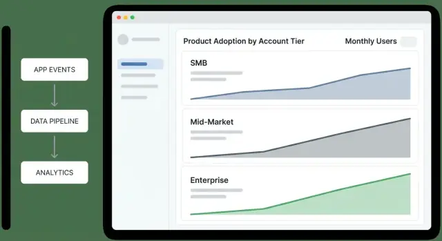
A tier overview dashboard should let an exec answer one question in under a minute: “Which tiers are improving, which are slipping, and why?” Treat it as a decision screen, not a reporting scrapbook.
Tier funnel (Awareness → Activation → Habit): “Where are accounts getting stuck by tier?” Keep the steps consistent with your product (e.g., “Invited users” → “Completed first key action” → “Weekly active”).
Activation rate by tier: “Are new or reactivated accounts reaching first value?” Pair a rate with the denominator (accounts eligible) so leaders can tell signal from small-sample noise.
Retention by tier (e.g., 7/28/90-day): “Do accounts keep using after the first win?” Show a simple line per tier; avoid over-segmenting on the overview.
Depth of use (feature breadth): “Are they adopting multiple product areas or staying shallow?” A stacked bar per tier works well: % using 1 area, 2–3 areas, 4+ areas.
Add two comparisons everywhere:
Use consistent deltas (absolute percentage-point change) so executives can scan quickly.
Keep filters limited, global, and sticky:
If a filter would change metric definitions, don’t offer it here—push it to drill-down views.
Include a small panel for each tier: “What’s most associated with higher adoption this period?” Examples:
Keep it explainable: prefer “Accounts that set up X in the first 3 days retain 18pp better” over opaque model outputs.
Put Tier KPI cards at the top (activation, retention, depth), one scroll of trend charts in the middle, and drivers + next actions at the bottom. Every widget should answer one question—or it doesn’t belong on the executive summary.
A tier dashboard is useful for prioritization, but the real work happens when you can click through to why a tier moved and who needs attention. Design drill-down views as a guided path: tier → segment → account → user.
Start with a tier overview table, then let users slice it into meaningful segments without building custom reports. Common segment filters:
Each segment page should answer: “Which accounts are driving this tier’s adoption score up or down?” Include a ranked list of accounts with score change over time and top contributing features.
Your account profile should feel like a case file:
Keep it scannable: show deltas (“+12 this week”) and annotate spikes with the feature/event that caused them.
From the account page, list users by recent activity and role. Clicking a user shows their feature usage and last-seen context.
Add cohort views to explain patterns: signup month, onboarding program, and tier at signup. This helps CS compare like-with-like rather than mixing brand-new accounts with mature ones.
Include a “Who uses what” view per tier: adoption rate, frequency, and trending features, with a click-through list of accounts using (or not using) each feature.
For CS and Sales, add export/share options: CSV export, saved views, and shareable internal links (e.g., /accounts/{id}) that open with filters applied.
Dashboards are great for understanding adoption, but teams act when they’re nudged at the right moment. Alerts should be tied to account tier so CS and Sales aren’t flooded with low-value noise—or worse, missing critical issues in your highest-value accounts.
Start with a small set of “something is wrong” signals:
Make these signals tier-aware. For example, Enterprise might alert on a 15% week-over-week drop in a core workflow, while SMB might require a 40% drop to avoid churn-noise from sporadic usage.
Expansion alerts should highlight accounts that are growing into more value:
Again, thresholds differ by tier: a single power user may matter for SMB, while Enterprise expansion should require multi-team adoption.
Route alerts to where work happens:
Keep the payload actionable: account name, tier, what changed, comparison window, and a link to the drill-down view (e.g., /accounts/{account_id}).
Every alert needs an owner and a short playbook: who responds, the first 2–3 checks (data freshness, recent releases, admin changes), and the recommended outreach or in-app guidance.
Document playbooks next to metric definitions so responses stay consistent and alerts remain trusted.
If adoption metrics drive tier-specific decisions (CS outreach, pricing conversations, roadmap bets), the data feeding them needs guardrails. A small set of checks and governance habits will prevent “mystery drops” in dashboards and keep stakeholders aligned on what numbers mean.
Validate events as early as possible (client SDK, API gateway, or ingestion worker). Reject or quarantine events that can’t be trusted.
Implement checks like:
account_id or user_id (or values that don’t exist in your accounts table)Keep a quarantine table so you can inspect bad events without polluting analytics.
Adoption tracking is time-sensitive; late events distort weekly active usage and tier rollups. Monitor:
Route monitors to an on-call channel, not to everyone.
Retries happen (mobile networks, webhook redelivery, batch replays). Make ingestion idempotent using an idempotency_key or a stable event_id, and dedupe within a time window.
Your aggregations should be safe to re-run without double counting.
Create a glossary that defines each metric (inputs, filters, time window, tier attribution rules) and treat it as the single source of truth. Link dashboards and docs to that glossary (e.g., /docs/metrics).
Add audit logs for metric definitions and adoption scoring rule changes—who changed what, when, and why—so shifts in trends can be explained quickly.
Adoption analytics is only useful if people trust it. The safest approach is to design your tracking app to answer adoption questions while collecting the least sensitive data possible, and to make “who can see what” a first-class feature.
Start with identifiers sufficient for adoption insights: account_id, user_id (or a pseudonymous id), timestamp, feature, and a small set of behavior properties (plan, tier, platform). Avoid capturing names, email addresses, free-text inputs, or anything that could accidentally contain secrets.
If you need user-level analysis, store user identifiers separately from PII and join only when necessary. Treat IP addresses and device identifiers as sensitive; if you don’t need them for scoring, don’t keep them.
Define clear access roles:
Default to aggregated views. Make user-level drill-down an explicit permission, and hide sensitive fields (emails, full names, external ids) unless a role truly requires them.
Support deletion requests by being able to remove a user’s event history (or anonymize it) and to delete account data on contract end.
Implement retention rules (for example, keep raw events for N days, keep aggregates longer) and document them in your policy. Record consent and data processing responsibilities where applicable.
The fastest way to get value is to choose an architecture that matches where your data already lives. You can always evolve it later—what matters is getting trustworthy tier-level insights into people’s hands.
Warehouse-first analytics: events flow into a warehouse (e.g., BigQuery/Snowflake/Postgres), then you compute adoption metrics and serve them to a lightweight web app. This is ideal if you already rely on SQL, have analysts, or want one source of truth shared with other reporting.
App-first analytics: your web app writes events to its own database and calculates metrics inside the application. This can be quicker for a small product, but it’s easier to outgrow when event volume increases and historical reprocessing becomes necessary.
A practical default for most SaaS teams is warehouse-first with a small operational database for app configuration (tiers, metric definitions, alert rules).
Ship a first version with:
3–5 metrics (e.g., active accounts, key feature usage, adoption score, weekly retention, time-to-first-value).
One tier overview page: adoption score by tier + trend over time.
One account view: current tier, last activity, top features used, and a simple “why the score is what it is.”
Add feedback loops early: let Sales/CS flag “this looks wrong” directly from the dashboard. Version your metric definitions so you can change formulas without rewriting history silently.
Roll out gradually (one team → whole org) and keep a changelog of metric updates in the app (e.g., /docs/metrics) so stakeholders always know what they’re looking at.
If you want to move from “spec” to a working internal app quickly, a vibe-coding approach can help—especially for the MVP phase where you’re validating definitions, not perfecting infrastructure.
With Koder.ai, teams can prototype an adoption analytics web app through a chat interface while still generating real, editable code. That’s a good fit for this kind of project because the scope is cross-cutting (React UI, an API layer, a Postgres data model, and scheduled rollups) and tends to evolve rapidly as stakeholders converge on definitions.
A common workflow:
Because Koder.ai supports deployment/hosting, custom domains, and code export, it can be a practical way to get to a credible internal MVP while keeping your long-term architecture choices (warehouse-first vs app-first) open.
Start with a shared definition of adoption as a sequence:
Then make it tier-aware (e.g., SMB activation in 7 days vs. Enterprise activation requiring admin + end-user actions).
Because tiers behave differently. A single metric can:
Segmenting by tier lets you set realistic targets, choose the right north star per tier, and trigger the right alerts for high-value accounts.
Use a deterministic, documented rule set:
valid_from / valid_to.This prevents dashboards from changing meaning when accounts upgrade or downgrade.
Pick one primary outcome per tier that reflects real value:
Make it countable, hard to game, and clearly tied to customer outcomes—not clicks.
Define explicit stages and qualification rules so interpretation doesn’t drift. Example:
Track a small set of critical-path events:
signup_completeduser_invited, invite_acceptedfirst_value_received (define your “aha” precisely)Include properties that make slicing and attribution reliable:
Use both:
Snapshots typically store active users, key feature counts, adoption score components, and the tier for that day—so tier changes don’t rewrite historical reporting.
Make it simple, explainable, and stable:
core_action on 3 distinct days in 14 days).Roll up by tier using distributions (median, percentiles, % above a threshold), not just averages.
Make alerts tier-specific and actionable:
Route notifications to where work happens (Slack/email for urgent, weekly digests for low urgency), and include the essentials: what changed, comparison window, and a drill-down link like /accounts/{account_id}.
Adjust stage requirements by tier (Enterprise activation may require both admin and end-user actions).
key_feature_used (or per-feature events)integration_connectedPrioritize events that represent progress toward outcomes, not every UI interaction.
account_id (required)user_id (required when a person is involved)tier (captured at event time)plan / SKU (if relevant)role (owner/admin/member)workspace_id, feature_name, source, timestampKeep naming consistent (snake_case) so queries don’t become a translation project.