Goals and Audience: What the Site Must Do
Before choosing features or rewriting pages, get clear on what your church or community site is for and who it serves. A site that tries to do everything for everyone usually ends up hiding the basics.
The main goals
Most successful church and community websites focus on a small set of outcomes:
- Inform: service times, location, parking, childcare, accessibility, contact details.
- Invite: make it easy for a first-time visitor to feel welcome and know what to expect.
- Connect: help people find groups, ministries, programs, and ways to ask questions.
- Support giving: offer a respectful, secure path for online donations.
- Recruit volunteers: highlight needs and provide clear sign-up steps.
Key audiences to design for
Write and organize content with real people in mind:
- First-time visitors (often anxious and in a hurry)
- Members and regular attenders (need quick updates and schedules)
- Families (kids/youth info, safety details, calendar clarity)
- Seniors (readability, simple navigation, phone-first contact options)
- Youth and young adults (mobile-first, shareable events)
- Community partners (program info, eligibility, points of contact)
Top homepage actions
Decide the 3–5 actions you want to be obvious above the fold, such as:
- Plan a visit
- View service times and directions
- See upcoming events
- Watch/listen to recent sermons
- Give or volunteer
What success looks like
Define measurable wins so you can improve over time: higher attendance at key events, more sign-ups, increased volunteer participation, growth in online giving, and fewer repeated questions by phone/email because answers are easy to find.
Site Structure and Navigation That Stays Clear
A clear structure helps first-time visitors find what they need in seconds—and helps regulars keep up without hunting around. The goal is simple: the most common actions should be obvious from every page.
Keep the main navigation short and familiar. A reliable starting point for a church or community website is:
- Visit (service times, address, parking, what to expect) → /visit
- Events (calendar + featured upcoming items) → /events
- Sermons (latest + library/search) → /sermons
- About (mission, staff, beliefs, history) → /about
- Give (secure online giving, other ways to give) → /give
- Contact (phone, email, form, directions) → /contact
If you have more pages, group them under a couple of dropdowns (for example, put “Ministries” and “Groups” under Connect) rather than adding more top-level items.
The most important details should be reachable in one click from the homepage—and ideally visible without scrolling:
- Service times and location/address (including a “Get directions” button)
- A single Next event highlight that links to /events
- A clear “I’m new” path (button to /visit)
Use consistent calls to action in the header (e.g., “Plan a Visit” and “Give”) so people don’t have to return to the homepage to take action.
Many visitors scroll to the bottom to confirm they’re in the right place. Include:
- Address, phone, and email
- Office hours (and a note if they vary)
- Social links (only the channels you actively update)
- A Privacy page link → /privacy
Add site search when content grows
If you have lots of sermons, posts, or announcements, add a visible search (header or top of /sermons). Search prevents frustration, especially for people looking for a specific series, speaker, or topic.
Events Calendar: Simple, Up-to-Date, and Easy to Find
A church or community website’s calendar shouldn’t feel like a puzzle. People visit with one question in mind: “What’s happening—and can I show up without guessing?” A clear, current calendar also reduces admin work, because fewer people call or email for details.
The event details people actually need
Every event page should include the basics in plain language:
- Date and start/end time (include time zone if you have online attendees)
- Location (address, room name, and a quick “where to park/enter” note if needed)
- Cost (free, suggested donation, ticket price)
- Who it’s for (age group, childcare availability, accessibility notes)
- Contact (a name plus email/phone, not just “call the office”)
If you only do one upgrade: make location and contact unmissable. Those two fields prevent most follow-up questions.
Recurring events and last-minute changes
Recurring events (Sunday services, weekly groups, monthly meals) should be managed as repeating entries so you don’t have to copy/paste each week. Still, each occurrence needs the ability to be edited when reality changes.
Best practice:
- Create a series for the repeating event.
- Allow single-date overrides (holiday schedule, guest speaker, venue change).
- If something is canceled, mark that date clearly as Canceled rather than deleting it—people may already be planning around it.
For last-minute updates, add a short “Update” line near the top of the event page (for example: “Update: moved to Fellowship Hall due to weather”).
Categories that match how people think
Use a small set of categories and keep them consistent. For many organizations, these work well:
- Services
- Kids
- Youth
- Community outreach
- Classes
Categories help visitors filter quickly and help your team avoid dumping everything into “Other.”
RSVP/registration and “Add to calendar”
Not every event needs a registration form, but when it does, keep it simple: name, email, headcount, and any genuinely necessary notes.
Also add a quick action so people can commit immediately:
- A visible RSVP/Register button
- An Add to calendar option (ICS download or add to Google/Apple/Outlook)
Feature the next 1–3 key events on the homepage
Many visitors won’t click into a full calendar. On the homepage, highlight the next 1–3 key events (not ten) with a short title, date/time, and one clear button like “Details” or “Register.” Link each highlight to the full event page, and include a “View all events” link to /events for everyone else.
Sermons Library: Audio/Video, Series Pages, and Search
A well-organized sermons library helps regulars catch up and gives first-time visitors a low-pressure way to understand your teaching and tone. The goal is simple: every message should be easy to find, easy to play, and easy to share.
Plan for multiple sermon formats—even if you don’t publish them all every week:
- Audio (fast to upload, great for commuters)
- Video (YouTube/Vimeo embeds work well)
- Livestream replay (clearly labeled when it’s the full service)
- Notes and slides (PDF downloads when available)
When possible, add captions or transcripts. They improve accessibility for Deaf/HoH visitors, help non-native speakers, and make messages easier to skim.
Use a consistent sermon page template
Each sermon should follow the same structure so visitors don’t have to relearn your site every time. A reliable template includes:
- Title + series name
- 1–3 sentence summary
- Audio/video player (and a “watch” vs “listen” choice if both exist)
- Scripture/reference, speaker, date
- Downloads: notes, slides, small group questions
Series pages matter too. They turn individual sermons into an obvious path: “Start here, then continue.”
Make search and filters do the heavy lifting
As your archive grows, navigation matters more than design. Include filters such as series, speaker, date, topic, and scripture/reference. Even a simple search bar that supports keywords (e.g., “anxiety,” “Romans,” “forgiveness”) will serve people better than scrolling.
Add a “Start here” playlist for new visitors
Create a curated playlist like “New to our church?” that highlights a few representative messages. Link it from your visitor page (for example, /visit) and from the sermons overview so newcomers have an immediate, welcoming next step.
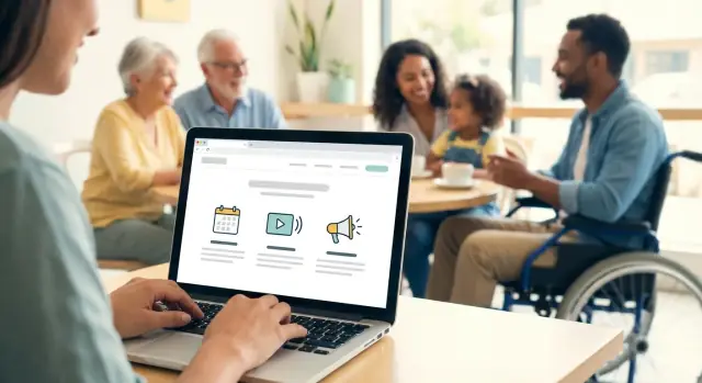
A church or community website needs updates—but too many “urgent” posts quickly turn into noise. Start by separating time-sensitive announcements (something people must act on soon) from longer news posts (stories, recaps, or background that stays relevant for weeks).
A simple model: one weekly update + a few homepage highlights
Create a Weekly Update page (or post) that acts like a bulletin: upcoming dates, quick notes, and links to details. Then, keep the homepage focused with 2–4 highlights only—just the items most people need this week.
- Weekly Update lives at a consistent URL (easy to share and re-find), e.g. /updates
- Homepage highlights link out to /events, /give, a key signup, or the full update
This approach gives regular attendees one predictable place to check, while keeping first-time visitors from feeling overwhelmed.
Writing that’s easy to scan (and act on)
For each announcement, aim for:
- Short headline: “Youth Game Night (Fri 7pm)” beats “Important Youth Ministry Announcement”
- Plain language: avoid insider terms; explain briefly when needed
- One call-to-action: “Sign up,” “Add to calendar,” or “Learn more”—not all three
If you need extra details, put them on a dedicated page and link to it.
Expire, archive, and keep trust
Set a habit for cleanup. Any announcement tied to a date should expire automatically (many editors support this) or be moved to an Archive section after it passes. Out-of-date notices reduce confidence fast.
Optional: email signup for updates
Offer a simple email signup near the Weekly Update (e.g. “Get weekly updates”) and link to preferences or privacy info. Keep it opt-in, minimal, and easy to unsubscribe.
Ministries, Groups, and Community Programs Pages
Deploy without the hassle
Ship your site from Koder.ai and manage updates without a complex pipeline.
Ministries and groups pages do more than list what you offer. They help people quickly answer: Is this for me, when is it, and who do I contact? If the information is clear and consistent, newcomers feel comfortable reaching out—and regulars stop asking the same questions every week.
A simple page template that works for every group
Use the same structure across all ministries (choir, men’s group, prayer team, youth, small groups). Consistency makes the site easier to scan and easier to maintain.
Include:
- Who it’s for: ages/stage of life, newcomers welcome, any prerequisites
- Meeting time and location: day/time, frequency, room/building, online link if applicable
- What to expect: typical schedule, length, childcare, accessibility notes
- Leader contact: name + role (not personal details beyond what’s needed)
- Next step: a clear button like “Join this group” or “Ask a question”
Every group should have a simple way to connect:
- A short contact form that routes to the leader or a shared inbox
- Or a group email address (e.g., youth@, smallgroups@) rather than a personal email
Add one sentence setting expectations: “We usually reply within 2–3 days.” It reduces anxiety for new visitors and can prevent repeat submissions.
Community programs (food pantry, classes, recovery/support groups, tutoring) deserve their own section or category, because many visitors come for help before they come for a service.
For each program, list:
- Purpose and eligibility (who it serves)
- Schedule and location
- What to bring / what’s provided
- How to sign up or show up
- Partner info (if run with another organization)
If dates change often, link to your /events calendar rather than rewriting details on multiple pages.
A clear path for newcomers: “How to join a group”
Don’t make people guess. Add a short “How to join” block on group pages (and/or one central page) with three steps: Browse groups → Contact the leader → Try a meeting. Mention that it’s okay to visit once without committing.
Safety notes for kids and youth pages
Be welcoming, but careful with details. Share general meeting times, check-in info, and leader roles. Avoid posting:
- Children’s full names, personal schedules, or identifiable details in public posts
- Private contact info for minors
- Photos without clear consent policies
If you have guidelines, link to them (e.g., “See our child safety practices”) and keep the tone reassuring and practical.
A first-time visitor is usually scanning for reassurance: “Is this for people like me?” and “Will I know what to do when I arrive?” A few well-kept pages can answer both—without overselling.
The “About” essentials (keep it skimmable)
Your About area should cover the basics clearly:
- Mission and values in plain language
- Leadership (names, roles, a short bio, and a friendly photo)
- Beliefs or statement of faith (as applicable—write for newcomers, not insiders)
- How your community serves others (a couple concrete examples)
Practical “Plan Your Visit” details
Make a dedicated “What to Expect” or “Plan Your Visit” page that includes:
- Service times (and whether they change seasonally)
- Parking and entrances (note the easiest first-time route)
- Accessibility (ramps, elevators, hearing assistance, seating options)
- Childcare / kids’ check-in (ages, safety process, where to go)
- Dress and format (casual/formal, music style, typical length)
A clear /contact page builds immediate confidence: address, map, phone, email, office hours, and simple directions. If possible, add “Who answers this inbox?” so people know they’ll hear back.
Photos, testimonials, and permission
A few warm community photos can help visitors picture themselves there. Use recent images, avoid posting children’s faces without consent, and collect written permission for any identifiable testimonials.
Keeping it current
Trust fades fast when details are outdated. Assign one owner for service times and contact info, review monthly, and add a “Last updated” note on key visitor pages when schedules change.
Giving and Volunteer Sign-Ups: Clear, Respectful, and Secure
Set up giving and serving
Create simple forms and pages for giving and volunteer signups, then iterate from feedback.
Giving and serving are often the two actions people want to take quickly—especially after a service, a community event, or reading about a need. Make both paths easy to find (a clear “Give” and “Volunteer” link in the header, plus a prominent button on the homepage).
Donation page essentials (what to include)
Start with the purpose: one short paragraph that explains what donations support (general fund, outreach, building, benevolence). Then offer simple options:
- Where it goes: General, Missions/Outreach, Youth, Benevolence (keep it to a small set)
- How to give: Card, bank transfer/ACH, and (if available) text-to-give
- How often: One-time and recurring (weekly/monthly)
Set expectations on the same page: processing time, whether fees are covered, and who to contact for help. After payment, show a clear confirmation screen (“Thank you—your gift was received”) and send an email receipt with a link back to /give for next time.
A volunteer sign-up flow that respects people’s time
Volunteer pages work best when roles are concrete. Instead of “Sign up to help,” list opportunities with:
- Role description: what you’ll actually do
- Time commitment: shift length, frequency, start/end dates
- Requirements: training, background check (if applicable), age limits
- Point of contact: one name or team inbox
A simple flow is: choose a role → select available dates/times (if relevant) → submit form → receive confirmation + next steps. If you don’t have scheduling software, a short form plus a follow-up email is enough.
Keep forms minimal. For giving, you typically only need what the payment provider requires. For volunteering, start with name, email/phone, preferred role, availability—avoid long questionnaires upfront.
Add a brief privacy note near the submit button: what data you collect, why you need it, and who can access it. Example: “We use this information to coordinate schedules. We don’t sell your data.” Link to /privacy.
Most importantly, every form should end with a next step: when they’ll hear back, who to contact, and what happens after they click submit.
Mobile and Accessibility: Welcoming Every Visitor
Most people will visit a church or community website on a phone—often while in the car (parked), walking in, or trying to find a start time quickly. That changes the priority: mobile visitors don’t browse; they complete a task.
What mobile-first changes
Design key pages so the answer shows up without hunting: service times, address, parking info, kids check-in notes, and contact options should be near the top. Keep important actions as clear buttons (Call, Get Directions, Give, Join a Group), not tiny text links.
Quick mobile checklist
- Readable fonts: 16px+ body text, generous line spacing
- High contrast: dark text on light background (or vice versa), avoid low-contrast gray
- Tappable buttons: large enough for thumbs, with space between buttons
- Short pages: break long content into sections; use “###” headings to scan
- Fast-loading: compress images, avoid heavy sliders or auto-playing media
Accessibility basics (good for everyone)
Accessibility isn’t just compliance—it reduces confusion for every visitor.
- Alt text for images: describe what matters (e.g., “Volunteers serving breakfast”)
- Real headings: use H2/H3 structure (don’t fake headings with bold text)
- Clear link labels: “Download the bulletin (PDF)” instead of “Click here”
- Captions/transcripts: add captions to sermon videos; provide transcripts when possible
Maps, directions, and click-to-call
Make your address a tappable link that opens a map app. Add “Where to park” and “Which door to use” as one or two plain sentences. Phone numbers should be click-to-call links so a visitor can reach someone with one tap.
Test before publishing
Before you post an update or new page, check it on:
- iPhone and Android (or at least two different screen sizes)
- Wi‑Fi and cellular data
- With large text enabled (accessibility setting)
If it’s hard to read, hard to tap, or hard to find, it’s worth adjusting before Sunday.
Design and Content Style That Feels Familiar
A church or community website should feel like an extension of what people experience in person: welcoming, clear, and recognizable. Design isn’t about impressing visitors—it’s about helping them find answers quickly and feel confident they’re in the right place.
Keep the look consistent (and calm)
Choose a small, consistent palette (2–3 core colors plus neutrals) that matches your community’s identity—often this is already present in signage, bulletins, or a logo. Pair it with one clean type style for headings and one for body text, and use them everywhere. Consistency reduces mental effort, especially on mobile.
A simple rule: if something looks like a button, it should always behave like a button. If something is a heading, it should look like a heading on every page.
Use real photos—thoughtfully
Authentic photos build trust faster than stock images, but they should be used with care:
- Get consent when individuals are clearly identifiable (especially children)
- Aim for diversity that reflects your real community
- Choose images that show what it feels like to be here (welcoming moments, groups, service projects)
Keep photos purposeful: one strong image can do more than a rotating slideshow that people ignore.
Homepage layout: quick answers first, deeper paths second
Your homepage should answer the top visitor questions immediately—then offer paths for regulars.
Place essentials near the top: service times, location, parking/entrance notes, and a clear “Plan a Visit” link. Right after that, feature the next 1–3 key actions: upcoming events, watch/listen to the latest sermon, and a simple way to get updates.
Once those needs are met, the homepage can guide people deeper: ministries, small groups, community programs, giving, volunteering, and contact.
A lightweight content style guide (so everything sounds like you)
Even with multiple editors, your site should read like one voice. A one-page style guide helps:
- Tone: warm, plain language, avoid insider jargon
- Terminology: pick one term (e.g., “Kids” vs “Children’s Ministry”) and stick to it
- Naming conventions: consistent titles like “Sermon Series,” “Events,” “Groups,” “Serve”
Templates for repeatable pages (faster updates, fewer mistakes)
Create simple templates volunteers can reuse:
- Event pages: what/when/where, who it’s for, cost, accessibility notes, contact, registration link
- Sermons: date, speaker, series, Scripture reference, audio/video, notes
- Group/ministry pages: purpose, meeting time, leaders, age range, how to join
Templates keep quality high and editing easy—so the site stays current without constant reinvention.
If you’re rebuilding the site rather than tweaking it, tools like Koder.ai can help you generate consistent page structures and templates from a simple chat brief—useful when you want a modern web stack and the option to export source code later.
Easy Editing for Volunteers and Staff
Create a sermons library
Generate sermon pages with search-friendly structure and consistent series templates.
A church website only stays helpful if it’s easy to keep current. “Easy editing” should mean that a non-technical volunteer can complete core updates in minutes—without breaking layouts.
Define “easy editing” (practical tasks)
At minimum, your editor should be able to:
- Update an event (title, location, date/time, registration link)
- Post a sermon (audio/video + notes + series selection)
- Swap homepage blocks (announcement, hero text, featured event) without touching design settings
If any of these require copying HTML, resizing images manually, or guessing which page to edit, it’s not truly easy.
Use role-based access to prevent accidents
Set clear roles so the right people can edit the right things:
- Admins: site settings, templates, user access
- Editors: publish and update pages, events, sermons
- Authors: draft posts/announcements for review
This reduces mistakes (like overwriting the homepage) and keeps accountability simple.
A quick editing checklist (before you publish)
Train everyone to run the same final checks:
- Preview on desktop and mobile
- Confirm links work (especially sign-ups and giving)
- Verify dates/times and time zones
- Scan for spelling and naming consistency (series titles, speaker names)
- Set the right publish time (immediate vs scheduled)
Train volunteers in 30–60 minutes—and plan for turnover
Do one short live walkthrough, then provide a one-page “how we do it here” guide (with screenshots) for the three most common tasks. Keep it in a shared folder so when volunteers change, the next person can step in with minimal friction.
Workflow, Roles, and Maintenance Checklist
A church or community website stays useful when updates happen on a predictable rhythm—and when everyone knows what they own. The goal isn’t perfection; it’s consistency.
A simple weekly workflow
Pick a cadence that matches your real capacity (even if that’s just one hour a week).
- Events (Monday/Tuesday): Events Editor adds new events, confirms times/locations, and marks anything canceled.
- Sermons (same day as service or next day): Sermon Uploader posts the latest message, checks audio/video playback, and links it to the right series page.
- Announcements (midweek): Comms Reviewer publishes only what people need now, and expires posts that are no longer relevant.
- Quick final review (10 minutes): Site Lead scans the homepage and visitor info for accuracy.
If you have a small team, one person can wear multiple hats—just keep the steps the same each week.
Roles and permissions that prevent headaches
Limit access so volunteers can help without risking key settings.
- Give most helpers Editor access (create/edit pages and posts) but reserve Admin for 1–2 trusted people.
- Keep a shared “How to post” note with screenshots (a Google Doc is fine) so the process survives staff changes.
Safety basics (non-negotiable)
- Use strong, unique passwords and turn on two-factor authentication where possible.
- Remove accounts when someone rotates off the team.
- Schedule automatic backups (daily or weekly) and occasionally test restoring one.
Single source of truth for recurring details
To avoid mismatched information, maintain one canonical place for repeating items like service times, address, office hours, kids check-in instructions, and livestream link. Update it once, then reuse it across pages (and in printed materials).
Launch checklist (before you announce it)
- Navigation: clear labels, no dead ends
- Contact info: address, phone, email, office hours
- Forms: submissions deliver to the right inbox
- Events: dates/times accurate; recurring events display correctly
- Mobile test: homepage, giving, event details, sermon playback
Ongoing maintenance
- Monthly: click-check key links (giving, contact, livestream, visitor info)
- Quarterly: archive outdated announcements, review ministry pages, and remove expired programs
A few small routines keep your site dependable—and make volunteering feel manageable rather than stressful.