20 ਅਪ੍ਰੈ 2025·8 ਮਿੰਟ
ਕਿਵੇਂ ਇੱਕ ਸਰਵਜਨਕ ਫੈਸਲਾ ਇਤਿਹਾਸ ਸਾਈਟ ਬਣਾਈਏ
ਸਿੱਖੋ ਕਿ ਕਿਵੇਂ ਇੱਕ ਸਰਵਜਨਕ ਫੈਸਲਾ ਇਤਿਹਾਸ ਸਾਈਟ ਡਿਜ਼ਾਈਨ ਅਤੇ ਬਣਾਈਏ: ਕੀ ਪ੍ਰਕਾਸ਼ਿਤ ਕਰਨਾ ਹੈ, ਐਂਟਰੀਆਂ ਕਿਵੇਂ ਸੰਰਚਿਤ ਕਰਨੀਆਂ ਹਨ, ਟੂਲ ਕਿਵੇਂ ਚੁਣੇ ਜਾਣ, ਅਤੇ ਇੱਕ ਸੁਰੱਖਿਅਤ, ਦੁਹਰਾਏ ਜਾਣ ਯੋਗ ਵਰਕਫਲੋ ਚਲਾਉਣਾ।
What a Public Decision History Is (and Isn’t)
A public decision history is a curated record of meaningful product decisions—published on your website—so people can understand what you chose, when you chose it, and why it made sense at the time.
Think of it as the “rationale layer” that sits next to your docs and changelog. It’s not marketing copy and it’s not a meeting transcript. It’s a practical reference that reduces speculation, speeds up alignment, and prevents the same debates from restarting every few months.
What it is
A good public decision history:
- Captures decisions that affect users or contributors (features, deprecations, pricing model changes, security posture shifts, API principles, UX conventions)
- Explains context and constraints (customer needs, regulatory requirements, technical limits, timing)
- States options considered and the trade-offs you accepted
- Makes it easy to point to a stable URL when someone asks “Why did you do it this way?”
What it isn’t
To set expectations, be explicit about what you’re not publishing:
- Not every internal conversation: it’s a log of outcomes, not a replay of Slack, calls, or debate threads.
- Not a promise of future work: it records decisions made, not a roadmap.
- Not a place for sensitive details: you can explain reasoning without exposing private customer info, vulnerabilities, or internal metrics.
Why publish it (the practical goals)
Most teams publish a public decision history to:
- Build trust by showing consistent reasoning
- Speed up onboarding for customers, partners, and new teammates
- Reduce repeat arguments (“We already decided this”) by linking to a canonical entry
Who it’s for
Your target readers usually include:
- Customers evaluating fit and long-term direction
- Partners integrating with your product
- Contributors (open-source or community) aligning on standards
- Press and analysts looking for primary sources
If you can name your primary reader, your entries will be shorter, clearer, and more useful.
Scope: Which Decisions to Publish
A public decision history works best when readers can predict what they’ll find. If you publish everything, the site becomes noisy; if you publish only “wins,” it reads like marketing. Define a scope that is consistent, useful, and sustainable for your team.
Start by naming your decision types
List the categories you want to capture, and write down a simple rule for each. Common types include:
- Product features: why you built (or removed) a feature, and what problem it solves
- Pricing and packaging: changes to plans, limits, trials, discounts policy
- Security and privacy: meaningful improvements, trade-offs, and customer-facing implications
- UX and design: major interaction changes, accessibility decisions, navigation changes
A good test: if a customer might ask “why did you do that?”, it likely belongs.
Pick a time range you can maintain
Decide whether you publish decisions:
- From day one (ideal for new products)
- Starting from a specific milestone (e.g., “v2.0 and later”)
- Only for major releases (a pragmatic starting point)
If you’re backfilling history, choose a clear cutoff and say so in an intro note. It’s better to be explicit than to look incomplete.
Choose the right level of detail
Not every decision needs a long narrative. Use two tiers:
- Short entries: a 3–6 sentence summary with links to related docs or releases
- Deep write-ups: used for high-impact decisions (pricing, breaking changes, trust/safety)
Consistency matters more than length; readers want a dependable format.
Define what stays private
Write down exclusions up front to avoid case-by-case debates:
- Security-sensitive details (attack paths, internal controls)
- Personal data (customers, employees, interview notes)
- Contract and negotiation specifics
- Internal metrics that could harm users or competitiveness if misused
When you must omit details, publish the decision with a brief “What we can share” note so the entry still feels honest and complete.
Decision Entry Template and Required Fields
A public decision history only works if each entry answers the same core questions. Readers shouldn’t have to guess what problem you were solving, what you considered, or what changed after you chose a path.
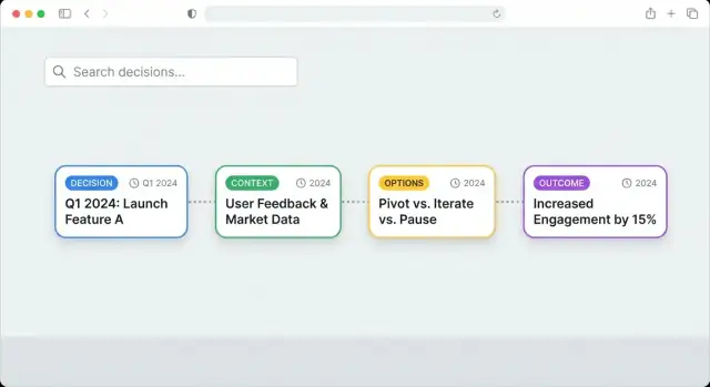
The core template (Context → Options → Decision → Rationale → Impact)
Use a consistent structure for every decision page. A repeatable flow keeps authors disciplined and makes scanning easier:
- Context: What triggered the decision? Include constraints (time, budget, policy), user needs, and relevant background.
- Options: The real alternatives you evaluated (usually 2–4). Briefly note trade-offs.
- Decision: The chosen option, stated plainly.
- Rationale: Why this option won. Include key factors and any assumptions.
- Impact: What changed after the decision—user-visible behavior, internal processes, deprecations, or new risks.
Required metadata (so entries are sortable and trustworthy)
Add a small “header” block of fields at the top of every entry:
- Date (and optionally “decision effective date” if different)
- Status: proposed / accepted / reversed (or superseded)
- Owners: accountable person/team (not necessarily the author)
- Tags: product area, customer segment, platform, etc.
- Audience (optional): who should care—customers, partners, internal users
This metadata powers filters and timelines later, and it signals how final the decision is.
Link the decision to what people can verify
A decision is more credible when readers can trace it to outcomes and artifacts:
- Link to the related changelog entry (e.g., /changelog/2025-04-18-search-update)
- Link to supporting documentation (e.g., /docs/search/indexing)
- Link to the release note or version page (e.g., /releases/1.12)
Plan for reversals and “superseded” decisions
Reversals are normal—publish them clearly. When a decision is replaced:
- Change Status to reversed or superseded
- Add Superseded by linking to the newer entry (e.g., /decisions/014-new-rate-limits)
- Add a short Why it changed paragraph (new data, unexpected costs, policy change)
This keeps your decision timeline honest without rewriting history.
Information Architecture and Navigation
A public decision history only works if readers can quickly answer two questions: “What happened?” and “Where do I find the decision that explains this?” Your information architecture should make browsing feel obvious, even for someone who’s never seen your product before.
Pick a primary navigation that matches how people look
Most teams do best with 3–4 top-level items that cover different reading styles:
- Timeline — a chronological view for people following the story end-to-end.
- Topics/Tags — a way to jump to themes like “Pricing,” “API,” “Accessibility,” or “Security.”
- Key Decisions — a curated list of the decisions you reference often (and that outsiders ask about).
- About — what this site is, what it includes/excludes, and how to interpret entries.
Keep the top nav stable. If you add new pages later (e.g., “Methodology”), tuck them under About rather than expanding the main menu.
Decide on URL patterns (and don’t change them later)
Clear URLs make the site easier to share, cite, and search. A simple pattern that works well is:
/decisions/2025-03-feature-flags
Use dates for sortability and a short, human-readable slug. If you expect many decisions per month, include the day (/decisions/2025-03-18-feature-flags). Avoid renaming URLs after publishing; if you must, add redirects.
Add a “Start here” page
A short guide reduces confusion and prevents readers from misreading drafts or partial records. Create a prominent page like /start-here (and link it from the header and About) that explains:
- what counts as a “decision” on this site
- how to use tags, search, and filters
- what “status” labels mean (e.g., Proposed, Accepted, Reversed)
- how to interpret updates and revisions
Design for scanning first, depth second
Most visitors skim. Structure each decision page so the essentials are visible immediately:
- a one-paragraph summary (what changed and why)
- key metadata near the top (date, status, owner)
- the detailed rationale below, with sections that can be collapsed/expanded
On lists (Timeline, Topics), show “card-style” previews with a title, date, and 1–2 line summary. This lets readers browse quickly without opening every entry, while still keeping the full detail one click away.
Data Model: How to Store Decisions
Build a decision history site
ਆਪਣੀ ਫੈਸਲਾ-ਇਤਿਹਾਸ ਸਾਈਟ ਨੂੰ ਚੈਟ ਵਿੱਚ ਵਰਣਨ ਕਰੋ ਅਤੇ ਜਲਦੀ ਇੱਕ React ਐਪ ਪ੍ਰਾਪਤ ਕਰੋ।
A public decision history is only as useful as its underlying structure. If readers can’t reliably link to a decision, filter it, or understand what it relates to, the site quickly turns into a pile of posts.
Choose the simplest storage that fits your team
You generally have three options:
- Markdown files in a repo: great for versioning, reviews, and low cost. Works well with static site generators and a Git-based workflow.
- CMS entries: easier for non-technical editors and built-in drafting/approvals, but you’ll want to control URLs and exports.
- Database records (custom app): best for complex relationships and analytics, but highest effort to build and maintain.
Start with Markdown or a CMS unless you already need advanced relationships (e.g., many-to-many links across products, releases, and customer segments).
Use a stable unique ID to prevent broken links
Treat each decision like a permanent record. Assign a stable decision ID that never changes, even if the title does.
Example formats:
DEC-00127PDH-2025-04-15-analytics-export
Use the ID in the URL (or as part of it) so you can rename pages without breaking links from support tickets, docs, or blog posts.
Model fields that power filtering and navigation
Even if you don’t expose every field publicly, define them up front so you can build filters later. Common fields include:
- Product area (e.g., Billing, Reporting)
- Customer segment (e.g., SMB, Enterprise)
- Status (Proposed, Decided, Revisited)
- Release (version, date, or link to /changelog)
- Decision date and effective date
- Tags (privacy, pricing, performance)
Plan how to store attachments
Decide where diagrams, screenshots, and PDFs live:
- Keep lightweight images near the decision entry (e.g., an
/assets/decisions/DEC-00127/folder). - For PDFs or larger files, use a stable file path and name them by decision ID.
Whatever you choose, make attachment URLs predictable so they remain valid as the site evolves.
Tooling Choices: Static Site, CMS, or Custom App
Your tooling should match two things: how often you publish decisions, and how much “reader experience” you need (search, filters, relationships). Most teams start simple and only graduate to something more complex if the archive grows.
Option 1: Static site (fast, low maintenance)
A static site generator (for example, a docs-style site) turns Markdown files into a fast website. This is usually the easiest way to launch a public decision history.
It works well when:
- You publish decisions occasionally or on a predictable cadence
- Your filtering needs are basic (by product area, date, status)
- You want a low operational burden (no servers, fewer moving parts)
Static sites also play nicely with “decisions as code": each decision entry is a Markdown file in a repository, reviewed with pull requests. Pair it with a hosted search provider if you want high-quality full‑text search without building your own.
Option 2: Git-based Markdown vs headless CMS
Git-based Markdown is great if contributors are comfortable with pull requests and you want a clear audit trail. Reviews, approvals, and history are built in.
A headless CMS is better if many authors are non-technical or you need structured fields enforced in a form (decision type, impact level, tags). You still publish to a static site, but editing happens in the CMS.
Option 3: Custom app (advanced filtering and relationships)
A custom app makes sense when you need rich filtering (multi-select facets, complex queries), cross-linking (decisions ↔ releases ↔ docs), and personalized views. The tradeoff is ongoing engineering and security work.
If you want the benefits of a custom app without a long build cycle, a vibe-coding workflow can be a practical middle ground: you describe the data model (decision entries, tags, status, supersedes links), the pages (Timeline, Topics, Key Decisions), and the admin workflow, and then iterate quickly.
For example, Koder.ai can help teams spin up a decision-history site or lightweight custom app from a chat-based planning and build process—using React on the web, Go services, and PostgreSQL under the hood—while still keeping an exportable codebase and predictable URLs. This is especially useful if you want filters, search, previews, and role-based publishing without committing to a full internal platform rewrite.
Search and preview environments
For search, choose one of:
- Built-in site search (quick to set up, limited)
- Hosted search (best relevance and filtering)
- Server-side search (most control, highest maintenance)
Whichever route you choose, set up preview builds so reviewers can see a decision entry exactly as it will appear before it’s published. A simple “preview” link attached to each draft reduces rework and helps governance stay lightweight.
Search, Filters, and Reader Experience
A public decision history is only useful if people can quickly find the decision they care about—and understand it without having to read everything. Treat search and navigation as product features, not decoration.
Full‑text search that understands intent
Start with full‑text search across titles, summaries, and key fields like “Decision,” “Status,” and “Rationale.” People rarely know your internal terminology, so search should tolerate partial matches and synonyms.
Pair search with filters so readers can narrow results fast:
- Tag (e.g., “pricing,” “API,” “privacy”)
- Status (proposed, accepted, reversed, deprecated)
- Date range (quarter, year, custom)
- Area/owner (team, product surface, region)
Make filters visible on desktop and easy to open/close on mobile. Show the active filters as removable “chips,” and always include a one-click “Clear all.”
Cross‑linking for context, not clutter
Most readers arrive from a changelog, a support ticket, or a social thread. Help them build context by linking decisions to:
- Related decisions (dependencies, alternatives, “supersedes/superseded by”)
- Outcomes (metrics, learnings, follow-up actions)
- Supporting docs (release notes, policy pages, FAQs)
Keep links purposeful: one or two “Related” items are better than a long list. If your entries include a unique ID, allow searching by that ID and display it near the title for easy referencing.
“What changed since my last visit”
Add a Recent view that highlights new or updated decisions. Two practical options:
- A /decisions/recent page sorted by updated date
- An optional RSS/Atom feed for updates (especially helpful for journalists and partners)
If you support user accounts, you can also show “since last visit” based on a timestamp, but a simple recent list already delivers most of the value.
Accessibility and readability
Use clear heading structure (H2/H3), strong color contrast, and readable fonts/sizes. Ensure keyboard navigation works for search, filters, and pagination, and provide visible focus states. Keep summaries short, use scannable sections, and avoid dense walls of text so readers can grasp the decision in under a minute.
Publishing Workflow and Governance
Publish with confidence
ਆਪਣੀ ਫੈਸਲਾ-ਇਤਿਹਾਸ ਡਿਪਲੋਇ ਕਰੋ ਅਤੇ ਹੋਸਟ ਕਰੋ ਤਾਂ ਜੋ ਇਹ ਗਾਹਕਾਂ ਅਤੇ ਭਾਈਦਾਰਾਂ ਨਾਲ ਸਾਂਝਾ ਕਰਨ ਲਈ ਤਿਆਰ ਹੋਵੇ।
A public decision history only stays useful if readers can trust it: that entries are complete, consistent, and written with care. You don’t need heavy bureaucracy, but you do need clear ownership and a repeatable path from “draft” to “published.”
Define the roles (even if one person wears two hats)
Establish who does what for each entry:
- Author: writes the decision, explains context, links supporting material, and proposes the final wording.
- Reviewer: checks clarity and completeness, challenges assumptions, and confirms links and references are accurate.
- Approver: validates that the decision is real, current, and aligned with internal approvals (e.g., product leadership, security, legal).
- Publisher: ensures the entry meets the publishing standard, applies tags/status, and publishes to the site.
Keep these roles visible on each entry (e.g., “Author / Reviewer / Approver”) so the process is transparent.
Use a lightweight pre-publish checklist
A short checklist prevents most quality issues without slowing you down:
- Clarity: Can a non-expert summarize the decision after reading once?
- Links: Are there links to relevant docs, tickets, research, or releases?
- Sensitive info: Does it reveal customer data, security details, contract terms, or internal-only plans?
- Tone: Is it neutral and factual (no blame, no snark), and does it explain trade-offs fairly?
If you later create templates, embed this checklist directly into the draft.
Rules for edits: correct errors without rewriting history
Decisions are historical records. When something needs fixing, prefer additive changes:
- Make typo/format fixes silently.
- For factual corrections, add a short “Update” note with the date and what changed.
- If the decision changes, publish a new decision entry that links back to the earlier one (“Supersedes …”) rather than editing the old conclusion.
Publish your writing standards
Add a short guideline page such as /docs/decision-writing that explains:
- what qualifies as a publishable decision,
- expected structure and vocabulary,
- how to handle uncertainty and trade-offs,
- the edit policy above.
This keeps the voice consistent as more people contribute, and reduces reviewer load over time.
Privacy, Security, and Legal Considerations
Publishing decision rationale builds trust, but it also increases the chance you’ll accidentally share something you shouldn’t. Treat your public decision history as a curated artifact—not a raw export of internal notes.
Redaction: decide what never goes public
Start with a clear redaction rule set and apply it consistently. Common “always remove” items include personal data (names, emails, call transcripts), private customer details (account specifics, contract terms, renewal dates), and anything that could aid abuse (security findings, system diagrams with sensitive components, exact rate limits, internal admin URLs).
When a decision was informed by sensitive input, you can still be transparent about the shape of the reasoning:
- Summarize the evidence (“Support reported repeated payment failures in EU cards”) instead of quoting tickets.
- Replace identifiers with broad categories (“enterprise customer” vs. company name).
- Defer specifics (“security team recommendation—details withheld”) rather than omitting the whole entry.
Legal/compliance review: a lightweight gate
Not every decision needs legal review, but some do. Set a defined “review required” flag for topics like pricing changes, regulated industries, accessibility claims, privacy policy implications, or partner agreements.
Keep the step simple: a checklist plus a designated reviewer, with turnaround expectations. The goal is to prevent avoidable risk without freezing publication.
Be explicit about what’s intentionally omitted
Add a short policy note (often in your “About” page or footer) explaining what you don’t publish and why: protecting users, honoring contracts, and reducing security exposure. This sets expectations and reduces speculation when readers notice gaps.
Create a correction and concern path
Give readers a clear way to report issues, request corrections, or raise privacy concerns. Link to a dedicated channel such as /contact, and commit to a response window. Also document how you handle takedown requests and how revisions are noted (e.g., “Updated on 2026-01-10 to remove customer identifiers”).
Connecting Decisions to Releases, Docs, and Outcomes
Add governance without overhead
Author, review, approve, ਅਤੇ publish ਕਦਮਾਂ ਲਈ ਇੱਕ ਹਲਕਾ ਫੁੱਲ ਅਡਮਿਨ ਵਰਕਫਲੋ ਬਣਾਓ।
A decision page is most useful when it’s connected to what people can see and verify: what shipped, what changed, and what happened afterward. Treat every decision as a hub that points to releases, documentation, and real-world results.
Link decisions to releases and changelogs
Add a small “Shipped in” block on each decision entry with one or more links to the relevant release notes, for example to /changelog. Include the release date and version (or sprint name) so readers can connect the rationale to the moment it became real.
If a decision spans multiple releases (common for phased rollouts), list them in order and clarify what changed in each phase.
Maintain “Related docs” links
Decisions often answer “why,” while docs answer “how.” Include a “Related docs” section that links to the specific pages in /docs that were created or updated because of the decision (setup guides, FAQs, API references, policy pages).
To keep these links from rotting:
- Make “docs link check” part of the publishing workflow (even a quarterly review helps).
- Prefer stable doc URLs (avoid date-based slugs).
Show outcomes, not just intent
Add an “Outcomes” section that you update after release. Keep it factual:
- Metrics you track (e.g., support tickets, activation rate, time-to-complete)
- Feedback received (summarized themes, not raw private quotes)
- Follow-up tasks (links to public issues if you have them, or a short list with statuses)
Even “Outcome: mixed” builds trust when you explain what you learned and what you changed next.
Create an index of “Most referenced decisions”
For onboarding, add a lightweight index page (or sidebar module) listing “Most referenced decisions.” Rank by internal links, page views, or citation count from docs and /changelog entries. This gives new readers a fast path to the decisions that shaped the product the most.
Measuring Impact and Iterating
A public decision history is only useful if people can actually find answers and trust what they find. Treat the site like a product: measure how it’s used, learn where it fails, and improve it in small, regular cycles.
Track what people actually use
Start with lightweight analytics focused on behavior, not vanity metrics. Look for:
- Top pages: which decisions get read the most (candidates for better cross-links and clearer summaries).
- Searches with no results: the fastest way to discover missing tags, unclear titles, or absent decisions.
- Time on page and exits: a long read may indicate high interest—or confusion. Pair this with feedback prompts to tell which.
If you have a /search page, log queries (even anonymously) so you can see what people tried to find.
Collect feedback where it matters
Make it easy to respond on each decision page, while the context is fresh. A simple “Was this helpful?” prompt plus a short text field is often enough. Alternatively, add a link like “Question about this decision?” that pre-fills the decision URL.
Route feedback to a shared inbox or tracker so it doesn’t disappear into one person’s email.
Define success signals
Pick a few outcomes you can observe:
- Fewer repeated questions from customers/partners/support about the same topic.
- Faster stakeholder alignment (e.g., fewer meeting cycles needed to re-litigate past choices).
- Higher-quality discussions: feedback that references the rationale and trade-offs, not just the conclusion.
Set a practical cadence
Schedule a monthly review to:
- prune or merge duplicates,
- add missing tags and cross-links,
- rewrite unclear summaries,
- improve titles so search works better.
Keep changes visible (e.g., a “Last updated” field) so readers see the site is maintained, not abandoned.