06 ਜੁਲਾ 2025·8 ਮਿੰਟ
ਇੱਕ ਬੇਸੂਰਤੀ ਵੈਬਸਾਈਟ ਨੂੰ ਪੇਸ਼ੇਵਰ ਬਣਾਓ: عملي ਰੀਡਿਜ਼ਾਇਨ ਕਦਮ
ਇੱਕ عملي ਕਦਮ-ਬ-ਕਦਮ ਗਾਈਡ ਕਿ ਤੁਸੀਂ ਕਿਸ ਤਰ੍ਹਾਂ ਇੱਕ ਬੇਸੂਰਾ ਵੈਬਸਾਈਟ ਨੂੰ ਤੇਜ਼ੀ ਨਾਲ ਪੇਸ਼ੇਵਰ ਬਣਾ ਸਕਦੇ ਹੋ—ਤੇਜ਼ ਨਤੀਜੇ, ਲੇਆਉਟ, ਟਾਈਪੋਗ੍ਰਾਫੀ, ਰੰਗ, ਚਿੱਤਰ, UX, ਮੋਬਾਈਲ ਅਤੇ QA.
ਇੱਕ عملي ਕਦਮ-ਬ-ਕਦਮ ਗਾਈਡ ਕਿ ਤੁਸੀਂ ਕਿਸ ਤਰ੍ਹਾਂ ਇੱਕ ਬੇਸੂਰਾ ਵੈਬਸਾਈਟ ਨੂੰ ਤੇਜ਼ੀ ਨਾਲ ਪੇਸ਼ੇਵਰ ਬਣਾ ਸਕਦੇ ਹੋ—ਤੇਜ਼ ਨਤੀਜੇ, ਲੇਆਉਟ, ਟਾਈਪੋਗ੍ਰਾਫੀ, ਰੰਗ, ਚਿੱਤਰ, UX, ਮੋਬਾਈਲ ਅਤੇ QA.
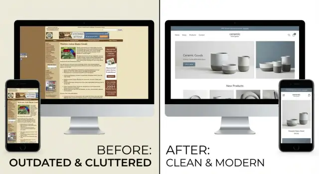
A “professional” website isn’t one that looks trendy—it’s one that feels trustworthy, answers questions quickly, and makes the next step obvious. Before touching fonts or colors, define what “professional” means for your site.
Limit yourself to a handful of outcomes you can measure. Then assign a single primary action for each key page—everything else is supporting content.
Examples:
If a page has two competing primary actions, it will usually convert worse on both.
Pick the main visitor type you’re designing for (not “everyone”). Then list the top questions they need answered to trust you and move forward:
Decide what must stay (logo, CMS, domain, core pages), your timeline, budget, and tools. Constraints prevent endless tweaking and help you make cleaner, more consistent choices.
Pick 1–3 numbers you’ll use to judge the redesign: bounce rate on key pages, form submissions, demo requests, checkout starts, or calls. When design decisions get subjective, your goals and metrics keep you grounded.
Before you redesign anything, get specific about what feels “ugly.” Vague goals like “make it modern” lead to random tweaks. A quick audit turns gut feelings into a clear list of problems you can actually fix.
Open your key pages (homepage, pricing/services, contact, top blog post) and note what looks broken, confusing, or outdated. Don’t solve yet—just collect evidence.
Common red flags to write down:
Find 5–10 sites in your industry (or adjacent) that feel clean and trustworthy. For each, write one sentence on why it works—“big headings + generous spacing,” “simple color palette,” “clear hero message,” “consistent buttons.” You’re not copying; you’re defining standards.
Make a simple list of current pages, major sections, CTAs, forms, and content gaps. This prevents redesigning “in your head” and missing important pieces like footers, error states, or thank-you pages.
Mark each issue as high/medium/low impact and estimate effort. Start with fast wins (readability, spacing, button consistency) before deep rewrites or new templates.
Protect anything that must stay: legal copy, required disclaimers, core checkout/signup flow, brand marks, analytics tags, and any validated conversion elements. This keeps your cleanup from accidentally breaking the business.
A website can look “ugly” simply because it’s confusing. Before you touch colors or fonts, fix the structure so people can find what they need in a few clicks.
Your top navigation is not a sitemap—it’s a decision shortcut. Rewrite labels to be clear, short, and user-focused. Replace vague items like “Solutions” or “Resources” with plain-language options (e.g., “Pricing,” “Services,” “Case Studies,” “Contact”).
Then trim it to the essentials. If you can’t explain why a link belongs in the top nav, move it to the footer. Common footer candidates: careers, press, legal pages, older blog categories, policies.
Aim for a predictable structure where each page has one job and one primary next step. A simple hierarchy might look like:
Keep URLs consistent and readable. For example, use /services/web-design instead of /page?id=17 or mixing styles like /Services/WebDesign. Consistency alone makes a site feel more professional.
Before you publish, scan each page and confirm it answers:
If any answer is unclear, add a headline, one sentence of context, and a single obvious call to action.
Search helps when you have enough content (think: lots of articles, docs, products). If your site is small, search often adds clutter and exposes weak organization. Fix navigation first; add search later if users truly need it.
Typography is the quickest way to make a site feel intentional. Even if your layout is messy, consistent type choices can instantly signal “this is a real business,” not “this was thrown together.”
Start by choosing a single, readable font for everything. If you want a little personality, add one accent font for headings—but only if you can keep it consistent.
Good rule: one font family with multiple weights (Regular, Medium, Bold) is usually enough. Avoid mixing five different fonts; each one introduces a new “voice,” and the page stops feeling cohesive.
Define a basic scale (four levels is plenty) and apply it everywhere:
Once those are set, stop improvising. Random 17px headlines and 13px body copy are a big part of what makes a website look unprofessional.
If your site uses a CMS, bake this into your styles so editors can’t accidentally create new “almost-the-same” sizes.
Two small adjustments often do more than a total redesign:
If you only change one thing, change line height. It immediately makes text feel calmer and more premium.
Professional typography usually means fewer variations, not more. Clean up common clutter:
Consistency is the real upgrade.
Type that looks fine on desktop can fall apart on a phone. Do a quick pass on your smallest screen:
If you want a simple standard: prioritize readability over style. A clean type system is often the fastest “make a website look professional” move you can make.
Color is where many “ugly” sites go off the rails—not because the colors are bad, but because there are too many of them used for too many different meanings. The goal isn’t a perfect palette; it’s predictable color.
Keep it simple:
If you already have brand colors, don’t reinvent them—just limit where they show up. A professional look often comes from saying “no” more than saying “yes.”
Pick a single color for your primary action button (e.g., “Get a quote,” “Start free trial”). Then enforce a rule: if it’s not the main action, it doesn’t get the main CTA color.
Secondary actions should look secondary—use an outline button, a neutral fill, or a text link. This instantly reduces visual noise and helps users move through the page without thinking.
Gradients, heavy shadows, neon glows, and random bevels can look “templated” fast—especially when they’re mixed. Choose one direction and stick to it:
Delete anything that doesn’t match your brand tone. If you’re unsure, remove it and see if the UI feels calmer. It usually does.
Low contrast is one of the most common reasons a site feels unprofessional—and it hurts accessibility.
Quick checks:
If you need a simple rule: when in doubt, make text darker and backgrounds lighter.
Professional interfaces behave consistently. Create a small set of states and reuse them everywhere:
Document these choices in a tiny style note so you don’t re-decide them on every page.
A site can have “good colors” and “nice fonts” and still feel amateur if the layout is inconsistent. Spacing is the silent signal of quality: when things line up, breathe, and follow predictable patterns, the whole interface feels intentional.
You don’t need to reinvent layout. Adopt a consistent grid—many teams default to a 12‑column grid because it flexes well from desktop down to mobile.
The important part isn’t the number; it’s consistency. Decide how wide the main content area is, where the gutters live, and when multi-column layouts collapse.
Random padding values are a major source of “why does this feel messy?” Choose a simple spacing scale and reuse it everywhere. For example, a base unit of 8px (8, 16, 24, 32, 48) makes it easy to keep margins and padding coherent.
Once you have a scale, apply it to:
If everything is packed tightly, users feel overwhelmed—especially on marketing pages. Increasing whitespace doesn’t mean “wasting space”; it means grouping related items and separating unrelated ones.
A quick rule: increase spacing between sections more than spacing inside components. That creates clear page rhythm.
Scan your page and look for imaginary vertical lines. Do card edges align with headings? Do buttons line up with the text blocks they relate to? Are images snapping to the same left edge as the copy?
Misalignment is one of the fastest ways to make a design look improvised. Fixing it is often just adjusting container widths and using consistent left/right padding.
Professional sites repeat patterns. Define a few component standards and reuse them everywhere:
This reduces “layout surprises” between pages.
Open 5–10 key pages side by side. Your header, footer, page width, and section spacing should feel like the same system everywhere. If every template has its own rules, the site feels stitched together.
When in doubt, simplify: fewer layout variations, more consistency, and a clear spacing system will make the biggest “designed” difference with the least effort.
Great visuals don’t need to be flashy. Most “ugly” sites look that way because images and icons feel random: different styles, inconsistent sizes, awkward crops, and blurry files. The fix is less about finding perfect art and more about creating rules you follow everywhere.
Start by removing anything that looks pixelated, stretched, or overly compressed. If you can’t replace everything, replace the most visible offenders first: the homepage hero, product/service thumbnails, and team photos.
Aim for a consistent source and style (real photography vs. illustration vs. 3D renders). Mixing styles can work, but only when it’s intentional and tightly controlled.
A common mistake is adding images to “fill space.” Instead, every image should do at least one job:
If an image doesn’t support the message, remove it. A simpler page with fewer, stronger visuals often feels more professional immediately.
Lists are where inconsistency screams the loudest (blog grids, product cards, testimonials). Pick 1–2 aspect ratios and enforce them:
Then crop everything to match. Uniform thumbnails make your layout feel designed even if the content varies.
Icons should look like they belong to the same family: same stroke width, corner radius, fill/outline style, and level of detail. Don’t mix a thin-line set with chunky filled icons.
If you already have a UI kit or design system, use its icon set. If not, choose one set and apply it everywhere (navigation, feature lists, buttons, empty states).
Create a tiny “visual rules” checklist your team can follow:
These small constraints prevent the site from drifting back into inconsistency over time—and they’ll also help with performance and polish when you get to final quality checks.
If your site feels “ugly,” your homepage is usually where that impression forms. The good news: you can make it feel professional fast by tightening messaging, adding real proof, and simplifying what you ask people to do.
Above the fold (what people see before scrolling), you need a single sentence that answers: what you do, who it’s for, and the outcome.
Examples (use your own details):
Avoid vague claims like “innovative solutions” or “we’re passionate about…” They waste your most valuable space.
A professional homepage usually reads like a tidy story:
This structure reduces design “noise” because it tells you what sections belong—and what doesn’t.
Social proof is the fastest trust-builder, but it backfires if it looks fake. Use it only when you can back it up.
Good options:
Place proof near your first call-to-action so it supports the decision.
A messy homepage often has 5–10 competing buttons. Pick one primary CTA and repeat it.
If you need a secondary CTA, keep it clearly secondary (outline style, less emphasis) and make it different but not distracting (e.g., “Watch 2‑min overview”).
Professional pages feel calm because they say “no” to extras.
Do a quick sweep and remove or demote:
If a section doesn’t help a visitor understand, trust, or act—cut it. Your design will instantly look cleaner without touching the color palette.
Even with a cleaner layout and better colors, an “ugly” site can still feel amateur if the writing is messy. Professional sites sound consistent, help people scan quickly, and make buttons and messages predictable.
Most visitors don’t read top-to-bottom—they hunt for answers. Break long paragraphs into:
A good rule: if a paragraph runs longer than 4 lines on mobile, split it.
Replace vague phrases with specific ones. Cut buzzwords, “we’re passionate about…”, and any sentence that doesn’t help someone decide.
Instead of: “We provide innovative solutions for modern teams.”
Try: “Track projects, share files, and get approvals in one place.”
If you have multiple audiences, don’t cram them into one sentence—use a heading per audience and keep each description tight.
Microcopy is the small stuff people notice when something goes wrong (or when they’re about to click). Consistency builds trust.
You don’t need a brand book—just a shared document with rules for:
This prevents your site from sounding like five different people wrote it.
Focus effort where visitors decide and convert:
If you want a quick win, rewrite your CTAs and form messages first—they’re small changes that can instantly make the site feel more intentional.
Mobile issues often make a site feel “cheap” even when the desktop version is fine. The good news: a handful of quick, visible fixes can dramatically improve usability and perceived quality.
Don’t try to perfect every template. Focus on your top-entry pages (usually the homepage, a key product/service page, and your contact/lead page). Pull up your analytics, pick the top 3–5 pages, and fix those first.
Tiny type and cramped lines are the fastest way to look outdated.
If someone has to pinch-zoom or mis-taps a link, they won’t trust the site.
Headers that feel fine on desktop can become a nuisance on phones.
On mobile, your hero section should quickly answer: “What is this, and what do I do next?”
Open your key pages on at least one iPhone-sized and one Android-sized screen. Then try: open the menu, find pricing/contact, tap the primary CTA, and fill out the first form field. Any friction you feel is a fix worth doing today.
A site can look polished and still feel cheap if it’s slow, glitchy, or hard to use. A quick round of performance, accessibility, and QA fixes often delivers the “professional” feel faster than any visual tweak.
Start with the biggest offenders:
If you have access to your CMS or builder settings, turn on caching/minification where available—but don’t chase perfect scores. Aim for “fast enough on mobile.”
Accessibility fixes usually make the site feel more deliberate:
Standardize forms: consistent field spacing, one primary button style, and error states that match your brand colors and remain readable.
Do one pass for visuals and one for function:
Treat this as your pre-launch gate. It’s the difference between “redesign” and “reliable.”
A redesign isn’t “done” when you hit publish—it’s done when it keeps looking good while the site grows. Treat launch like a controlled release, then set lightweight habits that prevent the site from drifting back into chaos.
Start with fast wins that deliver immediate polish, then tackle deeper work once the basics are stable.
Pick a few metrics tied to your goals: homepage CTA clicks, contact form starts/completions, demo requests, or pricing-page scroll depth.
Run simple A/B tests only where it’s likely to pay off—usually headlines, primary CTA text, and page hero layout. Keep tests narrow so results are readable.
If you’re rebuilding pages (or launching a new version of the site) and want to avoid slow, fragmented handoffs, tools that generate working UI from clear requirements can help.
For example, Koder.ai is a vibe-coding platform where you can describe pages in chat and generate a real web app experience (commonly React on the front end with Go + PostgreSQL on the back end). It’s especially useful for:
If you do use a build tool like this, still apply the same rules above: one primary CTA per page, a small type scale, a spacing system, and a consistent component set.
To stay professional, future pages need rules. Create a short internal doc (one page is enough) that defines:
Set a recurring monthly or quarterly checklist: remove outdated content, fix broken links, refresh screenshots/logos, and delete unused assets.
If you’re updating pricing often, keep that workflow tight (and link it clearly from key pages, e.g., /pricing) so old info doesn’t quietly undermine trust.
Start by defining 3–5 measurable goals and assign one primary action per key page (e.g., homepage → “Book a call,” service page → “Request a quote”). When design debates get subjective, your goals and metrics (form submissions, demo requests, checkout starts, calls) decide.
If a page has two “primary” actions, it usually underperforms on both—pick one and make everything else supporting content.
Do a fast audit and write down specific red flags instead of vague opinions:
Then prioritize fixes by impact vs. effort so you get quick wins first.
Keep top navigation as a decision shortcut, not a sitemap. Use clear labels like “Pricing,” “Services,” “Case Studies,” “Contact” and move low-priority links (careers, press, policies) to the footer.
A quick test: if you can’t explain why a link belongs in the top nav, it probably doesn’t.
Scan each page and ensure it answers:
If any answer is unclear, add a direct headline, one sentence of context, and a single obvious CTA. Clarity often “fixes ugly” even before you touch colors or fonts.
Typography is usually the fastest upgrade:
If you change only one thing, increase line height—readability instantly feels more premium.
Use a small, predictable palette:
Also enforce one rule: only the primary CTA uses the primary CTA button color. Secondary actions should look secondary (outline/neutral/text). This reduces noise and makes the page feel intentional.
Stop eyeballing spacing and adopt a simple system:
Consistency across templates (same header/footer/page width) is what makes a site feel “designed.”
Make images and icons follow rules:
Uniform visuals make your site feel cohesive even if content varies.
Above the fold, use one clear sentence that states what you do, who it’s for, and the outcome. Then follow a clean structure:
Add proof only if it’s real (testimonials with details, allowed client logos, verifiable stats) and place it near the first CTA. Keep CTAs specific (“See pricing,” “Book a call,” “Start free trial”).
Fix the biggest “cheap” signals first:
Then do a quick QA pass: test the main flow (menu → pricing/contact → CTA → first form field) on at least one iPhone-sized and one Android-sized screen.