Feb 24, 2026·8 min
App onboarding design that keeps users coming back
App onboarding design helps turn a good demo into daily habit with clear empty states, useful first tasks, and simple next steps.
App onboarding design helps turn a good demo into daily habit with clear empty states, useful first tasks, and simple next steps.
A good demo creates a feeling: "This could save me time." That feeling matters, but it does not prove daily value. People leave the demo excited, open the app on their own later, and face a harder question: "What do I do first, and why should I come back tomorrow?"
That gap is where many products lose people. The real test of app onboarding design is not the guided walkthrough. It is the first quiet session, when the user has no guide, no applause, and no patience for guessing.
The first screen often decides the outcome. If it looks empty, busy, or vague, new users stall before they begin. An empty dashboard feels like homework. A crowded one feels like a test. In both cases, people hesitate, doubt themselves, and close the app.
Too many choices make this worse. When users see five possible paths, ten buttons, and a long menu, they do not feel free. They feel responsible for picking the right thing. That small pressure slows them down, and slow starts hurt user activation.
The first task matters just as much. If the app asks for too much setup, too much reading, or too many decisions, it starts to feel like work before the user gets a clear result. Return visits often drop right there.
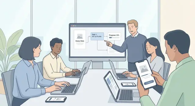
Think about a founder who just saw a CRM prototype created on Koder.ai. The demo felt fast and promising. On the next visit, they land in a blank workspace with several options, unclear labels, and no obvious next step. Instead of adding one contact or tracking one follow-up, they hesitate. The product did not fail because it lacked power. It failed because the first solo moment lacked direction.
People keep using apps when they reach one small win quickly. If they can finish something simple, understand what changed, and see why it helps tomorrow, the app starts to earn a place in their routine. If not, the demo excitement fades fast.
The first five minutes should answer one question quickly: what can this app help me do right now? If people have to guess, they drift. Good onboarding makes the value clear in one plain sentence, before the user sees settings, long forms, or a maze of menus.
A simple line often works better than a full tour. "Turn your idea into a working app by chatting through what you want to build" tells people the outcome, not the feature list. They can picture success, and that lowers the chance they leave after the first click.
Then ask for less. Only collect what is needed to start the first useful action. If a user can begin without choosing a team name, setting preferences, or filling every profile field, let them begin. Extra questions feel expensive before the app has earned trust.
The first screen should also make the next step obvious. Not six equal buttons. Not a dashboard full of empty boxes. Just one clear action. It might be starting a project, importing existing work, answering one setup question, or completing a short sample task.
That step should lead to a small win in minutes, not a promise of value later. If someone opens a tool to build something, let them create a draft, generate a first version, or finish a starter task right away. A small result beats a perfect setup.
This is especially true in tools that can do a lot. A first-time user on Koder.ai does not need a tour of hosting, snapshots, or pricing before they begin. They need a clear prompt, a quick way to describe what they want, and a visible result they can react to. Once something real starts taking shape, the product makes sense.
The first session also needs a reason to return. Save progress automatically, show what happens next, or tee up a second task that feels close and useful. "Your draft is ready to refine tomorrow" is much stronger than ending on a blank dashboard. The best first session does not try to teach everything. It helps people finish one small thing and want the next one.
Strong app onboarding design starts with one clear promise: help the user finish one useful job fast. Not three jobs. Not a full setup. Just one thing that makes them say, "Yes, this is worth coming back to."
Start by choosing the goal of the first session before you design any screens. If your app does many things, pick the job that is easiest to understand and quickest to complete. A budgeting app might guide someone to add one expense. A team app might help them create one shared task. The first session should feel small, clear, and finished.
Then cut anything that can wait. People do not need every setting, preference, or profile field on day one. If setup does not help them reach that first win, move it later. This is where many apps lose people: they ask for too much before giving anything back.
Put the first action where it is hard to miss. The screen should answer one question right away: what do I do now? Keep the main button or input near the center of attention, reduce extra choices, and make the next step obvious. If someone opens a product-building tool like Koder.ai, a better first session is asking them to describe a simple app idea and generate a first draft, not asking them to think about deployment options.
As soon as they act, show progress. People need proof that their effort worked. That could be a created project, a saved item, a preview, a sent message, or any visible change on screen. The result should be clear enough that the user could explain it in one sentence.
Right after that, suggest one next useful task. Keep it close to the result and make it feel like a natural continuation, not a whole new project. If they created a draft, suggest editing the title. If they invited a teammate, suggest assigning the first task. Momentum matters most right after users see success.
The first session should feel like a short path: one job, less setup, one obvious action, one clear result, one next step. That is how early excitement turns into repeat use.
An empty screen should never feel like a dead end. If someone opens a new app, project, or dashboard and sees nothing useful, they need a clear next step right away. Good empty state examples do two jobs at once: they explain what belongs here, and they show what to do next.
Start with plain language. Instead of a vague line like "No data found," say what this area is for: "Your project has no tasks yet" or "You haven't added your first page." That helps people understand the screen without guessing.
Then give them one main action. Not three buttons. Not a row of competing choices. One button is usually enough, such as "Create first task" or "Add your first page." Early hesitation often turns into drop-off, so clarity matters more than variety.
A good empty state also reduces fear. Show a simple example of the finished result, even if it is tiny. That might be a preview card, one sample item, or a short line like "After you add a page, it will appear here." People are more likely to click when they know what success looks like.
Set expectations too. If the button opens a short setup form, say that. If it creates a starter item they can edit later, say that. Clear expectations make first-run tasks feel safer and faster.
On a platform like Koder.ai, a new user might open a fresh project and see an empty workspace. A better message would be: "Your app doesn't have screens yet. Start with one screen and edit it after." The main button could say "Create first screen," with a simple preview of a basic layout nearby.
A quick check helps:
The tone should stay calm and specific. The goal is not to sound clever. The goal is to help people move.
The best first-run tasks do one simple thing: they help someone reach a small win quickly. People stay when they can see progress, not when they are asked to learn everything first.
Start with a task that produces a visible result in a minute or two. That could be creating a first project, importing one contact, sending a test message, or publishing a simple page draft. If the result is easy to notice, users feel that the app works for them, not that they merely finished setup.
Large setup jobs should be broken into smaller steps. Asking for profile details, team invites, integrations, preferences, and billing all at once creates friction. A better path is to ask only for what is needed to complete the first useful action, then bring in the rest later.
A simple way to judge a first-run task is to ask:
Fake training tasks often hurt more than they help. If someone clicks through a pretend demo or fills in sample data they will never use again, the effort feels wasted. Real progress is better, even if it is small.
For example, on Koder.ai, a stronger first task is "create your first simple app screen from a prompt" instead of "complete a full workspace setup." The user gets real output fast. Things like custom domains, deployment settings, or team workflows can wait until the first result exists.
After that task is done, give one useful suggestion, not five. If a user just created their first screen, the next prompt might be to add one form or publish a preview. That keeps momentum going without making the path feel crowded.
Fast tasks build confidence. Confidence leads to a second session, and that is where product adoption starts.
Good onboarding removes small moments of hesitation. When people pause and think, "What happens if I tap this?" or "Did that work?" momentum drops fast.
The fix is usually simple. Use clear words, set expectations, and give feedback that answers the next question before the user has to ask it.
Buttons should describe the result, not the system action. "Create my workspace" is clearer than "Continue." "Generate landing page" is better than "Run." People feel safer when the label matches the outcome they want.
The same rule applies to product language. Internal terms may make sense to your team, but they create doubt for new users. If a tool says "Initialize project context," many people will freeze. "Set up your app" is easier. On a platform like Koder.ai, "Build your first screen" will be clearer to a new user than a label tied to the model or agent behind the task.
Time cues help too. If a step takes about 10 seconds, say so. If a setup task takes about two minutes, say that before the user starts. This lowers stress and makes the app feel more honest.
A simple check for first-run copy:
Success messages should do more than celebrate. Confetti can be fun, but it does not answer the real question: "What changed?" A better success message is specific: "Your project is ready. You can now edit the homepage and publish when you're ready." That gives reassurance and direction.
When something fails, keep the fix on the same screen. Do not force people to hunt through help articles or settings. If a password is too short, say the minimum length right there. If a file type is unsupported, name the accepted formats in the error message.
Good failure feedback has three parts:
That kind of feedback keeps people moving. And when the first session feels clear and recoverable, they are more likely to come back for the second one.
Picture a founder opening a new CRM app for the first time. They are not there to admire the interface. They want one thing: get a real lead into the system and know what to do next.
That is where app onboarding design earns its keep. The screen should not ask them to learn the whole product. It should help them finish one small job that matters.
After sign-up, the founder lands on an empty contacts page. Instead of a blank table and a menu full of options, the page shows one clear action: Add your first contact.
A short line under the button explains why it matters: start with one lead so you can track follow-ups and deals. That small bit of context turns an empty state into a next step.
The founder adds a name, company, and email. The form stays short, so the task feels easy to finish. As soon as they save the contact, the app responds with a useful suggestion: Set a follow-up reminder for tomorrow.
This works because the first action creates the second one. The founder is not exploring at random. They are moving toward a real outcome: remembering to contact a lead.
When they come back the next day, they should not see the same empty-style dashboard or a generic welcome message. They should see unfinished work.
The app can open with a simple prompt like: 1 follow-up due today for Sarah Chen. Now the founder knows where to click and why the app still matters after the demo moment is gone.
From there, the next step can stay small. Log the call. Update the status. Add one note. Each action connects to the previous one, so the product feels coherent instead of noisy.
That is what strong first-run tasks do. They create momentum. The user starts with a blank contacts screen, adds one real person, sets one reminder, and returns to complete one pending task.
Nothing here is flashy. But it feels useful fast, and that is what helps product adoption stick.
A lot of apps lose people by asking for too much before giving anything useful back. If a new user has to fill out a long profile, connect tools, invite teammates, and tweak settings before they can do one meaningful thing, many will leave. People want a quick win first. Setup can come after they see why the app matters.
Another common mistake is the guided tour that takes over the screen. A few hints can help, but a step-by-step overlay that blocks the main task often creates friction instead of clarity. If someone opened the app to create something, test an idea, or solve a problem, the interface should help them start right away.
Empty states are often wasted. Many products use them as decoration, with a friendly illustration and a vague line of text, but no clear action. A better empty state answers one question: what should I do next?
Some teams celebrate the wrong moment. A sign-up confirmation feels good internally, but it means very little to the user. The real milestone is first value: the first task completed, first result generated, first saved project, or first useful outcome.
This matters even more in products where people arrive with a goal, like building a simple app or testing an idea. On Koder.ai, for example, the exciting moment is not account creation. It is getting a working first screen, feature, or prototype from a plain-language prompt.
Another repeat-use killer is hiding the next step after a task is done. Users finish one action, see a success message, and then hit a dead end. Good onboarding keeps momentum going.
A simple review helps catch this:
If any answer is no, repeat use will usually drop. People do come back after a strong first session, but only when the product keeps showing them what to do next.
Good app onboarding design often fails for a simple reason: the first session looks impressive, but the second session feels unclear. Before launch, test the basics with someone who has never seen the product before. Watch what they do in the first five minutes and where they pause.
If a new user cannot complete one small but useful task quickly, the setup is too heavy. The first win should feel real, not like homework. In a tool for building software, that might mean creating a simple page, naming a project, or publishing a rough draft instead of asking people to configure everything first.
Use this as a final pass before you ship:
A good test is simple. Ask a new person to sign up, complete one task, close the app, and come back the next day. Can they tell where to continue within a few seconds? If not, repeat users will drop off even if the first demo felt exciting.
Empty state examples are especially useful here because they reveal hidden confusion. A blank dashboard, project page, or inbox should never feel dead. It should answer two questions fast: what is this area for, and what should I do now?
The last check is just as simple: every success state should unlock one clear next step. When users finish something and feel momentum, user activation gets easier. When they finish something and hit silence, that momentum disappears.
The first version of onboarding is still a guess, even when it is a good one. What matters next is watching what real people do after sign-up, especially in the first session and when they come back on day two.
Start with the points where people pause, leave, or repeat the same action. If many users open the app, look around, and never finish the first useful task, the problem is usually not motivation. It is confusion, weak guidance, or too many choices too early.
A simple review rhythm helps:
When you improve the flow, change one thing at a time. If you rewrite the welcome screen and also change the checklist and empty state, it becomes hard to tell what helped. Small tests are slower, but they teach you more.
Empty states need cleanup too. If users keep asking the same question, the screen is probably not doing its job. Rewrite it so the next action is obvious. Instead of "No projects yet," say what to do now and what the user will get after doing it.
If you're building with Koder.ai, it helps to plan onboarding before you generate screens. Its planning mode is useful for mapping the first-run path in plain language: what the user sees first, what they should do next, and what counts as an early win. That makes it easier to spot extra steps before they turn into real UI.
Testing also gets easier when changes are low-risk. In Koder.ai, snapshots and rollback let you try a shorter checklist, a different empty state, or a new first task without losing earlier work. That makes quick onboarding experiments much easier to manage.
A healthy onboarding process is never really finished. Watch behavior, make one change, measure the result, and keep the version that helps more people reach value faster.
Start with one clear action that leads to a small result fast. If users can finish one useful task in the first few minutes, they are much more likely to return.
Show what this area is for and give one obvious next step. A blank screen should feel like a starting point, not a dead end.
Pick a task that creates something real in one to three minutes. Good examples are adding one contact, creating one page, or generating a first draft.
Only ask for what is needed to reach the first win. Things like team setup, preferences, billing, and advanced options can usually wait until after users see value.
Not usually. A few hints can help, but long guided overlays often slow people down and block the main task. It is better to help users do the real action right away.
Use plain language, name the outcome, and reduce doubt. A button like Create first page is clearer than Continue because users know what will happen next.
Tell users exactly what changed and show the next step. A good success state keeps momentum going instead of ending with a generic confirmation.
Show saved progress or unfinished work, then point to one next action. The second visit should feel like a continuation, not like starting over.
Test with someone new and watch the first five minutes closely. If they pause, hesitate, or cannot get to one useful result quickly, the flow needs to be simpler.
Guide users to describe a simple app idea and generate a first draft before showing advanced features. On Koder.ai, a quick result like a first screen or prototype is a better starting point than deployment or workspace setup.