Apr 15, 2025·8 min
How to Build a Daily Reflection & Self-Tracking Mobile App
A practical guide to building a daily reflection and self-tracking app: core features, UX, data model, privacy, MVP scope, testing, and launch steps.
A practical guide to building a daily reflection and self-tracking app: core features, UX, data model, privacy, MVP scope, testing, and launch steps.
Before you design screens or choose features, decide what “success” means for this app—and for whom. Daily reflection apps most often fail when they try to serve everyone with the same flow.
Pick one primary audience and write a one-paragraph persona.
A good test: if you removed all other user types, would the app still feel complete for this one person?
Decide the single most important user outcome. Examples:
Write this as a promise on a sticky note. Every feature should support it.
Avoid vanity metrics. Choose simple measures tied to the outcome:
Define what “active” means (e.g., 3 check-ins/week) so you can evaluate changes later.
Be explicit about:
Constraints aren’t limitations—they’re your design brief.
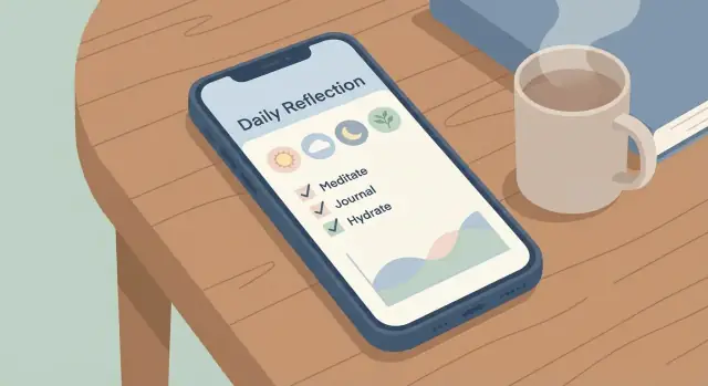
A daily reflection app succeeds or fails on one thing: how easy it feels to complete a meaningful entry in under a minute. Before adding trackers, tags, or charts, design a single “core loop” users can repeat with minimal effort.
Choose a simple rhythm and stick to it:
Prompt → entry → quick review/insight → gentle nudge tomorrow
The goal is a habit: users should know exactly what happens after they open the app.
“Daily” can be interpreted in a few ways, and the choice affects retention:
Whatever you choose, show it clearly (e.g., “Today’s check-in is available until 3am”) and handle time zones and shift-work patterns gracefully.
Your baseline path should be short and predictable:
Common friction points in reflection apps:
Design for “easy to start, satisfying to finish,” then expand once the core loop is proven.
Feature choices are where a daily reflection app either feels effortless—or becomes a “productivity project” users abandon. Aim for a small set of features that work beautifully together, with optional depth for people who want more.
Many successful journaling experiences offer both modes, but make one the default.
Free text is the fastest way to capture thoughts. Keep it frictionless: a single input, good keyboard behavior, and no forced formatting.
Guided prompts help on low-motivation days. Consider a short prompt set that rotates (e.g., “What felt hard today?” “What are you grateful for?”). Let users skip prompts, and avoid turning prompts into a questionnaire.
A practical pattern: one prompt at the top and a free-text box underneath. Users can answer the prompt or ignore it.
Tracking should support reflection—not compete with it. Pick a handful of inputs that can be completed in under 15 seconds.
For mood and energy, a simple scale works well (e.g., 1–5 with labels). For sleep, avoid demanding precision; “Poor/OK/Great” or “<6, 6–8, 8+ hours” is often enough. Stress can mirror mood (low/medium/high). Gratitude can be a quick checkbox (“I felt grateful today”) or a single short field.
Habits are tempting to add early, but they can bloat your app. If you include them, keep the first version minimal: a small list of user-defined habits with daily checkmarks and no complicated schedules.
History is what makes the app feel valuable after the first week.
A calendar view helps users see gaps and build consistency. A timeline (reverse chronological list) is great for quick scanning. Add search and tags only if they’re genuinely useful for your audience; tags can be optional (suggest a few common ones like “work,” “family,” “health”).
Keep the entry detail page clean: reflection text first, then tracking values, then metadata (tags, time, edits).
Insights can drive retention, but only if they’re understandable and non-judgmental.
Start with a weekly summary: number of entries, average mood/energy, and a couple of gentle highlights (“Best mood day: Tuesday”). Trends can be simple charts over time.
If you add correlations, keep them optional and carefully worded (“On days you slept 8+ hours, your energy tended to be higher”). Avoid medical-sounding claims, and always allow users to turn insights off.
A good rule: if an insight can’t be explained in one sentence, it’s too complex for the first release.
Consistency is mostly a design problem: the easier it feels to “do the thing” today, the more likely users return tomorrow. Aim for a flow that’s fast, forgiving, and quietly rewarding.
Keep onboarding to a few choices that immediately shape the experience:
Let users start without creating an account. If you need sign-in later, frame it as “backup and sync,” not as a gate.
A blank journal screen can feel like homework. Use short prompts by default—three questions max—such as:
Offer an “Add more” button for longer entries, so people who only have 30 seconds can still complete the session.
Design for quick, repeatable actions:
Put the primary action (“Save” or “Done”) within thumb reach, and autosave drafts so interruptions don’t punish the user.
Readable fonts, high contrast, and clear tap targets improve retention for everyone. Support offline entries and sync later; reflection often happens on a commute or in low-signal environments.
Finally, show gentle progress: a streak can motivate, but always include a “no shame” reset message so missed days don’t cause churn.
A daily reflection app or self-tracking mobile app feels “simple” on the surface, but early data decisions determine whether features like mood tracking, history, and insights stay reliable as you grow.
Most journal app features can be supported with a handful of building blocks:
Keep Entry as the anchor. Everything else (answers, tags, habit logs) should reference it so history and analytics stay consistent.
People change their minds. If someone edits yesterday’s reflection, preserve meaning without creating confusing duplicates.
At minimum, store created_at and updated_at timestamps. If you plan to offer “see previous version” later, add lightweight versioning: save prior text in a revisions table or store a change log per field.
Export is a trust feature, not just a nice-to-have. Design your data so you can generate:
Also decide where backups live (device-only, cloud, or both) before you commit to storage.
Write down clear rules: how long you keep data by default, what happens on account deletion, and whether users can delete single entries vs. everything. Make “Delete my data” straightforward and final—user trust depends on it.
People write about moods, habits, and hard days. If your app feels unsafe, they won’t use it consistently—no matter how polished the UI is. Treat trust as a product feature from day one.
Be explicit about what data stays on the device and what (if anything) syncs to the cloud. In onboarding and Settings, use plain language like: “Entries are stored only on this phone unless you enable sync.” Avoid vague statements.
If you offer cloud sync, explain what gets uploaded (raw entries, tags, mood scores, attachments) and what doesn’t. Also state how backups work and what happens when someone changes phones.
Protect data in transit with TLS (HTTPS) for all API calls. Protect data at rest with encryption for local storage and server databases. If you support accounts, use secure authentication (e.g., OAuth flows, short-lived tokens, secure password hashing) and consider optional 2FA for higher-risk users.
A daily reflection app doesn’t need a user’s contacts, precise location, or ad identifiers. Collect only what directly improves the experience (for example: reminder schedule, basic analytics, and reflection data itself).
If you run analytics, avoid logging raw journal text. Prefer event-level metrics like “created entry” or “completed prompt.”
Add a passcode/biometric lock option so the app is private even on a shared device. Provide export (PDF/CSV/JSON) and a clear “Delete my data” flow. If you have accounts, support deleting the account and server data without emailing support.
A concise Privacy page linked in Settings (e.g., /privacy) helps users—and keeps your team honest.
Choosing where and how you’ll build your daily reflection app affects everything: budget, time to market, performance, and how quickly you can iterate after launch.
If your target users are mostly on one platform (for example, iOS-heavy markets), launching on a single platform first can cut cost and simplify testing. If your audience is broad—or you’re building for a company with a mixed device fleet—plan for both iOS and Android from day one.
A practical rule: start where your early adopters are, then expand once retention and the core reflection flow are proven.
Native (Swift for iOS, Kotlin for Android) typically gives the best platform feel, smoother animations, and the least friction with system features like widgets, HealthKit/Google Fit, and notification scheduling. The tradeoff is maintaining two codebases.
Cross-platform (Flutter or React Native) can reduce development time by sharing most UI and business logic. It’s a strong fit for journaling, mood tracking, and habit tracking screens. The main risk is spending extra time on edge cases: platform-specific bugs, plugin limitations, or “almost native” UI details.
If you want to move quickly without rebuilding the same scaffolding repeatedly, consider a build workflow that shortens the “idea → usable app” cycle. For example, Koder.ai is a vibe-coding platform where you can describe your daily reflection app in chat and generate a working web app (React) with a Go + PostgreSQL backend, then iterate on screens, storage, and flows. It can be a practical way to prototype your MVP, validate the daily loop with testers, and export source code when you’re ready to take it further.
Reminders are core to consistency, but they’re tricky:
If reminders are a key feature, validate notification reliability early—before polishing UI.
A daily reflection app succeeds or fails on one thing: whether people return tomorrow. Your MVP should focus on delivering a reliable daily loop with as few moving parts as possible. Everything else can wait until you’ve proven the habit.
For v1, aim to ship a complete, end-to-end experience:
If any of these parts are missing, users can’t build the routine you’re trying to support.
Common features that sound exciting but often slow down v1:
Instead, prefer lightweight wins: a clean streak indicator, a simple weekly summary later, and a polished entry flow.
Keep each release goal-focused:
Tie each version to one measurable objective (e.g., “increase 7-day return rate”).
Write “done” in user terms. Examples:
Clear acceptance criteria prevents feature creep and makes testing straightforward.
Once your flow is clear, implementation is about getting the everyday experience right: fast, predictable, and forgiving when something goes wrong.
Start with a thin, end-to-end slice of the product so you can write an entry and see it later:
A daily reflection app should work even with spotty connectivity. Use a consistent state approach (for example, a single source of truth for “today’s entry”) and persist locally first.
Keep local storage optimized for:
If you sync, treat the server as a backup—not the primary writing surface.
Notifications are simple until they aren’t. Respect:
Offer a default schedule, plus options like weekdays only.
Design the awkward moments so users don’t feel stuck:
These details reduce churn more than fancy features because they protect the habit.
Analytics for a daily reflection app should answer one question: are people building a habit? If you only track downloads or screen views, you’ll miss the behavioral signals that show whether the product is actually helping.
Pick a small set of metrics you can watch weekly:
These three quickly show whether onboarding and the core loop are working.
Reflection apps can contain extremely personal text. You can still learn a lot by tracking structure rather than content.
Good product events include:
entry_started, entry_saved, entry_streak_updatedprompt_shown, prompt_skipped, prompt_completedreminder_enabled, reminder_time_changed, reminder_openedAvoid sending raw journal text, tags that reveal health details, or anything that could identify a person from their writing. If you need sentiment or topic insights later, consider doing it on-device and only sending aggregated counts (or not sending it at all).
Add a tiny prompt right after completion: “Was this prompt helpful?” (Yes/No). Over time, you’ll learn which prompts create more completed entries and fewer skips.
Also include a simple feedback form (Settings → Feedback) with two fields: “What should we improve?” and an optional email. Keep it optional so users don’t feel pressured.
Segment your metrics into cohorts such as:
Cohorts help you see whether reminders, prompt types, or tracking features improve consistency—without guessing.
A reflection + tracking app fails fast when tiny friction shows up at the wrong moment (a late notification, a slow save, a confusing done state). Testing should focus on reliability and “feel,” not just whether buttons work.
Run these on real devices (not only simulators), and repeat after every build:
Performance and stability matter more than fancy features:
Start with a small cohort (10–30 people) for 1–2 weeks. Ask testers to log one entry per day and share what stopped them.
Ship weekly fixes, keep short release notes, and prioritize: (1) data integrity, (2) reminder reliability, (3) confusing UX. For feedback collection, link to a lightweight form from a screen like “Help” or “Send feedback.”
Shipping is a product feature. A reflection app only works if it fits into real routines, so treat launch as the start of learning—not the end of building.
Your store listing should set expectations clearly and reduce anxiety:
If you have a privacy policy page, link it as a relative route (for example, /privacy).
Start small:
Keep your first launch goal simple: get a handful of people to complete reflections for 7 days.
Reflection is personal; retention tools should feel supportive:
Avoid pressure tactics. Charge for clear, ongoing value:
If you’re building fast experiments, align pricing with iteration speed: ship the MVP, validate retention, then add paid tiers as you add durable value. Platforms like Koder.ai support an MVP-friendly workflow (including deployment/hosting, snapshots and rollback, and source code export), which can reduce the cost of trying—and reverting—product changes.
Whatever you choose, keep core reflection usable for free so the app earns trust before asking for money.
Start by choosing one primary target user (e.g., beginners, therapy support, busy professionals). Then write a single main outcome as a promise (like “I reflect most days without it feeling like homework”) and pick 1–2 metrics tied to that outcome (e.g., entries/week, D7 retention).
If a feature doesn’t directly support that promise, keep it out of v1.
A reliable core loop is:
Design it so a meaningful check-in takes under 60 seconds.
Pick one definition and make it explicit:
Communicate the cutoff clearly (and handle time zones and DST), so users don’t feel “punished” for schedule changes.
Common friction points:
Aim for “easy to start, satisfying to finish” in every session.
Use both, but pick a default:
A practical pattern is one prompt at the top + a free-text box underneath, so users can answer the prompt or ignore it without friction.
Treat tracking as support for reflection, not a separate “project.” Keep inputs finishable in ~15 seconds:
If tracking makes the entry feel longer, it will hurt consistency.
Start simple and non-judgmental:
Avoid medical-sounding claims and let users turn insights off.
A minimal, scalable data model often includes:
Build trust with clear defaults and real control:
Focus on habit formation and avoid sensitive content:
Keep Entry as the hub so history, search, and analytics stay consistent as you add features.
Link a simple privacy page from Settings (e.g., /privacy).
entry_started, entry_saved, prompt_skipped, reminder_openedThis tells you whether the daily loop works without compromising trust.