

Building a Mobile App Around One Daily Repeated Decision
A practical framework to build a mobile app around one daily choice: clarify the decision, design the flow, set reminders, test quickly, and measure impact.
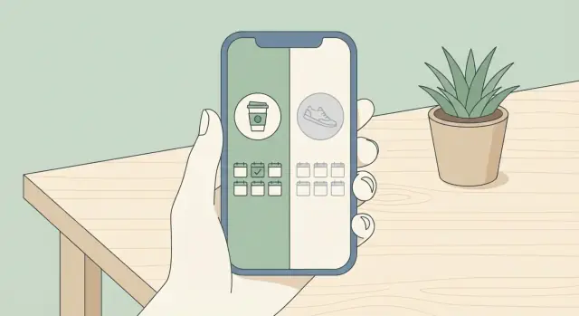
What a “Repeated Daily Decision” App Really Is
A “repeated daily decision” app is built around one choice a person needs to make again and again—ideally at roughly the same moment each day. The product isn’t “a lifestyle app.” It’s a decision helper that shows up, asks a clear question, and helps the user answer it with minimal effort.
One decision means one question
In practice, this decision is usually a simple yes/no or a small set of options that can be answered in a few seconds:
- “Did I drink a glass of water?” (Yes / Not yet)
- “What’s my lunch today?” (Option A / B / C)
- “Will I take a 10-minute walk?” (Yes / Later / Skip)
The key is that the decision is repeatable, specific, and easy to recognize without extra thinking. If the user has to interpret what the app is asking, you’ve already added friction.
Why narrowing to one decision works
Focusing on a single daily choice reduces the number of screens, settings, and open-ended inputs that usually slow people down. The user doesn’t need to “manage” the app; they just need to answer the question. That simplicity increases consistency, which is the real fuel of habit-based design.
It also makes the product easier to learn. When someone can predict exactly what will happen after opening the app, they feel in control—and they’re more willing to return tomorrow.
Examples of good “daily decisions”
Here are a few decisions that naturally fit this model:
- Drink water: “Have I had my first glass today?”
- Choose a meal: “Which meal plan am I following today?”
- Plan tomorrow: “Did I pick tomorrow’s top priority?”
- Take a short walk: “Am I walking after lunch?”
Each example can be supported with a tiny loop: prompt → quick choice → small confirmation.
Simplicity over feature completeness
This kind of app isn’t trying to be complete. It’s intentionally narrow so it can be fast, repeatable, and easy to stick with.
If you’re tempted to add journals, social feeds, complex analytics, or “everything dashboards,” treat that as a warning sign: you may be turning a daily decision into a daily project.
Start by Specifying the Decision and Its Moment
A “daily decision app” only works if the decision is crystal clear. Before you sketch screens or pick notification sounds, write the decision in one sentence that includes who, what, when, and where.
Write the one-sentence decision
Make it concrete enough that two people would interpret it the same way:
- “At 7:30am in my kitchen, I decide whether I’m making coffee at home or buying it on the way to work.”
- “At 10:00pm in bed, I decide whether to scroll social media or read for 10 minutes.”
- “During my lunch break at my desk, I decide what I’ll eat and whether it fits my plan.”
Notice how each sentence names a specific moment. That’s the anchor your mobile app flow will revolve around.
Map the user’s current alternatives
Your app isn’t competing with “no solution.” It’s competing with whatever people already do today, including:
- Memory and willpower (“I’ll remember tomorrow”)
- Notes apps or paper (lists, sticky notes, journals)
- Existing specialized apps (calendars, timers, meal trackers)
- Doing nothing (defaulting to the easiest option in the moment)
In behavioral UX, this matters because the “switching cost” is real: if a notes app already works well enough, your habit-based design must feel simpler, faster, or more reliable at the exact decision moment.
Identify the true moment of decision
People often describe the decision as a general goal (“eat healthier”), but the real decision happens in a narrow window with a trigger and context:
- Time of day: morning, lunch, bedtime, commute
- Trigger: arriving home, finishing a meeting, opening the fridge
- Context: location, mood, social setting, available options
If you can’t pinpoint this, reminders become guesswork and “ethical nudges” get slippery.
Define success in human terms
Avoid app-centered outcomes (“logs every day”). Define success as what the user feels or gains:
- Feels in control at the moment they usually autopilot
- Saves time by reducing back-and-forth thinking
- Follows through more often with less effort
This success definition becomes your north star for micro-interactions, reminder strategy, and later app metrics.
Design the Smallest Habit Loop
A daily-decision app succeeds when it reduces friction around one moment of choice. Before you add trackers, tips, or content, be clear about whether your product is helping people decide or do. Many apps fail by trying to cover both.
Separate “decide” from “do”
Deciding is a cognitive task (“Yes or no?” “Option A or B?”), while doing is execution (“workout,” “cook,” “send the message”). Pick one to own.
If your app is a decision tool, your job ends when the user has made and confirmed the choice. The “doing” can be a simple next-step handoff (a checklist item, a timer start, a short note), but it shouldn’t become a full activity platform.
Map the smallest possible loop
The smallest habit loop for a repeated daily decision can be written as:
- Trigger → the moment the decision is relevant
- Choice → the user selects an option
- Confirmation → the app acknowledges and locks in the choice
- Next step → a lightweight “what now” that lets the user move on
Keep the loop tight: one screen for choice, one micro-interaction for confirmation. If users need to read, browse, or configure before choosing, the loop is too big.
Decide what the app will not do
Boundaries prevent bloat and make the experience trustworthy.
Common “no’s” for a single-decision product:
- No long education feeds before the decision
- No complex goal planning
- No multi-step journaling every day
- No social features that change the decision into performance
Write these exclusions down early. They protect your mobile app flow when new feature ideas appear.
Make an MVP promise you can keep
A strong MVP promise is simple: “Help me decide in under 10 seconds.” That promise forces habit-based design: minimal input, clear options, and fast closure.
If a user can open the app, make the daily decision, and exit in one breath, you’ve built the loop. Everything else should earn its place by making that loop more reliable—not larger.
Create a One-Screen Decision Flow
A daily decision app wins or loses on one moment: the tap. If the “decision screen” feels busy, unclear, or risky, people hesitate—and hesitation is where streaks die.
Build the core screen as one question
Design the main screen as a single, plain-language question with 2–4 obvious answers. Think “What are you choosing right now?” not “Configure your plan.” Keep everything else secondary.
Examples of strong one-screen questions:
- “Did you walk for 10 minutes today?” → Yes / Not yet / Not today
- “What will you eat for breakfast?” → Option A / Option B / Something else
- “Are you drinking alcohol tonight?” → No / Yes / Not sure
The answers should be mutually exclusive and instantly understandable. If a user has to read labels twice, your screen is doing too much.
Defaults: smart help, not a forced choice
Defaults can reduce friction, but they can also create distrust if they feel like the app is deciding for the user.
A smart default is when you preselect the most likely choice based on context (for example, showing “Not yet” earlier in the day and “Not today” later). A forced choice is when the user can’t proceed without accepting the app’s preferred option.
Use defaults carefully:
- Preselect only when it clearly saves time and can be changed in one tap.
- Never hide alternative answers or make them visually “less valid.”
Plan for “Not today” and “Remind me later” without guilt
Daily decisions aren’t daily realities. People get sick, travel, forget, or just need a break. If the UI implies failure, they’ll quit instead of returning.
Include a neutral escape hatch:
- Not today (a real answer, not a punishment)
- Remind me later (a timing choice, not avoidance)
Avoid language like “You missed it” or “Try harder.” Keep it factual: “No decision logged yet.”
Reduce fear with fast undo/edit
Many users hesitate because they don’t want to “ruin” their data or streak with one wrong tap. Add a quick Undo (snackbar-style) or an Edit option on the confirmation state.
Keep the flow tight:
- Tap an answer
- Show a simple confirmation state (optional)
- Offer Undo for a few seconds and Edit in the day’s log
A one-screen decision flow should feel like answering a text, not filling out a form.
Onboarding That Gets to the First Decision Fast
Onboarding for a single daily decision app has one job: get someone to experience the moment of choosing immediately. If the first session ends with “I’ll set it up later,” you’ve already lost the habit.
The first-run goal: understand value, then act
Aim for two outcomes in the first minute:
- The user understands what decision the app helps them make
- The user makes that decision once, right now
Everything else (profiles, preferences, streaks, explanations) is secondary until the first decision is completed.
Show only what’s needed to reach the decision
Treat the first run like a guided hallway with no side doors. Good onboarding screens are often just:
- A single sentence that frames the benefit in plain language (“Make today’s choice in 10 seconds.”)
- One optional context question if it’s required for the decision (not for personalization “later”)
- The decision screen itself
Avoid long tutorials and multi-step feature tours. If a concept is necessary, explain it at the exact moment it matters (“Tap to choose your option for today”).
Delay account creation until after first value
Whenever possible, let users complete their first decision without creating an account. Ask for sign-in only when there’s a clear reason tied to value, such as:
- Saving history across devices
- Backing up progress
- Syncing reminders
When you do ask, keep it lightweight: one tap options (Apple/Google), or email later. The message matters: “Save this so it’s here tomorrow,” not “Create an account to continue.”
Use microcopy that feels human
Use short, concrete language: “Pick for today,” “Done,” “Remind me tomorrow.” Replace labels like “Configure” or “Preferences” with the outcome the user wants. The app should feel like it’s helping them decide, not asking them to learn a system.
Personalization Without Making Users Fill Forms
Personalization should feel like the app is listening, not interviewing. For a daily decision app, you usually need far less data than you think—often just enough to deliver the decision at the right moment and keep the experience relevant.
The minimum you actually need
Start with a tiny “personalization core” that supports the daily decision:
- Time window: When should the decision happen (or be prompted)? Morning, lunch, evening—ideally a specific range.
- A simple preference tied to the decision: one choice that changes the suggestions (e.g., “quiet” vs. “social,” “quick” vs. “thorough”).
- Optional constraints: anything that prevents bad recommendations (e.g., “no notifications during meetings”).
If you can’t explain how a data point changes tomorrow’s experience, don’t ask for it today.
Let users control scheduling before you get “smart”
Early “smart” timing guesses can feel intrusive or just be wrong. Offer a clear, user-controlled schedule first:
- “Remind me at 7:30 AM” beats “We’ll learn your routine.”
- Add a “skip today” or “pause for a week” option so users don’t fight the app.
Once you’ve earned trust, you can introduce optional automation as a toggle (“Suggest a better time”).
Progressive profiling: one small question at a time
Instead of onboarding forms, ask tiny questions only when they unlock value. Examples:
- After day 1: “Want this decision earlier or later?”
- After day 3: “Pick one goal: calmer / faster / more consistent.”
This keeps momentum while steadily improving personalization.
Explain permissions before you ask
If you need notifications, calendar access, or location, preview the benefit in plain language first:
- “Allow notifications so you don’t miss the daily decision.”
- “Share location to tailor suggestions to where you are—optional, and you can turn it off anytime.”
Clarity reduces drop-off and makes personalization feel like a choice, not a demand.
Reminders, Nudges, and Timing Rules
A one-decision app is highly sensitive to timing. The goal isn’t to “notify more.” It’s to show up at the moment a person is most likely to decide—and then make that decision effortless.
Pick the right reminder surfaces
Start with push notifications because they’re immediate and familiar. Add other options only when they truly fit the decision:
- In-app prompts for people who open the app on their own (a subtle banner or card).
- Widgets for “glance-and-decide” behavior without opening anything.
- Calendar reminders when the decision is tied to a real-world schedule.
- Email only if the decision has a work/admin context or the user explicitly wants it.
Make notifications actionable
When appropriate, the notification should let the user complete the decision in one tap. For example: “Today: Choose A or B” with two buttons, or “Yes / Not today.” If the choice needs context, route to a single screen that presents the options immediately—no extra menus.
Timing rules that prevent annoyance
Build guardrails into the system so reminders feel respectful:
- Quiet hours (user-defined, with a sensible default like nighttime).
- Max reminders per day (for most apps, 1–2 is plenty).
- Stop after completion (once the decision is made, don’t keep pinging).
- Adaptive spacing (if a reminder is ignored, wait longer before trying again).
Give people simple controls
Every reminder should offer a graceful exit:
- Snooze (e.g., 15 minutes, 1 hour, “this evening”).
- Change time (a quick picker, not a settings scavenger hunt).
- Pause reminders (for vacation, busy weeks, or burnout).
Done well, reminders feel like a helpful assistant—not a nagging alarm.
Feedback, Motivation, and “Return Tomorrow” Design
A single-decision app is defined by what happens in the seconds after a user acts. The goal is simple: make completion feel immediate, meaningful, and easy to repeat tomorrow.
Make completion feel instant with micro-interactions
When the user taps their choice, respond right away. A subtle animation (like a checkmark that snaps into place) can make the action feel “done,” not “submitted.” Sound and haptics can be optional—some people love them, others find them distracting—so let users toggle them in settings.
Keep the micro-interaction short. If it takes longer than a blink, it starts to feel like a loading screen.
Confirm clearly: “Saved” and what happens next
Users shouldn’t wonder whether their decision counted.
Use plain confirmation text such as “Saved,” followed by one line that sets expectations: “We’ll remind you tomorrow at 8:00 AM.” If tomorrow’s time changes based on behavior, say that instead: “We’ll check in tomorrow morning.”
A good confirmation screen also answers: “Am I done for today?” If yes, show a calm “All set” state rather than pushing extra tasks.
Motivation without pressure: careful streak design
Streaks can help, but they can also create anxiety. Avoid punishment language (“You lost your streak”) and avoid overly dramatic visuals when a day is missed.
If you use streaks, frame them as a positive record (“3 days in a row”) and don’t put them everywhere. One small mention after completion is enough.
Gentle recovery paths after missed days
Missed days are normal. Provide a simple restart message: “Welcome back—ready for today’s decision?”
Consider a “grace day” or an “ignore missed day” option sparingly, and make it feel supportive rather than like a cheat. Most importantly, don’t block today’s action behind guilt. The fastest path back to habit is completing the next decision.
Progress Tracking That Helps, Not Overwhelms
Progress tracking in a single-decision app should answer one question: “Is this getting easier, and what should I do tomorrow?” If the tracking starts to look like a dashboard, you’ve likely added too much.
Decide what to show (and what to hide)
Start from the decision itself and track only what can be captured with low effort. Good defaults:
- Streaks and consistency: “You made the decision 5 days this week.”
- History: a simple calendar or list of the last 14–30 decisions.
- Patterns: time-of-day trends (“Most completions happen before 9am”) or context tags if users add them.
- Small, actionable insights: one sentence at a time, tied directly to tomorrow’s choice.
Avoid tracking unrelated “wellness” metrics unless you can clearly connect them to the decision and keep input friction near zero.
Keep analytics understandable
Your best view is often a weekly summary because it matches how people think about routines. Prefer minimal charts with obvious meaning:
- A 7-day row (filled/empty) beats multi-line graphs.
- A simple trend label (“Up from last week” / “Same as last week”) beats percentages.
- A single highlight (“Your toughest day is Wednesday”) beats a report.
If you include numbers, label them in plain language (“3 decisions made”) and avoid jargon (“retention,” “adherence,” “compliance”).
Don’t imply outcomes you can’t prove
Progress screens can accidentally promise results (“You’re healthier now”). Unless you have evidence and the right regulatory footing, keep claims modest and behavior-based:
- Say: “You chose X 12 times this month.”
- Not: “This improves your sleep/weight/anxiety.”
If users track personal notes (mood, symptoms), present them as self-observations, not as cause-and-effect.
Data control builds trust
Even at the planning stage, design for user control:
- Export: a simple file of decision history and notes.
- Delete: clear “delete selected” and “delete all data” options.
When people feel safe and in control, they’re more willing to return tomorrow—and that’s the only metric your progress tracking truly needs to support.
Testing and Metrics for a Single-Decision Product
A single-decision app succeeds when people reach the decision moment quickly, complete it easily, and feel like returning tomorrow. That means your analytics should be simple, focused, and tied to user value—not vanity numbers.
Define the few metrics that matter
Start with three “health” metrics that map to the product promise:
- Activation: the share of new users who make their first decision (ideally on day 0). If someone installs but never reaches the decision, nothing else matters.
- Daily completion rate: among active users, how many actually complete today’s decision. This tells you whether the flow works in real life.
- Retention: do they come back and complete again (day 2, day 7, day 30). Retention is your proof that the decision is becoming a routine.
Keep definitions consistent. For example, decide whether “completion” means tapping “Done,” logging an outcome, or confirming after a timer—then stick to it.
Track friction, not just outcomes
Instrument the moments where people get stuck:
- Onboarding drop-offs: which screen loses them—permissions, explanation, account creation, or the first decision screen.
- Notification opt-out rate: if many people disable reminders, your timing, wording, or frequency may feel annoying or intrusive.
- Time-to-first-decision: long delays often signal confusion or unnecessary steps.
Plan A/B tests with a single question
Run small experiments that change one thing at a time:
- Wording: “Make today’s choice” vs. “Quick check-in.”
- Defaults: pre-selected option vs. no default.
- Reminder timing: fixed time vs. “next best time” based on past behavior.
- Layout: big primary action vs. equal buttons.
Decide “good enough” before you test
Before launching an experiment, write down what success looks like (for example: “increase activation by 5% without increasing opt-outs”). Pre-commit to a stop rule: how long you’ll run it, how many users you need, and what trade-offs you will not accept. This keeps testing honest—and keeps you from chasing noise.
Ethics, Privacy, Accessibility, and Monetization Fit
A single-decision app can feel surprisingly personal. When it shows up every day, it can either support users—or accidentally pressure them. Treat trust as a core feature, not a legal checkbox.
Ethical nudges: supportive, never coercive
Nudges should reduce friction, not increase anxiety. Avoid copy that implies moral failure (“You missed again”) or social pressure (“Everyone is doing it”). Prefer neutral, choice-respecting language (“Want to do this now or later?”) and allow a clean “Skip today” option.
If you use streaks, design them to be forgiving. Consider “streak freezes,” “best-of-week,” or “consistency score” so one busy day doesn’t undo progress. And don’t hide the off-switch: users should be able to mute reminders, change cadence, or pause without losing access.
Privacy: collect less, explain more
Be explicit about what you store, why you store it, and where it lives (on-device vs. synced). Keep sensitive fields optional by default—especially anything related to health, finances, relationships, or location.
A good rule: the app should still work if the user shares nothing beyond the decision itself.
Also include simple controls:
- Export/delete data in one place
- Clear consent for notifications
- No surprise data sharing for “analytics”
Accessibility: make the daily tap easy for everyone
Design for tired thumbs and small screens. Use large tap targets, readable text sizes, and strong color contrast. Don’t rely on color alone to indicate states (e.g., “done” vs. “not done”). Support screen readers with clear labels, and keep animations subtle so they don’t distract or trigger discomfort.
Monetization that fits a focused product
Pick a model that doesn’t require stuffing the app with extra features. Options that usually fit well:
- Freemium: core decision flow stays free; paid adds extras like more reminder rules or themes
- One-time purchase: simple, honest, low-maintenance
- Subscription: only if you provide ongoing value (new content packs, coaching prompts, family sharing)
Whatever you choose, avoid paywalls that block the daily decision itself—nothing breaks trust faster.
Shipping Faster Without Expanding the Scope
Single-decision apps are a great fit for rapid prototyping because the core experience is so constrained: one question, a few answers, a reminder schedule, and a minimal history view. If you want to validate the loop quickly, using a build approach that keeps iteration cheap can be as important as the UX.
For example, teams often prototype this kind of product on Koder.ai, a vibe-coding platform where you can describe the decision flow in chat and generate a working web app (React) and backend (Go + PostgreSQL) without building a full pipeline from scratch. It’s especially useful for testing onboarding copy, notification rules, and the one-screen flow early, because you can iterate in “planning mode,” snapshot versions, roll back when an experiment fails, and export the source code when you’re ready to take it further. If you’re keeping the MVP promise (“decide in under 10 seconds”), your development process should be just as lightweight.
FAQ
What is a “repeated daily decision” app, in plain terms?
A repeated daily decision app is centered on one recurring choice the user makes at roughly the same time each day. It should show up, ask a single clear question, capture an answer in seconds, and get out of the way—more like a decision prompt than a full “lifestyle platform.”
Why does focusing on one daily decision work better than a feature-rich habit app?
Narrowing to one decision reduces friction: fewer screens, fewer settings, and less interpretation. When the user can predict exactly what happens after opening the app, consistency and return behavior improve—because the app feels effortless, not like another project to manage.
How do I define the “one decision” clearly enough to build the app around it?
Write the decision in one sentence that includes who, what, when, and where. Example format: “At [time] in/at [place], I decide whether I will [option A] or [option B].” If two people would interpret it differently, it’s not specific enough yet.
How do I identify the true “moment of decision” to anchor the app?
Look for the narrow window where the choice actually happens:
- Trigger: finishing lunch, arriving home, getting into bed
- Context: location, mood, social setting, available options
- Time of day: a repeatable daily anchor
If you can’t name the moment, reminders and nudges will feel random and annoying.
What’s the smallest habit loop for a single-decision app?
Keep the core loop tight:
- Trigger (prompt at the right moment)
- Choice (2–4 options, ideally one screen)
- Confirmation (“Saved” + what happens next)
- Next step (lightweight handoff, not a new workflow)
If users must read, browse, or configure before choosing, the loop is too big.
Should the app focus on helping users decide, or helping them do the action?
Choose whether you’re helping the user decide (a cognitive choice) or do (execute the activity). A decision tool should end at confirmed choice, with only a minimal handoff (e.g., start a timer, add a checklist item). Trying to fully own both often bloats the product and increases drop-off.
What makes a strong one-screen decision flow?
Design the main view as one plain-language question with 2–4 mutually exclusive answers. Include neutral escape hatches like Not today and Remind me later, and add fast Undo/Edit so users aren’t afraid of “ruining” their streak or history with one wrong tap.
How should onboarding work for a single daily decision app?
Onboarding should get users to their first decision immediately:
- One sentence on the benefit (“Decide in under 10 seconds.”)
- Only essential setup (like choosing a reminder time)
- The decision screen right away
Delay account creation until after the user experiences value (e.g., when they want backup or cross-device sync).
How can I personalize the app without making users fill out long forms?
Collect only what improves tomorrow’s experience:
- A time window for the decision/reminder
- One preference that changes options meaningfully
- Optional constraints (quiet hours, no pings during meetings)
Use progressive profiling—ask tiny questions after day 1/day 3 rather than front-loading forms.
What reminder and notification rules keep nudges helpful instead of annoying?
Respectful reminders come from clear rules:
- Quiet hours + max reminders/day
- Stop reminders after completion
- Actionable notifications when possible (answer from the notification)
- Simple controls: Snooze, Change time, Pause
Aim to show up at the decision moment—not to increase notification volume.