Nov 01, 2025·8 min
How to Build a Mobile App for One Repetitive Daily Action
Learn how to design and build a mobile app centered on one daily action—MVP scope, UX, reminders, analytics, retention loops, and launch steps.
Learn how to design and build a mobile app centered on one daily action—MVP scope, UX, reminders, analytics, retention loops, and launch steps.
A one-action daily app is a mobile app designed around a single repeated behavior that a person completes once per day. The “action” is intentionally narrow: one tap, one short entry, one scan, one timed session—then you’re done.
The goal isn’t to build a “do-everything” tool. It’s to make one daily behavior so easy and obvious that people actually stick with it.
The daily action should be something you can complete in under 10 seconds (or close to it), ideally from the home screen.
Common one-action patterns include:
What matters is that the action is repeatable, unambiguous, and small enough to do even on a busy day.
A good one-action app has a clear definition of “done.” Success is:
Examples:
Single-action apps work because they trade features for clarity, speed, and consistency.
This guide focuses on practical product decisions—how to pick the action, shape the experience, and keep people coming back—rather than code or tech stack details.
A one-action daily app lives or dies by clarity. If the action is fuzzy (“be healthier”), people won’t know what “done” looks like—so they won’t return.
Pick a clear user and situation. Write it like a tiny scene:
Example: “Remote workers who slump at their desk at 3pm and want a quick reset.” This level of specificity guides everything that follows, from copy to reminders.
Use a simple value proposition format:
“Help me do X every day so I get Y.”
Good: “Help me drink one glass of water every day so I feel more energized.”
Too vague: “Help me improve wellness.”
If you can’t fit the promise into one sentence, the app is probably trying to do more than one thing.
Decide what counts as success:
Rules reduce decision fatigue and prevent arguments with your own UI later.
Pick one primary metric that matches the promise:
Make that metric visible in your product thinking—even if you don’t show it to users yet. It keeps the app honest about what it’s actually helping people do.
A one-action daily app succeeds when it’s fast, clear, and dependable. Your MVP should feel complete on day one—not like a demo with half the experience missing.
Keep the first release to three essentials:
If you can’t explain the product using these three items, the scope is already drifting.
Save the “nice-to-have” ideas for later versions:
These features slow shipping and often distract from the habit you’re trying to support.
Design the MVP around a single happy path:
Define “ready to ship” using concrete checks:
If you want to move fast on the first prototype without over-investing in a full pipeline, tools like Koder.ai can help you stand up a working React/Flutter front end and a Go/PostgreSQL backend from a chat-driven spec—useful for validating the one-action loop before you commit to weeks of custom build.
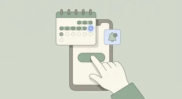
A one-action app succeeds or fails on a single moment: opening the app and completing today’s action without thinking. The goal of UX here isn’t to impress—it’s to remove friction so the daily action feels instant.
The home screen should be built around a single, obvious action—usually one big button placed where thumbs naturally reach.
Make that button self-explanatory with plain language:
Avoid secondary CTAs competing for attention. If the user has to scan, you’ve already slowed the app down.
People open a single-purpose mobile app to answer one question: “Did I do it today?” Show the answer immediately with distinct states:
The more obvious the state, the less cognitive load—and the higher your app retention.
For this kind of MVP app development, three tabs are usually enough:
Skip hidden menus and deep hierarchies. If users can’t find something in two taps, it doesn’t belong in the MVP.
Micro-interactions should provide feedback, not ceremony:
Done well, these moments make streaks and reminders feel satisfying—without turning a one-tap habit into a mini workflow.
Onboarding for a one-action daily app isn’t a tour of features—it’s a guided sprint to the first completion. If someone can do the action once, they understand the value. If they can’t, they leave.
Make the first session succeed even for distracted, skeptical users. A good rule: the primary button should be visible on the first screen, and the action should be completable in a few taps.
Keep your success metric simple: time-to-first-action (how long it takes from install/open to completing the daily action). Measure it, then redesign until it’s reliably under a minute.
Account creation is one of the biggest drop-off points. For many apps, it’s optional until after the first win.
Allow one of these flows:
If you must request an account early (e.g., regulated data), explain why in one sentence and offer the quickest method (Apple/Google sign-in).
Avoid long walkthroughs. Instead, use 1–3 short screens or tooltips that appear exactly when needed.
A practical pattern:
Microcopy matters. Replace vague text (“Track your habit”) with direct, action-first language (“Tap to log today”).
Simple accessibility improvements reduce mistakes and speed up onboarding:
When onboarding is done right, users don’t feel “onboarded.” They feel like they’ve already started—and that first win becomes the reason they return tomorrow.
Reminders are a retention tool, but they’re also where people decide whether your app feels supportive or intrusive. For a one-action daily app, the goal isn’t “more notifications.” It’s the right nudge at the right moment—then getting out of the way.
Different daily actions fit different channels. Offer a small set of options and let users choose.
Don’t add every channel by default. Each extra channel increases the chance of annoyance.
Always allow users to set a preferred reminder time, and make the copy adjustable. A neutral, non-guilting default works for most people:
“Ready for your daily check-in?”
Avoid shame or pressure (“You’re failing your streak!”). If your app’s promise is small and friendly, the reminders should sound that way too. Consider a “gentle” vs “direct” tone toggle, not a library of complicated templates.
If someone travels, your reminders should follow their current local time (or let them lock a home time zone). Add quiet hours so users can silence nudges during sleep, meetings, or family time.
Also plan for missed days. A good reminder system assumes people are busy sometimes:
Don’t request notification permissions on the first screen “because apps do that.” Wait until the user has completed the action once and understands why reminders help.
When you do prompt, explain it in plain language:
This approach improves opt-in rates and reduces the feeling that your app is trying to grab attention instead of delivering value.
A one-action daily app lives or dies on motivation that feels encouraging, not manipulative. The goal is simple: help people return tomorrow without making them feel guilty today.
Start with just a few elements that users instantly understand:
If you add more than this, each extra mechanic should earn its place by improving retention—not by adding complexity.
Streaks can motivate, but they can also cause drop-off when someone breaks one and thinks, “Why bother now?” Consider softening the failure state:
Be clear about the rules upfront so users trust what they see.
Progress should be visible within one screen, without digging into menus:
This reinforces identity (“I’m someone who does this”) with minimal effort.
After the daily action, add one short line of positive reinforcement. Keep it varied and sincere:
Avoid hype. The best tone is calm, friendly, and consistent—like a coach who respects the user’s time.
A one-action daily app lives or dies on consistency. Analytics aren’t there to “spy”—they’re there to answer simple questions: Are people getting to the first win? Do they return tomorrow? What gets in their way?
Start with a tiny event set so you can trust the data and move quickly. For a single-purpose mobile app, you can learn a lot from four events:
Keep event names consistent, and avoid logging sensitive content. For example, track “completed daily action” rather than what the user wrote, recorded, or selected.
Pick metrics that reflect a daily habit, not vanity numbers:
If you also track “opened app,” watch for sessions with no completion—this often points to friction in UX or unclear prompts.
Use privacy-respecting analytics by default: no contact uploads, no ad IDs unless you truly need them, and minimal identifiers. In onboarding, write consent language like a human:
“We collect basic usage data (like first action and daily completion) to improve reminders and make the app easier to use. We don’t collect the content of your entries.”
Offer a simple toggle in Settings, and link to a clear privacy page (for example, /privacy). Trust is a feature—especially for a habit tracker app.
A lightweight cycle keeps improvements focused:
Treat every change as a mini-experiment. Over time, these small improvements add up to better app retention without bloating the product.
A one-action daily app earns money when it reliably helps someone follow through. The fastest way to lose that trust is to monetize before the user has felt a real benefit.
Because the app does one thing, pricing should be easy to understand.
For a daily action app, “value” usually means a small streak or a visible improvement.
Good moments to ask for payment:
What should stay free? At minimum, the ability to complete the daily action and see basic progress. If you paywall the core action, people can’t build the habit that would make them willing to pay.
Avoid dark patterns: no hiding the close button, no confusing trials, no “accidental” upgrades. Show the price, billing period, and renewal terms in plain language.
Add a clear /pricing link in your marketing site and inside the app (Settings is a natural spot). Also include:
Trust is a feature. When users feel respected, they’re more likely to subscribe—and to stick with the daily action long enough to justify it.
A one-action daily app can look perfect in a demo and still fail in real life—usually because the “daily” parts behave differently outside your test phone. Treat testing and launch as a reliability project first, a growth project second.
Before you worry about polish, stress-test the core loop across real conditions:
Write test scripts that mirror messy reality: low battery mode, poor connectivity, multiple devices, and missed days.
A short beta with target users will reveal confusion you can’t predict. Keep it small (10–30 people), and track two things:
Ask testers to screen-record their first session, or at least send a quick note when they get stuck. Your goal is to remove friction, not debate features.
Avoid a frantic release day by preparing the basics:
If you build with a platform like Koder.ai, consider using snapshots/rollback during early releases so you can ship small improvements quickly while keeping a safe recovery point if an update affects reminders, time zones, or streak calculations.
Plan updates that improve consistency: notification reliability, faster startup, clearer error states, and small UX fixes that reduce missed actions.
Watch early signals like day-2 and day-7 retention, reminder opt-in rate, and “action completed” success rate. If those numbers aren’t moving, new features won’t save the app—clarity and reliability will.
A one-action daily app is built around one repeatable action that users complete once per day (e.g., a single tap check-in, a 1–5 rating, a quick timer). The experience is intentionally narrow so it’s fast, obvious, and easy to repeat—especially on busy days.
Keeping the action tiny reduces friction and decision fatigue. Users don’t have to figure out what to do, so they’re more likely to complete the action and return tomorrow—improving consistency and retention.
Write a one-sentence promise: “Help me do X every day so I get Y.” Then make sure the action is:
If you can’t describe it clearly, it’s probably more than one action.
Define rules early so you don’t fight your UI later:
Clear rules reduce confusion and make streaks/history feel trustworthy.
A tight MVP needs three essentials:
If you add more, make sure it doesn’t slow down the daily loop.
Postpone anything that adds complexity without strengthening the daily habit:
These often delay shipping and distract from the one thing users came for.
Make the home screen revolve around one primary control (usually one big button). Then show an immediate state:
Minimal navigation (often Home/History/Settings) keeps the action effortless.
Optimize for time-to-first-action:
Measure how long it takes a new user to complete the action—and iterate until it’s reliably under a minute.
Use reminders as a supportive nudge, not noise:
Track a small, trustworthy set of events:
Watch metrics that match the promise: activation rate, , and completion frequency. Keep analytics privacy-friendly (track completion, not sensitive content) and provide a clear link like .
Short, neutral copy beats guilt-based messaging.
/privacy