Oct 27, 2025·8 min
How to Build a Mobile App for Personal Metrics Snapshots
Learn how to build a mobile app that captures quick personal metrics snapshots—MVP scope, UX, data model, privacy, sync, and launch checklist.
What “Personal Metrics Snapshots” Means
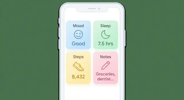
A personal metrics snapshot is a quick, time-stamped check-in: you open the app, capture a few numbers or a short note, and you’re done. It’s not a diary entry and it’s not a medical record. The goal is low friction, so people can log consistently—even on busy or messy days.
What counts as a snapshot?
A snapshot can be anything you can record in seconds, such as:
- Mood (1–5) and a short tag like “stressed” or “calm”
- Sleep hours (e.g., 6.5) and/or sleep quality
- Weight or body measurements
- Steps (manual entry or imported later)
- Focus (1–10), pain (0–10), energy (1–5)
- A quick note (“late coffee,” “headache,” “big meeting”)
The common thread: each entry is small, structured, and time-stamped. Even if your app supports longer notes, snapshots should feel like tapping a few controls and moving on.
Why “consistent capture” beats “perfect accuracy”
Snapshots work because they build a habit. A slightly imprecise mood score logged daily is often more useful than a perfect score logged twice a month. Over time, patterns emerge—sleep dips before stressful weeks, pain spikes after certain workouts, focus improves when caffeine is earlier.
Define success upfront
Pick a few success criteria so you can evaluate v1 without guessing:
- Daily entry rate (e.g., % of days with at least one snapshot)
- Retention (e.g., people still logging after 2–4 weeks)
- Export/share rate (how often users download or share their history)
These metrics keep the product honest: if logging isn’t fast and repeatable, the rest of the app won’t matter.
Choose Your Audience and Core Use Case
A “personal metrics snapshots” app can serve very different people: someone tracking mood, a runner logging readiness, or a coach reviewing client check-ins. If you try to satisfy everyone on day one, you’ll ship a confusing product with too many options.
Identify your target user (and their top use case)
Pick one primary audience and one secondary audience. For each, name the top 1–2 reasons they’d open the app:
- Self-reflection: “I want a quick record of how I’m doing, without journaling.”
- Coaching: “I want consistent check-ins I can review before sessions.”
- Health routines: “I want to notice what affects sleep, energy, or symptoms.”
Write this as a single sentence you can test:
“This app helps [who] capture [what] in under 10 seconds so they can [benefit].”
Define the jobs-to-be-done
Keep your first version aligned to a few repeatable jobs:
- Capture a snapshot in ~10 seconds
- Review a weekly summary in under 2 minutes
- Spot patterns (not perfect conclusions) across time
Decide your stance: general-purpose or niche
A general-purpose app needs flexible metric setup and great defaults. A niche app (fitness, mental wellbeing, productivity) can feel simpler because metrics and language are pre-chosen.
If you’re unsure, start niche. You can expand later once you understand real usage.
Draft 3–5 user stories (features will fall out naturally)
- As a busy user, I want to log energy and mood in two taps so I don’t skip tracking.
- As a user, I want weekly highlights so I can reflect without digging through raw entries.
- As a coach, I want a client’s last 7 days in one view so I can guide our session.
- As a health-focused user, I want to tag “late caffeine” so I can compare it to sleep quality.
- As a privacy-conscious user, I want local-only mode so I can track without creating an account.
Scope an MVP That People Will Actually Use
An MVP for a personal metrics snapshots app should feel instantly useful on day one: open the app, log in seconds, and later see what changed. The fastest way to get there is to ship less.
Start with a tiny metric set
Pick 3–6 metrics for launch, plus a free-text note. This forces clarity and keeps the logging screen simple. Examples: sleep (hours), mood (1–5), energy (1–5), weight, steps, caffeine, and a short note like “late meeting, skipped lunch.”
If you try to support every metric from the start, you’ll spend v1 building configuration instead of value.
Prioritize the “daily loop” features
For v1, focus on the actions users will repeat:
- Add snapshot (fast, low-friction)
- Edit snapshot (fix mistakes without frustration)
- History (a clean list or calendar)
- Simple charts (one metric at a time, basic trends)
- Reminders (opt-in, minimal settings)
- Export (so users trust they can leave)
Anything that doesn’t support this loop can wait.
Define what you won’t build yet
Write this down early so the MVP stays intact:
- No social feed or sharing by default
- No complex goals, streak competitions, or coaching workflows
- No custom dashboards with dozens of widgets
Versioning plan (so scope stays real)
- v1: core logging + history + simple charts + reminders + export
- v1.1: quality-of-life (faster input, better search, improved chart labels)
- v2: advanced features (custom metrics, deeper insights, integrations)
A small, polished MVP beats a sprawling v1 that people abandon after two days.
UX Patterns for Fast Daily Logging
Daily logging succeeds or fails on speed. Your “Add snapshot” experience should feel like sending a quick text: open, tap a few times, done.
Design the “Add snapshot” flow
Aim for a single screen with big, thumb-friendly controls and sensible defaults. Put the primary action (Save) in an easy-to-reach spot, and avoid modal pop-ups that interrupt the flow.
A practical pattern is: date/time (auto) → metric inputs → optional note → Save. If you support multiple snapshot types, let users pick a template first, then keep the rest on one screen.
Choose input types that minimize thinking
Match the control to the data:
- Toggles for yes/no (took meds, exercised)
- Sliders for “good to bad” or “low to high” (stress, mood)
- Number fields for precise values (weight, steps), with a numeric keypad and unit hints
- Quick tags for common context ("travel", "late meal", "headache")
Use defaults aggressively: prefill the most common unit, remember the last selected tags, and keep optional fields collapsed.
Reduce fatigue with reuse
People quit when logging feels repetitive. Add shortcuts:
- Templates for common snapshot sets (Morning check-in, Post-workout)
- Last-used values prefilled automatically
- A one-tap “Same as yesterday” (with an option to edit before saving)
Make these helpers visible but not noisy—think small chips or a subtle “Reuse” row.
Accessibility basics (don’t skip)
Use large tap targets, clear contrast, and readable font sizes. Provide optional voice input for notes or quick tags, and ensure all controls work with screen readers. Small UX details here directly improve consistency for everyone.
Data Model: Store Snapshots Without Painting Yourself Into a Corner
A “snapshot” is a small bundle of values captured at a moment in time. If you model it cleanly, you can add new metrics, import from other apps, and generate insights later—without rewriting your database.
Core entities (keep them boring and flexible)
Start with a simple set of entities:
- Snapshot: the event itself (when it was captured, who it belongs to, where it came from)
- MetricValue: one measurement inside a snapshot (weight, mood, steps, hours slept, etc.)
- Tag: lightweight labels like
workout,travel,sick - Note: free text attached to a snapshot (or to a metric value if you need per-metric context)
- Source: where the snapshot originated (manual entry, HealthKit, Google Fit, wearable API)
- Attachment (optional): a file reference (photo of a meal, PDF lab result). Keep this optional so most snapshots stay fast.
A practical structure is: Snapshot 1 → many MetricValues, plus optional tags and a note. This mirrors how users think (“this was my day at 9pm”) and keeps querying straightforward.
Time: store rules explicitly
Time bugs create user mistrust. Store:
captured_at_utc(an instant in UTC)timezone(IANA name likeAmerica/New_York)captured_at_local(optional cached local timestamp for display/search)
Rule of thumb: store the instant (UTC), display in the user’s local time. If you support backdating (“yesterday”), record the timezone used at capture so history doesn’t shift when someone travels.
Custom metrics vs. a fixed schema
- Fixed schema (predefined fields like
weight,sleep_hours): simpler UI and validation, faster analytics, but limits personalization. - Custom metrics (user-defined): more flexible, but you must store
metric_id,value_type(number/text/bool), units, and validation rules.
A good compromise: ship with a curated set of common metrics, plus custom metrics stored using a generic MetricValue table keyed by metric_id.
Plan export from day one (future you will thank you)
Define stable exports early:
- CSV: one row per MetricValue with columns like
snapshot_id, captured_at_utc, timezone, metric_key, value, unit, note, tags. - JSON: nested by snapshot (snapshot + array of metric values), preserving IDs and sources.
If your internal model maps cleanly to these formats, adding “Export my data” later becomes a product feature—not a rescue mission.
Offline-First Storage and Sync Strategy
Keep control of your source
Own your codebase with source export when you are ready to take it further.
An offline-first app treats the phone as the primary place your snapshots live. Users should be able to log a metric in an elevator, edit yesterday’s entry on a plane, and trust that everything will sync later without drama.
Pick a local database you can rely on
For “personal metrics snapshots,” a real database is usually better than plain files because you’ll want filtering, sorting, and safe updates.
- Android: SQLite with Room is the common default (good tooling, migrations, query safety).
- iOS: Core Data works well, especially if you want built-in change tracking and background saves.
- Cross-platform/embedded options: SQLite directly, or embedded databases like Realm (fast to ship, opinionated). Choose based on your team’s comfort and how much control you need over schema and migrations.
Whatever you pick, make the local database the source of truth. Your UI reads from it; user actions write to it.
Design offline-first behavior (create/edit now, sync later)
A simple pattern:
- When the user creates/edits a snapshot, write it locally immediately.
- Mark the record as “needs sync” (or add a row to an outbox/queue).
- When connectivity returns, sync in the background and clear the flag.
This avoids blocking the UI on network requests and prevents “lost logs.”
Handle conflicts predictably
Conflicts happen when the same snapshot is edited on two devices before syncing.
- Last-write-wins (LWW): simplest and often acceptable for personal data. Use a clear timestamp rule.
- Per-field merges: can feel smarter but may surprise users (e.g., weight from one device, mood from another). If you do it, keep rules consistent and visible.
If you expect multi-device use, consider showing a rare “choose which version to keep” screen rather than silently merging.
Backups: don’t make sync the only safety net
Offer multiple layers:
- Device backup (iCloud/Google backup) for the local database where supported
- Optional cloud sync for multi-device continuity
- Manual export (CSV/JSON) so users can keep their own copy or migrate later
The goal: users trust that logging offline is safe, and syncing is a convenience—not a requirement.
Tech Stack Options and App Architecture
Picking a tech stack is mostly about trade-offs: speed of development, access to device features, performance, and how many engineers can maintain it.
Native vs. cross-platform
Native (Swift for iOS, Kotlin for Android) is a good fit if you expect heavy use of platform health APIs, lots of widgets, or very polished platform-specific UX. You’ll ship two codebases, but you’ll also get first-class tooling and fewer “bridge” surprises.
Cross-platform (Flutter or React Native) is a good fit for a focused MVP with a shared UI and shared business logic.
- Flutter: consistent UI across devices, strong performance, great for custom components.
- React Native: leverages web-like development, large ecosystem, easy to hire for in many markets.
If snapshots are simple (numbers + notes + timestamp) and you’re validating product-market fit, cross-platform usually wins on time-to-market.
If you want to move even faster, a vibe-coding approach can help you prototype the end-to-end flow (logging screen → local storage → charts) before investing in a full team. For example, Koder.ai can generate a working React + Go (PostgreSQL) web app or a Flutter mobile app from a chat-based spec, which is useful for validating your “daily loop” and export format early—then iterating with snapshots/rollback when requirements change.
A simple, durable architecture
Keep the app easy to reason about with three layers:
- UI layer: screens, navigation, state for forms and errors
- Domain layer: “snapshot” rules (validation, derived values, streaks), use-cases like SaveSnapshot and ListSnapshots
- Data layer: local database, sync client, encryption utilities
This separation lets you change storage (SQLite → Realm) or sync strategy without rewriting the whole app.
If you add sync: minimum viable API
Even if v1 is offline-only, design with sync in mind:
- Authentication: email magic link, OAuth, or passkeys—keep it simple.
- Snapshot endpoints: create/update (idempotent), list by time range, delete.
- Versioning: include a
schemaVersionand support API versioning (/v1/...) so you can evolve fields later.
Testing that protects the daily logging flow
Focus tests on what breaks user trust:
- Unit tests: calculations/insights, validation (units, ranges), timezone/date handling
- UI tests: the “log a snapshot in under 10 seconds” path, offline mode behavior, and error recovery (failed sync, duplicate submit)
A small, well-tested core beats a fancy stack that’s hard to maintain.
Privacy and Security Basics for Personal Data
Prototype the mobile flow
Prototype templates, reminders, and simple insights in a Flutter app without starting from scratch.
A personal metrics app quickly becomes a journal of someone’s health, mood, habits, and routines. Treat that data like it’s sensitive by default—even if you never plan to “sell” it or run ads.
Collect less, protect more
Start with data minimization: only collect what you truly need for the core experience to work.
If a feature doesn’t rely on a field, don’t store it “just in case.” Fewer data points means less risk, simpler compliance, and fewer scary edge cases (like handling someone’s location history when you never needed it).
Permissions: be specific and honest
Ask for permissions at the moment they’re needed, and explain the benefit in plain language:
- Notifications: “Enable reminders to log your snapshot in under 10 seconds.”
- Health integrations: “Import steps and sleep to avoid manual entry.”
- Photos: “Attach a meal photo to today’s snapshot.”
Avoid surprise permission prompts during onboarding if the user hasn’t chosen those features yet.
Secure storage and transport
Aim for strong defaults:
- Encryption in transit: always use HTTPS (TLS) for API calls.
- Encryption at rest where possible: use platform-secure storage for secrets (iOS Keychain / Android Keystore) and encrypt the local database if you store sensitive entries.
- Least-privilege access: keep tokens scoped, rotate them, and don’t log personal data in analytics or crash reports.
User controls build trust
Give users obvious, reliable controls:
- Delete individual entries and “delete all data.”
- Export data (CSV/JSON) for leaving or backing up.
- Optional app lock (passcode/biometrics) for shared-device scenarios.
Trust is a feature. If users feel safe, they’ll log more consistently—and your app becomes genuinely useful.
Turn Snapshots Into Insights (Without Overcomplicating Charts)
People don’t log personal metrics to admire graphs—they log to answer small questions: “Am I improving?”, “What changed this week?”, “Did I miss days or did nothing happen?” The best v1 insights are simple, fast, and hard to misread.
Start with a small set of “everyday” stats
Begin with daily/weekly totals, averages, streaks, and a basic trend line. These cover most use cases without heavy analytics.
A solid default summary card can include:
- This week vs last week (total and average)
- Current streak (and longest streak)
- Last 7/30 days trend (up/down + percentage)
Choose charts that fit tiny screens
Favor clear, compact visuals:
- Sparklines in list rows so users can scan multiple metrics quickly
- Calendar heatmaps for “did I do it?” metrics (habits, mood, symptoms), where missing days matter
- Simple line charts for numeric metrics (weight, sleep hours, spending), with minimal decoration
Keep interactions lightweight: tap to see the exact value, long-press to compare two points.
Add filters without turning it into a dashboard builder
Filters should feel like narrowing a story, not configuring software:
- Metric selector
- Date range presets (7d, 30d, 12w, custom)
- Tags (e.g., “workout”, “travel”, “sick”) to explain spikes
Prevent misleading visuals
Two common mistakes: smoothing away real volatility and hiding missing entries. Make gaps explicit:
- Show breaks in the line for missing days (don’t connect points).
- Use a subtle “No entry” state in heatmaps.
- Add a short note like: “3 days missing—trend excludes those days.”
If your app helps users trust what they’re seeing, they’ll keep logging—and your insights will improve naturally as data grows.
Reminders and Habit Support That Don’t Annoy Users
Reminders should feel like a helpful tap on the shoulder, not a guilt trip. The goal is consistency in daily snapshots, but the user should stay in control: when reminders happen, how often, and when they never happen.
Pick a small set of reminder types
Start with a few clear options that map to real behavior:
- Fixed time: “Every day at 8:30 PM.” Simple and predictable.
- Smart nudges: only send when it’s likely useful (for example, if the user usually logs in the evening but hasn’t today).
- Missed-day prompts: a gentle next-day message like “Want to add yesterday’s snapshot?” with a one-tap shortcut.
Keep each type easy to understand, and avoid stacking multiple notifications on the same day.
Respectful notification rules
Let users define their schedule and enforce quiet hours by default (for example, no notifications overnight). Offer frequency controls (“daily,” “weekdays,” “3x/week”) and an obvious “pause reminders” switch.
Copy matters: use neutral language (“Ready to log?”) instead of judgment (“You forgot again”). Also, don’t send repeated nags if a reminder was ignored.
Onboarding timing: ask after a win
Instead of requesting notification permission during first launch, wait until the user completes their first successful entry. Then ask: “Want a daily reminder? What time works best?” This increases opt-in because the value is proven.
Measure whether reminders help
Track a few metrics (anonymously where possible): opt-in rate, notification open rate, and logging within X minutes after a reminder. Use this to tune defaults—without creeping users out with overly personal “smart” behavior.
Integrations, Import, and Export Workflows
Deploy and test with users
Go from local prototype to a hosted app when you want real users testing it.
Integrations can make your app feel effortless, but they also increase complexity and support burden. Treat them as optional power-ups: the app should still be useful with manual logging alone.
Pick integrations that match the core use case
Start by listing the metrics people will want to capture daily (sleep, weight, mood, steps, resting heart rate, caffeine, etc.). Then decide which ones are best imported vs. manually entered.
A practical rule:
- Auto-import for high-frequency, sensor-driven values (steps, sleep duration, heart rate) where typing is annoying.
- Manual-only for subjective or context-heavy entries (mood, stress, symptoms, “today felt hard”) where automation can’t capture meaning.
If you support Apple Health or Google Fit, keep the first version narrow: import a small set of fields really well rather than “everything” inconsistently.
Make data sources obvious (and trustworthy)
When you show a snapshot value, label its source clearly:
- User-entered (typed by the person)
- Imported (from Apple Health/Google Fit/wearable)
This avoids confusion when values change unexpectedly (for example, sleep being adjusted after a wearable reprocesses data). Source labeling also helps users trust trends: a chart mixing manual and imported values without explanation can feel wrong even when it’s technically correct.
Import workflows: reduce fear and friction
If you offer importing, show a short preview before committing:
- what metrics will be imported
- the date range
- whether imports will overwrite existing entries or be stored as separate records
Default to “don’t overwrite” unless users explicitly choose it.
Export and sharing: let users leave (gracefully)
Exports are both a trust signal and a real feature. Common options:
- Email a CSV (good for spreadsheets and coaches)
- Share sheet export (send CSV to Files, Messages, or another app)
If export is a paid feature, say so upfront and link to /pricing—don’t hide it behind a broken-looking button. Include basics in the CSV: timestamp, metric name, value, unit, and source (manual vs. imported) so the data stays meaningful outside your app.
Launch Checklist and What to Improve After v1
Launching a personal metrics snapshots app is mostly about clarity: show people they can log quickly, trust you with their data, and get something useful back within a week.
App store basics (so the right people install)
Your screenshots and short description should emphasize two promises:
- “Log in seconds”: show the fastest possible flow (open → tap a value → save).
- “See patterns”: show a simple weekly view or streak + trend, not a dense dashboard.
If you have onboarding, keep it minimal and reflect it in screenshots so expectations match reality.
Collect feedback without interrupting habits
Add a small in-app prompt after 7 days of use, when users have enough data to judge the app. Offer two options: a quick rating, or “Tell us what’s missing” that opens a lightweight survey link (or an email form).
Keep the prompt skippable and don’t show it again if they dismiss it.
Measure what matters (without collecting personal data)
You can track product health while avoiding sensitive data collection. Focus on:
- Activation: did they create their first metric and log once?
- Daily logging rate: how many days per week they log anything.
- 7-day and 30-day retention: who keeps coming back.
Instrument events like “created metric,” “logged snapshot,” and “viewed insights,” but avoid recording metric names or values.
If you’re building quickly with a platform like Koder.ai, you can also treat analytics events and export schemas as part of the initial “planning mode” spec—so you don’t accidentally ship a v1 that can’t answer basic questions like “did reminders help?” or “is the logging flow actually under 10 seconds?”
Iterate your roadmap after v1
Prioritize improvements that strengthen the core loop:
- Custom metrics and better templates
- Goals (optional), plus home screen widgets
- Clearer insights (a few helpful callouts beat more charts)
- Performance: faster launch, faster logging, smoother sync
Treat v1 as proof that daily logging is easy—and that the app respects privacy from day one.
FAQ
What is a “personal metrics snapshot” in this context?
A personal metrics snapshot is a quick, time-stamped check-in you can capture in seconds—typically a few structured values (like mood or sleep) plus an optional short note. It’s designed to be low-friction so people can log consistently, even on busy days.
What kinds of data should count as a snapshot?
Anything you can record quickly and consistently, such as:
- Mood (e.g., 1–5) with a tag like “stressed”
- Sleep hours and/or sleep quality
- Steps, weight, energy, pain, focus
- A short note like “late coffee” or “headache”
The key is that entries are small, structured, and time-stamped.
Why is “consistent capture” more important than perfect accuracy?
Because consistency creates usable patterns. A slightly imperfect value logged daily is often more informative than a “perfect” value logged rarely. Over time, you can notice trends (e.g., sleep drops before stressful weeks) without needing clinical-grade precision.
How do I choose the right audience and use case for v1?
Pick one primary audience and one core reason they’ll open the app. Write a testable sentence like:
- “This app helps [who] capture [what] in under 10 seconds so they can [benefit].”
If you try to serve everyone (mood tracking, sports readiness, coaching) in v1, the product usually becomes confusing and bloated.
What should an MVP include for a snapshots app?
Start with the “daily loop”:
- Add snapshot (fast)
- Edit snapshot (easy corrections)
- History (list/calendar)
- Simple single-metric charts
- Opt-in reminders
- Export (CSV/JSON)
Delay everything that doesn’t support repeated daily logging (social features, complex dashboards, gamified streak competitions).
What UX patterns make daily logging fast (under ~10 seconds)?
Aim for one screen with big, thumb-friendly controls:
- Auto-filled date/time
- Metric inputs matched to the data (sliders, toggles, numeric keypad)
- Optional note
- Save in an easy-to-reach spot
Use sensible defaults and keep optional fields collapsed so logging feels like “tap, tap, done.”
How can I reduce logging fatigue so users don’t quit?
Add lightweight reuse features that reduce repetitive work:
- Templates (e.g., “Morning check-in,” “Post-workout”)
- Prefill last-used values
- “Same as yesterday” with an option to edit before saving
Keep these helpers visible but subtle so they speed up power users without cluttering the screen.
What’s a clean data model for storing snapshots?
Model snapshots as a bundle captured at a moment:
Snapshot(who/when/source)MetricValue(one measurement inside a snapshot)- Optional
TagandNote
Store time safely:
How should offline-first storage and sync work?
Make the local database the source of truth:
- Write changes locally immediately
- Mark records “needs sync” (outbox/queue)
- Sync in the background when connectivity returns
For conflicts, start simple (last-write-wins with a clear rule) or, if multi-device edits are common, show a rare “choose which version to keep” flow instead of silent merges.
What privacy and security basics should I build in from day one?
Treat privacy features as core product features:
- Collect only what you need (data minimization)
- Ask permissions when needed with plain-language explanations
- Use HTTPS for transport; store secrets in Keychain/Keystore
- Consider encrypting the local database if you store sensitive entries
- Provide user controls: delete entries, delete all data, export CSV/JSON, optional app lock
Also avoid logging personal metric values into analytics/crash reports.