Oct 04, 2025·8 min
Build a Coaching Program Website With Funnel-Based Content
Learn how to structure a coaching website like a funnel: attract the right leads, capture emails, build trust, and convert visitors into calls and enrollments.
Learn how to structure a coaching website like a funnel: attract the right leads, capture emails, build trust, and convert visitors into calls and enrollments.
Funnel-based content means your coaching website isn’t a set of disconnected pages or random blog posts—it’s a guided path. Each piece of content has a specific job: move the right visitor one step closer to a conversation (or an application) and, ultimately, enrollment.
Instead of optimizing for “more traffic,” you optimize for qualified action: email sign-ups from your ideal client, discovery call bookings, and program applications that make sense for both sides.
A good content funnel feels helpful and natural. Visitors should quickly understand who you help, what problem you solve, and what to do next—without hunting for links or reading a novel.
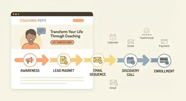
In this guide, we’ll build content around a simple set of stages:
By the time you finish, you’ll have a clear website flow and the core assets to support it:
The result is a coaching website that acts like a system—turning attention into conversations and conversations into program enrollment.
A funnel-based coaching website works best when it’s built around one clear promise for one specific type of person. If you try to speak to everyone, your copy gets vague—and vague sites don’t convert.
Start with a plain-English description of your ideal client. Include practical details (role, stage, situation) and a clear “not for” line to reduce mismatched inquiries.
For example:
This kind of clarity makes your content feel personal, and it filters leads before they reach your inbox.
Your offer needs a tight triangle:
When you name objections early, your pages feel honest—like you understand the decision.
Pick a single next step and build the site around it: book a discovery call, apply, or buy now. Everything else is secondary.
One primary action keeps the funnel clean and makes your calls-to-action consistent across the homepage, about page, and program page.
A message map is a one-page reference that keeps your website copy consistent:
With this in place, writing each page becomes faster—and your funnel reads like one coherent conversation.
Your site map should mirror the decisions a potential client needs to make: “Is this for me?”, “Do I trust you?”, and “What’s the next step?” When your pages match that sequence, your website feels simple—because it is.
Most coaching programs only need a handful of core pages to support a clean content funnel:
Design the site so visitors naturally flow in one direction.
For organic/content traffic:
Blog → Offer (or Proof) → Book/Apply
For direct traffic:
Home → Offer → Proof → Book/Apply
Your navigation should support this, not compete with it. A good rule: keep the top menu to 4–6 items (Home, Offer, About, Proof, Blog, Book/Apply). Everything else can live in the footer.
Choose calendar booking when:
Choose an application when:
Either way, the Book/Apply page should be the primary destination across the site—so every page answers questions and then points to that next step.
Your homepage isn’t the place to explain everything. Its job is to help the right person quickly think, “This is for me,” and then take one clear next step.
A conversion-focused homepage should do two things within the first screen:
If visitors have to “figure out” what you do, they’ll bounce—even if your coaching program is excellent.
Here’s a practical section flow you can copy:
Keep it skimmable. Most people won’t read top to bottom—they’ll scan for relevance.
Make your button text match the commitment level:
You can include a secondary link (like “View the program”), but don’t give five equal options.
Use short paragraphs, clear headings, and high-contrast text. Buttons should be large enough for thumbs, with action-focused labels (not “Submit”). Avoid walls of text, and make sure your primary CTA is easy to find on mobile.
A lead magnet is the “first yes” in your content funnel: a small, valuable resource someone can get in exchange for their email. For coaching, the best lead magnets don’t try to teach everything—they create momentum and prove your approach works.
A good lead magnet is:
Pick a format you can create in a day and improve later:
Your opt-in page should be focused and scannable:
Don’t end the experience at “Thanks.” Use the thank-you page to guide one next step:
This flow is small, but it’s where your website starts turning attention into real conversations.
An email nurture sequence turns a new subscriber into a confident, informed lead. The goal isn’t to “sell harder”—it’s to build trust, deliver a few real wins, and calmly handle objections people already have (time, money, “will this work for me?”, fear of failing again).
Email 1 — Welcome + set expectations (Day 0)
Deliver the lead magnet, tell them what to expect next, and ask one quick reply question (“What are you struggling with most?”).
Email 2 — Quick win (Day 1–2)
Teach one small step they can do in 10 minutes. Keep it specific.
Email 3 — Your story + the “before/after” (Day 3–4)
Share a short turning-point story that explains why your approach exists.
Email 4 — Handle a common objection (Day 5–6)
Pick one: time, consistency, confidence, support, or past failures. Show a reframe and a practical example.
Email 5 — Proof (Day 7–9)
Share a client result with context: starting point, what you changed, and the outcome.
Email 6 — Invite (Day 10–12)
Explain who your program is for, what happens next, and invite them to take one clear action.
Keep links minimal and intentional:
Use honest subject lines (no tricks), include your mailing address if required by your email provider, and always add a clear unsubscribe link. Most importantly: write like a coach, not a billboard—every email should stand on its own as useful, even if the reader never buys.
A coaching sales page isn’t just a “buy now” pitch. Its job is to qualify (help the wrong people self-select out), educate (clarify what changes and how), and invite action (book a call, apply, or enroll) with zero confusion about the next step.
1) The outcome (and a believable promise)
Lead with the result your client wants, plus a short line on what makes it realistic (timeframe, effort, support level).
2) Who it’s for (and who it’s not for)
Be specific: situation, goals, and readiness. A quick “not for you if…” reduces mismatched calls.
3) Your method (the path, not your life story)
Explain your approach in 3–5 steps. Keep it practical so readers can picture themselves doing it.
4) What’s included
Spell out deliverables: session frequency, messaging support, templates, community, feedback, and any boundaries (response times, office hours).
5) FAQ + objections
Use real questions from DMs and consults.
6) CTA (one primary action)
Repeat the same button and wording throughout (e.g., “Apply Now” or “Book a Discovery Call”). Link to /apply or /book.
Cover the big four: time, money, fit (“Will this work for someone like me?”), and fear of failure (“What if I don’t follow through?”). When your page answers these calmly, your calls become shorter—and more qualified.
People don’t buy coaching because the website is pretty—they buy because they trust you can help them get a specific result. Trust builders reduce the “is this for real?” feeling and make the next step (opt-in, booking, applying) feel safe.
Use a mix so visitors can find the kind of validation they personally rely on:
When asking, prompt clients with questions that create a clear before/after:
Example structure you can edit into a strong testimonial:
“Before coaching, I was ____. After __ weeks, I ____. The most helpful part was ____. I’d recommend this to ____.”
Get written permission to publish. Don’t imply guarantees (“you will earn $10k/month”) or hide important context. If you share metrics, add a brief note like “results vary based on effort and circumstances.”
Add proof in small doses, repeatedly:
Your “next step” should match your offer and your buyer’s readiness. If you make people jump through hoops too early—or let unqualified leads book your calendar—you’ll feel it fast.
Book a call works best when:
Apply is better when:
Buy now fits when:
Keep this page simple and specific:
Aim for 5–8 fields to qualify without creating friction:
Set up an immediate confirmation email with the calendar invite, the meeting link, and what to bring.
Add reminders (e.g., 24 hours and 1 hour before). If you use applications, send a status email (“received,” “approved,” or “not a fit”) so people aren’t left guessing.
Your blog isn’t “extra content”—it’s the top of your content funnel. Each post should attract the right person (awareness), help them name their problem (clarity), and give them a next step that leads to your opt-in (action).
If a reader finishes a post and doesn’t know what to do next, the funnel breaks.
Write posts that solve one small, specific problem your ideal client is already searching for. Teach just enough to create momentum, then offer a lead magnet that continues the same thread.
Example: a post about “why you keep procrastinating” can naturally invite a checklist like “The 10-minute reset routine” via /free-guide.
Use these as plug-and-play formats aligned to common coaching stages:
Every blog post should link to:
One opt-in that matches the post’s promise (e.g., /free-guide)
One business page that moves them closer to working with you—either /book for a call or /program for enrollment
Keep links contextual (inside sentences), not buried in a long list.
Start with 1 post per week (or biweekly if you’re busy). Aim for 900–1,400 words per post: long enough to be genuinely useful, short enough to finish in one sitting.
Publish consistently for 8–12 weeks, then double down on the posts that drive the most opt-ins.
A conversion-focused coaching website doesn’t need a pile of software. It needs a few tools that work together and make the next step obvious for your visitor.
At minimum, you’ll want:
If your website builder already includes forms or basic email, you can start there and upgrade later.
If you want to move faster than a traditional build, a vibe-coding platform like Koder.ai can also be a practical option: you describe the funnel pages you need (home, program, opt-in, emails, booking flow) in a chat interface, then iterate quickly as you refine messaging. For teams that care about ownership and reliability, Koder.ai supports source code export, deployment/hosting, custom domains, and snapshots/rollback—useful when you’re testing funnel changes over time.
Use these criteria to keep decisions simple:
Skip vanity metrics and track a few key steps:
Use UTM links in your emails and social bios so you know what sources lead to signups and bookings.
Create simple legal and trust pages such as /privacy and /terms. (This isn’t legal advice—if you’re unsure what you need, consult a qualified professional.)
Launching isn’t the finish line—it’s the start of learning what your visitors actually do. A simple 30-day improvement cycle keeps you moving without constantly rebuilding your site.
Go through your funnel like a brand-new visitor on desktop and mobile. Do it yourself, then ask one friend to do it while you watch.
Check every step:
If you use tracking, confirm that key events fire: opt-in, booking, application submit, and purchase.
You don’t need big redesigns. Start with a few quick tests:
Change one thing at a time so you know what helped.
Days 1–3: Fix obvious issues (broken links, confusing steps, mobile layout problems).
Days 4–10: Improve clarity: tighten headline, rewrite first CTA, add one proof block near the top.
Days 11–20: Review data weekly (page views, opt-in rate, booking rate). Collect 5–10 pieces of qualitative feedback: “What made you hesitate?”
Days 21–30: Run one focused experiment (new CTA wording, different lead magnet title, proof higher on the page). Keep what wins; revert what doesn’t.
Key pages to review: /pricing, /contact, /blog
Funnel-based content turns your website into a guided path where each page or post has a clear job (attract, capture, nurture, convert, enroll). Instead of chasing “more traffic,” you focus on qualified actions like email sign-ups, discovery call bookings, and applications from the right people.
Because clarity converts. When you serve one clear ideal client with one clear promise, your copy becomes specific, your calls-to-action stay consistent, and you get fewer mismatched inquiries. If you try to speak to everyone, your message turns vague and visitors don’t know what to do next.
Use these stages:
Each stage should point to one next step so the visitor always knows where to go.
A lean funnel-friendly site map usually includes:
Pick one primary action based on your offer:
Then make that action the consistent CTA across your home, offer, proof, and blog content.
Aim for a homepage that delivers clarity + direction above the fold:
Keep paragraphs short and make the CTA easy to tap on mobile.
Choose something that creates a quick win in 10–20 minutes and matches your ideal client’s situation. Effective formats include:
Your opt-in page should focus on one promise, 3–5 benefit bullets, one email field, and a simple privacy note.
A practical 6-email sequence is enough:
Use a structure that qualifies, clarifies, and invites:
If you don’t show pricing, explain what the call/application decides and who it’s intended for.
Track actions that map directly to enrollment:
Use UTMs in emails and social links to see what sources drive sign-ups and calls. Then run small 30-day improvements (headline specificity, CTA wording, proof placement, fewer form fields) one change at a time.
Keep top navigation to 4–6 items and push everything else to the footer.
Keep links minimal: one helpful resource and one conversion link (e.g., /book or /apply).