Oct 05, 2025·8 min
How to Build a Consultant Website with Lead Forms and Calendars
Step-by-step guide to build a consultant website that converts: clear positioning, service pages, lead forms, and calendar booking with simple integrations.
Step-by-step guide to build a consultant website that converts: clear positioning, service pages, lead forms, and calendar booking with simple integrations.
A consultant website isn’t a portfolio piece—it’s a sales assistant that works when you’re not in the room. The goal is to turn the right visitors into qualified leads and, ideally, a booked client discovery call.
Before you touch consulting website design, decide what “conversion” means for you:
This choice affects everything—homepage layout, service pages, your copy, and what you ask for in a form.
A high-performing consultant website supports a clear flow:
If any step is fuzzy, conversion rate optimization turns into guesswork.
You’ll assemble a practical lead engine: a focused homepage, specific service pages, lead forms that encourage replies, an appointment booking calendar that matches your workflow, and a simple follow-up system.
Most underperforming sites fail for predictable reasons: beautiful design with unclear positioning, vague website copy for consultants, too many calls-to-action, and no follow-up after someone reaches out. The fix usually isn’t more pages—it’s a clearer path to “yes.”
Before you pick a template or write a headline, get clear on what you’re selling and who it’s for. A consultant website works best when it helps the right people self-identify quickly—and helps the wrong people opt out.
You don’t need an ultra-narrow specialty, but you do need a specific “who” and “what.” Compare:
Clarity makes your service pages easier to write and your lead forms easier to qualify.
Use this simple formula:
I help [audience] achieve [outcome] by [approach], without [common pain].
Example: I help operations leaders in manufacturing reduce late orders by redesigning planning workflows, without adding new software.
This sentence becomes the backbone of your homepage hero, service page intros, and your “Book a call” pitch.
Pick one primary action across the site:
Whichever you choose, keep it consistent in your header button, homepage sections, and service pages.
Write down what a good-fit lead looks like. Typical criteria:
These points will directly shape your lead generation forms and your booking rules in later steps.
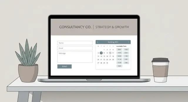
A consultant website shouldn’t feel like a full brochure. Its job is to move the right visitor toward one clear next step—usually a client discovery call booked through your appointment booking calendar or a short inquiry via lead generation forms.
Before you design anything, decide what you want most visitors to do:
When your structure matches this flow, you don’t need more pages—you need the right ones.
Homepage (trust + direction):
Your homepage should quickly confirm: “I’m in the right place, and I know what to do next.” Use it to state who you help, the outcomes you deliver, and a clear CTA button (“Book a discovery call”). Save the details for service pages.
Service page(s) (sell and pre-qualify):
Create one page per service line if they’re meaningfully different. Strong website copy for consultants explains outcomes, who it’s for/not for, your process, and your pricing approach (even if it’s ranges or “starting at”). This reduces mismatched leads and improves conversion rate optimization.
Case studies/testimonials (reduce perceived risk):
A dedicated proof page helps skeptical buyers. Include the situation, what you did, and measurable results when possible. If your work is confidential, anonymize details and focus on the transformation.
About page (credibility + connection):
This is where people decide whether they trust you. Keep it client-focused: your relevant experience, your approach, and why it benefits them.
Contact page (fallback):
Even if your calendar is the primary path, include a Contact page with a short form and clear expectations (response time, what details to include). This is also useful for media, partnerships, and referrals.
If you plan to invest in SEO for consultants, add a simple blog/resources section. Publish practical articles that match your buyers’ questions and link naturally to your service pages.
Next, you’ll design your homepage layout and CTA placement so visitors always know where to go.
Your homepage has one job: move the right visitors to one clear next step (usually a discovery call or inquiry form). A high-converting layout is less about clever design and more about clarity, proof, and momentum.
Start with a headline that says who you help and what outcome you deliver.
Headline formula: Who you help + outcome + timeframe/approach (only if accurate)
Examples:
Right under the headline, add:
Keep the CTA visually dominant and repeat it throughout the page—same label, same destination.
After the hero section, use outcome-focused blocks that answer what prospects are silently asking:
Add credibility where decisions happen:
Place one strong testimonial near the first CTA repeat.
Don’t leave visitors wondering. Under the button or form, add a short “Next steps” line, such as:
“Pick a time → answer 3 questions → get a short agenda email → meet for 20 minutes.”
That small clarity can be the difference between a click and a bounce.
A strong service page doesn’t just describe what you do—it helps the right people self-identify, understand the engagement, and take the next step with confidence.
Create one service page for each core offer (e.g., “Strategy Sprint,” “Fractional Ops,” “Leadership Coaching”). Mixing multiple offers on one page usually forces you into vague language and makes visitors unsure which option fits.
Keep each page focused on:
People hire consultants for outcomes, but they compare consultants using deliverables. Include both:
Add one short “What this is not” paragraph to prevent mismatched expectations (for example: “This isn’t done-for-you implementation”).
A clear process reduces uncertainty and signals professionalism. Keep it lightweight:
Write it in plain language and specify typical timing (e.g., “Weeks 1–2”).
You have three practical options:
End with a clear next action that matches intent (not everyone is ready to book).
Include a CTA block such as:
Link to your booking or contact flow using a relative link (e.g., /contact).
Your lead form is where “interested” turns into “action.” If it feels long, vague, or risky to submit, people will bounce. The goal is to make it quick to raise a hand, while still collecting enough detail to respond confidently.
Start by deciding what you’re optimizing for:
If your workflow requires a quick review before booking, use the form first and send qualified leads to scheduling on the thank-you page.
Every extra field is a reason to quit. A strong baseline is:
Then add 1–3 qualifying questions that help you route and prioritize. Examples:
People hesitate when they think they’ll be spammed. Use plain language like:
“By submitting this form, you agree to receive follow-up emails about your inquiry. Unsubscribe anytime.”
Skip scary, overly legal text—clarity builds trust.
After submission, send visitors to a dedicated thank-you page with next steps:
A good form doesn’t just collect leads—it sets expectations and starts the relationship well.
A booking calendar should make it easy for qualified prospects to meet you—without turning your week into a patchwork of calls. Aim for a scheduling experience that feels effortless to the visitor while still protecting your time.
Start by defining when you actually want calls to happen. Pick clear availability windows (for example, Tue–Thu mornings), then add buffer time so you can prep and write notes without running late.
Meeting length matters, too. If your calls regularly run over, don’t fight it—set the default duration to match reality. A calendar that reflects your real workflow reduces stress and creates a better first impression.
Most consulting sites benefit from two options:
Keep labels plain and outcome-focused. “Discovery Call” is fine, but “Discuss your goals and see if we’re a fit” is clearer. If you offer too many meeting types, prospects hesitate—so start with the minimum set that matches your sales process.
Use the booking step to gather context that helps you show up prepared. A few high-value fields usually outperform a long questionnaire:
This also pre-qualifies leads gently—people who can’t describe their goal may need a different entry point (like a contact form).
Enable instant confirmation emails and add at least one reminder (commonly 24 hours and/or 1 hour before). Include the call link, time zone, and what to prepare. A short, polite line like “If something changes, please reschedule rather than missing the slot” sets expectations without sounding strict.
Allow self-serve reschedule/cancel options, but set guardrails—such as a minimum notice period. This protects your calendar while keeping the experience respectful and low-friction.
If you want the rest of your site to support this, your homepage and service pages should point to the right meeting type with a single, clear CTA.
A lead form and a booking calendar are powerful on their own—but the real lift happens when they work as a single, intentional flow. Reduce friction for serious prospects while filtering out the “just browsing” crowd.
Decide what you want visitors to do next on each page: submit a form or book a time. If both are equally loud, people hesitate.
A practical rule: service pages often work best with a form-first CTA (“Tell me about your project”), while your contact page can be calendar-first (“Book a discovery call”).
A high-performing pattern for consultants is:
This does two things: it pre-qualifies the inquiry and makes the call more productive because you already have the basics.
If you don’t want to gate the calendar, you can still ask lightweight questions during booking—just don’t overload the scheduler.
Use the same CTA placement rhythm across key pages:
Avoid stacking multiple competing buttons in the same screen area (e.g., “Book,” “Download,” “Subscribe”). Choose the single next step.
Your button text and nearby microcopy should lower anxiety and set expectations:
When form → calendar feels like one continuous experience, your lead flow becomes smoother—and your calls get better.
A lead form or booking link is only half the system. The other half is what happens after someone clicks Submit or schedules a call—where their details go, how they’re organized, and how quickly you respond.
Start by choosing the “source of truth” for new inquiries:
If you want redundancy, send to all three—but keep the CRM as the primary record so you don’t manage duplicates everywhere.
Your form fields can do more than collect contact info. Use answers to automatically apply tags like:
Those tags can then route the lead to the right pipeline, assign an owner, or trigger the right email template—so you’re not starting from scratch every time.
At minimum, send an immediate confirmation that sets expectations:
If you automate, keep it short: 1 instant email + 1 reminder 24–48 hours later. The goal is clarity, not a newsletter.
Track three things end-to-end:
Use UTM links in your ads and social profiles, and store the UTM fields in your CRM so you can see which channels create real conversations.
Pick one integration method (native integration if available; otherwise an automation tool). Then test it like a prospect:
Do this before launch day and anytime you change a form field or calendar settings.
A consultant website should feel effortless on a phone: quick to load, simple to scan, and obvious where to tap. Speed and clarity aren’t “nice-to-haves”—they directly affect how many people reach your form or booking page.
Start by viewing every key page on a real phone:
Accessible pages are clearer for everyone:
Build pages that match how buyers search:
Install analytics (GA4, Plausible, or similar) to track form submissions and booking clicks. Add a simple /privacy-policy, and only show a cookie banner if your tools require it. Keep tracking statements accurate and minimal.
Launching isn’t the finish line—it’s the moment your consultant website starts proving whether your funnel actually works. Before you announce it on LinkedIn or email your list, run one end-to-end test that mirrors a real prospect.
Open your site on both desktop and mobile and go through the entire path:
Pay attention to the “in-between” moments: the thank-you page, the confirmation screen, and the tone of the emails. These are small, but they heavily influence whether someone shows up to a client discovery call.
A clean launch prevents embarrassing first impressions and protects your tracking:
If you want a deeper guide to form quality, keep it simple and start here: /blog/lead-form-best-practices.
Once real traffic hits the site, improve one thing at a time so you can tell what helped:
If you’re rewriting your pages, focus on clarity and specificity—this overview helps: /blog/consultant-website-copy.
If you want to ship a consultant website quickly—without stitching together a theme, form tool, calendar embed, and custom pages—you can use a vibe-coding platform like Koder.ai to generate a production-ready web app from a simple chat prompt, then iterate in “planning mode” before making changes. It also supports deployment/hosting, custom domains, source code export, and snapshots/rollback—handy when you’re testing new CTAs or form fields and want to revert fast.
Consistency beats big redesigns. Each month:
Over time, this creates a consultant website that doesn’t just look professional, but steadily improves lead generation forms, booking rates, and the quality of calls you take.
Choose one primary conversion and build everything around it:
Once you pick, keep the same CTA label and destination across the site.
Use a clear one-liner that a buyer can understand in 5 seconds:
I help [audience] achieve [outcome] by [approach], without [common pain].
Then place it in your homepage hero, service page intros, and near your main CTA so visitors immediately know who it’s for and what result you deliver.
Start with a small set of pages that support the lead flow:
Above the fold, make three things obvious:
Then build the rest of the page around outcomes, your process (3–5 steps), and a clear “what happens next” line under the CTA.
Create one page per core offer when the engagements are meaningfully different (timeline, deliverables, buyer type, or price point). It keeps copy specific and makes it easier for visitors to self-select.
If you mix multiple offers on one page, you usually end up vague, which increases low-fit inquiries and hurts conversions.
Include both, because buyers hire you for outcomes but compare you on deliverables:
Add a short “What this is not” paragraph to prevent mismatched expectations and reduce unqualified leads.
Keep fields minimal and add only a few qualifiers:
If you need more detail, use a multi-step form so it feels shorter and reduces drop-off.
Use form → calendar when you want better-fit calls and more productive discovery:
If you don’t need gating, let people book directly but keep scheduler questions lightweight so it doesn’t feel like a second long form.
Protect your time with simple rules:
If the calendar widget is slow on mobile, link to a dedicated page like /book.
Track the full funnel and test it end-to-end:
Before launch (and after changes), submit a test form, verify the lead lands in the right place, confirm tags/routing, and complete a test booking to ensure every email and reminder fires correctly.
Add a blog only if you’ll publish consistently for SEO.