Aug 13, 2025·8 min
Build a Daily Reset Checklist App: From Idea to Release
Learn how to plan, design, and build a personal checklist mobile app that resets every day, with clear data modeling, reset rules, reminders, and launch steps.
Learn how to plan, design, and build a personal checklist mobile app that resets every day, with clear data modeling, reset rules, reminders, and launch steps.
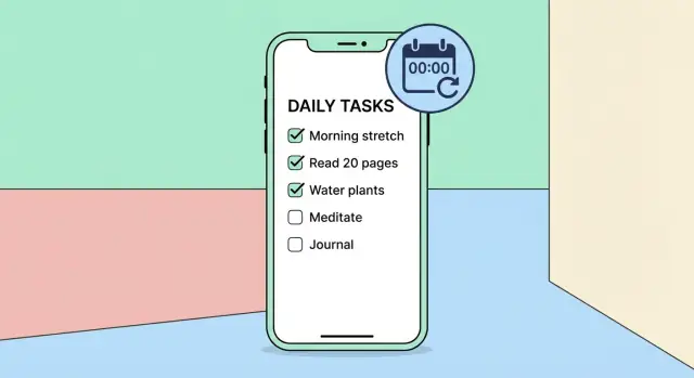
A “daily reset” checklist is a list of items you can tick off during the day, then have those ticks cleared automatically so the same list is ready again tomorrow. The key idea is that the list stays mostly the same, while completion status is per-day.
This is different from a to-do app where tasks are done once and disappear, and different from many habit trackers that focus on streaks, goals, and charts. A daily reset checklist is about getting through a reliable set of actions with as little thinking as possible.
People want this because daily life is repetitive. The win is not “planning,” it’s “execution.” If the app makes it easy to start, check items quickly, and stop, it becomes part of the routine rather than another system to maintain.
Common use cases include:
A daily reset checklist is for people who already know what they want to do, but don’t want to rely on memory. It fits users who value speed and consistency more than endless customization.
It’s not ideal for users who need complex project planning, dependencies, or heavy prioritization. If you try to satisfy both audiences, you usually slow down the daily experience.
To earn a place in someone’s day, the product needs a few non-negotiables:
Define what “good” looks like before building too much. Practical signals include:
If the daily reset feels predictable, fast, and trustworthy, users stop thinking about the app—and that’s the point.
Before you design screens or write code, decide what your app is. “Daily reset” can describe a few different product models, and choosing the wrong one creates confusing expectations.
A daily checklist is “today-only”: you start fresh each day and tap items as done. It’s great for routines like “make bed” or “review calendar,” where the goal is completion, not long-term streaks.
Recurring tasks behave more like a to‑do list with due dates and repeat rules. Users expect flexibility: skip days, shift due dates, and keep unfinished items visible. This model is better for obligations (e.g., “pay rent monthly”).
A habit tracker focuses on consistency over time. Users expect streaks, charts, and “did you do it?” history. If you don’t plan to support insights and motivation features, a pure habit tracker can feel incomplete.
A practical approach is to start as a daily checklist and add light history later, without promising full habit analytics.
Decide what “done” means:
Keep the MVP simple: optional items by default, with an optional “required” toggle if your audience needs it.
A single list is fastest. Multiple lists (Morning / Work / Evening) add clarity but also extra UI decisions: ordering, switching, and what “finished” means across lists.
If you offer multiple lists, make them feel like tabs—not separate apps.
Backfilling is powerful but complicates trust (“Did I really do it?”). For a simple daily reset app, allow viewing past days early on, and add editing past days only if users explicitly ask for it.
A daily reset checklist app succeeds when it’s faster than paper, not when it has every feature on day one. The MVP should prove one thing: people can create a daily checklist, complete it with zero friction, and trust that it resets predictably.
Keep the first release tight:
If you can ship those four, you’ve built a real daily checklist app—not a demo.
These can wait until you see consistent usage:
Be explicit about what you’re not building yet:
This clarity also helps with positioning: you’re building a checklist-first product, not a complex habit suite.
Write a handful and build exactly what they describe:
A daily reset app wins or loses in the first five seconds. The UX goal is simple: open the app, see “today,” tap to complete, and get on with your day. Everything else should stay out of the way until the user asks for it.
Home (Today) is the default landing screen. It should show the current date, one active list (or a clear list switcher), and the items for today.
From there, navigation stays shallow:
Keep “Manage lists” as a separate space so organizational tasks don’t interrupt daily completion.
Daily usage is repetitive, so tiny details matter:
The Home screen should feel stable. Completed items can collapse or move to a “Completed” section, but don’t make them disappear without an option.
Use large tap targets (especially for checkmarks), clear contrast, and text that respects system font size.
Support VoiceOver/TalkBack with meaningful labels (“Mark ‘Take vitamins’ complete”) and predictable focus order. Avoid relying on color alone to show status.
A blank screen is confusing. On first run, show a short onboarding card and preload an example checklist (editable and removable). The empty state should answer: what is this app, what do I do next, and where do I tap to add my first item.
A daily reset app feels simple on the surface, but the data model decides whether it stays simple as features grow. Aim for a model that can answer three questions quickly: “What should I do today?”, “What did I complete today?”, and “What’s my history?”
List
A container for related items (e.g., “Morning”, “Work Shutdown”). Typical fields: id, name, color (optional), createdAt.
Item
A checklist entry that can be completed every day. Typical fields:
id, listIdtitleorder (for stable sorting)enabled (hide without deleting)notes (optional)reminderTime (optional, local time-of-day)Completion
A record that an item was checked on a specific day. Typical fields: id, itemId, dateKey, completedAt.
Settings
User-level preferences: day-start time (if you support it), notification toggles, backup/sync options.
Storing a mutable boolean like item.isDoneToday looks tempting, but it creates edge cases (midnight, travel, DST, or reopening the app days later).
A cleaner approach is to store completions by date and derive today’s checked state by querying: “Is there a completion for this item with today’s dateKey?” This gives you reliable history and makes “reset” essentially free.
List(id, name, ...)
Item(id, listId, title, order, enabled, reminderTime, notes)
Completion(id, itemId, dateKey, completedAt)
Settings(id, timeZoneMode, dayStartHour, ...)
Use a stable dateKey such as YYYY-MM-DD computed in the user’s current local time (or a chosen “home” time zone if you support that). Store completedAt as an absolute timestamp for audit/history.
When daylight saving time shifts, avoid “24 hours ago” logic. Instead, compute “today” by calendar date in the selected time zone, so a short or long day doesn’t break resets or streak-like summaries.
Daily reset is the feature users notice fastest—when it’s right, the app feels effortless; when it’s wrong, it feels unreliable. The goal is behavior people can predict.
You have three sensible options:
Whatever you pick, show it clearly in settings and in the UI copy (“Resets at 4:00 AM”).
Users usually expect checkmarks to clear. Everything else should be a conscious choice:
A safe default is: reset completion state only, keep content.
Resets must work even if the app isn’t running at the reset moment. Plan for:
Use two checks: one when the app opens, one scheduled in the background.
Store:
- resetTimeMinutes (e.g., 0 for midnight, 240 for 4:00 AM)
- lastResetDayKey (e.g., YYYY-MM-DD according to local time + resetTime)

On app open:
- compute currentDayKey
- if currentDayKey != lastResetDayKey:
    clear daily completions
    lastResetDayKey = currentDayKey

In background:
- schedule a job/notification to run shortly after next reset boundary
- when it runs, do the same dayKey check and reschedule the next one
The “day key” approach prevents double-resets and makes behavior consistent across missed events.
Notifications can make a daily checklist feel supportive—or get your app muted forever. The goal is to help users at the right moment with the least possible noise.
Start with one clear default and let users adjust later. Common options:
For an MVP, one daily prompt plus an optional summary usually covers most needs without creating notification overload.
Local notifications are fast, reliable, and don’t require accounts or servers. When asking for permission, be specific about the benefit: “We’ll remind you once per day at the time you pick.” Avoid asking on first launch; wait until the user sets a reminder time so the request feels earned.
Give a simple control panel:
A great compromise is a nudge: send a reminder only if items remain unchecked. For example, an evening notification triggers only when the checklist isn’t finished. It feels helpful, not spammy—and users keep it on longer.
An app people open every morning should feel instant and dependable. The safest way to get there is to treat the phone as the primary source of truth—at least at first.
Store checklists and completions locally so the app works on airplanes, in basements, and during spotty commutes. Local-first also keeps the “open → check off → done” loop fast because you’re not waiting on network calls.
A practical baseline is:
Even if you don’t build login on day one, design your data so it can be synced. The tricky part isn’t uploading—it’s conflict resolution.
Make early decisions such as:
For a daily reset app, a simple and predictable rule set beats clever merging. Users mostly want their current day to look right.
Users will ask, “If I lose my phone, do I lose my routine?” Offer realistic options:
Be explicit about what’s included (lists, item notes, completion history) and what isn’t.
Daily routines can be personal and sometimes health-adjacent. Default to minimal data collection, keep sensitive data on-device when possible, and explain plainly what leaves the phone (especially if you introduce sync). Trust is a feature here, not a footnote.
A daily reset checklist app looks simple, but it touches a few gotchas (time, notifications, offline use). The goal is a stack that stays easy to reason about as you add features.
Cross-platform (Flutter / React Native) is usually fastest for an MVP: one codebase for iOS and Android, shared UI logic, and fewer duplicated bugs. You may spend extra time polishing platform-specific interactions (navigation feel, widgets, accessibility quirks), but for a checklist app it’s rarely a dealbreaker.
Native (Swift + Kotlin) gives the most predictable platform behavior and top-tier UX polish, especially around system integrations (widgets, Siri/Shortcuts, Android tiles). The trade-off is cost and velocity: two codebases, double the UI work, and more coordination.
If your core promise is “open, tap, done,” cross-platform is a practical default—go native later if you need deeper platform features.
Keep the app in three clear layers:
This separation prevents notification logic from leaking into UI code and makes testing date/time behavior simpler.
Use SQLite via a friendly wrapper (Room on Android, Core Data/SQLite on iOS, or an equivalent plugin in Flutter/RN). It handles thousands of items smoothly, supports queries like “show today’s checklist,” and survives app restarts without surprises.
Store preferences in lightweight key–value storage:
Keep settings in one place and have the data/notification layers subscribe to changes so reminders and reset behavior update immediately.
If you’re validating the idea and want to move quickly, a vibe-coding workflow can help you ship an MVP sooner—especially for “standard” pieces like list CRUD, settings screens, and a simple backend for optional sync.
For example, Koder.ai lets you build web, server, and mobile apps from a chat-driven planning flow, with agents under the hood. It can generate a React web UI, a Go + PostgreSQL backend, and a Flutter mobile app, then support deployment/hosting, custom domains, and source code export. For a daily reset checklist product, that can shorten the path from spec → working prototype, while you still keep tight control over the core logic (date boundaries, offline-first storage, and notification behavior).
A daily reset checklist app often holds sensitive patterns: health routines, medication reminders, therapy exercises, or personal goals. Trust is a feature. If people worry their data is being mined or shared, they’ll abandon the app—even if the UX is great.
Start with the assumption that everything can live on the device. For many MVPs, you don’t need accounts, email addresses, contact lists, analytics identifiers, or location.
If you do add analytics later, keep it minimal and focused on product quality (crash reports, basic feature usage), not personal content. A simple rule: you shouldn’t be able to reconstruct a user’s checklist from anything you collect.
On modern phones, on-device storage is already protected by the system when the device is locked. Build on that:
Also think about “shoulder-surfing” moments: a simple “Hide completed items on lock screen previews” setting for notifications can reduce accidental exposure.
Ask for permissions only when needed, and explain why in plain language:
Don’t request permissions on first launch unless the user is actively enabling that feature.
Write a short, readable privacy summary for your app store listing: what you store, where it’s stored, what you share (ideally nothing), and how users can delete their data. Keep it consistent with the actual product behavior.
Daily-reset apps fail in surprisingly specific ways: the checklist “unchecks itself” at the wrong time, reminders fire late, or travel makes yesterday reappear. Testing should focus less on UI polish and more on time.
Define one source of truth for “today” (usually device local time plus a user-configured reset hour). Then test behaviors on both sides of that boundary:
Include daylight saving time changes (spring forward and fall back), and test traveling:
Reminders are easy to get wrong. Validate:
Add unit tests for date math (reset boundary, DST, time zones) and for data migrations (old records load correctly, no crashes on upgrade).
Ask testers:
Launch is less about a single day and more about setting your app up to learn quickly without annoying users. A daily reset checklist app should feel calm and predictable on day one—and improve steadily after.
Before you submit, prepare store assets that match the experience:
Double-check your store listing matches reality: if notifications are optional, say so; if data stays on-device by default, highlight it.
Define a small set of events so you can answer: “Are people reaching the ‘aha’ moment?” Track:
Prefer aggregated metrics over detailed behavior, and keep identifiers minimal.
Set up one path for help: an in-app “Help” screen with a short FAQ (reset timing, time zone behavior, notifications, backups) and a “Contact support” action that includes app version and device info.
Ship small improvements on a rhythm (weekly or biweekly). Common early wins:
Let real usage guide your roadmap: optimize the daily flow before adding advanced features.
If you’re experimenting with growth, consider adding lightweight loops that don’t affect the core experience—like a referral link or an “earn credits” program for users who create content. Platforms such as Koder.ai offer both referral and content-credit mechanics, and the same idea can be adapted carefully for a checklist app as long as it stays optional and doesn’t clutter the daily flow.
A daily reset checklist keeps the same set of items, but clears completion at a predictable day boundary so it’s ready again tomorrow. The value is speed and reliability: you open the app, check items, and close it—without replanning the list each day.
A to-do app expects tasks to be completed once and then disappear or get archived. A daily reset checklist expects tasks to repeat by default, and the primary question is “Did I do this today?” rather than “Is this task finished forever?”
Habit trackers usually emphasize streaks, goals, charts, and long-term consistency. A daily reset checklist emphasizes execution with minimal friction. You can add light history later, but if you don’t plan to support deep analytics, avoid positioning it as a full habit tracker.
Start with a daily checklist if your core promise is “open → tap → done,” and most items should be done nearly every day.
Choose recurring tasks if users need:
Defaulting to optional keeps the MVP simple and reduces guilt.
Add a required toggle only if users truly need a “finish the day” signal (with a clear summary).
Treat timed items carefully—they imply reminders, late/early states, and more notification complexity.
One list is fastest and least confusing. Multiple lists (Morning/Work/Evening) can help clarity, but add UI overhead (switching, ordering, defining what “done” means across lists).
If you support multiple lists, make switching feel lightweight (like tabs) and keep “Manage lists” out of the daily flow.
In most cases, don’t allow editing past days in v1.
A practical approach:
This avoids trust issues like “Did I really do it, or did I edit it later?”
Don’t store a mutable isDoneToday flag. Store completions by date and derive “done today” from queries.
A simple model:
ListItemCompletion(itemId, dateKey, completedAt)This makes reset behavior predictable and gives you history “for free.”
Be explicit about the reset boundary:
Use a dateKey like YYYY-MM-DD computed in the chosen local/timezone context, and avoid “24 hours ago” logic so DST and travel don’t break the reset.
Start with one daily prompt and (optionally) an evening summary/nudge only if needed.
Good defaults:
If notifications feel noisy, users will disable them—opt for fewer, smarter reminders.