Oct 13, 2025·8 min
Build a Founder Website to Share Experiments and Failures
Learn how to plan, write, and launch a founder website that documents experiments, failures, and lessons—without overengineering or losing your voice.
Learn how to plan, write, and launch a founder website that documents experiments, failures, and lessons—without overengineering or losing your voice.
Before you pick a theme or write your first post, decide what this site is for. A founder website that shares experiments and failures works best when it has a clear intent—and clear limits.
Your purpose is the filter for what you publish and how you write. Common, founder-friendly reasons include:
Write your purpose in one sentence. Example: “I publish experiments to document my learning and make it easier for customers and future teammates to see how I work.”
If “experiment” is too narrow, you’ll run out of material. If it’s too broad, the site becomes a random diary. A useful definition can include:
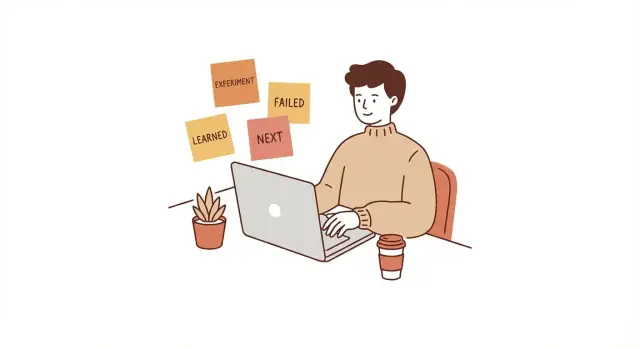
The key is that an experiment has a hypothesis, a change you made, and an outcome—good or bad.
Consistency beats intensity. Pick a rhythm that survives busy weeks:
You can also commit to a minimum: “One post per month, plus short notes when something breaks.”
Decide what you will not share, and stick to it. Typical boundaries include legal constraints, private financial details, sensitive team situations, customer information, and anything involving partners where you don’t have explicit permission.
A simple rule: if a detail could harm someone, violate trust, or create legal risk, summarize it at a higher level.
Success doesn’t have to mean traffic. Pick one or two signals that match your purpose: thoughtful replies, inbound opportunities, clearer thinking, a portfolio of startup lessons learned, or a reliable record of failure postmortems and wins. With that definition in place, the site becomes easier to maintain—and easier to be proud of.
A founder site gets easier (and more valuable) when you stop writing “to everyone” and choose one primary audience. Your experiments and failures can help lots of people, but clarity beats coverage.
Choose the one group you most want to serve right now:
You can still welcome others, but your default reader should be obvious.
Write these down and keep them near your editor. Examples:
Your point of view is mostly consistency. A simple set of voice rules keeps posts useful:
One sentence that tells readers what to expect:
“I run small, time-boxed startup experiments and publish what worked, what failed, and what I learned—without the gloss.”
Pick a baseline so you don’t renegotiate every post: will you include numbers, screenshots, and timelines by default? A practical rule: share enough detail that a reader could reproduce the experiment, while keeping sensitive info private (you can redact or round figures and still be credible).
A founder site works best when visitors can understand what you do—and find your experiments—within a few seconds. Aim for a small set of “forever” pages, and treat everything else as optional.
Home: A short explanation of what you’re building and why you publish experiments and failures. Put a prominent entry point to your latest experiments and a quick way to subscribe or follow along.
About: Your credibility, values, and context. Keep it practical: what you’re working on, what you’ve learned, and what readers can expect from your writing.
Experiments: The main archive. This is the hub where people browse your posts, filter by category/tag, and open any experiment in one click.
Now: A “current focus” page. This prevents your Home and About from becoming outdated, and it gives repeat visitors a reason to return.
Contact: A clear, low-friction way to reach you (email or a simple form) plus guidance on what you welcome (introductions, partnerships, press, speaking).
If they support your goals, consider: Speaking, Press, Uses (tools/workflow), Projects (active and past), Newsletter (a dedicated landing page). Optional pages should never bury your experiments; they’re supporting actors.
Use a top navigation that is short and predictable. A good default is:
Home · Experiments · About · Now · Contact
If you add an optional page, make it earn its spot. If your menu wraps to two lines on mobile, it’s too long.
Choose one primary CTA and repeat it consistently: Subscribe or Follow the journey. Then add a secondary CTA for people with intent: Contact. Place CTAs on the Home page and at the end of experiment posts.
Structure isn’t just menus—it’s how easily someone can scan on a phone. Keep page titles obvious, use short sections, and make sure buttons and text aren’t cramped. If your Experiments page is hard to browse on mobile, your best work might never get read.
Your homepage isn’t the place to explain everything you’ve ever done. It’s a promise: what visitors will get here, how often, and what kind of honesty you practice. When that promise is clear, the right people stick around—and the wrong people self-select out (which is a gift).
In the first screen, write two short lines:
Keep it specific enough that someone can say, “Yes, that’s me.” Avoid buzzwords. Plain language builds confidence.
A founder homepage benefits from credibility, but it should match the tone of public learning. Use a small “Previously” strip with 2–4 items, such as:
The rule: proof, not hype. If you’re early, it’s okay to be light here.
Add a compact “Current Experiments” block. This turns your site from “personal bio” into “working lab.” Keep it simple:
This gives returning visitors a reason to come back even between big posts.
Pick three featured slots: one failure, one lesson learned, and one experiment template example. If you haven’t published yet, use placeholders like “Coming next: Why my onboarding test failed” so the site still signals direction.
Choose a single CTA: newsletter or email updates. Say what people will receive (“one note per week: what I tested, what broke, and what changed”). Make it easy to join without hunting through menus.
A good homepage sets expectations, reduces confusion, and earns permission to be imperfect in public.
Your About page isn’t a resume. It’s a credibility shortcut: a clear explanation of who’s running the experiments, what “winning” looks like, and how you’ll behave when things get messy.
Give readers quick orientation in three beats:
This format helps people understand your context before they judge your results.
Trust grows when readers know your boundaries. Add a short “Operating rules” paragraph covering:
Constraints make your posts easier to interpret—and make your decisions feel grounded, not performative.
Include a clear photo so readers feel they’re following a real person.
Then add one personal detail that signals steadiness and accountability (not oversharing). Examples: where you’re based, a long-term hobby that shows patience, or a brief note on why you care about the problem.
Be explicit about the benefit. For example: you share readable postmortems, repeatable templates, and honest numbers when possible—so others can avoid your mistakes or copy what works.
Finally, make it easy to keep up: mention a /now page for your current focus and a /contact page for feedback, introductions, and corrections.
A repeatable post format makes it easier to publish consistently—and easier for readers to learn from you. Instead of reinventing your structure each time, use one template that works for both wins and failures.
Open with 3–5 lines that answer: What did you try, what happened, and what’s changing next? Many people will only read this section, so make it complete on its own.
Use the same sequence in every experiment post:
Metrics are only useful when readers can judge how “real” they are. When you include results, add quick context like:
This keeps you honest and prevents readers from overgeneralizing.
Close with one specific question that invites feedback: “If you’ve tested onboarding emails, what subject lines performed best?” or “What would you try next to reduce churn in week one?” This turns posts into conversations—and often into better next experiments.
If you want people (and future-you) to learn from your experiments, they need a predictable way to browse. Categories answer “what kind of work is this?” Tags answer “what’s it about, specifically?” Together, they prevent your site from turning into an endless scroll of unrelated posts.
Use categories as your top-level buckets. Keep them few, clear, and mutually exclusive.
A founder-friendly starting set:
When an experiment fits two categories, pick the one where a reader would most expect to find it. Consistency beats perfection.
Tags should capture the “ingredients” of the experiment—things you might want to cross-reference later.
Good tag types:
Aim for 3–6 tags per post. If you add 12 tags, you’re no longer organizing—you’re annotating.
Create an Archive page that lets readers filter by category and tag, so they can answer questions like “show me all pricing experiments” without searching.
Add a small “Best of” list at the top (5–10 posts) for people who want the highlights. This also helps new visitors understand your thinking style quickly.
For longer efforts, create series pages (e.g., “30 Days of Cold Email”) that collect every part, show the timeline, and summarize what changed from one iteration to the next.
Set a rule for post titles: include the outcome or metric when possible.
Examples:
Clear labels help readers self-select—and they keep your archive useful as it grows.
You want feedback loops, not a wall of charts. The goal of adding metrics to a founder website is to learn what resonates and what drives meaningful conversations—without turning every post into a performance report.
Use a simple analytics setup and pay attention to direction over time, not one-day spikes. A post that quietly drives a steady trickle of replies for three weeks is usually more valuable than a post that goes mini-viral and disappears.
If you find yourself checking numbers daily, you’re probably optimizing for feelings, not learning.
Pick a few goals that match why the site exists. Good “founder-friendly” metrics include:
Everything else is supporting context. Pageviews are fine, but they don’t tell you whether people trust you.
When you share an experiment post on different channels, add UTM parameters so you can tell where attention is actually coming from. Keep it simple and consistent (same naming conventions each time), and treat it as a way to learn distribution—not to “game” attribution.
Instead of cluttering posts with numbers, keep a private “metrics log” page or document. For each experiment, jot down:
Your public post stays readable; your private log stays honest and specific.
Once a month, review your trends and pick one or two changes to test next—maybe a clearer call-to-action on posts, a different homepage headline, or a simpler signup flow. The habit matters more than the perfect metric.
Sharing experiments and failures is valuable, but it can also expose people who didn’t sign up to be part of your story. A simple ethics layer protects your relationships, your readers, and your future self.
Add a small “Disclosure” note (footer or a dedicated page) that states, in plain language:
Keep it brief and consistent. The goal is clarity, not legal theater.
Decide your defaults and follow them every time:
If naming a person or company could damage their reputation, hiring prospects, or commercial position, don’t do it. Focus on the decision, the constraint, and the lesson. You can still be honest without being specific.
Include a short “Corrections” line: what you’ll fix (factual errors, misquotes), what you won’t (changing history), and how readers can report an issue (a simple email address is enough).
If you collect emails, say what you collect, why, where it’s stored, and how to unsubscribe. Promise not to sell addresses—and mean it.
The best toolset is the one you’ll still use when you’re tired, busy, or a little embarrassed about the results. Optimize for consistency and low maintenance—not endless tweaking.
You have three practical options:
Whichever you choose, set a “no-fiddling” rule: if a change doesn’t improve clarity for readers, don’t do it.
If you’re also building product alongside your writing, consider tooling that reduces “setup tax.” For example, Koder.ai lets you vibe-code web apps through a chat interface (React on the front end, Go + PostgreSQL on the back end) and supports deployment, hosting, custom domains, snapshots, and rollback. That can be helpful if your founder site includes interactive elements like an experiment archive, tagging, or a lightweight newsletter signup flow—and you’d rather iterate fast than maintain a traditional pipeline.
Your site is basically a reading environment. Prioritize:
A simple, consistent layout will make your experiments feel more credible than a flashy theme.
Decide your URL pattern once and stick to it. A consistent structure makes your archive easier to browse and share. For example:
/experiments/slug/failures/slugThen set up a basic post template in your tool (or as a saved draft): opening context, what you tried, what happened, what you learned, what you’d do next.
If you add a newsletter, keep it minimal: one field, clear expectation (“monthly notes” vs. “weekly”), and a double-check on the confirmation flow. Test it end-to-end so you know:
Create a one-page style guide you can follow on autopilot: headings, callouts, how you present numbers, and what screenshots or charts should look like. The goal isn’t perfection—it’s reducing decision fatigue so you keep shipping honest updates.
Launching your founder site doesn’t require a “big reveal.” The goal is to ship a simple version, then build momentum through a repeatable routine. Treat publishing like an experiment: small scope, clear next step, steady cadence.
Create a checklist you can run in 30–45 minutes so you don’t rely on motivation:
Keep the checklist in the same place you write—so “publish” is the default outcome.
Maintain a running backlog of post ideas. Each entry should be just:
Whenever you finish a meeting, ship a feature, lose a deal, or change pricing, add one line to the backlog. You’re capturing future material, not writing a novel.
For every full post, repurpose into three smaller updates:
This keeps the site as the “source of truth,” while your updates simply point people back to the full write-up.
Don’t ask for “thoughts.” Ask a specific prompt, such as: “What would you test next?” or “Where is my logic weakest?” Add a clear way to respond (a contact page or a visible email address).
Set a realistic cadence (e.g., one experiment post every two weeks). Track streaks, not vanity metrics. The win is consistency—and a growing archive of lessons you can reuse in pitches, hiring, and decision-making.
Start with a one-sentence purpose and a few clear boundaries.
These two lines will guide your structure, tone, and what you choose to publish.
Use a definition that’s broad enough to sustain, but structured enough to stay useful.
An experiment should include:
This works for product, marketing, ops, and even founder habits—without turning into a random diary.
Pick the cadence that survives your busiest weeks.
You can also set a minimum: “one post per month + short notes when something breaks.”
Set your “won’t share” rules upfront and default to summarizing sensitive details.
Practical boundaries to consider:
If a detail could harm someone, violate trust, or create legal risk, raise the level of abstraction.
Choose one primary audience so your posts are easier to write and more valuable to read.
Common primary audiences:
Then keep 3–5 audience questions near your editor (e.g., “What did you try?” “What changed your mind?”).
A simple, practical set of pages is enough.
Minimum “forever” pages:
Keep navigation short (e.g., Home · Experiments · About · Now · Contact) and make sure experiments are always one click away.
Treat the homepage like a promise, not a biography.
Include:
The goal is fast clarity: the right readers stay; the wrong readers self-select out.
Use a repeatable structure so publishing stays easy and readers can compare experiments.
A solid template:
Start with a 3–5 line summary and end with one specific question to invite feedback.
Use a small set of stable categories and lightweight tags.
Aim for 3–6 tags per post, and consider an archive page that filters by category/tag plus a small “Best of” list.
Track only the metrics tied to your purpose, and review trends—not daily spikes.
Founder-friendly outcomes:
Use UTMs to understand sources, keep detailed metrics in a private log, and do a monthly review to pick 1–2 improvements (CTA, homepage headline, signup flow).