Apr 23, 2025·8 min
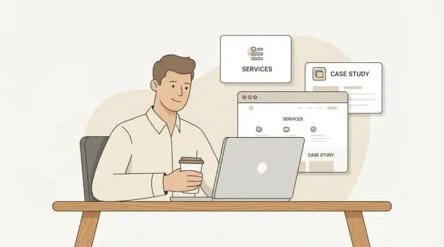
Build a Freelancer Website to Showcase Services and Case Studies
Step-by-step guide for freelancers: choose a platform, structure pages, write service copy, publish case studies, add CTAs, and improve SEO to get leads.
Step-by-step guide for freelancers: choose a platform, structure pages, write service copy, publish case studies, add CTAs, and improve SEO to get leads.
A freelancer website works best when it’s built around one clear outcome. Before you choose colors, templates, or a logo, decide what you want visitors to do—and why they should pick you.
Pick the single action that matters most right now:
Everything on your site should support that action—especially your home page, service pages, and contact flow.
“Anyone who needs design/writing/dev” is too broad. Instead, describe:
This is the foundation of a strong freelancer personal website: it makes your messaging specific and helps the right clients self-identify quickly.
Avoid listing everything you’ve ever done. Choose 1–2 services to headline (e.g., “Landing page copy” and “Email sequences”). If you offer extras, treat them as add-ons or secondary options so the main offer stays easy to understand.
Proof doesn’t have to be perfect. Gather what you can today:
Pick one number to track for the next 30 days, such as qualified inquiries per month or calls booked per month. This keeps your website focused—and makes it easier to improve later.
Before you design anything, pick tools you can actually maintain. A freelancer website that’s “almost done” for months is usually a platform mismatch.
Website builders (Webflow, Squarespace, Wix) are great if you want speed, hosting included, and a visual editor. They’re ideal when you’d rather tweak layouts than troubleshoot plugins. Expect a monthly fee, and check whether basic SEO settings, forms, and analytics are included.
WordPress makes sense if you want flexibility, lots of templates, and room to grow (blog, booking, memberships). The trade-off is more setup: hosting, updates, backups, and occasional plugin conflicts. If you enjoy customizing—or have someone who can help—WordPress can be a strong long-term choice.
A simple one-page site is a smart option if your offer is clear and you mainly need credibility: services, a few proof points, and a contact button. It’s also a good “version 1” you can expand later.
Vibe-coding platforms (like Koder.ai) can be a strong middle ground when you want a custom site without living in code or fighting templates. With Koder.ai, you can describe your freelancer website structure (pages, sections, CTAs) in chat and generate a working web app (React frontend, Go backend with PostgreSQL if needed), then export source code or deploy with hosting and custom domains. It’s especially useful if you want to iterate fast—snapshots and rollback help you test changes without fear.
Pick a domain that matches your personal brand: yourname.com or yourname.co is usually best. If it’s taken, add a simple modifier like “studio” or your niche—avoid long, hyphen-heavy names.
Set up a professional email like hello@yourdomain. It’s a small detail that signals you’re established.
Write down the pages you’ll launch with (home, services, case studies, about, contact) and the key message for each. With that mapped, choosing a template and layout becomes much easier.
A freelancer website works best when it answers a visitor’s questions in a predictable order: “What do you do?”, “Can you prove it?”, “How do I hire you?” Keep the structure small, with one clear action per page.
Home: orient new visitors and send them down the right path. Primary action: click into your main service or book a call.
Services: explain what you offer, who it’s for, what it costs (or how pricing works), and what happens next. Primary action: request a quote / book a call. This is your core freelance services page experience.
Case Studies / Work: show proof with outcomes, constraints, and your process. Primary action: view a relevant case study or contact you.
About: build trust and credibility without turning into a life story. Primary action: reassure and move them to Services or Contact.
Contact: convert intent into a qualified inquiry. Primary action: submit the form.
Use a short top navigation: Home, Services, Work, About, Contact. Put the same links in the footer, plus essentials like your email, location/time zone, and a link to your privacy policy if you collect form data.
Add a consistent CTA in both the header and footer—something like “Book a call” or “Get an estimate.” Repetition helps visitors find the next step without hunting.
Many clients land on your site cold. Give them a guided route:
This turns your site into a simple client journey instead of a menu of pages.
Your home page has one job: help the right client quickly understand what you do, trust that you can deliver, and take the next step.
Start with a headline that answers two questions in plain language: who you help and what you deliver. Avoid vague positioning like “creative solutions” or “full-service.” Instead, make it easy for a client to self-identify.
Examples:
Directly under the headline, add 2–3 key benefits that describe outcomes (not tools, not personality traits). Think results a buyer actually wants: more leads, faster delivery, clearer messaging, fewer revisions, smoother launches.
Above the fold (what people see before scrolling), place a single clear call to action such as “Book a call” or “Get a quote.” Make it visually obvious and repeat it later on the page.
If you offer multiple services, don’t list every option in the primary CTA. Your home page should guide visitors into one next step, not a menu of decisions.
Include one strong proof element near the top—ideally a short testimonial that names the outcome, or a quick result snippet (e.g., “Cut onboarding time by 30%”). This reduces skepticism before a visitor invests time scrolling.
If you have multiple proof points, keep the top section lightweight and link to more detail later (e.g., your case studies section or a /work page).
A short “How it works” section builds confidence because it answers the unspoken question: What happens after I contact you?
Keep it simple and client-centered:
This is also where you can set boundaries politely (response times, number of revision rounds, typical timelines) without sounding defensive.
A high-converting home page is not a full resume. It’s a clear front door that funnels visitors to:
If you’re unsure what to cut, remove anything that doesn’t help a client decide: “Is this for me?” and “Should I reach out now?”
A strong service page isn’t a brochure—it’s a decision page. It should help a client quickly confirm: “This is for me, I understand what I get, and I know what to do next.” The easiest way to do that is to create separate pages for your main offers (instead of one long list).
Aim for 2–5 primary services that match what you want to sell most. Each service gets its own page so you can be specific, add proof, and rank for the right searches.
Example structure:
Keep the copy plain and concrete. A simple template that works:
Who it’s for
Name the client type and the situation (e.g., “B2B teams launching a new product page” or “founders who need a clear pitch before fundraising”).
What you’ll deliver
List tangible outputs: number of pages, concepts, drafts, files, formats, and what “done” looks like.
Timeline
Give a typical range and what affects it.
What’s included
Spell out meetings, research, handoff, and support—so clients don’t have to guess.
Add a small FAQ that covers the buying friction points:
Don’t make people hunt. Use one primary call to action near the top and again at the bottom:
If you qualify leads, mention what to include in the message (budget range, deadline, goal). That turns your service page into a filter—saving time for both sides.
A strong case study isn’t a long story—it’s proof that you can solve a specific problem for a specific type of client. The easiest way to keep them consistent (and fast to write) is to use the same case study template every time.
Think of each case study as a one-page “project receipt” that answers the questions a buyer has before they email you:
Context → Goal → Your role → Approach → Result
This structure helps you avoid vague write-ups like “helped with marketing” and instead communicate clear value.
Buyers trust what they can see. Add 2–5 artifacts that make the work feel real:
A good rule: if someone skimmed the visuals only, they should still understand what you did.
Quantified results are great only if you can verify them (analytics screenshots, client confirmation, invoices, etc.). If you can’t, describe impact in practical terms:
Clarity beats big claims.
A short client quote—one or two sentences—can do more than a paragraph of your own writing. If you don’t have testimonials yet, consider asking for a quick line after delivery, and always get permission to publish it.
Don’t make readers guess what to do next. Finish each case study with a direct CTA like:
Want similar results? Contact me
That simple link turns “interesting work” into real inquiries.
Your portfolio isn’t a museum of everything you’ve ever done—it’s a filter that attracts the kind of work you want next. A strong portfolio website for freelancers makes it easy for a busy client to think: “Yes, this person does exactly what I need.”
Aim for 4–8 projects that mirror your ideal gigs. If you want more landing page work, lead with landing pages—not a random mix of logos, social posts, and one web page.
A simple rule: if a piece doesn’t help you win your next contract, remove it.
For each item, include a compact “label” so people can scan:
Then add a short caption (2–4 lines) that answers:
This small layer of explanation often matters more than the visuals.
Don’t force visitors to guess. Group work by service type (e.g., “Email sequences,” “Web design,” “Branding”) or by industry if you specialize. This supports a clean freelancer website structure and helps the right client find the right proof quickly.
No client work yet? Create 2–3 spec projects that demonstrate your process and standards. Label them as spec or “self-initiated,” and write the caption like a real brief: target audience, constraints, and goals.
If you want your portfolio to support freelancer lead generation, treat every project like a mini “why hire me” page—not just a screenshot gallery.
Your About page isn’t a full autobiography—it’s a trust page. The goal is to help a potential client quickly answer: “Is this person a good fit for my project, and will working with them feel safe and straightforward?”
Open with 2–3 sentences that connect your story to the client’s outcome. Instead of listing everything you’ve ever done, anchor it to the kind of work you want more of:
Example framing: “I help early-stage SaaS teams turn unclear messaging into homepage copy that converts—without sounding generic.”
Then include a tight “proof” block. Keep it scannable and specific:
Avoid padding. A short, true list beats a long, vague one.
Many prospects hesitate for predictable reasons. Add a short paragraph that removes doubt:
This is also a good place to state a gentle boundary (“I don’t take unpaid trials”) in a professional tone.
A clear headshot helps clients feel they’re hiring a real person. If you add a personal touch, keep it brief and neutral—something that signals personality without shifting focus away from the work.
End with a single call to action that pushes visitors toward evidence, not more reading: “See how I work in this case study: /case-studies/best-project.”
A great contact page does two jobs at once: it makes it easy for good-fit clients to reach you, and it quietly reduces inquiries that won’t convert.
Keep options simple so people don’t hesitate:
If you include a scheduling link, place it below the form so the form still captures most leads.
Long forms lower submissions. Stick to essentials that help you reply with a clear next step:
Budget ranges can be broad (e.g., “<$1k, $1–3k, $3–10k, $10k+”). This helps you route responses and prevents uncomfortable back-and-forth.
Right under the submit button, add a short promise like:
“Reply within 1–2 business days. If it’s a fit, I’ll suggest a quick call or send a short proposal outline.”
Also consider an immediate auto-reply confirming you received the message and what happens next.
You don’t need a harsh “do not contact.” A small “Best fit for” block filters politely:
I’m a good fit for: funded startups, B2B teams, redesigns with clear decision-makers.
Not a fit for: unpaid tests, rush projects under 72 hours, “exposure” work.
Include social profiles only when they strengthen credibility (for many freelancers, that’s LinkedIn; for designers/devs, Dribbble/GitHub). Keep it to 1–3 links so the page stays focused on contacting you.
A freelancer website doesn’t need fancy effects to feel premium. It needs to be easy to read, easy to click, and easy to use—especially on a phone. When design gets out of the way, your offer and proof (services + case studies) do the work.
Pick one consistent font pair (one for headings, one for body text) and stick to it across every page. Pair that with a small color palette—usually one primary color, one accent, and neutrals. Consistency makes your site feel intentional, and it helps visitors recognize what’s clickable and what’s just decoration.
Keep layouts clean: generous spacing, short paragraphs, and scannable headings. When someone is comparing freelancers, they’re skimming for answers like “Do you solve my problem?” and “How do I hire you?” Your design should make those answers effortless to find.
Buttons and links should look like buttons and links—no guessing.
A simple rule: if it’s important, it should be visible without hovering.
Most prospects will view your site on a phone first, even if they later hire you from a laptop. Check these basics:
Before you publish, open your home page, a service page, and a case study on your phone. If you have to pinch-zoom, it’s too small.
Accessibility isn’t just a compliance checkbox—it reduces friction for all visitors.
When your design is clear, mobile-friendly, and accessible, your content feels more credible—and prospects move faster from “interesting” to “I should contact this person.”
SEO for freelancer websites is less about “tricks” and more about being clear: what you do, who you do it for, and where you can help.
Give each core page a single focus. For example, your services page might target a term like “freelance services page” plus a specific niche (“UX writing for SaaS”, “Shopify email marketing”, etc.). A case study can target the service + outcome (“landing page copy that increased demo signups”).
Keep the wording natural—use the keyword in the H1, a couple of subheadings, and once or twice in body text.
Your page title should describe the offer, not tease it. Think:
FAQs help both readers and search engines understand your scope. Use questions you hear on calls:
Don’t pad—keep answers accurate and specific.
Compress images, name files descriptively (e.g., saas-onboarding-email-case-study.jpg), and write alt text that describes what’s shown (not a keyword dump).
Guide visitors (and crawlers) through your site:
Home → Services → Case Studies → /contact
Add 1–2 internal links per page (for example, from a service page to your best matching case study). This small step improves discoverability and helps your freelancer lead generation flow feel effortless.
A freelancer website is never really “done.” The goal is to ship a clear, working version, then use real data and real conversations to improve it. A small, steady routine beats occasional redesigns.
Before you publish (or before you announce it), run through a short checklist that prevents the most common credibility-killers:
If you want a second pair of eyes, ask a friend to try one task: “Find what I do, how much it costs, and how to contact me.” Watch where they hesitate.
You don’t need complex tracking. Add one simple analytics tool and define two or three actions that matter:
This is enough to answer useful questions: Which service page gets attention? Do case studies lead people to contact you? Is your home page doing its job or acting like a dead end?
Instead of blasting it everywhere immediately, do a soft launch:
This approach reduces anxiety and usually improves your messaging fast.
Put a recurring task on your calendar once a month:
To keep the site working as a lead generator, pick a sustainable cadence:
Small, ongoing improvements compound—and your site stays aligned with the clients you actually want.
If you’re rebuilding often (new niche, new offers, new positioning), consider keeping your site in a system that makes iteration cheap. For example, with Koder.ai you can update page structure and website copy for freelancers via chat, take a snapshot before changes, and roll back if the new version underperforms—useful when you’re testing messaging for SEO and conversions.
Pick one primary action for the next 30 days: inquiries (form/email), bookings (schedule link), or email sign-ups.
Then:
Define three things in plain language:
Use that trio in your homepage headline and the first paragraph of your services pages.
Choose the option you’ll actually maintain:
A good rule: if you don’t want to troubleshoot, pick a builder.
Launch with a small, predictable set:
Lead with 1–2 primary services you want to sell most. Put everything else in one of these buckets:
This keeps your offer easy to understand and helps the right clients self-qualify.
Treat each service page as a decision page. Include:
Use a repeatable structure:
Keep it credible by:
Aim for 4–8 strong samples that match the work you want next.
Make scanning easy:
Yes—if you keep it client-focused. A good About page:
Avoid turning it into a full autobiography; keep it tied to the work you sell.
Focus on clarity and conversions, not “SEO tricks”:
If you change one thing each month (headline, CTA, proof block), improvements compound quickly.
Keep navigation simple (Home, Services, Work, About, Contact) and add a “Start here” path like Home → /services → case study → /contact.
If you can’t share exact pricing, share a starting-from range and what changes it.
If you’re new, include 2–3 spec projects, clearly labeled as self-initiated.