Apr 22, 2025·8 min
Build-in-Public Website: From Story to Launch for Your Product
Plan, design, and launch a product website while building in public—clear messaging, roadmap, changelog, updates workflow, and trust signals.
Plan, design, and launch a product website while building in public—clear messaging, roadmap, changelog, updates workflow, and trust signals.
A build-in-public website isn’t just a normal product site with frequent posts. It’s a clear agreement with visitors: you’ll share real progress, explain decisions, and be honest about what’s ready and what isn’t.
Before you write a line of copy, define what “build in public” means for your product—because different audiences expect different levels of openness.
Decide what you will consistently share (milestones, learnings, product direction) and what you won’t (customer-identifying details, security specifics, sensitive revenue numbers). These boundaries keep your updates credible and sustainable.
A simple framing that works for most products:
A build-in-public site can attract attention, but attention isn’t the goal. Choose the primary outcome you want the site to produce:
Everything else—updates, roadmap, changelog—should support that outcome by reducing uncertainty and building trust.
If every page asks for something different, visitors hesitate. Pick one primary CTA and one secondary CTA and reuse them across the site.
Examples:
Most build-in-public sites attract more than potential users. Identify your key audiences and what they need to quickly understand:
When you’re clear on your promise, goal, CTAs, and audiences, your website stops being a collection of pages and becomes a focused system that earns trust and drives action.
Your website is the public “front door” of your build-in-public project. The goal isn’t to sound bigger than you are—it’s to be clear, specific, and believable.
Write one sentence that names who it’s for and the outcome they get. Keep it plain and testable.
Examples of a good structure:
This sentence becomes the anchor for your homepage headline, social bios, and update intros—so it should be easy to repeat without cringing.
Build-in-public audiences are sensitive to hype. A short “why now” increases trust when it’s verifiable.
Good “why now” angles:
Avoid vague claims like “revolutionizing” or “the future of.” Instead, use specifics: what changed, what’s broken, and what you’re doing about it.
Pick 3–4 adjectives and use them as guardrails. For build in public, a strong default is transparent, practical, humble, direct.
That tone should show up in small choices:
Before writing full pages, map your core message stack:
When you publish updates, keep this hierarchy consistent. It makes every new post reinforce the same promise—without repeating the same wording.
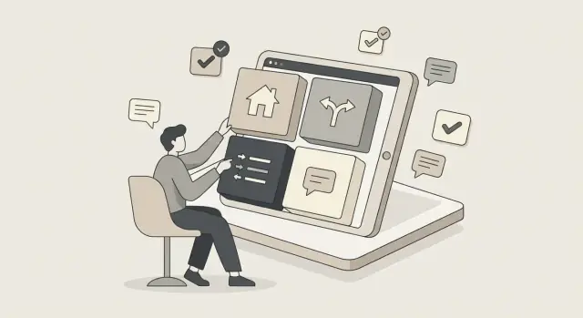
A build in public website works best when visitors can quickly answer three questions: What is this? Is it real? What should I do next?
Your site structure should make those decisions easy, even as you publish frequent updates.
Keep the core navigation tight and predictable. A simple starting map that scales well is:
Put only the highest-intent pages in the top nav (usually Home, Pricing, Roadmap, Updates). Move secondary links (Contact, About, legal) to the footer so the header stays calm and decision-focused.
Treat updates as a category with its own landing page (your “Updates” index). It should summarize what you share, how often, and highlight the latest posts, top milestones, and most-read entries—so new visitors can catch up in minutes.
A build in public website doesn’t need a dozen pages on day one. It needs a clear product website foundation that answers the basic questions quickly, so your public updates and momentum have somewhere credible to land.
Your homepage is your “one-screen pitch.” Keep it focused on:
If you’re building in public, it’s okay to acknowledge it. A short line like “We ship weekly—follow progress and get early access” sets expectations without turning the whole page into a diary.
Even early, a pricing page reduces back-and-forth and signals you’ve thought things through. Include:
If pricing isn’t final, say so directly and explain what will influence it.
Share the founder story, mission, and values—then add a short transparency note: what you’ll share publicly (milestones, learnings, changelog) and what you won’t (customer data, sensitive security details).
A simple support section prevents frustration. State:
Once these core pages work, extras like a roadmap page and changelog page can plug in cleanly without redoing your startup marketing site later.
A build-in-public website works best when visitors can quickly answer two questions: “What are you building next?” and “What did you already ship?”
A clear Roadmap and a reliable Changelog do that job—without turning your site into a never-ending stream of posts.
Keep the Roadmap simple and consistent. Use a short list of items with a one-line description and a visible status label:
Avoid vague, hype-heavy promises. If you can’t reasonably commit to something, don’t put it on the Roadmap yet.
Your Changelog is the proof. Make entries small and factual:
This is not a blog post. It’s a record.
Say, plainly, what feedback can influence (priority, UX details, edge cases) and what it can’t (legal constraints, security decisions, core positioning). This reduces disappointment and prevents your Roadmap from becoming a public negotiation.
When something moves to Shipped, reference the related Changelog entry from the Roadmap item (and note the original Roadmap title in the Changelog). That traceability builds confidence: people can see you finish what you start.
A build-in-public website works best when updates feel familiar each time—readers should instantly know what they’ll get, and you should be able to publish without turning it into a production.
Pick a few content pillars you’ll consistently report on. Common options:
Set boundaries early. For example: no sensitive customer details, no security specifics, no revenue numbers if you’re not comfortable, and no personal information.
Choose weekly or biweekly and treat it like a small recurring commitment. The goal is consistency, not volume. If you’re busy, publish a shorter update instead of skipping—momentum builds trust.
A practical rule: if you can’t imagine doing it for 3 months, the cadence is too aggressive.
Create 2–3 repeatable formats so you can match the update to the week:
Keeping the headings the same makes your updates scannable and easier to write.
Add lightweight tagging so people can follow what they care about (and you can reuse topics). Examples: UI, performance, growth, pricing, onboarding, bugfixes.
This turns a stream of posts into a usable library—and makes your progress feel real over time.
A good build-in-public update makes readers feel the project is moving, without dumping private details, messy internal debates, or customer-sensitive information.
The goal is simple: show evidence of progress and invite the kind of feedback that helps.
Consistency makes your updates skimmable and easier to maintain. A simple structure also prevents “stream of consciousness” posts that reveal more than you intended.
Use the same core sections each time:
Metrics can be motivating, but raw numbers can mislead.
Instead of “Signups doubled,” add the framing: timeframe, starting point, and what influenced the change (a launch, a pricing change, a new channel). If you show a chart, label it clearly and avoid dramatic scales that exaggerate movement.
A screenshot of a new onboarding step, a before/after of copy, or a 10–20 second clip of the feature working can communicate more than paragraphs.
Blur or redact anything sensitive (customer names, invoices, internal IDs) before posting.
Don’t ask “Thoughts?” Ask one specific thing, such as:
Focused questions invite useful feedback—and keep the update from turning into an unfiltered diary.
When you build in public, trust is part of the product. Social proof can accelerate that trust—but only if it’s honest, specific, and easy to verify.
Add testimonials only from real users, and label them clearly. “Early access user” or “Beta customer” is better than a vague quote that sounds like marketing.
A good testimonial includes:
If someone prefers anonymity, say why in a neutral way (“Name withheld at request”). Don’t invent identities.
Logos are powerful, which is why people notice when they’re misused. Show company logos or a “Used by” row only with explicit permission.
If you can’t get permission, switch to safer alternatives:
You don’t need a wall of compliance badges to be trustworthy. Add a short, plain-language data handling summary you can stand behind, such as:
Avoid promises you can’t verify.
Include a short “What we’re working on” block on the homepage. Keep it tight: 3–5 bullets that mirror your current priorities.
It signals momentum, sets expectations, and shows visitors they’re joining an active project—not a static page.
A build-in-public website can get a lot of “drive-by” attention: people skim an update, feel optimistic, then disappear.
Your job is to give them one easy next step—without turning the site into a maze of popups.
Choose a single main action and build the page around it. Most early teams do best with one of these:
If you offer multiple options, make one the default and keep the others secondary (for example, a small link under the main button).
“Sign up for updates” is vague. Tie the opt-in to a specific benefit that matches your build-in-public promise, such as:
Be explicit about what happens after they submit: “Get a short update every two weeks. Unsubscribe anytime.” That clarity increases signups and reduces spam complaints.
The fastest way to drop conversions is to ask for too much too early. For most build-in-public capture flows, email-only is enough.
Add one sentence under the form to set expectations: what you’ll send, how often, and whether it’s product news, behind-the-scenes progress, or both.
This also helps you attract the right audience (people who value the process, not just the launch).
After someone subscribes, don’t end the experience on a dead-end “thanks” message. Send them somewhere that deepens trust:
This turns a single moment of interest into a small journey—one that keeps the story moving and makes subscribing feel like a smart next step, not a commitment.
A build-in-public site only works if you can keep it updated without it turning into a side project. The goal is a setup where publishing an update feels as easy as writing it.
Choose based on who will ship updates and how often:
If updates are weekly, prioritize the stack with the lowest publishing friction, not the most features.
If you want to ship a product site and an updates hub quickly without rebuilding everything later, a vibe-coding platform like Koder.ai can be a practical option: you can describe the pages you need (Home, Pricing, Roadmap, Changelog, Updates) in chat, iterate on copy and layout fast, and export source code when you’re ready to own the stack.
Design your site as a set of repeatable blocks you can mix and match:
Reusable components make new pages and updates quick, and they reduce the chance your site slowly becomes inconsistent.
Write down a few basics: colors, fonts, spacing scale, button styles, and how headings and links should look.
This keeps new sections looking on-brand without constant design decisions.
Assume most visitors arrive from a social post on their phone. Use readable font sizes, generous spacing, and short sections.
Keep pages fast by limiting heavy animations, compressing assets, and choosing a simple layout that loads quickly on slow connections.
If you wait until “after launch” to handle SEO, accessibility, and analytics, you’ll end up rewriting pages and rethinking structure under pressure.
Doing the basics early keeps your build-in-public story easy to find, easy to use, and easy to measure.
Start with clarity, not tricks. Give every page a clear, specific title and use headings that match what a real person would scan for (H1 for the page topic, H2s for sections).
Write a simple meta description for key pages—one or two sentences that say what the page is and who it’s for.
Keep internal links intentional: your homepage should point to the product, roadmap, changelog, and email waitlist; updates should link back to the relevant feature or guide page.
A build-in-public website looks empty without updates. Seed it with a small set of posts so people immediately understand what you’re building:
Check color contrast early so text is readable. Add alt text to meaningful images (and skip it for decorative ones).
Make sure buttons, menus, and forms work with keyboard navigation—especially your signup flow.
Track what matters to your build:
Set these as clear goals/events from day one so each update teaches you something, not just “more traffic.”
A build-in-public website is never “done.” The goal is to ship a credible first version, learn what people actually respond to, then keep improving without turning the site into a side project.
Launch a v1 with the essentials; avoid waiting for “perfect.” For most products, v1 means: a clear headline, who it’s for, the main problem you solve, one primary call-to-action (signup or waitlist), and a short “why trust this?” section.
Treat everything else as optional until you see demand. A smaller launch gets you real data faster—and reduces the risk of polishing pages no one reads.
Create a feedback loop: site widget, email alias, or simple form. Keep it lightweight and specific:
Route feedback to one place and review it weekly. If you’re building in public, small comments often reveal big messaging gaps.
Review site performance monthly: top pages, drop-offs, conversion rates. Look for:
Maintain a visible “Last updated” date on roadmap and key pages. It’s a quiet trust signal that reassures visitors you’re still shipping—and it forces you to revisit claims, screenshots, and status notes before they go stale.
Define your baseline rules up front:
Then repeat those rules on your About page and your Updates hub so visitors know what to expect.
Pick one primary outcome and let everything else support it:
If attention doesn’t lead to one of these, the site becomes noise instead of a system.
Use one primary CTA and one secondary CTA across the site.
Example pairings:
Repeating CTAs reduces decision fatigue and makes every page feel connected.
Start with a small navigation that answers the core questions fast:
Write one sentence that names:
Template you can reuse: “For who want , helps you without .”
Add a short, verifiable reason the product should exist now, such as:
Avoid vague claims like “revolutionizing” and stick to specifics people can sanity-check.
Use a simple status system and keep each item scannable:
Only list things you can reasonably commit to, and link Shipped items to the related changelog entry so visitors can see follow-through.
Treat the changelog as a record, not a blog:
Keep it factual and consistent. Trust comes from regular, specific entries—especially when you connect them to roadmap items.
Use a repeatable template so posts stay scannable and safe:
End with one focused question to invite useful feedback instead of “Thoughts?”
Keep capture low-friction and route people to the next best step:
This turns drive-by interest into an intentional journey.
Keep high-intent pages in the header; move secondary links to the footer.