Nov 03, 2025·8 min
How to Build an Influencer Website With a Great Media Kit
Learn how to build an influencer website with a polished media kit: structure, must-have pages, proof assets, rate cards, SEO, and a contact flow brands love.
Start With Your Offer and Audience
Before you pick a theme or write a single line of copy, decide what your influencer website is for. A great media kit website isn’t a scrapbook—it’s a conversion tool that helps the right brands understand what you sell and how to book you.
Define your primary goal
Pick the main outcome you want from the site, and let that goal shape every page:
- Inbound brand deals (your site acts as a brand collaboration page and lead generator)
- Affiliate sales (your content and links are optimized for product discovery)
- Bookings (speaking, events, appearances, consulting)
- Community growth (newsletter signups, memberships, waitlists)
If you try to optimize for all of these equally, your call-to-action gets diluted.
Know who you want to work with
List 3–5 ideal brand partner categories (for example: skincare, travel, fitness apps, sustainable fashion). Then match those to deal types you actually want:
- UGC packages (content created for the brand’s channels)
- Sponsored posts (distribution on your channels)
- Ambassadorships (longer-term partnerships)
This clarity helps you write a creator media kit and influencer portfolio that speak directly to a brand’s needs.
Define what “success” looks like
Choose a simple scorecard, such as:
- inquiries per month
- % of inquiries that become calls
- media kit downloads
Now you can measure whether your press kit template and rate card details are doing their job.
Choose one primary call to action
Your influencer website should push one main next step: “Email me,” “Request rates,” or “Book a call.” Make it obvious and consistent across the homepage, media kit, and contact form for influencers.
Choose the Right Site Structure for Brands
Brand managers don’t browse creator sites the way fans do. They’re usually trying to answer a few questions fast: “Is this a fit?”, “What can you deliver?”, “What’s it cost?”, and “How do we book?” Your structure should make those answers obvious within one or two clicks.
Core pages to include (the brand-ready minimum)
A simple 5-page structure works well for most creators:
- Home: a clear positioning statement (niche + audience), highlights, and a strong “View Media Kit” button.
- Media Kit: your key stats, demographics, content formats, past partners, and quick FAQs.
- Work / Case Studies: 3–6 examples with outcomes and screenshots (think “what we did + results”).
- About: credibility, values, and why your audience trusts you.
- Services + Contact: deliverables, packages, starting rates (or “request rates”), and an easy booking form.
If you want to keep the top navigation tight, you can combine Services and Contact into one “Work With Me” page.
Optional pages (add only if they support booking)
Optional pages help when they match your business model:
- Testimonials (short quotes from brands)
- Press (features, podcasts, speaking)
- Shop / Resources (for products, affiliates, or digital downloads)
- Blog (useful if you’re targeting SEO)
- Newsletter signup (good for long-term audience building)
Navigation labels brands understand instantly
Use straightforward labels like Media Kit, Case Studies, Services, and Contact—not clever or vague names. The goal is scan-ability.
Media Kit: page, PDF, or both?
- Page: best for quick scanning, mobile viewing, and SEO.
- PDF download: helpful for internal sharing and procurement.
- Both: ideal—use the page for browsing and offer a “Download PDF” button for forwarding.
Set Up the Basics: Domain, Platform, and Branding
Before you design pages or write your creator media kit, lock in the basics that make your site feel legitimate to brands—and easy for them to remember.
Choose a domain brands can type correctly
Pick a domain that matches your creator name or niche, and keep it simple: short, easy to spell, and easy to say out loud on a call. If your exact name is taken, add a small modifier (e.g., “with”, “studio”, “creates”) rather than extra hyphens or numbers.
If you plan to grow beyond one platform, avoid naming yourself too tightly around a single channel (for example, “TikTok” in the domain). Your website should outlast trends.
Pick the right platform for how you work
Select a website builder or CMS based on what you’ll actually use:
- Want a fast setup with good templates? Choose a builder with strong portfolio and landing-page layouts.
- Want blogging and SEO content long-term? Choose a CMS that makes posting and organizing categories easy.
- Need integrations (email capture, scheduling, downloads)? Confirm those exist before committing.
If you want to move even faster—or you want more control than a template builder without the usual dev cycle—consider building with Koder.ai. It’s a vibe-coding platform that lets you create web apps through a chat interface, so you can generate a clean, brand-ready site (pages like /media-kit, /case-studies, and /contact) quickly, then export the source code, connect a custom domain, and use snapshots/rollback when you update your rate card or press kit template.
Whatever you choose, test one thing: can a brand rep find your media kit, portfolio, and contact flow in under a minute?
Don’t skip the technical essentials
At minimum, make sure you have SSL (https), fast hosting, and a mobile-responsive theme—most brand checks happen on phones. Add analytics early so you can track what pages get attention (media kit, services, case studies) and improve them over time.
Create a simple style guide (so your site looks “you”)
Write down a mini brand style guide: 2–3 colors, 1–2 fonts, your tone of voice (fun, editorial, expert), and photo style (bright, moody, studio, candid). Consistency makes your site feel credible—even if it’s just a one-page setup today.
Design a Homepage That Converts Brand Visitors
Your homepage has one job: help a brand decide, in seconds, that you’re the right creator—and show them exactly where to go next. Keep it scannable, specific, and built around how brand managers evaluate an influencer website.
Lead with a one-line positioning statement
Open with a clear statement that answers: who you help, the outcome you drive, and where you deliver.
Examples:
- “I help skincare brands drive product discovery on TikTok and Instagram with UGC that converts.”
- “I create high-performing YouTube reviews for home tech brands that want trust and long-term sales.”
This is stronger than generic labels like “Lifestyle creator,” and it sets expectations for your creator media kit and influencer portfolio.
Add social proof above the fold
Before a visitor scrolls, give them a reason to trust you. Choose one format and keep it clean:
- A row of 5–8 brand logos (“Worked with”)
- A short line of notable press mentions
- One punchy testimonial with a name and company
If you have numbers, make them meaningful (e.g., “Avg. 3.8% IG engagement last 90 days” is better than “100k+ views” without context). The goal is to reduce doubt quickly—especially for someone opening your media kit website from a busy inbox.
Create a simple “Start here” path
Don’t make brands hunt. Add a compact “Start here” section right after the hero that points to the two pages they typically need:
- Media Kit (your brand collaboration page summary, audience, stats, deliverables)
- Work / Case Studies (proof of results and examples)
Use clear labels, not clever ones. Think: “View Media Kit” and “See Work Examples.”
Keep CTAs focused: one primary, one secondary
Every creator site needs a single, obvious next step.
- Primary CTA: “Request a quote” or “Book a collaboration call”
- Secondary CTA: “Download rate card” or “View media kit”
Place the primary CTA in the hero and again near the bottom. Make the secondary CTA available without competing for attention. This structure supports both types of visitors: brands ready to hire now, and those still comparing options.
If you’re building a link in bio website too, keep it separate (or clearly labeled) so it doesn’t distract from your main booking flow.
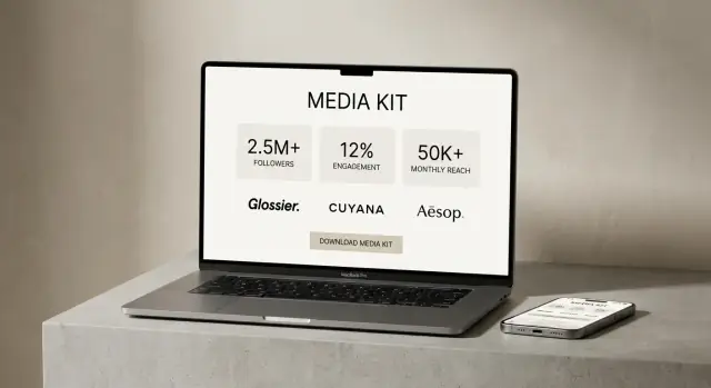
Build a Media Kit Page Brands Can Scan Quickly
Your media kit page is a decision page: a brand manager should be able to understand your audience, performance, and offer in under a minute—then download a PDF to share internally.
Start with a “Highlights” block
Place a scannable summary at the top so visitors don’t have to hunt.
- Niche + positioning: one sentence on what you create and who it’s for
- Primary platforms: where you’re strongest (with links)
- Fast proof: 2–4 numbers that support your value
Add a prominent button like “Download Media Kit (PDF)” above the fold and again near the bottom. If you host the file, link it as a relative URL (for example: /downloads/media-kit.pdf).
Show key audience stats (only what you can stand behind)
Brands look for fit first, then scale. Include:
- Audience size per platform (followers/subscribers)
- Demographics (age ranges, gender split) if available
- Top geographies (countries or cities, whichever is most relevant)
If a metric is an estimate or varies by month, label it clearly.
Share verifiable performance indicators
Avoid vague claims like “high engagement.” Use numbers you can back up with platform analytics.
Consider presenting a small table:
| Metric | Typical range | Source |
|---|---|---|
| Avg. views per post | 25k–40k | Platform analytics |
| Story reach | 8k–12k | Platform analytics |
| Engagement rate | 3.8% | Platform analytics |
List the content formats you offer
Make it easy for brands to map your work to their brief. Include formats such as Reels, TikTok, Shorts, YouTube integrations, and newsletters, plus any add-ons (usage rights, whitelisting, raw clips).
Close with a clear next step: “For rates and availability, contact me” linking to /contact.
Add Services, Packages, and Rate Card Details
Build Your Media Kit Site Fast
Build a brand-ready creator site by chatting your pages into place, then publish when it looks right.
Your Services page should make it easy for someone to understand what you sell, how it works, and what it costs—without a long email thread. Think of this as the “shopping” section of your media kit website.
Describe your core packages (in plain language)
Keep package names simple and outcome-focused. For example:
- Sponsored post: One Instagram Reel with 3 Story frames driving to a launch or promotion.
- UGC bundle: 5 short vertical videos delivered for the brand to post on their channels.
- Monthly retainer: A set number of videos/posts each month to support ongoing campaigns.
Add 1–2 lines under each explaining who it’s for and what result it supports (awareness, conversions, app installs, email signups).
Add rate card details (without boxing yourself in)
You don’t have to publish exact numbers. Many creators use:
- “Starting at” pricing (e.g., “Reels starting at $___”)
- Price ranges (e.g., “$–$ depending on usage and deliverables”)
This sets expectations while leaving room for campaign complexity, rush timelines, or paid usage.
Clarify what’s included (and what costs extra)
Spell out the details brands care about:
- Usage rights (organic only vs. paid ads; length of usage)
- Deliverables (final videos, captions, thumbnails; raw footage if offered)
- Revisions (how many rounds are included)
- Timeline (typical turnaround and shipping deadlines)
- Add-ons (whitelisting, extra hooks, alternative edits, exclusivity)
“What I need from you” checklist
Include a short checklist to speed approvals:
- Brief + key message + do-not-say notes
- Product/offer details and links
- Required hashtags, tags, and disclaimers
- Usage plan (organic vs. ads, length of usage)
- Deadline and approval contact
End with a clear next step like “Request availability” linking to /contact.
Show Proof With Case Studies and Portfolio Examples
Brands don’t hire “potential”—they hire proof. A strong case study section turns your influencer website from a pretty portfolio into a decision-making tool. The goal is to make it easy for someone on a brand team to scan, understand what you did, and feel confident you can do it again.
Create 3–6 case studies brands can trust
Aim for a small set of your best projects rather than a long gallery. For each case study, stick to a repeatable format so brands can compare quickly:
- Goal: What the brand wanted (awareness, sign-ups, UGC for ads, store visits).
- Deliverables: Exactly what you produced (e.g., 1 Reel + 3 Stories + 10 photos).
- Approach: One or two sentences on your concept, hook, or testing process.
- Results: Metrics you can support (reach, views, saves, CTR, conversions, code uses).
If you can’t share a number, share a clear outcome instead (e.g., “content was whitelisted for paid social” or “brand renewed for a second month”).
Organize examples by content type and niche
Help brands self-select by grouping your influencer portfolio in a way that mirrors how they buy:
- Content type: Reels/Shorts, Stories, long-form video, blog/SEO posts, UGC product demos.
- Niche or audience: skincare, fitness, travel, B2B tools, family, budget meals, etc.
This is especially helpful on a media kit website where different teams (social, performance, PR) may be scanning for different outcomes.
Use logos carefully (permission first)
Only include brand logos if you have permission (or if it’s explicitly allowed in your agreement). When you don’t, write it clearly without naming:
“Global skincare retailer” or “Direct-to-consumer meal kit brand.”
That still signals credibility while keeping your brand collaboration page professional.
Make scanning effortless with captions and consistent layout
Treat each example like a product card: one visual, one short caption, and the same fields every time. Keep captions tight, like:
“30-sec routine Reel — 214k views — 1.8% link sticker CTR.”
If you offer a downloadable creator media kit or rate card, link to it right after this section so interested brands can move from proof to pricing without hunting (e.g., /media-kit or /work-with-me).
Create an About Page That Builds Trust
Create the Core Pages
Create Home, Media Kit, Case Studies, and Contact pages in one guided chat.
Your About page isn’t a full autobiography—it’s a credibility page for brands. The goal is to help a marketing manager quickly answer: “Is this creator a fit, and will working together be easy?”
Lead with what you’re known for
Start with 2–3 sentences that clearly state your niche and audience. Mention the topics you cover, the style you’re known for (educational, comedic, minimalist, high-production), and the kinds of outcomes you prioritize (awareness, traffic, conversions, community engagement).
Share values and boundaries (briefly)
Brands want alignment, not perfection. Add a short paragraph on what you stand for—e.g., transparency, evidence-based recommendations, inclusive creative, sustainability-minded choices—plus any “non-negotiables” that protect your audience’s trust.
Explain how you collaborate
Make the working relationship feel predictable. Include a simple outline of your process and communication style:
- How you handle briefs (what you need from the brand)
- Your creative workflow (concept → draft → revisions → publish)
- Typical timelines and how you share performance results
- Preferred communication channels (email, Slack, platform messaging)
Add visuals that feel professional (not corporate)
Include a high-quality headshot that matches your on-platform vibe. Then add 2–4 behind-the-scenes images (shoot setup, editing desk, studio corner, travel kit). This signals you’re real, prepared, and production-ready.
Brand-safety signals (without legal claims)
Close with a few practical notes such as: you follow platform disclosure rules for sponsored content, you don’t buy fake engagement, you respect community guidelines, and you keep content family-safe (if relevant). Keep it factual and simple—avoid promising guarantees.
If you have a media kit, add a clear button to /media-kit or /work-with-me so brands can take the next step quickly.
Set Up a Brand-Friendly Contact and Booking Flow
If a brand likes your work, the next question is simple: “How do we book you?” Your contact flow should make that step quick, clear, and low-friction—without wasting either side’s time.
Offer a few ways to reach you
Different teams have different preferences, so include multiple options:
- A visible email address (for procurement and agencies)
- A short inquiry form (best for qualifying leads)
- An optional calendar booking link for calls (only if you can keep availability up to date)
Place the same call-to-action on your Media Kit and Services pages (for example: “Inquire about a collaboration”).
Use form fields that qualify the request
Keep the form short, but collect the details you’ll need to quote and schedule accurately:
- Budget range
- Desired timeline / launch date
- Deliverables (e.g., Reels, TikTok, Stories, blog post, UGC)
- Usage needs (organic only vs. paid ads, length of usage)
- Brand / website and primary contact name
This protects you from endless back-and-forth and helps brands self-select if you’re not a match.
Set expectations after someone submits
Under the form, add a one-line promise like: “Typical response time: within 1–2 business days.” Also explain what happens next: you’ll confirm scope, share availability, and send a proposal or rate card.
Add a mini FAQ to remove common friction
Include 4–6 short questions near the form, such as:
- Do you have a rate card?
- What’s your typical turnaround time?
- Do you offer usage rights or whitelisting?
- Can you work with gifting-only campaigns?
A clean contact flow makes you look organized—and makes it easier for brands to say yes.
Handle SEO and Discoverability for Creator Sites
SEO for an influencer website isn’t about chasing every keyword—it’s about making it easy for brands (and talent scouts) to find the exact page they need, fast. Start by aligning your pages with the way brands search: “creator media kit,” “UGC creator,” “influencer portfolio,” and your niche (fitness, skincare, travel, etc.).
Optimize titles, headings, and URLs
Give each page a clear job and name it accordingly.
- Homepage title idea: “UGC Creator for Skincare Brands | [Your Name]”
- Media kit page title idea: “Media Kit + Rates | [Your Name], UGC Creator”
- Case studies title idea: “Case Studies: Brand Collaborations | [Your Name]”
Keep URLs readable and predictable, such as:
- /media-kit
- /case-studies
- /services
- /contact
On-page headings should match what people scan for. For example, on your brand collaboration page, use an H2 like “Media Kit” or “Creator Media Kit” and include your niche near the top.
Metadata and image alt text (quick wins)
Write a meta title and description for key pages (Home, /media-kit, /case-studies, /contact). Your description should say who you help and what to do next (e.g., “Download the creator media kit and request a quote”).
For portfolio images, add descriptive alt text that mentions the deliverable and niche, like: “UGC video thumbnail for clean skincare routine” rather than “IMG_1234.”
Internal links that guide brand decision-makers
Link your site like a smooth brand workflow:
Home → /media-kit → /case-studies → /contact
Add a short “See results” link on /media-kit to /case-studies, and a clear “Book” link from every page to /contact.
Add simple schema (Person/Organization)
If your platform supports it, add basic structured data so search engines understand who you are:
{
  "@context": "https://schema.org",
  "@type": "Person",
  "name": "Your Name",
  "jobTitle": "UGC Creator",
  "url": "https://yourdomain.com",
  "sameAs": [
    "https://www.instagram.com/yourhandle",
    "https://www.tiktok.com/@yourhandle"
  ]
}
This small step can support your influencer website visibility without adding clutter.
Add Integrations: Social, Downloads, and Analytics
Update Without Stress
Update your rate card or stats and roll back instantly if something breaks.
Integrations can make your influencer website feel “alive” and measurable—but too many widgets can slow pages down and distract brands from the yes.
Social embeds: less is usually more
Social proof matters, but embed selectively. A single Instagram grid or a short TikTok highlight can work well on a /media-kit or /portfolio page.
Prioritize speed and readability:
- Limit embeds to 1–2 per page (or use static screenshots that link out)
- Avoid autoplay video embeds on your homepage
- Test on mobile—brands often review creators from their phone
Downloadable assets brands actually use
Give brands a quick way to share you internally. Add clear download buttons (above the fold if possible):
- PDF media kit (your full story and stats)
- One-page rate card (easy for procurement)
- Optional brand deck (for larger campaigns or retainers)
Label downloads by version and date (e.g., “Media Kit — Oct 2025”) so you don’t confuse returning partners.
Analytics: track what leads to paid work
You don’t need complex dashboards. Track a few conversion events:
- Contact form submissions
- Outbound clicks (email address, booking link, calendar link)
- Downloads (PDF kit, rate card)
If you use Google Analytics, set these as events so you can see which pages create inquiries and which are just “nice to have.”
Choose integrations you can maintain
Start simple. A lightweight stack might be:
- Email marketing tool for a “Brands” update list
- A basic CRM, or even a spreadsheet with inquiry status
- A calendar/booking tool only if you’ll keep availability up to date
If an integration requires constant upkeep, it will quietly break—and brands notice.
Launch Checklist and Ongoing Updates
A creator media kit is only “done” the day you publish it. After that, your influencer website should be treated like a living sales asset: keep it accurate, fast, and easy for brands to act on.
Quick pre-launch checklist (don’t skip mobile)
Before you publish, test the site like a brand manager who has 60 seconds and one thumb.
- Mobile layout: check spacing, readability, and tap targets on your homepage, influencer portfolio, and brand collaboration page.
- Forms: submit your contact form for influencers end-to-end (including the confirmation email). Make sure it works on mobile and doesn’t land in spam.
- Downloads: click every download button (PDF rate card, press kit template, one-pager). Confirm the file opens quickly and the filename is clear (e.g.,
YourName_MediaKit_2026Q1.pdf). - Speed & basics: confirm your domain is correct, SSL is on (https), and the site looks clean in a link preview when pasted into DMs.
Ongoing updates: a simple quarterly routine
Set a recurring calendar reminder every quarter to refresh the numbers and proof points brands care about. A fast checklist keeps your influencer website consistent without turning into a project.
Quarterly update checklist:
- Update key stats (followers, reach, email list, average views) and keep dates visible (“Updated: Q1 2026”).
- Add new brands and logos you’re allowed to mention.
- Refresh your influencer portfolio with 2–4 recent examples that match the work you want more of.
- Review packages and your rate card for outdated deliverables (especially if platforms changed).
- Add or rotate testimonials (even one strong quote can lift conversions).
Make case studies a repeatable workflow
The easiest way to maintain momentum is to capture a case study immediately after each campaign—while the results are fresh.
Keep a lightweight template you can duplicate: goal → deliverables → creative approach → results → 1–2 visuals → short takeaway. If you do this consistently, your “case studies for creators” section stays current without a big overhaul.
Link your key pages everywhere brands look
After launch, make your site easy to find.
Add links to your homepage, /media-kit (or your creator media kit page), and /contact in:
- your bio tools (your link in bio website)
- outreach emails and pitch decks
- proposals and invoices
That way, every touchpoint sends brands back to the same clear path: understand your offer, see proof, and book you.
FAQ
What should be the main goal of an influencer website?
Start by picking one primary outcome—inbound brand deals, affiliate sales, bookings, or community growth—and design every page around that.
A focused goal keeps your messaging and CTAs clear, which makes it easier for brands to take the next step.
What pages does a brand-ready influencer website need?
Use a tight, brand-friendly structure that answers four questions fast: fit, deliverables, pricing expectations, and booking.
A solid “brand-ready minimum” is:
- Home
- Media Kit
- Work / Case Studies
- About
- Services + Contact (or a combined “Work With Me” page)
What navigation labels work best for brands?
Brands scan for clarity, not cleverness. Use straightforward navigation labels like:
- Media Kit
- Case Studies (or Work)
- Services
- Contact
This reduces friction and helps a brand rep find what they need in one or two clicks.
Should my media kit be a webpage, a PDF, or both?
Ideally, offer both:
- A Media Kit page for quick scanning, mobile viewing, and SEO
- A PDF download for internal sharing and procurement
Place a clear button (e.g., “Download Media Kit (PDF)”) above the fold and near the bottom, linking to a relative path like /downloads/media-kit.pdf.
What should my homepage include to convert brand visitors?
Lead with a one-line positioning statement that says who you help, what outcome you drive, and where you deliver.
Then add:
- One strong social-proof element (logos, a press line, or a short testimonial)
What information should I include on a media kit page?
Put a scannable “Highlights” block at the top and include only stats you can stand behind:
- Audience size per platform
- Demographics (if available)
- Top geographies
- Verifiable performance indicators (e.g., average views, story reach, engagement rate)
Finish with what you offer (formats + add-ons) and a clear next step linking to /contact.
Do I need to publish my exact rates on my website?
Give enough pricing context to set expectations without locking yourself in.
Common options:
- Starting at pricing
- Price ranges based on deliverables and usage
- “Request rates” if projects vary widely
Also clarify what affects pricing (usage rights, paid ads/whitelisting, exclusivity, rush timelines).
What should I clarify on my Services page to avoid confusion?
Focus on details brands need to approve and execute campaigns quickly:
- Usage rights (organic vs paid; length)
- Deliverables (final assets, captions, raw clips if offered)
- Revisions (how many rounds)
- Timeline (turnaround and shipping deadlines)
- Add-ons (whitelisting, extra edits, exclusivity)
A short “What I need from you” checklist can reduce back-and-forth and speed approvals.
How do I create case studies that brands trust?
Create 3–6 case studies with a consistent, repeatable format:
- Goal
- Deliverables
- Approach (your concept/testing)
- Results (metrics you can verify)
If you can’t share numbers, include outcomes like “renewed for a second month” or “content was whitelisted for paid social.” Organize examples by content type or niche so brands can self-select quickly.
What’s the best contact and booking setup for brand inquiries?
Keep the contact flow low-friction and qualifying:
- Show a visible email address
- Use a short inquiry form (budget range, timeline, deliverables, usage needs)
- Add an optional booking link only if you can maintain availability
Set expectations under the form (e.g., “Response within 1–2 business days”) and add a mini FAQ covering rate card, turnaround time, and usage/whitelisting.