Oct 02, 2025·8 min
How to Build a Lightweight Project Tracking Mobile App
Step-by-step guide to plan, design, and build a lightweight project tracking app: must-have features, MVP scope, UX tips, tech choices, and launch checklist.
Step-by-step guide to plan, design, and build a lightweight project tracking app: must-have features, MVP scope, UX tips, tech choices, and launch checklist.
“Lightweight” isn’t a synonym for “missing features.” It means the app keeps work moving with minimal setup, minimal tapping, and minimal mental load.
A lightweight project tracking app prioritizes speed over completeness:
If users need a manual to track a to-do, it’s not lightweight.
Lightweight project tracking works best for:
These audiences share one need: they must be able to log progress quickly, even in short bursts.
Define success in measurable behaviors:
The fastest way to lose “lightweight” is to copy full project suites. Watch out for:
Before you define features, define who the app is for. Lightweight apps win when they fit a daily rhythm—often under 30 seconds per interaction.
Choose one primary user type and one secondary. For example:
Write a one-sentence promise for the primary user, such as: “Capture work in seconds and stay on top of what’s due today.” This promise helps you say “no” later.
Limit v1 to a handful of repeatable moments:
From these use cases, list the top jobs the app must support:
Be explicit about exclusions. Common “not in v1” items include Gantt charts, resource planning, time tracking, custom workflows, and complex reporting. Put these in a “Later” list so stakeholders feel heard without bloating the MVP.
Pick metrics that reflect real value, not vanity:
These KPIs keep “project management features” focused on everyday usefulness rather than complexity.
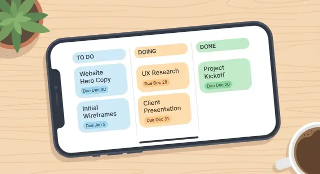
A lightweight project tracking app should make three daily actions effortless: capture a task, see what’s next, and mark progress.
Start with the smallest set that still feels like “project tracking,” not a notes app:
If you can’t explain how a feature improves one of these daily actions, it probably doesn’t belong in version 1.
These can improve speed, but they add UI and edge cases:
A practical rule: only add a nice-to-have if it reduces drop-off during the first week.
If you want collaboration, keep it lean:
Avoid roles, custom permissions, and advanced threaded discussions in the MVP.
On first launch, users should be tracking in under a minute. Offer two paths:
The goal is momentum: less configuration, more completed tasks.
Lightweight apps succeed or fail on “time-to-done.” If adding or updating a task takes more than a few seconds, users will postpone it—and the app becomes an afterthought.
Aim for a short, clear set of screens that cover 90% of daily behavior:
If you find yourself adding “Dashboard,” “Reports,” and “Team Hub” at this stage, you’re drifting away from lightweight.
Pick a navigation structure users recognize immediately:
Whichever you choose, make the “Add” action reachable with one thumb. A floating add button is common, but a persistent “+” in the header can also work if it’s consistently placed.
Most interactions are updates, not creation. Optimize for:
A good test: can a user mark three tasks complete and reschedule one in under 15 seconds?
Lightweight doesn’t mean minimal effort. Build in a few accessibility wins:
These choices reduce mis-taps and friction for everyone—exactly what a productivity UX should do.
The app feels fast when the underlying model is simple. Before you design screens or APIs, decide what “things” exist in your system and how they move from start to done.
Start with only what you need to support the MVP:
If you’re unsure about Tag, skip it and revisit after you see real usage.
A task should be creatable in a few seconds. Recommended fields:
You can add notes later, but comments often cover context without bloating the task form.
Limit statuses to 3–5 max so users don’t spend time “managing the management.” A practical set:
If you need one more, consider Blocked—but only if you plan to use it in filtering or reminders.
Even small apps benefit from reliable history. Include:
This enables features later (recent activity, overdue views, weekly summaries) without redesigning the database.
A lightweight project tracking app wins when it’s easy to build, easy to maintain, and cheap to run. Optimize for iteration speed more than theoretical scale.
If you want the fastest path to “works great on most phones,” cross-platform is usually the best default.
If your app is mostly lists, forms, reminders, and sync, cross-platform is typically enough.
Three practical options:
For a lightweight tracker, managed backend or local-first usually reduces risk.
Avoid mixing multiple databases, multiple state-management approaches, and custom analytics from day one. Fewer moving parts means fewer bugs and less dependency churn.
Before committing, confirm:
If you can’t explain your stack to a new teammate in five minutes, it’s probably too complex for an MVP.
If your goal is to validate the UX and workflow quickly, a vibe-coding platform like Koder.ai can help you prototype and ship a first version faster.
Because Koder.ai generates full applications through a chat interface (with a planning mode to clarify scope up front), it’s well-suited to a “keep it small” MVP process: you can iteratively refine screens like Today, Project, and Task details without committing to weeks of manual scaffolding.
A few practical ways it maps to this type of app:
Offline support can feel “small” until users rely on it. For a lightweight tracker, the goal isn’t perfect offline parity—it’s predictable behavior that keeps people moving when reception is bad.
Start with a clear promise:
If something won’t work offline (e.g., inviting teammates), disable it and explain why in one sentence.
Keep sync rules simple enough to fit in a help tooltip:
A practical compromise: use last-write-wins for low-risk fields (status, due date) and prompt only for high-risk text fields (description, notes).
Users don’t hate syncing—they hate uncertainty. Add consistent indicators:
Also show a small “pending” badge on tasks edited offline until confirmed.
Sync breaks most often when you move too much data. Fetch only what the current screen needs (title, status, due date) and load heavy details (attachments, long comments) on demand.
Smaller payloads mean faster sync, fewer conflicts, and less battery drain—exactly what a lightweight app should feel like.
Notifications help only when they’re predictable and rare. If your app pings users for every comment, status change, and background sync, they’ll silence it.
Start with a short, opinionated set:
Everything else (likes, edits, activity feed noise) should stay in-app.
Offer controls where users naturally think about context:
A safe default is to enable “Assigned to me” and “Due today,” and keep “Overdue” on but conservative.
Two reminder types cover most needs without turning into a calendar app:
Make reminders fast to set while editing a task—ideally one tap to pick “Today,” “Tomorrow,” or “On due date,” plus an optional time.
If multiple tasks become overdue overnight, don’t send five alerts. Batch them:
In the copy, be specific and actionable. Show the task name, project, and a next step (e.g., “Mark done” or “Snooze”) instead of vague messages.
Lightweight doesn’t mean casual about trust. People will put real work details into your app—client names, deadlines, internal notes—so you need a few fundamentals from day one.
Match login to your audience rather than adding every method:
Keep sessions secure (short-lived access tokens, refresh tokens, device logout).
Start with the smallest permission model that supports your core workflow:
If shared projects exist, add roles only when you truly need them:
Avoid complicated per-task permissions early; they create UI friction and support tickets.
Use HTTPS/TLS for all network calls, and encrypt sensitive data on the server.
On-device, store as little as possible. If you support offline access, cache only what the user needs and use platform secure storage (Keychain/Keystore) for tokens.
Also: don’t store secrets in the app bundle (API keys, private certificates). Anything shipped to the device should be assumed discoverable.
Collect only what you need (email, name, project data). Make analytics optional where appropriate, and document what you track.
An Export option builds credibility and reduces lock-in concerns. Provide:
Include projects, tasks, and timestamps so users can actually reuse the data.
You don’t need “big data” to improve a lightweight project tracking app—you need a few signals that tell you what people actually do, where they hesitate, and what breaks.
Start with a short list of key events:
Add minimal context (e.g., “from quick add vs. project view”), but avoid collecting content like task titles.
Track drop-offs that hint at confusion or annoyance:
If a change improves completion rates but increases opt-outs, it may be adding pressure rather than usefulness.
Add two simple in-app options:
Route both to a lightweight triage process so every message becomes either a bug, an experiment, or a “not now.”
Treat analytics as a way to remove clutter:
Small, consistent iterations beat big redesigns—especially for productivity apps people open in a hurry.
A lightweight project tracking app only feels “lightweight” when it’s dependable. Slow sync, missed updates, and confusing task states create mental load fast.
Before adding more features, make sure the core loop is solid. Run this checklist on every build:
Emulators are useful, but they don’t reproduce real mobile conditions. Use at least a couple of physical devices and include slower networks.
Focus areas:
A few “small” bugs can make users question the whole system:
Keep automated tests focused on reliability:
Treat every bug fix as a test case you never want to rediscover.
Launching a lightweight project tracking app isn’t just “submit to the store and wait.” A smooth release is mostly about clear positioning, low-risk rollout, and fast follow-ups based on real usage.
Write copy that matches what the app actually does on day one: fast task capture, quick updates, and simple tracking. Avoid “all-in-one” promises.
Create 3–6 screenshots that tell a short story:
Pair them with a short description that explains who it’s for (“quick personal and small-team tracking”) and what it intentionally doesn’t do (no complex Gantt charts).
Onboarding should confirm value quickly, not teach every feature:
If you include a sample project, make it skimmable and easy to delete—users should feel in control immediately.
Start with a small beta and staged release so you can watch stability and engagement without exposing everyone to early bugs:
Your post-launch checklist should be ruthless:
If you want a sanity check, compare release notes against your MVP scope from earlier sections—and keep it small.
“Lightweight” means low friction, not “missing essentials.” In practice:
It works best when updates happen in short bursts and people don’t want process overhead, such as:
A practical v1 should cover repeatable moments:
If a feature doesn’t support these moments, it’s usually not MVP material.
Start with the smallest set that still feels like project tracking:
These cover most daily behavior without turning the app into a full suite.
Common “not in v1” items that bloat UI and slow iteration include:
Keep a “Later” list so ideas aren’t lost, but don’t ship them until the core loop is proven.
Use metrics that reflect real value and habit formation:
Pair KPIs with a speed target like “mark done in under 5–10 seconds.”
Keep your screen map small and optimize for updates:
Aim for one-tap completion and inline edits so users don’t open full forms for tiny changes.
Start with a simple set of objects and fields:
Keep statuses to 3–5 max so users don’t spend time “managing the management.”
Pick one of these approaches based on speed vs. control:
A good rule: if your app is mostly tasks, reminders, and sync, keep the stack simple and easy to explain to a new teammate.
Make offline behavior predictable and easy to describe:
Minimize payload size to reduce failures and battery drain.