Dec 08, 2025·8 min
How to Build a Mobile App That Captures Daily Decisions
A practical, step-by-step guide to plan, design, and build a mobile app that captures daily decisions—covering MVP scope, UX, data, privacy, and launch.
What a Daily Decision Capture App Should Do
A daily decision capture app is a lightweight “decision journal” you can use in seconds—right when a choice is made or immediately after. The goal isn’t writing long entries; it’s quickly logging the decision plus just enough context to make it meaningful later.
At minimum, each capture should answer two questions:
- What did I decide?
- What was going on when I decided?
Context can be as simple as a category, a one-line reason, a mood/energy tag, or a confidence slider.
Common use cases (the decisions people actually make)
People rarely track “decisions” in the abstract—they want help in specific areas where small choices compound.
- Spending: “Skipped takeout and cooked,” “Bought the expensive option,” plus a quick note like “tired” or “celebration.”
- Health: “Went for a walk,” “Drank water instead of soda,” with time-of-day and energy.
- Work priorities: “Said no to a meeting,” “Focused on deep work,” with a tag like “deadline week.”
- Parenting: “Held the boundary,” “Adjusted bedtime,” with a note like “overtired meltdown.”
- Habits and routines: “Did 10 minutes of language practice,” “Went to bed by 11,” plus a streak-friendly checkbox.
The outcomes: why people keep using it
A good decision capture app helps users do three things over time:
- Learn patterns: Identify triggers (stress, time pressure, social settings) that lead to certain choices.
- Reduce regret: Make decisions more intentional by reviewing past outcomes and reasoning.
- Improve consistency: Reinforce the choices that align with personal goals, values, or routines.
What it is not (clear boundaries help product decisions)
To stay focused—and trustworthy—be explicit about what your app doesn’t try to be:
- Not therapy: It can support reflection, but it doesn’t diagnose or treat mental health conditions.
- Not financial advice: Logging spending decisions isn’t the same as budgeting guidance or investment recommendations.
- Not a complex BI tool: Users shouldn’t need dashboards, formulas, or heavy configuration to get value.
Keeping the promise small—capture fast, review later, learn a little each week—sets the foundation for everything else you build.
Define Your Users and Success Criteria
Before you sketch screens or pick a database, get clear on who this app is for and what “working” means. A decision capture app can serve many people, but the first release should be built around a small set of primary users.
Pick 1–2 primary user types
Start with a short list and choose the best-fit audience for v1:
- Busy professionals who make frequent trade-offs and want a lightweight log for later reflection.
- Students who want to track study choices and outcomes.
- Habit trackers who prefer “decision notes” over long journaling.
- Managers who want to record hires, priorities, and meeting decisions with context.
Write a one-sentence job-to-be-done for each, then select the group with the clearest pain and the simplest workflow.
Write 3–5 concrete user stories
Good user stories emphasize speed, context, and the moment of use. Examples:
- “As a busy professional, I can log a decision in under 10 seconds so I don’t lose the moment.”
- “As a manager, I can tag a decision with project + confidence level to review patterns later.”
- “As a student, I can note the expected outcome so I can compare it with what happened.”
- “As a habit tracker, I can save an entry with one hand while walking.”
Define the one-minute experience
Describe the default flow in plain language: open → choose → save.
For example: open the app, tap “Quick Log,” pick a decision type, optionally add one short note, hit save. If it can’t be done in under a minute, it’s not “capture”—it’s journaling.
Choose success metrics for the first release
Pick a few numbers you can actually measure:
- Daily active users (DAU)
- Entries per active user per day
- 7-day and 30-day retention
- Optional: time-to-save (median seconds from open to saved)
Define targets (even rough ones) so you know whether to improve onboarding, speed, or reminders.
Scope the MVP (and What to Leave Out)
An MVP for a decision journal app is not “a small version of everything.” It’s a complete version of one core job: capturing a decision in seconds and finding it later.
The smallest useful feature set
Start with the few actions that make the app viable day-to-day:
- Add an entry (decision + a sentence or two of context)
- View a timeline (recent entries, quick scroll)
- Edit / delete (people will correct wording or remove sensitive items)
- Search (basic keyword search is enough for MVP)
If a feature doesn’t directly support capture or retrieval, it’s probably not MVP.
Pick one differentiation (only one)
Choose a single “reason to prefer your app” and implement it well. MVP-friendly options:
- Templates (e.g., “Work decision,” “Health,” “Money” prompts)
- Tags (fast filtering later)
- Reminders (a gentle daily nudge)
- Outcome follow-up (one simple “check back in 7 days” prompt)
Resist stacking multiple differentiators. You’ll slow down shipping and dilute the experience.
Your “Not now” list (write it down)
Make a clear list of tempting features to postpone:
- Social feed, likes, comments
- Complex dashboards and analytics
- Team workspaces, sharing, approvals
- Fancy AI summaries or recommendations
- Deep integrations (calendars, task managers) beyond export
This list is a product tool: it helps you say “no” quickly when scope creep shows up.
A realistic build-guide scope
For a build guide, aim to deliver in phases:
MVP definition → core UX flow → data/storage basics → privacy essentials → offline/sync approach → notifications → review/export → testing and launch checklists.
This keeps the project actionable without turning it into an engineering manual.
Design the Fastest Possible Capture Flow
Your capture flow is the whole product in miniature: if logging a decision feels slow or fussy, people will stop using it. Aim for a “10–20 second entry” that works one-handed, in a hurry, and in imperfect conditions (on a train, in a hallway, between meetings).
The primary entry form (keep it simple)
Start with the minimum set of fields that actually describe a decision. Everything else should be optional or tucked away.
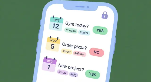
- Decision: a short sentence prompt (e.g., “How should I respond to the client?”).
- Options: quick bullets or chips (2–5 options is plenty). Provide an “Add option” action that doesn’t interrupt typing.
- Chosen option: one tap to select; consider auto-selecting the last edited option to reduce extra taps.
- Confidence: a fast slider or 5-step scale (e.g., 20%–100%). This is critical for later learning.
Design tip: default the cursor into Decision with the keyboard open. Let “Next” move through fields without hunting.
Lightweight context fields (optional, not demanding)
Context improves later review, but it shouldn’t block capture. Use progressive disclosure: keep secondary fields collapsed behind an “Add details” row.
Optional fields that work well:
- Time: auto-filled; editable if needed.
- Location (optional): off by default; offer an “Add location” toggle rather than requesting permission on first run.
- Tags: suggested tags based on recent use (“Work”, “Health”, “Money”) plus quick add.
- Notes: one expandable text box for nuance.
Expected outcome and review date (build the learning loop)
To turn logging into improvement, capture what “success” looked like at the time.
- Expected outcome: one sentence (e.g., “Keep the relationship while protecting scope”).
- Review later: a date picker with smart presets like “Tomorrow”, “1 week”, “1 month”.
Avoid complex forecasting fields. You’re collecting a hypothesis, not writing a report.
Accessibility and speed-friendly UI
Fast isn’t just fewer screens—it’s fewer mistakes.
- Use large tap targets (especially for confidence and option selection).
- Choose readable typography with strong contrast; keep line lengths short.
- Consider dark mode early so the capture screen stays comfortable at night.
After saving, show a lightweight confirmation and keep people in flow: offer “Add another” and “Set review reminder” as small, optional actions—not interruptions.
Map the Core Screens and Navigation
Your app succeeds or fails on whether people can log a decision in seconds and find it again later. Start by sketching the few screens that handle 90% of use.
Key screens to sketch first
Home (Today): A lightweight “what happened today” view. Show today’s entries, a clear “Add decision” entry point, and small cues like streaks or “last decision logged” to reinforce the habit.
Add Decision: The capture form should be calm and minimal. Consider a single text field plus optional chips (category, confidence, expected outcome). Keep advanced fields tucked behind “More.”
Timeline: A chronological feed across days with search and quick filters (tags, people, context). This is where users browse and rediscover patterns.
Decision Details: A readable page for the full entry, edits, and follow-ups (what happened, what you learned). Put destructive actions behind a menu.
Insights: A simple dashboard (weekly review, most common categories, outcomes) that nudges reflection without feeling like “analytics.”
Navigation: keep it predictable
Two common patterns work well:
- Bottom tabs (Home, Timeline, Insights, Settings): best when users frequently switch modes.
- Single feed + floating action button: best when the Timeline is the home and capture is always one tap away.
Pick one and keep the mental model consistent.
Empty states and guidance
Empty screens should teach. Add one example entry, a quick-start template (e.g., “Decision / Why / Expected result”), and a short line explaining the benefit (“Log it now, review it later”).
Add friction only where it protects users
Use confirmation for delete, not for save. Offer an optional lock screen (PIN/biometric) and a subtle undo after deletion so the app feels both fast and safe.
Plan the Data Model and Storage
Launch without setup pain
Deploy and host your app when your MVP is stable enough for real users.
A daily decision app lives or dies by how reliably it saves entries and how easy it is to review them later. A clean data model also keeps future features (search, reminders, insights, export) from turning into painful rewrites.
Core entities to model
Start with a small set of “things” your app understands:
- DecisionEntry: the main record (timestamp, title, details, confidence, expected outcome, context, optional outcome check-in date).
- Tag: reusable labels (e.g., “health”, “career”, “money”) with a many-to-many link to entries.
- Template: predefined prompts/fields for faster capture (e.g., “Purchase decision” vs “People decision”).
- Reminder: when to nudge capture or follow-up reviews (schedule, enabled flag, last-fired).
- Review: a lightweight record of reflection (what happened, lessons, rating), linked to a DecisionEntry.
- Attachment (optional): metadata for photos/files/voice notes (URI, type, size), stored separately from the entry text.
Keep fields explicit and boring: strings, numbers, booleans, and timestamps. Derived fields (like streaks or weekly counts) should be computed, not stored, unless performance forces it.
Storage approach: local-first vs sync-first
For most MVPs, local-first (on-device) is the safest path: fast capture, works offline, fewer moving parts. Add sync later once the core flow proves valuable.
If you need multi-device from day one, still treat local storage as the source of truth and sync in the background.
Edits, history, and conflict safety
People will edit entries. Avoid silent overwrites by planning versioning:
- Store
updatedAtand a simpleversioncounter. - On sync conflicts, prefer keeping both versions (or preserving a “previous content” snapshot) rather than losing history.
Decide export early
Choose export formats up front—CSV and/or JSON—and align your field names to them. It prevents future rework when users ask to back up, switch devices, or analyze their decision journal elsewhere.
Privacy and Security Basics (Without Legal Overreach)
A decision journal quickly becomes personal: health choices, money calls, relationship moments, work dilemmas. Treat “private by default” as a product feature, not a legal checkbox. Your goal is simple: users should understand what happens to their data and feel safe writing honestly.
Set clear privacy expectations
Use plain language in onboarding and Settings:
- Where entries live (only on the device, or also in the cloud)
- Whether anyone else can read them (ideally: no)
- What happens if the phone is lost or replaced
Avoid vague promises. Be specific about what you do and don’t do.
Collect less than you think you need
For an MVP, the safest default is minimal collection.
Data you may need: decision text, timestamp, optional tags, optional mood/outcome fields.
Data you should avoid by default: contacts, precise location, microphone access, advertising identifiers, reading other apps, or any background collection.
If you want analytics, consider aggregated, non-identifying events (e.g., “created entry” count) and make it opt-in.
Security basics users actually notice
- Device encryption: assume modern iOS/Android encryption; use platform-secure storage (an encrypted database where possible).
- App lock: offer PIN and biometrics to open the app (and optionally to open exports).
- Secure backups: if you support cloud sync/backup, encrypt data in transit and at rest. Prefer end-to-end encryption when feasible.
If you use accounts, keep auth straightforward
Support one or two reliable options (email + password, or “Sign in with Apple/Google”). Plan the basics:
- Verified email on signup
- Password reset flow that doesn’t expose whether an email exists
- Session timeout and “log out of all devices”
Finally, add a simple “Delete my data” control inside the app. This is a trust builder, even before you write any long policy text.
Choose Your Tech Stack and Architecture
Ship a v1 this week
Turn your user stories into real screens without setting up the full stack first.
Your tech stack should make the app feel fast, reliable, and simple to maintain. A daily decision capture app is mostly about quick input, dependable storage, and (optionally) syncing across devices—so you can keep the architecture lean.
Native vs. cross-platform: pick based on reality
Native (Swift for iOS, Kotlin for Android) is a strong choice when you need the smoothest input experience, best platform integrations, and you have dedicated iOS/Android skills. The trade-off is maintaining two codebases, which usually means higher cost and longer timelines.
Cross-platform (Flutter or React Native) can be ideal for an MVP when you want one team shipping both platforms quickly and your UI is fairly standard. The trade-off is occasional platform-specific work (especially around notifications, background tasks, and OS upgrades).
A practical rule: if your team already knows one approach well, choose that. Familiar tools beat “perfect” tools.
Backend decision tree: how much server do you really need?
- No backend: everything stays on-device. Lowest cost and simplest privacy story. Best for single-device use.
- Sync-only backend: a small service that stores encrypted user data and handles sign-in + device sync. Best balance for most journaling apps.
- Full backend: user accounts, collaboration, dashboards, admin tools, maybe team features. Higher complexity and ongoing operations.
If you’re unsure, start with “no backend” or “sync-only” and design your data so you can add more later.
Common building blocks you’ll likely need
- Local database: SQLite-based options are common (often wrapped by a library). This supports fast search and offline use.
- Push notifications: for reminders and gentle nudges—keep them optional and user-controlled.
- Analytics: track basic funnels (first entry, daily streak, export) without collecting sensitive content.
- Crash reporting: essential for stability; it’s the fastest way to learn what breaks in the real world.
A fast path if you want to ship without building the whole pipeline
If your goal is to validate the UX quickly (capture speed, retention, review loops), a vibe-coding platform like Koder.ai can help you prototype and iterate without standing up the entire stack first. You describe the app in chat, generate a React-based web experience (and extend toward mobile), and later export the source code if you decide to invest in a full production build.
This approach is especially useful for decision-journal products because the differentiator is rarely an exotic algorithm—it’s the flow, defaults, and trust-building details you refine through real usage.
Document the trade-offs for future you
Write down what you chose and why: platform approach, data storage, sync strategy, and what you intentionally skipped. When you revisit the app in six months, this short “decision log” prevents expensive rework.
Offline-First, Sync, and Backup Strategy
An offline-first approach means the app works fully even with no connection. For a decision capture tool, that’s the difference between “I’ll log it later” (and forgetting) and a two-second save that sticks.
Why offline-first matters for daily capture
People record decisions in imperfect moments: on the subway, in an elevator, in a basement meeting room, or when the network is simply slow. Offline-first keeps capture fast because the app writes to the device immediately—no waiting for servers, no spinners, no failed submissions.
It also reduces anxiety: users can trust that what they wrote is stored right away.
Sync options: device-only vs. accounts
Choose one path:
- Device-only (no account): simplest MVP. Data stays on the phone. Add export or backup later, but be clear that uninstalling can erase data.
- User accounts + sync: enables multi-device use and safer recovery, but adds complexity.
If you sync, define conflict rules early. A practical default:
- Each decision entry has a unique ID and timestamps.
- Edits: last-write-wins can be acceptable for MVP if you also keep a small edit history per entry.
- Deletes: treat delete as a tombstone that syncs, so removed items don’t reappear.
Backup and restore behavior
Users will change phones or reinstall. Decide what restore means:
- With accounts: restoring should pull all entries after sign-in, then merge with any offline entries created before login.
- Without accounts: offer local backup/restore (for example, an exported file the user can re-import) and clearly explain what happens on uninstall.
Sensible limits (only if you can support them)
If you allow attachments, set expectations upfront: maximum attachment size, supported types, and whether there’s a storage cap. If you can’t reliably enforce quotas yet, keep attachments out of MVP and focus on text-first capture.
Reminders and Habit-Friendly Notifications
Notifications can help people build a lightweight decision-journaling habit, but only if they feel optional and respectful. The goal is consistency and learning—not pressure.
Pick a small set of reminder types
Start with three types that match how people actually use a decision journal:
- Daily prompt: a gentle nudge to capture one decision (or to log “nothing notable today”).
- Scheduled review: a weekly recap reminder to look back and spot patterns.
- Outcome follow-up: a reminder tied to a specific entry (for example, “Check outcome in 3 days”).
Keep these configurable. Some users want daily prompts; others only want review reminders.
Make notifications respectful by default
Good defaults prevent notification fatigue:
- Frequency caps: daily prompts max one/day; reviews max one/week; follow-ups only when users set them.
- Quiet hours: default to no notifications during typical sleep hours, with a simple time picker.
- Easy opt-out: allow turning off each reminder type from a single settings screen.
If you add “smart timing” later, keep it transparent (“We’ll send this at 7pm”) and always editable.
Streaks and goals: only if they support learning
Streaks can motivate, but they can also create guilt. If you add them, keep them gentle:
- Use language like “days captured” rather than “streak broken.”
- Offer flexible goals (for example, 3 days/week).
- Celebrate reviews and follow-ups, not just daily check-ins.
Example notification copy (neutral and concise)
- Daily prompt: “Any decision worth noting today? Capture one in 30 seconds.”
- Daily prompt (light): “Quick check-in: log a decision—or skip for today.”
- Weekly review: “Weekly review: look back on your decisions and outcomes.”
- Outcome follow-up: “Follow-up: how did ‘Try the new workout plan’ turn out?”
- Opt-out friendly: “Too many reminders? Adjust notification settings anytime.”
Insights, Review Loops, and Export
Iterate safely
Use snapshots and rollback to test changes without risking your core capture experience.
The point of capturing decisions isn’t to create a perfect archive—it’s to learn faster. Your app’s insights should help users notice patterns and run better personal experiments, without pretending to predict the future.
Start with a few simple, high-signal views
Keep the first iteration lightweight and easy to understand. A good baseline set:
- Decisions per day (a timeline or calendar view) to reinforce the habit.
- Top tags (and tag trends over time) to show what topics dominate attention.
- Confidence vs. outcomes (a basic scatterplot or grouped summary) to reveal overconfidence or underconfidence.
These views should work even when data is messy. If a user only logs confidence half the time, your summaries should reflect that gracefully.
Build a review mode that closes the loop
Insights matter most when users revisit past entries. Add a dedicated review mode that surfaces older decisions and prompts a quick update:
- “What happened?” (won/lost/neutral, or a short note)
- “What did you learn?”
- Optional: “Would you make the same decision again?”
Make review feel quick: one screen, few taps, and the ability to skip. A weekly review prompt is often more sustainable than a daily one.
Don’t overpromise—summarize, don’t predict
Phrase outputs as summaries: “Your highest-confidence decisions had mixed outcomes this month,” not “You should trust your gut less.” Avoid recommendations that sound like medical, financial, or legal advice.
Export and sharing (with clear privacy notes)
Add export early because it builds trust and reduces lock-in fear. Common options include email to self and save a file (CSV/JSON/PDF).
Be explicit about privacy: explain what’s included, whether exports are encrypted, and that emailing a file may store a copy in a mail provider’s systems.
Testing, Beta, and Launch Plan
Testing is where a decision journal app earns trust. If capture fails once, people stop using it. Keep your plan practical: test what users do most (capture), what they expect to “just work” (offline), and what can ruin confidence (lost data).
A focused test checklist
Run a short checklist before every release:
- Capture flow speed: open app → add decision → save in a few seconds.
- Offline behavior: create/edit entries in airplane mode; verify they still appear after restart.
- Edit/delete: confirm updates persist and deletes don’t reappear after sync.
- Search and filtering: search by keywords/tags; confirm results are consistent and fast.
- Data integrity: no duplicated entries, missing fields, or corrupted timestamps.
Edge cases that break journaling apps
Prioritize weird-but-common situations:
- Timezone changes while traveling: entries should keep the original created-at time and display correctly.
- Daylight saving time shifts: avoid duplicated or “impossible” times; store timestamps in UTC internally.
- Missing permissions: notifications disabled, storage restrictions, or denied biometrics—app should degrade gracefully.
- Low storage / low battery: ensure saves don’t silently fail.
Beta and feedback loops
Run a small beta (20–100 users) for 1–2 weeks. Collect feedback with a simple in-app form (category + free text + optional screenshot) or an email option. Ask specifically about capture friction, confusion in review, and any moments of lost trust.
Launch essentials
Before release, confirm onboarding explains the one-minute habit, your store listing is clear, screenshots focus on the capture flow, and you have a short roadmap: what’s next, what won’t be built yet, and how users can request features.
If you’re iterating quickly, consider using tools that support rapid snapshots and rollback (so you can ship improvements without risking data loss). Platforms like Koder.ai also support exporting source code when you’re ready to move from prototype to a more customized production setup.
FAQ
What is a daily decision capture app?
A daily decision capture app is a lightweight decision journal for logging choices in seconds, right when they happen. Each entry should record what you decided plus minimal context (e.g., tag, mood/energy, confidence) so it’s useful later.
Why does speed matter more than rich journaling features?
Because decisions often happen in rushed, imperfect moments (hallways, commutes, between meetings). If capture takes longer than 10–20 seconds, users procrastinate and forget—turning “capture” into traditional journaling.
What’s the minimum viable feature set for an MVP?
Keep the MVP to what supports capture and retrieval:
- Add an entry (decision + quick context)
- Timeline view (scroll recent entries)
- Edit/delete (to fix wording or remove sensitive items)
- Basic search (keywords/tags)
Everything else should be optional or deferred.
What’s one good way to differentiate without bloating the product?
Pick one MVP-friendly differentiator and do it well:
- Templates (pre-filled prompts)
- Tags (fast filtering)
- Reminders (gentle nudges)
- Outcome follow-up (check back in 7 days)
Avoid stacking multiple differentiators early; it slows shipping and muddies the core flow.
What should the “one-minute experience” look like?
A practical default flow is open → Quick Log → choose type/template → optional note/tag/confidence → save. Design for one-handed use, start with the cursor in the main field, and keep optional fields behind “Add details” or “More.”
What fields should each decision entry include?
Use the smallest set that makes review meaningful:
- Decision text
- Chosen option (if applicable)
- Confidence (slider or 5-step)
- Timestamp (auto-filled)
- Optional: tags, short note, mood/energy
- Optional: expected outcome + review date
Make context fields skippable so they never block saving.
Should the app be local-first or cloud-first?
For most MVPs, go local-first: write to an on-device database immediately, work offline, and add sync later. If you need multi-device early, still treat local storage as the source of truth and sync in the background.
How do you handle edits and sync conflicts without losing data?
Start simple and safe:
- Store
updatedAtand aversioncounter - If syncing, keep delete “tombstones” so removed items don’t reappear
- On conflicts, prefer preserving both versions (or a snapshot) over silent overwrites
The goal is to avoid losing user trust due to missing or reverted entries.
What privacy and security basics should a decision journal app include?
Make it private by default and collect less:
- Be explicit about where data lives (device vs cloud)
- Avoid sensitive permissions by default (contacts, precise location, microphone)
- Offer app lock (PIN/biometrics)
- If cloud sync exists, encrypt in transit and at rest; consider end-to-end encryption
- Include an in-app “Delete my data” control
What should you test before launching a decision capture app?
Test what breaks trust and habit formation:
- Capture speed (open → save in a few seconds)
- Offline create/edit, then restart the app
- Search/filter consistency
- Data integrity (no duplicates, missing timestamps)
- Timezone and daylight saving handling (store timestamps in UTC)
- Low storage/low battery behavior (no silent save failures)