May 07, 2025·8 min
How to Build a Mobile App for Daily Focus and Goal Setting
Learn the steps to plan, design, and build a mobile app that helps users set daily focus, track progress, and stay motivated with simple workflows.
Clarify the Daily Focus Problem and Audience
Before you write code, decide what “daily focus” means inside your app. If the definition is fuzzy, the feature set will sprawl and the product will start behaving like a generic to-do list.
Pick one clear focus model
Choose a model users can understand in five seconds:
- One Priority: a single “must-do” that anchors the day.
- Top 3: three outcomes that balance ambition with realism.
- Themes: broad categories (Health, Work, Family) that guide choices.
- Time Blocks: schedule-based focus for people who think in calendar chunks.
Whichever you pick, make it the default path. You can introduce additional modes later, but your MVP should protect simplicity.
Identify who you’re building for (and why)
Different users need different forms of support and motivation:
- Students: deadlines, studying consistency, and reducing procrastination.
- Knowledge workers: task prioritization, meeting-heavy days, and context switching.
- ADHD-friendly needs: low-friction entry, gentle prompts, and reduced cognitive load.
- Busy parents: short planning windows, frequent interruptions, and realistic goals.
Write a one-sentence promise for each target group (what changes by using the app daily).
Name the pain points and success metrics
Common problems include distraction, unclear priorities, and inconsistent follow-through—all issues a habit loop can address.
Define success in user terms, not vanity metrics:
- Clarity: “I know what matters today.”
- Completion rate: % of focus items done.
- Streaks: consistency without shame.
- Reduced carryover: fewer unfinished tasks rolling into tomorrow.
Decide what your app will not do
To avoid becoming a full project manager, set boundaries early: no complex dependencies, no multi-level backlogs, no heavy reporting. Your mobile app development choices should support focus, not busywork.
Define Outcomes, MVP Scope, and the Daily Loop
Before you sketch screens or pick a tech stack, decide what “success” means for the app. A daily focus app works best when it makes a clear promise—and keeps it every day.
Start with a simple promise
Pick one concrete outcome you can deliver quickly:
“Set your focus in under 60 seconds each morning.”
This promise becomes your filter. If a feature doesn’t help someone choose today’s focus faster or follow through more consistently, it probably doesn’t belong in version one.
Write a handful of user stories
Keep them plain and behavioral. Aim for 3–5 stories that describe the core rhythm:
- “Set today’s top goal in one step.”
- “Pick up to three priority tasks that support that goal.”
- “Review yesterday in 20 seconds (what worked / what didn’t).”
- “Check in mid-day: on track or adjust.”
- “Plan tomorrow with a quick rollover of unfinished items.”
These stories become your scope checklist—and they prevent the app from turning into a general-purpose to-do list.
Define MVP vs. nice-to-haves
MVP is what you need to fulfill the promise reliably:
- A daily goal + 1–3 priorities
- A simple check-in and reflection
- Basic history (at least a few days)
Nice-to-haves can wait: streaks, deep analytics, templates, integrations, social features, elaborate gamification.
Map the daily loop
Your main loop should be obvious and repeatable:
Plan → Act → Check-in → Reflect → Adjust.
If any step feels optional or confusing, simplify it.
Pricing (only if it matters now)
Keep early decisions lightweight: a free core experience with an optional upgrade for extras (themes, advanced history, premium prompts). Don’t let monetization complicate the MVP or slow down shipping.
Choose Features That Support Focus, Not Busywork
A daily focus app succeeds when it reduces decisions, shortens planning time, and makes follow-through feel achievable. Feature choices should reinforce one clear daily objective, while keeping everything else optional and lightweight.
Start with a single “Daily Focus”
Make the core object one primary objective for the day. Let users add a few supporting tasks, but keep them secondary—think “helpful steps,” not a second to-do list. A good rule: if a feature adds more typing than action, it probably hurts focus.
Make planning fast (templates and gentle suggestions)
Speed matters more than flexibility. Offer:
- Templates for common focus types (deep work, admin, health, learning)
- Repeating focus items (e.g., “Write 30 minutes” on weekdays)
- Suggested goals based on past choices (without forcing automation)
This reduces the “blank page” problem and helps users commit in under a minute.
Track progress without turning it into a spreadsheet
Keep tracking simple: checkboxes for supporting tasks, an optional time-spent field, and a short completion note. Time tracking should be frictionless (start/stop or quick add), and notes should be limited so users don’t feel they must journal.
Add reflection that improves tomorrow
Use one end-of-day prompt that takes seconds: mood/energy, what blocked progress, and one takeaway. The goal is learning, not grading.
Show history as patterns, not pressure
A calendar view or timeline helps users spot streaks, dips, and recurring blockers over weeks. Keep it visual and forgiving—history should motivate, not guilt-trip.
Design the User Journey and Key Screens
A daily focus app succeeds when the “happy path” is obvious: open the app, choose today’s focus, take one small action, then check in. Design screens around that loop, not around feature lists.
Onboarding (make the promise, then get out of the way)
Onboarding should explain the value in one or two screens: reduce decision fatigue, pick one focus, follow through.
Ask only 1–2 questions that immediately personalize the experience (for example: “What are you focusing on most right now—work, health, learning?” and “When do you want a reminder?”). Avoid long forms and settings walls. If you need more details later, collect them gradually.
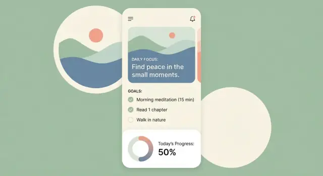
Home screen (today first)
The home screen should answer three questions at a glance:
- What’s my focus today?
- What’s the next action?
- What do I do now?
Use a single clear call to action (CTA) such as “Start next step” or “Check in.” Keep secondary actions (edit, history, settings) visually quieter.
Planning flow (turn intent into a doable plan)
Let users create or edit today’s focus in under a minute. After naming the focus, prompt for 1–3 small steps. Offer a simple reminder picker (time + optional days) and sensible defaults.
Check-in flow (frictionless honesty)
Checking in should be one tap: done / not yet, plus an optional quick note (“What got in the way?”). Make adjusting the plan easy: swap the next step, reduce scope, or move it to tomorrow without framing it as failure.
Review flow (plain-language reflection)
End the day with a short summary: what was completed, your streak (if you use one), and one clear insight (for example: “You finish more often when reminders are before 10am”). Keep it encouraging and specific so users return tomorrow.
Plan the Data Model and App States
A daily focus app feels simple on the surface, but it stays calm only when the underlying data is clear. A good data model also makes future features (templates, streaks, weekly reviews) easier without forcing a rewrite.
Core entities (what you store)
DailyFocus is the “one thing for today.” Keep it small and explicit:
date(the day it belongs to)title(short, scannable)description(optional detail)priority(e.g., low/medium/high or 1–3)status(draft, active, completed, skipped)
Tasks/Steps break the focus into doable parts:
- linked to
DailyFocusviadailyFocusId orderfor manual sortingisCompletedcompletedAttimestamp (useful for reflection and analytics)
Check-ins capture progress without making people write a journal:
- linked to
DailyFocusviadailyFocusId result:done,partial, orblocked- optional
note createdAt
Reminders should be flexible but not complicated:
schedule(time of day and optionally days of week)type(morning plan, midday nudge, evening review)timezonehandling (store the user’s timezone; adjust when traveling)quietHours(start/end to prevent unwanted pings)
User settings keep behavior consistent across days:
- notification preferences (on/off, reminder times)
- default templates (a starter DailyFocus title/steps)
- data export options (if you include them)
Here’s a compact way to picture the relationships:
{
  "DailyFocus": {"id": "df_1", "date": "2025-12-26", "status": "active"},
  "Task": {"id": "t_1", "dailyFocusId": "df_1", "order": 1, "completedAt": null},
  "CheckIn": {"id": "c_1", "dailyFocusId": "df_1", "result": "partial"}
}
App states (how the app behaves)
Define a few predictable states so the UI always knows what to show:
- No focus set for today → prompt to create/select a DailyFocus.
- Focus active → show today’s title, steps, and quick check-in.
- Focus completed/skipped → show summary and a gentle “plan tomorrow” entry.
- Editing → local draft state so users can cancel without damage.
- Offline (optional) → allow edits and queue changes for later sync.
When your data and states are this tidy, “focus” stays the default feeling of the product—not something users have to work for.
Create a Simple, Encouraging UX and UI
Iterate Without Breaking
Experiment with notification timing and copy safely using snapshots and rollback.
A daily focus app succeeds when it feels calm and obvious. The UI should reduce decision fatigue, not add choices. Aim for a “quiet” design where users can open the app, confirm one priority, and move on.
Make the main focus unmissable
Use a clean visual hierarchy: one main focus item above everything. Give it the most space, the strongest contrast, and the simplest controls. Secondary tasks and notes can exist, but they should sit visually below the primary focus so the screen doesn’t turn into a checklist wall.
Design for thumbs and fast moments
Most people check focus tools in motion—between meetings, in a hallway, on a commute. Make actions thumb-friendly:
- Bottom-aligned primary button for “Set Today’s Focus” or “Start”
- Swipe to complete, snooze, or reschedule
- Large tap targets and generous spacing to prevent mis-taps
Use supportive microcopy, not instructions
Short prompts guide behavior better than long explanations. Supportive microcopy sets the tone without sounding preachy:
- “What matters most today?”
- “Pick one win you’ll feel good about.”
- “Want to adjust your plan?”
Keep language positive and optional. Avoid guilt-driven copy (“You failed yesterday”).
Add gentle feedback without pressure
Feedback should encourage consistency while staying low-stakes. A small progress ring, a simple streak indicator, or “3 days this week” can motivate without turning the app into a scoreboard. Celebrate completion with brief confirmations—then get out of the way.
Include comfort settings early
Ship dark mode and adjustable text size early. They’re not “nice-to-haves”—they shape readability, night use, and accessibility from day one, and they’re harder to retrofit later.
Build Notifications and Reminder Logic
Notifications can make a daily focus app feel supportive—or irritating. Treat reminders as a light “tap on the shoulder,” not a megaphone. Start by defining a small set of moments that match a daily rhythm.
Pick three notification types
Most focus apps only need:
- Morning plan: a prompt to choose today’s top goal (and maybe one backup task).
- Mid-day nudge: a quick check to confirm the plan still makes sense.
- Evening reflection: a gentle wrap-up to mark what happened and reset for tomorrow.
Keep the copy short and specific. “Pick your one priority” beats “Stay productive!”
Give users real control (opt-in, editable)
Make reminders off by default or clearly opt-in during onboarding. Then let users adjust:
- Frequency (daily, weekdays only, or custom)
- Specific times for each notification type
- Quiet hours (including weekends)
Also provide a one-tap “pause reminders for a week” for vacations and busy periods.
Use actionable notifications
Action buttons reduce friction and increase follow-through. Common actions:
- Mark done (or “Completed”) for the daily focus
- Snooze (10–30 minutes)
- Open check-in to update the plan
Design actions to be safe: if a user taps “done” accidentally, let them undo in-app.
Handle timezones and schedule changes
People travel and devices change time automatically. Store reminder schedules in a way that respects the user’s local time, and reschedule when:
- Timezone changes
- The user edits their reminder time
- Daylight saving shifts occur
Avoid spam with smart limits
Add simple rules so reminders don’t pile up:
- Don’t send a mid-day nudge if the user already checked in recently.
- Skip reminders if today’s focus is already marked complete.
- Cap total notifications per day (even if multiple goals exist).
This keeps notifications meaningful—and protects long-term retention.
Pick Your Tech Stack and Architecture
Scale When You Need To
Begin on the free tier, then move up when you need more capacity for teams or production.
Your tech stack decisions should reflect what this app must do every day: open quickly, feel calm, and work reliably even when the user has spotty service. Choose platforms first, then an architecture that keeps “daily focus” simple rather than fragile.
iOS, Android, or cross-platform?
- iOS first can be faster if your audience skews toward iPhone users and you want one high-quality release quickly.
- Android first makes sense if your audience is broad and price-sensitive, or you expect a lot of device variety.
- Cross-platform is often the best budget/speed compromise when you need both platforms soon and your UI is fairly standard.
Native vs Flutter vs React Native (plain terms)
- Native (Swift for iOS, Kotlin for Android): best performance and platform polish, but you maintain two codebases.
- Flutter: one codebase, consistent UI across devices, strong for custom design; you’ll still write some platform-specific code for certain integrations.
- React Native: one codebase and a web-like developer experience; can move fast, but sometimes needs extra work to keep performance and animations smooth.
For a daily focus app (lists, check-ins, reminders), cross-platform works well unless you’re betting on deep platform-specific experiences.
A fast way to prototype (without committing too early)
If you want to validate your daily loop quickly—screens, data model, and basic backend—you can prototype on a vibe-coding platform like Koder.ai. It lets you build web, server, and mobile apps from a chat-driven planning flow, then export the source code when you’re ready to own the implementation.
That’s especially useful for a focus app because you can iterate on onboarding, notifications copy, and the “60-second plan” promise before spending weeks polishing edge cases.
Offline-first is not optional
Daily planning should work without a network. Treat connectivity as a bonus:
- Create/update today’s focus, goals, and check-ins locally.
- Queue changes for sync later (if you add accounts).
- Prevent “blank states” when offline—show the last known day and progress.
Local storage and sync strategy
Use a local database for speed and reliability:
- SQLite: proven and flexible; great when you want control.
- Realm: developer-friendly models and fast reads; good for iterative MVPs.
If you add accounts, keep sync simple: start with “last write wins” for most fields, and design your data so conflicts are rare (for example, one daily entry per date).
Set up CI/CD early
Even for an MVP, automate the boring parts:
- Repeatable builds and versioning
- App signing setup (so releases don’t stall later)
- Test builds for your team and beta users
This saves hours every week and reduces release-day surprises.
Backend, Sync, and Account Decisions
This is the point where many “daily focus app” ideas get heavier than they need to be. A focus and goal setting app can ship an excellent MVP without complex infrastructure—if you’re clear about what must be shared across devices and what can stay local.
Accounts: guest mode vs. sign-in
For an MVP, defaulting to guest mode is often the fastest way to reduce friction and improve first-use completion. Users can open the app, set today’s focus, and do a quick check-in without creating a password.
Add sign-in only if you truly need one of these early:
- Sync across multiple devices
- Backup/restore after reinstall
- Sharing goals with a coach/team
A common compromise: guest mode first, then an optional “Save & Sync” upgrade path.
If you use a backend: keep the APIs small
If you choose backend support, define the minimum set of APIs around your core daily loop:
- Focus items: create/update the day’s top priorities and small notes
- Check-ins: mark progress, completion, or a simple “done/not done” outcome
- Reminders: store user preferences (time window, frequency, quiet hours) and last-sent timestamps
Keep payloads simple. You can always expand later once analytics shows where people get stuck.
If you’re building on Koder.ai, a practical default stack is already aligned with many MVP needs: a React-based web layer, a Go backend, and a PostgreSQL database, with the option to generate a Flutter mobile app. That can reduce architecture thrash early—while still letting you export code and evolve the system like a traditional build.
Sync conflicts: decide the rule before you ship
Edits can happen on two devices (or offline). Pick one clear rule and apply it everywhere:
- Last write wins (fastest to implement; good for single-user data)
- Field-level merge (better, but more work)
Also decide what happens when both devices change the same focus item: overwrite, duplicate, or prompt the user.
Store minimal data by design
Collect only what you need to run the habit tracking and task prioritization experience. Avoid sensitive information (health details, precise location, contacts) unless it directly supports the app’s promise.
Basic admin needs
Even small apps need a lightweight support view: account lookup (if accounts exist), device/sync status, and the ability to delete data on request. Skip moderation tools unless you have user-generated public content.
Add Analytics and Feedback for Iteration
Analytics isn’t about spying on users—it’s about learning which parts of your daily focus app actually help people follow through. If you can’t measure “set focus” and “completed focus,” you’ll end up guessing what to improve.
Track a small set of product events
Start with a lean event list that maps to the daily loop:
- Created focus (a user sets today’s focus)
- Completed focus (marks it done)
- Opened reminder (taps a notification)
- Finished reflection (completes the end-of-day check-in)
Keep event names consistent and include simple properties like timestamp, timezone, and whether the action happened from a notification.
Define funnels that reflect real progress
A useful funnel shows where users drop off:
Onboarding → first focus set → first completion → week 2 return
If many users set a focus but don’t complete it, that’s a product signal: the focus prompt might be unclear, the day plan too long, or reminders poorly timed.
Measure retention and habit formation
Daily focus is a habit, so watch habit-friendly metrics:
- Weekly Active Users (WAU) to see ongoing value
- Streak continuation to understand consistency (and whether streaks motivate or discourage)
Compare new users week-over-week, not just overall totals.
Test changes carefully
Small A/B tests can help you tune prompts and reminder timing—but only if you have enough users to trust the result. If you don’t, run time-boxed experiments (one change for one week) and compare funnel and retention trends.
Add in-app feedback that fits the routine
Add a lightweight prompt after reflection: “What was hard today?” with optional free text. Tag feedback to the stage of the loop (after reminder, after completion, after reflection) so you know what triggered the frustration—and what to fix next.
Privacy, Security, and Accessibility Essentials
Prototype Across Platforms
Create web, backend, and mobile foundations in one place, then iterate on onboarding and reminders.
A daily focus app quickly becomes personal: it can reveal routines, goals, and when someone is most active. Treating privacy, security, and accessibility as core features builds trust and prevents painful rework later.
Privacy: consent and clear choices
If you use push notifications, ask for permission at the moment it makes sense (“Want a daily reminder at 9:00 AM?”), not on first launch. Explain what the user gets and what you don’t do (for example, “We don’t sell your data”).
Optional tracking should be truly optional. If you collect analytics for iteration, keep it minimal and make it easy to opt out in Settings. Avoid collecting sensitive text like goal titles or journal-style notes unless you have a strong reason.
Data controls users can understand
If you offer accounts or cloud sync, provide straightforward controls:
- Export (optional, but helpful for trust)
- Delete specific items (today’s focus, history, notes)
- Delete account and associated data
Make deletion behavior explicit: what’s removed from the device vs. from the server, and how long it may take. “Delete” shouldn’t mean “hidden.”
Security basics that prevent common mistakes
Start with fundamentals:
- Encrypt data in transit (HTTPS/TLS) for any network call.
- Use secure storage for tokens and sensitive preferences (platform keychain/keystore).
- Be careful with logs: never log auth tokens, email addresses, or full goal text.
Also consider how notifications behave on lock screens. A reminder that reveals a private goal (“Finish the breakup letter”) may not be appropriate by default. Offer a “hide notification content” option.
Accessibility: design for real-world use
A focus app should work one-handed, in bright light, and for users relying on assistive tech:
- Add screen reader labels to buttons, icons, and input fields.
- Maintain readable contrast and avoid using color alone to convey priority.
- Use large tap targets and predictable navigation.
Test with system settings turned on: larger text, reduced motion, and high-contrast modes. Small issues here quickly become daily frustrations.
Internationalization (if you expect multiple languages)
Even if you launch in one region, avoid hard-coding strings. Use localization files early, format dates/times with locale-aware tools, and plan for longer text so buttons don’t break when translated.
Testing, Beta Release, and Launch Checklist
A daily focus app feels “simple” only when every small interaction works reliably. Testing isn’t just for preventing crashes—it’s how you protect trust when users return each morning.
Test the core flows (end-to-end)
Start with the handful of actions that define the experience and test them as complete journeys:
- Set today’s focus (first-time and returning user)
- Edit the focus (before and after completion)
- Mark complete and add a short reflection
- View history and confirm entries match the right dates
Run these flows with real data (multiple days), not only with fresh installs.
Cover the tricky edge cases
Daily apps often break around time and gaps. Create specific test cases for:
- Missed days (user returns after 3–14 days): what shows on “Today,” and how history is filled
- Timezone travel: a focus set at night shouldn’t “jump” to a different date unexpectedly
- Daylight Saving Time shifts: reminders shouldn’t double-fire or disappear
Also validate what happens when the user changes device time manually, or the phone is offline.
Notification testing on real devices
Push notifications and local reminders behave differently across OS versions and manufacturer settings. Test on a small device matrix:
- iOS: at least one older supported version and the latest
- Android: at least two major versions plus a device with aggressive battery optimization
Verify permission prompts, scheduled times, “tap to open” behavior, and what happens after the user disables notifications.
Beta release checklist
Before inviting beta users, confirm the basics are in place:
- Crash reporting enabled and tested (force a test crash)
- Performance checks: cold start time, scrolling history, saving a focus
- Onboarding clarity: users understand what to do in under 30 seconds
- Simple feedback path: one place to report issues or confusion
If you’re iterating quickly, platforms like Koder.ai can help here too: snapshots and rollback make it safer to test changes to the daily loop, and deployment/hosting options can speed up sharing builds with early users. When you’re ready, you can export the source code and continue with your own CI/CD.
Launch plan (store assets + release notes)
Prepare app store assets early: icon, screenshots that show the daily loop, and a short description focused on outcomes. For release notes, keep a consistent format (what’s new, what’s fixed, what to try) so updates feel trustworthy and predictable.
FAQ
What does “daily focus” mean in a daily focus app, and how do I choose a model?
Start by choosing one model users can grasp instantly:
- One Priority (single must-do)
- Top 3 (three outcomes)
- Themes (broad categories)
- Time Blocks (calendar-style)
Pick one as the default for your MVP and avoid offering multiple competing models on day one.
How do I decide who the app is for without making it too broad?
Write a one-sentence promise per audience that describes the change they’ll feel from daily use.
Examples:
- Students: “Plan one study outcome each day and reduce procrastination.”
- Knowledge workers: “Cut context switching by committing to one priority.”
- ADHD-friendly: “Set focus with minimal typing and gentle prompts.”
What success metrics matter most for a daily focus and goal-setting app?
Use user-centered metrics tied to the daily loop:
- Clarity: users report they know what matters today
- Completion rate: % of focus items completed
- Consistency: streaks or “days used this week” (without shame)
- Reduced carryover: fewer unfinished items rolling into tomorrow
Avoid vanity metrics (downloads, raw screen time) unless they map to actual follow-through.
What features should I explicitly avoid so the app doesn’t turn into a full to-do list?
Set boundaries early so the product doesn’t become a generic task manager. Common “no’s” for an MVP:
- No complex dependencies
- No multi-level backlogs
- No heavy reporting dashboards
If a feature increases planning time more than it improves follow-through, exclude it from v1.
What is the simplest “daily loop” that actually works for users?
Anchor everything around a repeatable loop:
- Plan (set today’s focus + 1–3 steps)
- Act (start the next action)
- Check-in (done / not yet / blocked)
- Reflect (one short prompt)
- Adjust (shrink scope or roll over)
What should be in the MVP for a daily focus app vs. saved for later?
Limit your MVP to what’s required to deliver your promise (for example, “set focus in under 60 seconds”):
- One Daily Focus per date
- 1–3 supporting steps/tasks
- Quick check-in + short reflection
- Basic history (at least a few days)
Defer streak mechanics, deep analytics, integrations, templates marketplace, and social features until you’ve validated retention.
How should onboarding work for a daily focus app to reduce drop-off?
Keep onboarding short and action-oriented:
- Explain the value in 1–2 screens
- Ask only 1–2 setup questions (e.g., preferred reminder time, broad area like Work/Health/Learning)
- Get the user to their first “Today” focus as fast as possible
Collect extra preferences later, gradually, after the habit starts forming.
Which core data entities and app states do I need to model from the start?
Use a small set of predictable app states so the UI always knows what to show:
- No focus set → prompt to create/select today’s focus
- Active focus → show title, next step, check-in
- Completed/skipped → show summary + “plan tomorrow”
- → local draft users can cancel
How do I design reminder notifications that help without becoming spam?
Most apps only need three notification moments:
- Morning plan (choose today’s priority)
- Mid-day nudge (confirm or adjust)
- Evening reflection (wrap up and reset)
Make reminders opt-in or clearly controllable, add quiet hours, and include safety rules (skip nudges if already checked in; skip if focus is complete). Handle timezone/DST so notifications don’t drift or double-fire.
Do I need accounts, a backend, or a specific tech stack to ship a strong daily focus MVP?
Treat offline-first as a baseline requirement:
- Store focus, tasks, and check-ins locally (fast open, works without service)
- If you add accounts, start with simple sync rules (often last write wins)
- Default to guest mode unless you truly need multi-device sync or backup
Choose a stack based on speed and reliability: cross-platform is usually fine for lists/check-ins/reminders, while native can help if you’re betting on deep platform-specific polish.