Apr 14, 2025·8 min
How to Build a Mobile App for Digital Business Cards
Step-by-step plan to build a mobile app for digital business cards and networking: core features, tech choices, privacy, MVP scope, launch, and growth.
Step-by-step plan to build a mobile app for digital business cards and networking: core features, tech choices, privacy, MVP scope, launch, and growth.
A digital business card app only works if it fixes a real friction point. Most people don’t struggle with having contact info—they struggle with collecting it cleanly, keeping it current, and actually following up.
Before features, start by deciding which moment you’re improving and what “better” looks like.
Write down the exact moment your app is meant to improve. Common pain points include:
Be specific: is the core problem speed (exchange in 5 seconds), accuracy (no manual entry), or continuity (turn a meeting into a relationship)?
Different users expect different outcomes:
Choose a primary persona for your MVP so your onboarding, features, and pricing don’t become generic.
Define “success” in measurable actions, not downloads:
Pick a single situation to optimize end-to-end—e.g., in-person events, B2B outreach, or an internal company directory—and make that flow feel effortless before expanding.
An MVP for a digital business card app should focus on one job: help people exchange contact details quickly, then actually use those contacts later. That means getting the profile right, making sharing frictionless, and ensuring every received card can turn into an actionable relationship.
Start with a clean, fast profile builder. At minimum, let the user add their name, role, company, photo, short bio, and key links (LinkedIn, website, calendar, portfolio).
Keep editing lightweight: users should be able to update their title or link in seconds—because details change often.
For a mobile networking app, sharing needs to work in noisy, low-signal environments (events, lobbies, taxis). Build two primary methods:
A strong MVP bonus is a Wallet pass (Apple/Google). It makes the card one tap away without opening the app, which increases real-world usage.
Once someone receives a card, saving should be effortless and flexible:
The key is avoiding “hostage data.” Users should feel they can take their contacts with them.
A contact exchange app becomes valuable after the handshake. Add lightweight fields like “where we met” and free-form notes, plus tags (e.g., Partner, Hiring, Lead).
Follow-up reminders turn a pile of contacts into outcomes. Keep it simple: a date and optional prompt.
People rarely remember full names. Provide search and filters by tag, company, location, and date met. This is one of the fastest ways to make the app feel “sticky” without adding complex features.
Wireframes are where your “digital business card app” becomes a real, testable experience. Keep these screens lean enough for an MVP, but detailed enough that design, engineering, and QA agree on what “done” means.
Aim for a 60–90 second first run. Users should be able to create a card without thinking.
Key states to include:
This is the “business card screen” people will open at events.
Checklist:
Scanning must feel dependable.
Include:
After a scan, users need quick next steps.
Add:
Use readable text sizes, strong contrast, and large tap targets—especially on the QR and scan screens where people use the app one-handed.
Before you write code, lock down what the app must store and how it behaves when people are exchanging contacts in a hallway with spotty reception. A clear requirements list also prevents “feature creep” from breaking your MVP.
Decide early how users will log in, because it affects onboarding speed and support load. Common options:
Many apps offer Apple/Google plus one fallback (email or phone).
A practical baseline schema:
Networking often happens offline. Use a local cache (so the user can show their card and save new connections) plus background sync to reconcile once connectivity returns.
Define conflict rules (e.g., “latest edit wins” for profile fields; keep all notes).
Push notifications should be purposeful: follow-up reminders and confirmation of a new connection (where applicable). On the admin side, plan minimum tools for content moderation, abuse reports, and basic support lookups (e.g., account recovery, blocking, and audit trails).
Picking a tech stack is mostly about tradeoffs: speed to launch, hiring flexibility, performance, and how much you want to maintain long term. For a digital business card app, the “right” choice is the one that supports fast sharing, reliable profiles, and rapid iteration.
Native (Swift for iOS, Kotlin for Android) is a strong fit if you expect heavy use of platform features like NFC, camera scanning, contact permissions, widgets, or Apple/Google identity sign-in. Native also tends to feel slightly smoother and can reduce edge-case bugs around QR scanning and deep links.
Cross-platform (Flutter or React Native) usually wins on time-to-market and cost, because you build one UI and ship to both platforms. For an MVP, this can be the fastest way to validate whether people actually exchange cards and return to update profiles.
Rule of thumb: if NFC and camera scanning are central from day one, lean native; if speed and a single codebase matter most, start cross-platform.
Managed backends (Firebase, Supabase, AWS Amplify) can dramatically reduce development time. You often get authentication, databases, file storage, and push notifications with minimal setup—ideal for early-stage product discovery.
A custom API (Node.js, Python, Go, etc.) makes sense when you need complex business logic, advanced permissions, or custom integrations (CRM syncing, team admin controls). It can cost more upfront, but gives you tighter control.
If you want to prototype quickly without committing to a full engineering pipeline, a vibe-coding platform like Koder.ai can help you stand up a working MVP via chat, iterate in a planning mode, and keep momentum with snapshots/rollback. It’s especially useful when your target stack aligns with common app needs (React for web views/admin, Go + PostgreSQL for a robust API, and Flutter for cross-platform mobile).
For profiles, connections, and teams, a relational database (PostgreSQL) is a safe default: structured data, strong consistency, and good reporting.
A document database (Firestore/MongoDB) can be quicker for flexible profile fields, but analytics and complex queries may require more planning.
If you anticipate “search people/company/title” early, consider adding a dedicated search layer later (or choose a backend that supports full-text search).
Store images (avatars, logos, backgrounds) in object storage (S3, Firebase Storage, Supabase Storage) and keep only URLs in your database. This keeps the app fast and avoids bloating your core tables.
Optimize for predictable monthly costs: free tiers, pay-as-you-go, and simple scaling. Start small, measure usage, then upgrade only when you see real retention and sharing volume. If you want to compare pricing and constraints, keep a simple decision doc alongside your /pricing assumptions.
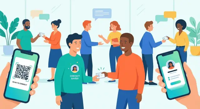
Sharing is the “moment of truth” for a digital business card app: it has to work instantly, even with spotty internet, mixed devices, or people who don’t have your app installed.
QR is the safest baseline because every phone camera can handle it. Generate unique, revocable QR codes per user (and optionally per card/profile version). If a code is posted publicly or scraped, let users revoke it and issue a new one.
To limit damage when a QR is compromised, support rotation: the app can automatically refresh the underlying token while keeping the user’s on-screen QR looking the same. For offline events, cache a short-lived token that still resolves when connectivity returns.
NFC enables “tap-to-share” and can feel more natural than scanning. The catch is device and OS differences: not all Android phones have NFC enabled, and NFC behavior varies by platform settings.
Treat NFC as an enhancement, not a dependency. A good rule: NFC tap if available → fallback to QR in one tap. Also consider printing NFC stickers/cards that open a deep link.
vCard export/import is essential for people who just want a contact saved. Include core fields like: full name, company, title, phone(s), email(s), website, address, and notes.
Watch formatting pitfalls:
TEL, EMAIL) and avoid custom fields that some address books drop.Use deep links so a scan opens the profile in-app when installed, with a clean fallback to a web profile page when it’s not. Keep the web page lightweight and include a clear “Save contact” action.
Finally, protect users: add rate limits for scanning and profile lookups, and restrict unsolicited messages (e.g., request/accept flows). This reduces spam while keeping exchanges frictionless.
Trust is a feature. If people hesitate to share their contact details, they won’t use your digital business card app in real networking moments. Build privacy and security into the MVP from day one so you don’t have to retrofit them later.
Start with the smallest profile that still creates value: name, role, company, and one primary contact method. Avoid requesting sensitive permissions (full contacts access, location, photos) unless the feature clearly requires it.
A simple rule: if you can ship without a data field or permission, don’t ask for it.
Give users clear control over what others can see. Many people want to share a work email publicly but keep a personal phone number private.
Consider per-field visibility toggles such as:
Make the sharing state obvious on the card preview so users don’t accidentally overshare.
Protect data both in transit and on device:
If you store business card data locally (for offline access), encrypt it and lock it behind the device’s passcode/biometrics when possible.
Networking happens across devices. Provide:
Even an MVP should include a clear data lifecycle:
Add these actions to a simple settings screen and link to your policies (for example, /privacy and /terms).
Once your MVP nails fast, reliable contact sharing, the next step is helping people use those new connections. “Networking features” shouldn’t feel like a heavy CRM—they should make follow-up and organization effortless.
Many users start solo, then quickly want their whole team to look consistent.
For team accounts, consider:
A simple model is: personal plan → add a team workspace with roles like Admin/Manager/Member.
Teams care about brand trust. Add branding controls that apply across the workspace:
Tip: enforce a few “required” fields for team templates to avoid half-filled cards that look unprofessional.
Users often want to move leads into their existing tools. Start with easy wins:
Later phases can include native integrations with HubSpot or Salesforce, but you can validate demand first with exports + webhooks.
A digital business card app becomes more valuable when it nudges the next step:
Keep it optional and fast: a single tap after saving a contact should be enough.
If your users attend conferences, “event mode” can differentiate your product.
Core ideas:
Design it as a temporary context users can turn on/off, so the everyday experience stays clean and simple.
Monetization for a digital business card app should feel invisible during a real conversation. If someone pulls out the app at an event, the experience must be fast: open, share, done. Charging at the exact moment of exchange is a great way to lose trust—and users.
A strong free tier helps adoption and makes your app “safe” to try:
This supports organic growth because users can share with anyone, even if the other person hasn’t installed the app.
Subscriptions work best when they enhance professionalism or provide measurable benefits:
Some upgrades are more natural as one-time buys:
For companies, pricing per seat is familiar. Bundle admin controls (team management, template locking) and offer SSO as an upsell for larger orgs.
Keep basic sharing free and reliable. Put paywalls on enhancements—branding, advanced analytics, team administration—not on the core act of exchanging contact details.
Analytics should answer one question: are people actually exchanging contacts faster and more reliably than with paper cards?
Start with a small, consistent event taxonomy so you can trust the numbers. At minimum, track: profile created, card shared, card scanned, contact saved, and follow-up set.
Add useful context (without collecting sensitive content): share method (QR/NFC/link), whether the share happened online/offline, and time-to-complete.
Your first funnel should connect onboarding to a real networking outcome:
Two practical KPIs: onboarding completion rate and time to first successful share. If users create a profile but never share, the app may be “interesting” but not essential.
Daily retention can look weak for networking tools, so focus on behavior that matches events and meetings. Track weekly active users (WAU), repeat shares per user, and returning users after events (e.g., activity spikes on conference days, then follow-up usage during the next week).
Test only what affects activation:
Anonymize analytics where possible, avoid logging full contact details, and offer clear opt-outs in settings. Trust is a growth lever for a contact exchange app—protect it while you measure it.
A digital business card app lives or dies on one promise: sharing contact details smoothly, every time. Your launch plan should focus on trust (no surprises), speed (scan + share), and clear value in the store listing.
Run a structured beta before you submit to the App Store/Play Store.
Use TestFlight (iOS) and a closed test track (Android) with 30–100 testers who attend events, meet clients, or do sales.
Collect feedback with short surveys after key tasks: create card, share via QR/NFC, scan someone else, save to contacts, and update details. Add one open question: “Where did you get stuck?”
Prioritize the moments where users feel friction:
Prepare store assets early: clear screenshots showing “Create → Share → Save,” a tight keyword strategy (e.g., “QR code business card,” “vCard sharing”), and accurate privacy labels/data safety forms.
If you request contacts or camera access, explain why in plain language.
Publish a lightweight FAQ and add in-app feedback (“Report a problem” + “Suggest a feature”). Include simple troubleshooting steps like “scan not focusing,” “NFC not detected,” and “can’t import to contacts.”
Keep the first campaign simple: a short demo video, a clear /pricing page, and an onboarding email sequence (welcome → “set up your card” → “tips for events” → “invite your team”). Track which message drives the first successful share—your earliest leading indicator of retention.
Shipping your digital business card app is the start of the work, not the end. The best long-term apps treat maintenance as a product feature: users trust that sharing and scanning will be instant, reliable, and safe every time.
Plan a lightweight feedback loop from day one: in-app “Send feedback,” periodic surveys, and a support inbox that’s actually monitored. Track why people leave.
Common churn reasons for contact exchange apps include:
Translate these into a tight backlog of top requests and the paper cuts that create drop-offs.
Even small apps need a simple operations routine:
A sensible next phase often includes team plans (company directories, admin controls), CRM integrations (HubSpot/Salesforce), and advanced search (tags, notes, filters). Introduce bigger features behind settings or tiers so the main scan/share flow stays fast.
As usage expands, prioritize localization (languages, name formats, phone formats) and accessibility upgrades (dynamic text sizing, screen reader labels, high-contrast support). These improvements reduce support load and increase retention.
Performance budgets help: set targets for “time to share” and “time to save a contact,” then fail builds that regress. Users forgive missing features; they don’t forgive a slow exchange moment.
Start by choosing a single “moment” to improve (e.g., exchanging details at in-person events) and define whether you’re optimizing for speed, accuracy, or continuity (follow-up). Then validate with a small set of real users and track metrics like shares per user and save rate, not just downloads.
Pick one primary persona for the MVP so your onboarding and features stay focused:
A narrow first persona usually ships faster and tests more cleanly.
A practical MVP includes:
Treat “Your Card” as the share-first home screen:
Design for one-handed use and speed in noisy environments.
A solid scanning flow includes:
The goal is predictable behavior—users won’t trust scanning if it fails under event conditions.
Provide multiple save options so users aren’t locked in:
Avoid “hostage data.” Portability builds trust and reduces churn.
QR is the best baseline because it’s universal. Use:
Keep the on-screen experience stable while changing the underlying token when needed.
NFC feels premium (“tap-to-share”) but varies by device and settings. A practical approach:
This preserves reliability across mixed devices.
Use deep links so a scan opens:
Add protections like rate limits on lookups/scans and consider request/accept flows if you enable messaging, to reduce spam without adding friction to basic sharing.
Track outcomes that reflect networking behavior:
Instrument a small event taxonomy early so the numbers stay trustworthy.
These features support the full loop: share → save → follow up.