Dec 03, 2025·8 min
How to Build a Mobile App for Digital Forms and Data Collection
Learn how to plan, design, build, and launch a mobile app for digital forms and field data collection, including offline mode, sync, security, and analytics.
Learn how to plan, design, build, and launch a mobile app for digital forms and field data collection, including offline mode, sync, security, and analytics.
Before you sketch screens or pick a tech stack, get specific about what your “digital forms app” is actually for and who it serves. A mobile data collection app built for field technicians has very different needs than one used by customers at home or by office staff on company devices.
Start by naming the primary user group and their context:
Be honest about constraints: is the user walking around a site, standing in the rain, or sitting at a desk? Those details shape everything from button size to whether offline form submission is mandatory.
Avoid a vague goal like “collect data.” Write down the few core activities your app must handle end-to-end, such as:
For each job, define the outcome users expect. An inspection isn’t “fill a form”—it’s “capture evidence, mark issues, and submit a report that triggers follow-up.” This clarity helps you design workflows, not just screens.
Pick measurable outcomes that reflect real value, such as:
These metrics guide MVP decisions and help you evaluate improvements later (for example, whether auto-fill or better validation actually reduces mistakes).
A digital forms app can range from a simple mobile form builder UX to a full workflow system.
If you need complex workflows, plan for roles, statuses, and an admin experience early. If you don’t, keep the mobile app MVP tight: prioritize fast entry, clear validation, and reliable data sync and validation over advanced features users won’t touch.
Once you know the purpose and audience, get clear on what the app must do on day one—and what can wait. Requirements for a mobile data collection app are easiest to validate when they’re grounded in real, end-to-end work.
Write user stories that describe the full flow from opening the app to submitting data. Aim for 5–10 stories that cover your most common and most risky scenarios.
Examples you can adapt:
Create a “Launch” bucket and a “Later” bucket. At launch, prioritize flows that:
Save nice-to-haves—custom themes, advanced conditional logic, complex dashboards—for later once you’ve seen real usage.
List every input your forms need so your model supports them from the start:
Also note constraints: max photo size, allowed file types, and whether GPS is mandatory.
Non-functional needs often decide success:
Document these alongside features so prioritization reflects real-world conditions—not just UI preferences.
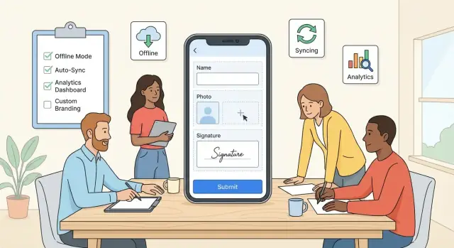
Before you think about screens and colors, map the few critical paths your users will repeat all day. For most mobile data collection apps, the core flow is simple—and your UX should make it feel effortless.
A practical baseline flow looks like:
Keep the form list focused: show what’s assigned, what’s due, and what’s already completed. A visible sync status (e.g., “Queued”, “Uploaded”, “Needs attention”) reduces confusion and support tickets.
Field users often have one hand free, glare on the screen, and spotty connectivity. Prioritize:
Short sections beat long scrolls. If your forms are lengthy, use sections with a sticky “Next” and allow quick navigation between sections.
Errors are part of the experience, not edge cases. Define what happens when users:
Make messages specific (“Photo is required for the Equipment section”) and point directly to the field.
Decide where drafts live and how users return to them. A good default:
When a user reopens a draft, restore their last position and show what’s incomplete—so finishing feels like checking boxes, not starting over.
A great digital forms app isn’t just a screen with inputs—it’s a consistent form model that can be rendered on iOS/Android, validated offline, and synced without surprises. Treat the form definition as data (JSON or similar) that your mobile data collection app can download and interpret.
Start with a small set of building blocks and make them predictable:
Keep field IDs stable and machine-friendly (e.g., site_id, inspection_date). Stable IDs are crucial later for reporting and data sync and validation.
Validation should be enforced on-device so users can complete offline form submission with confidence. Use a layered approach:
Design error messages for humans (“Enter a temperature between 0–100”) and place them close to the field. If validation is too strict, it reduces completion rates; if it’s too loose, admins spend hours cleaning data.
Field data collection often needs proof: photos, signatures, PDFs. Decide early:
Also define what happens when connectivity is poor: queue uploads separately from the main submission so the form can still be marked “complete” and synced later.
Forms will evolve. Plan versioning so updates don’t break work in progress:
This keeps your form builder UX flexible while protecting real-world data collection in the field.
Your tech stack should match your team’s skills, the environments where field teams work, and how fast you need to ship a mobile app MVP. For a mobile data collection app, the two biggest drivers are offline form submission reliability and how often your digital forms app will change.
Native apps (Swift for iOS, Kotlin for Android) give the best access to device capabilities and predictable performance—useful if you rely heavily on camera capture, background uploads, or complex validation. The trade-off is maintaining two codebases.
Cross-platform (Flutter or React Native) can speed up delivery and keep behavior consistent across devices, which is attractive for field data collection teams. Flutter tends to feel more “all-in-one” for UI, while React Native can fit well if you already have web React expertise.
If your priority is getting a solid MVP into users’ hands quickly (without skipping the fundamentals like roles, drafts, and sync status), platforms like Koder.ai can help you accelerate delivery. Koder.ai is a vibe-coding platform where you can build web, server, and mobile applications from a chat interface—useful when you want to iterate on form flows, validation rules, and admin tooling fast, then export source code when you’re ready to take full ownership.
Offline mode starts with local persistence: SQLite (or Room on Android, Core Data on iOS). Store form definitions, drafts, and a queue of submissions. Treat sync as a first-class feature: use versioned payloads, idempotent endpoints, and conflict rules so data sync and validation behave consistently.
Estimate active users, submissions per day, and attachment storage (photos, signatures). Choose object storage for files, add rate limits, and design your database for growth (indexes on user, form, date). If you expect rapid expansion, document an upgrade path from “single region” to multi-region and from simple queues to a message broker.
Offline support is often the feature that makes a mobile data collection app usable in the field. Treat it as a first-class workflow, not a fallback. The goal is simple: users should be able to complete work without thinking about connectivity—and trust that everything will sync later.
Start by documenting offline behavior for each action:
Implement background sync that retries automatically and never loses data. Use exponential backoff and resume uploads after app restarts.
Make sync status obvious in the UI:
Connectivity may flap between 0–2 bars, so design sync to be battery-friendly:
Photos, signatures, and files should be stored locally with the draft/submission, then uploaded when connected.
Use resumable uploads where possible, and show progress so users know large attachments are still moving—even if they leave the screen.
Your backend is the source of truth for form definitions, user access, and the data you collect. A clean API makes the mobile app faster to build, easier to maintain, and safer to operate.
Start with a small set of endpoints that cover the full lifecycle:
Keep payloads predictable and documented so the mobile team can implement quickly.
Mobile users shouldn’t re-download every form definition every time. Add a lightweight sync mechanism:
version, updated_at, or an ETag for each form.This reduces bandwidth and speeds up app launch, especially on poor connections.
Client-side validation improves user experience, but server-side validation protects data quality and prevents tampering. Re-check critical rules such as required fields, numeric ranges, allowed options, and permission-based visibility.
When validation fails, return structured errors the app can map to fields.
{
  "error": {
    "code": "VALIDATION_FAILED",
    "message": "Some fields need attention",
    "field_errors": {
      "email": "Invalid email format",
      "temperature": "Must be between -20 and 60"
    }
  }
}
Use stable error codes (e.g., AUTH_EXPIRED, FORM_VERSION_MISMATCH, ATTACHMENT_TOO_LARGE) and human-readable messages. This lets the app decide whether to retry, prompt the user to sign in, re-sync forms, or highlight specific inputs.
If you later add an admin portal or exports, you’ll reuse these same APIs—so it’s worth getting the fundamentals right now.
Security isn’t a “final sprint” item for a mobile data collection app. Forms often contain personal details, locations, photos, signatures, or operational notes—so you want clear rules for who can access what, and how data is protected on the device and in the cloud.
Start with how your users will log in on real job sites (poor connectivity, shared devices, high turnover).
If devices are shared, consider short session timeouts plus a quick re-auth method (PIN/biometric) to prevent the next person from seeing prior submissions.
At minimum, use TLS (HTTPS) for all API calls so data is encrypted in transit. For offline form submission, you may also store sensitive drafts locally; consider at-rest encryption on the device (encrypted database or OS keychain-backed storage) and avoid writing sensitive data to logs.
Also think about “small leaks”: screenshots, clipboard copying, or cached attachments. Restrict these only if your risk level justifies the usability trade-off.
Define roles early and keep them simple:
Limit access by project, region, or team so people only see the data they need.
Decide how long you keep submissions, how users request deletion, and how admins export data (CSV/PDF/API) for audits or partners. Document these behaviors in your product UI and help center without making broad compliance claims you can’t back up.
Mobile forms succeed when they feel faster than paper. Completion rates go up when the app reduces typing, avoids rework, and uses phone hardware in a predictable way.
Support inputs that match field work:
These features reduce “I’ll add it later” moments that often lead to incomplete submissions.
Location can prevent errors, but only if you treat permissions and accuracy responsibly.
Ask for GPS permission only when the user hits a location field, and explain why. Offer an accuracy selector (e.g., “Approximate” vs “High accuracy”) and show a confidence indicator (“± 12 m”). Always allow manual override—workers may be indoors or in poor coverage.
Barcode/QR scanning is one of the biggest completion boosters for inventory, assets, patients, samples, and deliveries. Make scanning a first-class input type, with a fallback to manual entry and a visible “last scanned” history to reduce repeats.
Small time savers add up:
Combine these with mobile-friendly controls (numeric keyboards, date pickers, one-tap toggles) to keep forms moving and prevent abandonment.
A mobile data collection app improves quickly when you can see what’s happening in the field. The goal isn’t “more data”—it’s clear signals about friction, reliability, and rollout progress.
Start with a small, consistent set of events tied to real user outcomes:
Keep analytics privacy-friendly: avoid capturing typed values, attachments, or free-text notes. Instead, log metadata like field type, error counts, and timestamps.
Reporting should answer operational questions in seconds:
These dashboards help you spot UX issues (a confusing date picker), data model gaps (missing “unknown” option), and connectivity problems.
A lightweight admin panel can prevent chaos when forms evolve:
If you want to iterate on admin workflows quickly, consider building the first version in Koder.ai: you can prototype a React-based admin portal plus a Go/PostgreSQL backend, ship it to a pilot team, and use features like snapshots and rollback to safely test changes to form publishing and exports.
If you’re still deciding how to implement analytics and admin features, see /blog/choosing-mobile-app-stack. For pricing and plan limits around dashboards and exports, link users to /pricing.
A mobile data collection app lives or dies on reliability. Field users won’t forgive a digital forms app that loses entries, validates inconsistently, or behaves differently across devices. Treat testing as part of product design—not a final checkbox.
Start with a clear, layered test plan:
Offline form submission is where bugs hide. Simulate real-world disruption:
Verify that drafts never disappear, sync resumes safely, and users can see what’s queued vs. completed. Pay special attention to data sync and validation conflicts (e.g., two edits to the same record).
Run a device matrix across screen sizes, OS versions, and low-end devices. Measure time-to-open form, typing latency, and large-form scrolling. Mobile keyboards, autofill, and camera permissions are frequent sources of field data collection friction.
Pilot with a small group that mirrors real usage: different roles, locations, and connectivity. Collect structured feedback (what blocked submission, confusing labels, missing fields) and track completion rate. A short in-app survey plus a weekly debrief often surfaces more than bug reports alone.
A mobile data collection app succeeds or fails after release: if teams can’t get started quickly, they won’t reach the point where your digital forms app proves its value. Treat launch as the beginning of a feedback loop—shipping is only step one.
Prepare your store presence and your first-run experience together. App store assets set expectations; onboarding confirms them.
If you already have documentation elsewhere, link to it with relative URLs like /help/getting-started and /blog/offline-sync-basics.
Onboarding should answer three questions: What do I do next? What happens if I’m offline? How do I know my data is safe and submitted?
Use short, skippable steps with plain language. Show a visible sync indicator and a “Last synced” timestamp so users trust the system. If your app supports multiple roles, detect role on first sign-in and tailor the tour (field staff vs. admin).
Don’t make users leave the app when they’re stuck mid-form.
Include:
Plan iteration cycles so you can improve quickly without disrupting active field data collection.
Use feature flags for risky changes, schedule form version migrations (with backward compatibility for in-progress submissions), and prioritize performance tuning for slow networks and older devices.
If you’re moving fast, choose tooling that supports safe iteration. For example, Koder.ai includes planning mode for aligning on requirements, supports deployment and hosting, and offers snapshots/rollback—useful when you’re pushing frequent updates to a digital forms app and want a clean way to revert if a form version or workflow change causes friction.
Finally, measure outcomes post-launch: onboarding completion rate, form completion rate, offline queue size, sync success rate, and time-to-first-successful-submission. Use these signals to refine onboarding and reduce drop-offs in the first week.
Start by defining the primary users (field teams, customers, or internal staff) and their working conditions (offline, gloves, shared devices, desk-based). Then list 3–5 “jobs to be done” (inspections, surveys, audits, checklists) with a clear end outcome, and pick success metrics like completion rate, time to submit, and error reduction.
Design offline as a core workflow:
A practical MVP “happy path” is:
Keep the form list focused (assigned, due, completed), use short sections instead of long scrolls, add progress indicators, and treat error states (offline submit, invalid inputs, failed uploads) as first-class experiences.
Treat form definitions as data (often JSON) that the app can download and render. Include predictable building blocks (sections, field types, repeatable groups, conditional logic, calculations) with stable, machine-friendly field IDs (e.g., site_id). This makes offline validation and consistent syncing easier across iOS/Android.
Use layered, human-friendly rules enforced on-device:
Make messages specific and field-linked (e.g., “Enter a temperature between 0–100”). Then mirror critical validation on the server to protect data quality.
Define it per field early:
A strong pattern is “store locally first, upload later,” with queued/resumable uploads and visible progress so large files don’t block completing the form.
Use versioning to prevent updates from breaking drafts:
This supports continuous improvement without corrupting field work.
Choose based on device needs, team skills, and offline complexity:
Whichever you pick, plan local storage (SQLite/Room/Core Data) and idempotent sync endpoints.
Keep the API surface small but complete:
Add incremental updates (ETags/updated_at) so devices download only what changed.
Track events tied to real outcomes while avoiding sensitive payloads:
Use dashboards for completion time, drop-off points, error hotspots, and sync health to guide UX and reliability improvements.