Sep 27, 2025·8 min
How to Build a Mobile Language Learning App That Users Keep
A practical guide to building a language learning mobile app: features, lesson design, tech choices, content, analytics, monetization, and a roadmap from MVP to launch.
A practical guide to building a language learning mobile app: features, lesson design, tech choices, content, analytics, monetization, and a roadmap from MVP to launch.
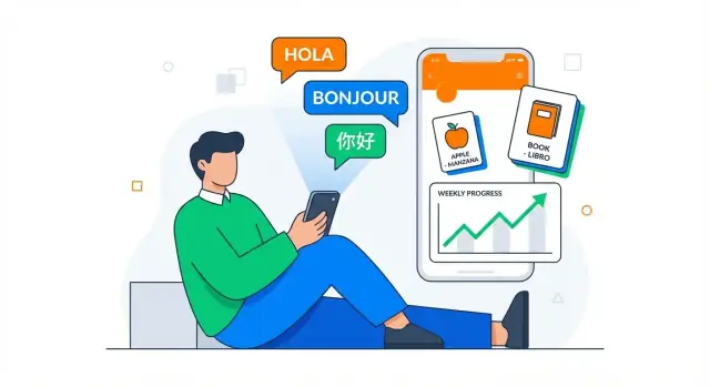
A language learning app succeeds or fails based on focus. Before you think about mobile app development details, decide exactly who you’re helping—and what “progress” means for them. This keeps your lesson design, UX for education apps, and analytics aligned.
Avoid “everyone who wants to learn Spanish.” Pick a primary audience segment and write it down:
Once you pick one, you can make better choices about tone, pacing, and whether features like speech recognition are essential on day one.
Great apps don’t try to improve everything at once. Choose outcomes that are easy to explain in one sentence, such as:
These outcomes will guide your exercise types, feedback style, and what you measure.
Match the format to the learner’s real life: daily practice streaks, short lessons (3–7 minutes), or longer sessions for deeper study. Your core loop later should reinforce this choice.
Pick a small set of metrics that reflect learning and user retention:
These metrics will shape your MVP for apps and help you avoid building features that don’t move the needle.
Before you design lessons or write a line of code, get clear on what already exists—and why your app should exist alongside it. Market research isn’t about copying features; it’s about finding an underserved promise you can deliver better than anyone else.
Start with 5–10 apps your target learners already use. Include big names and smaller niche products. For each one, note:
A fast way to do this is to read recent App Store/Google Play reviews and sort complaints by frequency. Patterns will show you where learners feel stuck.
Choose a differentiator users can understand in one sentence. Examples:
Your differentiator should shape your product decisions. If you claim “conversation practice,” your first screen shouldn’t be a vocabulary list.
Create a landing page with your one-sentence promise, 2–3 screenshots (mockups are fine), and a waitlist form. Drive a small paid test (e.g., $50–$200) on search or social ads to see if people actually sign up. If you can, offer a paid pre-order or a “founder price” to measure real intent.
Write two lists:
This keeps version 1 focused—and makes it easier to ship something learners can judge quickly.
A language learning app succeeds when users always know what to do next—and doing it feels quick. Your UX should reduce decision-making and make “today’s practice” the obvious path.
Start with a small set of screens you can perfect:
Avoid trapping new users in a long setup. Offer two paths:
If you include a placement test, show progress and allow users to exit without losing what they’ve entered.
Design around a single daily loop: Home → Lesson/Practice → Review → Done. Keep secondary features (forums, grammar library, leaderboards) behind tabs or a “More” area so they don’t compete with practice.
Plan for:
A simple flow plus inclusive design improves both learning and user retention—without adding complexity.
Your app’s “core learning loop” is the small set of actions users repeat every day. If this loop feels satisfying and clearly improves their skills, retention becomes much easier.
A practical default is:
Learn → Practice → Review → Track progress
“Learn” introduces a tiny concept (a phrase, a pattern, or 5–10 words). “Practice” checks recall (not just recognition). “Review” brings back older items at the right time. “Track progress” gives users a clear sense of movement: what they can now say, understand, and remember.
The key is to keep each cycle short enough to complete in 2–5 minutes, while still feeling like real learning—not just tapping through flashcards.
Spaced repetition works best when it’s not a separate mode hidden behind a menu. Build it directly into the loop:
Even at MVP stage, track outcomes per item (easy/medium/hard or correct/incorrect). That’s enough to schedule smart reviews.
Listening practice can be as simple as “tap to hear → choose meaning → replay at slower speed.” For speaking, a lightweight flow might be “listen → repeat → self-check,” plus optional speech recognition where available.
The goal isn’t perfect scoring—it’s building confidence and habit. If speech recognition misfires, allow users to skip grading without penalty.
Streaks should reward consistency, not punish real life. Offer a “streak freeze” or grace day, and keep reminders user-controlled (time, frequency, and mute options). Tie notifications to the loop: “2 reviews due—3 minutes to stay on track,” not generic nagging.
If you want a deeper look at engagement mechanics, you can later expand this in a retention section (see /blog).
A language learning app succeeds when lessons feel predictable, quick, and rewarding. Before you write lots of content, define a repeatable lesson “container” you can reuse across levels and topics. This helps lesson design scale and keeps mobile app development focused.
Aim for micro-lessons that fit naturally into a day: 3–7 minutes each. Use the same rhythm (e.g., Warm-up → Learn → Practice → Quick check) so learners know what to expect and can start immediately.
Consistency also makes it easier to plug in spaced repetition later, because you can reliably re-surface old items in short sessions without derailing the course.
Pick one progression model and stick to it:
Whichever you choose, show learners where they are and what “done” looks like (e.g., “Order food in a café” or “Past tense: regular verbs”). Clear progression supports user retention because progress feels real.
Vary exercises, but map each to a learning goal:
Avoid adding exercise types just for novelty. A smaller set, repeated often, is easier for users to learn and cheaper to maintain.
Write a short style guide that every author follows:
These guidelines reduce inconsistent lessons and make QA faster—critical when you move from an MVP for apps to a growing catalog.
Content is the “curriculum” of your language learning app. If it’s inconsistent, hard to update, or culturally off, even a great UX won’t save retention.
Start by picking a sustainable source (or mix) that matches your budget and pace:
Whatever you choose, define ownership: who can edit content, who approves it, and how often it ships.
Localization is more than translation. Plan for:
Keep a glossary for key terms (“streak,” “review,” “level”) so your app stays consistent across languages.
Avoid hardcoding lessons into the app. Use structured formats like JSON/CSV or a CMS so you can update exercises, reorder lessons, fix typos, and A/B test content without an app release.
Create a lightweight QA checklist:
Treat content like product code: version it, review it, and ship it on a predictable schedule.
These features often decide whether a language learning app feels “real” or like flashcards with extra steps. The goal is to make practice convenient and credible without overwhelming the MVP.
Start by deciding when you need native recordings vs. text-to-speech (TTS).
Native recordings shine for beginner phrases, pronunciation-heavy lessons, and anything you want learners to imitate. They cost more (talent, studio time, editing), but they build trust fast.
TTS is flexible for long-tail vocabulary, user-generated sentences, and rapid content expansion—especially if you’re iterating weekly.
Define quality targets early: consistent volume, minimal background noise, natural pacing, and a “slow” variant for beginners. Also plan basic audio controls (replay, slow, waveform/seek) so users can practice efficiently.
Speaking is tricky because “perfect scoring” isn’t required—use the simplest method that supports your learning goal.
Speech-to-text (STT) checks whether the learner said the expected words. It’s great for structured drills, but be careful with strict grading; accept reasonable variants.
Pronunciation scoring adds detail (sounds, stress), but expectations must be clear and culturally fair. If you can’t score reliably, consider “shadowing”: users repeat after a model, record themselves, and compare. That still increases speaking time, which is what matters.
Offline is a retention feature: commutes, travel, poor connections. Decide what can be downloaded (lessons, audio, images) and set storage limits (e.g., per course or per unit). Define sync rules for progress: queue events locally, resolve conflicts predictably, and show users when changes are pending.
Use notifications for daily goals, review reminders, and streak protection—but give users control. Offer frequency options, quiet hours, and an easy “pause reminders” toggle in Settings. Tie reminders to behavior (missed reviews, unfinished lesson) rather than blasting everyone at the same time.
Picking the right tech stack isn’t about chasing the newest tools—it’s about matching your product goals, team skills, and the learning experience you want to ship.
If you want the best performance for audio playback, smooth animations, and reliable offline mode, native apps (Swift for iOS, Kotlin for Android) are hard to beat.
If your team is small and you need to ship on both platforms quickly, cross-platform frameworks can be a strong choice. Flutter is popular for consistent UI and good performance; React Native is common when you already have JavaScript/TypeScript skills. The tradeoff is occasional platform-specific work (especially around audio, speech, and background downloads).
If you want to move fast without stitching together a full pipeline up front, platforms like Koder.ai can help you prototype a working app from a chat-driven spec, then iterate in “planning mode” before committing to full builds. It’s especially handy when you’re still validating your core learning loop and don’t want weeks of engineering investment before user testing.
Even a simple language learning app typically needs a backend for:
A practical approach is a lightweight API (Node.js, Python, or Go—pick what your team knows) plus managed services for storage/CDN.
If you’re building on Koder.ai, this “standard” setup is a common default: React on the web, Go on the backend, and PostgreSQL for core product data—useful for moving quickly while keeping an architecture that’s easy to export and own later.
Learners expect their streaks and reviews to feel instant. Store core learning data locally first (for speed and offline), then sync.
Collect the minimum data needed to teach well. Use TLS, store sensitive tokens in secure device storage (Keychain/Keystore), and encrypt sensitive data at rest on the server.
Keep authentication “boring and safe” (OAuth/OpenID, short-lived tokens). If you handle voice recordings, be explicit: what you store, for how long, and how users can delete it.
A prototype is the quickest way to learn whether your app “makes sense” before you spend weeks polishing UI or building complex features. The goal isn’t to impress—it’s to reveal confusion early, while it’s still cheap to fix.
Before high-fidelity UI, sketch 5–7 screens that cover the core journey:
These wireframes should focus on flow and clarity: What happens next? What does the user think the button will do?
Use a simple clickable prototype (Figma, ProtoPie, even Keynote) that lets a learner tap through onboarding and complete a short lesson. Keep it realistic: include actual example content, error states, and at least one “moment of difficulty” (e.g., a speaking prompt or a tricky translation) so you can see how users react.
If you’re trying to validate quickly, you can also build a thin, functional prototype (not just clickable screens) with a vibe-coding workflow. For example, Koder.ai can generate a basic end-to-end app flow from a chat spec, which is often enough to test lesson pacing, review UX, and retention hooks with real users.
Recruit learners who match your target audience (level, motivation, age, device). Ask them to think out loud while you watch.
Track:
Keep a simple log with timestamps and severity (“blocked,” “slowed,” “minor”). Patterns matter more than single opinions.
Small details often fix big problems. Tighten onboarding copy, add clearer hints, and improve feedback:
Test again after changes. Two or three quick rounds usually produce a dramatically smoother first-time experience.
An MVP isn’t a small version of everything. It’s the smallest product that delivers a complete learning experience end-to-end. Define what “done” means for your first release: a user can learn, practice, review, and track progress without hitting dead ends.
For a language learning app, a practical MVP scope often looks like:
If any of those four is missing, users may try the app once and leave because it doesn’t support habit-building.
Pick one language pair (e.g., English → Spanish) and one learning path (e.g., “Travel basics” or “Beginner A1”). This reduces content production, QA complexity, and customer support. You can still design your system so adding more courses later is straightforward—just don’t launch with them.
Also decide early whether you need source-code ownership and the ability to deploy quickly. Some teams use Koder.ai to get to a shippable baseline faster, then export the code when they’re ready to fully own and extend the implementation.
Leaderboards, chats, and friend systems add moderation, edge cases, and ongoing operations. Early on, they also distract from the one thing that matters: the quality of the core learning loop. If you want a lightweight social element, consider a simple “share my streak” button and revisit deeper features post-MVP.
A workable plan includes: design (1–2 weeks), content production (ongoing, but enough for the MVP), build (3–6 weeks), QA and bug fixing (1–2 weeks), plus store review time (often several days). Pad for iteration—your first submission is rarely the final one.
Analytics is how you tell the difference between “people like the idea” and “people are actually learning and coming back.” Start small, measure consistently, and tie every metric to a product decision.
Track a handful of key events end-to-end:
These events let you see where learners drop off, not just that they did.
A clean funnel shows whether onboarding and the first learning moments are working:
install → signup → first lesson → first review → Day-7 retention
If “install → signup” is fine but “signup → first lesson” is weak, your app may be asking for too much too soon. If Day-7 retention is low, learners might not be forming a habit or seeing progress.
Good language apps track progress indicators such as:
These signals help you tune spaced repetition, difficulty, and lesson pacing.
Use A/B tests to answer specific questions:
Keep tests limited to one main change, and define success before you start.
Monetization works best when it supports learning instead of interrupting it. Pick a model that matches how your users progress—and keep it simple enough to explain in one screen.
A few common options for a language learning app:
Subscriptions usually win for long-term retention, but packs can be great if your app is course-based.
Decide what’s free and premium based on value, not pressure. A good rule: keep onboarding and early wins free, then charge for features that cost you money (audio downloads, speech scoring) or save time (personalized review plans).
Make the paywall transparent:
Trials can boost conversion, but only if users understand what happens next. Show the renewal price, billing frequency, and cancel steps clearly. If you offer discounts, limit them to a few predictable moments (first week, annual plan) so pricing doesn’t feel arbitrary.
If you’re promoting your build process publicly, consider tying your marketing to something tangible: for example, Koder.ai has an “earn credits” program for creating content about what you built, plus referral links—useful if you want to offset early development costs while you validate demand.
Before release, build a small “trust kit”: store screenshots, a short demo video, an FAQ, and an in-app support flow (report a problem, refund requests, account restore). A simple /pricing and /help center link inside the app reduces support load.
Post-launch, ship on a steady rhythm: new lessons, bug fixes, and speed improvements. Tie updates to learning outcomes (completion rates, retention) so every release improves the learning experience—not just the changelog.
Start by choosing one primary learner segment (e.g., travelers, exam prep, kids, professionals) and writing a one-sentence promise of progress.
Then pick 1–2 outcomes you’ll deliver (like “speaking confidence in daily situations” or “vocabulary growth via spaced repetition”) so lesson design, UX, and analytics all point in the same direction.
Pick outcomes that are easy to explain and measure, such as:
Avoid vague goals like “be fluent,” especially for an MVP.
A practical daily loop is:
Keep the loop short (about ) so it fits real life and supports habit-building.
Make it part of the default session instead of a hidden mode:
This is enough to get value from SRS without complex algorithms on day one.
Design a small set you can perfect:
If users always know what to do next, retention improves naturally.
Offer two paths:
If you include a test, show progress, allow early exit, and don’t punish users for skipping.
Map 5–10 competitor apps your learners already use, then mine recent reviews for repeated complaints.
Choose one differentiator users understand in one sentence (e.g., “conversation practice first” or “professional healthcare vocabulary”), and make sure your first screens reflect it—no mismatch between promise and experience.
Run a small validation test:
If possible, offer a pre-order or “founder price” to measure real willingness to pay, not just curiosity.
Ship speaking and listening in a lightweight way:
Don’t require perfect scoring. If speech recognition is unreliable, allow skipping grading without penalty so users keep practicing.
Instrument events that explain behavior:
Then track a simple funnel:
Use learning signals (accuracy by exercise type, time-to-master, review intervals) to tune difficulty and spaced repetition.