May 17, 2025·8 min
Build a Mobile App for Local Alerts & Community Announcements
Plan, design, and launch a local alerts app with geolocation, push notifications, admin tools, moderation, and privacy best practices.
Clarify the Goal and Who the App Serves
Before you sketch screens or pick a tech stack, get specific about what problem the app solves. “Local alerts” can mean tornado warnings, water shutoffs, traffic incidents, or a reminder that the farmer’s market moved. If you don’t define the purpose early, you’ll end up with an app that tries to do everything—and feels urgent about nothing.
Define the core problem
Decide whether your app is primarily for urgent alerts, daily notices, or a clear mix of both.
Urgent alerts require speed, trust, and a strict publishing process. Daily notices require consistency and relevance so people don’t mute notifications.
A practical way to frame it is:
- Urgent: “People need this within minutes to stay safe or avoid disruption.”
- Everyday: “People benefit from knowing, but it’s not time-critical.”
If you support both, separate them clearly in the experience (channels, colors/labels, notification rules). Otherwise, a parking update will train users to ignore a real emergency.
Choose the target area (your coverage boundary)
Pick the geographic scope that matches your organization and your content sources:
- Citywide / countywide: best for public agencies and broad services.
- Campus: good for universities with a defined population and perimeter.
- HOA / neighborhood: great for hyperlocal announcements, but requires strong moderation.
Your boundary affects everything: geofencing accuracy, onboarding, the number of publishers, and how you measure success.
Identify primary users (and their needs)
List your main audiences and what they expect from a local alerts app:
- Residents: want relevant alerts, minimal noise, and easy preference controls.
- Visitors/commuters: want temporary, location-based updates (closures, events, safety).
- Businesses: care about disruptions (roadwork, utilities) and public notices.
- Officials/publishers: need a simple, reliable way to post quickly with accountability.
Be honest about who you’re optimizing for first. Secondary user groups can be supported later via roles, categories, or separate feeds.
Define success metrics you can actually track
Set a small set of metrics that reflect whether the app is useful—not just downloaded.
Common early metrics include:
- Install rate: how many people install after seeing it promoted.
- Opt-in rate: who enables push notifications and (if needed) location.
- Read rate: opens per alert, and how quickly people view urgent posts.
- Retention: do users keep the app after 30/90 days?
Tie metrics back to the goal: for urgent alerts, speed and reach matter; for announcements, repeat engagement matters.
Set scope for the full build guide
For a 3,000+ word project guide, commit to a realistic arc: planning → build → launch. That means you’ll define the goal and audience first, then move into alert types, MVP scope, user experience, geofencing, push strategy, admin workflow, moderation, privacy, tech choices, testing, and finally adoption and iteration. A clear destination at the start keeps every later decision aligned.
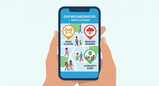
Pick Your Alert Types and Content Categories
Before you design screens or write code, decide what content your app will carry. Clear categories make publishing faster for staff and make it easier for residents to choose what they want to receive.
Start with the core categories
Most local alert apps work best with four buckets:
- Emergency alerts (urgent): severe weather warnings, evacuation notices, missing person alerts, immediate safety threats.
- Service updates (time-sensitive): road closures, transit delays, water outages, trash pickup changes.
- Community announcements (informational): local events, school notices, public meeting reminders, volunteer needs.
- User-submitted reports (community-sourced): hazards like downed branches, lost pets, suspicious activity—only if you can add safeguards.
Define “alert” vs “announcement” in plain language
Users tolerate notifications when the rules are predictable. Write a short internal definition that every publisher follows:
- Alert = urgent, actionable, and location/time critical. If a resident needs to do something now (or avoid an area), it’s an alert.
- Announcement = useful but not urgent. It can appear in the feed and optionally send a quieter notification.
A simple test: If someone receives this at 2 a.m., would you stand behind waking them up? If not, it’s probably an announcement.
Add safeguards for user-submitted reports
User reports can increase coverage, but they also increase risk. Consider:
- Requiring a category (hazard, lost pet, etc.) and a location pin
- Holding submissions for review before public posting
- Rate limits and account verification for repeat posters
- Clear “not confirmed” labels until staff validate
These choices shape everything later—filters, notification settings, and your moderation workflow—so lock them in early.
Define the MVP and a Simple Roadmap
An alerts product can grow into a big platform quickly—so you need a clear “first version” that solves the core problem: getting timely, relevant updates to the right people, with minimal friction.
Start with an MVP that works end-to-end
Your MVP should include only what’s required for a resident to receive local alerts and for an admin to publish them confidently.
Resident MVP features
- Signup / basic onboarding (email, phone, or anonymous access depending on your trust model)
- Location setup (choose home area, optional additional areas like work/school)
- Feed showing recent alerts and announcements
- Push notifications for urgent and high-priority posts
- Settings for alert categories, quiet hours, and location preferences
Keep the resident experience fast: open the app, understand what happened, know what to do.
Separate the resident app from the back-office needs
Many teams underestimate the admin side. Even in an MVP, you need a lightweight publishing workflow so alerts don’t become chaotic.
Admin / back-office MVP requirements
- Create, edit, and publish posts with category + priority
- Target by area (city-wide vs specific zones)
- Preview how a notification will appear
- Simple roles (at least Admin vs Publisher)
- Basic audit trail (who sent what, and when)
Treat these as first-class features—not “later”—because a local alerts app is only as good as its operational reliability.
Add nice-to-haves later (they’re easy to imagine, hard to ship)
It’s tempting to add engagement features early, but they can slow you down and complicate moderation.
Consider these after the MVP is stable:
- In-app chat
- Comments
- Polls
- Attachments (photos, PDFs)
- Maps and incident pins
Define non-goals to prevent scope creep
Write down what you will not build in the first release. Examples:
- No open community posting from day one
- No full “social network” profiles
- No complex gamification or points
- No multi-agency integrations until your core workflow is proven
Non-goals make decisions easier when new requests appear.
A simple roadmap: MVP → v1.1 → v2
- MVP: reliable signup, location preferences, feed, push notifications, basic admin publishing
- v1.1: quality-of-life improvements (better filters, saved locations, improved notification controls, basic analytics)
- v2: richer features (maps, attachments, polls/comments, integrations, advanced admin roles)
This approach gets you to a usable local alerts app quickly, while keeping a clear path for expansion.
Design the User Experience for Speed and Clarity
When people open a local alerts app, they’re usually trying to answer one question quickly: “What’s happening near me, and what should I do?” Your UX should prioritize speed, plain language, and predictable navigation—especially under stress.
Push-first, but always explain what happened
Urgent alerts should reach users fast via push notifications, but the app must make it easy to confirm details. Tapping a notification should land users on a single alert page with:
- A clear title (“Water main break: Boil water advisory”)
- Time posted and last updated
- Location/area affected
- “What to do now” in 1–3 steps
- Source label (City, Police, School District)
Keep wording short and avoid jargon. If an alert is updated, highlight what changed.
A simple in-app feed for catching up
Your home screen should be an in-app feed for browsing and catching up. Add lightweight filters so people can narrow alerts by category (traffic, weather, utilities, events) and by area (neighborhood, citywide). Make “Latest” the default, and let users quickly mute categories they don’t care about.
Map view: helpful, optional for the MVP
A map view can clarify location-based incidents, but it’s not required for a first release. If you include it, keep it secondary—an alternate tab or toggle—and ensure the list view remains fully usable.
Accessibility and low-connectivity behavior
Design for readability: large text support, clear color contrast, and screen reader-friendly labels (avoid relying on color alone for severity).
For offline or low-connectivity moments, cache the last known alerts and show a visible “Last updated” timestamp. Even limited information is better than a blank screen.
Location, Geofencing, and User Preferences
Location is the difference between “useful” and “noise.” The goal is to deliver alerts that match where someone is (or cares about) without making them feel tracked.
Choosing a location method
Most apps benefit from offering more than one option:
- GPS (current location): best for time-sensitive alerts while someone is moving around town.
- Selected neighborhoods: a map-based picker or a list (districts, wards) that works even when GPS is off.
- Saved addresses: “Home,” “Work,” and other places the user chooses (for example, a parent’s address).
Let people mix these methods so they can stay informed without leaving location permissions on all the time.
Defining geofences that match real life
Geofences can be:
- Radius-based (e.g., “within 2 miles”): quick to set up and easy to understand.
- Polygon boundaries (drawn shapes): better for irregular areas like school zones, evacuation zones, or downtown corridors.
- Admin-defined zones (prebuilt areas): consistent naming and fewer user decisions.
If you support multiple locations, allow users to assign different categories per place (e.g., construction near Work, school updates near Home).
Opt-in controls users actually want
Give clear controls for:
- Alert categories (weather, road closures, community events, utilities)
- Quiet hours and do-not-disturb behavior
- High-priority exceptions for critical safety messages (clearly labeled)
Plan for tricky edge cases
Handle reality: traveling users, people living near city borders, and inaccurate GPS indoors. Provide an “I’m not here” toggle, show the active location/zone on screen, and let users manually switch locations when GPS is wrong.
Push Notification Strategy That Users Will Accept
Get notifications right
Generate push-first flows with deep links that open the exact alert detail screen.
Push notifications are the fastest way to reach people—but they’re also the quickest way to get your app muted or deleted. The goal is simple: send fewer notifications, make each one unmistakably useful, and always close the loop.
Define clear notification levels
Use a small set of severity levels so people instantly understand what to do:
- Critical: immediate safety risk (evacuation, shelter-in-place). Short, direct, action-first.
- High: urgent but not life-threatening (road closures, major outages). Clear impact and timeframe.
- Normal: community announcements and reminders (events, maintenance). Friendly and optional.
Keep the format consistent: what happened → where → what to do next.
Make taps land on the right screen
Every notification should deep link to a specific destination: tap the message and the app opens the exact alert details screen, not a generic feed. Include the map location (if relevant), official source, last updated time, and any steps residents should take.
Prevent spam during fast-moving events
During storms or large incidents, updates can pile up. Use throttling and bundling:
- Bundle minor updates into a single “Update: Incident on Main St (3 new details)” message.
- Throttle repetitive alerts so users don’t get the same instruction every few minutes.
Use multiple delivery channels thoughtfully
Make push + in-app the default. For users who opt in, add optional email/SMS integrations for critical alerts (especially helpful when push is delayed or disabled).
Always send updates and “all clear”
Trust grows when the system finishes the story. Send follow-ups when guidance changes and an “all clear” when the issue is resolved, so residents know it’s safe to stand down.
Build the Admin Console and Publishing Workflow
Your app is only as reliable as the system behind it. A clear admin console and publishing workflow prevents accidental false alarms, keeps messaging consistent, and makes it easy to act fast when minutes matter.
Set up roles that match real responsibilities
Start with a simple role model so people can help without having full control:
- Creator: drafts announcements, selects categories, zones, and attachments.
- Reviewer: checks clarity, tone, and required details (who/what/where/when).
- Approver: publishes and can trigger urgent sends.
- Super admin: manages users, permissions, categories, zones, and system settings.
Keep permissions predictable: most mistakes happen when “everyone can publish.”
Use a workflow that changes with urgency
Build a default pipeline of Draft → Review → Publish. Then add an “urgent” lane with guardrails:
- Non-urgent posts (events, reminders, planned road closures): require review and scheduled publishing.
- Urgent alerts (shelter-in-place, boil-water notice): allow fast approval with fewer steps, but still require at least one approver and a mandatory reason/incident reference.
A good console makes the status visible at a glance and prevents editing after publish without creating a new version.
Create templates for common alerts
Templates reduce writing time and improve quality. Provide pre-filled fields like location, start/end time, impact, and next update time. Prioritize:
- Weather advisories
- Facility or road closures
- Missing person notices
Templates should also include a short “push-friendly” title and a longer body for the in-app post.
Target precisely (and respectfully)
Admins should be able to target by zone, category, time window, and language. Make the audience count visible before sending (“This will notify ~3,200 users”) to catch mis-targeting.
Keep an audit log you can trust
Maintain an immutable audit trail: who sent what, when, edits made, and which areas/languages were targeted. This is essential for accountability, after-action reviews, and responding to public questions.
Moderation, Safety, and Misinformation Controls
Plan the right scope
Use Planning Mode to define categories, severity levels, and workflows before you generate code.
Local alerts only work when people trust them. That trust is earned through clear rules, consistent moderation, and product decisions that reduce the chance of rumors spreading faster than facts.
Start with clear reporting rules and verification steps
If you accept user reports (e.g., “road blocked,” “lost pet,” “suspicious activity”), publish simple community rules in plain language and show them during first-time posting.
Build lightweight verification into the flow:
- Require a category and location, plus “how you know” (saw it yourself, heard from someone, official source).
- Ask for optional evidence (photo/video), but never force uploads for sensitive situations.
- Prompt for time sensitivity (“happening now” vs “earlier today”) to prevent stale posts.
Moderation tools that keep humans in control
Give moderators an admin queue with filters by severity, area, and virality. Basic tools that matter:
- Flagging and reasons (misinformation, harassment, spam, duplicate, unsafe).
- Auto-filters for banned terms, repeated copy-paste, and suspicious links.
- Escalation paths: volunteer mod → staff mod → trusted authority partner when applicable.
For incident reporting, consider a separate “review required” lane so reports don’t instantly notify the whole city.
Prevent misuse by design
Separate “report” from “broadcast.” A report is an input to verify; a broadcast is a confirmed message sent widely. This distinction reduces rumor amplification.
Add controls that slow down abuse without hurting regular users: rate limits on posting, account reputation (age, verified phone/email, past approved posts), and attachment scanning for malware or explicit content.
Handling mistakes during a crisis
Plan for corrections. When an alert is wrong or outdated, publish a clear retraction that:
- Links to the original post
- Explains what changed and why
- Notifies the same audience that received the initial alert
Keep an audit trail visible to admins, and consider a public “Last updated” stamp so users can quickly judge freshness.
Privacy, Security, and Trust Basics
A local alerts app only works if people trust it. That trust is earned by collecting less data, being clear about what happens to it, and securing it like it matters—because it does.
Collect the minimum (and prove it)
Start with a simple rule: store only what you need to target and deliver alerts. If you can send a neighborhood road-closure alert without saving a user’s exact GPS trail, don’t save it.
Good “minimum” examples include:
- A selected area (city, ZIP, or neighborhood polygon)
- Notification preferences (categories, quiet hours)
- A device token for push notifications (not tied to a real name)
Avoid collecting contacts, advertising IDs, or continuous background location unless there’s a clear, user-visible reason.
Give real location privacy choices
People have different comfort levels. Offer options such as:
- Precise location for block-level targeting
- Approximate location for broader area alerts
- Manual selection (pick a city/neighborhood without sharing location)
Make the default conservative when possible, and explain what changes with each choice (e.g., “Precise helps target street closures; Approximate still covers citywide emergencies”).
Be plain about retention and deletion
Tell users—clearly—how long you keep data and how to delete it. Avoid legal jargon. A good pattern is a short summary plus a detailed page (linked from onboarding and settings).
Include specifics like:
- How long location areas, device tokens, and incident reports are retained
- What happens when someone turns off location or deletes their account
- Who can access admin tools and logs
Secure storage and transit by default
Use encryption in transit (TLS) and encrypt sensitive data at rest. Limit who can view or export user data with role-based access, audit logs, and least privilege (staff only gets what they need to do their job). Protect the admin console with strong authentication (SSO/2FA) and secure backups.
Plan compliance early (before launch)
Even a simple MVP needs a privacy policy, consent prompts (especially for location and notifications), and a plan for kids’ data rules if the app could be used by minors. Writing these early prevents last-minute redesigns and builds credibility from day one.
Choose a Tech Approach Without Overcomplicating It
The best tech stack for a local alerts app is the one that gets a reliable MVP into people’s hands quickly—and stays predictable when an incident spikes traffic.
Mobile app: pick speed of delivery first
You generally have two practical options:
- Native iOS + Android if you already have strong teams for both and need maximum platform control.
- Cross-platform (React Native or Flutter) if you want one codebase for a faster MVP and easier feature parity.
For most teams starting out, cross-platform is a sensible default because your core UI (feed, categories, alert detail, settings) is straightforward, while push notifications and location permissions are well-supported.
If you want to accelerate the first release without committing to a long, traditional development cycle, a vibe-coding workflow can help. For example, Koder.ai lets teams build web/admin consoles (React) and backend services (Go + PostgreSQL), and generate mobile apps (Flutter) from a guided chat interface—useful when you’re trying to validate the MVP quickly while keeping a clean path to exporting source code later.
Backend essentials (keep the first version small)
Your backend should do a few things extremely well:
- User profiles (minimal fields) and consent flags
- Zones/areas (neighborhoods, districts, custom geofences)
- Alerts with targeting rules (by zone, category, urgency)
- Device registry for push tokens (APNs/FCM)
- Analytics focused on delivery and engagement (sent → delivered → opened)
A simple REST API is often enough for MVP. Add real-time channels later only if you truly need live updates.
A clean database model (outline)
You can keep your data model readable with a few core tables/collections:
- alerts: id, title, body, severity, category_id, status, publish_at, expires_at
- categories: id, name, icon, defaults (e.g., opt-in/out)
- zones: id, name, geo (polygon or radius), city_id
- subscriptions: user_id, zone_id, category_id, preference flags
- devices: user_id (or anonymous), platform, push_token, last_seen
Performance: design for “notification bursts”
Two common bottlenecks are (1) fast feed loading and (2) high-volume push sends. Cache the feed, paginate by time, and use a queue for notifications so sending doesn’t block publishing.
Integrations: only ship what you can trust
Maps are usually worth it (for showing zones and incident locations). Weather feeds and city systems can be valuable—but only integrate sources that are stable, documented, and monitored. If reliability is uncertain, link out to the official source from the alert detail (e.g., /sources) rather than building a fragile dependency.
Testing for Real-World Emergencies and Daily Use
Create the mobile client
Generate a Flutter mobile app that matches your feed, settings, and alert detail UX.
Testing a local alerts app isn’t only about “does it work?” It’s about whether it still works when everything is happening at once—and whether it stays calm and usable on ordinary days.
Notification delivery (the part users notice first)
Push notifications should be tested across a realistic mix of devices and OS versions, because delivery timing, grouping, and sound/vibration behavior vary.
Check:
- Opt-in states (first install, after denial, after re-enabling in system settings)
- Quiet hours and override rules (e.g., “critical only” vs. “all alerts”)
- Delivery and display: lock screen, notification center, grouped notifications, and deep links into the right screen
Also verify that notification content remains understandable when truncated—especially for longer place names.
Simulate emergency conditions
Run “stress scenarios” that mimic how agencies actually post:
- A high posting rate (multiple alerts per minute)
- Edits and cancellations (typos fixed, area narrowed, duplicated alerts withdrawn)
- “All clear” messages that should close the loop without creating confusion
You’re testing more than performance: does the timeline stay readable, do older alerts get clearly marked as updated, and can users quickly see what is current?
Accessibility and content QA
Emergency information must be readable and operable for everyone.
Test with VoiceOver (iOS) and TalkBack (Android), dynamic type/large text, and contrast checks. For content QA, review spelling, clarity, and consistent severity levels (e.g., Info / Advisory / Warning / Emergency) so users don’t have to guess what matters.
Operational drills
Do a “people test” too:
- Who is allowed to send what types of alerts
- On-call plan and escalation steps
- Approval workflow, plus an override path for time-critical alerts
If you have a staging environment, run drills there weekly. If not, schedule controlled production tests and publish them clearly as tests to avoid alarm.
Launch, Adoption, and Continuous Improvement
A local alerts app succeeds or fails on trust. Treat launch less like a marketing moment and more like a reliability program: start small, prove value, then expand.
Start with a focused pilot
Pilot with one neighborhood or a single partner organization (for example, a school district or a business improvement district). A narrower audience makes it easier to validate message timing, category clarity, and how well alerts match real boundaries.
During the pilot, collect lightweight feedback right in the app (one-tap “Was this useful?” and an optional comment). Use it to tune categories and reduce noisy alerts before a citywide rollout.
Onboarding that prevents confusion
Your onboarding should quickly explain three things:
- Location setup (why you need it, and what still works without it)
- Categories (what each one means in plain language)
- Notification controls (how to mute, schedule quiet hours, or opt out)
A short “settings checklist” screen after signup can reduce immediate uninstalls.
Measure what matters
Track metrics that reflect acceptance, not just installs:
- Opt-in rate for notifications (overall and by category)
- Open rate and time-to-open for urgent alerts
- Unsubscribe/mute rate after an alert (a strong noise signal)
- Retention (7/30/90 days), especially for non-emergency users
Partnerships drive adoption
Community partnerships improve credibility and reach: city hall, schools, local groups, and businesses can promote specific categories and encourage residents to opt in.
Iterate safely
Add features only when trust and reliability are strong. Prioritize improvements that reduce false alarms, clarify wording, and make notification controls easier—before expanding into new modules or channels.
If you’re iterating quickly, consider tooling that supports safe change management. Platforms like Koder.ai include snapshots and rollback, which can be helpful when you’re shipping frequent improvements to an alerts system and want a clean way to recover from a bad release without disrupting critical communications.
FAQ
How do I define what my local alerts app is actually for?
Start by deciding whether your app is for urgent alerts, everyday notices, or a clearly separated mix of both.
- Urgent: needed within minutes for safety or major disruption
- Everyday: helpful, but not time-critical
If you support both, keep them distinct (channels, labels/colors, notification rules) so non-urgent updates don’t “train” users to ignore real emergencies.
What geographic area should the app cover?
Pick a boundary that matches your organization and content sources, because it affects geofencing, onboarding, publishing, and measurement.
Common scopes:
- City/county: broad services and public agencies
- Campus: defined perimeter and audience
- HOA/neighborhood: hyperlocal, but needs stronger moderation
Start narrow if you’re unsure—expansion is easier than fixing an overly broad first launch.
Who are the main users of a local alerts app, and how should that shape the product?
Design around your primary users first, then add secondary roles later.
Typical groups and needs:
- Residents: relevance, low noise, easy preferences
- Visitors/commuters: temporary location-based closures/safety
- Businesses: disruptions (roadwork/utilities) and notices
- fast posting with accountability
What success metrics should I track beyond downloads?
Use a small set of trackable, outcome-oriented metrics:
- Install rate (from promotions)
- Opt-in rate (push and, if needed, location)
- Read/open rate and for urgent alerts
What alert types and content categories should I start with?
Many teams start with four buckets:
- Emergency alerts (urgent): safety threats, evacuations
- Service updates: outages, closures, transit delays
- Community announcements: events, meetings, reminders
- User-submitted reports: only with safeguards
Clear categories make publishing faster and give users predictable controls (what they’ll be notified about and what stays in the feed).
How do I decide whether something is an “alert” or an “announcement”?
Use a simple internal rule that every publisher follows:
- Alert: urgent, actionable, location/time critical
- Announcement: useful, not urgent; usually feed-first
A practical test: If this arrived at 2 a.m., would you stand behind waking people up? If not, it’s probably an announcement.
What should a true MVP include for a local alerts app?
An MVP should work end-to-end for both residents and admins.
Resident basics:
- onboarding + location setup
- feed + alert detail screen
- push notifications
- settings (categories, quiet hours, locations)
Admin basics:
What’s the best approach to location, geofencing, and user preferences?
Offer multiple methods so users can stay informed without feeling tracked:
- GPS current location (best for moving users)
- Selected neighborhoods/zones (works with GPS off)
- Saved addresses (Home/Work)
Support practical controls like category preferences and quiet hours, and handle edge cases (border areas, indoor GPS drift) with manual location switching and a visible “active zone.”
How do I design push notifications people won’t mute?
Keep the system predictable with a small severity set and consistent formatting.
Recommended levels:
- Critical: immediate safety risk
- High: urgent disruption (major outage/closure)
- Normal: reminders and community info
Best practices:
What should the admin console and publishing workflow include?
Build a simple workflow with accountability and an audit trail.
Core elements:
- Roles like Creator, Reviewer, Approver, Super admin
- A default pipeline (Draft → Review → Publish) plus an urgent lane with guardrails
- Templates for common incidents (closures, advisories)
- Targeting by zone/category with a visible audience estimate