Apr 07, 2025·8 min
How to Build a Mobile App for Mobile-First Data Entry
Learn how to plan, design, and build a mobile-first data entry app with offline support, fast forms, validation, syncing, and secure field workflows.
Learn how to plan, design, and build a mobile-first data entry app with offline support, fast forms, validation, syncing, and secure field workflows.
Mobile-first data entry isn’t “a web form on a smaller screen.” It’s data capture designed for speed and certainty in short, interrupted sessions—often with one hand, on the move, and under less-than-ideal conditions. If users need to stop, zoom, re-read, or fight the keyboard, the app isn’t truly mobile-first.
Most mobile-first data entry apps serve a few repeatable moments:
These scenarios share a theme: users are trying to finish a record quickly and get back to the job.
Before design and development, agree on what “good” looks like. Common metrics include:
Tracking these early helps you prioritize improvements that actually move the needle.
Be explicit about:
Also document constraints that will shape the UX:
Getting these basics right prevents costly rework later—and keeps the app focused on the job, not the screen.
The fastest way to waste time on a data entry app is to start by sketching screens. Start with what people are trying to get done in the field, under real constraints: gloves, bad signal, bright sun, short attention, and strict data requirements.
Capture 5–10 key user stories in plain language. Keep them outcome-focused so you can test them later:
Required fields aren’t universal—they depend on the step. Decide what must be collected at capture time versus what can be completed later by a supervisor or back office.
For example: a location and timestamp might be mandatory immediately, while notes and secondary IDs may be optional unless a specific condition is selected.
Before UI details, map the full flow:
capture → validate → sync → review → export
This forces clarity around handoffs: who fixes errors, who approves, and what “done” means. It also surfaces where the app needs status indicators (draft, queued, synced, accepted, rejected).
List offline-critical actions (create, edit, attach photos, search recent records) and what can be online-only (bulk exports, admin settings, large catalogs). This single decision shapes everything from storage to user expectations.
Define an MVP that supports the core stories reliably. Then create a visible “later” list (dashboards, complex rules, deep analytics) to avoid overbuilding before the basics are proven in the field.
A data entry app succeeds or fails on what it captures—and how reliably it captures it. Before polishing screens, define the “shape” of your data so every form, API call, export, and report stays consistent.
List the real-world things you’re recording (entities) and how they connect. For example: Customer → Site → Visit → Checklist Item. For each entity, define required attributes (what must be present to save) and optional ones (nice-to-have, may be blank).
Keep it simple at first: fewer entities and fewer relationships reduce sync complexity later. You can extend the model once the MVP proves the workflow.
Mobile data often starts offline, so you can’t rely on the server to assign IDs at the moment of capture. Plan for:
These fields help with accountability, customer support, and conflict handling when two people edit the same record.
Decide whether rules run:
Use on-device validation for speed: required fields, ranges, formats, and simple cross-field checks. Keep server validation for rules that depend on shared data (duplicate checks, permissions, inventory levels).
Define attachment types per entity and set limits up front: max file size, allowed formats, compression rules, and offline storage behavior. Decide what happens when a device is low on space, and whether attachments upload immediately or queue for Wi‑Fi.
Create a lightweight “data dictionary” that names every field, type, allowed values, default behavior, and validation rule. This prevents mismatches between the app, the API, and downstream reporting—and saves weeks of rework later.
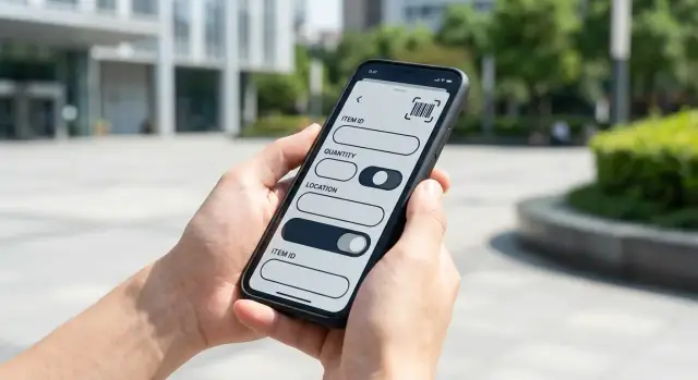
A data entry app succeeds or fails on how quickly someone can complete a form while standing, walking, or working with gloves. The goal is simple: minimize taps, prevent wrong entries, and make the next action obvious.
Use large, tap-friendly fields and buttons, with clear labels and enough spacing to avoid mis-taps. Keep layouts predictable: one primary action per screen (e.g., Next or Save) and a consistent place for it. If users often work one-handed, place key actions within easy reach at the bottom.
Typing is slow and error-prone on mobile. Prefer the correct input type every time:
These choices reduce mistakes and speed up entry without training.
Use smart defaults and autofill from context, such as user profile, location, current time, and the last saved value. For repetitive work, add templates and “repeat last” actions so users can copy the previous record and change only what’s different.
Picklists are often faster than search—especially when users are offline.
Keep forms short by splitting them into steps or collapsible sections. Show progress (e.g., “Step 2 of 4”) and keep users oriented. If you need optional details, tuck them behind an Add details section rather than mixing them with required fields.
If you want to standardize patterns across the app, document these decisions in a lightweight UI guide and reuse them across screens (see /blog/common-pitfalls-and-a-practical-roadmap).
Data entry fails quietly: a missing digit, a swapped unit, a duplicated record. The best apps don’t just “validate”—they guide people toward correct input at the moment a mistake becomes likely.
Add checks that match how the field team actually works:
Keep validation fast and local so users get feedback even with spotty connectivity.
Show the message next to the field, not only in a generic banner or at the end of the form. Use plain language and tell them what “good” looks like:
Also highlight the field visually and move focus to it after a failed submit.
Not every anomaly should stop progress. If a value is unusual but possible (e.g., “Mileage seems high”), use a warning that can be acknowledged and logged. Reserve hard blocks for data that will break workflows or compliance.
When someone enters a name, address, asset ID, or customer code, offer lookup/search and suggested matches (“Looks like this record already exists—use it?”). This is often more effective than deduping later.
A short summary screen helps catch mistakes (wrong unit, missing photo, incorrect selection) without forcing users to scroll back through long forms. Make it tappable so they can jump straight to the field that needs fixing.
Field teams don’t stop working when coverage drops. If your app depends on a live connection, it will fail at the exact moment it’s needed most. Treat offline as the default state and syncing as an optimization.
Design so every form save writes to local storage first (for example, a local database on the phone). The UI should always read from that local store, not from the network response. This keeps the app fast, predictable, and usable in basements, rural areas, and elevators.
A good rule: if the user taps “Save,” it’s saved—whether or not the internet is available.
Instead of trying to “submit” immediately, record changes as a queue of actions (create/update/delete). When the device reconnects, the app processes the queue in order and retries automatically if the connection drops again.
Keep retries safe by making uploads idempotent (the same change sent twice doesn’t create duplicates). If a request fails, the app should back off and try again later without blocking the user.
Syncing everything is slow and expensive. Plan for partial sync so the device downloads only what the user needs:
This reduces startup time, storage use, and the chances of conflicts.
Conflicts happen when two people edit the same record before syncing. Choose one approach and be explicit:
Whatever you choose, log it so support can explain what happened.
Users should never wonder whether data “went through.” Show clear states like Pending, Synced, Failed, and Needs attention, and allow a manual “Sync now” action. If something fails, point to the exact record and what to do next (edit, retry, or contact support).
A mobile-first data entry app gets dramatically faster when it leans on the phone’s built-in hardware. The goal isn’t to add “cool” features—it’s to cut taps, avoid typos, and make records more trustworthy.
If the workflow benefits from evidence (damage photos, receipts, meter readings), let users attach photos directly from the camera.
Keep uploads quick by compressing images on-device (and resizing to a practical maximum). Offer a “retake” option and a short checklist prompt (“Capture label clearly”) so photos reduce follow-up questions instead of creating them.
Scanning replaces manual entry for IDs, SKUs, asset tags, or shipment codes. It’s usually the single biggest speed win.
Design the scan step to:
GPS can be useful for site visits, delivery confirmation, or audits, but don’t make it mandatory by default. Ask for clear consent and explain why (“Attach location to this job for verification”). Consider a “capture once” button instead of continuous tracking, and allow users to override with a reason when location isn’t available.
If sign-off is part of the process, add signature capture at the end of the flow. Pair it with the signer’s name, timestamp, and optional photo for stronger proof, and allow “no signature” with a required explanation when policies permit.
Assume hardware features won’t always be available (camera blocked, low light, no GPS, older devices). Request permissions right before they’re needed, explain the benefit, and provide alternate paths (manual entry, file upload, “skip with reason”) so the form never becomes a dead end.
Data entry apps often touch operational data (inventory, inspections, customer records) that people will rely on later. Security isn’t only about preventing breaches—it’s also about preventing the wrong person from changing the wrong record, and being able to explain what happened.
Start by defining what each role is allowed to do, then bake that into both the UI and the backend:
Avoid “admin can do everything” as your default—make elevated actions explicit and auditable.
Mobile-first data entry means data may sit on the phone for hours (offline mode, queued uploads). Protect it:
Use TLS everywhere, but also plan for stolen sessions:
For every change that matters, store who, what, when—and ideally from which device/app version. Keep an immutable history for approvals and edits (old value → new value), so disputes can be resolved without guesswork.
Only collect sensitive data you truly need. Document retention requirements early (what to keep, for how long, and how deletion works), and align them with your industry or internal policies.
Tech decisions are easiest to change on day one—and hardest to change after hundreds of forms and thousands of records are in the wild. For mobile-first data entry, pick tools that make offline work, quick search, and reliable syncing “boring” (in the best way).
Native (Swift/Kotlin) can be worth it when you need best-in-class camera performance, background tasks, enterprise device management, or very large, complex forms.
Cross-platform (React Native/Flutter) is often the fastest route to an MVP mobile app and a consistent UI across iOS and Android. The key question isn’t ideology—it’s whether your team can ship fixes quickly and keep device features (camera, GPS, barcode scanning) stable across OS updates.
A practical rule: if your app is mostly forms + offline + sync, cross-platform is usually fine. If the app leans heavily on device-specific workflows or strict enterprise constraints, native may reduce long-term friction.
For a data entry app, REST is straightforward, cache-friendly, and easy to debug in the field. GraphQL can reduce over-fetching and simplify complex screens, but requires more discipline around caching and error handling.
Whatever you choose, plan versioning from day one:
/v1/...) or use explicit schema versions.Offline mobile forms live or die on local persistence.
Choose based on: fast queries for search, safe migrations, and good tooling for debugging corrupted or partial data. Also decide how you’ll store drafts, attachments, and sync metadata (timestamps, status flags, server IDs).
If you capture photos, signatures, or PDFs, plan file uploads early: compression, retry logic, and a clear “upload pending” state. Background sync should respect OS rules (iOS background limits, Android WorkManager constraints) and handle poor connectivity without draining battery.
Add push notifications only if they solve a real workflow need (assignment changes, urgent updates). Otherwise, they add operational complexity.
Set targets before development so “fast enough” is not subjective:
These goals influence everything: local indexing, pagination, image sizing, and how often you attempt sync.
If you’re trying to validate workflows quickly, a fast build loop matters as much as the tech stack. Platforms like Koder.ai can help teams spin up a form-heavy MVP from a chat-driven “planning mode” (including web and backend), then iterate rapidly as field feedback comes in. For teams that want to keep control, source code export and snapshots/rollback can be useful when experimenting with form logic and sync behavior.
A data entry app can look perfect in a meeting and still fail on a noisy job site, in bright sunlight, with gloves on and a spotty connection. The fastest way to avoid expensive rework is to prototype early, test in real conditions, and treat feedback as continuous input—not a one-time checkbox.
Before writing production code, build a clickable prototype that mimics the real flow: the first screen a worker sees, the common form path, and the “oops” moments (missing required fields, wrong selections, accidental taps). Then test it with real users doing real tasks where they actually work.
You’re looking for practical friction: too much scrolling, confusing labels, picklists that are too long, or fields that don’t match how people think.
Run a short pilot with a small group and measure time to complete the most common tasks. Pair qualitative feedback (“this dropdown is annoying”) with quantitative signals:
This data tells you where improvements will pay off fastest.
Use pilot results to refine the form order, defaults, and picklists. Small changes—moving a high-confidence field earlier, preselecting a common value, shortening a list—can cut completion time dramatically.
Also add a simple feedback loop inside the app so users don’t need to hunt for an email address:
Close the loop by shipping small updates quickly and telling pilot users what changed. That’s how you earn adoption in the field.
A data entry app can be “feature-complete” and still fail on day one if people can’t start quickly, get help when blocked, or trust that submissions won’t disappear. Treat launch like a product feature.
Aim for a first session that produces a valid record, not a tour of screens.
Provide starter templates for common jobs (e.g., “Daily inspection”, “Delivery proof”, “Stock count”), plus sample records that show what “good” looks like. Add short, contextual tips (one sentence, dismissible) near tricky fields such as dates, units, or required photos.
If your users are invited by an admin, pre-configure defaults (location, team, device permissions) so the app opens directly into the right workflow.
Before launch, decide how admins will handle existing data and reporting needs.
Support CSV import/export for essentials (users, locations, products/assets, form templates). If you rely on integrations, document what’s supported at launch and provide a simple admin UI for mapping fields and checking failures.
Set up monitoring for crashes, API errors, and sync anomalies (stuck queues, repeated retries, unusually large payloads). Track success metrics that matter: “records created”, “records successfully synced”, “average time to sync”, and “failed validation rate”.
Define a clear path when a worker can’t submit: in-app “Report a problem” with logs attached, a human response target (e.g., same business day), and an escalation route for time-critical jobs. Include a safe workaround, such as saving a draft and exporting it for manual submission.
Plan an update strategy that respects offline reality. Maintain backwards compatibility for a period (old app versions still syncing), avoid destructive schema changes without migration, and communicate required updates inside the app. If you must change endpoints or validation rules, roll out gradually and monitor sync error spikes before forcing upgrades.
Most data entry apps fail for predictable reasons: they’re designed like desktop software, tested in perfect conditions, and launched without a plan for what happens when reality disagrees.
Overly long forms are the classic mistake. If a task takes more than a minute or two per record, people will skip fields, type “N/A,” or abandon the app.
Another frequent issue is having no offline plan. Field teams often work in basements, rural areas, warehouses, or moving vehicles—connectivity will be inconsistent.
Unclear errors are a quiet productivity killer. “Invalid value” doesn’t tell someone what to fix. People need plain-language messages and a clear path to completion.
Teams often underestimate:
If you ignore these early, you’ll end up redesigning workflows after launch.
Start small, then expand in controlled steps:
If you’re building the MVP under time pressure, a vibe-coding workflow (for example, using Koder.ai to generate a React web admin, a Go + PostgreSQL backend, and a Flutter mobile app from a single guided chat) can help you get to a pilot faster—then you can harden offline, sync, and auditability once the workflow is proven.
If you want help scoping a realistic MVP (and the roadmap beyond it), see /pricing or reach out via /contact.
Mobile-first data entry is optimized for short, interrupted sessions and one-handed use, often with bad connectivity and poor lighting. It prioritizes speed, certainty, and minimal typing—not shrinking a desktop form to fit a smaller screen.
Use measurable outcomes tied to real work:
Instrument these early so design changes are driven by evidence, not opinions.
Start with use cases and user stories, then map the workflow end-to-end:
This reveals handoffs (who fixes errors, who approves), necessary statuses (draft/queued/synced/rejected), and what must work offline before you commit to screens.
Treat “required” as contextual:
Use conditional rules (e.g., “If status = Damaged, photo required”) to avoid forcing unnecessary input every time.
Define entities, relationships, and core metadata up front:
This reduces sync ambiguity, improves accountability, and prevents reporting/API mismatches later.
Use both in most field apps:
Design messages to be specific and placed next to the field, not hidden in generic banners.
Reduce typing and errors by matching controls to data:
Add smart defaults (time/user/location), autofill, and “repeat last”/templates for repetitive work.
Build offline as the default:
Show clear statuses: , , , .
Pick and document a conflict strategy before launch:
Log decisions so support can explain outcomes and users can recover quickly when conflicts occur.
Cover security end-to-end:
Also practice data minimization: collect and retain only what you truly need.