Jun 28, 2025·8 min
How to Build a Personal Finance & Expense Tracker App
Step-by-step plan to build a mobile personal finance app: MVP features, UX, data model, bank imports, security, testing, and launch strategy.
Step-by-step plan to build a mobile personal finance app: MVP features, UX, data model, bank imports, security, testing, and launch strategy.
Before you sketch screens or pick a tech stack, decide who you’re building for and what “success” looks like. Personal finance apps often fail by trying to satisfy everyone with the same workflow.
Choose one primary audience and write a simple profile. For example:
A clear audience keeps your expense tracker app focused and makes later decisions (like bank sync or shared wallets) much easier.
Your app should make one core promise that users can repeat back to you. Common “north stars” in personal finance app development include:
If you can’t express it simply, your MVP personal finance app scope will likely drift.
Pick 2–4 metrics that match your promise and can be measured early:
Write down hard limits now: region and currency support, platform(s), team size, timeline, and whether compliance requirements apply. Constraints aren’t blockers—they’re guardrails that help you ship a simpler, more effective first version.
An expense tracker app can expand endlessly—subscriptions, investing, credit scores, bank sync, and more. Your MVP should prove one thing: people can log spending consistently and understand where their money went.
For a first release, keep the loop tight:
This scope is small enough to ship, but useful enough that early users can form a habit.
Use a simple rule: if a feature doesn’t support daily logging or monthly understanding, it’s probably not MVP.
Must-haves
Nice-to-haves (plan, don’t build yet)
You can still design with these in mind (e.g., data fields and navigation), without building full flows.
Onboarding is where many finance apps lose users. Consider two modes:
A strong compromise is quick start by default, with a “Set up budgets” prompt later.
Even an MVP needs a minimal support path:
This keeps iteration focused and helps you prioritize the next release based on real usage—not guesses.
A clean data model is what makes budgeting, reports, and syncing reliable later. Start with a few core entities and make them flexible enough for real-life edge cases (refunds, split purchases, multiple currencies).
Model transactions as immutable records whenever possible. Typical fields:
Plan for split transactions (one purchase across multiple categories) and transfers (between accounts) as first-class cases.
Support common account types: cash, card, checking, savings. Decide how balances work:
Many apps combine both: keep a derived “current balance” per account and periodically verify it from transactions.
Budgets usually need:
Store budget “envelopes” linked to categories/tags and a period definition so historical budget performance is reproducible.
If you support multi-currency, store:
Always keep the user’s time zone for display and reporting boundaries (e.g., month-end differs by locale).
A great expense tracker app succeeds when logging takes seconds, not willpower. Your UX should make “capture now, understand later” feel effortless—especially when someone is tired, busy, or on the move.
Treat the home screen like a quick check-in, not a report.
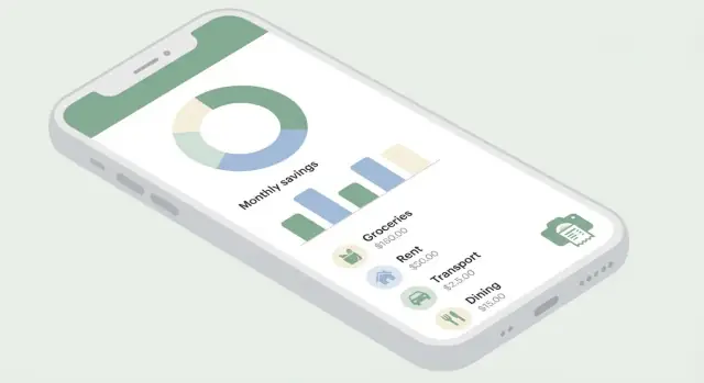
Show 3–5 essentials: today/this month spend, remaining budget, and one or two alerts (e.g., “Dining out is 80% of budget”). Keep labels explicit (“Spent this month”), and avoid clever but confusing visualizations.
If you include charts, make them accessible: high contrast, clear legends, and numbers visible without tapping. A simple bar chart often beats a dense donut.
Daily logging is the core of your personal finance app development effort, so optimize the add-expense flow aggressively:
Consider an “add another” mode for entering multiple receipts, and a lightweight confirmation so mistakes don’t feel scary.
Category management should not turn into a setup project. Start with a small, sensible set and allow edits later.
Avoid long multi-step category creation. If a user types “coffee,” let them save it as-is, then later merge it into “Dining” or rename it. This keeps budgeting app features approachable without overwhelming people.
Money apps can trigger stress. Use calm microcopy, clear errors (“Bank connection timed out—try again”), and easy undo for edits and deletions.
When warning about overspending, keep it supportive: “You’re close to your limit—want to adjust your budget or keep tracking?” This tone builds trust and improves retention for any expense tracker app.
Once you’ve nailed fast, reliable manual logging, the next step is adding time-savers that reduce taps and prevent repetitive work—without making the experience feel complicated.
Start simple: let users attach one or more receipt photos to a transaction. Even without perfect OCR, photos add trust and make later reconciliation easier.
If you add basic OCR, design for reality: totals and dates are easier than line items. Show extracted fields (merchant, date, total, tax, tip) and a clear “tap to edit” flow. The goal isn’t flawless scanning—it’s making correction faster than retyping.
A practical pattern is a review screen:
Auto-categorization is one of the highest-impact features in an expense tracker app. Keep it understandable: “When merchant contains ‘Uber’ → Category: Transport.”
Support a couple of rule types to start:
Always show what happened and why. For example, display a small label like “Auto-categorized by rule: ‘Starbucks’ → Coffee.” Give users a one-tap way to fix the category and optionally update the rule so it learns.
Recurring expenses are predictable, which makes them perfect for automation. Detect patterns (same merchant + similar amount + monthly cadence) and suggest: “Looks recurring—create a subscription?”
When users set up recurring items, include real-life controls:
Pair recurrence with gentle reminders for upcoming bills so users feel supported, not nagged.
Splitting is essential for mixed purchases (groceries + household) and shared costs (roommates, trips). Keep the split UI lightweight:
If you support “people” splits, you don’t need full debt tracking on day one—just record who paid and who owes for later export.
As data grows, search becomes the main navigation tool. Prioritize filters people use most:
Add quick chips for common ranges (This month, Last month) and keep results fast. A good search experience often matters more than adding another chart.
Bank connectivity can make an expense tracker app feel “automatic,” but it also adds complexity, cost, and support burden. Treat it as an optional module: start with imports, prove the core experience, then add live connections when you’re ready.
A practical first step is letting users import transactions from their bank or card as a CSV file. It’s widely available, avoids storing banking credentials, and works even in regions where open banking is limited.
When you build CSV import, focus on a clear mapping flow:
If you later add bank sync, most apps use an aggregator (for example, open banking providers or data aggregators). Availability, supported banks, and data quality depend heavily on region, so design your product to degrade gracefully.
Key product decisions to make early:
Imported and synced feeds are rarely clean. Your data model and logic should account for:
A common approach is to generate a “fingerprint” (date ± tolerance, amount, normalized merchant) and keep an internal transaction status (pending/posted/reversed) so the UI stays consistent.
Be explicit in the UI about what users can expect:
This prevents support tickets and builds trust—especially when totals don’t match a bank statement yet.
Even the best integrations fail: bank maintenance, MFA challenges, revoked consent, or aggregator outages. Keep manual entry and CSV import available as a fallback, and provide a simple “Fix connection” path that doesn’t block the rest of the app.
Security and privacy aren’t “later” features for an expense tracker app—they shape what you build, what you store, and how much trust users place in you. Start with a few high-impact decisions that reduce risk without adding a lot of complexity.
Many people open a personal finance app in public spaces, so quick protection matters. Offer lightweight options such as:
A practical approach is: default to device-based sessions, then let users opt into a passcode/biometric lock for the app.
Use TLS for all network traffic, and encrypt sensitive data stored on the device and in your backend database. Keep encryption keys out of source code and out of plain config files—use platform key stores (iOS Keychain / Android Keystore) and managed secret storage on the server.
If you log events for debugging, treat logs as sensitive: never write full account numbers, tokens, or merchant details to logs.
Apply the “minimum data” principle: only collect what the app truly needs to track expenses and provide insights. For example, you might not need precise GPS location, contact lists, or raw bank credentials. The less you store, the less you can leak.
Add clear consent screens (especially for optional features like bank sync or receipt scanning), and provide simple controls:
Link to your privacy policy with a relative URL like /privacy.
Plan for basics like screen scraping (hide sensitive screens in the app switcher), device backups (ensure encrypted storage stays encrypted), and log leaks (sanitize analytics and crash reports). These small safeguards prevent many real-world incidents.
Your tech choices should match the reality of your team and the promises you want to make to users (speed, privacy, offline reliability).
If your team is small or you need iOS and Android quickly, a cross‑platform stack (Flutter or React Native) can cut development time while still delivering a polished UI.
Go native (Swift/Kotlin) if you expect heavy OS integration (widgets, advanced background work), you need maximum performance, or your team already specializes in one platform.
Expense tracker apps can be built in three common modes:
Pick the simplest option that still supports your roadmap. You can start local‑only and add sync later, but plan your data model so it can be synced without painful migrations.
If you want to validate product flows quickly before investing in a full engineering pipeline, a vibe-coding platform like Koder.ai can help you prototype a personal finance app end-to-end via chat (UI + backend + database), then iterate on onboarding, logging speed, and reporting screens with less overhead.
A clean architecture pays off quickly in finance apps. Keep a clear domain layer for calculations (balances, category totals, budget rules, recurring transactions) that doesn’t depend on UI code.
Organize code into modules (e.g., Transactions, Budgets, Accounts, Import) so features can evolve without breaking everything else.
On-device databases like SQLite (or wrappers such as Room/GRDB) work well for offline-first tracking. If you add sync, choose a server database that matches your query needs and scaling expectations, and keep identifiers stable across devices.
If you plan reminders (“log today’s expenses”) or recurring transaction checks, design background work early. Mobile OS rules are strict, and aggressive scheduling can drain battery. Keep tasks small, respect user settings, and test on real devices before launch.
Offline support is a trust feature: people log expenses in a subway, on a flight, or when data is spotty. If the app “forgets” or blocks entry, users churn fast.
Be explicit about what must work without internet. At minimum, allow users to add/edit expenses, categorize, attach notes/receipts (queued), and view recent totals. Make the UI clearly show sync status (e.g., “Saved on device” vs “Synced”) and keep the app usable even if sync fails.
A practical rule: write to a local database first, then sync in the background when connectivity returns.
Conflicts happen when the same transaction is edited on two devices. Decide your policy early:
When a conflict can’t be safely resolved, show a small “Review changes” screen instead of silently picking a winner.
Users assume finance data is permanent. Offer at least one of:
Communicate retention (“We keep backups for 30 days”) and what happens on reinstall or phone change.
Keep notifications timely and configurable:
Let users control frequency, quiet hours, and which alerts they receive—especially for shared devices.
Budgeting and insights are where an expense tracker app turns raw entries into decisions. The key is to keep reports clear, calculations explainable, and customization easy—so users trust what they see and actually act on it.
Start with a small set of high-signal views:
Keep charts readable, but always include exact numbers and totals. If a number looks surprising, users should be able to tap through to the transactions that created it.
Budget confusion is a common reason people abandon finance apps. Add short, inline explanations such as:
A small “How we calculate this” link in each report builds trust without cluttering the UI.
Offer goal templates (emergency fund, debt payoff, vacation savings) plus custom goals. Show:
Use prompts sparingly: reminders to log, nudges when a category is nearly exceeded, and check-in summaries. If you use streaks, keep them optional and only when they clearly reinforce the habit.
Let users customize categories, budget periods (weekly, biweekly, monthly), and report views (hide categories, reorder, switch chart types). These small controls make the app feel built for their life, not yours.
A personal finance app fails most often in the details: one incorrect total, a missing transaction, or a confusing privacy prompt. Treat QA as a product feature, not a final hurdle.
Validate calculations with real-world edge cases, not just happy paths:
Create a small set of “golden” test accounts with known expected totals and run them after every release.
Expense logging is often done on older phones with limited resources. Check:
Stress-test the screens that can grow indefinitely:
You don’t need to be a lawyer to get the basics right:
Prepare a lightweight support system:
A finance app doesn’t “ship” once—it improves in cycles. Treat your first public release as a learning tool, not a final product. The goal is to validate that people can onboard quickly, log expenses daily, and trust the data.
Start with a small, representative group (friends-of-friends, a waitlist segment, a niche community). Give them a clear test mission—e.g., “Track all spending for 7 days and set one budget.”
Collect feedback in a consistent format so you can compare responses. A short survey works well: what they expected, where they got stuck, what felt confusing, and what they’d pay for.
Instrument the funnel so you can see where people leave:
Pay extra attention to onboarding. If users don’t log an expense in the first session, they rarely return.
Plan releases around impact. Fix the top issues (crashes, confusing categories, missing edit/undo, slow entry) before building new features. Keep a lightweight roadmap that separates:
Common models: freemium, subscription, or a one-time purchase. For personal finance, subscriptions work when you offer ongoing value (automation, advanced insights, multi-device sync).
Set a clear boundary: keep essential tracking usable in the free tier (log expenses, basic categories, simple totals). Monetize convenience and depth—premium reports, smart rules, exports, multi-currency, or family sharing. For a detailed breakdown, link to /pricing once you finalize tiers.
If you’re building in public, consider turning your development updates into a growth loop: teams using Koder.ai can ship faster and may also earn platform credits through its content program or referrals—useful if you’re testing monetization while keeping costs predictable during early iterations.
Start with one primary user you can describe in a single sentence (e.g., “freelancers with variable income who need fast logging and tax-friendly exports”). Use that profile to decide defaults (categories, onboarding steps, reports) and to say “no” to features that don’t support their daily workflow.
Write one “north star” promise users can repeat, such as:
Then pick 2–4 measurable success metrics tied to that promise (e.g., time-to-first-expense, logging consistency, D7/D30 retention, budget adherence).
A practical MVP core loop is:
If a feature doesn’t improve daily logging or monthly understanding, treat it as “later,” not MVP.
Model transactions as the source of truth with fields like amount (signed), date/time (store UTC + original time zone), category, tags, notes, and optional attachments. Plan for real cases early:
Support core account types (cash, card, checking, savings) and choose how you represent balances:
Many apps do both: store a derived current balance and periodically verify it against transactions.
Start with CSV import because it’s high impact and lower risk than live bank connections:
Add live bank sync later via an aggregator once your core experience is proven and you’re ready for support burden and regional variability.
Plan for messy feeds from day one:
A common approach is an internal status plus a “fingerprint” (normalized merchant + amount + date tolerance) to identify likely duplicates.
Optimize the add-expense flow:
Design the home screen as a quick check-in (3–5 essentials) rather than a dense report.
Implement a few high-impact basics:
Make consent understandable in the UI, and link policies with relative URLs like /privacy.
Keep essentials free (logging, categories, simple totals) and charge for convenience and depth, such as:
Define pricing boundaries early and publish tiers at /pricing once finalized.