Nov 07, 2025·8 min
How to Build a Mobile App for Journaling and Mood Tracking
A practical guide to building a journaling and mood tracking mobile app: core features, UX, data model, privacy, analytics, testing, and launch.
A practical guide to building a journaling and mood tracking mobile app: core features, UX, data model, privacy, analytics, testing, and launch.
Before you think about screens or features, get clear on what problem your app solves. “Journaling” and “mood tracking” sound similar, but users often want them for different reasons—and that changes what you build.
Ask a simple question: what should a user be able to do in 60 seconds?
If it’s primarily a personal journaling app, the core promise might be “capture thoughts quickly and safely.” If it’s mainly a mood tracking app, it could be “log how I feel and spot patterns over time.” If you’re doing both, decide which one leads and which one supports—otherwise the product can feel unfocused.
Pick a primary audience and write it down as a one-sentence persona. Examples:
Each group has different needs: students may want expressive writing and tags, professionals may need speed and reminders, therapy support users may value exports and clear summaries. You don’t need to serve everyone on day one.
Success shouldn’t be “more time in app.” Choose a small set of outcomes that align with user wellbeing goals and your business goals, such as:
Create a short list of must-haves that directly support your core promise (e.g., “create an entry,” “log a mood,” “search past entries,” “lock with passcode”). Everything else—streaks, themes, social sharing, advanced mood analytics—goes into “nice-to-have.”
This early clarity will keep your mobile app development effort lean, help you prioritize journal app features, and make later decisions (like onboarding and privacy) much easier.
An MVP isn’t “a worse version” of your app—it’s the smallest set of features that lets people reliably journal, log moods, and find past entries. If you try to ship everything (prompts, AI summaries, streaks, community), you’ll slow down decisions and dilute what users actually came for.
Start by defining the two daily actions your app must make effortless:
Journal entry basics are simple but important: free-text, date/time, and tags (so entries are retrievable later). Consider optional edit history if your audience cares about seeing how thoughts evolve over time; if not, skip it for MVP to reduce complexity.
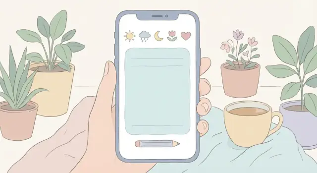
Mood logging should take seconds. Include a scale (e.g., 1–5 or 1–10), an emoji set for quick selection, a small set of mood words (happy, anxious, tired, calm), and an intensity slider or tap options. These basics cover most users without turning the experience into a questionnaire.
A journaling app becomes useful over time, so retrieval is an MVP feature—not a “nice to have.” Support search by keyword plus filtering by date range, tag, and mood. Keep the UI lightweight: a single search bar and a filter sheet is usually enough.
Data portability builds confidence and reduces churn. For MVP, offer at least one human-friendly option (PDF) and one structured option (CSV or JSON). Even if exports are tucked into Settings, having them from day one signals that users stay in control of their writing.
If you want to validate your MVP quickly, a vibe-coding platform like Koder.ai can help you prototype the journaling flow, mood check-in screens, and basic backend faster through a chat-driven workflow. It’s particularly useful when you need a working React web app, a Go + PostgreSQL backend, or a Flutter mobile client, with options like snapshots/rollback and source code export once the product direction is clear.
If you’re unsure what to cut, ask: “Does this help someone capture a thought or reflect on it later?” If not, it’s probably not MVP.
Mood tracking only works if it feels quick, safe, and human. The goal isn’t to “diagnose” users—it’s to help them notice patterns over time with minimal effort.
Start with the simplest interaction you can.
A practical approach is to default to single mood, then offer “Add more details” for multi-select or a wheel.
Context is what makes later insights meaningful, but too many questions can feel like homework. Offer lightweight tags users can skip:
Use sensible defaults, remember last-used tags, and allow custom tags so users don’t feel boxed in.
Asking “Why do you feel this way?” can be helpful—or intrusive. Make prompts gentle and skippable:
Users won’t check in every day. Design your charts and streaks to tolerate gaps:
When mood tracking respects time, privacy, and energy levels, people stick with it—and the data becomes genuinely useful.
A journaling feature succeeds when it feels effortless to start and safe to continue. Treat the journal as the “home base” of the app: a place users can quickly capture thoughts now, then return later to reflect.
Different days call for different formats. Offer a few entry types up front, but keep the creation screen consistent so users don’t feel like they’re learning a new tool each time:
Let users set a default entry type, and remember the last used option.
Attachments can make journaling more expressive, but they also raise privacy expectations. Support them thoughtfully:
If you support attachments, explain where they’re stored in plain language and link to /privacy.
Templates and prompts should reduce blank-page anxiety, not turn journaling into homework. Use lightweight patterns: suggested prompts under the text box, “shuffle prompt,” and the ability to save personal templates.
Journaling is emotional; the UI must never surprise the user. Auto-save frequently, show a subtle “Saved” state, and keep drafts easy to find. Support fast editing (tap-to-edit, undo) and make entry dates/times editable when users are logging something retroactively.
A reliable journal experience builds the trust you’ll need for everything else—reminders, insights, and long-term retention.
A journaling and mood tracking app should feel like a safe, quiet space—not another task manager. A calm UX starts with clear navigation, minimal decisions per screen, and wording that supports the user without sounding clinical.
Most apps in this category can stay simple with a small set of destinations:
Use a bottom navigation bar with 3–5 items. Avoid hiding core actions behind menus. If “New” is your primary action, make it a prominent button that stays visible.
Speed matters when someone is tired or anxious. Offer:
Make optional fields collapsible so the default experience stays lightweight.
Build accessibility in from the start: readable contrast, scalable text size, and clear screen reader labels (especially for mood icons and charts).
Keep microcopy supportive and non-medical: “How are you feeling right now?” and “Want to add a note?” Avoid claims like “This will treat anxiety.” Small details—gentle confirmations, neutral error messages, and “You can edit later”—help the app feel calm and trustworthy.
A journaling and mood tracking app lives or dies by its data model. Get it right early and you’ll ship faster, sync more reliably, and avoid “mysterious” bugs when you add features like insights or attachments.
Most apps in this space can be built around a small set of building blocks:
Keep relationships simple and explicit:
Decide whether mood check-ins can exist without a journal entry (often yes).
Even if you add cloud later, assume users will write offline. Use sync-ready IDs from day one (UUIDs), and track:
createdAt, updatedAtdeletedAt (soft delete) to avoid sync confusionStore raw data (entries, check-ins, tags). Compute insights (streaks, weekly averages, correlations) from that raw data so results can improve without migrating everyone’s database.
If you later add analytics screens, you’ll be grateful you kept the raw timeline clean and consistent.
Where you store journal entries and mood logs shapes everything else: privacy expectations, reliability, and how “portable” the app feels. Decide this early so your design, onboarding, and support docs all match.
Local-only is simplest for users who want maximum privacy and zero accounts. It also supports an offline-first experience by default.
The tradeoff is portability: if someone loses their phone or switches devices, their history is gone unless you offer an export or device backup guidance. If you choose local-only, be explicit in settings about what’s saved, where, and how users can back it up.
Cloud sync is best when users expect seamless multi-device access. But it adds real product requirements beyond “save to the cloud”:
Also decide what happens when users log out: does data remain on the device, get deleted, or become “locked” until they sign in again? Spell this out in plain language.
Hybrid often fits journaling best: entries are stored locally for speed and offline access, with an optional sync toggle for those who want it.
Consider an anonymous mode: let people start writing without an account, then invite them to enable sync later (“Protect and sync your journal across devices”). This reduces onboarding friction while still supporting growth.
If you offer sync, add a small “Storage & Sync” screen that clearly answers: Where is my journal stored? Is it encrypted? What happens if I change phones?
A journaling and mood tracking app is only useful if people feel safe using it. Privacy isn’t just a legal checkbox—it’s a product feature that affects retention and word-of-mouth.
Start with a simple rule: only store what you truly need to deliver the features you’ve promised. If a feature doesn’t require a data point, don’t ask for it.
For example, a personal journaling app rarely needs a real name, contacts, or precise location. If you want optional analytics, consider on-device processing first, or store aggregated data rather than raw entries.
Make this visible in the app: a “What we store” screen in Settings builds confidence quickly.
Don’t hide privacy details only in a long policy page. Add a short, readable privacy summary in Settings with clear answers:
Use straightforward wording like “Your journal entries are private. We don’t read them. If you turn on sync, they are stored encrypted on our servers.” Link to a longer page if needed (e.g., /privacy), but keep the essentials in-app.
Give users control over how private the app feels day-to-day:
Done well, these choices make your mood tracking app feel respectful—without adding friction.
Onboarding for a journaling and mood tracking app should answer one question fast: “How will this help me today?” The goal isn’t to tour every feature—it’s to get someone to a first entry (and a small win) with minimal friction.
Don’t make onboarding mandatory before someone can log their first mood or write a note. Offer a clear choice:
That simple split respects different mindsets: some users want to explore; others just need a quiet place to type.
Instead of showing five slides about features, teach one behavior in context:
This keeps onboarding relevant and prevents the “too much, too soon” feeling.
Personalization should be optional, skippable, and easy to change later (e.g., in Settings). Focus on choices that shape daily experience:
A good rule: if a setting doesn’t change what happens in the next 24 hours, it probably doesn’t belong in onboarding.
Insights feel supportive only when they’re based on enough entries. Until then, use friendly placeholders like:
That approach sets expectations and avoids charts that look empty or “clinical.”
Reminders can make a journaling or mood tracking app feel supportive—or instantly annoying. The difference is control. Treat notifications as a user-owned tool, not a growth lever, and you’ll keep engagement high without making people feel chased.
Most people want different prompts on different days. Provide a small set of clear options:
Keep setup lightweight: a default suggestion, plus an “Advanced” option for people who like fine control.
Journaling is private. Notification text should be neutral by default (e.g., “Time for your check-in”), with an option to show more context only if the user wants it. Add per-reminder toggles for sound/vibration, and a single “Pause all reminders” switch for travel, busy periods, or mental breaks.
If you use streaks, frame them as “patterns” rather than “promises.” Make them opt-in and easy to hide. Replace guilt cues (“You missed yesterday”) with supportive language (“Welcome back—want to log today?”). Consider goals like “3 check-ins per week” instead of daily streaks, so users don’t feel punished for having a life.
Reminders should respect real routines:
Finally, add a subtle in-app prompt (not a pop-up) that says “Want reminders?” after a few successful entries—when the app has earned the right to ask.
Analytics in a mood tracking app should feel like a gentle mirror, not a report card. The goal is to help users notice patterns they might miss day to day—while keeping the interpretation simple and optional.
Start with easy-to-read views that don’t overpromise precision:
Keep charts minimal: one screen, one idea. A short caption under each chart (“Based on entries from the last 7 days”) prevents confusion.
Mood data is personal and messy. Say it plainly: correlation isn’t causation. If a user tags “coffee” on anxious days, the app shouldn’t imply coffee causes anxiety. Use language like “often appears together” or “frequently tagged on days you felt…” instead of “leads to” or “causes.”
Insights are more useful when they invite reflection, not conclusions. Make prompts optional and user-controlled:
Let users turn prompts off or limit frequency.
Some people want a personal journaling app with no numbers at all. Provide a simple setting to hide insights (or pin journaling as the default tab), so the app supports both tracking-focused and journal-only users.
Shipping a journaling and mood tracking app isn’t just “does it work?”—it’s “does it feel safe, smooth, and predictable when life is messy?” A good release plan focuses on the everyday moments: quick entries, forgotten passwords, spotty internet, and users who are cautious about privacy.
Start with the actions people will do most often and measure how many taps and seconds they take.
Many issues appear only outside “perfect conditions.” Make these part of your test plan, not a last-minute scramble.
Prepare store assets that match the actual product: screenshots of real screens, a concise feature list, and plain-language privacy details. Ensure you have a support path (in-app link to /support) and a clear “How we handle your data” page (e.g., /privacy).
Treat launch as the start of learning. Add lightweight feedback prompts after meaningful moments (e.g., after a week of use), track crashes and drop-offs, and fix reliability issues before adding big features. Use feature flags for experiments so you can roll back quickly without disrupting users.
If your team wants to iterate faster without committing to a long setup upfront, tools like Koder.ai can help you spin up a working app, test flows with real users, and roll changes back via snapshots—then export the source code when you’re ready to move into a more traditional development lifecycle.
Start by defining the core promise in one sentence and a 60-second success action.
If you do both, choose which one leads; the other should support it (e.g., mood check-in attached to an entry, or a quick note attached to a mood).
Write a one-sentence persona and design around their highest-frequency need.
Examples:
Trying to serve everyone in v1 usually bloats onboarding and confuses navigation.
Treat MVP as the smallest set that supports daily capture and later retrieval.
A practical v1 set:
Default to the fastest possible flow, then let users optionally add nuance.
Good pattern:
Keep anything that feels like a questionnaire strictly skippable.
Make writing feel predictable and safe:
If you add attachments, be clear about storage, removal, and privacy expectations.
Use a small, predictable set of destinations and keep core actions visible.
A common structure:
Aim for 3–5 bottom nav items, and provide fast paths like one-tap check-in and quick entry templates.
Start with a few core entities and keep relationships explicit:
Use UUIDs, track , and consider for soft deletes. Store raw data; compute insights (streaks, averages) from it.
Pick based on privacy expectations and multi-device needs:
Whichever you choose, add a “Storage & Sync” screen that answers where data lives, whether it’s encrypted, and how restore works.
Build trust with clear defaults and user control:
Link to detailed docs with relative paths like /privacy and /support.
Test what users repeat under messy real-world conditions.
Checklist:
createdAt/updatedAtdeletedAtPost-launch, prioritize reliability and clarity before adding big features like advanced analytics or AI summaries.