Nov 26, 2025·8 min
How to Build a Mobile PKM App: From Idea to Launch
Learn how to plan, design, and build a mobile personal knowledge management app—from core features and data model to sync, privacy, testing, and launch.
Learn how to plan, design, and build a mobile personal knowledge management app—from core features and data model to sync, privacy, testing, and launch.
Before you sketch screens or pick a tech stack, decide what “personal knowledge” means in your app. For some people it’s mostly quick notes and meeting minutes. For others it’s web clips, highlights, bookmarks, and research artifacts. A clear definition prevents feature sprawl and keeps your v1 focused.
Start by choosing the core content types you’ll support on day one. Keep the list short and tied to real use cases:
The key question: What are users trying to remember or reuse later? Your data model and UI should serve that answer.
Most PKM apps succeed or fail on a few repeating behaviors. Choose which ones you’ll optimize for:
You don’t have to perfect all five in v1, but you should explicitly pick the two or three you’ll make excellent.
A “PKM user” isn’t one person. Students may care about lecture notes and exam review. Researchers need citations, PDFs, and linking. Professionals often want meeting notes, decisions, and fast retrieval.
Write 2–3 concrete scenarios (one paragraph each) such as: “A consultant captures action items in a meeting and retrieves them by client name next week.” These scenarios become your product north star when you debate features.
Define how you’ll know v1 is working—measurably:
With the goal, audience, and metrics in place, every design and engineering decision becomes easier—and your PKM app stays coherent instead of turning into “everything for everyone.”
An MVP for a PKM mobile app isn’t “the smallest app you can ship.” It’s the smallest app that reliably supports a complete habit: capture → organize lightly → find later.
Keep the core tight and friction-free:
If these four aren’t great, extra features won’t matter.
These can be excellent, but they add design, data, and support complexity:
Deferring them keeps the product easier to test—and easier for users to understand.
A practical rule: pick the platform you can maintain with confidence for 12 months.
Write one paragraph you can return to when new ideas appear:
“Version 1 helps individuals capture notes in seconds, add tags, and find anything later with search—offline. No AI, no collaboration, and no complex organization until the core capture-and-retrieval loop is consistently fast and reliable.”
Once your scope is clear, design the everyday paths users will repeat. A PKM app wins when capture and retrieval feel effortless—not when it has the most options.
Start by listing the few screens that carry most of the experience:
If you can’t explain what each screen is for in one sentence, it’s probably doing too much.
Your core flow should be “open → capture → move on.” Plan for:
A practical pattern: every captured item starts as an “Inbox note” with minimal fields, then can be tagged, titled, and filed later.
Pick one primary navigation model and commit:
Avoid hiding Search behind multiple taps—retrieval is half the product.
Empty states are part of your UX, not an afterthought. For Inbox, Tags, and Search, show a short hint and one clear action (e.g., “Add your first note”).
For first-run onboarding, aim for three screens max: what the Inbox is, how to capture (including share sheet), and how to find things later. Link to a deeper help page if needed (e.g., /blog/how-to-use-inbox).
Your PKM app will only feel “smart” if the underlying model is clear. Decide what kinds of things a person can save—and what those things have in common.
Start by naming the objects your app stores. Common options include:
You don’t have to ship all of these in v1, but you should decide whether your app is “notes-only” or “notes + sources,” because it changes how linking and search behave.
Metadata is what makes notes sortable, searchable, and trustworthy. A practical baseline:
Keep metadata minimal and predictable. Every extra field is another thing users must maintain.
Connections can be:
Make links first-class: store them as data, not just text, so you can render backlinks and navigate reliably.
Your model will evolve. Add a schema version to your local database and write migrations so updates don’t break existing libraries. Even simple rules—“we can add fields anytime, but we can’t rename without a migration”—save you from painful releases later.
The editor is where people spend most of their time, so small decisions strongly shape whether your PKM app feels “instant” or “in the way.” Aim for an editor that starts quickly, never loses text, and makes common actions one tap away.
Pick one primary format for v1:
If you support Markdown, decide early which extensions you’ll allow (tables? task lists?) to avoid compatibility issues later.
Formatting should be optional but frictionless. Add lightweight shortcuts for the basics: headings, bold/italic, links, and checklists. If your audience includes developers, include code blocks; otherwise consider deferring them to keep the toolbar simple.
Good mobile patterns include:
Decide what “notes” can hold. Common must-haves are images (camera + gallery), plus optional PDFs, audio, and scanned documents. Even if you don’t build full annotation in v1, store attachments reliably and show clear previews.
Also invest in capture entry points: share sheet, quick-add widget, and a one-tap “New note” action. These often matter more than fancy editor controls.
Use auto-save by default, with visible reassurance (e.g., a “Saved” state) but no modal dialogs. Keep a local draft if the app closes mid-edit.
If you’ll support sync later, design now for conflicts: preserve both versions and let users compare, rather than silently overwriting. The fastest way to lose trust is losing notes.
A PKM app lives or dies on whether you can put something away quickly and find it again later. The trick is choosing an organization system that stays consistent on a small mobile screen—without forcing users to overthink every save.
Folders are great when notes naturally belong to one place (e.g., “Work,” “Personal,” “Study”). They feel familiar, but they can become restrictive when a note fits multiple contexts.
Tags shine when notes need multiple labels (e.g., #meeting, #idea, #book). They’re flexible, but they require clear rules so tags don’t turn into duplicates (#todo vs #to-do).
Using both can work if you keep the contract simple:
If you can’t explain the difference in one sentence, users won’t remember it.
Mobile capture is often “save now, organize later.” An Inbox gives permission to do that.
Design it as a default destination for quick notes, voice snippets, links, and photos. Then support easy processing with a few fast actions: assign folder, add tags, pin, or convert to a task (if you support tasks).
Retrieval should start from what people already know: “I wrote this recently,” “it was about X,” “it was tagged Y.” Add lightweight tools like:
These reduce the need to navigate around, which matters on mobile.
Deep folder trees look tidy but slow people down. Prefer shallow structure with strong search and filtering. If you support nesting, keep it limited and make moving notes between levels painless (drag, multi-select, and “Move to…”).
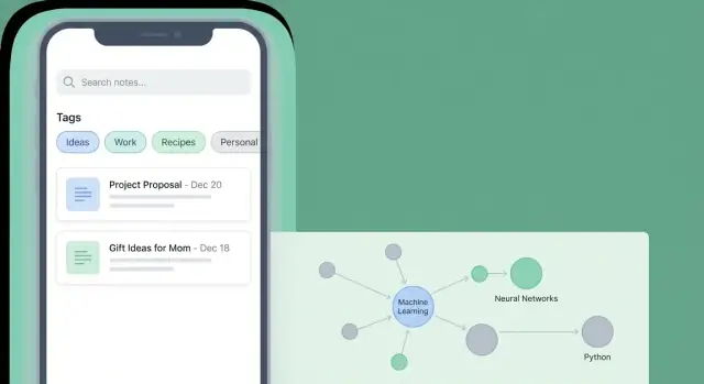
Search is the feature that turns a pile of notes into a usable knowledge base. Treat it as a core workflow, not a nice-to-have, and be explicit about what “searchable” means in v1.
Start with full-text search over note titles and bodies. This covers most use cases while keeping complexity manageable.
Attachments are trickier: PDFs, images, and audio require extraction (OCR, speech-to-text) that can bloat your MVP. A practical compromise is to index attachment filenames and basic metadata now, and add content extraction later.
Also index the metadata users expect to query:
Mobile search needs assistance. Build a search screen that feels guided, especially for non-power users:
Keep filters one tap away, and make active filters visible so users understand why results changed.
If indexing happens all at once, performance will collapse as users grow from 200 notes to 20,000.
Use incremental indexing: update the index when a note changes, and batch background work when the app is idle/charging. If you support offline-first storage, index locally so search works without connectivity.
A good result list answers “Is this the note I need?” without opening each item.
Show:
That combination makes retrieval feel instant—even when the library isn’t.
People trust a PKM app when it behaves predictably on a plane, in a basement, or on a flaky café Wi‑Fi. The simplest way to earn that trust is to be explicit about what works offline, when data leaves the device, and how recovery works if something goes wrong.
Offline-first means notes are saved to the device immediately; sync happens in the background when connectivity returns. Users experience it as “it always works,” but you must handle conflicts and local storage carefully.
Cloud-first means the source of truth is on a server; the app may cache content, but saving often depends on being online. It reduces conflict complexity, yet users can lose confidence when they see spinners or “can’t save right now.”
For most personal notes, offline-first is the safer default—as long as you’re honest about sync status.
You have three common options:
Many teams start with manual export for v1, then add cloud sync once retention proves the app’s value.
Edits will collide. Decide rules up front and describe them in plain language:
Surface a small sync indicator and a human-readable status (“Synced 2 min ago”, “Sync paused—offline”).
Offer backups that don’t trap people:
A PKM app often holds sensitive material: meeting notes, medical reminders, private ideas, and scans of documents. Treat privacy and security as product features, not “later” tasks.
Start by choosing an explicit data model for storage:
A simple rule: the less you collect and transmit, the less you have to protect.
Cover baseline protections that make people comfortable:
Many PKM features need permissions (camera for scanning, microphone for voice capture, files for import). Make them opt-in:
Add a small Privacy & Security screen in Settings that documents:
Keep it short, readable, and easy to find (for example, from /settings).
Your tech stack should support the two things PKM users notice immediately: how fast the app feels and how trustworthy their notes are (no missing edits, no weird sync conflicts). It’s tempting to copy what bigger apps use, but your v1 will be better if the stack matches your scope.
Native (Swift for iOS, Kotlin for Android) is a strong choice when you want the best platform feel, top performance for large note lists, and easier access to OS features (share sheets, widgets, background tasks). The trade-off is building and maintaining two codebases.
Cross-platform (Flutter or React Native) can get you to market faster with one UI codebase. Flutter often shines for consistent UI and smooth scrolling; React Native can be great if you already have strong JavaScript/TypeScript experience. The risk is spending extra time on edge cases like text input behavior, selection, and platform-specific integrations.
For a PKM mobile app, local storage is your foundation:
If you plan to store sensitive notes, decide early whether you need at-rest encryption (device-level encryption may not be enough for your audience). Encryption choices can affect indexing and search, so don’t bolt this on at the end.
If your v1 is offline-first, you can often ship without a backend. Add cloud pieces only when they solve a real problem:
If you want to validate screens and flows quickly—Inbox, editor, tags, and search—tools like Koder.ai can help you generate a working web or mobile-style prototype from a chat prompt, then iterate fast. It’s especially useful when you want to test product decisions (navigation, empty states, processing the Inbox) before you invest in a full native implementation.
Koder.ai also supports source code export and a planning mode, which can be handy for turning a PKM spec into a structured build plan you can hand to your team.
Before committing, build a tiny prototype that includes: typing in long notes, formatting, links, undo/redo, and scrolling through thousands of notes. Editor performance and “feel” are hard to predict on paper—testing early can save weeks of rework later.
A PKM app is only useful if it feels dependable. Notes must load quickly, edits must never vanish, and “it worked yesterday” can’t be a common story. Test the risky parts first, then keep regressions from sneaking back in.
Don’t wait until the end to discover your editor corrupts formatting or your search becomes slow after 5,000 notes.
Focus early prototypes on:
Write a checklist you can run before each release candidate:
If you can automate parts of this (even a few smoke tests), do it—reliability is mostly about preventing repeats.
Run short sessions with 3–5 people and watch quietly. Validate that users can:
Set up crash reporting from day one so you can fix real-world issues fast. For analytics, collect only what you need (e.g., feature usage counts, not note content), make it opt-in where appropriate, and explain it in settings.
A v1 launch is less about “shipping everything” and more about shipping a clear promise: what your PKM app is great at, who it’s for, and how it stays trustworthy with users’ notes.
Before you submit, prepare a small but complete store package:
Keep onboarding to 2–3 screens or a single interactive checklist. Add lightweight tooltips only where users might get stuck (first tag, first link, first search).
Include a simple help page in-app (“How to…”) that links to /blog for guides and, if you offer a paid tier, /pricing for plan details.
Make feedback easy while the context is fresh:
Use early feedback to prioritize a few high-impact upgrades:
Ship small updates frequently, and communicate changes inside release notes and your help page.
Start by choosing 2–3 primary jobs-to-be-done to excel at (usually capture, organize lightly, and retrieve). Then limit v1 content types to what supports those jobs (often just text notes + links). A tight definition prevents “everything for everyone” scope creep.
A solid v1 reliably supports the habit loop: capture → light organization → find later.
Practical must-haves:
Defer features that add heavy complexity before you’ve proven retention:
Ship them only after your core loop is fast and reliable.
Pick the platform you can maintain confidently for the next 12 months.
Avoid doubling scope before you’ve validated the product’s core habit.
Keep your “home base” small and obvious:
If you can’t explain a screen’s purpose in one sentence, it’s likely overloaded.
Choose a clear, minimal model:
Pick one primary editing format for v1 and make it feel instant.
Whatever you choose, prioritize: fast startup, reliable autosave, and recovery after app kill.
Treat search as a core workflow:
For MVP, index attachment filenames/metadata first and add OCR/transcription later.
Offline-first is usually the safest trust-building default: save locally immediately and sync in the background.
For sync/backups, common paths:
Define conflict rules up front and preserve both versions when in doubt.
Design privacy as a product feature:
Add a schema version and plan migrations early so libraries don’t break on updates.
The less data you collect and transmit, the less you must protect.