May 29, 2025·8 min
How to Build a Mobile App for Simple Habit Awareness
A practical step-by-step guide to plan, design, and launch a simple habit awareness mobile app—from MVP features and UX to reminders, privacy, and testing.
A practical step-by-step guide to plan, design, and launch a simple habit awareness mobile app—from MVP features and UX to reminders, privacy, and testing.
Before you plan features or screens, define what “habit awareness” means in your app. Awareness is not the same as performance. Your first job is to help people notice a behavior, log it with minimal effort, and reflect just enough to spot patterns.
Keep the goal small and repeatable:
If you can’t explain your loop in one sentence, the app will likely drift into “perfect tracking,” which increases friction and drop-off.
Pick a single target to launch with—sleep, water, movement, or mood. Each area implies different check-in styles and summaries. Starting with one reduces complexity and helps you learn what users actually do, not what you hope they’ll do.
User stories keep you honest about speed and clarity. Examples:
Set metrics that match awareness, not perfection: daily check-ins, 7-day retention, and time-to-first-check-in. If those improve, you’re building the right foundation—even if the app is still simple.
A habit awareness app only feels “simple” when it matches the realities of the people using it. Before you touch app wireframes or a habit tracker MVP feature list, decide who you’re building for and what their days actually look like.
Pick a single group to design around first—students, busy parents, or office workers. A focused audience helps you make clear trade-offs: what the daily check-in should ask, how often reminders should fire, and what “success” means.
Real-world constraints determine whether people will open the app at all:
Capture these in plain language. This will guide your behavior change basics (small prompts, low effort, no guilt).
Tone is a product decision. Choose one and stick to it:
Create one persona and one main use case.
Example: Maya, 34, busy parent, checks in at 10:30 pm after kids are asleep. She wants to notice patterns (snacking when stressed) without feeling judged. She tolerates one reminder per day, but ignores anything more.
Use this scenario to drive your initial screen decisions and keep privacy in mobile apps and user control grounded in real needs.
An MVP for a habit awareness app should help people notice their behavior with minimal effort. If the first version feels like homework, you’ll lose users before you learn anything.
Start with a small set of features that make “check-in” effortless and “looking back” meaningful:
This combination gives you the shortest path to value: users can check in within seconds, then spot patterns over time.
It’s tempting to add streaks, badges, and detailed analytics early. For habit awareness, these can distract from the core purpose and create pressure. Treat them as a later phase:
If you can, start simple with offline-first. It reduces signup friction and lets people begin immediately. You can add optional accounts later for backup and multi-device sync.
If your product requires an account (e.g., coaching, team programs), keep it minimal: email + verification, and let users explore before they commit.
Write a one-paragraph MVP scope statement and treat it like a contract:
MVP scope: Users can create one habit, check in daily in under 10 seconds, view the last 30 days of history, and set a single reminder. No streaks, no advanced analytics, no social features, no mandatory account.
When new ideas show up (and they will), compare them to this statement before adding anything.
Before you think about colors or fancy animations, sketch how someone moves through your habit awareness app in under a minute. The goal is to reduce decision-making: users should always know what to do next.
Start with the smallest set of screens that can support daily use:
Anything else (badges, multiple habits, social sharing) can wait until your core flow feels effortless.
Design the check-in so it takes 1–2 taps, max. Common models:
If you add a note, make it secondary—people should be able to submit without typing.
Use clear labels and large touch targets, especially for thumbs. Avoid icons that require guessing.
Plan your empty states upfront: the first day should feel welcoming (“Ready for your first check-in?”), and no data yet screens should explain what will appear after a few entries. This prevents the app from feeling broken when it’s simply new.
The check-in is the heart of a habit awareness app. If it feels heavy, users skip it; if it feels neutral and quick, they’ll keep showing up. Your goal is to capture a small, honest snapshot of what happened—without turning the app into a scorecard.
Different habits need different levels of detail. Choose one default, then allow an optional layer for people who want context.
A rigid schedule can create friction. Consider:
Keep progress views simple and readable:
Avoid labels like “good/bad,” “failed,” or “streak broken.” Use neutral prompts:
A calm reflection model builds trust—and makes the app feel like a tool for understanding, not judging.
A habit awareness app feels “simple” only if people trust it. The easiest way to build that trust is to decide, early, what you collect, what you don’t, and how users stay in control.
Use plain language, not legal-sounding text. For example: “We store your habit name, check-ins, and optional notes so you can see patterns over time.” If you collect anything extra (device ID, analytics events), explain the purpose: “to fix bugs” or “to understand which screens are confusing.”
Avoid collecting sensitive data unless it’s essential. Most awareness goals don’t need location, contacts, microphone access, or health data. If you later add mood or triggers, keep them optional and make it clear they’re personal.
On-device only is simplest for privacy: data stays on the phone, fewer policies, fewer failure points. The trade-off is no cross-device sync and losing data if the phone is lost.
Cloud sync helps with backup and switching phones, but it adds accounts, storage costs, and security work. If you choose sync, store only what you need and design for “offline-first” so check-ins still work without internet.
Include a small “Data & Privacy” area with:
When people can see, move, and remove their data, they’re more likely to use daily check-in consistently.
Technology choices can either speed you up or slow you down. For a simple habit awareness app, the “best” stack is usually the one that helps you ship a clean first version quickly—and makes future changes predictable.
If you’re building your first release, pick either iOS or Android. One platform means fewer design variations, fewer edge cases, and faster feedback from real users. You can expand to the second platform once you know the core experience works.
A simple rule: pick the approach your team can maintain for a year—not just build in a month.
If your goal is to validate the awareness loop quickly, a vibe-coding platform like Koder.ai can help you go from a written spec (“one habit, 10-second daily check-in, simple history, one reminder”) to a working web or mobile-style prototype via chat.
This can be especially useful for:
Even a small app benefits from a few essentials:
Create a short, shared doc that records what you chose and why (platform, frameworks, data storage, notification strategy). When you return to add features later—like new reflection prompts or extra check-in options—you’ll move faster and avoid re-debating old choices.
Onboarding should feel like a gentle setup moment, not a questionnaire. Your goal is to get someone to their first daily check-in within a minute or two, while setting the right expectation: this is an awareness tool, not a perfection machine.
Use one short screen (or even a single sentence) that frames the app’s job: “This app helps you notice patterns.” That line reduces pressure and makes the first interaction feel safe—especially for users who have tried habit trackers before and felt judged by streaks.
Ask only what you truly need to deliver value on day one:
If you offer multiple habit options, keep them readable and familiar (“Late-night snacking,” “Scrolling before bed,” “Skipping water”). Avoid long descriptions.
Include a short, optional tutorial (2–3 screens max) that shows what a check-in looks like and what happens after. Always provide a clear “Skip” button. Users who already understand the concept shouldn’t be forced through it.
Use readable text sizes, strong contrast, and simple language. Make tap targets generous, avoid dense paragraphs, and ensure onboarding works well one-handed. A calm, clean setup experience is part of what makes the app feel simple and trustworthy.
Reminders should feel like a gentle tap on the shoulder—not an alarm that makes people resent your app. The goal is to prompt awareness and a quick check-in, not to guilt users into “perfect” behavior.
Use soft, friendly copy that gives people an easy out. Compare:
Also, avoid turning every reminder on by default. Start with one simple option (for example, a daily nudge) and let people opt into more.
Let users define quiet hours so notifications never arrive during sleep, meetings, or family time. Add snooze choices that match real life—5 minutes, 30 minutes, “later today”—plus an easy “skip for now.”
A good rule: if a reminder can’t be delayed, it will eventually be disabled.
Different users respond to different cues. Support a small set of modes without overwhelming settings:
Measure what helps and what irritates. Useful metrics include notification opens, check-ins within 30–60 minutes of a reminder, and opt-outs/disables.
If a reminder style causes lots of disables, tone it down, reduce frequency, or make it opt-in only.
A habit awareness app can have the right features and still feel “hard” if the small details create extra decisions. Polishing UX is mostly about removing friction and making the app predictable.
Every tap should answer “what happens next?” Use short, friendly language that doesn’t judge the user.
Pick a small set of icons and stick to them: a check mark for completion, a speech bubble for notes, a bell for reminders. Keep colors doing one job each (for example: one accent color for primary actions, neutral colors for everything else). Avoid using color alone to communicate meaning—pair it with labels.
Settings should cover only what users expect:
If a setting requires a paragraph to explain, it probably doesn’t belong in version one.
A short help screen prevents support requests and reduces anxiety. Include 5–7 questions like:
Keep answers brief, practical, and reassuring.
Before you invest time in new features, spend a few hours watching real people use what you already have. Simple usability tests will show you where your “easy” flow still feels unclear.
Recruit 5–10 people who resemble your target users. Give them a phone and a short set of tasks—then stay quiet and observe:
Ask them to “think out loud” so you can hear what they expect to happen next.
Look for moments where people hesitate, backtrack, or ask questions like “Where do I tap?” or “Did that save?” These are your friction points. Typical fixes are small but powerful: clearer button labels, fewer decisions per screen, better default choices, and immediate feedback after an action.
Run the same tasks on a small phone and a large phone. Pay attention to:
Don’t try to fix everything. Rank problems by frequency and severity, then address the top items before adding new features. A smoother check-in flow beats a bigger feature list every time.
Once your habit awareness app is in people’s hands, your job is to learn what actually helps them check in consistently—not to chase vanity numbers. Pick a small set of signals that tell you whether the app is doing its core job: getting users to notice patterns.
Keep analytics lightweight and focused on the funnel from “installed” to “regular check-ins.” Three metrics are enough to guide early decisions:
If a metric doesn’t point to a clear product decision, skip it for now.
A daily check-in only works if the app feels reliable. Add crash and performance tracking early, and set a rule: fix stability issues before adding features. Slow launches, frozen screens, or failed saves break trust quickly—especially for a simple app where users expect “open, check in, done.”
Numbers tell you what is happening; feedback tells you why. Add a simple in-app “Send feedback” entry in settings (or after a check-in). Keep it frictionless: a short form or email draft with optional screenshots.
When you review messages, tag them into a few buckets (confusing onboarding, reminder complaints, missing habit types, data concerns). Patterns matter more than single requests.
Before you expand scope, decide what success looks like and what you’ll change next.
Update 1 (stability + clarity): fix crashes, speed issues, confusing copy, and any screen that blocks first check-in.
Update 2 (engagement + control): improve reminders, make check-ins faster, and add small user controls (like editing a check-in) based on what you learned.
If you’re iterating rapidly, tools like Koder.ai can help you ship small updates faster (UI tweaks, backend changes, and safe rollbacks) while keeping the product aligned with your MVP scope.
Shipping your first version is the start of the learning loop, not the finish line. A simple habit awareness app improves fastest when you treat release as an experiment: publish, watch for friction, then adjust.
Prepare store assets that set accurate expectations. Create 3–6 screenshots that show the core flow (onboarding → first daily check-in → history/reflection). Write a short description that emphasizes awareness over “perfect streaks.” Include clear privacy details: what you collect, why, and how users can delete it.
Begin with a small beta group (friends-of-friends, a community group, or early sign-ups). Give them a specific mission: “Use the daily check-in for 7 days.” Collect feedback in three buckets:
Prioritize fixes that affect first-time success: completing onboarding and logging a check-in smoothly.
Keep your launch checklist short: app icon, screenshots, description, privacy text, reminder defaults, analytics events (only what you need), and a tested “delete my data” path.
For support, set up one clear channel (email or an in-app form) and prepare canned replies for common issues: notification timing, account access (if any), and data deletion.
Outline the next 2–3 iterations based on real use. Good “later” upgrades for a habit awareness app include optional sync across devices, lightweight insights (patterns, not judgment), and small widgets for faster check-ins. Keep each roadmap item tied to one goal: help users notice their habits with less effort.
Define a one-sentence loop: Notice → Log → Reflect.
If the loop can’t be explained simply, the app will drift into high-friction “perfect tracking.”
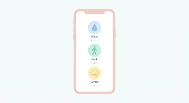
Start with one habit area (sleep, water, movement, or mood). You’ll ship faster, learn real usage sooner, and avoid building multiple tracking models at once.
Choose the first habit by:
A solid MVP usually needs only:
Defer streaks, badges, complex dashboards, social features, and deep analytics until the core loop is effortless.
Use metrics that reflect awareness and consistency, not perfection:
If these improve, you’re building the right foundation—even with a simple feature set.
Keep onboarding focused on getting to the first check-in fast (ideally within 1–2 minutes):
Add an optional 2–3 screen tutorial with a clear Skip so returning users aren’t forced through it.
Design reminders as helpful prompts, not pressure:
Track effectiveness with lightweight signals like notification opens, check-ins within 30–60 minutes, and disable/opt-out rate.
Use observation-first language and visuals:
The goal is information that builds trust—not a scorecard that creates guilt.
Decide early:
Explain data use in plain language and avoid collecting sensitive permissions unless truly necessary.
Pick what you can maintain for at least a year:
Budget for “beyond the app” basics: crash reporting, lightweight analytics, and reliable notifications.
Run lightweight tests with 5–10 target users and watch them do real tasks:
Fix the most frequent/high-severity issues first (unclear buttons, too many steps, “did it save?” uncertainty) before adding new features.