Apr 22, 2025·8 min
How to Build a Simple Time Awareness Mobile App, Step by Step
Learn how to design and build a simple time awareness mobile app: core features, UX patterns, tech choices, notifications, testing, and launch steps.
Learn how to design and build a simple time awareness mobile app: core features, UX patterns, tech choices, notifications, testing, and launch steps.
“Simple time awareness” is the habit of noticing where your time is going while you’re in the middle of a day—not producing a perfect log of every minute.
A time awareness app is less like a spreadsheet and more like a gentle nudge: pause, look up, and decide what you want the next block of time to be about. It’s about intention, not accounting.
Simple time awareness typically includes quick check-ins, lightweight timers, and small reflections. The goal is to reduce “autopilot” moments—scrolling longer than you meant to, task-switching without realizing it, or starting the day with no clear plan.
It is not full time tracking. You’re not asking users to categorize every activity or reconstruct their day. You’re giving them a few small prompts that help them steer.
This approach helps people who feel busy but can’t explain where the hours go, including:
Scenario 1: A remote worker starts a “45-minute focus” session before writing. When the timer ends, the app asks one question: “Did you work on the thing you intended?” That single checkpoint prevents an afternoon of accidental task-hopping.
Scenario 2: Someone trying to curb evening scrolling gets a 9:30 PM check-in: “How do you want the next hour to feel?” They choose “calm” and switch to a short wind-down routine.
Define success as a change the user can feel:
To avoid feature creep, be explicit:
If users can get value in under 10 seconds per check-in, you’re building the right kind of simplicity.
An MVP for a time awareness app isn’t “a smaller app.” It’s one promise your product keeps perfectly, every day. Your goal is to help someone notice time, make a tiny decision, and feel clearer afterward—without needing motivation or setup.
Before features, define the outcomes a user should get in under 30 seconds:
If an idea doesn’t directly improve one of these outcomes, it doesn’t belong in the MVP.
Pick a single loop and design everything around making it fast and calm:
Prompt → quick action → feedback
A good rule: the loop should be completable with one hand, in under 10 seconds, with sound off.
Retention doesn’t need gamification. Choose one:
You can combine both, but keep the MVP version minimal: one screen that makes progress feel real.
Capture clarity early with a one-page PRD:
If you can’t describe the MVP on one page, the loop isn’t tight enough yet.
A simple time awareness app works best when it’s built around a small set of “things” the user creates, sees, and edits. If you keep the core entities clear, the rest of the product (screens, notifications, analytics) becomes much easier to design.
Start with a tight model that matches what people actually do.
If you’re tempted to add tags, projects, goals, calendars, or complex reports, save them for later. Your MVP needs a fast “record → reflect” loop.
Your first successful check-in should happen within a minute of opening the app.
A clean flow is:
Designing around this flow prevents a common mistake: building settings, profiles, and dashboards before the user can do the basic action smoothly.
Granularity changes everything: UI, reminders, and summaries.
A practical compromise is offering broad blocks by default, with an option to switch to minutes later. If you do support minutes, don’t force users to pick an exact end time—allow “stop now” and estimate duration.
People will check in on the subway, in buildings with weak signal, or while battery saver is on. Your MVP should work offline by default.
When these decisions are made up front, your “Core Features” stop being a wishlist and become a coherent, testable set of user actions.
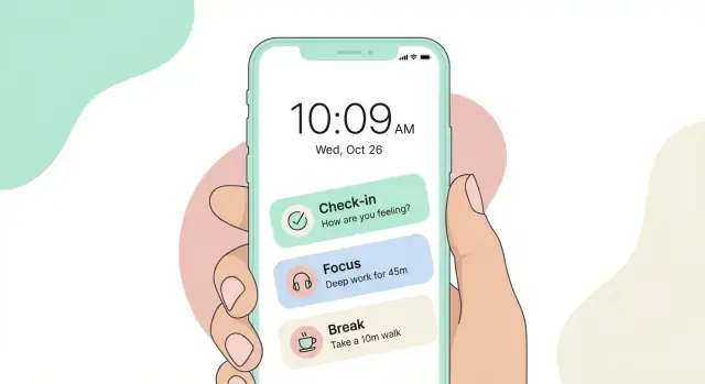
A time awareness app should feel like a quick glance, not a task. The best UI pattern is “one clear action, then you’re done.” Reduce choices on every screen, keep labels plain, and avoid visual noise that makes users second-guess.
Treat the home screen as a calm status view:
If you add secondary actions (history, settings), keep them small and consistent—icons or subtle text in the corners.
The check-in screen should be completable with one tap:
Use friendly microcopy like “Optional” or “Skip” to remove pressure.
History works best as a quick reassurance: a timeline of check-ins or calendar dots for consistency. Avoid heavy charts by default; a simple “You checked in 4 times this week” is enough to support awareness without turning it into performance.
Settings should be short and clearly grouped:
Use large type, generous spacing, and high contrast so the app works while walking, commuting, or between meetings. Aim for big tap targets and stable layouts to prevent mis-taps and reduce friction.
The best tech choice for a time awareness app is the one your team can ship, maintain, and polish without distractions. Early versions should favor simplicity: fast screens, reliable notifications, and data that never “mysteriously” disappears.
Native (Swift for iOS, Kotlin for Android) is the safest bet if you care most about platform feel and the least friction with system features like notifications, widgets, Focus modes, and accessibility.
Cross-platform (Flutter or React Native) can be a great fit when you want one codebase and faster iteration, especially for small teams.
Trade-offs to expect:
A practical rule: if your MVP depends heavily on reminders, background behavior, or widgets, lean native. If the MVP is mainly logging/check-ins and simple timers, cross-platform is usually fine.
If you want to validate the product loop before committing to a full engineering pipeline, a vibe-coding approach can help. For example, Koder.ai lets teams prototype and ship web, backend, and mobile-adjacent functionality via a chat interface (with source code export, deployment, and rollback). It’s especially useful for quickly testing your data model (check-ins/sessions/reminders), summary screens, and admin tooling—then moving to a production-grade mobile client when the loop proves sticky.
For an MVP, consider no backend at all: store everything on-device and optionally support export/import later. This reduces cost, legal/privacy surface area, and failure points.
If you must sync early (multi-device use is core), keep it minimal: authentication + simple cloud storage for a small user dataset.
Pick one local store and commit to it:
Reminders are the moment your app interrupts someone’s day—so they need to feel like a gentle nudge, not a nag. The goal is to support awareness ("What time is it? What was I about to do?") while staying easy to ignore when life is busy.
A good time awareness app usually needs only a few ways to prompt a check-in:
The key is making the default light: one or two reminders per day, then let users add more only if they ask for it.
People stop trusting apps that ping too often. Add controls that prevent notification overload:
These options should be quick to find and easy to change—ideally from the same screen where reminders are configured.
Notification text should be short, kind, and clear about the next step. Avoid guilt.
Examples:
Let people respond without opening the app:
Reminders can behave strangely if you don’t handle:
Feedback loops are what make a simple time awareness app feel supportive instead of “empty.” The trick is to keep feedback small, clear, and optional—so users feel guided, not judged.
Every core action should get a calm confirmation, plus one tiny insight.
For example, after a mindful check-in or a completed focus session:
Keep the insight factual and lightweight. Avoid popups that demand attention or ask for extra taps.
Daily and weekly summaries should be readable in a few seconds, with simple metrics instead of complex charts. Think:
Add one short sentence that interprets the numbers without overreaching: “You tended to start later on weekdays.” If you can’t say it confidently, don’t say it.
Streaks can motivate, but they can also create pressure. Use “streaks” as gentle continuity, not a game:
Let users define goals that fit their lives: flexible schedules, custom time windows, and adjustable targets (e.g., “2 focus blocks on weekdays”). When you nudge, suggest options—“Want to move this reminder to 10:30?”—rather than guilt messages.
The goal is a feedback loop that helps users notice patterns and adjust, while keeping the app calm and easy to leave.
Analytics should answer a small set of product questions: Are people getting value quickly? Which reminders help, and which annoy? Where do users drop off? If you can’t name the decision a metric will support, don’t track it.
For a simple time awareness app, the useful “event data” can stay minimal:
set_reminder, check_in, snooze, dismiss)Avoid storing free-form text, contact lists, location, or anything that could reveal a user’s identity unless it’s essential.
Pick a short list you can review weekly:
These metrics tell you whether reminders create habits—or friction.
Create one simple funnel and keep it consistent:
Install → first reminder created → first reminder delivered → first check-in
If many users stall between “created” and “delivered,” you may have permission or scheduling issues. If “delivered” is high but “check-in” is low, the reminder content or timing likely needs work.
Use anonymized IDs by default. Offer an opt-out for analytics where possible, and keep the app functional if a user opts out.
A basic dashboard should show week-over-week changes in your key metrics, plus a short notes area for experiments (e.g., “new reminder copy shipped on Tuesday”). This keeps iteration focused and prevents data overload.
A “simple” time awareness app can fail fast if it’s hard to read, hard to operate, or confusing across regions. Treat accessibility and localization as core functionality, not polish.
Support large text and dynamic type so the interface doesn’t break when users increase font size. Keep layouts flexible: buttons should grow, labels should wrap, and key actions should stay reachable.
Use strong color contrast and avoid relying on color alone (for example, don’t make “overdue” only red without an icon or label). Every interactive element needs a clear, descriptive screen reader label—especially custom controls like time pickers, toggles for “quiet hours,” and “snooze” actions.
Time is highly regional. Respect device settings for 12/24-hour time, first day of week, and local date formats. Avoid hard-coding strings like “AM/PM” or “Mon–Sun.” When showing ranges (e.g., quiet hours), present them in the user’s format and language.
Be careful with time zones and daylight saving time. Store timestamps in a consistent format (commonly UTC) and convert for display. If a user travels, clarify whether reminders follow the current location or a chosen “home” time zone.
Test on real devices (not only simulators), including low battery mode and poor connectivity. Validate these flows end-to-end:
If notifications are disabled, don’t just show a blank state. Explain what won’t work, provide an in-app alternative (e.g., on-screen check-ins), and guide users to re-enable permissions with clear, non-blaming language.
Your app succeeds or fails on a few moments: a user opens it, does a quick check-in, understands what happened today, and decides whether reminders feel supportive or irritating. You can validate all of that before writing much code.
Create a lightweight prototype that simulates the core loop: open → check-in → see a simple summary → set or adjust a reminder. Then run 5–10 short interviews with people who match your target audience.
Keep sessions practical: ask them to complete tasks while thinking out loud. Watch where they hesitate, what they ignore, and what they try to tap that isn’t tappable.
Focus your questions and observations on:
If users can’t explain the summary in their own words, it’s not clear enough.
Be cautious with A/B tests early on. With small user numbers, you’ll get noisy results and may optimize the wrong thing. Prefer changes you can roll back quickly—copy tweaks, one-screen layout adjustments, or a simpler reminder setting.
Add in-app feedback where it’s most relevant (after a reminder or after a summary) with a single question:
“Was this helpful?”
Optionally allow one short free-text note, but don’t force it.
After each round, write down the top 3 problems that block the core loop. Then explicitly cut features that don’t fix those problems. If a new idea doesn’t improve check-in speed, reminder comfort, or summary clarity, it waits.
Launching a simple time awareness app is mostly about trust: it must open fast, behave predictably, and deliver reminders when it said it would. A tight checklist keeps you from shipping “almost working” basics.
Your screenshots should teach the app in seconds. Aim for 3 frames that mirror the main loop:
Choose a rhythm (e.g., check-in every 60 minutes)
Get a calm prompt (a gentle nudge, not a demand)
Log in one tap (e.g., “On track / Behind / Break”) and return to life
Use short captions and show real UI states (including the lock screen notification style, if allowed by the store rules).
Don’t ask for notification access on the first screen. First, let the user pick their check-in style and see a preview of how a reminder looks. Then ask at the moment it’s clearly useful: “Want me to nudge you at 3:00?” If they say no, offer a quiet fallback (in-app banners) and a clear path to enable later.
Keep it simple:
Before you ship, confirm:
Pick three upgrades you can validate with early users:
Smarter quiet hours (meetings, sleep windows)
More flexible schedules (weekdays vs weekends)
Better summaries (one weekly insight that encourages, not judges)
Ship small updates quickly, and keep the core loop unchanged unless users prove it’s confusing.
“Simple time awareness” is lightweight noticing, not detailed accounting. The app helps users pause, see what they’re doing, and choose the next block intentionally—often with a quick check-in, a short timer, and a tiny reflection.
It’s best for people who feel busy but can’t explain where the hours go—especially:
A tight MVP loop is:
If you can’t complete it one-handed in under 10 seconds, it’s too heavy for the MVP.
Start with 3–5 entities you can explain simply:
Avoid projects/tags/goals in v1 unless they directly speed up the check-in loop.
Default to broad blocks because they’re calmer and more sustainable. Offer “minutes” later for users who want precision.
A practical compromise is:
Make “first success” happen in under a minute:
Don’t put dashboards and settings before the first check-in.
Use a “calm dashboard” pattern:
For check-ins, keep it to one question, big tap targets, and an optional note field hidden behind a tap.
Start gentle and make it easy to ignore:
Write human, non-guilting copy (“Quick check-in: what are you doing right now?”).
For an MVP, offline-first is the safest default:
If multi-device isn’t reliable yet, don’t imply it.
Track only what supports clear product decisions:
check_in, set_reminder, snooze, dismissAvoid collecting free-form text or sensitive data. Offer analytics opt-out where possible and keep the app usable without tracking.