Apr 20, 2025·8 min
How to Build a Mobile App for Subscription Usage Insights
Plan and build a mobile app that turns subscription activity into clear insights: tracking, key metrics, dashboards, alerts, privacy, data pipeline, and rollout.
Plan and build a mobile app that turns subscription activity into clear insights: tracking, key metrics, dashboards, alerts, privacy, data pipeline, and rollout.
Before you design screens or pick analytics tools, get clear on who the app is for and what decisions it should support. “Usage insights” isn’t just charts—it’s a small set of reliable signals that explain how subscribers use your product and what to do next.
Most subscription usage insights apps serve more than one audience:
Make these questions concrete. If you can’t write the question in one sentence, it’s probably not a mobile-friendly insight.
Insights should drive action. Common decision goals include:
Define measurable outcomes such as:
This guide focuses on defining metrics, tracking events, joining data sources, privacy basics, and building clear mobile dashboards with alerts.
Out of scope: custom ML models, deep experimentation frameworks, and enterprise-grade billing system implementation.
Before you design dashboards, you need a shared definition of what a “subscription” is in your product. If the backend, billing provider, and analytics team each use different meanings, your charts will disagree—and users will lose trust.
Start by writing down the lifecycle stages your app will recognize and display. A practical baseline is:
The key is to define what triggers each transition (a billing event, an in-app action, or an admin override) so your “active subscribers” count doesn’t depend on guesswork.
Your subscription usage insights app will typically need these entities, each with a stable identifier:
Decide early which ID is the “source of truth” for joining (for example, subscription_id from your billing system) and make sure it flows into analytics.
Many products eventually support more than one subscription: add-ons, multiple seats, or separate plans for different accounts. Decide rules such as:
Make these rules explicit so your dashboards don’t double-count revenue or undercount usage.
Edge cases often drive the biggest reporting surprises. Capture them up front: refunds (full vs. partial), upgrades/downgrades (immediate vs. next renewal), grace periods (access after failed payment), chargebacks, and manual credits. When these are defined, you can model churn, retention, and “active” status in a way that stays consistent across screens.
Your app’s “usage insights” are only as good as the choices you make here. The goal is to measure activity that predicts renewal, upgrades, and support load—not just what looks busy.
Start by listing the actions that create value for the subscriber. Different products have different value moments:
If you can, prefer value produced over pure activity. “3 reports generated” usually tells you more than “12 minutes in app.”
Keep the initial set small so dashboards stay readable on mobile and teams actually use them. Good starter metrics often include:
Avoid vanity metrics unless they support a decision. “Total installs” is rarely helpful for subscription health.
For every metric, write down:
These definitions should live next to the dashboard as plain-language notes.
Segments turn a single number into a diagnosis. Start with a few stable dimensions:
Limit segments at first—too many combinations make mobile dashboards hard to scan and easy to misinterpret.
A subscription usage insights app is only as good as the events it collects. Before you add any SDKs, write down exactly what you need to measure, how you’ll name it, and what data each event must carry. This keeps dashboards consistent, reduces “mystery numbers,” and makes later analysis much faster.
Create a small, readable catalog of events that covers the full user journey. Use clear, consistent naming—typically snake_case—and avoid vague events like clicked.
Include, for every event:
subscription_started, feature_used, paywall_viewed)A lightweight example:
{
  "event_name": "feature_used",
  "timestamp": "2025-12-26T10:15:00Z",
  "user_id": "u_123",
  "account_id": "a_456",
  "subscription_id": "s_789",
  "feature_key": "export_csv",
  "source": "mobile",
  "app_version": "2.4.0"
}
Plan identifiers up front so you can connect usage to subscriptions later without guesswork:
user_id: stable after login; don’t use email as an ID.account_id: for team/workspace products.subscription_id: ties usage to a specific plan and billing period.device_id: useful for debugging and offline delivery, but treat as sensitive.Decide rules for guest users (temporary IDs) and what happens at login (ID merge).
Mobile tracking must handle spotty connections. Use an on-device queue with:
event_id UUID per event)Also set a maximum retention window (for example, drop events older than X days) to avoid reporting misleading late activity.
Your schema will change. Add schema_version (or maintain a central registry) and follow simple rules:
A clear tracking plan prevents broken charts and makes your usage insights trustworthy from day one.
Subscription usage insights only feel “true” when the app connects behavior, payments, and customer context. Before you design dashboards, decide which systems are the sources of record—and how you’ll stitch them together reliably.
Start with four categories that typically explain most subscription outcomes:
You generally have two workable paths:
Data warehouse-first (e.g., BigQuery/Snowflake) where you transform data into clean tables and power dashboards from a single source.
Managed analytics-first (e.g., product analytics tools) for faster setup, with a lighter warehouse layer for billing/support joins.
If you plan to show revenue-aware insights (MRR, churn, LTV), a warehouse (or at least a warehouse-like layer) becomes hard to avoid.
Most joining problems are identity problems. Plan for:
A simple approach is to maintain an identity map table that relates anonymous IDs, user IDs, and billing customer IDs.
Define freshness by use case:
Being explicit here prevents overbuilding pipelines when a daily update would meet the product promise.
Subscription usage insights only work long-term if people trust how you handle data. Treat privacy as a product feature: make it understandable, easy to control, and limited to what you truly need.
Use plain language that answers two questions: “What are you tracking?” and “What do I get out of it?” For example: “We track which features you use and how often, so your dashboard can show your activity trends and help you avoid paying for unused tiers.” Avoid vague terms like “improve our services.”
Keep this explanation close to the moment you ask for consent, and mirror it in Settings with a short “Data & Privacy” page.
Build consent as a configurable flow, not a one-time screen. Depending on where you operate and your policies, you may need:
Also plan for “withdraw consent” behavior: stop sending events immediately, and document what happens to previously collected data.
Default to non-identifying data. Prefer counts, time ranges, and coarse categories over raw content. Examples:
Define retention periods by purpose (e.g., 13 months for trends, 30 days for raw logs). Limit who can view user-level data, use role-based access, and keep an audit trail for sensitive exports. This protects customers and reduces internal risk.
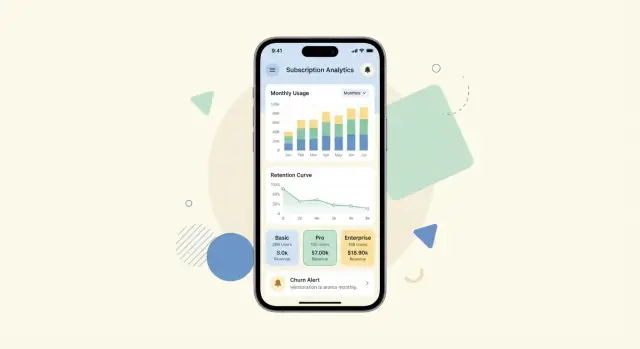
Mobile dashboards succeed when they answer one question per screen, quickly. Instead of shrinking a web analytics UI, design for thumb-first scanning: big numbers, short labels, and clear “what changed?” signals.
Start with a small set of screens that map to real decisions:
Use cards, sparklines, and single-purpose charts (one axis, one legend). Prefer chips and bottom sheets for filters so users can adjust segments without losing context. Keep filters minimal: segment, plan, date range, and platform is usually enough.
Avoid dense tables. If you must show a table (e.g., top plans), make it scrollable with a sticky header and a clear “sort by” control.
Analytics screens often start empty (new app, low volume, filtered to zero). Plan for:
If stakeholders need to act outside the app, add lightweight sharing:
Make these options available from a single “Share” button per screen so the UI stays clean.
A usage insights app is only as useful as the KPIs it puts next to real behavior. Start with a tight set of subscription metrics that executives recognize, then layer in “why” metrics that connect usage to retention.
Include the metrics people use to run the business day to day:
Pair subscription KPIs with a small set of usage signals that typically predict retention:
The goal is to let someone answer: “Churn rose—did activation drop, or did a key feature stop getting used?”
Cohorts make trends readable on small screens and reduce false conclusions.
Add light but visible guardrails:
If you need a quick reference for definitions, link to a short glossary page like /docs/metrics-glossary.
A usage insights app is most valuable when it helps people notice changes and do something about them. Alerts should feel like a helpful assistant, not a noisy alarm bell—especially on mobile.
Start with a small set of high-signal alerts:
Each alert should answer two questions: What changed? and Why should I care?
Use channels based on urgency and user preference:
Users should be able to adjust:
Explain rules in plain language: “Alert me when weekly usage drops by more than 30% compared to my 4-week average.”
Pair alerts with recommended actions:
The goal is simple: every alert should lead to a clear, low-effort action inside the app.
A subscription usage insights app usually has two jobs: collect events reliably and turn them into fast, readable dashboards on a phone. A simple mental model helps you keep scope under control.
At a high level, the flow looks like this:
Mobile SDK → ingestion → processing → API → mobile app.
The SDK captures events (and subscription state changes), batches them, and sends them over HTTPS. An ingestion layer receives those events, validates them, and writes them to a durable store. Processing aggregates events into daily/weekly metrics and cohort tables. The API serves pre-aggregated results to the app so dashboards load quickly.
Pick what your team can maintain:
If you want to prototype this end-to-end quickly (especially the “mobile UI + API + database” loop), a vibe-coding platform like Koder.ai can help you validate the dashboard screens, event ingestion endpoints, and aggregation tables from a single chat-driven workflow. It’s particularly useful for iterating on data contracts and UI states (empty states, loading, edge cases) while keeping deployment and rollback straightforward via snapshots.
Batch events on-device, accept payloads in bulk, and enforce rate limits to protect your ingestion. Use pagination for any “top items” lists. Add a cache (or CDN where appropriate) for dashboard endpoints that many users open repeatedly.
Use short-lived tokens (OAuth/JWT), enforce least-privilege roles (e.g., viewer vs. admin), and encrypt transport with TLS. Treat event data as sensitive: restrict who can query raw events, and audit access—especially for customer support workflows.
If your data is wrong, your dashboard becomes a confidence killer. Treat data quality as a product feature: predictable, monitored, and easy to fix.
Start with a small set of automated checks that catch the most common failures in subscription usage insights:
Make these checks visible to the team (not hidden in a data team inbox). A simple “Data Health” card inside the admin view is often enough.
New events should not go straight to production dashboards.
Use a lightweight validation flow:
Add a “versioned schema” mindset: when the event tracking schema changes, you should know exactly which app versions are affected.
Instrument the pipeline like any other product system:
When a metric breaks, you want a repeatable response:
This playbook prevents panic—and keeps stakeholders trusting the numbers.
An MVP for a subscription usage insights app should prove one thing: people can open the app, understand what they’re seeing, and take a meaningful action. Keep the first release intentionally narrow—then expand based on real usage, not guesses.
Start with a small set of metrics, a single dashboard, and basic alerts.
For example, your MVP might include:
The goal is clarity: every card should answer “So what?” in one sentence.
Beta test with internal teams first (support, marketing, ops), then a small set of trusted customers. Ask them to complete tasks like “Find why revenue dipped this week” and “Identify which plan is driving churn.”
Capture feedback in two streams:
Treat your analytics UI as a product. Track:
This tells you whether insights are genuinely helpful—or just “nice-looking charts.”
Iterate in small releases:
Add new metrics only when the existing ones are used consistently.
Improve explanations (plain-language tooltips, “why it changed” notes).
Introduce smarter segmentation (cohorts like new vs. retained users, high-value vs. low-value plans) once you know which questions people ask most.
If you’re building this as a new product line, consider doing a fast prototype pass before committing to a full engineering cycle: with Koder.ai you can sketch the mobile dashboards, stand up a Go + PostgreSQL backend, and iterate in “planning mode,” with source code export available when you’re ready to move to a traditional repo and pipeline.
“Usage insights” are a small set of trustworthy signals that explain how subscribers use the product and what action to take next (reduce churn, improve onboarding, drive expansion). They’re not just charts—each insight should support a decision.
Start by writing the one-sentence questions each audience needs answered:
If a question can’t fit on one mobile screen, it’s probably too broad for an “insight.”
Define the subscription lifecycle states you will display and what triggers each transition, such as:
Be explicit about whether transitions come from billing events, in-app actions, or admin overrides so “active subscribers” isn’t ambiguous.
Pick stable IDs and make them flow through events and billing data:
user_id (not email)account_id (team/workspace)subscription_id (best for tying usage to entitlement and billing periods)device_id (useful, but treat as sensitive)Also decide how you merge identities so usage doesn’t fragment across IDs.
Choose metrics that reflect value created, not just activity. Good starter categories:
Keep your first set small (often 10–20) so mobile dashboards stay scannable.
For each metric, document (next to the dashboard if possible):
Clear definitions prevent teams from arguing over numbers and protect trust in the app.
A practical plan includes:
snake_case)Start with four sources that explain most outcomes:
Then decide where transforms happen (warehouse-first vs analytics-first) and maintain an identity map to link records across systems.
Design mobile screens to answer one question per view:
Use cards, sparklines, chips/bottom sheets for filters, and strong empty states (“No data—try a longer range”).
Keep alerts high-signal and action-oriented:
Let users tune thresholds, frequency, and snooze, and always include a next step (educate, invite teammates, upgrade/downgrade, contact support).
event_id UUID for deduplicationschema_versionThis prevents broken dashboards when mobile connectivity or app versions vary.