How to Build a Mobile Time Tracking & Productivity App
Learn how to plan, design, and build a mobile time tracking app—from MVP features and UX to data, privacy, testing, and App Store/Google Play launch.
Define the Goal and Target Users
A mobile time tracking app succeeds when it makes one promise: capturing time should feel easier than skipping it. Before thinking about screens or features, write down the core goal in one sentence. For example: “Help people record work hours in seconds, so timesheets and reports are always accurate.”
Who is the app for?
Time tracking means different things depending on the user. Pick a primary audience first, then support others as secondary.
- Freelancers need fast start/stop tracking, client/project separation, and clean totals for invoices.
- Employees often need compliant timesheets, category codes, and reminders for missing entries.
- Teams care about consistency: shared projects, roles, approvals, and visibility into where time goes.
- Students track study sessions, routines, and progress toward goals (often more “habit” than “billing”).
If you try to serve everyone equally, you’ll likely build a confusing timesheet app. Choose one “hero” user and design for their daily reality.
The primary job-to-be-done
Define the main action your mobile time tracking app must make effortless:
“Record time with minimal effort, even when the user is busy or distracted.”
That translates into practical decisions like fewer taps, sensible defaults, and quick ways to fix mistakes.
Outcomes that matter
Be clear about what success looks like for users:
- Better focus: time blocks that encourage starting and staying on task.
- Accurate timesheets: fewer forgotten hours and less end-of-week guesswork.
- Clearer reports: simple insights users can understand at a glance.
Constraints to clarify early
Write down constraints now to avoid rework later:
Offline use (subways, job sites), supported devices, budget and timeline, and any rules (company policies, school privacy needs). These constraints shape what your MVP mobile app can realistically deliver.
Research Competitors and Choose Your Differentiator
Before you start productivity app development, spend a few hours studying what’s already winning (and what’s annoying) in the market. A mobile time tracking app is easy to copy at the feature level, so the real advantage is usually in setup speed, daily habit formation, and clarity of results.
Pick 3–5 real competitors (and one “indirect” alternative)
Choose apps your target users already mention: a timesheet app for teams, a freelancer time tracker, and a work hours tracker with invoicing. Add one indirect competitor like a calendar app or a note-taking tool—many people “track time” without a timer.
For each competitor, scan:
- App Store / Google Play reviews (filter 1–3 stars for pain points)
- Recent update notes (what they’re rushing to fix)
- Pricing pages (what’s locked behind paywalls)
Map the feature patterns—and the gaps
Common time tracking features to benchmark:
- Pomodoro timers (focus sessions + breaks)
- Manual timers (start/stop, quick-switch tasks)
- Automatic tracking (detecting activity, location-based prompts)
Now look for gaps users complain about: setup friction (too many steps to log the first hour), confusing reports, and weak reminders that don’t match real schedules.
Decide your differentiator (one sentence)
Pick an angle you can defend in an MVP mobile app. Examples:
- Simplicity: “Log time in under 10 seconds.”
- Teams: “Approvals and timesheets that managers actually use.”
- Invoicing: “Track → invoice → get paid without spreadsheets.”
- Habits/Focus: “Time tracking designed around routines and Pomodoro.”
If you can’t explain why someone would switch in one sentence, you’re still feature-matching rather than differentiating.
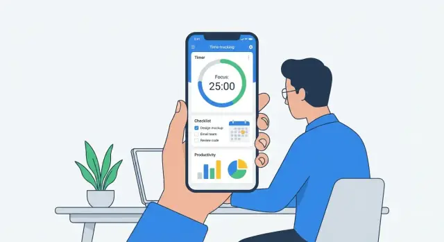
Choose MVP Features (What to Build First)
An MVP time tracker isn’t “small”; it’s focused. Your goal for v1 is to help people reliably record work time with minimal friction, then show just enough feedback to make the habit stick.
Must-have MVP (ship these first)
Start with the features that make your mobile time tracking app usable on day one:
- Start/stop timer: a single, prominent control to begin and end tracking. Include a clear “currently tracking” state so users don’t forget it’s running.
- Manual time entry: people will forget to start the timer. Let them add or edit entries with start/end time (or duration), date, and notes.
- Projects + tags (or categories): keep it simple—projects for “client/workstream,” tags for “type of work.” This is the foundation of reporting later.
These three also define the core data you’ll rely on for reporting, exports, and billing features down the road.
Basic productivity features (keep them lightweight)
Productivity app development can spiral quickly, so choose only what reinforces time entry:
- Daily goals: a simple target like “track 6 hours today” or “2 hours on Project X.” Avoid complex goal systems.
- Reminders: gentle nudges like “No time logged today” or “Timer running for 3 hours—still working?”
- Simple stats: a weekly total, today’s total, and top projects. Think “glanceable,” not analytics-heavy.
Nice-to-have later (avoid in v1)
These are valuable, but they slow down your first release and add edge cases:
- Team time tracking features like approvals, roles, and shared projects
- Invoicing and billable rates
- Integrations (calendar, payroll, project management tools)
You can plan for them in your roadmap, but don’t build them until you’ve validated that your timesheet app nails accurate capture.
Define what’s out of scope (so you actually ship)
Write down a v1 “no list.” For example: offline mode, multi-device sync conflicts, complex permissions, custom reports, and automation rules. Being explicit about what won’t be built helps you protect the MVP and get your work hours tracker into users’ hands faster.
Design a Simple UX for Fast Time Entry
A time tracker succeeds or fails on one thing: can someone start (and stop) tracking in seconds, without thinking? If your UX forces people to “set things up first,” they’ll track for a day, then fall back to guessing hours later.
Core screens to get right
Keep your first version focused on a small set of screens that cover the full loop from “I have work” to “I can bill/report it.”
- Onboarding: explain the benefit in one sentence, then get out of the way. Let people try without creating a complex workspace.
- Timer (home): the primary action should be obvious and large. Start/stop needs to be the biggest target on the screen.
- Task/project picker: make it fast to choose where time goes, without forcing deep navigation.
- History: show what was tracked today and this week, with quick edits (duration and project).
Reduce taps (your UX north star)
Time entry is a micro-moment. Design for “thumb speed,” not “perfect organization.”
- Quick start: allow starting a timer immediately, even if a project isn’t selected yet. Prompt to categorize later.
- Recent projects: put the last 5–10 items at the top of the picker so most users never search.
- One-tap resume: add a “Resume” button next to recent entries in History, so repeating work is effortless.
If you want one simple rule: the user should be able to start tracking from the lock-screen mindset—one decision, one tap.
Accessibility basics that also improve conversion
Accessibility isn’t only about compliance; it prevents “I can’t use this quickly” friction.
Use readable type sizes, clear contrast for timer state (running vs stopped), and large tap targets—especially for Start/Stop and project selection. Avoid relying on color alone to show status; pair it with text like “Running” or a clear icon.
Empty states that teach without nagging
A brand-new account has no projects, no history, no reports—so show the next step.
Good empty states do two jobs:
- Explain what this screen is for (“Your history shows tracked sessions and manual edits.”)
- Offer a single action (“Start your first timer” or “Add a project”)
Keep the copy friendly and specific. Avoid generic “No data” messages; instead, give people a clear path to their first successful entry.
When this UX is working, users don’t feel like they’re “using an app.” They feel like they’re simply starting work—and the tracker keeps up.
Pick Your Tech Stack and Architecture
Your tech stack is less about “best technology” and more about what lets you ship a reliable time tracker quickly—without breaking offline sync, battery life, or reporting.
Option A: iOS + Android native (best platform fit)
Go native (Swift/SwiftUI for iOS, Kotlin/Jetpack for Android) if you want the smoothest timer behavior, background execution control, widgets, and platform-native notifications.
Native also helps when accuracy matters: handling sleep/wake states, time zone changes, and OS restrictions is often easier when you’re using the platform’s first-class APIs. The trade-off is higher cost: you’ll maintain two codebases and likely need iOS and Android specialists.
Option B: Cross-platform (reuse code, ship faster)
A cross-platform approach (commonly Flutter or React Native) can cut development time and keep UI/logic consistent. For many MVP time tracking apps, this is a practical path—especially if your team is small.
Be realistic about “one codebase.” You may still need native modules for background timers, health/battery optimizations, and deep OS integrations.
Backend choice: lightweight API vs serverless vs managed BaaS
- Lightweight API (e.g., REST/GraphQL): best when you need custom reporting, complex permissions, or integrations.
- Serverless: good for early stages with variable traffic, quick iteration, and lower ops overhead.
- Managed BaaS: fastest for authentication, storage, and push notifications—great for an MVP mobile app—though reporting and data exports can become limiting later.
If you want to prototype fast without locking yourself into a brittle “no-code” setup, a vibe-coding workflow can help. For example, Koder.ai lets teams build React web apps, Go backends, and Flutter mobile apps through a chat-driven interface, with source code export and deployment/hosting—useful when you’re validating the core tracking loop before investing in heavier infrastructure.
Decide based on real constraints
Choose based on team skills, timeline, offline requirements, and reporting complexity. Time tracking often needs offline-first entry with reliable sync, so plan for local storage on-device plus conflict handling.
A simple architecture that works well: mobile app → API/BaaS → analytics + reporting pipeline, with clear separation between “time entries” (source of truth) and “reports” (derived views).
Plan Data Model and Tracking Logic
Before you build screens, decide what “truth” looks like in your app: what data you store, what rules make it valid, and how you turn raw timers into totals people trust.
Core entities (keep them boring and flexible)
Start with a small set of objects that can cover most use cases without constant redesign:
- Users: profile, settings (time zone, week start day), subscription status.
- Projects: client/workstream container; optional hourly rate.
- Tasks: optional child of a project (some users track only by project).
- Time entries: the heart of the app—start time, end time, duration, source (timer/manual), notes.
- Tags: lightweight labels (“Meeting”, “Deep work”, “Admin”).
- Goals: targets like “10 billable hours/week” or “2 hours/day on Focus”.
A practical rule: allow projects and tasks to be optional on a time entry, but require at least one classification (project/task/tag) if your reports depend on it.
Tracking rules that prevent “mysterious totals”
Time tracking apps lose users when numbers don’t add up. Define these rules early:
- No overlapping timers: a user can’t have two running entries at once. If they start a new timer, either stop the current one automatically or force a choice.
- Pauses are explicit: either model a paused state on the running entry, or store multiple segments under one entry. Don’t “guess” gaps.
- Time zones are stored, not inferred: save timestamps in UTC plus the user’s time zone (or offset) at creation time. This avoids broken day/weekly totals when users travel or DST changes.
Offline-first syncing (so tracking works everywhere)
Assume users will track time in elevators, planes, and bad Wi‑Fi.
Store changes locally first (including “timer started” events). Queue them for background sync with unique IDs and a “last updated” marker. When syncing, handle duplicates and conflicts by preferring the newest edit, while keeping an audit trail for sensitive fields like start/end times.
Reporting model (what you’ll sum later)
Design time entries with reporting in mind: daily/weekly totals, billable vs non-billable, and totals by project/task/tag. Precompute simple aggregates (per day, per week) to keep reports fast, but always be able to rebuild them from raw entries if something changes.
Implement Timers, Reminders, and Edge Cases
A time tracker is only as trustworthy as its timer. Users will forgive a simple UI, but they won’t forgive missing or “mysteriously rounded” hours. This section is about making the timer dependable, even when the phone doesn’t cooperate.
On-device timer reliability (background limits + fallbacks)
Mobile operating systems aggressively pause apps to save battery. Don’t rely on a timer “ticking” in the background. Instead, store a start timestamp and compute elapsed time from the current clock when the app resumes.
For long-running sessions, add a fallback strategy:
- Save start/stop events immediately to local storage (not only in memory).
- Periodically checkpoint (e.g., every few minutes) so a crash loses seconds, not hours.
- Sync to the server when possible, but keep the app usable offline.
Edge cases you must handle
Treat these as product requirements, not rare bugs:
- App killed / force-closed: on next launch, detect an “active” session and ask whether to continue or stop at a chosen time.
- Phone restart: restore the last known running timer from persisted data and reconstruct elapsed time.
- Low Battery Mode / background restrictions: warn users that reminders may be delayed; keep time math correct regardless.
Reminders and optional Pomodoro
Use notifications for two things: (1) “You started tracking 2 hours ago—still working on this?” and (2) “You haven’t tracked anything today.” Keep them opt-in with clear controls (frequency, quiet hours).
If you add Pomodoro, treat it as a mode on top of the same tracking system: focus blocks create time entries; breaks do not (unless the user explicitly tracks them).
Audit trail for edits and manual adjustments
Users will edit time—make it safe and transparent. Keep an audit trail that stores what changed (start/end/duration), when, and why (optional note). This prevents disputes, supports team approvals, and builds trust in your timesheet app.
Build Reports and Insights Users Will Actually Read
Reports are where a time tracker proves its value. The goal isn’t to impress users with dashboards—it’s to answer the questions users ask after a busy day: “Where did my time go?” and “What should I change tomorrow?”
Start with 2–3 charts that tell the truth
Pick a small set of visualizations that are hard to misread:
- Time by project (simple bar chart or stacked list)
- Time by tag/category (another bar chart)
- Billable vs non-billable (single ratio card or small donut)
Keep labels clear, totals visible, and sort by “most time” by default. If a chart needs a legend explanation, it’s probably too complex for v1.
Filters that match real workflows
The fastest way to make reports feel “smart” is good filtering. Include:
- Date range (Today, This week, This month, Custom)
- Project
- Tag
- Billable (yes/no)
Make filters sticky so users can tweak one thing without rebuilding the whole view. Also show the active filters plainly (e.g., “This week • Project: Client A • Billable”).
Export, but keep it MVP-friendly
Most users don’t need a full reporting suite—they need to share something. For MVP, offer:
- CSV export (for invoices or spreadsheets)
- Shareable summary (a formatted text/email share with totals)
Don’t hide export in a settings screen; put it directly in the report view.
Minimal visuals, maximum confidence
Prioritize accuracy and readability over fancy UI. Use whitespace, consistent units (hours/minutes), and a small number of colors. If you want to go deeper later, you can add advanced reports as an upsell—see /pricing for how teams often evaluate value.
Handle Accounts, Privacy, and Security Basics
Trust is a feature in any mobile time tracking app. If users worry you’re collecting more than work hours, they’ll abandon the app—even if the UI is great. Start with simple account choices, ask for the least access possible, and explain your tracking clearly in-app.
Account options that reduce friction
Offer multiple paths so different users can start quickly:
- Guest mode for trying the app without commitment (store data locally and clearly explain what happens if they delete the app).
- Email sign-in for people who want portability across devices.
- Apple/Google sign-in to reduce password fatigue and speed up onboarding.
If you support guest mode, provide an easy “upgrade” flow later (e.g., “Save your data to an account”) so trial users don’t lose their history.
Minimum permissions: ask only when needed
A timesheet app rarely needs broad device access. Avoid requesting contacts, photos, or location unless a feature truly depends on it—and if it does, request permission at the moment of use, not on first launch. Users should always understand the “why” behind any prompt.
Data protection basics (without overengineering)
Cover the essentials early:
- Encryption in transit: use HTTPS/TLS for all API calls.
- Secure storage: keep auth tokens in iOS Keychain / Android Keystore; avoid plain-text storage.
- Encryption at rest: encrypt sensitive data in your database/backups when applicable.
Clear, in-app privacy explanations
Add a short “What we track” screen during onboarding and a permanent page in Settings. Use plain language: what you track (projects, timestamps, notes), what you don’t track (e.g., keystrokes), and how users can export or delete their data. Link to your full policy using a relative route like /privacy.
Test for Accuracy, Reliability, and Usability
Time tracking apps live or die on trust. If your timer drifts, totals don’t match, or edits behave oddly, users will assume every report is wrong—even when it isn’t. Make testing a feature, not a final checkbox.
Accuracy: prove the math
Create a small set of repeatable test scenarios and run them on real devices:
- Timer accuracy: start/stop repeatedly, long runs (1–3 hours), and background/lock-screen behavior.
- Edits: manual time entry, splitting an entry, crossing midnight, and changing project/task after the fact.
- Time zones: travel simulation (change device time zone), daylight saving time shifts, and entries that span a change.
- Offline sync: create entries without connectivity, then reconnect and confirm totals, ordering, and duplicates are handled.
Keep a “golden dataset” (expected results) so you can quickly catch regressions when you ship updates.
Reliability: test where apps usually break
Cover a realistic device matrix: small and large screens, lower-memory devices, and a couple of older OS versions you intend to support. Pay special attention to background execution limits—timers and reminders often behave differently across OS versions.
Add crash and error tracking early (before beta). It shortens debugging time by showing which screen, device, and action triggered the issue, instead of relying on vague user reports.
Usability: validate with real people
Before launch, run quick usability tests with 5–10 target users (freelancers, managers, or whoever you’re building for). Give them tasks like “track a meeting,” “fix yesterday’s entry,” and “find last week’s total.” Watch where they hesitate, not what they say.
If key actions take more than a few taps or require reading instructions, simplify the flow—your retention will thank you.
Monetization and Pricing Without Surprises
Monetization works best when users understand what they’re paying for and feel in control. For a mobile time tracking app, the simplest path is usually a single plan that unlocks “serious” usage—without turning the free experience into a dead end.
Pick a model you can explain in one sentence
Choose one primary approach and keep it consistent across the app store listing, onboarding, and billing screens:
- Freemium: Free for light use, paid for advanced needs.
- Free trial: Everything unlocked for 7–14 days, then subscribe.
- One-time purchase: Works best for offline-first personal trackers, but can be hard to sustain if you have ongoing cloud costs.
If you’re building for freelancers and small teams, freemium or trial-to-subscription is typically easier to understand than multiple tiers on day one.
Show value before the paywall
Let people experience “the win” first: faster time entry, accurate totals, and a report they can actually use. Then apply limits that feel fair, such as:
- Number of projects/clients
- Exports (CSV/PDF), invoice templates, or integrations
- Team members (free for solo, paid for team time tracking)
Avoid blocking basic tracking early; instead, gate convenience and scale.
Billing screens that earn trust
Make pricing obvious and repeat it in plain language: what’s included, billing period, and renewal terms. Add a clear link to /pricing and use the same plan names everywhere.
No dark patterns—ever
Don’t hide cancellation, lock features behind confusing toggles, or trick users into upgrades. Provide a straightforward “Manage Subscription” entry, confirm changes, and make downgrades and cancellations easy. A timesheet app succeeds long-term when users feel respected, not trapped.
Launch, Measure, and Improve After v1
Shipping v1 is less about “finishing” and more about starting a feedback loop. A time tracking app lives or dies on trust: users must feel it’s accurate, quick to use, and improving.
App Store / Google Play launch checklist
Before you submit, prepare the basics that affect both approval and discoverability:
- Screenshots: show the core flow in 3–5 frames (start timer, switch task, review day, export/report). Add short captions.
- Keywords and title: use the language your users search for (e.g., “timesheet,” “work hours,” “freelancer,” “team”). Keep it readable.
- Privacy information: clearly state what you collect (account email, device identifiers, analytics), why, and how to request deletion.
- Store description: focus on outcomes (accurate hours, fewer missed entries) and your differentiator.
Create a simple landing page (and link it from the app)
A one-page site is enough for v1: what it does, who it’s for, pricing, privacy, and support contact. Add a lightweight blog section at /blog for release notes, common questions, and “how to track time” guidance.
Inside the app, include links to /blog and your privacy page so users can quickly self-serve without opening a support ticket.
Launch plan: beta → phased rollout → support
Start with a small beta group (10–50 users) that matches your target audience. Then do a phased rollout so issues don’t hit everyone at once.
Set up a dedicated support inbox and reply quickly during the first two weeks. Even short, human responses reduce refunds and negative reviews.
Post-launch metrics that actually guide decisions
Track a few numbers that map to real product health:
- Activation: % who complete first time entry within 10 minutes.
- Daily usage: how many days per week users log time.
- Retention: day-7 and day-30 return rate.
- Churn reasons: collect a short in-app “why are you leaving?” prompt.
Use this data to prioritize fixes: accuracy bugs and slow entry screens beat new features every time.
FAQ
What’s the first step to building a mobile time tracking app?
Start by writing a one-sentence promise that makes tracking feel easier than skipping it (e.g., “Record work hours in seconds so reports are always accurate”). Then pick one primary audience (freelancers, employees, teams, or students) and design the MVP around their daily workflow—not everyone’s.
A practical anchor is the core job-to-be-done: record time with minimal effort even when busy or distracted.
Who should a time tracking app be designed for first?
Pick one “hero” user first:
- Freelancers: fast start/stop, client/project separation, clean totals for invoices.
- Employees: compliant timesheets, category codes, reminders for missing entries.
- Teams: shared projects, roles, approvals, visibility.
- Students: routines, study sessions, progress toward goals.
If you try to serve everyone equally in v1, you’ll likely build a confusing timesheet app.
How do I research competitors and choose a differentiator?
Review 3–5 direct competitors plus one indirect alternative (like a calendar or note app). Focus on:
- 1–3 star reviews for recurring pain points
- Release notes for what they’re fixing urgently
- Pricing pages to see what’s paywalled
Then choose a differentiator you can explain in one sentence (e.g., “Log time in under 10 seconds” or “Track → invoice → get paid without spreadsheets”).
What are the must-have MVP features for a time tracking app?
A focused MVP typically includes:
- Start/stop timer with a clear “currently tracking” state
- Manual time entry/editing (users will forget to start timers)
- Projects + tags (categories) for basic organization and reporting
These define the core data you’ll build reporting, exports, and billing features on later.
How can I design UX so users can log time quickly?
Treat time entry like a micro-moment:
- Allow quick start even without selecting a project; categorize later.
- Show recent projects at the top so most users never search.
- Add one-tap resume from History for repeated work.
A good rule: starting tracking should feel possible from a “lock-screen mindset”—one decision, one tap.
Should I build native or cross-platform for a time tracking MVP?
Choose based on constraints (skills, timeline, offline needs, reporting complexity):
- Native (Swift/Kotlin): best timer behavior, widgets, notifications, OS edge cases; higher cost (two codebases).
- Cross-platform (Flutter/React Native): faster MVP, shared logic/UI; may still need native modules for background timers and deep integrations.
Plan for offline-first local storage plus reliable sync regardless of stack.
What data model and tracking rules prevent incorrect totals?
Start “boring and flexible”:
- Users, Projects, optional Tasks, Tags
- Time entries (start, end, duration, source timer/manual, notes)
- Optional Goals
Define rules early to avoid distrust:
- No overlapping running timers
- Explicit pause behavior (state or segments)
- Store timestamps in UTC + time zone/offset at creation to handle travel and DST correctly
How do I make timers reliable with background limits and crashes?
Don’t rely on a background “ticking” timer. Store a start timestamp and compute elapsed time from the clock when the app resumes.
Also handle these edge cases deliberately:
- App force-closed: detect an active session next launch and ask to continue/stop
- Phone restart: restore last running timer from persisted data
- Low Battery Mode/background limits: warn reminders may delay, but keep time math correct
Persist start/stop events immediately and checkpoint periodically to minimize data loss.
What reports should a time tracking app include in v1?
Keep reports small and confidence-building:
- Time by project
- Time by tag/category
- Billable vs non-billable
Add workflow-friendly filters (Today/This week/This month/Custom, Project, Tag, Billable), and make them sticky so users can iterate quickly.
For MVP sharing, offer CSV export and a simple shareable summary directly from the report view.
How should I test a time tracking app for accuracy and reliability?
Test for trust, not just UI polish:
- Accuracy: repeated start/stop, long sessions, background/lock behavior
- Edits: manual entries, splitting, crossing midnight, changing projects after the fact
- Time zones: device time zone changes and DST shifts
- Offline sync: create entries offline, reconnect, verify ordering and duplicates
Keep a small “golden dataset” of expected totals to catch regressions before release.