Nov 30, 2025·8 min
How to Build a Mobile App to Track Medication Schedules
Learn how to plan and build a medication schedule tracking app: core features, UX, reminders, data privacy basics, tech stack choices, and testing tips.
Learn how to plan and build a medication schedule tracking app: core features, UX, reminders, data privacy basics, tech stack choices, and testing tips.
Before you sketch screens or pick a tech stack, get painfully clear about what problem you’re solving. Medication tracking apps fail most often not because the code is hard, but because the product tries to satisfy everyone and ends up helping no one.
Start with the real-world friction:
Write this as a short problem statement, for example: “Help people take the right medication at the right time, and make it easy to confirm what happened.”
Medication scheduling looks different depending on who’s holding the phone:
Choose one primary user for version 1. A “patient-first” app will make different tradeoffs than a “caregiver-first” app—especially around sharing and permissions.
Pick a measurable outcome that reflects real value. Good examples:
A single metric helps you avoid shipping features that look impressive but don’t improve adherence.
Non-goals are just as important as goals. Common non-goals for a medication reminder app:
This keeps your scope realistic and can reduce regulatory and safety risk.
Be explicit about whether it’s:
This decision affects everything downstream: onboarding, data access, support expectations, and what “privacy and security” must look like from day one.
Before you think about features, translate the real medication journey into clear requirements. This keeps your medication reminder app focused on what users actually need—especially people who aren’t technical or who may be managing multiple prescriptions.
Start with a simple flow and turn each step into what the app must do:
Onboarding → add meds → reminders → logging → insights.
For example:
Medication tracking fails most often at predictable points:
A medicine schedule tracker MVP should reliably: add meds, remind, log, and show a basic history—offline if needed. Everything else (caregiver sharing, refill scanning, “smart” insights) can come later.
Make a short “must-have vs. nice-to-have” list, then cut until you can build and test quickly.
Do quick paper sketches or simple wireframes for:
If a screen takes more than a few seconds to understand, simplify it. This is where accessibility in mobile apps and app UX for seniors starts—long before development.
Write requirements so you can verify them later:
This clarity will guide mobile health app development and prevent feature creep.
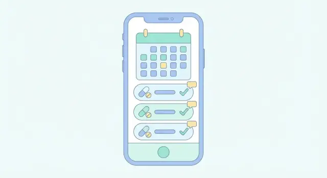
A medication tracking app succeeds or fails on a handful of everyday actions: adding a medicine correctly, getting reminded at the right time, confirming what happened, and seeing a clear record later. Start with features that cover those actions reliably before adding “nice-to-haves.”
Each medication entry should capture what a person needs to take and how to take it: name, dosage/strength, timing, start and end dates (or “ongoing”), and notes (e.g., “with food,” “avoid before driving,” “half tablet”). Keep this screen quick to update—real life changes often.
Not everyone takes meds “once a day.” Support the common patterns early:
For PRN, the key is frictionless logging and optional guardrails (like “don’t exceed 2 doses in 24 hours”) if the user chooses.
Reminders should lead to a simple decision: Taken, Snooze, or Skip. “Taken” should record confirmation immediately; “Snooze” should offer a few sensible options (10 min, 30 min, 1 hour); “Skip” should optionally ask for a reason (“felt unwell,” “no pills left,” “doctor advised”) without forcing it every time.
A logbook is where users verify adherence and spot patterns. Record timestamps automatically, and allow an optional short comment. Make it easy to filter by medication and view a single day at a glance.
Refill reminders feel “smart” without being complicated: track pill count (or doses remaining) and subtract based on taken doses. Then notify when the supply is projected to run out, with a buffer (e.g., “7 days left”).
Together, these features create a complete loop: plan → remind → confirm → review → refill.
A medication app only works if it feels effortless. Many people using it may be stressed, tired, in pain, or not confident with smartphones—so your UI should reduce decisions and make the “right next step” obvious.
Keep onboarding short and forgiving. Let people start immediately with a “Try without an account” option, then offer account creation later for backup and syncing.
Use plain, friendly prompts like “Add your first medicine” and show a small example (e.g., “Metformin 500 mg, twice a day”). If you need permissions (notifications), explain the benefit in one sentence: “We use notifications to remind you when it’s time to take a dose.”
Design around two or three primary actions:
Use large text, strong contrast, and clear action buttons—especially for “Taken” and “Snooze.” Keep taps easy: big hit areas, minimal typing, and consistent button placement. For one-handed use, place the most common controls within thumb reach and avoid tiny icons that require precision.
Replace clinical terms with plain labels:
When you must use a medical term (e.g., “mg”), pair it with an example and keep it consistent across the app.
Empty states should teach: “No reminders yet. Add a medicine to get your schedule.” Error messages should explain what happened and what to do next: “We couldn’t save your changes. Check your connection or try again.” Avoid vague alerts like “Something went wrong.”
Accessibility isn’t a feature—it’s the default. Support dynamic text sizing, screen readers, and color-safe contrast so people can trust the app even on a bad day.
Medication apps succeed or fail on reminder reliability. Users won’t forgive a reminder that fires an hour late, twice in a row, or not at all—especially when the schedule changes during travel or daylight saving time.
Local notifications (scheduled on the phone) are usually best for predictable medication times because they can fire even with no internet. They’re ideal for “Every day at 8:00 AM” or “Every 6 hours” reminders.
Server-driven push is useful when reminders depend on real-time updates: a caregiver adjusting a plan, a clinician changing dosage, or multi-device syncing. Push can also “nudge” the app to refresh schedules, but don’t rely on it as the only delivery method—network and push delivery aren’t guaranteed.
A practical approach is local-first reminders with server sync to update the schedule.
Store schedules in a way that matches user intent:
Handle DST transitions explicitly: if a time doesn’t exist (spring forward), shift to the next valid time; if it repeats (fall back), avoid double-firing by tracking a unique “reminder instance” ID.
When reminders are missed, don’t punish the user. Show a clear state like “Missed at 9:00 AM” with options: Take now, Skip, or Reschedule.
Set guardrails so reminders help without harassing:
Finally, build a failsafe for real devices: battery saver modes can delay background work. Re-check upcoming reminders when the app opens, after reboot, and periodically schedule the next few alerts ahead of time so the system has multiple chances to deliver them.
A medication tracking app lives or dies by its data model. If the model is too simple, reminders become unreliable. If it’s too complex, people will struggle to enter meds correctly. Aim for a structure that’s flexible, but predictable.
Start with a Medication entity that describes the drug itself and how the user should take it. Useful fields include:
Keep strength and form structured where possible (dropdowns) to reduce typos, but always allow a plain-text fallback.
Create a separate Schedule model that describes the rules for generating planned doses. Common schedule types:
Store schedule rules explicitly (type + parameters) rather than saving a long list of future timestamps. You can generate “planned doses” for the next N days on-device.
A DoseLog (or DoseEvent) should track adherence:
This separation lets you answer real questions (“How often was it taken late?”) without rewriting history.
Prevent impossible setups (e.g., “every 2 hours” plus a daily limit) and warn about overlaps that create duplicates. If your app allows edits to past logs, consider an edit history (who changed what and when) so shared care plans remain trustworthy.
Offer simple exports like CSV (for spreadsheets) and PDF (clinician-friendly summaries). Include medication details, schedule rules, and dose logs with timestamps so caregivers can understand the full picture.
A medication reminder app handles information that can reveal a person’s health status, routines, and sometimes their identity. Treat privacy and security as product requirements from day one—because retrofitting them later often forces painful redesigns.
Start by mapping your data flows: what the user enters, what the app stores, and what (if anything) is synced.
A common compromise is: schedules stored locally with optional encrypted sync for users who want backups.
Use encryption in two places:
Also plan for safe logging: never write medication names, doses, or identifiers to debug logs.
Request only what you truly need. A medicine schedule tracker rarely needs contacts, location, microphone, or photos. Fewer permissions builds trust and reduces risk if a third-party SDK misbehaves.
Explain privacy in the app—not just in a legal page.
“HIPAA-ready app considerations” depend on whether you handle identifiable health data and who your customers are (consumer app vs. healthcare provider workflow). Write down your intended use, data types, and vendors early so you can choose the right contracts, hosting, and policies before you build too much.
Your tech choices should serve reliability, reminders, and easy long-term updates—not novelty. A medication reminder app usually benefits from a simple, predictable architecture that works well offline and syncs safely.
Native (Swift/Kotlin) gives the most control over background behavior, notification scheduling, accessibility APIs, and OS-specific edge cases. It can be a good fit if reminders are truly mission-critical and you have separate iOS/Android capacity.
Cross-platform (React Native/Flutter) can speed up development and keep UI consistent. The trade-off is extra care around background tasks, time-zone changes, and vendor plugins for notifications and secure storage. If you choose cross-platform, budget time for deep testing on real devices.
If you want to validate quickly before committing to a full custom build, a vibe-coding platform like Koder.ai can help you prototype (and even ship) an app from a structured chat workflow—useful when you’re iterating on screens, data models, and sync rules. Because Koder.ai can generate React-based web portals, Go + PostgreSQL backends, and Flutter mobile apps, it’s also a practical way to keep a consistent stack if you plan a consumer app plus an admin/caregiver dashboard later.
Some apps can run fully local, but most benefit from a backend for:
Keep the backend thin: store schedules and dose logs, run audits, and avoid complex server-side “smart logic” unless necessary.
Start with a local database (SQLite/Room/Core Data) as the source of truth. Record every dose log locally, then run background sync when connectivity returns. Use a queue for pending changes and conflict rules like “latest edit wins” or explicit per-field merges.
Choose proven providers for push notifications, authentication, and secure storage (Keychain/Keystore). Make sure your reminder system works even if the user disables network access.
Define OS support (e.g., last 2 major versions), a modular code structure, and a predictable release cadence for bug fixes—especially around daylight saving time and notification reliability.
If you’re moving fast, also plan how you’ll manage changes safely. For example, platforms like Koder.ai support snapshots and rollback, which can be handy when a reminder-logic update introduces a subtle time-zone regression and you need a quick recovery path.
Once your core tracking and reminders work reliably, optional features can make a medication reminder app feel personal and genuinely helpful. The goal is to reduce setup effort and prevent avoidable mistakes—without adding complexity for people who just want “simple reminders.”
Manual entry should always be available, but consider shortcuts that save time:
If you add scanning, treat it as a convenience—not a source of truth. Always show the parsed values and ask the user to confirm before saving.
Helpful suggestions can reduce drop-off during setup and improve adherence:
Make these suggestions transparent (“Suggested”) so users don’t feel the app is making medical decisions.
Many people manage meds for children, aging parents, or partners. A caregiver mode can support this safely:
Design for accountability: show who logged a dose and when.
Integrate carefully, and only if it clearly reduces missed doses:
Keep integrations opt-in, with plain-language explanations and a clear disconnect option.
Educational content can build confidence when presented responsibly. Link out to reputable sources and label them as general information, not instructions. A simple “Learn more” section with curated links can be enough (see /blog/medication-safety-basics).
A medication app succeeds or fails on small details: wording, timing, and whether people feel confident they did the “right thing.” Before building the full product, create a clickable prototype and put it in front of the people who will actually use it.
Aim for the shortest set of screens that covers the main journey. For most medication tracking apps, 5–8 screens is enough to validate the MVP:
The prototype should feel real: use readable font sizes, high-contrast colors, and large tap targets so older adults can judge the experience accurately.
If your team wants to iterate on these flows quickly, Koder.ai’s planning mode can be useful for turning this journey into a concrete spec and a working prototype faster than a traditional sprint cycle—while still keeping the option to export source code later.
Do short sessions (15–30 minutes) with 5–8 participants. Include older adults and at least one person who takes multiple medications.
Give tasks, not instructions. Example: “It’s 8pm and you just took your blood pressure pill—show me what you would do.” Watch where they hesitate.
Medication apps must be understood at a glance. Check whether users correctly interpret:
Ask users to explain what they think will happen next. If they can’t, the wording needs work.
Validate reminder tone, frequency, and clarity. Try variants like “Time to take Metformin (500 mg)” vs. “Medication reminder,” and see what users prefer. Also confirm what they expect after snoozing or skipping.
Capture patterns: where users got confused, which screens felt unnecessary, and what “must-have” reassurance they requested (e.g., an Undo after marking a dose). Turn these notes into concrete MVP changes before engineering starts.
A medication reminder app is only “good” if it behaves correctly on a boring Tuesday night when the phone is on low power mode, the user is traveling, and the schedule has exceptions. Testing is where you prove the app can be trusted.
Start with automated unit tests around schedule calculations, because most real-world bugs hide in edge cases:
Treat your schedule engine like a small library with deterministic inputs/outputs. If the math is right, the rest of the app is easier to reason about.
Notifications are where apps often fail in practice. Do hands-on testing across:
Make sure reminders still trigger after the user force-quits the app, restarts the phone, or changes the system time.
Many medication trackers are used by seniors or people with low vision. Test with:
Even without going deep into compliance, verify the basics:
Run a small beta with real medication routines. Instrument crash reporting and lightweight feedback prompts, and track: missed reminder reports, notification permission drop-off, and the most common “edit schedule” actions. A short beta can prevent months of support tickets after launch.
A medication tracking app isn’t “done” when it ships. Launch is the moment you start learning what real people struggle with: missed reminders, confusing schedules, or devices set to the wrong time zone.
Health-related apps can face extra scrutiny during review. Be ready to explain what your app does (and doesn’t do), especially if you show adherence “scores” or insights.
Keep your store listing and in-app copy clear:
People rely on medication reminders. When something breaks, they won’t “try again later.” Ship a simple support setup from day one:
You can also link to a short help hub like /blog/medication-reminder-troubleshooting.
Track product health (crashes, reminder delivery, feature usage), but avoid collecting unnecessary sensitive data. Prefer event analytics that don’t include medication names or free-text notes. If you offer an account, separate identity data from health logs where possible.
After launch, prioritize improvements that reduce missed doses and confusion:
Publish your plan transparently and keep shipping small, reliable updates. If you offer tiers, keep pricing simple and easy to find at /pricing.
Start by writing a one-sentence problem statement (e.g., “Help people take the right medication at the right time, and confirm what happened”), then choose one primary user (patient or caregiver) for version 1.
Pick a single success metric such as doses logged on time to guide every feature decision.
A solid MVP reliably does four things:
Use local notifications for most scheduled reminders because they can fire without internet and are more reliable for “every day at 8:00 AM.”
Add server sync only to update schedules across devices or support caregiver edits—don’t rely on push as your only reminder delivery path.
Store schedules based on user intent:
Handle DST by shifting non-existent times forward and preventing double-fires using a unique reminder-instance ID.
A practical minimum model is:
Keeping “planned” separate from “actual” makes history and insights trustworthy.
Design reminders to lead to a clear decision:
Add guardrails like snooze limits and quiet hours so reminders help without harassment.
Optimize for stressed, tired, or non-technical users:
Also support dynamic text sizing and screen readers from day one.
Avoid scope creep by explicitly listing non-goals, such as:
This reduces safety risk and keeps the MVP buildable and testable.
Make an early product decision:
A common compromise is local-first storage with optional encrypted sync for users who want backup/sharing.
Treat reliability as the product:
Plan an in-app troubleshooting FAQ for issues like missed reminders and battery optimization.