Jul 06, 2025·8 min
How to Build a Mobile App That Tracks One Metric Per Day
A practical step-by-step guide to plan, design, and build a mobile app that tracks one metric per day, from MVP scope to UI, storage, and launch.
A practical step-by-step guide to plan, design, and build a mobile app that tracks one metric per day, from MVP scope to UI, storage, and launch.
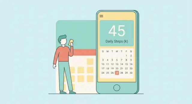
A “one metric per day” app does exactly one thing: it asks the user to record a single number (or simple value) once per calendar day. No forms, no long checklists, no multiple tabs of data. The goal is to make daily logging feel as effortless as checking a box.
Most tracking apps fail for a boring reason: they ask for too much, too often. When users have to remember multiple inputs, interpret labels, or decide what “counts,” they skip a day—and then stop entirely.
Limiting the app to one metric lowers the mental load:
That simplicity makes the habit easier to keep when life gets busy—which is when tracking is usually most valuable.
A metric should be quick to capture and easy to compare over time. Good examples include:
The key is that the user should understand the scale without rereading instructions every day. If they have to think hard about what number to enter, the app is already losing.
This kind of app is ideal for people who want a lightweight self-check-in: personal growth, health routines, productivity experiments, or simply noticing patterns. It works especially well when users don’t need precision—they need consistency.
Be explicit about what the app is and isn’t. This is a personal log, not a diagnosis tool. If you’re tracking things like pain, mood, or sleep, avoid medical claims and present the data as “your notes over time,” not medical advice.
A one-metric app stays simple only if the metric is unambiguous. Before you design screens or databases, write down the rules in plain language so users always know what to enter and when.
Start by choosing a single thing people can measure consistently. Then choose the unit that matches how people naturally think about it:
Write the label exactly as it will appear in the app, including the unit. For example: “Sleep (hours)” is clearer than “Sleep.”
Validation prevents messy data and reduces user frustration later.
For a numeric metric, define:
For a scale, define what each end means (“0 = none, 10 = worst imaginable”) so users stay consistent across days.
For yes/no, decide whether “no entry” should be treated as “no” or as “unknown.” Usually, it’s better to keep “not tracked” distinct from “no.”
Users expect the app to follow their local day. Use the user’s timezone for grouping entries and set a clear cutoff (typically local midnight).
Also decide how you’ll handle travel. A simple approach: each day is based on the timezone at the time of entry, and past days don’t shift later.
Backfilling can help honesty and continuity, but unlimited edits can undermine trust in trends.
Pick one policy and state it clearly:
These rules make your data dependable and keep the “once a day” promise intact.
A one-metric app wins by being fast and predictable. The MVP should feel “finished” because it does a small set of things extremely well—and refuses everything else.
Today (Entry): the home screen where the user logs today’s value. It should be obvious what “today” means and whether an entry already exists.
History (Calendar or list): a simple view of recent days with quick scanning and the ability to tap a day to edit.
Trends: one basic chart that answers “how am I doing lately?” without extra options.
Settings: the minimum controls: metric name/units, daily boundary (if needed), reminders, export, and privacy basics.
For a first release, limit functionality to:
Everything beyond that is a distraction early on.
These features usually add complexity to the UI, data model, and support burden:
If you’re unsure about a feature, it’s probably not MVP.
Write a few measurable targets so you can tell whether the MVP is working:
These criteria keep decisions grounded: every new idea must protect speed, clarity, and trust.
The “Today” screen is your app. If it takes more than a few seconds, people will skip it. Aim for one glance, one action, done.
Pick an input that matches the metric’s shape:
Whichever control you choose, let a single tap save. Avoid extra “Confirm” screens unless the metric is irreversible (it usually isn’t). Show immediate feedback like “Saved for today” and the recorded value.
People shouldn’t wonder what “7” means:
Keep language consistent across the app: the same unit, the same scale, the same wording.
Use large tap targets (thumb-friendly), strong contrast, and readable type. Support system text sizing. Ensure controls have meaningful names for screen readers (e.g., “Increase value” rather than “Button”). Don’t rely on color alone to convey meaning.
A note field can add context (“slept poorly,” “travel day”), but it can also slow logging. Keep it optional and collapsed by default (“Add a note”). Consider a setting to turn notes off entirely for people who want maximum speed.
A one-metric app only feels “simple” if the history screen stays calm. The goal is to answer two questions quickly: “What happened?” and “Is it changing?”—without turning the app into a dashboard.
Choose a single default view and make everything else secondary:
If you offer both, don’t present them as equal tabs on day one. Start with one, and hide the alternate behind a simple toggle.
Decide upfront how to represent “no entry.” Treat it as blank, not zero, unless zero is a meaningful value the user actively chose.
In the UI:
Streaks can motivate, but they can also punish. If you include them:
Trends should be a quick summary, not a charting tool.
A practical approach is to show 7/30/90-day averages (or sums, depending on the metric) with a short line such as: “Last 7 days: 8.2 (up from 7.5).”
Avoid multiple chart types. One small sparkline or a single bar strip is enough—especially if it loads instantly and stays readable at a glance.
This kind of app succeeds when it feels instant. Your tech choices should optimize for a simple daily metric tracker that loads fast, works offline, and is easy to maintain as a mobile app MVP.
If you want maximum OS integration (widgets, system reminders, best scrolling performance), go native: Swift (iOS) and Kotlin (Android). You’ll ship the most “at home” experience, but you’ll maintain two codebases.
If speed of delivery matters more, a cross-platform framework is usually enough for a habit tracking app:
Both approaches work well for a one-screen-per-day flow.
If you want to move even faster from idea to a working MVP, a vibe-coding platform like Koder.ai can help you generate a React web app, a Go + PostgreSQL backend, or a Flutter mobile client from a simple chat—then export the source code when you’re ready to own and extend it.
Model your core record as a single daily entry:
{ date, value, createdAt, updatedAt, note? }Use a canonical date that represents the user’s “day” (store as an ISO date like YYYY-MM-DD), separate from timestamps. This keeps validation straightforward: one entry per day, overwrite or edit as needed.
At minimum, plan these layers:
Pick small, well-maintained dependencies:
Add analytics later only if it won’t complicate the core flow.
A one-metric-per-day app succeeds when it never loses entries and never blocks the user. That’s why the MVP should be local-first: the app works fully offline, saves instantly, and doesn’t require an account.
Pick a proven on-device database layer rather than trying to “just write files.” Common options:
Keep the data model boring and durable: a record with a date key, the metric value, and lightweight metadata (like “note” or “createdAt”). Most issues happen when you don’t treat “date” carefully—store a clear day identifier (see the timezone section) so “one entry per day” stays enforceable.
Design the app so every daily entry is confirmed as saved without a network connection. This reduces friction and eliminates a whole category of failures (login outages, server downtime, poor reception).
If you add sync later, treat it as an enhancement, not a requirement:
Export builds trust because users know they can leave with their data.
Offer at least one simple format:
Make export easy to find (Settings is fine) and make the file self-explanatory: include the metric name, unit (if any), and the date/value pairs.
For the MVP, rely on platform backups (iCloud device backup on iOS, Google backup on Android) where appropriate.
Optionally plan an “upgrade path” later:
The key is consistency: local saves must be immediate, exports must be reliable, and backups must feel like a safety net—not a hurdle.
Reminders can make a one-metric app stick, but they can also be the fastest way to get uninstalled. The guiding principle: reminders should feel like a helpful nudge that the user owns—not a system that nags.
Start with a single daily reminder time setting. During onboarding, offer a sensible default (for example, early evening), then immediately show a clear toggle to disable reminders entirely.
Keep the controls simple:
Short, calm copy reduces pressure and guilt. Avoid streak language and judgment.
Examples:
If the metric has a name, include it only if it’s short and unambiguous.
If the user doesn’t act, don’t keep firing notifications. One per day is enough.
Inside the app, handle missed days with a gentle prompt:
Make “Not now” a first-class option, and don’t penalize the user with warnings.
Once the core loop is stable, consider quick entry features that reduce friction:
Add these only if they meaningfully shorten the path to a daily entry.
Trust is a feature. A one-metric app has a big advantage here: you can design it to collect almost nothing—and explain that clearly.
Default to storing just the daily value, the date, and (if required) the unit. Avoid collecting anything that turns a simple tracker into personal profiling—no contact lists, no precise location, no advertising identifiers, and no “helpful” demographic questions.
If you offer notes or tags, treat them as potentially sensitive. Make them optional, keep them short, and never require them to use the app.
Spell out storage in plain language inside the app:
Even without a cloud, users should know whether uninstalling the app deletes everything, and how export works.
Protect against casual snooping:
Put a clear “Privacy Policy” item in Settings labeled exactly and include the placeholder path as text: /privacy. Pair it with a short, readable summary: what you store, where it’s stored, and what you don’t collect.
A one-metric app should feel quiet and focused—your analytics should be the same. The goal isn’t to track everything; it’s to confirm that people can add today’s value quickly, keep doing it, and trust the app with their data.
Start with a tiny event set that maps to your user journey:
If you add reminders later, track reminder enabled/disabled as configuration events (not a behavioral score).
You can learn a lot without storing the metric itself. Prefer aggregations and derived properties, such as:
This lets you understand retention curves and streak distribution while avoiding sensitive value collection.
Use analytics tooling that supports:
Tie product changes to a small scorecard:
If a change doesn’t improve one of these, it may be complexity disguised as progress.
A one-metric-per-day app looks simple until you hit calendar reality. Most “mysterious bugs” show up when a user travels, changes their device clock, or tries to enter yesterday’s value at 12:01 a.m. A small, focused test plan will save you weeks of support later.
Define what “a day” means in your app (usually the user’s local day) and test the boundaries explicitly:
A helpful trick: write tests using fixed “clock” inputs (mocked current time) so results don’t depend on when the tests run.
Edge cases often come from normal user behavior:
Prioritize unit tests for:
Simulators won’t catch everything. Test on at least one small screen and one larger device, plus:
If these tests pass, your app will feel “boringly reliable,” which is exactly what daily tracking needs.
A one-metric app lives or dies on clarity. Your launch should make the “daily entry” feel obvious, and your first week after release should be about smoothing friction—not adding features.
Your store page is part of the product. Keep it visual and specific:
Pick a pricing model you can explain in one line. For a simple tracker, complexity hurts trust:
Your onboarding should set up the minimum needed to start.
Ask for:
Then drop the user directly into “Today.” Avoid multi-step tutorials.
Treat the first release as a learning tool:
If you’re building and iterating quickly, tools like Koder.ai can shorten the feedback loop: prototype the MVP via chat, deploy/host it, snapshot and roll back changes safely, and export the code when you want to move into a longer-term engineering pipeline.
Pick something the user can capture in a few seconds without interpretation. Good candidates are:
If users regularly pause to ask “what does this number mean?”, the metric is too ambiguous for a daily habit.
Define it as the user’s local calendar day and store a separate day key (e.g., YYYY-MM-DD) instead of relying only on timestamps. A practical rule is:
This keeps “one entry per day” enforceable and predictable.
Use validation to prevent messy data and reduce user frustration later:
Validation belongs in both the UI (fast feedback) and the data layer (true enforcement).
Pick one policy and state it clearly in the UI. Common MVP-friendly options:
Tighter rules improve trust in trends; looser rules improve continuity. Avoid “silent” changes that users can’t see.
Keep it to four screens so the loop stays fast:
If a feature doesn’t protect speed, clarity, and trust, defer it.
Choose the control that matches the metric shape and allows “tap-to-save”:
Avoid extra confirmation screens unless the action is irreversible (it usually isn’t). Show immediate feedback (“Saved for today”).
Treat missing as blank, not zero (unless zero is a deliberate, meaningful value). In the UI:
This keeps history honest and prevents misleading charts.
A local-first approach is ideal for this use case:
Use a real local database (SQLite/Room, Core Data, Realm) rather than ad-hoc files to reduce corruption and edge-case bugs.
Offer export in Settings so users can take ownership of their data:
Include the metric name, unit, and date/value pairs so the file is self-explanatory. If you include notes, export them as an optional column/field.
Keep analytics minimal and privacy-friendly:
For privacy disclosures, make them easy to find (e.g., link to /privacy) and clearly state what’s stored and where.