Nov 19, 2025·8 min
Build a Product Website for First-Time Founders: Step-by-Step
Learn how to plan, write, design, and launch a product website that converts. A practical guide for first-time founders, from structure to SEO.
Learn how to plan, write, design, and launch a product website that converts. A practical guide for first-time founders, from structure to SEO.
A product website is not a brochure. For a first-time founder, the fastest way to ship something effective is to decide what the website is for: one primary outcome you want visitors to complete.
Choose a single goal that reflects where your product really is today:
If you try to do all of these at once, your homepage becomes a menu and people hesitate. One goal makes decisions easier: what to say, what to show, and what to remove.
Your homepage should have one “default action” that appears repeatedly (top hero, mid-page, and bottom), using the same wording.
Examples:
You can still include secondary links (pricing, docs, contact), but visually they should be quieter than the primary CTA. If your header has five equal-looking buttons, you’re asking visitors to choose before they understand your value.
A goal without a number is just a wish. Pick 1–3 simple metrics you’ll review weekly:
Keep the first targets realistic and time-bound, like “20 waitlist signups per week” or “10 demo requests per week.” This turns your product website into a measurable system, not a design project.
Before you touch layout or colors, list the non-negotiables. For example:
These “must be true” statements guide every trade-off. When you’re deciding whether to add another section, animation, or page, you’ll know if it supports the goal—or distracts from it.
Before you write a headline or choose a template, get specific about who you’re building for and why they should care. This is the fastest way to avoid a “nice-looking” website that doesn’t convert.
Write your target user like you’d describe them to a friend—role, context, and what makes their day harder.
Example:
A first-time founder who has a working MVP, a small budget, and limited time. They’re trying to get early customers, but they struggle to explain the product clearly, worry they look “too small,” and aren’t sure what to put on a website beyond features.
A quick checklist:
Use this fill-in-the-blank and keep it human:
For X, who need Y, our product does Z.
Example:
For first-time founders who need to launch a credible product site quickly, our product turns a messy idea into a clear landing page that explains value and captures leads.
If you can’t say it in one sentence, your homepage won’t either.
Your competitors aren’t only products like yours. List 3–5 things people might choose instead:
This helps you explain what’s different without sounding vague.
Trust is built with specifics. Gather anything real you can share:
Even 2–3 credible proof points can make your positioning feel believable.
A first product website doesn’t need a dozen pages. It needs a handful of pages that mirror how someone decides to buy: understand what it is, confirm it’s for them, check price, build trust, then take action.
For most first-time founders, a clean starting point is:
This set covers the questions buyers ask without creating a maintenance burden.
If a page can’t answer a single, clear question, it usually shouldn’t exist yet.
If your product is early and your audience is narrow, you can fit most content on a single landing page (Home) and still keep Pricing separate. That often converts better because visitors can scan quickly.
Create separate pages when:
A simple rule: if a section routinely becomes “scroll forever” or tries to answer two different questions, it earns its own page.
Your copy has one job in the first few seconds: help a busy first-time founder understand what you do, who it’s for, and what they get out of it. If they can’t repeat it back quickly, they’ll keep scrolling—or leave.
Use a structure that earns attention first, then builds confidence.
Founders describe their situation in constraints: “I don’t have time,” “I’m not sure what to prioritize,” “I need something I can ship this week,” “I can’t hire a developer yet.” Mirror that language. It signals “this is for me” faster than feature lists.
A quick way to get this wording:
Features are facts. Benefits are changes in the user’s day.
Instead of: “Automated onboarding emails.”
Try: “New users start faster—send the right onboarding email sequence automatically, so you don’t lose signups while you’re busy building.”
The formula: Feature → what it enables → why it matters → example.
Write a mini script you can paste across your homepage, pricing page, and use-case pages.
Avoid jargon like “synergy,” “end-to-end,” or “AI-powered” unless you explain what it does for the founder. If a sentence needs rereading, rewrite it. A good test: could someone unfamiliar with your product understand it in 10 seconds and tell a friend what it is?
A pricing page is not just numbers—it’s a decision page. The goal is to help someone quickly answer: “Which option fits me, and what happens after I pay?”
Avoid vague labels like “Pro” without context. For each plan, state what’s included in concrete terms (limits, features, support), and write one sentence that explains the outcome.
Also add a simple “who it’s for” line:
Keep the rows to what people actually compare.
| Feature | Starter | Team | Company |
|---|---|---|---|
| Users included | 1 | 5 | 20+ |
| Core feature access | Yes | Yes | Yes |
| Collaboration | Limited | Full | Full |
| Admin / permissions | — | Basic | Advanced |
| Support | Priority email | Dedicated contact |
If you have add-ons (extra seats, usage, onboarding), list them below the table in one short block.
Use a small FAQ right under the plans.
FAQ
Do you offer a free trial?
If you offer one, state the exact length and what’s included. If not, say what someone can do instead (demo, sample project, limited free plan).
Can I cancel anytime?
Be direct: explain whether cancellation is immediate or end-of-billing-period.
Do you offer refunds?
Only promise what you can honor. If refunds are limited, define the window and conditions.
Can I switch plans later?
Confirm upgrading/downgrading is possible and how billing changes.
Add “Pricing” to your top navigation and route it to /pricing so visitors don’t hunt for it.
Good design isn’t about looking fancy—it’s about making your product feel real, easy to understand, and safe to try. If people can’t scan your page quickly on a phone, they’ll bounce before they ever reach your pricing.
Pick 2–3 core colors and 1–2 fonts and stick to them everywhere. Consistency signals professionalism, and it also makes your site faster to build and easier to expand later.
Spacing matters as much as color. Use the same padding and margins across sections so the page feels calm and intentional instead of “stitched together.”
Your page should tell a story at a glance:
Aim for “10-second comprehension.” If someone skims for a few seconds, they should still understand the product’s value and the next step.
Most first visits will happen on mobile, even for B2B. Design for small screens from the start:
Test on your own phone frequently. If you need to zoom or squint, fix it.
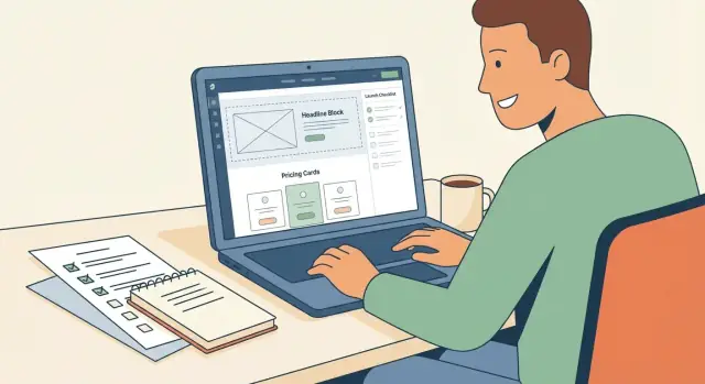
Use screenshots, short clips, or simple diagrams that show the product solving a real problem. A single annotated screenshot can do more than a full paragraph of claims.
Avoid generic stock imagery that could belong to any startup. It reduces trust because it feels like marketing, not product.
Treat your site like a set of building blocks: feature blocks, testimonial cards, and CTA strips you can reuse across pages. You’ll ship faster, your website structure stays coherent, and future updates won’t break the design.
Your first product website should be easy to update, hard to break, and boring in the best way. The goal isn’t an impressive stack—it’s a site you can keep correct while you’re building the product.
Start by choosing one of three common paths:
If you don’t have a developer on hand, a builder or a CMS is usually the safer bet.
If you do want developer-level control without building everything from scratch, a vibe-coding platform like Koder.ai can be a practical middle path: you can describe the site and flows in chat, generate a React-based front end with a Go/PostgreSQL backend when needed, and still export the source code later.
Be explicit about ownership:
A “perfect” stack that only one person can operate becomes a bottleneck quickly.
Before you pick anything, write down these baseline requirements:
These are table stakes for trust and reliability.
Contact, demo, and waitlist forms should send data somewhere you actually check: an inbox, a CRM, or a spreadsheet. Whatever you choose, test each form end-to-end (including confirmation messages) after every major change.
Every plugin, app, and script is another failure point. Start with the essentials, add tools only when they solve a clear problem, and remove anything that isn’t paying rent. A smaller setup means fewer surprises during launch week—and fewer late-night fixes later.
A homepage has to speak to everyone, which often means it feels specific to no one. Use-case pages solve that. They let a visitor instantly see “this is for me” without you rewriting your entire site.
Aim for 2–5 use-case pages based on your most common audiences or problems. If you’re not sure where to start, look at:
Use the same template on every use-case page. Consistency makes the site feel organized and helps you write faster.
Recommended flow:
Keep the first screen focused on clarity. A visitor should understand the use case in 10 seconds.
Use-case pages are the best place for proof because it’s contextual. Add what you can verify:
If you don’t have strong proof yet, use concrete details instead: what steps change, what gets automated, what decisions become easier.
Each use-case page should target a single “X for Y” idea. For example:
Don’t cram multiple audiences into one page. If two audiences have different goals or objections, they deserve separate pages.
Make the pages easy to navigate:
Use-case pages don’t add complexity for the sake of content—they reduce confusion by letting people self-select quickly and move toward a decision.
SEO is mostly about being understandable: to your buyer and to search engines. For a first product website, you don’t need complex tactics. You need clean pages that match what people are actually searching for when they’re ready to evaluate a solution.
Pick 5–10 keywords that describe a real buying moment—things someone would search when they’re comparing options or trying to solve the problem you address.
Examples of “intent” themes:
Write a unique page title and meta description per page. Think of them as your search snippet: clear, specific, and aligned with the page’s promise.
Keep structure simple:
Help visitors move through the site by referencing related pages in context. For example, your homepage can point readers to “Pricing,” and a use-case page can reference “How it works.”
If you note destinations, use simple relative paths like /pricing or /use-cases/fundraising—no need to get fancy.
These small items prevent common SEO issues later:
Do this, publish consistently good pages, and you’ll have a foundation you can improve over time.
You don’t need a complicated analytics stack to learn what’s working. You need a few key events, clean data, and a simple habit of making one change at a time.
Start by writing down what “success” means for your site, then track the steps that lead to it. For most product websites, the core events are:
Add one supporting event if it helps explain drop-off, like pricing page viewed or CTA button clicked. Anything beyond that can wait.
If someone is hesitating, they’re usually missing information—not motivation. Use page elements that answer common doubts close to the CTA:
Keep these scannable and specific. “Fast setup” is weaker than “Set up in 10 minutes.”
Your form is part of the product experience. Reduce effort:
Before you drive traffic, ask three people to do two tasks:
Watch where they hesitate or get lost. Fix the obvious issues first.
Pick one change, measure it for long enough, then decide. Good first tests:
Small, consistent improvements compound—especially early on when every visitor counts.
Launching isn’t a single moment—it’s a sequence: make sure the site works end-to-end, announce it clearly, then learn fast from real visitors. A simple checklist prevents “we shipped… but nothing works” headaches.
Before you tell anyone, run through the site like a stranger who’s skeptical and in a hurry.
Have a small set of assets ready so you’re not scrambling:
Treat the first month as a learning sprint.
If you’re consistent for 30 days, your site stops being “a launch task” and starts becoming a conversion engine you can actually maintain.
Pick the one outcome that matches your stage:
When you choose one, your copy, sections, and navigation get simpler—and conversions usually improve.
Use one primary CTA with the same wording in the hero, mid-page, and footer (e.g., “Join the waitlist,” “Start free,” “Book a demo,” “Buy now”).
Keep secondary links (like Pricing at /pricing, docs, contact) visually quieter so people don’t have to decide before they understand the value.
Choose 1–3 metrics you’ll review weekly:
Set a realistic, time-bound target like “20 waitlist signups per week,” then iterate based on results, not opinions.
Write a short list of “must be true” statements, such as:
Use this list to decide what to add, cut, or postpone when you’re tempted to expand the scope.
Describe your target user in plain language:
Then mirror their words in your headline and benefits so visitors instantly feel “this is for me.”
Use a one-sentence positioning statement:
For X, who need Y, our product does Z.
If you can’t say it clearly in one sentence, your homepage likely won’t be clear either. Keep it human and outcome-focused, not feature-heavy.
Start with a small, maintainable set:
/pricing)Each page should answer one key question (e.g., Pricing answers “How much and what’s the risk?”). If a page can’t justify itself with a single question, postpone it.
Make it a decision page, not just a price list:
Also make pricing easy to find in the top nav and keep the URL simple (like /pricing).
Focus on clarity and scanning:
Use visuals only when they explain something real (screenshots, annotated flows), and avoid generic stock imagery that undermines trust.
Do the boring, high-leverage checks before you announce:
After launch, review metrics weekly, capture the top questions visitors ask, and ship one small improvement per week for 30 days.