Aug 07, 2025·8 min
Build a Product Website That Shows Clear, Honest Tradeoffs
A practical guide to building a product website that explains benefits and limits, helps buyers self-qualify, and reduces churn.
A practical guide to building a product website that explains benefits and limits, helps buyers self-qualify, and reduces churn.
If you want a product website that feels honest, start by getting brutally clear on what your product is—and what it is not. This is less about “better copy” and more about setting guardrails for every page you’ll write later.
Write a single sentence that includes who it’s for and the outcome:
“[Product] helps [specific buyer] [achieve outcome] by [primary approach].”
If you can’t keep it specific, your site will drift into vague claims.
Promises should be measurable or plainly observable—things a buyer will recognize as true after using the product.
Examples:
These promises become your “headline material” across the home page, product page, and onboarding expectations.
Constraints are the limits that shape the buyer experience. Pick the ones most likely to affect purchase decisions, such as:
Convert each constraint into a clear sentence you can reuse on-site:
Create a “do-not-say” list to avoid slippery superlatives. Ban phrases like “works for everyone,” “unlimited,” “fastest,” or “seamless” unless you can define the conditions. This keeps your honest marketing consistent—and prevents later pages from overpromising.
If your website is honest about tradeoffs, the first step is being equally clear about who you’re building for. A “product for everyone” message forces you to hide limits. A specific audience lets you explain boundaries without sounding defensive.
Write your ideal customer profile as if you’re describing a real person to a colleague:
Example framing: “This is for small ops teams who need consistent processes across locations and don’t have time to maintain a complex system.”
Pick the most frequent mismatch patterns and say them plainly. For example:
These “not for you” moments reduce refunds and shorten evaluation cycles.
Awareness: help them recognize the problem and what it costs.
Evaluation: show how your approach works, plus the limits that matter.
Decision: make pricing, requirements, and next steps feel predictable.
List the questions people ask before they believe you: “Will this work in my environment?”, “How long to see value?”, “What breaks first?”
Then choose proof that’s true and verifiable—customer quotes with context, simple metrics you can stand behind, screenshots of real workflows, and clear policies (support hours, SLAs, data handling) without promising outcomes you can’t guarantee.
Before you write a single headline, decide what your website is supposed to do. “Educate” is not a goal; it’s a method. A clear goal forces clarity in copy, layout, and which tradeoffs you highlight.
Choose one primary action and one secondary action per visitor type. Common primary actions include: request a demo, start a trial, buy now, contact sales, or subscribe.
If every page tries to do everything, buyers won’t do anything. Your primary action should match your sales motion and product complexity (e.g., self-serve products can push “Start trial,” while higher-ticket products may push “Book a demo”).
Pick metrics that reflect quality, not vanity.
A useful north star is: the right buyers move faster, and the wrong buyers disqualify themselves earlier.
At minimum, plan these pages and give each a single purpose:
Don’t hide constraints in a terms page. Decide up front which pages must mention limitations directly (typically Home, Product, Pricing, and key Use Cases). This prevents “we’ll add it later” from turning into “we never say it.”
Tradeoffs drift as the product changes. Assign one owner responsible for keeping claims, limits, and screenshots accurate, with a simple cadence (monthly for fast-moving products, quarterly for stable ones).
This is also where tooling can help: if you build your marketing site inside a platform that supports snapshots and rollback, you can ship clarity updates faster and revert safely when a change confuses buyers. For example, Koder.ai includes snapshots/rollback and a planning mode, which can make iterative copy and layout updates less risky—especially when you’re testing clearer “Best for / Not for” language.
Your home page should help the right buyers say “yes” quickly—and help the wrong buyers say “no” without wasting anyone’s time. The goal is clarity, not hype.
Lead with a main value proposition that a busy person can understand in five seconds. Skip internal jargon and vague claims like “all-in-one.” Use a concrete outcome and a clear subject.
Example: “Automate customer follow-ups for small support teams—without a complex CRM.”
Back it up with one short line that adds context: who it’s for, what it replaces, or the constraint that makes it different.
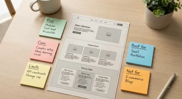
Near the top, include a compact block that lets buyers self-qualify:
This one element reduces churn later and increases trust now.
Don’t hide the downsides in a footer or legal page. Include a visible “Known limitations” link that jumps to a short section further down the home page.
In that section, list 3–6 constraints that matter in purchasing decisions (integrations you don’t have, performance limits, unsupported platforms, setup requirements). Keep it factual.
Replace “easy,” “fast,” or “powerful” with a real scenario: a specific task, a before/after workflow, or a measurable result. Even one concrete example beats a paragraph of adjectives.
If your product has meaningful tradeoffs, a hard “Buy now” can feel pushy. Use intent-aligned CTAs like “See if it fits”, “Check compatibility”, or “Explore limitations”—and reserve purchase CTAs for buyers who are already convinced.
A strong product page doesn’t try to win by listing everything. It helps a buyer quickly understand what they get, what they give up, and what needs extra effort. The goal is self-qualification: the right people lean in, and the wrong fit can move on without friction.
Group features by the result a customer wants, not by internal modules. For example: “Ship faster,” “Reduce errors,” “Stay compliant,” “Collaborate across teams.” Under each outcome, include 2–4 features that support it, written as plain benefits.
Instead of:
Use:
For each headline feature, add a short callout labeled “Tradeoff” to make boundaries easy to scan. Keep it specific and balanced:
Buyers shouldn’t have to guess what’s included.
Also state technical requirements in everyday terms: supported browsers/devices, single sign-on options, data residency, and any limits (file sizes, API quotas, team seats). If details vary by plan, point readers to the pricing page and FAQ for the exact breakdown.
A pricing page should help buyers decide quickly—and avoid surprises later. The simplest way to be “transparent” is to show what a plan is for, what it costs, and what it cannot do.
Add one sentence under each plan describing the best-fit scenario (not just a list of features).
Create a “Not included” row for each plan so limits are impossible to miss:
Explain the price levers in plain language:
State the exact moment costs change (on upgrade, at renewal, when you cross a threshold) and whether overages are blocked, billed automatically, or require an upgrade.
Choose Starter if you have 1–2 users and light usage.
Choose Team if you need collaboration and predictable monthly spend.
Choose Business if you need admin controls, higher limits, or priority support.
Add an honest note: if you need procurement terms, custom security reviews, invoicing, multi-team rollouts, or very high volume, talk to sales—self-serve will likely be slower and less cost-effective.
Use cases work best when they read like a real day at work: who’s doing what, in what order, and what they should expect at the end. Keep them specific enough that buyers can self-qualify—and include a clear “When this won’t work” callout so you don’t oversell.
Who it’s for: Ops or marketing managers at 5–50 person teams.
Workflow (10–20 minutes once set up): Connect data source → choose the KPI template → set a weekly schedule → review and share.
Expected outcome: A repeatable report your team understands without manual spreadsheet work.
Dependencies & timeline: Requires access to your analytics tool and permission to connect it. Setup typically takes 30–60 minutes if the data is clean.
When this won’t work: If your KPIs depend on combining 6+ systems with inconsistent naming, you’ll hit mapping limits and need a data warehouse first.
CTA: Start a guided trial with the “Weekly KPI” template.
Who it’s for: Teams that need auditability (legal, compliance, healthcare marketing).
Workflow (1–2 days to configure): Define roles → create an approval chain → add required fields → publish only after final sign-off.
Expected outcome: Clear accountability and a searchable record of who approved what, and when.
Dependencies & timeline: Needs agreed roles and an approval policy. Expect 2–5 business days if multiple stakeholders must confirm requirements.
When this won’t work: If you require qualified electronic signatures or region-specific compliance certifications the product doesn’t support.
CTA: Book a demo focused on approvals and audit history.
Who it’s for: Customer success teams onboarding 10–200 new accounts/month.
Workflow (same day): Choose an onboarding checklist → assign owners → trigger tasks at milestones → hand off to CS after activation.
Expected outcome: Fewer dropped handoffs and more consistent activation.
Dependencies & timeline: Requires your onboarding stages and owners. Integration with your CRM is optional but recommended; allow 1–3 hours for setup plus CRM approval time.
When this won’t work: If your onboarding requires heavy custom scripting at each step rather than standard task templates.
CTA: Download the onboarding checklist and compare it to your current process.
Who it’s for: Small marketing teams running coordinated launches.
Workflow (30–45 minutes per campaign): Create campaign brief → break into channel tasks → assign dates → track status.
Expected outcome: One place to see what’s shipping, what’s blocked, and what changed.
Dependencies & timeline: Needs asset owners and due dates. If you want calendar sync or Slack notifications, allow time for admin approvals.
When this won’t work: If you need pixel-perfect Gantt planning with advanced resource forecasting.
CTA: Try the campaign plan template and invite two teammates.
A simple text diagram can reduce ambiguity:
Source data → Template → Review → Share
Use this style to clarify handoffs, required inputs, and where delays typically happen.
Comparison pages are where honest tradeoffs pay off. They attract high-intent buyers who are already evaluating options—and they’re tired of vague claims. Your job isn’t to “win” every reader; it’s to help the right buyers self-qualify quickly.
Don’t limit comparisons to direct competitors. Include common alternatives by category, because that’s how buyers actually think:
This also lets you be transparent about the cases where your product isn’t the best fit.
Pick a small set of criteria and keep them consistent across every comparison so readers can scan and trust what they’re seeing. Good, buyer-friendly criteria include:
Be specific, and when you can’t be exact (because competitors change), say what you’re basing it on (e.g., “based on publicly listed plans as of last update”).
This is the simplest way to make tradeoffs explicit.
Avoid attacks, sarcasm, or guesses about a competitor’s intent. Stick to verifiable differences and your own limitations (feature gaps, constraints, ideal customer profile). That tone signals confidence.
Include a one-page checklist buyers can save or share internally (PDF or document). Focus it on questions to ask during evaluation—requirements, risks, hidden costs—not on pitching your product.
A good FAQ helps buyers self-qualify. It doesn’t “handle objections” with vague reassurance—it removes uncertainty with specifics people can verify.
Build your first draft by collecting the top 20 questions from sales calls, support tickets, and onboarding sessions. Look for repeats, especially questions that begin with:
Those questions reveal the hidden deal-breakers your site should make obvious.
Use plain language, short paragraphs, and scannable formatting. Each answer should include clear boundaries:
If the honest answer is “it depends,” define what it depends on (team size, data volume, security requirements) and give an example.
Make this a first-class section, not a footnote. Typical entries:
This section prevents surprises and reduces churn by setting expectations early.
It’s fine to mention supporting documentation or policies, but only if your team can reliably update them. An outdated “source of truth” damages trust faster than no documentation at all.
Trust signals help buyers feel safe moving forward—but only if they’re specific, verifiable, and phrased in a way that doesn’t promise the impossible. The goal isn’t to “sound credible.” It’s to make your claims easy to believe.
Use a small set of proof types that match your sales cycle and that you can keep current:
If you don’t have case studies yet, screenshots plus a few high-quality testimonials beat a vague “Trusted by hundreds” banner.
A good testimonial includes enough context for the reader to self-qualify. Include:
Avoid polishing testimonials into marketing slogans. A line like “We switched because setup took a day, not a month” is stronger than “Best tool ever.”
If you cite metrics, add a short note on measurement and caveats. For example:
This kind of specificity lowers the risk of buyers feeling misled later.
Create only the “trust” pages you can keep accurate, such as /security and /privacy. Keep them plain and factual: what you do, what you don’t do, how data is handled, and how customers can request changes.
Avoid implied guarantees (“will,” “always,” “best,” “no risk”). Prefer language like “may,” “often,” “typical,” and pair it with conditions. Honest nuance is a trust signal on its own.
Clear tradeoffs aren’t only about wording—they’re about making the “yes, but” visible at a glance. The goal is for a buyer to self-qualify quickly without hunting through footnotes.
Use small, repeatable UI elements that carry meaning everywhere:
Pick a handful of consistent tags and apply them across pages:
These labels work best as short blocks or chips with the same styling every time.
If you mention a feature, place its key limitation right there—not in a separate FAQ or a legal footer. Readers should never have to “collect” constraints across three pages to understand what they’re buying.
Decision aids turn ambiguity into quick answers:
Tradeoffs only help if everyone can read them: use strong color contrast, real heading structure, keyboard-friendly tooltips, and clear focus states. If you use icons or illustrations to signal “Limits” or “Requires,” ensure they have meaningful alt text so the same message reaches screen reader users.
A “transparent tradeoffs” site isn’t something you publish once and forget. The moment your product, pricing, or roadmap changes, yesterday’s honest copy can become today’s misleading promise. Treat your website like a living reference: it should get more accurate with time, not more optimistic.
Set up analytics around actions that signal people are understanding the fit:
If you only track sign-ups, you’ll miss whether buyers are arriving informed.
Create a simple feedback loop from real conversations:
When you see a pattern, update the page that should have answered it first—usually the Product, Pricing, Comparison, or FAQ page.
Run small A/B tests where the “B” version is more specific:
Judge results using fewer confused leads and fewer “surprise” cancellations—not only a higher click-through rate.
Optionally add a short change log section for major product changes that affect fit (pricing shifts, removed features, new limits).
Schedule quarterly reviews of limitations, pricing, and comparison pages. Assign an owner and a checklist so accuracy doesn’t depend on memory.
If you’re shipping fast, consider treating your website like product code: version changes, review them in a planning step, and keep a clean rollback path. Teams building with Koder.ai often work this way—using planning mode to draft updates, deploying quickly when the messaging is crisp, and relying on snapshots to revert if an “improvement” accidentally makes tradeoffs less clear.
Use the template: “[Product] helps [specific buyer] achieve [outcome] by [primary approach].”
If you can’t keep it specific, your site will drift into vague claims. Rewrite until a stranger could tell who it’s for and what changes after using it.
Pick promises a buyer can quickly verify after using the product—measurable or plainly observable.
Examples:
These become reusable “headline material” across Home, Product, and onboarding.
List limits that change purchase decisions, then surface them early:
Prioritize the constraints that most often cause refunds, churn, or long evaluation cycles.
Turn each constraint into a balanced sentence that clarifies fit.
Examples:
These statements prevent later pages from quietly overpromising.
Create a short “do-not-say” list and treat it like a style guide.
Avoid superlatives unless you define conditions (and can prove them), such as:
Replace them with specifics: supported environments, exact limits, typical timelines, and clear prerequisites.
Add a compact self-qualification block near the top:
This reduces churn later and helps the right buyers move faster now.
Put limitations where decisions happen—don’t bury them in legal pages.
Typically:
The goal is that buyers never have to hunt across pages to understand constraints.
Make price and limits legible in one scan:
Also state when costs change (upgrade moment, renewal, threshold crossing) and how overages work (blocked, billed, or forced upgrade).
Write use cases like a real workday, with explicit dependencies and failure points.
Include:
This helps buyers self-qualify and prevents “template demos” that hide the hard parts.
Treat the website as a living reference and review it on a cadence (monthly for fast-moving products, quarterly for stable ones).
Track “self-qualification” signals, not just sign-ups:
Use support tickets and sales call themes to update the first page that should have answered the question (often Product, Pricing, Comparison, or /faq).