Aug 04, 2025·8 min
How to Build a Product Website With Interactive Walkthroughs
Learn how to plan, design, and build a product website that includes interactive walkthroughs—covering UX, tech choices, tracking, and launch.
Learn how to plan, design, and build a product website that includes interactive walkthroughs—covering UX, tech choices, tracking, and launch.
Before you design pages or pick tooling, get clear on what you’re building and why. A product website with interactive walkthroughs isn’t just “marketing plus a demo”—it’s a guided path that helps the right people understand the value quickly and take a next step with confidence.
Write a one-sentence description of your product (what it does and for whom). Then define the primary job-to-be-done: the real outcome a visitor wants.
Example: “I need to see if this tool can automate my weekly reporting without involving engineering.”
If you’re trying to serve multiple audiences, pick one primary audience for the first version. You can expand later.
Your walkthrough should deliver a specific “win” that maps to the job-to-be-done. Good walkthrough outcomes include:
Keep it focused. One walkthrough that proves value beats five that explain features.
Decide what success means in one measurable action, such as trial starts, demo requests, or activation (e.g., completing a key step). Your website and walkthrough should both push toward the same north star.
Collect the top objections you hear in sales calls, support tickets, and reviews: pricing, security, setup time, integrations, learning curve, or “will this work for my use case?” Make sure the website answers these before the walkthrough begins—and the walkthrough reinforces them with proof.
Define pass/fail signals: completion rate, time to first value, drop-off points, and what percentage of users reach the final call to action. This becomes your baseline for improvement after launch.
Before you design pages or write walkthrough copy, decide what you want a visitor to do next—at every moment. Interactive walkthroughs work best when they’re the natural continuation of a clear story, not a surprise detour.
Start with a simple path that matches how people build confidence:
Your job is to reduce uncertainty at each stage. Discovery needs clarity. Proof needs specifics (results, examples, constraints). Try needs speed. Activate needs guidance.
Decide where the “try it” moment begins. Common entry points include:
Consistency matters: use the same labels and expectations so people don’t wonder whether they’re about to watch a video, start a demo, or sign up.
A walkthrough shouldn’t be “Step 1, Step 2, Step 3” unless those steps create value. Define milestones like:
These milestones should align with your site’s narrative: the page promises something, the walkthrough delivers it.
Use interactive walkthroughs for actions people need to feel (configuration, building, exploring). Use static content for what people need to understand quickly (positioning, limitations, pricing logic, security notes).
Keep your structure easy to scan. A basic sitemap might include: Home → Features → Use Cases → Pricing → Demo/Walkthrough → FAQ/Trust.
Then outline what question each page answers and which walkthrough (if any) it should start.
Your core pages should do two jobs at once: explain the product clearly and funnel the right visitors into an interactive walkthrough with confidence. The goal isn’t to “sell harder,” but to remove uncertainty so more people are willing to try the guided experience.
Lead with a crisp value proposition, who it’s for, and one primary call to action that starts the walkthrough (or takes users to a page where they can launch it). Keep supporting CTAs secondary so visitors don’t get decision fatigue.
Include a short “what you’ll do in the walkthrough” preview (2–4 steps) to set expectations and reduce drop-off.
Dedicate a page to each major feature, framed around outcomes (“reduce onboarding time,” “ship faster”) and backed by concrete examples.
Each feature page should end with a context-specific CTA, such as “Try this feature in the walkthrough.” If your walkthrough can deep-link into a relevant step, match the page copy to what users will see next.
Make tiers easy to compare, repeat the CTA near decision points, and answer common objections with a tight FAQ. If the walkthrough is available without signup, say so plainly—lowering perceived risk often lifts trial starts.
Case studies and testimonials should focus on real outcomes and constraints (“after 6 weeks,” “with a 3-person team”). Avoid inflated claims; credibility is what pushes visitors to invest time in a walkthrough.
Have dedicated pages for security, integrations, and documentation references where relevant. These pages often get visited right before conversion; a well-placed walkthrough CTA here can capture high-intent visitors who just needed reassurance.
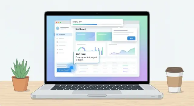
An interactive walkthrough is any guided, step-by-step experience that helps visitors “learn by doing” instead of just reading. Before you design screens, decide what the walkthrough should feel like for your product—and what success looks like (e.g., reaching a key feature, completing a setup task, or understanding a workflow).
Most teams benefit from a small set of patterns:
Choose formats based on intent: tooltips teach an action, hotspots spark curiosity, checklists drive completion.
Triggers should match user readiness:
Keep each step short, skippable, and action-first:
Always provide clear options: Skip, Remind me later, and Restart tour. Skipping shouldn’t feel like failure—treat it as a preference, and make it easy to re-enter when the user is ready.
Where you place an interactive walkthrough changes everything: what visitors can experience, how much friction you introduce, and how you measure success. The right choice depends on whether your walkthrough is meant to sell the promise or teach the product.
Use this when your goal is to help visitors understand value fast, before they commit.
An on-site walkthrough works best as an interactive feature preview: click through a simulated UI, explore a workflow, or “try” a key moment without creating an account. It’s ideal for top-of-funnel traffic and can lift conversions on your landing page and pricing page by reducing uncertainty.
Use this when the walkthrough must interact with real data and real settings.
In-app walkthroughs are true onboarding: they guide new users through setup, first project creation, integrations, or inviting teammates. Because they’re inside the product, they can react to what the user has (or hasn’t) done, making the guidance feel personal and timely.
Hybrid is often the most effective: a lightweight teaser on the product website to build confidence, followed by a deeper in-app walkthrough to drive activation.
The teaser should focus on outcomes and “aha” moments. The in-app walkthrough should focus on completion: connect, configure, create, and succeed.
Decide where the walkthrough is technically hosted based on user expectations and consistency. If it’s a marketing preview, keeping it on the website usually feels smoother. If it requires authentication or personal data, it belongs in the app—often on the same domain or an app subdomain.
Your call to action should clearly explain what happens next:
Aim for a seamless transition: visitors should recognize the same flow they just previewed, and immediately see how to resume it after signup.
Your tooling choices determine how quickly you can ship walkthroughs, how personalized they can be, and how painful they’ll be to maintain later. Aim for a stack that lets marketing update pages while product teams iterate on tours without redeploying the whole site.
No-code/low-code product tour tools are usually the fastest path. They’re great when you need tooltips, hotspots, checklists, and simple branching without engineering time.
When evaluating options, focus on:
A custom JavaScript build makes sense when walkthroughs are a core differentiator or when performance is extremely sensitive. You’ll gain precise control over styling, loading, and data collection—but you’ll also own QA, browser quirks, accessibility, and ongoing updates whenever the site changes.
If you want to move fast without rebuilding your whole pipeline, consider generating the marketing site and the app shell together. For example, Koder.ai can help teams prototype and ship a React-based product website and a real app experience from a chat-driven spec, then iterate safely using planning mode and snapshots/rollback. Because you can export source code and deploy with custom domains, it’s a practical way to keep the “teaser on the site + activation in the app” approach consistent as your walkthroughs evolve.
If non-technical teammates will regularly update landing pages, FAQs, and release notes, pick a CMS that supports fast edits and safe publishing.
Either way, define ownership: who updates walkthrough copy, who updates pages, and what the approval flow is.
Interactive walkthroughs touch both marketing and product outcomes, so plan for a combined view:
Decide event names and properties early (page, audience segment, experiment variant) so reporting stays consistent as you scale.
Interactive walkthroughs only help if people can actually use them. If pages load slowly, text is hard to read, or the walkthrough traps someone on a small screen, the experience turns from “guided” to “blocked.” This section focuses on the practical design decisions that keep walkthroughs fast, inclusive, and effective everywhere.
Create a small set of reusable UI components (buttons, modals, tooltips, step cards, banners, form fields). Use the same components across marketing pages and walkthrough overlays.
This consistency reduces design drift, speeds up iteration, and makes your walkthrough feel like part of the product—not an add-on. It also improves conversion because CTAs, typography, and spacing behave predictably from page to page.
Walkthroughs add scripts and UI layers, so performance needs a budget.
A good rule: the page should still feel quick even if the walkthrough fails to load.
A walkthrough is often a sequence of focus changes, overlays, and popups—exactly where accessibility breaks.
Ensure:
On phones, overlays can cover the target UI and force users into dead ends.
Prefer bottom sheets, compact tips, and scroll-to-target behavior. Avoid blocking the screen with large modals, and always include a clear “Skip” and “Finish” action.
If you serve multiple languages, design for longer text, different line breaks, and right-to-left layouts where needed. Keep step copy flexible, avoid text baked into images, and allow per-locale adjustments to triggers and CTAs.
A walkthrough shouldn’t feel like a separate “thing” you bolt onto a page. The layout should naturally build confidence, answer objections, and then offer the walkthrough at the exact moment a visitor is ready to explore.
Start with a simple page skeleton you can reuse across key pages (home, core feature pages, pricing).
This structure gives visitors a steady path: understand → trust → visualize value → act.
A walkthrough CTA works best when it’s attached to a specific promise. Put it:
Avoid placing the walkthrough link only in the navigation. Navigation clicks are low-intent; feature sections are high-intent.
Pick a single “main move” for the page—typically Start walkthrough or Try the interactive tour—and repeat that same CTA label throughout.
If you must include a secondary action (like “Contact sales”), visually down-rank it so it doesn’t compete. Competing buttons create hesitation.
Treat the walkthrough entry like a helpful guide, not a pop-up ambush. Good defaults:
Save attention-grabbing patterns (sticky banners, slide-ins) for returning visitors or high-intent pages, and only if they don’t obscure reading.
Your final section should remove the “last mile” doubts. Short FAQs, setup time, privacy notes, and “what you’ll see in the walkthrough” can increase clicks without adding clutter—because they answer the question behind the hesitation.
Interactive walkthroughs feel “magical” when they work—and confusing when they don’t. Analytics is how you turn that feeling into measurable, repeatable improvements. The goal isn’t to track everything; it’s to track the moments that explain adoption and drop-off.
Pick event names that are consistent across your site, product, and walkthrough tooling. Start with a small set you’ll actually use:
walkthrough_startedstep_viewedcompleteddismissedAdd a few shared properties so you can compare performance across pages and campaigns:
{
  "event": "step_viewed",
  "walkthrough_id": "pricing-tour",
  "step_id": "value-proof",
  "page": "/pricing",
  "entry_source": "cta_button",
  "campaign": "winter_promo",
  "referrer": "newsletter",
  "device": "mobile"
}
Attribution matters because a walkthrough launched from a hero CTA behaves differently than one launched from a sticky button or an exit-intent prompt. Track the entry source at minimum:
Set up a primary funnel that matches your business outcome:
Visit → CTA click → Walkthrough start → Signup → Activation
This gives you a single conversion narrative while still letting you diagnose each stage. If activation happens in your app, ensure IDs (anonymous and logged-in) are stitched correctly so the funnel doesn’t break at signup.
Create dashboards that show conversion and drop-off by step, not just overall completion. Look for:
Session replay and heatmaps can explain “why,” but only enable them if your privacy requirements allow it. Mask sensitive fields, honor consent, and document what’s collected so the walkthrough remains trustworthy.
Interactive walkthroughs work best when your website content does half the teaching before the first step appears. The goal is to reduce confusion: visitors should know what your product is, who it’s for, and what they’ll accomplish in the walkthrough.
Headlines should mirror what a visitor is trying to do, not what your feature is called. If someone arrives searching for “invoice approvals,” a headline like “Approve invoices in minutes, with a clear audit trail” will land better than “Workflow Engine.”
Keep the promise realistic. A walkthrough can demonstrate a quick win, but it can’t replace setup, data imports, or team adoption.
Choose examples that look like real work: realistic names, plausible numbers, and a scenario that matches your audience. When you show screenshots or UI previews:
If you can’t use screenshots yet, use simple diagrams or short UI snippets that explain outcomes rather than pretending the product is further along than it is.
Each step should ask for a single action and explain why it matters. This keeps people moving and builds confidence.
Example step copy:
Avoid multi-part instructions (“Click A, then B, then fill C”). Split those into separate steps.
Guided learning reduces risk for new users, but visitors still look for proof. Add testimonials, customer logos, or security statements only when you have permission and they’re current. Place trust near the moment of decision: next to the primary call to action and near the walkthrough entry point.
Build a small content library you can reuse across pages:
This keeps your site consistent and makes future walkthrough updates faster.
Interactive walkthroughs sit on top of your website experience, so small issues can turn into big conversion leaks. Treat testing as part of the product—not a final checkbox.
Start by validating the walkthrough on the combinations your visitors actually use: Chrome/Safari/Firefox, iOS/Android, and at least one smaller-screen device.
Check for UI overlap (tooltips covering buttons), broken positioning after scroll, and timing issues (steps advancing before a page finishes rendering). If your site has sticky headers, chat widgets, or cookie banners, confirm the walkthrough doesn’t collide with them.
Walkthroughs often behave perfectly in the “happy path” and fail everywhere else. Run a checklist for:
Also test partial completion. If someone closes step 3 of 7, what happens next visit—resume, restart, or stay dismissed?
A walkthrough should guide, not trap. Confirm the user can still:
If the walkthrough uses a modal overlay, add an obvious close button and ensure keyboard users can escape it.
Assume something will break: ad blockers, slow networks, or third-party script errors. Provide a graceful alternative such as a static demo page section, a short embedded video, or a screenshot carousel. The key is continuity: visitors should still understand the product even if the interactive layer doesn’t load.
Walkthrough tracking can touch analytics and behavioral events. Verify your privacy notice reflects what you collect (events, device info, identifiers) and that cookie consent gates non-essential tracking where required. If the walkthrough tool sets cookies or records sessions, confirm settings align with your consent categories and retention policies.
A strong launch is less about “shipping” and more about making sure people can find the site, load it quickly, and complete the walkthrough without surprises. Then the real work begins: learning from behavior and keeping the experience accurate as the product evolves.
Before announcing anything, run a tight checklist:
Pick one variable at a time and define success in advance (conversion rate, walkthrough completion, qualified signups).
Good starting tests:
Keep the test window long enough to capture weekday/weekend behavior, and avoid changing other parts of the page mid-test.
Use analytics and recordings to spot friction. Typical wins include:
Walkthroughs age quickly when UI labels and flows change. Create an internal process with:
Treat walkthrough updates like content updates: continuous, scheduled, and accountable.
Start with the visitor’s job-to-be-done and define one “win” the walkthrough delivers (e.g., generate a realistic sample result or complete a core workflow in a sandbox). Then align both the site and walkthrough to a single north-star metric like trial starts, demo requests, or activation.
If you can’t state the outcome in one sentence, the walkthrough is probably trying to do too much.
A solid default is:
Design each page and CTA to reduce uncertainty at the current stage and move users to the next stage.
Use consistent “try it” entry points where intent is highest:
Track the entry source (page + trigger) because walkthrough behavior varies a lot depending on where it starts.
Define milestones based on intent and value, not arbitrary steps:
Each milestone should match a promise made on the page that launches the walkthrough.
Make interactive what users need to feel:
Keep static what users need to understand fast:
A practical structure is Home → Features → Use Cases → Pricing → Demo/Walkthrough → FAQ/Trust.
For each page, write:
This prevents random CTAs and makes the walkthrough feel like the natural next step.
Use one primary CTA per page (e.g., “Start walkthrough”) and repeat it through the layout. Add a 2–4 step preview of what the walkthrough will do, and down-rank secondary actions like “Contact sales” so they don’t compete.
Place friction-reducers (setup time, privacy note, “no signup required”) right before the CTA.
Start with action-first, skippable steps:
Always offer Skip, Remind me later, and Restart tour so users don’t feel trapped and can re-enter when ready.
Choose based on whether you’re selling the promise or teaching the product:
Make the handoff explicit (“Start free trial to continue in the app”) so users understand what happens next.
Track a small, consistent set of events and connect marketing to activation:
This keeps the walkthrough short and reduces drop-off.
walkthrough_started, step_viewed, completed, dismissedwalkthrough_id, step_id, page, entry_source, campaign, deviceBuild one primary funnel: Visit → CTA click → Walkthrough start → Signup → Activation, and create step-by-step drop-off reporting to find where users get stuck.