Sep 07, 2025·8 min
How to Build a SaaS Roadmap & Vision Page That Converts Visitors
Learn how to plan, design, and publish a SaaS roadmap and vision page: structure, copy, UX patterns, SEO, analytics, and a launch checklist.
1) Decide What the Roadmap & Vision Page Must Achieve
Before you pick a template or write a single “Coming soon,” decide what this page is for. A roadmap & vision page can do several jobs, but it works best when you prioritize one or two outcomes—and design everything else to support them.
Start with a primary goal
Common goals include:
- Build trust through transparency (show you plan, listen, and ship)
- Support sales (help prospects feel confident choosing you)
- Deflect support tickets (answer “Is X planned?” without human replies)
- Capture better feedback (turn “please add this” into structured input)
Pick the top goal and write it down as a one-sentence statement (e.g., “Increase trial-to-paid by making our direction clear and credible”).
Choose the audience (and adjust the message)
A single page can serve multiple audiences, but the tone and detail level should follow your priority:
- Prospects need clarity and reassurance: themes, outcomes, and stability.
- Customers want specifics: progress signals, statuses, and near-term focus.
- Partners/investors look for strategic alignment: market direction and execution rhythm.
Define what “roadmap” means for you
Decide whether you’ll publish:
- Themes vs. features (problem areas and outcomes vs. individual buttons)
- Time-based vs. priority-based (e.g., “Q1” vs. “Now / Next / Later”)
This choice sets expectations. If you can’t confidently forecast dates, don’t imply them.
Set success metrics and constraints
Tie the page to measurable results: fewer “is this planned?” tickets, higher trial-to-paid conversion, more qualified feature requests.
Also clarify constraints upfront—legal, security, and competitive sensitivity—so you know what must stay vague, what needs disclaimers, and what should never be published.
2) Choose the Right Page Type and Format
Before you write a single roadmap item, decide what kind of page you’re building. The best choice depends on your buyer cycle, how often you ship, and how sensitive your plans are.
Pick the page model: one page or two
Combined “Vision + Roadmap” page works well when you want a single URL to share in sales calls and onboarding. Visitors get context (why you’re building) and proof of progress (what’s shipping).
Separate pages are better when each needs a different tone:
- A Product Vision page can be timeless and narrative-driven.
- A Public Roadmap page can be structured, frequently updated, and more tactical.
If you split them, keep the cross-links obvious: the vision should point to the roadmap, and the roadmap should summarize the vision in a short intro.
Select a roadmap format people can scan
Choose a format your audience can understand in 10 seconds:
- Now / Next / Later: great for transparency without over-promising dates.
- Quarterly themes: best for B2B buyers who plan around budgeting and adoption.
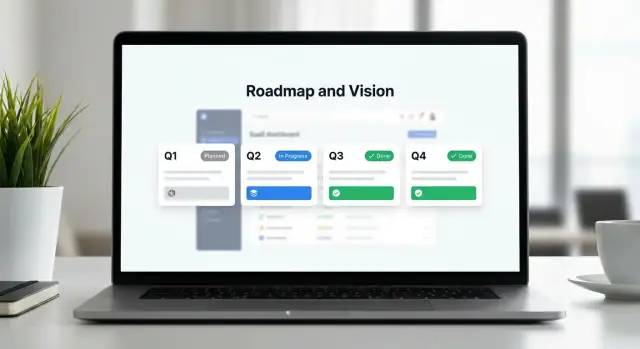
- Kanban-style statuses (Planned → In Progress → Shipped): ideal when you ship continuously and want clear movement.
Whatever you pick, stay consistent. Changing the structure every month makes your roadmap feel unreliable.
Decide the level of detail (and what you won’t say)
Your roadmap can be framed as:
- Outcomes (e.g., “Reduce onboarding time for new teammates”)—safer and more strategic.
- Problem statements (e.g., “Admins need better control of permissions”)—clear, still flexible.
- Specific features (e.g., “Role-based access control templates”)—high clarity, higher risk.
A practical approach: use outcomes/themes publicly, and link deeper feature specs only when you’re confident.
Plan supporting pages and ownership
Roadmap pages convert better when they connect to proof and next steps. Common companions include /changelog, /pricing, /security, and /contact.
Finally, set an update cadence (weekly, biweekly, monthly) and assign ownership: one editor, one approver. A stale roadmap quietly erodes trust.
3) Create the Vision Content (Simple, Credible, and Specific)
Your product vision page is the “why” behind your SaaS roadmap page. If visitors don’t understand who the product is for and what outcomes you’re driving, the roadmap will read like a random list of features.
Start with a short, clear vision statement
Aim for 1–2 sentences that answer: what you’re building, for whom, and what changes for them.
Example format:
We’re building [product] for [specific audience] to help them [core outcome], without [common pain/friction].
Keep it concrete. “For modern teams” is vague; “for small customer support teams handling 200–2,000 tickets/month” is easier to believe.
Add product principles (3–6 bullets)
Principles are decision filters. They make the roadmap feel consistent—even when priorities change.
Examples:
- Reduce time-to-value (first win in under 10 minutes)
- Prefer simple defaults over endless settings
- Security and privacy aren’t add-ons
- Build for reliability before adding complexity
These aren’t marketing slogans. Write them so a customer can predict what you won’t do.
Translate the vision into themes (problems, not features)
Themes connect the vision to roadmap items people can understand.
Instead of “Integrations,” try: “Fewer manual handoffs between tools.” Instead of “AI,” try: “Answer common requests faster with consistent quality.”
On a public roadmap, themes help visitors self-identify: “That’s my problem.” Then features become supporting details.
Avoid promises: use careful status language
A roadmap is a plan, not a contract. Use language that sets expectations:
- Exploring (researching, validating)
- Planning (scoping, sequencing)
- In progress (actively building)
Include a short note near the top: timelines can change based on learning, capacity, and customer impact.
Add “How we decide what to build” (trust + clarity)
A brief explainer reduces frustration and improves your feature request workflow.
Cover:
- Inputs you consider (customer feedback, usage data, security needs)
- How you weigh impact vs. effort
- What makes a request unlikely (edge cases, high maintenance, conflicting with principles)
This turns your roadmap website design from a list of updates into a credible story customers can trust.
4) Turn Ideas Into Roadmap Items People Can Understand
A roadmap page fails when it reads like an internal backlog. Visitors don’t need your project names—they need to quickly understand what’s changing, why it matters, and how far along it is.
Use a consistent “card” format
Pick one layout and repeat it for every item, so people can scan without thinking. A simple card structure works well:
- Title: plain-language, benefit-led (avoid code names)
- Summary: 1–2 sentences explaining the change
- Status: one of your defined stages
- Value: the user outcome (what gets easier or better)
- Target window (optional): a broad timeframe when you’re confident
Keep the summary focused on “what it enables” rather than “how we’ll build it.”
Define statuses in human terms
Status labels are only helpful if you explain them. Add short definitions near the roadmap (or in a tooltip), for example:
- Planned: we’re committed, scoped at a high level, and actively prioritizing
- In progress: actively being built and tested
- Under consideration: exploring demand and feasibility; not guaranteed
- Shipped: available to customers
This reduces support questions and avoids over-promising.
Add expected impact (without shaky numbers)
If you can’t quantify impact reliably, don’t force it. Instead, state the likely outcome:
“Fewer steps to export reports,” “Less manual tagging,” “Better visibility for managers,” or “Faster approvals.”
Show dependencies when it matters
Some items only make sense with prerequisites (e.g., “New permissions model” before “Team audit log”). A short “Depends on…” line prevents confusion and sets expectations.
Prove momentum with “What’s new” and “Recently shipped”
Add small blocks above the roadmap showing the latest releases. Visitors often judge credibility by progress—recent shipped items turn your roadmap from promises into evidence.
5) Information Architecture and Page Layout
A roadmap page converts when people can answer three questions quickly: what you’re building, why it matters, and how they can influence it. The easiest way to get there is to design for scanning first, reading second.
A proven page structure (top to bottom)
Start with a simple flow that matches visitor intent:
- Hero + vision (above the fold): a one-sentence vision, a short promise (“what to expect here”), and one primary action.
- Themes: 3–6 product themes (security, onboarding, integrations, etc.) with plain-language summaries.
- Roadmap grid/list: items grouped by status (Now / Next / Later) or by quarter—keep it consistent.
- Feedback CTA block: a focused “Submit feedback” area with minimal fields.
- FAQ: answer common questions (timelines, how feedback is used, what “Planned” means).
- Footer links: connect to supporting pages like /changelog, /support, /pricing.
Make scanning effortless
Use clear headings, short summaries, and consistent labels. If one card uses “In progress,” don’t switch elsewhere to “Underway.” Keep each roadmap item tight:
- Title + one-line outcome (“Reduce setup time from 30 min to 10 min”)
- Status label (Planned / In progress / Shipped)
- Who it’s for (Admins / Developers / Teams)
- Platform tags (Web / Mobile / API)
Filters and search (without overwhelming people)
Filters help visitors self-serve, especially on public roadmaps:
- By status (default)
- By theme
- By audience segment (SMB/Enterprise, Admin/End user)
- By platform (web/mobile/API)
If you have more than ~30 items, add search. Keep it forgiving: search title + summary + tags, and show “no results” suggestions (e.g., “Try ‘SSO’ or ‘mobile’”).
Keep a sticky conversion path
Add a sticky “Submit feedback” button that’s visible while scrolling (especially on mobile). Pair it with a secondary link like “See what’s shipped” pointing to /changelog, so visitors have two clear next steps: contribute or gain confidence.
6) Copywriting: Tone, Disclaimers, and Trust Signals
Match your data location needs
Deploy your app in the country you need to support privacy and data transfer requirements.
Your roadmap page isn’t a press release. It’s a promise of intent, written for busy people who don’t live in your product every day. Aim for clear, calm copy that explains what you’re working on, why it matters, and what visitors should do next.
Write for non-technical readers
Use everyday terms and avoid internal jargon (project codenames, architecture talk, “refactors”). If you need a technical term, define it in one line.
A simple pattern that works well is a one-sentence summary for each item:
Problem → approach → benefit
Example: “Reporting takes too long → we’re redesigning the dashboard and exports → you’ll answer questions faster with fewer clicks.”
Add disclaimers without sounding defensive
Disclaimers increase trust when they’re brief and upfront. Put them near the top of the page and again near any timeline.
Suggested copy:
- Roadmap may change. “Plans can shift as we learn from customers and reliability needs.”
- No guaranteed delivery dates. “Timeframes are estimates, not commitments.”
If you do share timing, use broad ranges (“Now / Next / Later” or quarters) rather than specific days.
Use trust signals that prove momentum
Show evidence that you ship. Link to your /changelog and highlight a few recently delivered milestones (“Shipped in the last 90 days”). That turns skepticism into confidence and helps visitors connect the roadmap to real outcomes.
Mini FAQ (keep it short)
Do you have exact dates? Not usually—estimates can change.
Can I vote? Yes, but votes guide priority; they don’t guarantee delivery.
How do I request a feature? Point to your preferred channel (form or contact).
What if I’m an enterprise customer? Explain how to discuss security, compliance, or custom needs via sales/support.
7) Feedback, Voting, and CTAs (Without Creating Noise)
A roadmap page should invite interaction, but not turn into a suggestion box that overwhelms your team (or confuses buyers). The goal is to make the next step obvious for visitors, while capturing feedback you can actually use.
Primary CTAs: pick one “main” action per audience
Choose a primary CTA that matches where your product is in the funnel: start trial, request access, join waitlist, or book demo. If you serve multiple segments, you can show two CTAs (e.g., “Start trial” and “Book demo”), but keep one visually dominant.
Place the primary CTA near the top and again after key sections (e.g., after “Now” and “Next”). Avoid repeating it after every roadmap item—this creates noise and reduces trust.
Secondary CTAs: channel feedback without friction
Your secondary CTA can be submit a feature request, vote, or subscribe to updates. Keep it clearly secondary so visitors don’t get pulled away from conversion.
When collecting feedback, capture context without long forms. A short form can ask:
- Use case (what they’re trying to do)
- Company size (or role)
- Urgency (nice-to-have vs. blocking)
Set expectations immediately after submission
After someone submits or votes, tell them what happens next: typical response time, how requests are reviewed, and what “Planned” actually means. This reduces follow-up emails and prevents “you promised this” misunderstandings.
Route feedback to the right place
Decide where submissions go: a product board, a shared inbox, or your CRM. If a request is complex or commercial, route it to a human path and link to /contact for edge cases.
8) Build Options: CMS, Static, or Web App
Make feedback actually usable
Create a structured feedback flow in your app so requests come with context, not noise.
Where and how you build your roadmap page affects trust, SEO, and how often it stays updated. The goal is simple: publish a stable, fast page your team can maintain without friction.
Choose a stable URL (and keep it)
Pick one location and stick with it long-term:
/roadmap(simple and memorable)/product/roadmap(clearer if you have multiple products)/vision(best when the page is more strategic than feature-by-feature)
A stable URL accumulates backlinks, search value, and returning visitors. If you ever change it, use permanent redirects (more on that below).
Option 1: CMS page (fastest to ship)
A CMS works well if marketing or product ops will own updates. Use it when roadmap items are mostly text with occasional status tags.
Pros: quick edits, approvals, version history. Cons: can get messy if you need filtering, voting, or account-aware content.
Option 2: Static page (fast, low maintenance)
Static pages are great for a simple “Now / Next / Later” roadmap and a crisp vision section.
Pros: excellent performance and reliability. Cons: updates often require engineering help unless you pair it with a headless CMS.
Option 3: Lightweight web app (most flexible)
Choose a small web app when you need interactivity: filtering by category, embedding changelog items, personalized views, or authenticated feedback.
Pros: can match your product UX and data model. Cons: needs product/engineering time and ongoing maintenance.
If you want to ship this kind of interactive roadmap quickly, a vibe-coding platform like Koder.ai can help you prototype (and iterate on) a React-based roadmap experience via chat—then export the source code for your team to review, customize, and deploy.
Structured data and SEO basics
If you include an FAQ section, consider adding FAQPage structured data. If the page reads like an editorial update, Article may fit. Keep it accurate—don’t mark up content that isn’t actually on the page.
Performance and migration details
Keep the page snappy: compress assets, avoid heavy third-party widgets, and lazy-load long lists (especially “Later” items).
If you’re migrating from a tool-hosted public roadmap to your own site, set up 301 redirects from the old public URL (and any popular item URLs) to your new /roadmap to preserve traffic and trust.
9) SEO and Internal Linking for a Roadmap Page
A roadmap page can attract high-intent visitors (people actively evaluating tools) if it clearly matches what they searched for and makes it easy to explore your product.
Align your title tag and H1 with search intent
Your title tag and H1 should say what the page is and who it’s for. Avoid clever labels (“The Future”) and use descriptive terms people actually search.
Example:
- Title tag: SaaS Product Roadmap & Vision (Updated Monthly) | YourProduct
- H1: Product Roadmap & Vision
If your audience searches “public roadmap,” consider adding it as a supporting phrase in the intro copy rather than forcing it everywhere.
Write a meta description that matches the page promise
Your meta description should set expectations and reduce bounce: what visitors will see, how often it’s updated, and what actions they can take.
Example:
- Meta description: Explore what we’re building next, what’s in progress, and what we shipped recently. Updated monthly. Vote on ideas and track product updates.
Use internal links that help evaluation
Roadmap traffic often wants proof and details. Add a few purposeful internal links (not a menu dump) to the pages that answer common questions:
- Pricing context: /pricing
- What’s already delivered: /changelog
- How it works: /docs
- Trust and procurement checks: /security
Place links near relevant sections (e.g., a “Security & compliance” roadmap theme can naturally point to /security).
Make major items indexable—only if they can stand alone
If you have a few big themes (e.g., “SSO,” “Reporting,” “Mobile app”), consider dedicated, indexable pages for each—but only when you can provide substantial content: problem, scope, status, and FAQs. Thin pages (one paragraph + status) usually aren’t worth indexing.
Separate “planned” vs “shipped” (don’t duplicate the changelog)
Search engines and humans both get confused when roadmap and changelog repeat the same content. Keep the roadmap focused on planned/in progress, and point “shipped” readers to /changelog for the full release detail. A small “Recently shipped” summary is fine if it’s clearly a teaser, not a copy of release notes.
10) Accessibility, Mobile UX, and Privacy Basics
A roadmap page often becomes a “high-intent” destination: people visit when they’re evaluating trust and fit. If it’s hard to read, hard to navigate, or silently invasive, you lose credibility—fast.
Accessibility: make it usable for everyone
Start with the basics that most roadmap pages get wrong.
- Use accessible color contrast for status badges and links. If your “Planned / In progress / Shipped” badges rely only on color, add text labels and icons so the meaning isn’t lost.
- Support keyboard navigation, clear focus states, and a visible “skip to content” link at the top. Visitors should be able to tab through filters, cards, and CTAs without getting trapped.
- Add ARIA labels for filters, tabs, and expandable details. For example, ensure tab controls announce which panel is active, and “expand” buttons describe what they reveal (e.g., “Expand details for SSO”).
Also check headings: your roadmap should have a logical structure (H2/H3) so screen readers can scan it quickly.
Mobile UX: don’t force a tiny timeline
Many “roadmap website design” patterns look great on desktop but collapse on phones.
Make roadmap cards readable on mobile (no tiny timelines). Prefer stacked cards with short summaries, a status badge, and an optional “Details” toggle. Keep tap targets large, and avoid horizontal scrolling for core content.
If you use filters (status, category, quarter), ensure they work as a simple dropdown or chip set that doesn’t take over the whole screen.
Privacy: measure what you need, not what you can
Respect privacy: avoid embedding trackers that collect more than needed. A public roadmap doesn’t require session replays or cross-site ad pixels.
Use privacy-friendly analytics and collect only essential events (e.g., filter usage, CTA clicks). If you offer voting or feature requests, disclose what you store and why, and link to your privacy policy (e.g., /privacy) near the form.
11) Analytics and Continuous Improvement
Iterate without fear
Experiment with layouts and copy safely using snapshots and rollback while you iterate.
A roadmap page should reduce uncertainty and increase action. The only way to know if it’s doing that is to measure it—then adjust based on what you learn.
What to track (events)
Start with a small set of meaningful events and name them consistently. Typical events for a SaaS roadmap page include:
- CTA clicks (e.g., “Start trial,” “Book a demo,” “Subscribe to updates”)
- Feedback submissions (new ideas, comments, upvotes)
- Filter usage (by segment, product area, status)
- Scroll depth (are people reaching “Planned” or “In progress”?)
If you’re using Google Analytics, PostHog, Mixpanel, or a similar tool, implement these as custom events so they’re easy to trend over time.
What to measure (outcomes)
Events are leading indicators. Pair them with outcomes that reflect business value:
- Demo requests and trials started after viewing the roadmap
- Support tickets asking “when is X coming?” (should decline)
- Sign-ups for product updates (email/RSS)
If you can, add a simple attribution note such as “Viewed roadmap page in session” rather than trying to perfectly credit the page.
Dashboards and lightweight experiments
Create two simple dashboards: one for product (feedback volume, top topics, status interest) and one for marketing (traffic sources, CTA conversion). Keep them visible and reviewed on a schedule.
Run small A/B tests when you have enough traffic: page layout, CTA wording, and even status naming (“Planned” vs “Next”). Test one change at a time.
Prevent stale content
Add a visible “Last updated” timestamp. Then monitor staleness (e.g., weeks since last update) as its own metric—because an out-of-date roadmap hurts trust faster than no roadmap.
For related optimization, see /blog/roadmap-page-seo and /blog/roadmap-page-accessibility.
12) Launch Checklist and Ongoing Maintenance
A roadmap & vision page is never really “done.” The difference between a page that builds trust and one that creates support tickets is the habit around it: clear ownership, predictable updates, and fast, honest communication when plans change.
Pre-launch checklist (quick but non-negotiable)
Before you hit publish, do one focused pass with fresh eyes:
- Copy review: remove internal jargon, define terms like “In progress,” and make the value to customers explicit.
- Disclaimers: add a short note that timelines can change and that items may shift based on feedback and constraints.
- Links: confirm every CTA works (e.g., “Request a feature,” “Contact sales,” “View /changelog”) and that any UTM tags are correct.
- Mobile testing: check cards, tables, and filters on a small screen; ensure tap targets are easy and scroll behavior feels natural.
- Accessibility check: headings in order, strong contrast, keyboard navigation, descriptive link text, and meaningful labels for forms.
Governance: who can publish and how approvals work
Treat roadmap updates like customer-facing releases. Define:
- Owners: one primary owner (typically Product) and one backup.
- Permissions: limit publish access to a small group.
- Approval flow: a simple rule like “Product drafts → Support reviews for clarity → Marketing checks tone → Publish.”
This avoids surprise promises and keeps messaging consistent across teams.
Update rhythm (example cadence)
Set expectations and stick to them:
- Weekly: ship notes or highlights (even if small) and cross-post to /changelog.
- Monthly: refresh the forward-looking roadmap—add new items, adjust status, and remove stale entries.
If you can’t maintain a frequency, choose a slower one you can keep reliably.
Crisis plan: delays, removals, and changes
Delays happen; silence is what hurts. When an item slips:
- Update the status quickly (e.g., “Delayed” or “Re-evaluating”).
- Add one sentence on why (capacity, dependencies, learnings) without over-explaining.
- Offer an alternative path: “Talk to us,” “Join the beta,” or “See the workaround.”
Optional add-ons that improve retention
If your audience wants updates, make them easy:
- Newsletter subscription for monthly roadmap highlights
- RSS feed for shipped updates
- Cross-posting between the roadmap and /changelog so visitors can see both plans and proof
If you’re iterating on the page frequently, consider a workflow that makes changes easy to preview and roll back. For example, platforms like Koder.ai support snapshots and rollback during rapid iteration, which can be useful when you’re experimenting with roadmap layouts, filters, and copy updates before you settle on a stable version.
FAQ
What is the first decision to make before building a SaaS roadmap & vision page?
Start with one primary goal and design the page around it. Common goals are:
- Build trust via transparency
- Support sales evaluation
- Deflect “Is X planned?” support tickets
- Capture higher-quality feedback
Write your goal as a single sentence (e.g., “Increase trial-to-paid by making our direction clear and credible”), then let that goal drive what you show, how detailed you get, and where CTAs appear.
How do I choose the right audience and message for a roadmap page?
Prioritize one audience and tune the page to their needs:
- Prospects: themes, outcomes, stability, proof you ship
- Customers: statuses, near-term focus, progress signals
- Partners/investors: strategic narrative and execution rhythm
If you must serve multiple audiences, keep the top section simple (vision + proof), and add details (filters, statuses, feedback) below.
Should my public roadmap list themes or specific features?
Use themes/outcomes publicly when you want flexibility, and use features only when you’re confident.
- Themes/outcomes reduce the risk of “you promised X”
- Features increase clarity but raise expectation risk
A practical middle ground: publish themes + problem statements, and link deeper specs only when an item is genuinely committed.
What roadmap format works best for most SaaS products?
Pick a format visitors can understand in ~10 seconds and stick with it:
- Now / Next / Later: transparency without dates
- Quarterly themes: good for B2B planning cycles
- Kanban statuses (Planned → In progress → Shipped): best for continuous delivery
Avoid changing formats frequently—structure changes make your roadmap feel unreliable.
How should I define roadmap statuses so they don’t create false promises?
Define each status in plain language near the roadmap (or via tooltips). Example:
- Under consideration: validating demand/feasibility; not guaranteed
- Planned: committed at a high level; sequencing in progress
- In progress: actively building/testing
- Shipped: available to customers
Clear definitions cut support tickets and prevent timeline assumptions.
What disclaimers should I include on a public roadmap?
Keep disclaimers brief, upfront, and consistent, especially near timelines.
Useful lines:
- “Plans may change as we learn from customers and reliability needs.”
- “Timeframes are estimates, not commitments.”
Then reinforce trust by pairing plans with proof: show “Recently shipped” and link to /changelog.
How do I add voting and feedback without creating noise or unrealistic expectations?
Make feedback easy, but structured:
- Use a secondary CTA like “Submit feedback” or “Vote” (keep conversion CTAs primary)
- Ask for minimal context: use case, role/company size, urgency
- After submission, explain what happens next (review timing, how votes affect priority)
Route submissions to a system your team will actually maintain (board, shared inbox, or CRM).
How do I improve SEO and internal linking for a roadmap page?
Optimize for evaluation intent and internal discovery:
- Use a clear title/H1 (e.g., “Product Roadmap & Vision”)
- Add a meta description that matches what’s on the page (update cadence + actions)
- Link to supporting pages where it helps decisions: /pricing, /changelog, /security, /docs
Keep “planned” and “shipped” distinct—don’t duplicate release notes on the roadmap.
Should I build my roadmap page in a CMS, as a static page, or as a web app?
Choose based on update ownership and needed interactivity:
- CMS page: fastest to ship; good for text + tags; easy non-engineering updates
- Static page: great performance; best for simple roadmaps; may require engineering to update
- Lightweight web app: best for filters, personalization, embedded changelog data, authenticated feedback; higher build/maintenance cost
Whatever you choose, keep a stable URL like /roadmap and avoid heavy third-party widgets.
What are the most important accessibility, mobile, and privacy requirements for a roadmap page?
Cover basics that often get missed:
- Accessibility: sufficient contrast, keyboard navigation, visible focus states, logical heading order, ARIA labels for filters/tabs
- Mobile UX: avoid tiny timelines; use stacked cards, readable status badges, large tap targets, no required horizontal scrolling
- Privacy: track only what you need (CTA clicks, filter usage), disclose what you store for voting/forms, and link to /privacy near submissions
These details directly affect credibility for high-intent visitors.