Jul 26, 2025·8 min
How to Build a School Website With Clear Enrollment Info
Step-by-step guide to creating a school or kindergarten website with clear enrollment info: pages to include, forms, accessibility, privacy, and launch tips.
Step-by-step guide to creating a school or kindergarten website with clear enrollment info: pages to include, forms, accessibility, privacy, and launch tips.
Before you write a single page, decide what “success” looks like for enrollment on your school website. A clear goal keeps the site focused on what parents actually need: finding steps quickly and completing them without confusion.
For most schools and kindergartens, the main goal is simple: help prospective parents understand eligibility and timelines, then complete the enrollment steps with minimal back-and-forth. That means every key detail should be easy to locate, written in plain language, and paired with an obvious next step (apply, request a tour, call, email).
Pick a few measurable outcomes so you can tell whether your enrollment information is working:
If you use a form tool, enable confirmation pages and basic analytics so you can see where families drop off.
Your site isn’t just for prospective families. List the key groups and the questions they bring:
Assume many parents will read and submit forms from a phone—often with one hand, between tasks. Prioritize:
These goals and metrics will guide every later decision about your school admissions page, online enrollment form, and overall parent communication.
Enrollment info works best when it mirrors how families think: “Is this right for my child?” then “Can we apply?” then “What happens after we submit?”
Collect questions from emails, phone calls, tours, and front-desk notes. If you don’t have that data yet, start with these common ones and refine as you learn:
Most families move through a predictable path:
Discover → Verify fit → Check eligibility → Apply → Confirm next steps
When you understand this flow, your school website can anticipate questions at each step. For example, “Verify fit” often needs a short program overview plus practical details (meals, naps, after-school care). “Apply” needs requirements, documents, and a simple way to submit.
If your community is multilingual, decide which pages must be translated first (usually the Enrollment/Admissions page, fees, and required documents). Even in one language, use short sentences, define school-specific terms (like “priority enrollment”), and avoid jargon.
Certain topics create the most confusion—and the most follow-up calls:
This groundwork makes the rest of your enrollment information easier to organize—and easier for parents to trust.
A parent visiting your school website is usually trying to answer a few urgent questions quickly: “Do you have space?”, “How do I enroll?”, “What does it cost?”, and “Who do I contact?” Your navigation should make those answers easy to find without hunting.
Keep the main menu focused and familiar. For most schools, this structure works well:
If you already have many pages, avoid adding more top-level items. Instead, group related content under these labels using dropdowns.
Put high-intent actions where they’re always visible (especially on mobile): Call, Email, Directions, and Enroll. These should be one tap away and work from every page.
Treat Enrollment as a hub that links to every step: requirements, timeline, tours, forms, and FAQs. Parents shouldn’t have to piece the process together from scattered pages.
A good rule: key pages should be reachable in 1–2 clicks from the homepage. If a parent needs three or four clicks to find tuition or application steps, your structure is working against you.
If you’re rebuilding your site and want to move fast without wrangling multiple tools, a vibe-coding platform like Koder.ai can help you prototype an enrollment hub, navigation, and forms through a chat-driven workflow—then iterate safely using snapshots and rollback.
A school website works best when parents can answer the basics in a few clicks: “Is this the right place for my child?” and “What do I do next?” Start with a small set of pages that stay accurate year-round.
Your homepage should immediately clarify:
Add a clear path to the next step, such as a button to /enrollment or /contact.
Parents look for values and people. Include your mission, a short history, and what makes your approach distinctive.
Highlight staff in a respectful, safe way: names, roles, and professional bios are enough. Avoid sensitive personal details (home addresses, personal phone numbers, personal social profiles).
Add a simple facilities overview—what spaces you have and how they support learning—without posting anything that could compromise safety.
This page reduces uncertainty. Explain:
If you share class size, only publish it if you can keep it accurate.
A calendar builds confidence because it shows planning and transparency. Post closures, events, parent meetings, and important deadlines. If updates happen often, separate /calendar and /news so families can find dates quickly.
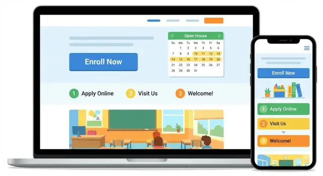
Your Enrollment page should feel like a clear checklist a parent can finish in one sitting. If families have to hunt through PDFs or multiple menus, they’re more likely to email (or give up). Aim for a single page that explains the process, sets expectations, and makes the next step obvious.
Open with a short summary: who can apply, which school year you’re enrolling for, and the general timeline.
Then add a step-by-step list parents can follow:
Keep each step to 1–2 lines and link to deeper details on the same page (jump links) or to a relevant page like /contact.
Parents want a quick “Do we qualify?” section. Include:
Spell out key dates: application open/close, lottery date (if used), and the notification window. If you review applications on a rolling basis, say so and give a realistic response time (e.g., “within 10 business days”).
List only what you actually offer:
If you have a detailed pricing breakdown, link to /tuition-and-fees so parents can confirm details without leaving the enrollment flow.
Parents will move faster (and feel calmer) when they can see exactly what’s needed—without hunting through emails or PDFs. Treat your document list like a simple checklist, not a policy document.
Add a short, scannable list on the page itself (best for mobile), with plain-language examples. For instance:
Keep it specific, and note when an item is “only if applicable” to avoid confusing families.
Directly under the list, explain how to submit documents and what formats you accept:
If you use an online enrollment form, link to it right beside the document list (for example, “Upload during enrollment: /enrollment”).
Provide a printable “Enrollment Document Checklist” PDF for families who like paper—and keep the same checklist on the page for phone users. Name the PDF clearly so it’s easy to find in downloads.
Say what you’ll do next and the timeline. Example: “If a document is missing, we’ll email you within 2 business days with a list of items to complete. Please submit missing documents by the stated deadline to hold your child’s spot.”
Enrollment forms are often the moment where interested parents either move forward—or give up. A good form feels quick, reassuring, and clear about what happens next.
Start by deciding what you actually need from parents at this stage.
A simple inquiry form is best when your process includes tours, calls, or a first conversation before an application. It reduces friction and increases submissions.
A full application form can work if you truly enroll on a first-come/first-served basis or if you need details to determine eligibility. If you go this route, make it obvious that it’s an application (not just a question form) and estimate the time to complete.
If you’re unsure, choose the inquiry form first. You can always collect more information after you’ve made contact.
Aim for the few fields that let you respond quickly:
Avoid long dropdowns and questions that feel invasive early on (household details, employer info, medical history). If you need those later, say so on the Enrollment page and request them after the initial step.
Parents want to know how their information will be used. Add a short consent checkbox near the submit button, written in plain language, such as:
“I consent to [School Name] using my information to contact me about enrollment and related updates. We do not sell personal data.”
Link to your privacy details using a relative URL (for example, /privacy). If you plan to send marketing newsletters, make that a separate opt-in.
Forms attract spam. Use CAPTCHA or an equivalent anti-spam tool that doesn’t frustrate mobile users.
After submission, show a confirmation message that includes next steps, not just “Thanks.” For example:
Also send an email confirmation so parents have a record—and include a clear contact path in case they don’t hear back (e.g., “Reply to this email” or “Call us at…”).
If you’re modernizing your enrollment workflow, you can implement these forms as true web forms (instead of PDFs) and keep them consistent across pages. For teams building quickly, Koder.ai can generate and iterate on form UX via chat, while still letting you export source code if you want to host and maintain it yourself.
Parents rarely arrive on your school admissions page ready to fill out an online enrollment form in one sitting. They often want one quick answer, a human confirmation, or a simple next step. Your job is to make that next step obvious on every enrollment-related page.
Add a small, consistent contact block on your Enrollment pages (and any page that supports enrollment information), not just on /contact. Include:
This reduces drop-off when parents have a question mid-read and don’t want to hunt for how to reach you.
If your team can support it, add a lightweight option such as “Book a tour” or “Request a call.” This is especially helpful for a kindergarten website, where families often want to see classrooms and meet staff before submitting forms.
Keep it simple: a short form (name, child’s age/grade, preferred time, phone/email) or a link to your scheduling tool. Place it near the top and again near the bottom of /enrollment so parents always have a next step.
Many enrollment questions are really “Can we get there easily?” Add a clear location section with:
This turns “I’ll ask later” into “Let’s visit this week.”
When parents are ready to act, link them directly to the next page—without sending them on a scavenger hunt. Use relative links like:
The best calls to action are specific and reassuring: “Check availability,” “Request a tour,” “Start enrollment,” or “Ask a question.” Keep the wording consistent across your school website so families always know what happens next.
Parents decide quickly whether a school feels organized, caring, and safe. Your content should make it easy to understand what you offer, how enrollment works, and what the first days will be like—without school-specific jargon or internal acronyms.
Write as if you’re answering a parent who is new to your school. Prefer short paragraphs, clear headings, and specific details (“Drop-off starts at 8:15”) over vague promises.
If you must use a term (like “before-care” or “extended day”), add a one-line explanation right under it.
Parents often skim on a phone. Put the most important information in bullets, highlight deadlines, and use tables for anything that compares options.
Example: hours and fees (simple table)
| Program | Days | Time | Fee (example) |
|---|---|---|---|
| Half-day | Mon–Fri | 8:30–12:00 | $___ / month |
| Full-day | Mon–Fri | 8:30–3:00 | $___ / month |
| Extended day | Mon–Fri | 3:00–5:30 | $___ / month |
Add a short note under the table for what’s included (meals, materials, after-school activities) and what’s not.
Real photos build confidence—classrooms, play areas, student work walls, and outdoor spaces help parents picture a normal day.
Only use student photos if you have appropriate permissions, and avoid identifying details (full names on cubbies, visible paperwork, uniforms with names).
A small FAQ reduces back-and-forth and shows you’ve thought about parents’ worries.
Include questions like:
Link to your /enrollment page from every relevant page, and end key pages with a simple next step: “Schedule a tour” or “Start an application.”
Families will check enrollment details on phones between work, errands, and pickup time. If your pages are hard to read, slow to load, or impossible to use without a mouse, you’ll lose inquiries—even when your program is a great fit.
Start with clear structure and readable design:
Also use descriptive titles and headings that match what parents search for. For example, instead of “Admissions,” consider “Kindergarten Enrollment Requirements” or “Enrollment Timeline and Tuition.”
If your school can support it, publish an accessibility statement (for example: /accessibility). Keep it practical: what you’ve done, what may still be improving, and how families can request help.
Mobile-friendly enrollment info is mostly about speed and simplicity:
Before launch, test your key enrollment paths on a phone using only your thumb and spotty Wi‑Fi. If it feels effortless, it’s ready.
Enrollment content naturally involves personal details. Parents will share more—and feel more confident—when your school website is clear about what you collect, why you need it, and how you protect it.
Start by trimming your forms to the essentials for an initial application (for example: child’s name, age/grade, parent/guardian contact details). Avoid requesting sensitive data unless it’s legally required at that step.
Examples of information to avoid collecting early (or at all on the website): full medical histories, copies of ID documents, or detailed custody documentation. If those are required later, describe the process and collect them through a safer, controlled channel.
Add a short privacy notice near every enrollment form, then link to a fuller policy page (for example, /privacy). Explain:
Avoid vague wording. Parents want specifics.
Your site should use HTTPS everywhere, especially on form pages. Restrict access to submissions so only the right staff can view them.
Be cautious with email: sending full applications and attachments via email can expose data to forwarding and inbox compromises. If you must use email notifications, send a “new submission received” alert with a link to a secure admin area instead of the full contents.
If you’re choosing a platform for hosting and deployment, ask where applications run and how data is stored. For example, Koder.ai runs on AWS globally and can deploy applications in different regions—useful when you need to consider data residency and privacy requirements.
Before launch, document the workflow:
Clear internal rules reduce mistakes and make your privacy promises real.
A school website can look finished and still fail families at the last step: a broken form, a missing deadline, or a phone number that no one answers. Before you share your new enrollment information widely, do a quick but thorough launch pass—and then set a simple routine so it stays accurate all year.
Run your checks like a parent would: on a phone, in the evening, with limited time.
If you have a dedicated school admissions page, make sure it’s reachable from the main navigation and from your homepage—parents shouldn’t need to guess where enrollment lives.
Outdated pages quietly erode confidence, even when the rest of your school website content is strong. Assign ownership (one staff role, not “everyone”) and pick a cadence.
A simple monthly check is usually enough:
For seasonal changes, set reminders ahead of time—e.g., six weeks before enrollment opens, and again a week before it closes.
If your team iterates frequently, consider using a workflow that supports safe changes and quick rollbacks. Platforms like Koder.ai include snapshots and rollback, which can reduce the risk of breaking enrollment paths during updates.
Add privacy-friendly analytics so you can see what parents actually use most: your Enrollment page, tuition info, required documents, or tour scheduling. Focus on page views and top paths, not personal profiles.
This helps you spot friction early (for example, lots of visits to the kindergarten website enrollment page but few form submissions) and improve wording, placement of calls to action, or clarity—without collecting unnecessary data.
If you want a quick pre-launch sweep of the entire site, adapt a simple /blog/school-website-checklist and run it each time you update enrollment information.
Start with one primary goal: help prospective parents understand eligibility and timelines and then complete the next step (apply, request a tour, call, or email) without confusion.
A practical way to check focus: every enrollment-related section should answer a parent question and end with a clear next action (for example, link to /enrollment or /contact).
Track a few outcomes that reflect real friction points:
If you use forms, add a confirmation page and basic analytics so you can see where families drop off.
List your audiences and design content for their top tasks:
Then make sure the most important pages are reachable in 1–2 clicks from the homepage.
Assume parents will read and submit forms on a phone, often quickly and with one hand. Prioritize:
Test the whole flow on mobile (including spotty Wi‑Fi) before launch.
A simple structure works for most schools:
Add persistent header actions like , , , and so parents can act from any page.
Make /enrollment a hub that explains the process and links to each step (requirements, timeline, tours, forms, FAQs).
A useful standard is that tuition, eligibility, and the application/inquiry form should be reachable in 1–2 clicks from the homepage.
Mirror the way families think:
Collect real questions from emails, calls, tours, and front-desk notes, then update the page copy to match the language parents use.
Use a short checklist and keep it scannable on the page:
Immediately below, state how to submit (upload/email/in person), accepted formats, file limits, and what happens if something is missing.
Collect only what you need at the current stage.
Keep early forms short (parent contact, child age/birth month-year, desired start date) and clearly state the expected response time on the confirmation message.
Include plain-language consent near the submit button and link to /privacy.
Keep it specific:
Avoid collecting sensitive data (full medical history, copies of IDs) unless required, and use HTTPS and restricted staff access for submissions.