

How to Build a Startup Hiring Page That Attracts Talent
Learn how to build a startup hiring page that attracts talent with clear roles, strong storytelling, simple applications, SEO basics, and fast performance.
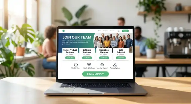
Set the Hiring Page Goals and Candidate Profile
A hiring page isn’t just a prettier list of open roles. It’s a tool—and like any tool, it works best when you’re clear on the outcome you want. Before writing copy or choosing a layout, decide what your hiring page is meant to do right now.
Define the primary goal
Pick one primary goal, and let everything else support it:
- Awareness: introduce the company to people who might be a fit later.
- Applications: drive qualified candidates to start and finish an application.
- Referrals: make it easy for your network (and employees) to share roles.
If you try to optimize for all three equally, you’ll often end up with a page that’s vague and underperforms.
Choose 1–3 priority roles and real candidate profiles
Start with the roles that will move the business forward in the next 60–90 days. For each, write a simple candidate profile that answers:
- What problem will this person own in their first 3 months?
- What experience is required vs. “nice to have”?
- What kind of environment will they thrive in (pace, ambiguity, collaboration style)?
This keeps your careers page copy focused and helps you avoid attracting lots of mismatched applications.
Decide success metrics you’ll actually track
A startup hiring page should be measurable. Agree on a few metrics, such as:
- Page views → job listing clicks
- Job listing clicks → “Apply” starts
- Apply completion rate and time to apply
These numbers tell you whether you have a traffic problem or a clarity/friction problem.
Align on tone—and only claim what you can prove
Employer branding works when it’s specific and credible. Choose a tone of voice (direct, warm, mission-driven, etc.) and stick to statements you can back up with examples. Candidates can spot hype quickly; clarity builds trust and drives better applications.
Create a Strong First Screen (Above the Fold)
The first screen of your startup hiring page is your “keep reading” moment. Candidates skim fast—especially on mobile—so your top section should answer two questions immediately: What do you do? and Who are you hiring?
Lead with a clear headline
Avoid vague taglines. Use a plain-language headline that combines your product and the type of roles you’re hiring.
Examples:
- “We’re building fraud prevention for small businesses — hiring engineers and customer support.”
- “Carbon accounting for manufacturers — hiring product, data, and sales.”
If you’re early-stage, it’s okay to say so. Clarity beats hype.
Add a simple mission + impact statement
Right under the headline, add 1–2 sentences that explain why the work matters. Keep it human and specific—no buzzwords, no abstract “changing the world.”
A good formula is: mission + who benefits + what changes.
Example:
“We help clinics spend less time on paperwork so doctors can see more patients. Our team is building software that cuts admin time by hours each week.”
One primary call-to-action (CTA)
Your above-the-fold CTA should be singular and obvious. Most startups do best with:
- View open roles (if you have multiple roles)
- Apply (if you’re hiring for one core role)
Place the CTA once as a primary button, and optionally add a secondary text link like “Meet the team” that anchors lower on the page. Don’t force candidates to decide between five buttons before they even know what you do.
Make it scannable on mobile
Design the top section so it works on a small screen without pinching or hunting:
- Keep the headline to 1–2 lines on mobile.
- Use short supporting text (2–3 lines max).
- Ensure the CTA is visible without scrolling on common phone sizes.
If you do nothing else, get this right: clear headline, real impact, one CTA, mobile-first layout. It’s the fastest way to improve candidate experience and increase clicks into your job listings page.
Tell a Credible Startup Story That Candidates Trust
Candidates don’t need a fairy tale—they need enough truth to decide whether your startup is worth their time. A credible story signals that you know what you’re building, how you work, and what you can (and can’t) offer right now.
Make the work feel real with specific outcomes
Skip vague mission statements and show proof that the work matters. Use concrete examples:
- “We reduced invoice processing time from 5 days to 6 hours for 40+ clinics.”
- “Our product helped customers cut churn by 12% over two quarters.”
If you’re early, talk about what you’ve shipped, what you learned, and what’s next. A short timeline (“launched MVP in March, paid pilots in June, first enterprise contract in October”) builds trust fast.
Describe values as behaviors, not slogans
Replace generic claims (“We value excellence”) with what people actually do:
- Write it down: decisions documented in a shared doc within 24 hours.
- Disagree and commit: debate in the meeting, align after the call.
- Own the outcome: the person closest to the problem drives it end to end.
This helps candidates self-select—and reduces mismatched expectations.
Add “What success looks like in 90 days” for key roles
For your most important roles, include a small, realistic snapshot:
- First 30 days: learn the product, ship a small improvement, meet customers.
- By day 60: own a core area, run a project with clear metrics.
- By day 90: deliver one meaningful outcome (e.g., improve activation by 5%).
Avoid claims you can’t verify
Statements like “best place to work” or “industry-leading” read as marketing unless you can cite evidence. Use honest trade-offs instead: fast pace, ambiguity, limited process, high ownership, and a clear reason those conditions are worth it.
Show the Team and Work Style
Candidates don’t join a mission—they join people. Your hiring page should make it easy to picture daily life at your startup: who they’ll work with, how collaboration feels, and what “good work” looks like.
Use real photos (and be intentional)
If you can, use real team photos from your actual workspace or offsites. A few candid shots usually outperform polished stock images because they signal authenticity. Keep them current, include names and roles, and avoid “mystery photos” that don’t tell candidates who they’re looking at.
Add voices, not just slogans
Short team quotes work best when they’re specific and attributed. Include the person’s role and tenure so candidates can calibrate the perspective.
- “I get feedback within 24 hours, which keeps projects moving.” — Priya, Product Designer (1.5 years)
- “We write decisions down, so you’re not guessing why something changed.” — Marco, Backend Engineer (8 months)
Share a simple org snapshot
Offer a quick overview so candidates can understand the shape of the company without hunting for it:
- Team size (e.g., 18 people)
- Core functions (Engineering, Product, Sales, Support)
- Leadership names and responsibilities (who owns what)
This reduces uncertainty—especially for candidates comparing you to larger, more familiar brands.
Explain how decisions and reviews actually work
A few sentences can prevent mismatched expectations.
Describe how decisions are made (founder-led, team-led, or a mix), how work is reviewed (PR reviews, design critiques, weekly demos), and what “done” means (quality bar, testing, documentation). If you have written norms, link them (e.g., /company/values or /handbook).
Design Job Listings That Are Easy to Browse
Your job listings page should feel like a clear menu, not a scavenger hunt. Candidates often skim quickly—especially passive talent—so structure matters as much as the roles themselves.
Use consistent job cards (so scanning is effortless)
Treat every role like a “card” with the same information in the same order. Consistency reduces mental load and makes it easier to compare roles at a glance.
A solid default job card includes:
- Title (clear and specific)
- Location / Remote (e.g., “Remote (US)” or “Berlin (Hybrid)”)
- Level (Junior/Mid/Senior, or “Lead”)
- Department (Engineering, Sales, Ops)
If you add extra details (salary range, visa support), apply them uniformly so candidates don’t assume missing info is being hidden.
Add filters that match how people actually search
Filters save time and increase the chances someone finds the right fit instead of bouncing. Keep them simple and visible:
- Location (including time zone if relevant for remote)
- Function / Department
- Remote / Hybrid / On-site
- Employment type (Full-time / Contract)
Make sure filters don’t reset unexpectedly, and let people share filtered results if possible.
Offer a “Don’t see your role?” option
Great candidates won’t always match an open requisition. Add a general application (e.g., “General Interest” or “Talent Network”) so people can raise their hand without emailing founders or guessing where to apply.
Make every job page shareable with a clean URL
Each role should have its own page and a readable link (for forwarding, Slack, and social posts), such as:
- /careers/product-designer
- /careers/senior-backend-engineer
Clean URLs also help candidates trust they’re applying to the right place—and they make promotion and tracking much easier later.
Write Job Descriptions People Actually Want to Read
A startup job description isn’t a legal document—it’s a decision tool. The best ones help candidates quickly answer: Do I want this? Can I do this? Will I grow here? If your careers page website is your storefront, each job post is a product page.
Start with a one-paragraph role summary (and why it exists)
Open with a short, human summary that explains the problem the role will solve and why you’re hiring now. This is especially important in startup recruiting, where titles can be flexible and scope changes fast.
Example structure:
- What you’ll own in the first 3–6 months
- Who you’ll work with
- What success looks like
Focus on outcomes, not a pile of tasks
Instead of a long list of responsibilities, prioritize 5–8 high-impact outcomes. Candidates trust employer branding that sounds like real work, not generic templates.
Good: “Ship onboarding flow improvements that raise activation by 10–15%.”
Less helpful: “Work on onboarding.”
Keep requirements realistic (and reduce self-selection drop-off)
Many qualified people won’t apply if they match only 60–70% of requirements. Help them by separating must-have from nice-to-have. This also improves candidate experience by setting clearer expectations.
- Must-have: core skills needed to do the job on day one
- Nice-to-have: helpful extras that can be learned on the job
Avoid laundry lists like “10+ years” for roles where you mainly need strong fundamentals and ownership.
Be transparent about compensation (or explain your approach)
If you can, include a salary range—candidates increasingly expect it, and it builds trust on your startup hiring page.
If you can’t, don’t dodge the topic. Add a short note explaining how you determine compensation (leveling, market bands, location adjustments) and when pay will be discussed in the process.
Also clarify what “equity” means at your company: e.g., early-stage options, typical vesting schedule, and that details depend on level.
Write like a person, not corporate copy
Careers page copy should be specific and plainspoken. Remove filler phrases, tighten sentences, and use “you” and “we” when it reads naturally. The goal isn’t to sound impressive—it’s to be understood quickly and trusted.
If it helps candidates, link to /careers/process (or the relevant section on your careers page website) so they can confirm what happens after they click “Apply.”
Present Compensation, Benefits, and Growth Clearly
Candidates can forgive a small brand; they rarely forgive fuzzy compensation. A clear, comparable package signals respect, reduces back-and-forth, and attracts people who are aligned with how you operate.
Make the offer easy to scan
Group benefits into predictable categories and include real numbers or ranges wherever possible.
- Compensation: Salary range (e.g., $110k–$140k) + bonus/commission if applicable (include the target and how it’s measured).
- Health: Medical/dental/vision (what % you cover), HSA/FSA options, mental health support.
- Time off: PTO policy (minimum and how it accrues), sick days, company holidays, parental leave details.
- Growth: Learning budget (e.g., $1,500/year), conference policy, mentorship, promotion review cadence.
Explain equity in plain terms
If you offer equity, don’t assume candidates know the vocabulary. At a high level: equity means you can own a small piece of the company. Most startups grant stock options, which give you the right to buy shares later at a fixed price.
Add the basics candidates can compare:
- The equity range for the role (or typical grant)
- Vesting schedule (commonly 4 years with a 1-year cliff)
- What happens if someone leaves (e.g., the exercise window)
Avoid promising outcomes (“this will be worth X”)—just explain the mechanics.
Be specific about flexibility
“Flexible” is meaningless without rules. State:
- Hours: core hours (if any) and meeting expectations
- Remote policy: remote-first, hybrid days, or location restrictions
- Equipment: home office stipend (e.g., $500–$1,000) and what it covers
Replace vague perks with comparables
Swap “great culture” and “competitive benefits” for details candidates can evaluate side-by-side. Specifics build trust—and help the right people self-select into your process.
Explain Your Hiring Process and Set Expectations
A clear hiring process is a trust signal. Candidates want to know how many steps there are, what each step is for, and how long the whole thing usually takes. When your careers page answers those questions upfront, you reduce drop-off and attract people who are genuinely aligned.
Map the stages (and keep them consistent)
Describe your typical flow in plain language, including approximate timing. For example:
- Application review (1–3 days) — we look for role fit, relevant outcomes, and clear communication.
- Intro call (20–30 min) — mutual fit: motivation, expectations, and role scope.
- Hiring manager interview (45–60 min) — depth on skills, decision-making, and how you work.
- Practical task (time-boxed) — realistic, paid if substantial, and designed to reflect the job.
- Team interviews (2–3 short conversations) — collaboration style and cross-functional work.
- Decision + offer (2–5 days) — references if needed, then offer details.
If some roles differ (e.g., engineering vs. sales), say so without overcomplicating it.
Tell candidates who they’ll meet—and what you’re evaluating
List the people or roles involved (“Recruiter,” “Head of Product,” “Engineer you’d pair with”) and explain the focus of each stage. This helps candidates prepare and makes the process feel fair.
Set expectations for communication
State how often you update candidates and when they should expect feedback (even if it’s a “no”). If you can’t give detailed feedback, be honest—but commit to timely responses.
Include accessibility and accommodations
Add a short note offering alternatives (phone interview, captions, extra time for tasks) and provide a direct email for accommodations (e.g., [email protected]).
Build a Low-Friction Application Experience
A great startup hiring page can still fail at the last step: the application. If candidates have to create an account, retype their resume, or guess what happens next, many will simply move on.
Keep the form short (and respectful)
Aim for the minimum you need to decide whether to invest time in a first conversation.
- Resume upload or LinkedIn profile (don’t force both)
- 2–4 short questions max (e.g., work authorization, location/time zone, start date, portfolio link)
- Avoid long “why us?” essays—save motivation questions for an interview
If you want more detail, consider a two-step flow: collect essentials first, then optionally ask for extra context after submission.
Offer “Apply with LinkedIn” when it truly helps
If it fits your workflow, “Apply with LinkedIn” can reduce friction for candidates who keep their resume updated there. Make sure it doesn’t create hidden downsides (like missing a portfolio link for design roles). A simple approach is: LinkedIn to prefill, plus one optional field for “Anything else we should know?”
Confirm submission and set next steps
After someone applies, show a clear confirmation screen (and send an email) that answers:
- You got it (with the role name)
- When they can expect an update
- What the next step typically is (screening call, take-home, etc.)
Link back to your /careers page so they can explore other roles while they wait.
Measure friction and fix it
Track where applicants struggle: form validation errors, time to complete, and drop-off by device. If you see a spike at one field (e.g., file upload), simplify it or add guidance. Small UX fixes here often translate directly into more completed applications.
Integrate Your Hiring Workflow (ATS, Forms, and Tracking)
A hiring page should feel simple to candidates, but it also needs to work smoothly for your team. The goal is to route every application to the right place, track status without chaos, and avoid losing strong people in someone’s inbox.
Choose your approach: ATS embed vs. lightweight form
You generally have two solid options:
- Embed an ATS job board (Greenhouse, Lever, Ashby, Workable, etc.). This is best if you’re hiring frequently, want built-in stage tracking, and need collaboration features (notes, scorecards, approvals).
- Build a lightweight application form if you’re hiring occasionally or want more control over the experience. Keep it minimal (name, email, LinkedIn, role, resume/portfolio). You can still add tracking later.
A good rule: if more than two people review candidates, an ATS will quickly pay off in reduced back-and-forth.
If you’re building the careers page experience yourself, platforms like Koder.ai can be a practical shortcut: you can describe the hiring page flow in chat (roles list, filters, an application form, and a confirmation screen) and iterate quickly without rebuilding everything from scratch. It’s especially useful when you want to ship improvements weekly based on analytics, while still keeping full control of the UX.
Make data handling clear (and visible)
Candidates will share personal information—be explicit about what you collect and why. Add a short note near the submit button and link to /privacy-policy. This reduces drop-off and prevents awkward follow-ups when someone asks how their data is used.
Also, avoid “surprise” fields (like salary expectations or demographics) unless you explain why they’re needed.
Improve visibility with JobPosting structured data
If you host jobs on your site (rather than only inside an ATS), add JobPosting structured data so roles can appear more clearly in job search results. Here’s a minimal JSON-LD example:
{
  "@context": "https://schema.org",
  "@type": "JobPosting",
  "title": "Product Designer",
  "description": "...",
  "datePosted": "2025-01-15",
  "employmentType": "FULL_TIME",
  "hiringOrganization": {
    "@type": "Organization",
    "name": "Your Startup"
  },
  "jobLocationType": "TELECOMMUTE"
}
Set up notifications and internal routing
Don’t rely on manual checking. Configure:
- Instant email notifications to a shared inbox (e.g., careers@) plus the hiring manager
- Routing rules by department/role so the right person sees applications first
- Autoresponder confirmation to the candidate (simple, friendly, and specific about next steps)
Finally, test the full flow monthly: submit a test application, confirm emails arrive, files open correctly, and tracking is accurate. That one habit prevents most “we never got your application” disasters.
Performance, Mobile, and Accessibility Essentials
A hiring page is often a candidate’s first “product experience” with your company. If it loads slowly, breaks on mobile, or is hard to use with assistive tech, people will assume the day-to-day work experience will be similar.
Page speed: make the first impression instant
Speed is a trust signal. Keep your careers page lightweight so candidates can scan roles and apply without friction.
- Compress images and export them in modern formats (WebP/AVIF) where possible.
- Lazy-load media below the fold so the job list and apply button appear fast.
- Reduce scripts and third-party widgets—each one adds load time and can break.
If you embed a video, consider a click-to-play thumbnail instead of auto-loading it.
Mobile-first: design for thumbs, not cursors
Many candidates browse roles between meetings or on commutes. Mobile usability should feel effortless:
- Use readable text sizes (avoid tiny captions for key details like location and salary).
- Make tap targets large enough (buttons, filters, and job cards should be easy to hit).
- Keep navigation fast: sticky “Open roles” / “Apply” actions can help, but don’t crowd the screen.
Accessibility: widen your talent pool
Accessibility basics improve usability for everyone, not only people using assistive tools.
- Ensure sufficient color contrast for text, buttons, and links.
- Provide meaningful alt text for images that convey information (skip decorative ones).
- Support keyboard navigation: users should be able to tab through filters, role pages, and forms.
Test before publishing
Before launch, test on multiple devices and browsers. Do a quick run-through of: opening a job, filtering, starting an application, submitting, and receiving confirmation. Fixing these issues early prevents silent drop-offs later.
Launch, Promote, and Improve Over Time
Treat your hiring page like a product launch, not a one-and-done task. The best pages start simple, go live quickly, then get better based on real candidate behavior.
Launch with SEO basics (so candidates can find you)
Start with clear, specific page titles and headings. “Careers” is fine for navigation, but search results do better with intent-rich phrasing like “Careers at Acme — Startup roles in Customer Success and Engineering.”
Write a short meta description that matches what candidates want: role types, location/remote policy, and why the work matters.
Add a few internal links that build trust and reduce questions:
- /about for the company story
- /culture for values and work style
- /team if you have it
- /privacy for how you handle applicant data
Make it share-ready
Most applicants arrive via a link from a friend, a recruiter, or a social post. Include a few “snippet” lines near the top of the page that are easy to copy into posts (e.g., “We’re hiring 3 roles this month: Design, Backend, and Support — remote-friendly”).
Set a simple Open Graph image so shared links look professional. Keep it consistent with your brand and include “We’re hiring” plus your logo.
Promote roles consistently
Don’t rely on job boards alone. Link to the hiring page from newsletters, founders’ social posts, and product updates. Always point back to the same canonical URL so you build momentum and SEO value.
Review monthly and iterate
Once a month, check: which roles get clicks, where candidates drop off (job list vs. job detail vs. apply), and which traffic sources convert. Update unclear copy, reorder roles, and refresh old postings. Small edits compound into a noticeably better candidate experience.
FAQ
What should the primary goal of a startup hiring page be?
Pick one primary goal and design the page around it:
- Awareness: explain what you do and why it matters
- Applications: reduce friction and push to “Apply”
- Referrals: make roles easy to share with clean URLs and clear summaries
If you try to optimize for all three equally, the page usually becomes vague and converts poorly.
How do I define the right candidate profile without overcomplicating it?
Start with the roles that matter in the next 60–90 days, then write a simple profile for each:
- The problem they own in the first 3 months
- Required vs nice-to-have experience
- The environment they’ll thrive in (pace, ambiguity, collaboration)
This keeps your copy focused and reduces mismatched applications.
What should be above the fold on a hiring page?
Make the first screen answer two questions immediately: What do you do? and Who are you hiring?
A strong default is:
- A plain-language headline (product + roles)
- 1–2 sentences on mission/impact
- One primary CTA like “View open roles”
- Mobile-first spacing so the CTA is visible without scrolling
How do I tell a credible startup story that candidates trust?
Use specific, verifiable details instead of hype:
- Concrete outcomes (metrics, customer results, what you shipped)
- A short timeline (MVP → pilots → contracts)
- Values described as behaviors (what you actually do)
Avoid claims like “best place to work” unless you can back them up with evidence.
What’s the best way to show team and work style without fluff?
Help candidates picture day-to-day work:
- Use real photos with names/roles when possible
- Add short, specific quotes attributed with role + tenure
- Include an org snapshot (team size, functions, who owns what)
- Explain how decisions, reviews, and “done” work (and link to /handbook or /company/values if you have it)
How should job listings be structured so candidates can scan quickly?
Make browsing effortless with consistent job cards that always show:
- Title
- Location/Remote (and time zone if relevant)
- Level
- Department
Add simple filters (location, function, remote/hybrid, employment type) and include a “General Interest” option for people who don’t match a specific role.
What makes a startup job description actually effective?
Write job descriptions as decision tools:
- Start with a one-paragraph summary: why the role exists and what it owns
- Focus on 5–8 outcomes rather than long task lists
- Separate must-have vs nice-to-have requirements
- Use plain language (“you/we”), not template corporate copy
How much compensation and equity detail should we include on the page?
Be specific enough that candidates can compare offers:
- Salary range (or explain when/how pay is decided)
- Equity basics in plain terms (range/typical grant, vesting, exercise window)
- Benefits grouped by category (health, time off, growth budget)
- Flexibility rules (core hours, remote policy, equipment stipend)
Clarity reduces back-and-forth and filters in the right applicants.
What should we include to explain our hiring process clearly?
Publish a clear, predictable flow with timing and purpose for each stage. A common structure:
- Application review (1–3 days)
- Intro call (20–30 min)
- Hiring manager interview (45–60 min)
- Practical task (time-boxed; paid if substantial)
- Team interviews (2–3 short conversations)
- Decision + offer (2–5 days)
Also state communication expectations and include an accommodations email (e.g., [email protected]).
How do we reduce application friction and avoid losing candidates at the last step?
Remove unnecessary steps and measure drop-off:
- Keep forms short (resume or LinkedIn, plus 2–4 questions)
- Show a confirmation screen and send an email with next steps
- Track apply completion rate, time to apply, and device-specific errors
- If you embed an ATS, test the flow monthly end-to-end
Small UX fixes (like simplifying file uploads) often increase completed applications immediately.