Mar 25, 2025·8 min
How to Build a Startup Landing Page Website That Converts
Learn how to build a startup landing page that turns visitors into users with clear messaging, fast pages, strong CTAs, trust signals, and testing.
Learn how to build a startup landing page that turns visitors into users with clear messaging, fast pages, strong CTAs, trust signals, and testing.
A landing page can’t convert if it’s trying to do everything. Before you write copy or pick a template, decide what the page is for and what you’re offering in exchange for a visitor’s action.
Choose the single action you want most visitors to take:
If you include multiple actions, make one clearly primary (visually and in the copy). Everything else should support it, not compete with it.
Early-stage startups often try to appeal to “everyone who might need this.” That usually produces vague messaging and weak landing page conversion.
Pick one high-potential segment for this page (e.g., “indie ecommerce owners,” “small HR teams,” “agency founders”). You can build additional pages later for other segments.
Use a one-sentence formula you can refine later:
For [who], get [outcome] without [pain / alternative], because [differentiator].
Example:
For small B2B teams, launch client reporting in minutes—not spreadsheets—because templates are prebuilt for your workflow.
This becomes the backbone of your headline, subheadline, and CTA language.
Set one or two metrics now so you don’t “ship and hope.” Common options for a startup landing page:
If you plan to measure activation, define what “activated” means (e.g., “created a project,” “connected an integration”) so the landing page aligns with the rest of your signup flow.
Before you write a single headline, get crystal clear on who your startup landing page is for and why they hesitate. Landing page conversion problems usually aren’t design problems—they’re “this isn’t for me” or “I don’t trust it” problems.
Write one sentence that sounds like something a real person would say at 4pm on a stressful day. Avoid jargon and features.
Examples:
That sentence becomes the anchor for your landing page design and copywriting for landing pages: everything on the page should point back to solving that pain.
Most visitors don’t click your call to action because of predictable fears. Write down the three most likely blockers for your audience:
These objections should shape your website for startup messaging, your signup flow, and what you emphasize near the CTA.
Pull language from interviews, sales calls, support tickets, app reviews, Reddit threads, and competitor comments. Look for repeated words and emotional cues (“frustrating,” “confusing,” “too slow,” “I just need…”). Use those phrases in headings and FAQs—this is how your landing page copy feels “instantly familiar.”
Pick proof that matches the objections:
This is the fastest way to build trust without adding clutter to your startup landing page.
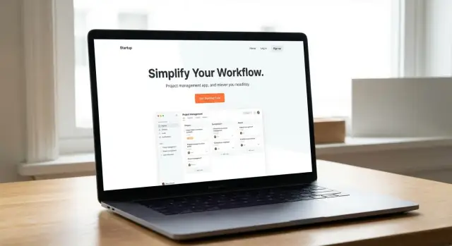
A converting landing page is less like a homepage and more like a guided conversation. The structure should answer three questions in order: What is this? Why should I care? What do I do next? If you get the order wrong, even great copy and design will feel confusing.
Treat the first screen as your elevator pitch. It should include:
If someone only reads this section, they should still understand what you do and what to click.
Once you have attention, earn trust with a predictable flow:
This middle section is where you turn “interesting” into “I can see myself using this.”
By the time visitors reach the end, they’re either convinced or still uncertain. Make the last section feel helpful, not pushy:
A common mistake is giving equal visual weight to multiple actions (book a demo, start free trial, download, subscribe, follow). Pick one primary conversion goal and let everything else support it quietly.
Great landing page copy isn’t “beautiful writing.” It’s a fast explanation that helps the right person decide: Is this for me, and what do I do next?
Your headline should communicate a concrete result, not your mission statement.
If you can, add a measurable detail (time saved, money saved, fewer errors) or a clear “before → after” transformation.
In one sentence, explain the product and the audience.
Example: “A lightweight CRM for freelance designers to track leads, proposals, and payments—without spreadsheets.”
This reduces confusion and filters out the wrong visitors early (which improves conversion quality).
Most visitors skim. Make the page work at a glance:
A helpful pattern is: Problem → Benefit → Proof/Detail. Keep each block tight.
Your visitor arrives with context. Your page should “continue the conversation.”
If your ad says “Book more demos from your website,” your hero and first benefit section should repeat that idea—same terms, same promise. For community posts, mirror their vocabulary. For SEO pages, answer the query directly, then show the product.
The goal is simple: no surprises, no translation required, and a clear next step.
Good landing page design isn’t about looking “fancy”—it’s about making the next step feel obvious and safe. When people hesitate, it’s usually because the page feels confusing, inconsistent, or risky. Your job is to remove friction with clear visual hierarchy and cues that signal credibility.
Don’t rely on abstract hero graphics. Visitors want proof that something real exists and that it can deliver a specific result.
Place this visual near the headline so it answers “What is it?” within a few seconds.
A page feels more trustworthy when it feels coherent. Choose a simple visual system and repeat it consistently.
Use:
This consistency helps visitors focus on the message instead of “design noise.”
Your primary CTA should look the same everywhere it appears.
Pick one button style (color, shape, size) and one wording choice (e.g., “Start free” vs. “Get started”) and stick with it across the page. Secondary links should look like links, not competing buttons.
If you want to offer an alternate path (like “Watch demo”), make it visually lighter so it supports—not competes with—the main action.
Accessibility improvements often make pages easier for everyone.
Ensure:
Clarity builds trust, and trust makes clicking the CTA feel reasonable.
Your CTA (call to action) is the moment of truth: it turns “interested” into “taking a step.” A high-intent CTA is specific, matches what you actually offer, and feels safe to click.
Choose a single main CTA label that describes the immediate outcome—not the vague dream.
Keep the wording consistent across the page and on the next screen. If the button says “Join waitlist,” the form title shouldn’t say “Request access.”
Every extra field is a reason to bounce. Ask only for what you need to deliver the next step.
For a waitlist, that’s often just email (and maybe one qualifier like “Company size” if it affects who you accept). If you want personalization, capture it later during onboarding.
If possible, offer one-click options (like Google sign-in) only when they truly speed things up—and don’t force them.
A tiny line of text can remove anxiety and set expectations:
This is also the place to clarify what happens after the click (confirmation email, calendar booking, instant access).
Add a secondary CTA only if it supports decision-making without stealing focus—e.g., a text link “See demo” or “Watch 2-min video.” Visually downplay it (outline button or link) so the primary CTA stays the default path.
People don’t convert because your landing page is “pretty”—they convert when they believe you’re credible and safe to try. Social proof and trust signals reduce perceived risk, especially for a new startup with a small brand.
A strong testimonial answers: “Will this work for someone like me?” Aim for quotes that include who said it and what changed.
For example:
“We cut onboarding time from 3 days to 45 minutes using [Product].” — Maya Chen, Ops Lead, Northwind Logistics
If you can, add specifics like timeframe, metrics, or a concrete outcome (replies increased, hours saved, churn reduced). Avoid anonymous quotes (“Great tool!”). If you don’t have many customers yet, use alternatives that are still honest: pilot users, waitlist users, advisors, or early community members—clearly labeled.
Use trust badges sparingly and only when they’re true. A few high-quality signals beat a wall of logos.
Good options include:
If you show numbers (users, revenue, uptime), make sure you can stand behind them.
One short block can remove a major objection:
Link to your full policy: /privacy.
Trust increases when there’s a human behind the product. Add at least one clear contact option: a support email, live chat, or a simple contact form. Place it in the footer and near the CTA for high-intent visitors who have one last question.
A landing page can have great copy and still underperform if it feels slow, cramped on a phone, or invisible to search. The goal here isn’t perfection—it’s removing friction that stops motivated visitors from taking action.
Start by trimming what the browser has to download and execute.
Compress and resize images before uploading (a “hero” image is often the biggest culprit). Prefer modern formats like WebP/AVIF when your builder supports them.
Limit third-party scripts. Each chat widget, heatmap, and extra tracker adds delay. If you’re unsure, ship with the minimum and add tools later.
Turn on caching and use a CDN if your platform offers it. Many hosted landing page tools do this by default—confirm it in settings.
Most visitors will see your page on a phone first, so design for thumbs and quick scanning.
Use readable type (generally 16px+ body text) and keep line lengths short.
Make your primary button large and thumb-friendly, with enough spacing so it’s easy to tap.
Keep forms short. If you only need an email to start, don’t ask for a company size and a phone number on day one.
You’re not doing a full SEO program—just making the page understandable to humans and search engines.
Use a clear URL (e.g., /demo or /waitlist), a specific title tag, and one obvious H1 that matches your promise.
Use headings (H2/H3) to structure benefits, use cases, and FAQs. This improves scanning and helps search engines interpret the page.
Install analytics early so you can learn from real usage.
At minimum, track:
These events tell you whether the problem is attention (CTA), friction (form), or trust (submission).
Speed matters more than polish at the start. A single page is enough to validate your message, collect signups, and learn what people actually respond to—so choose tools that help you publish quickly and edit without friction.
If you can launch faster with a CMS or site builder, do it. You’re not committing to a forever stack—you’re buying time to learn. The best tool is the one your team can update in minutes, not days.
A good “first version” setup usually includes:
If you’re building the product alongside the landing page, tools that shorten the build–test loop matter. For example, Koder.ai is a vibe-coding platform where you can create a web app (often React + Go + PostgreSQL under the hood) from a chat interface, then iterate quickly with snapshots and rollback—useful when your landing-page promise and onboarding flow are still changing week to week.
Start from a template that already supports your layout (hero → benefits → proof → FAQ → CTA). Avoid templates loaded with animations, sliders, and bulky plugins you don’t need—these slow down the page and make edits harder.
When evaluating a template, check:
Even a minimal landing page should feel legitimate.
If your platform supports it, bundling hosting + deployment + custom domains into one workflow reduces busywork. (Koder.ai, for instance, supports deployment/hosting and custom domains, which can simplify shipping fast without stitching together too many tools.)
Create these as simple, plain-language pages and link them in the footer:
If you’re collecting emails, a basic privacy policy is especially important. You can improve these pages later—shipping a clear, functional version today beats drafting the perfect wording for weeks.
Your landing page shouldn’t end at “Sign up.” If the message on the page doesn’t match what happens after signup, people bounce—even if they were excited a minute ago. The goal is simple: deliver a quick win that proves the promise you just made.
Immediately after signup, show users what they can do right away. Don’t drop them into a blank dashboard with five menus.
A good first-5-minutes experience usually includes:
If your landing page promises a specific outcome (“Generate a report in 2 minutes”), the first screen should steer directly toward that outcome.
Send a welcome email right away that repeats the value proposition in plain language and gives one next action.
Keep it tight:
This isn’t a product tour in email form. It’s a bridge back into the product.
If access isn’t immediate, say so clearly on the confirmation screen and in the email. Tell them:
Offer a simple way to share or invite (a personal referral link or “Invite teammates”). Make it feel helpful—not spammy.
Conversion isn’t “signup.” It’s activation. Pick 1–3 events that signal real value and track them from day one:
When you know where people stall, you can adjust the landing page promise, the signup flow, or the first-run experience so they align.
A/B testing doesn’t need to be a big analytics project. For an early-stage startup landing page, your goal is simple: learn what makes more qualified visitors take the next step, then keep what works.
Pick a single element tied to intent, not decoration. Good first experiments include:
If you change five things at once, you won’t know what caused the result.
Small traffic means noisy data. Keep each test running until you’ve seen a stable pattern (at minimum, a full week to capture weekday/weekend behavior). Make one change at a time, and keep the rest of the page identical.
A practical rule: if results flip back and forth day-to-day, you don’t have a winner yet—keep the test running or increase traffic (e.g., via one consistent channel).
Numbers tell you what happened; feedback tells you why. Use one lightweight prompt:
This often reveals missing info (pricing expectations, use cases, integration questions) you can address in copy.
Maintain a small spreadsheet or doc with: date, hypothesis, variation, result, and decision. It prevents repeating the same experiment and helps you build a clear “why we wrote it this way” story for future iterations.
If you want a place to test, document, and ship changes quickly, keep your experiments scoped to a single page and roll learnings into the next update (see /blog/pre-launch-checklist). If you’re building the funnel product yourself, using a platform that supports snapshots and rollback (like Koder.ai) can make iteration safer—especially when a “small” landing-page tweak accidentally breaks the signup flow.
Shipping a landing page is less about “perfect” and more about removing the obvious conversion blockers. Before you drive traffic, run a quick pre-launch pass that checks the promise, the path to signup, and basic credibility.
Use this as a final sweep:
Most “bad” landing pages fail in predictable ways:
Before you hit publish:
Pick a simple weekly rhythm: review sessions → CTA clicks → signups, plus top traffic sources. Make one change at a time (headline, CTA text, form length, proof placement), then measure again the following week.
Start by choosing one primary action (e.g., join the waitlist, start a free trial, request a demo). Design and copy should support that single path.
If you must include secondary actions (like “Watch demo”), visually downplay them so they don’t compete with the main CTA.
For early-stage pages, a simple above-the-fold set works best:
If visitors only see this section, they should still know what you do and what to click.
Use a one-sentence value prop you can refine:
For [who], get [outcome] without [pain/alternative], because [differentiator].
Then reuse that language across your headline, benefits, and CTA so the page feels consistent and specific.
Pick one high-potential segment per page (e.g., “agency founders” or “small HR teams”). Writing for “everyone” usually leads to vague claims that don’t feel relevant to anyone.
Create additional pages later for other segments once you learn what converts.
Collect real phrases from interviews, sales calls, support tickets, reviews, Reddit threads, and competitor comments. Look for repeated words and emotional cues (“too slow,” “confusing,” “I just need…”).
Use that wording in headlines, benefit bullets, and FAQs to make the page feel instantly familiar.
Most objections fall into three buckets:
Address them near the CTA with proof (results, process, experience, security) and short microcopy that sets expectations.
Treat the middle of the page like belief-building:
This is where you turn “interesting” into “I can see myself using this.”
Ask only for what you need to deliver the next step.
Every extra field increases drop-off, especially on mobile.
Add a short line of text right next to (or under) the button to reduce anxiety and set expectations, such as:
Microcopy works best when it clarifies what happens after the click.
Track the events that reveal where people drop off:
Pair this with one success metric like conversion rate (signups ÷ visitors) and, if relevant, an tied to a meaningful first action (e.g., “created a project”).