Aug 23, 2025·8 min
Build a Startup Website Without Hiring Designers or Developers
Step-by-step guide to build a startup website using no-code tools: pick a builder, choose a template, write copy, add SEO, set up analytics, and launch fast.
Step-by-step guide to build a startup website using no-code tools: pick a builder, choose a template, write copy, add SEO, set up analytics, and launch fast.
Before you pick a tool or a template, decide what this website is for. Startup sites fail most often when they try to do everything at once—explain the product, tell the story, recruit, blog, sell, and support—on day one.
Pick a single action you want most visitors to take:
Everything on the homepage should support that one action (headline, proof, FAQs, and the main call-to-action button).
Write down your audience in one sentence (for example: “Operations managers at small logistics companies”). Then list the top three questions they need answered quickly:
If your site answers those clearly, you’ll beat 80% of early startup websites.
Set a simple, measurable target so you can make decisions without guessing:
Make the goal small enough that you can actually review it after seven days.
A lean first version is easier to finish and improve. A practical starting set is:
You can add extras later, once your core message converts.
Your website tool choice matters less than your ability to publish quickly and keep updating. Pick a builder that matches what you’re trying to ship in the next few weeks—not what you “might” need later.
All‑in‑one website builders (hosted, template-driven) are usually the fastest path to a clean startup website. They handle hosting, updates, and security for you.
A CMS can be flexible, but it often brings more setup, plugins, and maintenance. It’s a good fit when you expect lots of content and multiple contributors, but it’s slower if you just need a crisp marketing site.
Landing page tools are perfect for a single page and rapid A/B testing. If you only need one page to validate demand, start here—then move to a fuller site when the product story stabilizes.
If you’re looking for something that goes beyond classic “no-code” (especially once you need a real app, not just pages), consider a vibe-coding platform like Koder.ai. You can describe what you want in chat and generate a working web app (React), backend (Go + PostgreSQL), or even a mobile app (Flutter), with options like source code export, hosting/deployment, custom domains, snapshots, and rollback. It’s a practical path when you want to move fast now without painting yourself into a corner later.
Look for:
If the builder makes any of those feel hard, you’ll stop updating your site.
Before you commit, check what’s limited: number of pages, bandwidth/visits, form submissions, team seats, and whether custom domains and SSL are included. If you’re comparing plans, bookmark the vendor’s plan page (and if you’re evaluating ours, see /pricing).
Pick one tool and stick with it for a month. Your goal is momentum: publish a good version 1, learn what visitors do, then improve—rather than restarting from scratch with a new platform every weekend.
Before you touch your homepage, lock down the basics that make your site feel legitimate: a domain you can say out loud, SSL (the little padlock), and an email address that matches your domain.
Choose a domain that’s easy to spell, say, and recall after hearing it once. If you have to explain hyphens, unusual spelling, or extra words (“with”, “app”, “get”), expect lost traffic and mis-sent emails.
If your exact brand name is taken, try small adjustments that still sound natural (e.g., adding a clear product word). Avoid trends that age quickly.
If you can get the .com, take it—many people type it by default. If .com is unavailable or unreasonably expensive, pick an extension that matches your market:
The key is confidence: your domain should look intentional, not “second-best.”
You have two clean options:
Builder-hosted (simplest): buy the domain inside your no-code website builder (or transfer it there). DNS and SSL are mostly automatic.
External registrar (more control): buy your domain at a registrar, then point DNS to your builder. This is still easy, but you’ll need to copy records carefully.
Either way, confirm SSL is enabled and working on both:
Also set one as the canonical version (usually automatic in the builder).
Create a simple shared address like hello@, support@, or founders@. If you’re moving quickly, start with basic forwarding to your inboxes, then upgrade to a proper mailbox (Google Workspace or Microsoft 365) when needed.
Minimum checks: test sending/receiving, add a signature, and make sure replies don’t come from a personal Gmail address.
A template feels like progress, but it can also lock you into a layout before you’ve decided what your website needs to do. Spend 20–30 minutes on structure first and your build will go faster, look cleaner, and convert better.
Start with the most common entry points: a Google search, a social post, a partner link, or a paid ad. For each, define the one action you want visitors to take (request a demo, start a trial, join a waitlist).
Then sketch the shortest path from entry page to that call-to-action:
Your navigation is not a sitemap—it’s a decision menu. If you can, keep it to 4–6 links so people don’t get stuck comparing options.
A common starter set:
If you have multiple audiences (e.g., “For Teams” and “For Creators”), consider one audience page under Product rather than adding many top-level items.
Aim for a small, clear set of pages:
When you run a campaign, create one focused landing page per campaign with a single message and CTA. Keep Home as your “general” entry point, and let landing pages do the heavy lifting for specific audiences or offers.
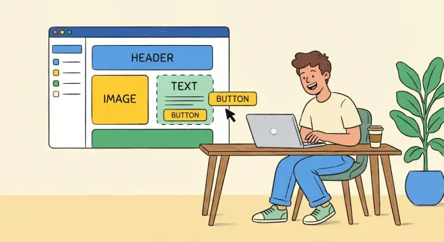
A good template does more than “look nice”—it gives you a proven page structure so you can focus on your message and offer. Your job is to pick a template that matches what your website must do on day one, then apply a few consistent brand rules so everything feels cohesive.
Start by choosing the template category based on your primary outcome:
When comparing templates, look for:
You don’t need a full brand book. You need a few rules you’ll actually follow:
Write these choices down in a note so you don’t “freestyle” later.
Most sites look amateur because every section feels like it was made by a different person. Use repetition on purpose:
Avoid custom animations, parallax, video backgrounds, and heavy effects until after launch. They add time, can hurt load speed, and rarely improve conversions early on.
Your website copy has one job: help a visitor understand what you sell in seconds, then make the next step feel obvious. You don’t need clever slogans—you need clarity.
Write one tight sentence that answers three questions:
If you can’t say it without jargon, you don’t understand it well enough yet. Keep it specific: numbers, time saved, fewer steps, fewer errors.
A simple, effective flow for a landing page for startups:
Write each section as if you’re answering a friend’s question: “Okay, but what do I get?”
Do a quick “buzzword cleanup” pass. Replace:
If a sentence doesn’t add meaning, delete it.
Create three versions and read them out loud:
Choose the one that a stranger understands instantly. Then test it later with analytics setup and experiments—but start simple and ship.
You don’t need a full design team to make your startup website look credible. You need consistency. A few repeatable rules—typography, color, spacing, and imagery—will do more than hours of tweaking.
For startups, generic stock photos often make visitors skeptical. Use:
A good default: one clear product screenshot near the top of the page, then smaller screenshots supporting each key benefit.
Messy image sizing is one of the fastest ways to make a site feel amateur.
Create a tiny folder structure like logo/, screenshots/, icons/ so you don’t upload duplicates.
Alt text helps accessibility and makes the site easier to understand for screen readers.
Write alt text that describes what matters, not what’s obvious:
If an icon is purely decorative, you can leave it empty in your builder so it’s skipped by assistive tech.
You can launch with 5 pages and look credible. The goal isn’t to say everything—it’s to help a visitor quickly answer: What is this, is it for me, and what do I do next?
Your Home page should be a fast “yes/no” filter.
Lead with benefits, then support them with features.
Write 3–5 benefit sections (each with a real example). For instance: “Reply to leads in 2 minutes” + a screenshot of the workflow + one sentence explaining how it works. If you can, add a short “How it works” 3-step strip.
Make tiers easy to compare at a glance.
Use 2–3 plans max, highlight the “most common” choice, and keep each plan to 5–7 bullets. Add a small FAQ under pricing to reduce hesitation (cancellations, trials, what’s included, invoices, security basics).
Explain the mission and why you’re credible.
Include a short origin story, what you believe, and proof points (experience, outcomes, partners). Add a human contact point—a named person with a photo or signature line—so visitors feel they can reach someone.
Keep it simple and set expectations.
Use a short form (name, email, message) plus a clear promise like “We reply within 1 business day.” Offer alternatives: a direct email and a calendar link for scheduling.
You don’t need an SEO tool stack to get your startup website found. A few basics done consistently will outperform “advanced” tactics done once and forgotten.
Every page should have a unique page title (the blue link in Google) and a meta description (the snippet). Match the words people actually use when searching.
If you have only 3–5 pages, do this manually in your no-code builder’s SEO settings.
Use one H1 per page (the main promise). Then break the rest into H2 sections that answer the next questions a visitor has—features, use cases, pricing, FAQs.
This helps search engines understand the topic, but it also makes the page easier to scan.
Good URLs are short and predictable:
When relevant, link between pages in your copy. For example, your homepage and feature page should naturally point to /pricing and your main call-to-action.
In your builder or hosting settings:
That’s enough to ship: clear intent, clear structure, and pages Google can actually see.
A startup website isn’t “done” when it looks nice—it’s done when it captures interest and tells you what’s working. You can add the essentials in an afternoon, without custom code.
Pick one primary conversion for your site (sign-up, purchase, demo booking, waitlist, contact). Then set up analytics so you can answer: “How many visitors turned into that outcome this week?”
Most no-code website builders let you paste in a measurement ID for tools like Google Analytics or a privacy-focused alternative. Keep it simple: track traffic sources and conversion rate.
If your tool supports click events, add a single event for your main button (for example: “Join waitlist” or “Book a demo”). Name it clearly so future-you understands it:
cta_clickhero_primaryThat’s often enough to learn whether your headline and hero section are pulling their weight.
Forms should never drop leads into a black hole. At minimum, set up:
If you already use a CRM (HubSpot, Airtable, Notion, etc.), connect it through your builder’s native integration or a simple automation tool.
If you’re building an actual product alongside the marketing site, consider keeping the same “lead → app access” flow consistent. For example, teams using Koder.ai often start with a waitlist or demo form, then quickly evolve it into a real onboarding path (accounts, emails, and an initial app shell) without rebuilding everything by hand.
If you sell anything that benefits from a conversation, embed a scheduling link on your “Book a demo” flow so prospects can self-serve.
For support/contact, route messages to one place (a shared inbox or helpdesk). Add a clear expectation like: “We reply within 1 business day.”
A startup website only has a few seconds to earn trust. Speed, mobile polish, and basic accessibility are the easiest upgrades that make you look more established—without changing your core message.
Don’t just glance at the homepage on your phone and call it done. Check the mobile layout section by section: hero, social proof, features, pricing, FAQ, footer.
Look for the common mobile breakers:
As a quick rule: keep key buttons big enough to tap comfortably, and make body text readable without zooming.
Most no-code sites get slow for simple reasons: huge images, extra sections, and too many add-ons.
Start here:
If your builder has a performance or page-speed panel, turn on built-in optimization and lazy-loading for images.
Accessibility helps more people use your site—and it often improves SEO and conversions.
Do a basic pass:
When in doubt, simplify: fewer sections, clearer typography, and one primary call-to-action per page usually wins.
Launching isn’t the finish line—it’s the moment you start learning. A clean, confident launch plus a simple weekly improvement rhythm will beat months of “almost ready.”
Before you publish, do one focused pass for obvious breakpoints:
Don’t just test the page—test the journey:
ad/link → landing page → form → confirmation/thank-you → confirmation email
Use a real device (mobile) and a “fresh” browser session (incognito) so you experience what new visitors see. If there’s any confusion or delay, fix it now—these are the highest-impact issues.
After publishing, keep an eye on:
Make only urgent fixes in the first three days. Save bigger changes for your weekly cycle.
Create a short iteration list and ship one change every week—for example: rewrite the hero, simplify a form, add one FAQ, or clarify pricing.
Optional: outline your first supporting post and, when your blog exists, link it from /blog to start building trust and organic discovery.
Start by choosing one primary goal (e.g., book a demo, join a waitlist, start a trial, subscribe). Then design every key homepage element to support that action: a clear headline, one main CTA button, a bit of proof, and a short FAQ that removes hesitation.
Keep it lean: 3–5 essential pages is enough to look credible and convert.
A practical starter set is:
Choose based on what you need to ship in the next few weeks:
Prioritize the essentials you’ll use every week:
If any of these are painful, you’ll stop updating the site.
Pick a domain that’s easy to say, spell, and remember. If people need hyphen explanations or unusual spelling instructions, you’ll lose traffic and misroute emails.
If your brand name is taken, make a small, natural adjustment (often adding a clear product word) that still sounds intentional.
Confirm SSL works for both versions:
https://yourdomain.comhttps://www.yourdomain.comThen set one as the canonical version (often handled automatically by your builder). This avoids duplicate versions of the site and prevents trust issues for visitors.
Keep navigation to 4–6 items so it functions like a decision menu, not a sitemap.
A common starter navigation:
Write a plain-English sentence that covers:
Example pattern: “For [audience], [product] helps you [outcome] by [how/why], so you get [result].”
Use “real” visuals that reduce skepticism:
Avoid generic stock photos. Also standardize image sizes and use modern formats (e.g., WebP for screenshots/photos; SVG for logos).
Focus on basics you can do quickly:
/pricing, /features)/sitemap.xml, and connect Google Search ConsoleThis is enough to launch and start getting found without an SEO tool stack.