Dec 19, 2025·8 min
How to Build a Subscription Newsletter Site With Archives
Learn how to build a subscription newsletter website with searchable archives, member-only access, payments, email delivery, and SEO—step by step.
Learn how to build a subscription newsletter website with searchable archives, member-only access, payments, email delivery, and SEO—step by step.
A subscription newsletter site with archives is really three products in one: a signup funnel, a publishing system, and a library people can browse (or unlock) later. If you get the basics clear before you touch design or tools, every later decision gets easier.
Be specific about what “success” means in the next 90 days:
Trying to optimize for all three at once often creates a cluttered homepage and an archive nobody can navigate. Pick the primary goal, then let the other two support it.
Your paywall rules determine your content structure.
Common approaches that work well:
Write these rules down as plain sentences. You’ll use them later to configure access, previews, and SEO.
At minimum, plan these pages and what each must do:
If you already know your URL structure, keep it simple (for example: /archive, /pricing, /about).
Choose a small first version you can ship in weeks, not months. A good MVP is: signup, 10–20 archive posts, a pricing page, and basic member access.
Save upgrades—mobile app, community, courses, advanced segmentation—for after you’ve proven people will subscribe and read.
Your setup determines three things you’ll feel every week: how fast you can publish, how much you can customize, and how hard it is to move later. There’s no universal “best” option—only the best fit for your content, budget, and tolerance for tinkering.
This approach uses a newsletter platform for writing, sending, subscriptions, and basic hosting—then adds a lightweight custom site (or marketing pages) on top.
Choose this if you want the quickest path to paid subscriptions and you’re okay with design limits on the archive and member experience.
Watch for: platform branding, limited template control, and whether the archive URL structure and SEO settings are editable.
Here you run the site on a CMS/website builder, connect an email service for delivery, and use Stripe (or similar) for payments. It’s the most flexible path for archives, navigation, and long-term SEO.
Choose this if your archive is a major product (searchable, well-structured, evergreen) and you want full control over the site experience.
Watch for: more moving parts, higher setup time, and ongoing maintenance (integrations, user accounts, access rules).
A practical alternative for teams that want control without months of build time: a vibe-coding platform like Koder.ai can help you prototype (and ship) a custom newsletter site by describing what you need in chat—homepage, archive, paywall rules, search, and an admin workflow. Under the hood it can generate a React web app with a Go + PostgreSQL backend, and you can export the source code, deploy/host, connect a custom domain, and use snapshots/rollback as you iterate.
Membership platforms often blend site + posts + paywall + email into one member-centric system. They typically offer stronger access control than newsletter-first tools.
Choose this if your business is “memberships with a newsletter,” not “newsletter with an optional paid tier.”
Watch for: export limits, restricted front-end customization, and whether email sending is as strong as dedicated ESPs.
Focus on four criteria:
If you’re unsure, start with the simplest option that won’t block your archive plans later.
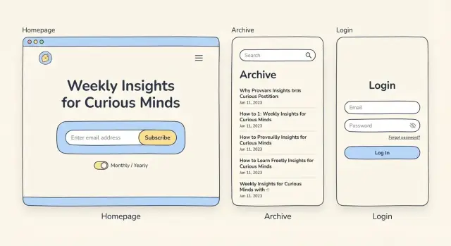
Your homepage has one job: get the right people to subscribe. Everything else (feature lists, your origin story, deep navigation) is secondary. If visitors have to hunt for what you publish, who it’s for, or how to sign up, they’ll leave.
Start with a simple, specific promise that answers three questions in one glance:
Keep it human and concrete. “Weekly insights” is vague; “a 5-minute brief on pricing experiments” sets expectations and attracts the right subscribers.
Place the signup form above the fold so visitors don’t need to scroll to take action. Keep it minimal: email address, and optionally a name field if you truly use it (personalization, onboarding).
Then repeat the signup form near the end of the page (or after a strong proof block). People who scroll are showing interest; make subscribing effortless when they’re ready.
If you offer both free and paid, make the default action clear (e.g., “Start free”) and explain the upgrade in one sentence, not a pricing table.
Instead of long explanations, show what someone will actually receive:
This is also where your newsletter archives help conversion: visitors can judge quality quickly, and you’re not asking for an email purely on faith.
A single credible proof element can lift conversions, but only if it’s verifiable. Use:
Avoid generic testimonials and inflated metrics. If you can’t verify it, skip it.
Your homepage doesn’t need to explain every feature of your paid newsletter site. If you want to add detail, link out to a dedicated page (like /pricing or /archive) and keep the main page flowing toward signup.
Pricing is where clarity beats creativity. Visitors should understand (1) what they get, (2) what it costs, and (3) what happens if they stop paying—without hunting through FAQs.
Most newsletter sites work best with two tiers: Free and Paid. Put the comparison high on your /pricing page and repeat it anywhere you ask people to subscribe.
| Feature | Free | Paid |
|---|---|---|
| Weekly email | ✓ | ✓ |
| Full archive access | Limited | Full |
| Member-only posts | — | ✓ |
| Comments / community | — | ✓ |
| Annual discount | — | ✓ |
If you have a third tier (e.g., “Founder”), make it clearly optional and limit it to a few concrete perks.
Spell out the billing cadence in plain language: “$10/month or $100/year (2 months free).” If you offer annual plans, explain the savings in one sentence.
Also state what the subscription includes: number of emails, access to the full archive, and any extras (events, templates, community). Avoid vague promises.
Make cancellation frictionless. A simple line like “Cancel anytime in your account; you’ll keep access until the end of your billing period” reduces anxiety and increases conversions. If you offer refunds, write the policy clearly.
Decide, document, and consistently apply rules such as:
Treat /pricing as a primary navigation destination: link to /pricing in your header, and include it in your signup prompts (buttons, popups, and end-of-post CTAs) so readers never wonder where to compare plans.
Your archive is where casual readers turn into regulars. A good archive makes it easy to answer two questions fast: “Is this newsletter for me?” and “What should I read next?”
Create a dedicated /archive page that behaves like a lightweight library, not a chronological dump. Aim for three quick ways to browse:
If you don’t have popularity data yet, start with “Newest” and add “Popular” once analytics or click data is reliable.
Add search near the top of the archive, above the list of posts, so people see it without scrolling. Good newsletter searches accept imperfect queries—partial words and common misspellings—because readers often remember “that issue about pricing” more than the exact title.
Also consider quick search helpers:
Each post page should be easy to scan. Use clear headings, short sections, and a consistent layout so readers know what to expect every time.
A simple structure that works well:
On every post, add Next/Previous links so a reader can keep going without returning to the archive. Pair that with a small “Related posts” block (3–5 items) based on shared topic tags.
This is one of the easiest ways to increase session depth without changing your writing.
For paid or member-only issues, don’t hide them completely. Show them in the archive with a clear label (e.g., “Member-only”), and use a preview approach:
This turns the archive into a catalog of value, instead of a wall of locked doors.
Your paywall isn’t just a “no access” screen—it’s the moment readers decide whether subscribing feels easy and trustworthy.
Pick one primary login method and make it frictionless:
If you offer multiple methods, make one the default and tuck the others behind “More options.”
Set roles early so your site behavior stays consistent:
Write these rules down like a contract. It prevents messy “special cases” later.
A paywall that only hides content visually is easy to bypass. Apply access checks in three places:
Billing and sharing issues affect real trust:
Make the “locked” state helpful: show a short preview, what they’ll get, and a direct path to subscribe or log in (/pricing, /login).
A subscription newsletter site lives or dies by consistency. If the email is great but the archive is messy, members won’t browse—and search engines won’t understand your content either. Set a workflow that makes “publish everywhere” the default.
Start by choosing your source of truth:
Whichever you choose, aim for one canonical version that can be reliably sent as an email and saved to the web archive.
Treat the email and archive page as two views of the same issue. Create a simple template and stick to it:
This reduces reader confusion (“Is this the same issue?”) and prevents broken references when someone shares an archived post.
Don’t wait until you have 50 issues to think about structure. Decide on a small, durable taxonomy now:
The payoff is immediate: cleaner browsing, better related-post recommendations, and far less time spent untangling a chaotic archive later.
Even solo creators benefit from clear stages:
Add a quick pre-publish checklist: preview on mobile, confirm member-only settings, and verify that tags/categories are applied. If your tool supports it, automate “publish to archive when email sends” so you don’t forget on busy days.
Email is the product delivery channel for a subscription newsletter site—so treat consent and list hygiene as part of your user experience, not just compliance.
On your signup form, say exactly what people will get and how often. A simple one- or two-sentence promise beats vague marketing copy.
Include:
If you offer both free and paid, make it obvious what “free” includes so new subscribers don’t feel misled.
Collect explicit consent (a checkbox and a short consent line is often enough). If your audience spans regions with stricter rules or you expect a lot of spam signups, double opt-in can help.
Double opt-in is a tradeoff:
If you choose double opt-in, keep the confirmation email short, with one clear button.
Don’t let the first email be a surprise. Send a welcome email immediately that:
Then add a short onboarding sequence (2–4 emails over 1–2 weeks) that highlights your best work and teaches readers how to use the archive.
Make unsubscribe one click, clearly visible in the footer. Better yet, offer a preference center so people can switch frequency, topics, or pause for a month instead of leaving entirely.
Also monitor delivery basics: bounced emails, spam complaints, and inactive subscribers. Regularly pruning unreachable addresses improves deliverability for everyone.
Your newsletter archive can become a steady source of search traffic—if search engines can understand what each issue is about and which pages they’re allowed to index. The goal is simple: make public pages discoverable, and keep member-only content private without confusing Google.
Give each issue a stable, readable URL (avoid long query strings or dates-only slugs). Pair that with a strong on-page title that matches what people would search for.
Write a unique meta description for every issue page. Treat it like ad copy: one sentence that summarizes the specific value of that edition, not a generic “Weekly newsletter about X.”
If your platform supports it, add structured data to issue pages using Article or BlogPosting. This helps search engines understand the content type, headline, publish date, author, and main image (if you use one).
Keep it accurate and consistent with the visible page content—don’t mark member-only text as if it’s fully available.
If the same issue exists in multiple places (web version, “view in browser,” campaign URLs), pick one preferred version and set a canonical URL to it.
Also make sure your archive page doesn’t generate many “near-duplicate” variations (filters, tracking parameters). Where possible, keep one indexable URL per issue.
Create indexable public pages like:
For member-only pages, require login and avoid indexing. A good pattern is to show a short excerpt publicly, then gate the rest—so search engines can still understand the page without exposing paid content.
A newsletter archive is a reading product. If it’s hard to read, slow to load, or frustrating on a phone, people won’t stick around long enough to subscribe.
Start with typography. Most archive posts are long-form, so optimize for comfort:
Also consider small touches that reduce fatigue: clear headings, generous spacing between sections, and a “reading width” container that stays consistent across posts.
Your signup, login, navigation, and search should work without a mouse.
Check these essentials:
If you use pop-ups (for signup prompts or paywall nudges), make sure focus moves into the modal and returns to the triggering element when it closes.
Archive listing pages can get heavy—dozens of excerpts, thumbnails, and filters. Prioritize speed:
Test the key flows on a phone, not just how the layout “looks”:
A fast, readable, accessible archive quietly signals quality—and makes subscribing feel like a safe bet.
You don’t need enterprise dashboards to run a paid newsletter site well—but you do need a few reliable signals. Set up analytics early so you’re not guessing which pages sell, where people drop off, or whether members actually use the archive.
Start with a small set of events that map to your subscription funnel and archive habits:
If you can, add a simple Paywall view event. It’s useful for measuring how often people hit the wall and whether the messaging prompts upgrades.
Pick a short weekly scorecard you’ll actually check:
Tie these numbers to specific pages: homepage, pricing page, and top archive entries.
Quantitative data tells you what happened; feedback tells you why:
Pre-launch: test signup, purchase, login/logout, password reset, paywall copy, receipt emails, and one end-to-end publishing run (draft → email → archive).
If you’re building a custom stack, use a staging environment and a rollback plan. Tools like Koder.ai can help here as well: its snapshots and rollback make it easier to iterate on paywall rules, archive navigation, and pricing copy without fearing a broken deploy.
Post-launch (first 2 weeks): review top drop-off points, refine pricing page messaging, improve the most-viewed archive pages, and turn the best “member question” into a new onboarding email or FAQ page.
If you end up sharing what you built, consider documenting your setup. Some platforms (including Koder.ai) run an earn-credits program for creators who publish content about their build process or refer other users—useful if you want your tooling to partially pay for itself.
Start by picking one primary goal for the next 90 days:
Trying to maximize all three at once often creates a cluttered homepage and an unusable archive.
Write your rules as plain sentences and keep them consistent across the site. Common setups:
These decisions drive your page templates, previews, SEO approach, and paywall configuration.
A solid MVP you can ship in weeks usually includes:
Save advanced features (community, courses, segmentation, mobile app) until you’ve proven people will subscribe and read.
Use four criteria:
If your archive is a core product and you care about long-term SEO, a CMS + email + payments is often worth the extra setup.
Make the homepage do one thing well: convert visitors into subscribers.
Practical structure:
Push details to supporting pages like and to keep focus.
Keep tiers simple and comparable (often Free and Paid).
On /pricing, be explicit about:
Clarity reduces anxiety and increases conversions more than clever packaging.
Treat the archive like a library, not a chronological dump:
If you don’t have “popular” data yet, start with “Newest” and add “Popular” later when analytics are reliable.
Don’t hide paid posts entirely. Show them in the archive with a clear label (e.g., “Member-only”) and a useful preview:
This turns the archive into a catalog of value instead of a wall of locked doors.
Pick one primary method and make it frictionless:
Also enforce access beyond the page UI:
Build a workflow where “publish everywhere” is the default:
For SEO, ensure: