Mar 01, 2025·8 min
Build a Tool Website with Clear Problem–Solution Messaging
Learn how to structure a tool website around the user’s problem, your solution, and proof—so visitors understand value fast and take action.
Learn how to structure a tool website around the user’s problem, your solution, and proof—so visitors understand value fast and take action.
Problem–solution framing is a way to write your tool’s website so the visitor immediately recognizes their situation ("Yes, that’s my issue") and sees a credible path to fixing it ("This tool is for me"). It’s not a slogan. It’s a story with a clear sequence:
problem → impact → promise → how it works → next step.
First-time visitors don’t arrive wanting a full product tour. They arrive with a messy goal: save time, avoid mistakes, ship faster, feel in control, reduce cost, or prove something to a boss or client. If your page starts with every feature, every integration, and every edge case, people have to work to figure out whether you solve their problem—and many won’t.
Clarity wins because it reduces decision effort. When the problem is named precisely, the right users self-select quickly, and the wrong users move on without confusion.
Your goal is not to convince everyone. It’s to help the right user:
By the end of this guide, you’ll have two practical assets you can draft in one sitting:
Problem–solution messaging only works when the “problem” feels personal. That starts by being brutally specific about who the page is for—and who it is not for.
Choose the one or two groups most likely to succeed with your tool right now. For each, write a quick boundary statement:
Example: “For solo marketers shipping weekly campaigns” (not “enterprise teams with custom approval chains”). Excluding audiences makes your message clearer, not smaller.
Skip demographics and write the job as a simple outcome:
When [trigger], I want to [make progress], so I can [benefit].
Example: “When a client asks for results, I want to turn messy data into a clean report, so I can show progress without losing a day.”
Your best copy usually already exists—in:
Look for repeated phrases that describe frustration, time pressure, and what “good” looks like.
Replace “busy professional” with a scene: what happened right before they searched for a tool? What deadline, mistake, or request triggered the need?
Write a short before story (3–4 sentences) that feels familiar. If a reader thinks “That’s me,” you’ve found your audience.
A good problem statement makes visitors nod and think, “Yes—that’s me.” If they can’t recognize themselves in the first few seconds, they won’t trust the solution (even if it’s genuinely helpful).
Focus on three pains your audience already feels, and describe the impact in plain terms:
Don’t describe the tool yet—describe the day-to-day mess it creates:
Errors that keep slipping through, delays that compound, rework that never ends, confusion about “which version is correct,” or decisions made on outdated information.
Show you understand their reality by naming the common workarounds:
Spreadsheets that turn into a patchwork, extra meetings to “get aligned,” hiring temporary help, adding yet another app that no one fully adopts, or writing a checklist that’s ignored under pressure.
Specific beats emotional. Use numbers only if you can stand behind them. Replace vague claims (“everything is chaotic”) with observable situations (“handoffs depend on memory, so tasks stall when someone is out”).
Here’s a simple structure you can apply across your homepage, landing pages, and product pages:
When [audience] tries to [important job], they get stuck with [recognizable symptoms], which leads to [time/money/risk impact].
They’ve tried [common workaround], but it still causes [core pain]—so progress feels harder than it should.
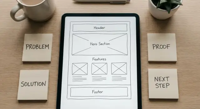
Your hero section has one job: help the right person instantly recognize “this is for me” and know what to do next. If it tries to explain everything, it usually explains nothing.
Aim for problem outcome + audience, not a feature list. People don’t wake up wanting “AI-powered dashboards”—they want fewer mistakes, faster turnaround, clearer decisions.
Examples:
Your subheadline should answer: How do you get me to that outcome? Keep it concrete and jargon-free.
Example patterns:
Give visitors a single obvious next step. If you offer five buttons, you’ve made them do work.
Keep the primary CTA visually dominant, and make sure both CTAs match what you actually want users to do on this page.
Prefer a screenshot, short loop, or simple mock flow that shows:
Avoid abstract art that forces people to guess what the tool is.
A qualifier sets expectations and saves support time. Keep it friendly and specific:
When the hero is clear, the rest of the page can earn trust and detail—without having to rescue confusion.
People don’t buy “features.” They buy a clearer next step. Your job is to make the tool feel easy to start and predictable to finish.
Use a simple 3-step flow that mirrors what users will actually do:
Keep this section near the top so users don’t have to “read the whole page” to understand the point.
For each key feature, finish the sentence: “So you can…” and tie it back to the pain you introduced earlier.
Then make the outcome concrete: “After using the tool, you go from guessing and rework to a clean result you can use right away.”
State what it does and does not do in plain language. Example: “It generates the output and checks for common errors. It does not replace a human review for edge cases.”
Include a small UI element near your primary message (for example, “How it works ↓”) that jumps to the 3-step explanation, so hesitant users can self-educate without hunting.
Most tool websites list features because they feel “objective.” But people buy outcomes: less risk, fewer mistakes, less time spent, more confidence. A Pain → Benefit → Feature map helps you translate what the tool does into what the user gets.
Start with the user’s pain in their own words. Next, describe the benefit as an observable outcome. Finally, attach the feature(s) that make that outcome possible.
| User pain (what they hate) | Benefit (what improves) | Feature (how it works) |
|---|---|---|
| “I keep re-checking my work because I don’t trust the result.” | Confidence you can act on without double-checking. | Validation rules + clear error messages. |
| “This takes me an hour every time.” | Finish in 10 minutes with fewer steps. | Templates + bulk actions + saved defaults. |
| “I’m worried I’ll share the wrong version.” | Fewer mix-ups and clearer handoffs. | Version history + naming conventions + exports. |
Swap generic words like “easy” and “fast” for measurable or observable results: “set up in 3 steps,” “catch missing fields before you submit,” “share a clean report your team can read.” If you can’t measure it, show it.
Use short, concrete lines: “Before you tracked changes in a spreadsheet; now you see them automatically in one place.” Keep each benefit scannable—one sentence, one idea.
Benefits belong on the main landing page. Deep technical details (integrations, encryption specifics, API behavior) should live on dedicated pages like /docs or /security, so the main story stays clear and readable.
Problem–solution messaging lands better when you back it up with evidence people can quickly judge. The goal isn’t to “prove everything.” It’s to reduce uncertainty so visitors feel safe taking the next step.
Pick proof types that directly support the core claim on the page:
When you use numbers, keep the language honest: “typical,” “example,” and “varies by use case” signal you’re not promising the same results for everyone.
Logos can help, but only if you have permission. If you don’t, skip them—forced logo strips can feel manipulative. Instead, lean on concrete specifics: job titles, industries, and real scenarios.
A screenshot or short clip can do what paragraphs can’t: show the workflow and the outcome. Aim for “here’s what you’ll see after step 1” rather than a glossy montage. The best demos map to the main user pain point (speed, clarity, fewer mistakes).
Add a compact FAQ near the primary CTA. Focus on the questions that block action:
Keep it short, specific, and consistent with your proof—trust grows when everything lines up.
Objections aren’t a separate “FAQ section” you tack on at the end. Place the reassurance right next to the moment the doubt appears: near pricing, next to the first CTA, under the data upload step, or beside claims about results.
If the first reaction is “Is this worth it?”, make the trade-off concrete. Explain what the user saves (time, errors, back-and-forth) and give a simple way to start small—like a limited free plan or a low-commitment trial—so they can validate value before paying.
If you’re doing X today (manual spreadsheets and copy/paste), here’s how we help: we automate the repetitive steps and deliver a ready-to-use output in minutes.
Spell out setup time and prerequisites so it feels predictable. Example: “Most people get their first result in 10–15 minutes.” List what’s required: a browser, an email, and the data source (CSV, URL, or connected account). If there’s any admin approval or permissions needed, say so upfront.
Users worry about breaking a workflow that already works “well enough.” Reduce risk with parallel-run positioning: they can try your tool on one project first, export results, and only then decide to migrate.
If you’re doing X today (using three tools and stitching results), here’s how we help: we replace the handoffs with one simple flow and keep exports compatible with what you already use.
Avoid vague promises. Define what “accurate” means in your context (validation checks, error flags, confidence indicators, revision history) and describe how users can review and correct outcomes before they act on them.
Say what you do with their data in plain language: what’s stored, what’s not, and how long. Mention access controls (role-based permissions), encryption, and whether users can delete data on demand—without exaggerating.
A call to action isn’t just a button—it’s a commitment you’re asking someone to make. If the ask is bigger than the visitor’s confidence, they’ll hesitate, bounce, or “save it for later.” The fix is to match the CTA to how ready they are right now.
Choose a single “main ask” and make everything else support it. Examples: start a trial, book a demo, request a quote, download the tool, or contact sales. When a page has multiple competing primary buttons, the message blurs and decision-making slows.
Not everyone is ready to try or buy. Add smaller steps that still move the story forward, such as:
These are especially useful for visitors who agree with the problem but need proof before committing.
Use the same CTA wording and style in the hero, mid-page, and at the bottom so it feels like one clear path. “Start free trial” and “Get started” can mean different things—pick one phrase and stick with it.
Reduce unnecessary effort (fewer fields, no surprises), but keep enough structure to set expectations. If a demo request needs a work email, say so. If a trial requires a credit card, state it near the button.
After a click or form submit, show confirmation messaging that answers: Did it work? What will happen next? When will they hear back? This tiny moment is where trust either grows—or evaporates.
Your site structure should follow the same problem–solution narrative as your copy. If visitors have to hunt for “what this is” or “how much it costs,” they’ll create their own story—and it won’t be kind.
Start with a small set of pages you can keep consistent and up to date:
Keep top navigation limited (think 4–6 items). If everything is “important,” nothing is.
Use a single general homepage when:
Use dedicated landing pages when:
Each use case page should mirror your main framework:
Treat your pages like signposts. After proof sections, nudge visitors toward “Pricing.” After “How it works,” nudge toward “Docs” or “Get started.” You can do this with buttons and short cues (e.g., “Next: see pricing”) without cluttering navigation.
Before you redesign pages or buy traffic, make sure your message is doing its job: helping a stranger understand the problem, the solution, and why they should trust you—fast.
Define the one sentence you want visitors to repeat back to you after a quick glance. Keep it plain and specific:
If you can’t write that sentence without using buzzwords, the page won’t feel clear to first-time visitors.
Show someone your hero section for five seconds (headline, subhead, primary CTA). Then ask:
If they answer with a feature (“it has dashboards”) instead of an outcome (“it helps me finish X faster”), your framing needs work.
Do a quick “problem → solution → proof” scan. Every major block should support the story arc.
A practical check: read only your headings and CTA labels from top to bottom. If the narrative breaks, visitors will break with it.
Start with the highest-impact elements:
Change one thing at a time, or you won’t know what caused the lift.
You don’t need a complex dashboard to learn:
When clicks are high but completion is low, your message may be fine—your next step is too hard.
Use this as a starting point, then adjust the order based on what your buyers ask most often.
Hero
Problem (recognition)
Why current options fail
How it works (3 steps)
Key benefits (not features)
Proof
Pricing preview
FAQ (objections)
Final CTA
Keep iterating using real questions from support tickets and sales calls. If people ask the same thing twice, your page should answer it once, clearly.
If your tool is itself a “build software faster” platform, the same framing applies. For example, Koder.ai positions well when the problem is explicit (slow, expensive development cycles) and the solution is explained as a predictable flow (chat → plan → generate an app you can deploy or export), with pricing clarity across free, pro, business, and enterprise tiers.
Problem–solution framing is a message structure that starts with the visitor’s situation and ends with a clear next step: problem → impact → promise → how it works → CTA. It helps the right users recognize themselves fast and understand what changes after using your tool—without reading a full feature tour.
Because first-time visitors are trying to answer one question quickly: “Is this for me?” Leading with a precise problem and outcome reduces decision effort. Feature-first pages force people to translate features into value, and many will leave before they connect the dots.
Pick 1–2 primary user types most likely to succeed right now, then write a boundary:
Excluding audiences doesn’t shrink your market as much as it sharpens your message (and reduces bad-fit signups).
Use a simple “job to be done” sentence:
When [trigger], I want to [make progress], so I can [benefit].
Example: “When a client asks for results, I want to turn messy data into a clean report, so I can show progress without losing a day.” This gives you a concrete outcome to anchor the headline, proof, and CTA.
Steal (ethically) from real language:
Collect repeated phrases about frustration, time pressure, and what “good” looks like. Then mirror those words in your problem statement and benefits.
A reusable two-line structure is:
When [audience] tries to [important job], they get stuck with [recognizable symptoms], which leads to [time/money/risk impact].
They’ve tried [common workaround], but it still causes [core pain]—so progress feels harder than it should.
Keep it specific and observable (avoid drama and unsupported numbers).
Your hero should do three things immediately:
A helpful pattern is “Outcome—for audience” + a subheadline like “Upload X, choose Y, export Z.”
Use a simple input → process → output flow:
Then translate features into benefits by ending each line with (e.g., “Saved presets—so repeated tasks take seconds, not a full setup”).
Add boundaries and proof that match your promise:
Match the ask to the visitor’s confidence level:
Be explicit about friction before the click (credit card, work email, permissions), and confirm what happens next after submission so the moment feels reliable.
Trust grows when claims, examples, and limits align.