Sep 24, 2025·8 min
How to Build a Tools Comparison and Decision Guide Website
Learn how to plan, build, and grow a tools comparison and decision guide website—from content structure and data models to SEO, UX, and monetization.
Learn how to plan, build, and grow a tools comparison and decision guide website—from content structure and data models to SEO, UX, and monetization.
Before you build a tools comparison website, decide exactly who you’re helping and what “success” looks like. A decision guide that tries to serve everyone usually ends up serving no one.
Start with one clear primary reader. Give them a job title, constraints, and a real situation:
This clarity determines what your product comparison table should emphasize. A freelancer may care about price and simplicity; an IT admin may prioritize security, SSO, and admin controls. Your feature matrix should reflect the reader’s decision criteria—not every feature a tool has.
Pick a narrow tool category first (e.g., “meeting transcription tools” rather than “productivity software”). A tighter niche makes tool reviews easier to write with authority and makes SEO for comparison pages more focused.
Next, define your desired outcomes:
Be honest here, because it affects your content style, CTAs, and affiliate disclosure placement.
Track a small set of metrics that map to your goals:
With a clear audience and measurable goals, every later decision—site structure, UX, and data collection for software tools—gets easier and more consistent.
A tools comparison website succeeds when it’s narrowly helpful. “All business software” is too broad to maintain and too vague to rank. Instead, pick a niche where people actively compare options and feel real switching pain—then build a structure that matches how they decide.
Start with a defined audience and a moment of decision. Good niches usually have:
Examples: “email marketing tools for Shopify stores,” “project management tools for agencies,” or “accounting tools for freelancers.” The more specific the niche, the easier it is to create meaningful comparisons and high-trust tool reviews.
Before you plan pages, write down the criteria your readers care about—not what vendors advertise. Typical criteria include price, ease of use, integrations, support, and setup time. Add niche-specific criteria too (e.g., “HIPAA compliance” for healthcare, “multi-store support” for ecommerce).
This list becomes your consistent product comparison table and feature matrix across the site, so users can quickly scan and feel confident.
Most niches still need structure. Create clear subcategories and “best for” use cases, such as:
These become your category hubs and future SEO for comparison pages.
Consistency helps users and search engines. Pick patterns and stick to them:
A simple, scalable structure looks like:
This architecture keeps the decision flow obvious: discover options → shortlist → compare → choose.
A comparison site lives or dies by consistency. Before you write reviews or build tables, decide what “a tool” means on your site and how you’ll compare one tool to another in a way readers can trust.
Start with a single tool profile structure you’ll use everywhere. Keep it detailed enough to power filters and tables, but not so bloated that updates become painful. A practical baseline includes:
Pick fields that match how people decide. Aim for a mix of:
Tip: keep a small set of “universal” fields across all tools, then add category-specific fields (e.g., “team inbox” for help desks, “version history” for writing tools).
Unknowns happen—vendors don’t publish details, features ship quietly, pricing changes mid-month. Define a rule like:
If you use scores or badges (“Best for teams”, “Budget pick”), document the criteria. Keep it simple: what qualifies, what disqualifies, and what evidence is required. Consistent rules prevent “score drift” as you add more tools—and they make your recommendations feel fair, not arbitrary.
If your site is successful, the hardest part won’t be writing pages—it’ll be keeping everything accurate as tools change pricing, rename plans, or add features. A simple data model turns updates from “edit 20 pages” into “change one record and everything refreshes.”
Begin with a spreadsheet (or Airtable/Notion) if you’re validating the idea. It’s fast, easy to collaborate on, and forces you to decide what fields you truly need.
When you outgrow it (more tools, more categories, more editors), migrate the same structure into a CMS or database so you can power comparison pages automatically.
Comparison sites break when everything is stored as free text. Instead, define a few reusable entities and how they connect:
This tool ↔ category ↔ feature ↔ pricing plan setup lets you reuse the same feature definitions across many tools and avoids mismatched wording.
Even before you think about “SEO for comparison pages,” capture the fields you’ll want on every page:
These fields make your pages easier to scan and help readers trust the content.
Decide what counts as a “material change” (pricing, key feature, limitations) and how you’ll show it.
At minimum, store:
Transparency reduces support emails and helps your site feel dependable as it grows.
Once your data model is taking shape, lock in the page types you’ll publish. Clear templates keep the site consistent, make updates faster, and help readers move from “just browsing” to a confident decision.
1) Category hub pages
These are your “browse and narrow down” entry points (e.g., Email Marketing Tools, Accounting Software). A good hub includes a short overview, a handful of recommended picks, and a simple filterable product comparison table. Add obvious paths into deeper research: “Compare top tools” and “Take the quiz.”
2) Tool detail pages
A tool page should answer: what it is, who it’s for, what it costs, and where it shines (and doesn’t). Keep the structure repeatable: summary, key features, pricing, integrations, pros/cons, screenshots (optional), and FAQs. This is also where readers expect a clear CTA like “Visit site” or “Get pricing.”
3) Comparison pages
Your head-to-head pages (Tool A vs Tool B vs Tool C) should lead with a concise verdict, then a standardized feature matrix so readers can scan quickly. Include common decision factors (price tiers, key features, support, onboarding, limitations) and end with next steps: “Compare,” “Shortlist,” or “Request a demo.”
4) Decision guide pages
These are “choose the right tool for your situation” guides. Think: “Best CRM for freelancers” or “How to pick a password manager for a small team.” They’re less about exhaustive specs and more about matching needs to options.
Build credibility into every page type with reusable blocks: a short “How we evaluate” snippet, visible last-updated dates, and links to your methodology, sources, and editorial policy (e.g., /methodology, /editorial-policy). If you use affiliate links, include a clear disclosure (and link to /affiliate-disclosure).
Create components you can drop anywhere: a comparison table module, feature list cards, FAQ blocks, and a consistent CTA bar (e.g., “Add to shortlist,” “See alternatives,” “Visit site”). Reuse is what keeps your tools comparison website scalable without feeling repetitive.
Your tech stack should fit how your team actually works. The goal isn’t to pick the fanciest option—it’s to publish trustworthy comparisons quickly, keep them updated, and avoid breaking pages every time you add a new tool.
If you’re a small team (or solo), a CMS or no-code setup can get you live fast:
A simple rule: if your comparisons are mostly editorial with a few tables, use a CMS; if your site is primarily a searchable database, consider a custom build (or a CMS + custom frontend).
If you want the flexibility of a custom build without a long build cycle, a vibe-coding platform like Koder.ai can help you prototype and ship a comparison site from a chat-based workflow—typically with a React frontend and a Go + PostgreSQL backend—then export the source code when you’re ready to own the stack.
Comparison sites often fail on speed because tables, icons, and scripts pile up. Keep the foundation light:
Fast load times aren’t just nice—they directly affect SEO and conversions.
Help visitors understand where they are and where to go next:
Don’t wait until after launch to measure what matters. Define events like:
Set this up early so you can improve pages based on real behavior instead of guesses. For next steps, see /blog/analytics-and-conversion-improvements.
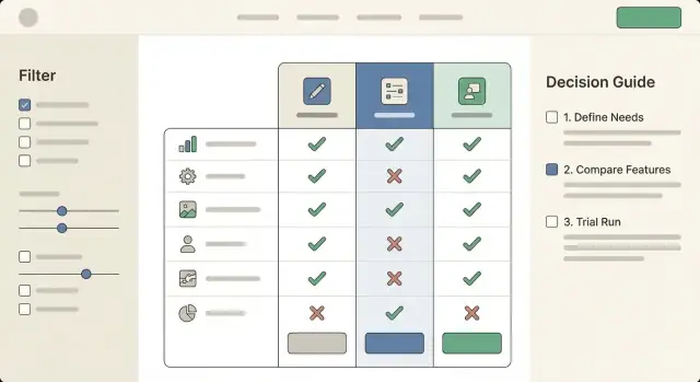
A comparison site wins or loses on clarity. People arrive with a goal (“pick something that works for my budget and team”), not a desire to study a spreadsheet. Your UX should help them narrow quickly, then confirm their choice with just enough detail.
Tables should scan well on both desktop and mobile.
Use sticky headers so the tool names and key columns stay visible while scrolling. Add a subtle column highlight on hover/tap (and when a column is focused via keyboard) to reduce “lost in the grid” moments.
Group rows into meaningful sections—e.g., Basics, Integrations, Security, Support—instead of one long list. Within each group, keep labels short and consistent (“SSO” vs “Single sign-on” vs “SAML” everywhere).
Avoid filters that mirror your database; match how people think. Common high-intent filters include budget, platform, team size, and a small set of “must-haves” (e.g., “works with Google Workspace”).
Keep filters forgiving: show how many tools remain, offer a one-click Reset, and don’t hide results behind an “Apply” button unless performance requires it.
Many visitors don’t want to compare 20 options. Offer a short “picker” path: 3–5 questions max, then show a ranked shortlist.
On every tool card or tool page, include a clear “Recommended for” summary (2–4 bullets) plus “Not ideal for” to set expectations. This reduces regret and improves trust.
Support keyboard navigation across filters and tables, maintain strong contrast, and use clear labels (avoid icon-only meaning). If you use color for “good/better/best,” provide text equivalents and ARIA labels so the comparison works for everyone.
Your content is the product. If readers sense you’re summarizing vendor marketing or forcing a “winner,” they’ll bounce—and they won’t return. High-trust comparison writing helps people make a decision, even when the answer is “it depends.”
Before listing tools, write a short intro that helps readers choose their criteria. Explain what typically matters in this category (budget, team size, integrations, learning curve, security, support, time-to-setup) and which trade-offs are common.
A good pattern is: “If you care most about X, prioritize Y. If you need Z, expect higher cost or setup effort.” This turns your page into a decision guide, not a catalog.
For every tool, keep the same structure so readers can compare quickly:
Consistency makes your comparisons feel fair—even when you have preferences.
Replace “best” and “fastest” with specifics: “best for teams that need…,” “fast for simple workflows, slower when…”. When you reference performance, pricing, or feature availability, explain where you got it: vendor docs, public pricing pages, your own test account, or user feedback.
Add “Last reviewed” timestamps on every comparison and review. Publish your editorial update cadence (monthly for pricing, quarterly for features, immediate updates for major product changes). If a tool changes materially, note what changed and when.
SEO for a tools comparison website is mostly about matching purchase-intent searches and making it easy for both readers and search engines to understand your structure.
Build your keyword list around queries that signal evaluation:
Each page should answer the intent quickly: who it’s for, what’s being compared, and what the recommended pick is (with a brief why).
Use internal links to guide readers through evaluation steps:
Hub → tool pages → comparisons → decision guides
For example, a category hub like /email-marketing links to individual tool pages like /tools/mailchimp, which link to /compare/mailchimp-vs-klaviyo and /alternatives/mailchimp, and finally into decision flows like /guides/choose-email-tool.
This structure helps search engines understand topical relationships and helps users keep moving toward a choice.
Add FAQ schema on pages that genuinely include Q&A sections. Consider Product schema only if you can provide accurate, specific product data and you’re eligible for it (don’t force it). Keep the content readable first; schema should reflect what’s already on the page.
Plan supporting articles in /blog that target informational queries and funnel readers to comparison pages. Examples: “How to choose a CRM for freelancers,” “What is a feature matrix?,” or “Common mistakes when switching tools.” Each post should link to the relevant hub (/crm), comparisons, and decision guides—without overstuffing anchors or repeating the same phrasing.
Monetization is part of the job—users understand that comparison sites need to pay the bills. What they won’t forgive is feeling tricked. The goal is to earn revenue while making it obvious when money is involved, and keeping your recommendations independent.
Be explicit about how you make money. Common models for a tools comparison website include affiliate links (commissions on purchases), sponsorships (paid placements or ads), and lead generation (paid qualified referrals or demo requests).
A simple note in your header/footer and a short line near key CTAs is often enough: “Some links are affiliate links. If you buy, we may earn a commission—at no extra cost to you.” Avoid vague wording that hides the relationship.
A disclosure page is necessary, but not sufficient.
Your credibility is your moat. To protect it:
You can measure performance accurately while staying honest.
Track revenue per page and per click using labeled outbound events (e.g., “affiliate_outbound_click”) and map them to page templates (best pages vs. individual reviews). Use this data to improve clarity and relevance—stronger intent matching typically raises conversion optimization without gimmicks.
If you’re testing CTA text or button placement, avoid anything that implies endorsement you can’t back up (e.g., “#1 guaranteed”). Trust compounds faster than short-term clicks.
Analytics isn’t just “traffic reporting” for a tools comparison website—it’s how you learn which parts of your tables and decision flows actually help people choose.
Set up event tracking for the interactions that matter most:
These events let you answer practical questions like: “Do people use the feature matrix, or do they skip straight to pricing?” and “Which filter combinations lead to outbound clicks?”
Build simple funnels such as:
Then segment by device. Mobile users often drop during table scrolling, sticky headers, or long filter panels. If you see a big fall-off after “table view,” test clearer tap targets, fewer default columns, and a more obvious “shortlist” action.
Prioritize tests that affect comprehension and confidence:
Keep one primary metric (qualified outbound clicks) and one guardrail metric (bounce rate or time-to-first-interaction).
Create a lightweight dashboard for: top pages, outbound clicks by source, filter usage, device split, and funnel conversion. Review weekly, pick one improvement, ship it, and re-check the trend the following week.
A comparison site is only as useful as its freshness. If your tables and “best” pages drift out of date, trust drops fast—especially when pricing, features, and plans change every quarter.
Treat updates like a recurring editorial job, not an emergency.
Keep a short internal checklist for each tool page so updates stay consistent: “pricing verified,” “screenshots reviewed,” “features re-confirmed,” “pros/cons adjusted,” and “last updated” date.
Put a small link near your comparison table and tool pages: “Suggest an update.” Route it to a form that captures:
Publish a clear correction policy (“We verify and update within X business days”). When you fix something, note it in a lightweight changelog on the page. This creates accountability without turning the site into a forum.
It’s tempting to add new categories quickly, but every new category multiplies maintenance.
A good rule: don’t launch a category until you can commit to updating its top tools on schedule (and you have a repeatable data collection process). If you can’t keep 15–30 tools current, start smaller with fewer, better-maintained entries.
Original research and small utilities give you defensible value beyond affiliate links.
Examples:
These assets attract references from other sites and keep your pages useful even when vendors change their marketing claims.
Start by defining one primary reader (role, budget, use case). Then pick a narrow category with clear buying intent (e.g., “meeting transcription tools” instead of “productivity software”) and define what success means for the site (affiliate clicks, email signups, demo requests).
Choose criteria your audience actually uses to decide: price, ease of use, integrations, support, setup time, and a few niche-specific requirements (like HIPAA, SSO/SAML, multi-store support). Keep a small universal set across all tools, then add category-specific fields where needed.
Use a consistent architecture:
This matches the natural flow: discover → shortlist → compare → choose.
Create a standard tool profile template with fields you can reuse everywhere:
This makes tables, filters, and updates much easier.
Make unknowns explicit and consistent:
This protects trust and reduces contradictions across pages.
Model the site like a database so updates don’t require editing many pages:
Design tables for scanning and mobile:
Readable tables reduce bounce and improve conversion.
Use high-intent filters that reflect how people decide:
Make filters forgiving: show remaining results, include a one-click reset, and avoid forcing an “Apply” button unless performance requires it.
Build trust through consistency and evidence:
Track behavior that maps to your goals:
Then run simple funnels (land → filter → view tool → click out) and segment by device to find mobile drop-offs. Use A/B tests on table layout and CTA labels, with one primary metric (qualified outbound clicks) and one guardrail metric (bounce rate or time-to-first-interaction).
This structure powers consistent comparisons and filtering.