Dec 23, 2025·8 min
How to Build a Web App for Segmentation and Cohort Analysis
A practical, step-by-step guide to building a web app for customer segmentation and cohort analysis: data model, pipelines, UI, metrics, and deployment.
A practical, step-by-step guide to building a web app for customer segmentation and cohort analysis: data model, pipelines, UI, metrics, and deployment.
Before you design tables or pick tools, get specific about what questions the app must answer. “Segmentation and cohorts” can mean many things; clear use cases prevent you from building a feature-rich product that still doesn’t help anyone make decisions.
Start by writing the exact decisions people want to make and the numbers they trust to make them. Common questions include:
For each question, note the time window (daily/weekly/monthly) and the granularity (user, account, subscription). This keeps the rest of the build aligned.
Identify the primary users and their workflows:
Also capture practical needs: how often they check dashboards, what “one click” means to them, and what data they consider authoritative.
Define a minimum viable version that answers the top 2–3 questions reliably. Typical MVP scope: core segments, a few cohort views (retention, revenue), and shareable dashboards.
Save “nice to have” items for later, such as scheduled exports, alerts, automations, or complex multi-step segment logic.
If speed-to-first-version is critical, consider scaffolding the MVP with a vibe-coding platform like Koder.ai. You can describe the segment builder, cohort heatmap, and basic ETL needs in chat and generate a working React frontend plus a Go + PostgreSQL backend—then iterate with planning mode, snapshots, and rollback as stakeholders refine definitions.
Success should be measurable. Examples:
These metrics become your north star when trade-offs appear later.
Before you design screens or write ETL jobs, decide what “a customer” and “an action” mean in your system. Cohort and segmentation results are only as trustworthy as the definitions underneath them.
Pick one primary identifier and document how everything maps to it:
Be explicit about identity stitching: when do you merge anonymous and known profiles, and what happens if a user belongs to multiple accounts?
Start with the sources that answer your use cases, then add more as needed:
For each source, note the system of record and refresh cadence (real-time, hourly, daily). This prevents “why don’t these numbers match?” debates later.
Set a single time zone for reporting (often the business time zone or UTC) and define what “day,” “week,” and “month” mean (ISO weeks vs. Sunday-start weeks). If you handle revenue, choose currency rules: stored currency, reporting currency, and exchange-rate timing.
Write down definitions in plain language and reuse them everywhere:
Treat this glossary as a product requirement: it should be visible in the UI and referenced in reports.
A segmentation app lives or dies by its data model. If analysts can’t answer common questions with a simple query, every new segment turns into a custom engineering task.
Use a consistent event structure for everything you track. A practical baseline is:
event_name (e.g., signup, trial_started, invoice_paid)timestamp (store in UTC)user_id (the actor)properties (JSON for flexible details like utm_source, device, feature_name)Keep event_name controlled (a defined list), and keep properties flexible—but document expected keys. This gives you consistency for reporting without blocking product changes.
Segmentation is mostly “filter users/accounts by attributes.” Put those attributes in dedicated tables rather than only in event properties.
Common attributes include:
This lets non-experts build segments like “SMB users in EU on Pro acquired via partner” without hunting through raw events.
Many attributes change over time—especially plan. If you only store the current plan on the user/account record, historical cohort results will drift.
Two common patterns:
account_plan_history(account_id, plan, valid_from, valid_to).Pick one intentionally based on query speed vs. storage and complexity.
A simple, query-friendly core model is:
user_id, account_id, event_name, timestamp, properties)user_id, created_at, region, etc.)account_id, plan, industry, etc.)This structure maps cleanly to both customer segmentation and cohort/retention analysis, and it scales as you add more products, teams, and reporting needs.
Cohort analysis is only as trustworthy as its rules. Before you build the UI or optimize queries, write down the exact definitions your app will use so every chart and export matches what stakeholders expect.
Start by selecting which cohort types your product needs. Common options include:
Each type must map to a single, unambiguous anchor event (and sometimes a property), because that anchor determines cohort membership. Decide whether cohort membership is immutable (once assigned, never changes) or can change if historical data is corrected.
Next, define how you calculate the cohort index (the columns like week 0, week 1…). Make these rules explicit:
Small choices here can shift numbers enough to cause “why doesn’t this match?” escalations.
Define what each cohort table cell represents. Typical metrics include:
Also specify the denominator for rate metrics (e.g., retention rate = active users in week N ÷ cohort size at week 0).
Cohorts get tricky at the edges. Decide rules for:
Document these decisions in plain language; your future self (and your users) will thank you.
Your segmentation and cohort analysis are only as trustworthy as the data flowing in. A good pipeline makes data predictable: same meaning, same shape, and the right level of detail every day.
Most products use a mix of sources so teams aren’t blocked by one integration path:
A practical rule: define a small set of “must-have” events that power core cohorts (e.g., signup, first value action, purchase), then expand.
Add validation as close to ingestion as possible so bad data doesn’t spread.
Focus on:
When you reject or fix records, write the decision to an audit log so you can explain “why the numbers changed.”
Raw data is inconsistent. Transform it into clean, consistent analytics tables:
Run jobs on a schedule (or streaming) with clear operational guardrails:
Treat the pipeline like a product: instrument it, watch it, and keep it boringly reliable.
Where you store analytics data determines whether your cohort dashboard feels instant or painfully slow. The right choice depends on data volume, query patterns, and how quickly you need results.
For many early-stage products, PostgreSQL is enough: it’s familiar, cheap to operate, and supports SQL well. It works best when your event volume is moderate and you’re careful with indexing and partitioning.
If you expect very large event streams (hundreds of millions to billions of rows) or many concurrent dashboard users, consider a data warehouse (e.g., BigQuery, Snowflake, Redshift) for flexible analytics at scale, or an OLAP store (e.g., ClickHouse, Druid) for extremely fast aggregations and slicing.
A practical rule: if your “retention by week, filtered by segment” query takes seconds in Postgres even after tuning, you’re nearing warehouse/OLAP territory.
Keep raw events, but add a few analytics-friendly structures:
This separation lets you recompute cohorts/segments without rewriting your entire events table.
Most cohort queries filter by time, entity, and event type. Prioritize:
(event_name, event_time))Dashboards repeat the same aggregations: retention by cohort, counts by week, conversions by segment. Precompute these on a schedule (hourly/daily) into summary tables so the UI reads a few thousand rows—not billions.
Keep raw data available for drill-down, but make your default experience rely on fast summaries. This is the difference between “explore freely” and “wait for a spinner.”
A segment builder is where segmentation succeeds or fails. If it feels like writing SQL, most teams won’t use it. Your goal is a “question builder” that lets someone describe who they mean, without needing to know how the data is stored.
Start with a small set of rule types that map to real questions:
Country = United States, Plan is Pro, Acquisition channel = AdsTenure is 0–30 days, Revenue last 30 days > $100Used Feature X at least 3 times in the last 14 days, Completed onboarding, Invited a teammateRender each rule as a sentence with dropdowns and friendly field names (hide internal column names). Where possible, show examples (e.g., “Tenure = days since first sign-in”).
Non-experts think in groups: “US and Pro and used Feature X,” plus exceptions like “(US or Canada) and not churned.” Keep it approachable:
Let users save segments with a name, description, and optional owner/team. Saved segments should be reusable across dashboards and cohort views, and versioned so changes don’t silently alter old reports.
Always show an estimated or exact segment size right in the builder, updating as rules change. If you use sampling for speed, be explicit:
Also show what’s included: “Users counted once” vs “events counted,” and the time window used for behavioral rules.
Make comparisons a first-class option: pick Segment A vs Segment B in the same view (retention, conversion, revenue). Avoid forcing users to duplicate charts.
A simple pattern: a “Compare to…” selector that accepts another saved segment or an ad-hoc segment, with clear labels and consistent colors across the UI.
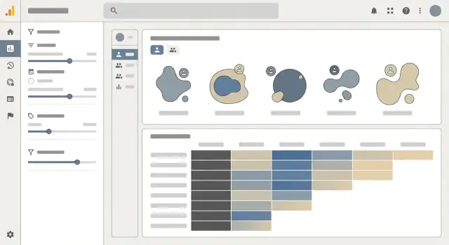
A cohort dashboard succeeds when it answers one question quickly: “Are we retaining (or losing) people, and why?” The UI should make patterns obvious, then let readers drill into the details without needing to understand SQL or data modeling.
Use a cohort heatmap as the core view, but label it like a report—not a puzzle. Each row should clearly show cohort definition and size (e.g., “Week of Oct 7 — 3,214 users”). Each cell should support switching between retention % and absolute counts, because percentages hide scale and counts hide rate.
Keep column headers consistent (“Week 0, Week 1, Week 2…” or actual dates), and show the cohort size next to the row label so the reader can judge confidence.
Add tooltips on every metric label (Retention, Churn, Revenue, Active users) that state:
A short tooltip beats a long help page; it prevents misinterpretation at the moment of decision.
Put the most common filters above the heatmap and make them reversible:
Show active filters as chips and include a one-click “Reset” so people aren’t afraid to explore.
Provide CSV export for the current view (including filters and whether the table is showing % or counts). Also offer shareable links that preserve the configuration. When sharing, enforce permissions: a link should never expand access beyond what the viewer already has.
If you include a “Copy link” action, show a brief confirmation and link to /settings/access for managing who can see what.
Segmentation and cohort analysis tools often touch customer data, so security and privacy can’t be an afterthought. Treat them as product features: they protect users, reduce support burden, and keep you compliant as you scale.
Start with authentication that fits your audience (SSO for B2B, email/password for SMB, or both). Then enforce simple, predictable roles:
Keep permissions consistent across the UI and API. If an endpoint can export cohort data, the UI permission alone isn’t enough—enforce checks server-side.
If your app supports multiple workspaces/clients, assume “someone will try to see another workspace’s data” and design for isolation:
This prevents accidental cross-tenant leakage, especially when analysts create custom filters.
Most segmentation and retention analysis works without raw personal data. Minimize what you ingest:
Also encrypt data at rest and in transit, and store secrets (API keys, database credentials) in a proper secrets manager.
Define retention policies per workspace: how long to keep raw events, derived tables, and exports. Implement deletion workflows that actually remove data:
A clear, documented workflow for retention and user deletion requests is as important as the cohort charts themselves.
Testing an analytics app isn’t only about “does the page load?” You’re shipping decisions. A small math mistake in cohort retention or a subtle filtering bug in segmentation can mislead an entire team.
Start with unit tests that verify your cohort calculations and segment logic using small, known fixtures. Create a tiny dataset where the “right answer” is obvious (e.g., 10 users sign up in week 1, 4 return in week 2 → 40% retention). Then test:
These tests should run in CI so every change to query logic or aggregations is checked automatically.
Most analytics failures are data failures. Add automated checks that run on every load or at least daily:
When a check fails, alert with enough context to act: which event, which time window, and how far it deviated from baseline.
Run performance tests that mimic real usage: large date ranges, multiple filters, high-cardinality properties, and nested segments. Track p95/p99 query times and enforce budgets (e.g., segment preview under 2 seconds, dashboard under 5 seconds). If tests regress, you’ll know before the next release.
Finally, do user acceptance testing with product and marketing teammates. Collect a set of “real questions” they ask today and define expected answers. If the app can’t reproduce trusted results (or explain why it differs), it’s not ready to ship.
Shipping your segmentation and cohort analysis app is less about a “big launch” and more about setting up a safe loop: release, observe, learn, and refine.
Pick the path that matches your team’s skills and your app’s needs.
Managed hosting (e.g., a platform that deploys from Git) is often the fastest way to get reliable HTTPS, rollbacks, and autoscaling with minimal ops work.
Containers are a good fit when you need consistent runtime behavior across environments or you expect to move between cloud providers.
Serverless can work well for spiky usage (e.g., dashboards used mostly during business hours), but be mindful of cold starts and long-running ETL jobs.
If you want an end-to-end path from prototype to production without rebuilding your stack later, Koder.ai supports generating the app (React + Go + PostgreSQL), deploying and hosting it, attaching custom domains, and using snapshots/rollback to reduce risk during iterations.
Use three environments: dev, staging, and production.
In dev and staging, avoid using raw customer data. Load safe sample datasets that still resemble production shape (same columns, same event types, same edge cases). This keeps testing realistic without creating privacy headaches.
Make staging your “dress rehearsal”: production-like infrastructure, but isolated credentials, isolated databases, and feature flags to test new cohort rules.
Monitor what breaks and what slows down:
Add simple alerts (email/Slack) for failed ETL runs, rising error rates, or a sudden spike in query timeouts.
Plan monthly (or biweekly) releases based on feedback from non-expert users: confusing filters, missing definitions, or “why is this user in this cohort?” questions.
Prioritize additions that unlock new decisions—new cohort types (e.g., acquisition channel, plan tier), better UX defaults, and clearer explanations—without breaking existing reports. Feature flags and versioned calculations help you evolve safely.
If your team shares learnings publicly, note that some platforms (including Koder.ai) offer programs where you can earn credits for creating content about your build or referring other users—useful if you’re iterating fast and want to keep experimentation costs low.
Start with 2–3 specific decisions the app must support (e.g., week-1 retention by channel, churn risk by plan), then define:
Build the MVP to answer those reliably before adding alerts, automations, or complex logic.
Write definitions in plain language and reuse them everywhere (UI tooltips, exports, docs). At minimum, define:
Then standardize , , and so charts and CSVs match.
Pick a primary identifier and explicitly document how others map to it:
user_id for person-level retention/usageaccount_id for B2B rollups and subscription metricsanonymous_id for pre-signup behaviorDefine when identity stitching occurs (e.g., on login), and what happens with edge cases (one user in multiple accounts, merges, duplicates).
A practical baseline is an events + users + accounts model:
event_name, timestamp (UTC), , , (JSON)If attributes like plan or lifecycle status change over time, storing only the “current” value will make historical cohorts drift.
Common approaches:
plan_history(account_id, plan, valid_from, valid_to)Choose based on whether you prioritize query speed or storage/ETL simplicity.
Pick cohort types that map to a single anchor event (signup, first purchase, first key feature use). Then specify:
Also decide whether cohort membership is immutable or can change if late/corrected data arrives.
Decide up front how you handle:
Put these rules in tooltips and export metadata so stakeholders can interpret results consistently.
Start with ingestion paths that match your sources of truth:
Add validation early (required fields, timestamp sanity, dedupe keys) and keep an audit log of rejects/fixes so you can explain number changes.
For moderate volumes, PostgreSQL can work with careful indexing/partitioning. For very large event streams or heavy concurrency, consider a warehouse (BigQuery/Snowflake/Redshift) or an OLAP store (ClickHouse/Druid).
To keep dashboards fast, precompute common results into:
segment_membership (with validity windows if membership changes)Use simple, predictable RBAC and enforce it server-side:
For multi-tenant apps, include everywhere and apply row-level scoping (RLS or equivalent). Minimize PII, mask by default, and implement deletion workflows that remove raw and derived data (or mark aggregates stale for refresh).
user_idaccount_idpropertiesKeep event_name controlled (a known list) and properties flexible but documented. This combination supports both cohort math and non-expert segmentation.
Keep raw events for drill-down, but make the default UI read summaries.
workspace_id