Oct 19, 2025·8 min
How to Build a Web App to Monitor Internal Automation Coverage
Learn how to design and build a web app that tracks internal automation coverage: metrics, data model, integrations, dashboard UX, and alerts.
Learn how to design and build a web app that tracks internal automation coverage: metrics, data model, integrations, dashboard UX, and alerts.
Before you build anything, write down what “automation coverage” means inside your organization. Otherwise, the dashboard turns into a grab bag of unrelated numbers that different teams interpret differently.
Start by choosing the units you’re measuring. Common options include:
Pick one primary definition for v1, then note secondary types you may add later. Be explicit about edge cases, like “semi-automated” steps that still require approvals.
Different audiences ask different questions:
Write 5–10 “top questions” and treat them as product requirements.
Define the primary outcomes: visibility (what exists), prioritization (what to automate next), accountability (who owns it), and trend tracking (is it improving).
Set clear boundaries for v1. Examples: “We won’t score quality yet,” “We won’t measure time saved,” or “We’ll only include CI-based tests, not local scripts.”
Finally, decide what success looks like: consistent adoption (weekly active users), high data freshness (e.g., updates within 24 hours), fewer blind spots (coverage mapped for all critical systems), and measurable follow-through (owners assigned and gaps shrinking month over month).
Before you can measure automation coverage, you need to know where “automation evidence” actually lives. In most organizations, automation is scattered across tools adopted at different times by different teams.
Start with a pragmatic inventory that answers: What signals prove an activity is automated, and where can we retrieve them?
Typical sources include CI pipelines (build/test jobs), test frameworks (unit/integration/E2E results), workflow tools (approvals, deployments, ticket transitions), runbooks (scripts and documented procedures), and RPA platforms. For each source, capture the identifier you can join on later (repo, service name, environment, team) and the “proof” you’ll store (job run, test suite report, automation rule, script execution).
Next, list your systems of record that define what “should exist”: repo hosting, issue tracker, and a CMDB/service catalog. These sources usually provide the authoritative list of services, owners, and criticality—essential for calculating coverage rather than just counting activity.
Match each source to the least-fragile ingestion method:
Record rate limits, authentication methods (PAT, OAuth, service accounts), retention windows, and known data quality issues (renamed services, inconsistent naming, missing owners).
Finally, plan a source reliability score per connector (and optionally per metric) so users can see whether a number is “high confidence” or “best effort.” This prevents false precision and helps prioritize connector improvements later.
A useful coverage dashboard starts with a data model that separates what you intend to automate from what has actually run recently. If you mix those together, your numbers may look good even when the automation is stale.
Start with these building blocks:
Pick one primary reporting level and stick to it:
You can support multiple views later, but your first version should have one “source of truth” level.
Use IDs that survive refactors:
Treat display names as editable, not as identifiers.
A practical pattern:
This lets you answer: “What should be covered?”, “What claims to cover it?”, and “What actually ran?”
Capture:
last_seen_at (asset still exists)last_run_at, last_failure_atlast_reviewed_at (someone confirmed the claim is still valid)Freshness fields make it easy to highlight “covered but stale” items without debate.
If your coverage metric is fuzzy, every chart becomes an argument. Start by choosing one primary metric for executive summaries, then add supporting breakdowns for teams.
Most orgs choose one of these:
You can still show all three, but make it explicit which one is the “headline” number.
Write explicit rules so teams score items consistently:
Keep rules measurable. If two people can’t score the same item the same way, refine the definition.
Use small integer scales (1–5) for inputs like risk, business impact, run frequency, and time saved. Example: weight = risk + impact + frequency.
Don’t count an item as “automated” unless it has evidence, such as:
This turns coverage from a self-reported claim into an observable signal.
Put the scoring rules and examples in one shared page (link it from the dashboard). Consistent interpretation is what makes trends trustworthy.
An internal automation coverage app should be boring in the best way: easy to operate, easy to change, and clear about where numbers come from. A simple “API + database + dashboard” shape usually beats a distributed system until you truly need it.
Pick a stack your team already supports. A common baseline is:
If you want to move faster on the first internal version, a vibe-coding approach can work well: for example, Koder.ai can help generate a React dashboard plus a Go + PostgreSQL backend from a structured spec, then let your team iterate via chat while still keeping full source-code export and conventional deployment.
Even in a “simple” system, separate responsibilities:
Use relational tables for canonical entities (teams, services, automations, evidence, owners). For trends (runs over time, coverage over weeks), keep either:
If multiple teams share the app, add explicit org_id/team_id fields early. This enables permissions and avoids painful migrations later when leadership asks for “just one dashboard, but segmented.”
Run dev/staging/prod and define how data moves:
For more on making the UI easy to navigate, see /blog/design-dashboard-ux.
A coverage dashboard quickly becomes a source of truth, so access control and data handling matter as much as the charts. Start simple, but design it so security can get stricter without major rewrites.
If your company already has SSO, integrate with it from day one (OIDC is often the easiest; SAML is common in larger orgs). If you need a fast internal launch, you can begin behind an existing internal auth proxy that injects identity headers, then swap to native SSO later.
Whichever route you choose, normalize identity to a stable user key (email can change). Persist a minimal user profile and fetch group/team membership on demand when possible.
Define a small set of roles and keep authorization consistent across UI and API:
Prefer scope-based permissions (by team/service) over “super users.” It reduces risk and avoids bottlenecks.
Coverage proof often includes links to CI logs, incident tickets, or internal docs. Restrict access to those URLs and any raw logs. Store only what you need for verification (for example: a build ID, timestamp, and a short status summary) rather than copying entire logs into your database.
Any manual edit to coverage claims or metadata should create an audit record: who changed what, when, and why (free-text reason). Finally, set a retention policy for run history and evidence—define how long to keep it, and implement safe purging so old records can be deleted without breaking current coverage calculations.
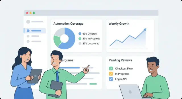
A coverage dashboard succeeds when someone can answer three questions in under a minute: How are we doing? What’s changing? What should we fix next? Design the UX around those decisions, not around the data sources.
Make the first screen a simple overview:
Keep labels plain-language (“Automated recently” beats “Evidence recency”), and avoid forcing readers to interpret technical statuses.
From any overview metric, let users click into a service/process page that answers “what” and “by what”:
Design each row/card to include the “why behind the number”: evidence link, owner, last run status, and a clear next action (“Re-run job”, “Assign owner”, “Add missing evidence”).
Offer filters that map to how the org works:
Keep filter state visible and shareable (URL parameters), so someone can send a link like “Prod + Tier-1 + last 14 days” to a stakeholder.
Use inline definitions, not long documentation:
Integrations are where your coverage app becomes real. The goal isn’t to mirror every feature of your CI or test tools—it’s to extract a consistent set of facts: what ran, when it ran, what it covered, and who owns it.
Start with the systems that already produce automation signals: CI (GitHub Actions, GitLab CI, Jenkins), test runners (JUnit, pytest), and quality tools (coverage reports, linters, security scans).
A connector should fetch (or receive via webhook) the minimum viable payload:
Keep connectors idempotent: repeated pulls shouldn’t create duplicates.
Some coverage gaps are intentional (legacy systems, third-party constraints, paused initiatives). Provide a lightweight “exception” record that requires:
This prevents permanent blind spots and keeps leadership views honest.
Different sources rarely agree on identifiers: one system says “payments-service,” another says “payments,” and a third uses a repo slug.
Create normalization rules for:
Do this early; every downstream metric depends on it.
Introduce alias tables (e.g., service_aliases, repo_aliases) that map many external names to one canonical entity. When new data arrives, match against canonical IDs first, then aliases.
If a new name doesn’t match, generate merge suggestions (e.g., “payments-api” looks like “payments-service”) for an admin to approve.
Schedule a recurring job that checks the latest run timestamp per source and flags anything stale (e.g., no CI runs in 7 days). Expose this in the UI so low coverage isn’t confused with missing data.
A dashboard is useful, but alerts and lightweight workflows are what turn interesting data into steady improvement. The goal is simple: notify the right people at the right time, with enough context to act.
Start with a small set of high-signal alerts:
Each alert should link directly to the relevant drill-down view (for example, /services/payments?tab=coverage or /teams/platform?tab=owners) so people don’t have to hunt.
Avoid one-size-fits-all thresholds. Let teams set rules like:
This keeps signals meaningful and reduces alert fatigue.
Send alerts to existing channels (email and Slack), and include: what changed, why it matters, and the owner. Alongside real-time alerts, add a weekly summary covering:
Treat alerts like tasks: allow acknowledgement, assignment, and status (open/triaged/resolved). A short comment trail (“fixed in PR #1234”) makes reporting credible and prevents the same issues from resurfacing silently.
A monitoring dashboard feels fast when the API answers the questions the UI actually asks—without forcing the browser to stitch together dozens of calls. Start with a minimal, dashboard-first API surface, then add background jobs to precompute anything expensive.
Keep the first version focused on the core screens:
GET /api/services (filters like team, language, tier)GET /api/services/{id}/coverage (overall score + key breakdowns)GET /api/services/{id}/evidence?status=passed&since=...PATCH /api/services/{id}Design responses so the dashboard can render immediately: include service name, owner, last evidence time, and current score in one payload rather than requiring extra lookups.
Lists and drill-down tables should always be paginated (limit + cursor). For frequently hit endpoints, add caching at the API layer (or a shared cache) keyed by filters and the caller’s access scope.
For anything that requires scanning lots of evidence (e.g., “coverage by team”), precompute rollups in a nightly job. Store rollups in a separate table (or materialized view) so reads are simple and predictable.
Trends are easiest when you store daily snapshots:
GET /api/services/{id}/trend?days=90.Snapshots avoid recalculating historical metrics on every page load and make “freshness” (how recently evidence ran) easy to chart.
Bulk onboarding is smoother with:
POST /api/import/services (CSV upload)GET /api/export/services.csvFinally, enforce validation rules at write time: required owner, allowed status values, and sensible timestamps (no “future” evidence). Rejecting bad data early prevents slow, confusing fixes later—especially once rollups depend on consistent inputs.
A coverage dashboard is only useful if people can trust it. Treat deployment and operations as part of the product: predictable releases, clear health signals, and simple recovery when something breaks.
For an internal app, optimize for low overhead and quick iteration.
If you’re using a platform like Koder.ai to accelerate development, take advantage of source-code export and deployment/hosting workflows early, so your internal app still follows standard promotion, review, and rollback practices.
You don’t need a complex stack to get reliable signals.
Set up automated database backups and a retention policy that matches your needs.
Document runbooks for:
A small amount of operational discipline prevents “coverage” from turning into guesswork.
A monitoring app only helps if teams trust it and use it. Treat rollout as a product launch: start small, define clear ownership, and bake in a predictable rhythm for updates.
Keep onboarding lightweight and repeatable:
A good goal is “first dashboard view in 30 minutes,” not a week-long configuration project.
Establish two rhythms:
Coverage scores can become political if rules change unexpectedly. Define a small governance group (often Eng Productivity + Security/Quality) that can:
Publish changes in a simple changelog page like /docs/scoring-changelog.
Track adoption with a few straightforward metrics: active users, services tracked, and freshness compliance (how many services have up-to-date evidence). Use these to guide iteration: better weighting, richer evidence types, and additional connectors—always prioritizing improvements that reduce manual work for teams.
If you decide to share your internal learnings publicly, consider standardizing your build notes and templates: teams using Koder.ai can also earn credits by creating content about their development workflow or by referring other users via a referral link, which can help fund continued iteration on internal tooling.
Automation coverage is whatever your organization decides to measure as “work handled automatically” versus manually. To avoid confusion, pick a primary unit for v1 (for example: processes, requirements/controls, test suites, or runbooks) and write down clear rules for edge cases like “partially automated” steps that still require approvals.
A good definition is one where two people would score the same item the same way.
Start by writing 5–10 “top questions” your users need answered, and treat those as product requirements. Common examples:
Different audiences (QA, Ops, leadership) care about different cuts, so decide whose needs v1 optimizes for.
Inventory where “proof” of automation lives and where the authoritative “should exist” list lives.
Without a system of record, you can count activity, but you can’t reliably calculate coverage (because you don’t know the full set of targets).
Pick the least-fragile method per source:
Also document connector constraints (rate limits, auth, retention windows) so users understand data freshness and confidence.
Separate intent, claims, and proof so metrics don’t look “green” while automation is stale.
A practical model:
Use freshness timestamps and evidence rules.
Common fields:
last_seen_at (asset still exists)last_run_at, last_failure_atlast_reviewed_at (someone confirmed the claim still applies)Then enforce a rule like “counts as automated only if there are N successful runs in the last 30 days.” This distinguishes “exists” from “works recently.”
Choose one headline metric and make the scoring rules explicit.
Typical headline options:
Keep weights simple (e.g., 1–5) and document what “automated / partially automated / manual” means with concrete examples.
Normalize identifiers early and handle renames explicitly.
Practical steps:
service_aliases, repo_aliases) to map external names to canonical IDs.This prevents duplicates and keeps historical trends intact when teams reorganize or rename repos.
Start with SSO (OIDC/SAML) if available, or temporarily use an internal auth proxy that injects identity headers. Define a small role set and keep permissions consistent across UI and API:
Store minimal sensitive evidence: prefer build IDs, timestamps, and short summaries rather than copying full logs. Audit manual edits (who/what/when/why) and define retention for run history.
Make alerts actionable and avoid global noise.
High-signal alert types:
Let thresholds vary by team/service (different “stale windows” and paging rules). Include deep links to drill-down pages (e.g., /services/payments?tab=coverage) and support acknowledgment/assignment/status so issues close cleanly.
Add ownership (team/person) and stable identifiers so renames don’t break history.